by Calculated Risk on 6/30/2009 06:23:00 PM
Tuesday, June 30, 2009
June Economic Summary in Graphs
Here is a collection of real estate and economic graphs for data released in June ...
Note: Click on graphs for larger image in new window. For more info, click on link below graph to original post.
 New Home Sales in May (NSA)
The first graph shows monthly new home sales (NSA - Not Seasonally Adjusted).
Note the Red columns for 2009. This is the lowest sales for May since the Census Bureau started tracking sales in 1963. (NSA, 32 thousand new homes were sold in May 2009; the record low was 36 thousand in May 1982).
From: New Home Sales: Record Low for May
 New Home Sales in May
This graph shows shows New Home Sales vs. recessions for the last 45 years. New Home sales have fallen off a cliff.
"Sales of new one-family houses in May 2009 were at a seasonally adjusted annual rate of 342,000 ...
This is 0.6 percent (±17.8%)* below the revised April rate of 344,000 and is 32.8 percent (±10.9%) below the May 2008 estimate of 509,000."
From: New Home Sales: Record Low for May
 New Home Months of Supply in May
There were 10.2 months of supply in May - significantly below the all time record of 12.4 months of supply set in January.
"The seasonally adjusted estimate of new houses for sale at the end of May was 292,000. This represents a supply of 10.2 months at the current sales rate."
From: New Home Sales: Record Low for May
 Existing Home Sales in May
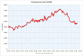
 This graph shows existing home sales, on a Seasonally Adjusted Annual Rate (SAAR) basis since 1993.
Sales in May 2009 (4.77 million SAAR) were 2.4% higher than last month, and were 3.6% lower than May 2008 (4.95 million SAAR).
From: Existing Home Sales Graphs
 Existing Home Inventory May
shows nationwide inventory for existing homes. According to the NAR, inventory decreased to 3.80 million in May. The all time record was 4.57 million homes for sale in July 2008. This is not seasonally adjusted.
Typically inventory increases in May, and then really increases over the next couple months of the year until peaking in the summer. This decrease in inventory was a little unusual, and the next few months will be key for inventory.
Also, many REOs (bank owned properties) are included in the inventory because they are listed - but not all. Recently there have been stories about a substantial number of unlisted REOs - this is possible.
From: Existing Home Sales Graphs
 Existing Home Inventory May, Year-over-Year Change
This graph shows the year-over-year change in existing home inventory.
If the trend of declining year-over-year inventory levels continues in 2009 that will be a positive for the housing market. Prices will probably continue to fall until the months of supply reaches more normal levels (closer to 6 months compared to the current 9.6 months), and that will take some time.
From: Existing Home Sales Graphs
 Case Shiller House Prices for April
This graph shows the nominal Composite 10 and Composite 20 indices (the Composite 20 was started in January 2000).
The Composite 10 index is off 33.1% from the peak, and off 1.0% in April.
The Composite 20 index is off 32.0% from the peak, and off 0.9% in April.
From: Case-Shiller: House Prices Fall in April
 NAHB Builder Confidence Index in June
This graph shows the builder confidence index from the National Association of Home Builders (NAHB).
The housing market index (HMI) decreased to 15 in June from 16 in May. The record low was 8 set in January.
From: NAHB: Builder Confidence Decreases Slightly in June
 Architecture Billings Index for May
"A leading indicator of U.S. nonresidential construction spending held steady for a second month in May, suggesting an economic recovery has stalled, an architects' trade group said on Wednesday.
The Architecture Billings Index edged up a tenth of a point to 42.9 last month after a slight decline in the prior month, according to the American Institute of Architects....."
From: American Institute of Architects: Recovery has stalled
 Housing Starts in May
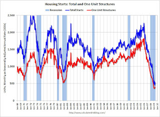
Total housing starts were at 532 thousand (SAAR) in May, rebounding from the all time record low in April of 454 thousand. The previous record low was 488 thousand in January (the lowest level since the Census Bureau began tracking housing starts in 1959).
Single-family starts were at 401 thousand (SAAR) in May; above the record low in January and February (357 thousand) and above 400 thousand for the first time since last November.
From: Housing Starts May
 Construction Spending in April
This graph shows private residential and nonresidential construction spending since 1993. Note: nominal dollars, not inflation adjusted.
Residential construction spending was up slightly in April (compared to March), and nonresidential spending has peaked and will probably decline sharply over the next two years.
From: Construction Spending in April
 May Employment Report
This graph shows the unemployment rate and the year over year change in employment vs. recessions.
Nonfarm payrolls decreased by 345,000 in May. The economy has lost almost 3.6 million jobs over the last 6 months, and over 6 million jobs during the 17 consecutive months of job losses.
The unemployment rate rose to 9.4 percent; the highest level since 1983.
Year over year employment is strongly negative (there were 5.4 million fewer Americans employed in May 2009 than in May 2008).
From: Employment Report: 345K Jobs Lost, 9.4% Unemployment Rate
 May Employment Comparing Recessions
This graph graph shows the job losses from the start of the employment recession, in percentage terms (as opposed to the number of jobs lost).
For the current recession, employment peaked in December 2007, and this recession was a slow starter (in terms of job losses and declines in GDP).
However job losses have really picked up over the last 8 months (4.6 million jobs lost, red line cliff diving on the graph), and the current recession is now one of the worst recessions since WWII in percentage terms - although not in terms of the unemployment rate.
From: Employment Report: 345K Jobs Lost, 9.4% Unemployment Rate
 May Retail Sales
This graph shows the year-over-year change in nominal and real retail sales since 1993.
The Census Bureau reported that nominal retail sales decreased 10.8% year-over-year (retail and food services decreased 10.1%), and real retail sales also declined by 10.8% on a YoY basis.
From: Retail Sales in May: Off 10.8% from May 2008
 LA Port Traffic in May
This graph shows the loaded inbound and outbound traffic at the port of Los Angeles in TEUs (TEUs: 20-foot equivalent units or 20-foot-long cargo container). Although containers tell us nothing about value, container traffic does give us an idea of the volume of goods being exported and imported.
Inbound traffic was 19.7% below May 2008.
Outbound traffic was 15.3% below May 2008.
There has been some recovery in exports over the last few months (the year-over-year comparison was off 30% from December through February). But this is the 3nd worst YoY comparison for imports - only February and April were worse. So imports from Asia appear especially weak.
From: LA Area Port Traffic in May
 U.S. Imports and Exports Through April
This graph shows the monthly U.S. exports and imports in dollars through April 2009.
Both imports and exports declined again in April. On a year-over-year basis, exports are off 21% and imports are off 31%!
From: Trade Deficit Increases Slightly in April
 May Capacity Utilization
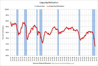
This graph shows Capacity Utilization. This series is at another record low (the series starts in 1967).
"Industrial production decreased 1.1 percent in May after having fallen a downward-revised 0.7 percent in April. The average decrease in industrial production during the first three months of the year was 1.6 percent. Manufacturing output moved down 1.0 percent in May with broad-based declines across industries. Outside of manufacturing, the output of mines dropped 2.1 percent, and the output of utilities fell 1.4 percent. At 95.8 percent of its 2002 average, overall industrial output in May was 13.4 percent below its year-earlier level. The rate of capacity utilization for total industry declined further in May to 68.3 percent, a level 12.6 percentage points below its average for 1972-2008. Prior to the current recession, the low over the history of this series, which begins in 1967, was 70.9 percent in December 1982."
From: Industrial Production Declines, Capacity Utilization at Record Low
 Vehicle Miles driven in April
This graph shows the annual change in the rolling 12 month average of U.S. vehicles miles driven. Note: the rolling 12 month average is used to remove noise and seasonality.
By this measure, vehicle miles driven are off 3.1% Year-over-year (YoY); the decline in miles driven was worse than during the early '70s and 1979-1980 oil crisis.
Note that rolling miles driven has a built in lag, and miles driven was larger in April 2009 than April 2008.
From: DOT: U.S. Vehicles Miles increase YoY in April
 Unemployment Claims
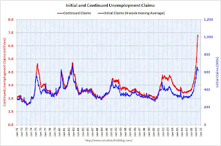
This graph shows weekly claims and continued claims since 1971.
Continued claims decreased to 6.74 million. This is 5.0% of covered employment.
Note: continued claims peaked at 5.4% of covered employment in 1982 and 7.0% in 1975.
The four-week average of weekly unemployment claims increased this week by 500, and is now 41,500 below the peak of 10 weeks ago. There is a reasonable chance that claims have peaked for this cycle.
From: Initial Unemployment Claims Increase
 Restaurant Performance Index for May
"The outlook for the restaurant industry was dampened somewhat in May, as the National Restaurant Association’s comprehensive index of restaurant activity registered its first decline in five months. The Association’s Restaurant Performance Index (RPI) – a monthly composite index that tracks the health of and outlook for the U.S. restaurant industry – stood at 98.3 in May, down 0.3 percent from April and its 19th consecutive month below 100."
From: Restaurants: 21st Consecutive Month of Traffic Declines
 Philly Fed State Conincident Indicators for May
Here is a map of the three month change in the Philly Fed state coincident indicators. Forty nine states are showing declining three month activity.
This is what a widespread recession looks like based on the Philly Fed states indexes.
From: Philly Fed State Coincident Indexes


