by Calculated Risk on 11/22/2018 08:31:00 AM
Thursday, November 22, 2018
Five Economic Reasons to be Thankful
With a Hat Tip to Neil Irwin (he started doing this several years ago) ... here are five economic reasons to be thankful this Thanksgiving ...
1) Low unemployment rate.
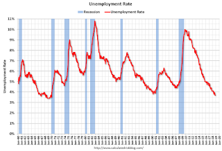
The unemployment rate declined to 3.7% in October. The unemployment rate is down from 4.1% in October 2017 (a year ago), and is down from the cycle peak of 10.0% in October 2009.

This is the lowest level for the unemployment rate since 1969!
Also, this is the largest decline in the unemployment rate, from cycle peak-to-trough, since the BLS started tracking the unemployment rate in 1948. (In the early '80s, the unemployment rate declined from 10.8% to 5.0%; a decline of 5.8 percentage points. The current decline from 10.0% to 3.7% is 6.3 percentage points!)
2) Low unemployment claims.

Here is a graph of initial weekly unemployment claims.
The dashed line on the graph is the current 4-week average. The four-week average of weekly unemployment claims is at 218,500.
The low level of claims suggests relatively few layoffs.
3) Job Openings Near Series High.
There were 7.0 million job openings in September. This is close to the series high of 7.29 million in August 2018.

For the sixth consecutive month, there were more job openings than people unemployed. Also note that the number of job openings has exceeded the number of hires since January 2015 (almost 4 years).
Also Quits are up 11% year-over-year. These are voluntary separations. (see light blue columns at bottom of graph for trend for "quits").
More job openings, and rising quits, are positive signs for the labor market.
4) Wages have been increasing at a faster rate.

The graph shows the nominal year-over-year change in "Average Hourly Earnings" for all private employees. Nominal wage growth was at 3.1% YoY in October.
Wage growth has generally been trending up for several years.
5) Household Debt burdens are near record lows.
Household debt burdens have declined sharply since the great recession.
The Household debt service ratio was at 13.2% in 2007, and has fallen to a series low of 9.84% in Q2 2018 (most recent data).

The overall Debt Service Ratio decreased in Q2 2018, and has been moving sideways and is at a series low. Note: The financial obligation ratio (FOR) was declined in Q2 and is also near a series low (not shown).
The DSR for mortgages (blue) is also at a series low (since at least 1980). This ratio increased rapidly during the housing bubble, and continued to increase until 2007.
This data suggests aggregate household cash flow has improved.
Happy Thanksgiving to All!
Wednesday, November 21, 2018
Philly Fed: State Coincident Indexes increased in 42 states in October
by Calculated Risk on 11/21/2018 03:06:00 PM
From the Philly Fed:
The Federal Reserve Bank of Philadelphia has released the coincident indexes for the 50 states for October 2018. Over the past three months, the indexes increased in 43 states, decreased in four states, and remained stable in three, for a three-month diffusion index of 78. In the past month, the indexes increased in 42 states, decreased in five states, and remained stable in three, for a one-month diffusion index of 74.Note: These are coincident indexes constructed from state employment data. An explanation from the Philly Fed:
emphasis added
The coincident indexes combine four state-level indicators to summarize current economic conditions in a single statistic. The four state-level variables in each coincident index are nonfarm payroll employment, average hours worked in manufacturing by production workers, the unemployment rate, and wage and salary disbursements deflated by the consumer price index (U.S. city average). The trend for each state’s index is set to the trend of its gross domestic product (GDP), so long-term growth in the state’s index matches long-term growth in its GDP.
 Click on map for larger image.
Here is a map of the three month change in the Philly Fed state coincident indicators. This map was all red during the worst of the recession, and all or mostly green during most of the recent expansion.
The map is mostly green on a three month basis, but there are some red states.
Source: Philly Fed.
Note: For complaints about red / green issues, please contact the Philly Fed.
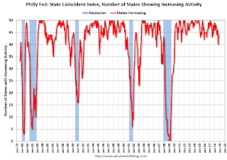
 And here is a graph is of the number of states with one month increasing activity according to the Philly Fed. This graph includes states with minor increases (the Philly Fed lists as unchanged).
In October, 44 states had increasing activity (including minor increases).
Comments on October Existing Home Sales
by Calculated Risk on 11/21/2018 12:23:00 PM
Earlier: NAR: Existing-Home Sales Increased to 5.22 million in October
Two key points:
1) The key for the housing - and the overall economy - is new home sales, single family housing starts and overall residential investment. Overall this is a reasonable level for existing home sales, and the recent weakness is no surprise given the increase in mortgage rates.
2) Inventory is still low, but was up 2.8% year-over-year (YoY) in October. This was the third consecutive year-over-year increase in inventory, and the largest YoY increase since late 2014.

The current slight YoY increase in inventory is nothing like what happened in 2005 and 2006. In 2005 (see red arrow), inventory kept increasing all year, and that was a sign the bubble was ending.
Although I expect inventory to increase YoY in 2018, I expect inventory to follow the normal seasonal pattern (not keep increasing all year).
Also inventory levels remains low, and could increase much more and still be at normal levels. No worries.

Sales NSA in October (446,000, red column) were below sales in October 2017 (458,000, NSA), but were the second highest since the housing bubble.
Sales NSA through October (first ten months) are down about 2.1% from the same period in 2017.
This is a small YoY decline in sales to-date - it is likely that higher mortgage rates are impacting sales, and it is possible there has been an impact from the changes to the tax law (eliminating property taxes write-off, etc).
NAR: Existing-Home Sales Increased to 5.22 million in October
by Calculated Risk on 11/21/2018 10:11:00 AM
From the NAR: Existing-Home Sales Increase for the First Time in Six Months
Existing-home sales increased in October after six straight months of decreases, according to the National Association of Realtors®. Three of four major U.S. regions saw gains in sales activity last month.
Total existing-home sales, which are completed transactions that include single-family homes, townhomes, condominiums and co-ops, increased 1.4 percent from September to a seasonally adjusted rate of 5.22 million in October. Sales are now down 5.1 percent from a year ago (5.5 million in October 2017).
...
Total housing inventory at the end of October decreased from 1.88 million in September to 1.85 million existing homes available for sale, but that represents an increase from 1.80 million a year ago. Unsold inventory is at a 4.3-month supply at the current sales pace, down from 4.4 last month and up from 3.9 months a year ago.
emphasis added
 Click on graph for larger image.
This graph shows existing home sales, on a Seasonally Adjusted Annual Rate (SAAR) basis since 1993.
Sales in October (5.2 million SAAR) were up 1.4% from last month, but were 5.1% below the October 2017 rate.
The second graph shows nationwide inventory for existing homes.
 According to the NAR, inventory decreased to 1.85 million in October from 1.88 million in September. Headline inventory is not seasonally adjusted, and inventory usually decreases to the seasonal lows in December and January, and peaks in mid-to-late summer.
The last graph shows the year-over-year (YoY) change in reported existing home inventory and months-of-supply. Since inventory is not seasonally adjusted, it really helps to look at the YoY change. Note: Months-of-supply is based on the seasonally adjusted sales and not seasonally adjusted inventory.
 Inventory was up 2.8% year-over-year in October compared to October 2017.
 Months of supply was at 4.3 months in October.
For existing home sales, a key number is inventory - and inventory is still low, but appears to have bottomed. I'll have more later ...
Weekly Initial Unemployment Claims increased to 224,000
by Calculated Risk on 11/21/2018 08:33:00 AM
The DOL reported:
In the week ending November 17, the advance figure for seasonally adjusted initial claims was 224,000, an increase of 3,000 from the previous week's revised level. The previous week's level was revised up by 5,000 from 216,000 to 221,000. The 4-week moving average was 218,500, an increase of 2,000 from the previous week's revised average. The previous week's average was revised up by 1,250 from 215,250 to 216,500.The previous week was revised up.
emphasis added
The following graph shows the 4-week moving average of weekly claims since 1971.
 Click on graph for larger image.
The dashed line on the graph is the current 4-week average. The four-week average of weekly unemployment claims increased to 218,500.
This was higher than the consensus forecast. The low level of claims suggest few layoffs.
MBA: Mortgage Applications Decreased Slightly in Latest Weekly Survey
by Calculated Risk on 11/21/2018 07:00:00 AM
From the MBA: Mortgage Applications Decrease Slightly in Latest MBA Weekly Survey
Mortgage applications decreased 0.1 percent from one week earlier, according to data from the Mortgage Bankers Association’s (MBA) Weekly Mortgage Applications Survey for the week ending November 16, 2018. This week’s results do not include an adjustment for the Veterans’ Day holiday.
... The Refinance Index decreased 5 percent from the previous week to its lowest level since December 2000. The seasonally adjusted Purchase Index increased 3 percent from one week earlier. The unadjusted Purchase Index decreased 1 percent compared with the previous week and was 5 percent lower than the same week one year ago.
...
“Treasury rates declined last week, as equity markets continued to see large swings amidst investor concerns over global economic growth. As a result, mortgage rates inched back across most loan types, including the 15-year fixed-rate mortgage, 5/1 ARM, and 30-year jumbo mortgage rate. The 30-year fixed rate mortgage also declined, stopping a run of six straight weekly increases,” said Joel Kan, MBA’s Associate Vice President of Economic and Industry Forecasting. “Mortgage applications saw mixed results last week. Purchase applications increased to their highest level in five weeks, but despite the pause in rates, refinance activity dropped again and remained at its lowest level since 2000.”
...
The average contract interest rate for 30-year fixed-rate mortgages with conforming loan balances ($453,100 or less) decreased to 5.16 percent from 5.17 percent, with points decreasing to 0.48 from 0.55 (including the origination fee) for 80 percent loan-to-value ratio (LTV) loans.
emphasis added
 Click on graph for larger image.
The first graph shows the refinance index since 1990.
Refinance activity will not pick up significantly unless mortgage rates fall 50 bps or more from the recent level.
 The second graph shows the MBA mortgage purchase index
 According to the MBA, purchase activity is down 5% year-over-year.
Tuesday, November 20, 2018
Wednesday: Existing Home Sales, Unemployment Claims, Durable Goods
by Calculated Risk on 11/20/2018 09:50:00 PM
Wednesday:
• At 7:00 AM ET, The Mortgage Bankers Association (MBA) will release the results for the mortgage purchase applications index.
• At 8:30 AM, The initial weekly unemployment claims report will be released. The consensus is for 213 thousand initial claims, down from 216 thousand the previous week.
• Also at 8:30 AM: Durable Goods Orders for October from the Census Bureau. The consensus is for a 2.4% decrease in durable goods orders.
• At 10:00 AM, Existing Home Sales for October from the National Association of Realtors (NAR). The consensus is for 5.20 million SAAR, up from 5.15 million. Housing economist Tom Lawler estimates the NAR will reports sales of 5.31 million SAAR for October and that inventory will be up 2.8% year-over-year. Take the over.
• At 10:00 AM, University of Michigan's Consumer sentiment index (Final for November). The consensus is for a reading of 98.3.
Housing Inventory Tracking
by Calculated Risk on 11/20/2018 05:08:00 PM
Update: Watching existing home "for sale" inventory is very helpful. As an example, the increase in inventory in late 2005 helped me call the top for housing.
And the decrease in inventory eventually helped me correctly call the bottom for house prices in early 2012, see: The Housing Bottom is Here.
And in 2015, it appeared the inventory build in several markets was ending, and that boosted price increases.
I don't have a crystal ball, but watching inventory helps understand the housing market.
Inventory, on a national basis, was up 1.1% year-over-year (YoY) in September, this was the second consecutive YoY increase, following over three years of YoY declines.
The graph below shows the YoY change for non-contingent inventory in Houston, Las Vegas, Sacramento, and Phoenix (through October) and total existing home inventory as reported by the NAR (through September, October will be released tomorrow). (I'll be adding more areas).

The black line is the year-over-year change in inventory as reported by the NAR.
Note that inventory was up 52% YoY in Las Vegas in October (red), the fourth consecutive month with a YoY increase.
Houston is a special case, and inventory was up for several years due to lower oil prices, but declined YoY recently as oil prices increased. Inventory was up 7% year-over-year in Houston in October.
Inventory is a key for the housing market, and I am watching inventory for the impact of the new tax law and higher mortgage rates on housing. I expect national inventory will be up YoY at the end of 2018 (but still to be somewhat low).
Also note that inventory in Seattle was up 102% year-over-year in October (not graphed)!
John Burns: Builder Confidence "Feels more like a 50 to me"
by Calculated Risk on 11/20/2018 01:57:00 PM
Yesterday the NAHB reported that builder confidence declined sharply to 60 in November from 68 in October.
Here are some interesting comments on confidence via twitter from John Burns, CEO of John Burns Real Estate Consulting (a premier RE consulting firm).
John Burns wrote:
"Our survey of new home buyer traffic and expected new home sales from 200+ of the exact same builders. Green is the last 4 Octobers. Hard to believe NAHB that HMI is a 60. Feels more like a 50 (normal) to me."Here is the graph that Burns posted:
 Click on graph for larger image.
Comments on October Housing Starts
by Calculated Risk on 11/20/2018 10:20:00 AM
Earlier: Housing Starts Increased to 1.228 Million Annual Rate in October
Housing starts in October were slightly below expectations, however starts for August and September were revised up. Overall this was close to expectations.
The housing starts report released this morning showed starts were up 1.5% in October compared to September (September starts were revised up), and starts were down 2.9% year-over-year compared to October 2017.
Single family starts were down 2.6% year-over-year.
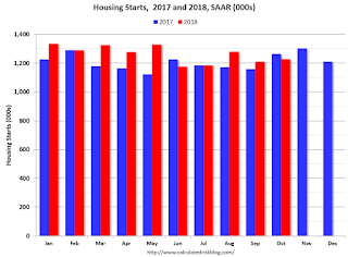
This first graph shows the month to month comparison for total starts between 2017 (blue) and 2018 (red).

Starts were down 2.9% in October compared to October 2017.
Through nine months, starts are up 5.6% year-to-date compared to the same period in 2017. That is a decent increase.
Note that 2017 finished strong, so the year-over-year comparisons are difficult in Q4.
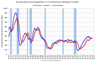
Below is an update to the graph comparing multi-family starts and completions. Since it usually takes over a year on average to complete a multi-family project, there is a lag between multi-family starts and completions. Completions are important because that is new supply added to the market, and starts are important because that is future new supply (units under construction is also important for employment).
These graphs use a 12 month rolling total for NSA starts and completions.

The rolling 12 month total for starts (blue line) increased steadily for several years following the great recession - but turned down, and has moved sideways recently. Completions (red line) had lagged behind - however completions and starts are at about the same level now (more deliveries).
It is likely that both starts and completions, on rolling 12 months basis, will now move mostly sideways.
As I've been noting for a few years, the significant growth in multi-family starts is behind us - multi-family starts peaked in June 2015 (at 510 thousand SAAR).

Note the relatively low level of single family starts and completions. The "wide bottom" was what I was forecasting following the recession, and now I expect further of increases in single family starts and completions.


