 RSS Feed
 by Calculated Risk on 8/09/2016 08:37:00 AM
Tuesday, August 09, 2016
NFIB: Small Business Optimism Index increased Slightly in July
From the National Federation of Independent Business (NFIB): Small Business Optimism Plateaus
The Index of Small Business Optimism rose one-tenth of a point in July to 94.6 ... according to the National Federation of Independent Business (NFIB).
Reported job creation remained weak in July, with the seasonally adjusted average employment change per firm posting a decline of -0.03 workers per firm, although better than June’s -0.17 reading. Fifty-three percent reported hiring or trying to hire (down 3 points), but 46 percent reported few or no qualified applicants for the positions they were trying to fill. Fourteen percent of owners cited the difficulty of finding qualified workers as their Single Most Important Business Problem. ... Twenty-six percent of all owners reported job openings they could not fill in the current period, down 3 points from, the highest reading in this recovery.
emphasis added
 Click on graph for larger image.
This graph shows the small business optimism index since 1986.
The index increased to 94.6 in July.
Monday, August 08, 2016
Tuesday: Small Business Index, Q2 2016 Household Debt and Credit Report
by Calculated Risk on 8/08/2016 09:02:00 PM
Tuesday:
• At 9:00 AM ET: NFIB Small Business Optimism Index for July.
• 10:00 AM: Monthly Wholesale Trade: Sales and Inventories for June. The consensus is for no change in inventories.
• 11:00 AM: The New York Fed will release their Q2 2016 Household Debt and Credit Report
From Matthew Graham at Mortgage News Daily: Mortgage Rates Threatening to Break Post-Brexit Range
Mortgage rates continued higher today, extending a sharp move that began on Friday following stronger-than-expected employment data. There are two distinctly different ways to look at the current rate environment. On the one hand, the average conventional 30yr fixed rate continues hovering in the mid 3's on top tier scenarios. While that's not quite as low as it was in early July, or on some occasions in 2012-2013, it's still in the territory of "all-time lows" in the big picture.Here is a table from Mortgage News Daily:
On the other hand, current rates are near the highest levels in just over a month. This means they're 'threatening'--for lack of a better term--to break out of the low range that followed The UK's vote to leave the EU (Brexit).
emphasis added
Update: U.S. Heavy Truck Sales
by Calculated Risk on 8/08/2016 02:27:00 PM
The following graph shows heavy truck sales since 1967 using data from the BEA. The dashed line is the July 2016 seasonally adjusted annual sales rate (SAAR).
Heavy truck sales really collapsed during the recession, falling to a low of 181 thousand in April 2009, on a seasonally adjusted annual rate basis (SAAR). Since then sales increased more than 2 1/2 times, and hit 486 thousand SAAR in November 2015.
Heavy truck sales have since declined - due to the weakness in the oil sector - and were at 399 thousand SAAR in July.
Even with the recent oil related decline, heavy truck sales are still above the average (and median) of the last 20 years.

Click on graph for larger image.
Phoenix Real Estate in July: Sales down 2%, Inventory up 3% YoY
by Calculated Risk on 8/08/2016 11:15:00 AM
This is a key housing market to follow since Phoenix saw a large bubble / bust followed by strong investor buying.
Inventory was up 3.3% year-over-year in July. This is the fifth consecutive months with a YoY increase in inventory, following fifteen consecutive months of YoY declines in Phoenix. This could be a significant change.
The Arizona Regional Multiple Listing Service (ARMLS) reports (table below):
1) Overall sales in June were down 1.8% year-over-year.
2) Cash Sales (frequently investors) were down to 19.7% of total sales.
3) Active inventory is now up 3.3% year-over-year.
More inventory (a theme in 2014) - and less investor buying - suggested price increases would slow sharply in 2014. And prices increases did slow in 2014, only increasing 2.4% according to Case-Shiller.
In 2015, with falling inventory, prices increased a little faster - Prices were up 6.3% in 2015 according to Case-Shiller.
Now inventory is increasing a little again, and - if this trend continues in Phoenix - price increases will probably slow in Phoenix. Prices in Phoenix are up 1.5% through May (about a 3.6% annual rate) - slower than in 2015.
| July Residential Sales and Inventory, Greater Phoenix Area, ARMLS | ||||||
|---|---|---|---|---|---|---|
| Sales | YoY Change Sales | Cash Sales | Percent Cash | Active Inventory | YoY Change Inventory | |
| Jul-08 | 5,9741 | --- | --- | --- | 54,5272 | --- |
| Jul-09 | 9,095 | 52.2% | 3,269 | 35.9% | 38,024 | ---2 |
| Jul-10 | 7,101 | -21.9% | 2,901 | 40.9% | 42,887 | 12.8% |
| Jul-11 | 8,397 | 18.3% | 3,779 | 45.0% | 27,663 | -35.5% |
| Jul-12 | 7,152 | -14.8% | 3,214 | 44.9% | 20,384 | -26.3% |
| Jul-13 | 8,214 | 14.8% | 2,944 | 35.8% | 20,049 | -1.6% |
| Jul-14 | 6,790 | -17.3% | 1,681 | 24.8% | 27,081 | 35.1% |
| Jul-15 | 7,915 | 16.6% | 1,731 | 21.9% | 22,940 | -15.3% |
| Jul-16 | 7,775 | -1.8% | 1,534 | 19.7% | 23,695 | 3.3% |
| 1 July 2008 does not include manufactured homes, ~100 more 2 July 2008 Inventory includes pending | ||||||
Vehicle Sales: Fleet Turnover Ratio
by Calculated Risk on 8/08/2016 08:12:00 AM
Back in early 2009, I wrote a couple of posts arguing there would be an increase in auto sales - Vehicle Sales (Jan 2009) and Looking for the Sun (Feb 2009). This was an out-of-the-consensus call and helped me call the bottom for the US economy in mid-2009.
I wrote an update in 2014, and argued vehicle sales would "mostly move sideways" for the next few years.
Here is another update to the U.S. fleet turnover graph.
This graph shows the total number of registered vehicles in the U.S. divided by the sales rate through July 2016 - and gives a turnover ratio for the U.S. fleet (this doesn't tell you the age or the composition of the fleet). Note: the number of registered vehicles is estimated for 2015 and 2016.
The wild swings in 2009 were due to the "cash for clunkers" program.
 Click on graph for larger image in graph gallery.
The estimated ratio for July close to 14 years - back to a more normal level.
Note: in 2009, I argued the turnover ratio would "probably decline to 15 or so eventually" and that has happened.
 The second graph shows light vehicle sales since the BEA started keeping data in 1967. The dashed line is current estimated sales rate.
The current sales rate is now near the top (excluding one month spikes) of the '98/'06 auto boom.
Light vehicle sales were at a 17.7 million seasonally adjusted annual rate (SAAR) in July.
I continue to expect vehicle sales to mostly move sideways over the next few years.
Sunday, August 07, 2016
Sunday Night Futures
by Calculated Risk on 8/07/2016 07:11:00 PM
Weekend:
• Schedule for Week of Aug 7, 2016
• More Employment Graphs: Prime Age Participation, Duration of Unemployment, Unemployment by Education and more
Monday:
• At 10:00 AM ET: The Fed will release the monthly Labor Market Conditions Index (LMCI).
From CNBC: Pre-Market Data and Bloomberg futures: S&P and DOW futures are up slightly (fair value).
Oil prices were up over the last week with WTI futures at $41.92 per barrel and Brent at $44.27 per barrel. A year ago, WTI was at $44, and Brent was at $48 - so prices are down less than 10% year-over-year.
Here is a graph from Gasbuddy.com for nationwide gasoline prices. Nationally prices are at $2.12 per gallon (down about $0.50 per gallon from a year ago).
More Employment Graphs: Prime Age Participation, Duration of Unemployment, Unemployment by Education and more
by Calculated Risk on 8/07/2016 11:56:00 AM
A few more employment graphs ...
Here are the previous posts on the employment report:
• July Employment Report: 255,000 Jobs, 4.9% Unemployment Rate
• Employment Comments: Another Strong Report
• Public and Private Sector Payroll Jobs: Carter, Reagan, Bush, Clinton, Bush, Obama
Employment-Population Ratio, 25 to 54 years old
 Since the overall participation rate has declined recently due to cyclical (recession) and demographic (aging population, younger people staying in school) reasons, here is the employment-population ratio for the key working age group: 25 to 54 years old.
In the earlier period the participation rate for this group was trending up as women joined the labor force. Since the early '90s, the participation rate moved more sideways, with a downward drift starting around '00 - and with ups and downs related to the business cycle.
The 25 to 54 participation rate was unchanged in July at 81.2%, and the 25 to 54 employment population ratio increased to 78.0%.
The participation rate for this group might increase a little more (or at least stabilize for a couple of years) - although the participation rate has been trending down for this group since the late '90s.
 This graph shows the duration of unemployment as a percent of the civilian labor force. The graph shows the number of unemployed in four categories: less than 5 week, 6 to 14 weeks, 15 to 26 weeks, and 27 weeks or more.
The general trend has been down for all categories, and the "less than 5 weeks", "6 to 14 weeks" and "15 to 26 weeks" are all close to normal levels.
The long term unemployed is at 1.3% of the labor force, however the number (and percent) of long term unemployed remains elevated.
 This graph shows the unemployment rate by four levels of education (all groups are 25 years and older).
Unfortunately this data only goes back to 1992 and only includes one previous recession (the stock / tech bust in 2001). Clearly education matters with regards to the unemployment rate - and all four groups were generally trending down - although the rate has somewhat flattened out recently.
Although education matters for the unemployment rate, it doesn't appear to matter as far as finding new employment.
Note: This says nothing about the quality of jobs - as an example, a college graduate working at minimum wage would be considered "employed".
 This graph shows total construction employment as reported by the BLS (not just residential).
Since construction employment bottomed in January 2011, construction payrolls have increased by 1.23 million.
Construction employment is still below the bubble peak, but close to the level in the late '90s.
 The BLS diffusion index for total private employment was at 63.7 in July, up from 61.8 in June. A solid reading.
For manufacturing, the diffusion index was at 54.4, up from 51.3 in June.
Think of this as a measure of how widespread job gains are across industries. The further from 50 (above or below), the more widespread the job losses or gains reported by the BLS. Above 60 is very good. From the BLS:
Figures are the percent of industries with employment increasing plus one-half of the industries with unchanged employment, where 50 percent indicates an equal balance between industries with increasing and decreasing employment.Overall private job growth was widespread in July, and manufacturing employment was somewhat widespread.
Saturday, August 06, 2016
Schedule for Week of Aug 7, 2016
by Calculated Risk on 8/06/2016 08:09:00 AM
The key economic report this week is Retail Sales on Friday.
10:00 AM ET: The Fed will release the monthly Labor Market Conditions Index (LMCI).
9:00 AM ET: NFIB Small Business Optimism Index for July.
10:00 AM: Monthly Wholesale Trade: Sales and Inventories for June. The consensus is for no change in inventories.
11:00 AM: The New York Fed will release their Q2 2016 Household Debt and Credit Report
7:00 AM ET: The Mortgage Bankers Association (MBA) will release the results for the mortgage purchase applications index.
 10:00 AM: Job Openings and Labor Turnover Survey for June from the BLS.
 This graph shows job openings (yellow line), hires (purple), Layoff, Discharges and other (red column), and Quits (light blue column) from the JOLTS.
Jobs openings decreased in May to 5.500 million from 5.845 million in April.
The number of job openings (yellow) were up 2% year-over-year, and Quits were up 5% year-over-year.
8:30 AM ET: The initial weekly unemployment claims report will be released. The consensus is for 265 thousand initial claims, down from 269 thousand the previous week.
 8:30 AM ET: Retail sales for July will be released. The consensus is for retail sales to increase 0.4% in July.
This graph shows retail sales since 1992 through June 2016.
8:30 AM: The Producer Price Index for July from the BLS. The consensus is for a 0.1% increase in prices, and a 0.2% increase in core PPI.
10:00 AM: Manufacturing and Trade: Inventories and Sales (business inventories) report for June. The consensus is for a 0.1% increase in inventories.
10:00 AM: University of Michigan's Consumer sentiment index (preliminary for August). The consensus is for a reading of 91.0, up from 90.0 in July.
Friday, August 05, 2016
Public and Private Sector Payroll Jobs: Carter, Reagan, Bush, Clinton, Bush, Obama
by Calculated Risk on 8/05/2016 04:23:00 PM
By request, here is another update of an earlier post through the July 2016 employment report including all revisions.
NOTE: Several readers have asked if I could add a lag to these graphs (obviously a new President has zero impact on employment for the month they are elected). But that would open a debate on the proper length of the lag, so I'll just stick to the beginning of each term.
Note: We frequently use Presidential terms as time markers - we could use Speaker of the House, or any other marker.
Important: There are many differences between these periods. Overall employment was smaller in the '80s, however the participation rate was increasing in the '80s (younger population and women joining the labor force), and the participation rate is generally declining now. But these graphs give an overview of employment changes.
First, here is a table for private sector jobs. The top two private sector terms were both under President Clinton. Reagan's 2nd term saw about the same job growth as during Carter's term. Note: There was a severe recession at the beginning of Reagan's first term (when Volcker raised rates to slow inflation) and a recession near the end of Carter's term (gas prices increased sharply and there was an oil embargo).
| Term | Private Sector Jobs Added (000s) |
|---|---|
| Carter | 9,041 |
| Reagan 1 | 5,360 |
| Reagan 2 | 9,357 |
| GHW Bush | 1,510 |
| Clinton 1 | 10,884 |
| Clinton 2 | 10,082 |
| GW Bush 1 | -811 |
| GW Bush 2 | 415 |
| Obama 1 | 1,921 |
| Obama 2 | 8,8771 |
| 142 months into 2nd term: 10,145 pace. | |
The first graph shows the change in private sector payroll jobs from when each president took office until the end of their term(s). Presidents Carter and George H.W. Bush only served one term, and President Obama is in the fourth year of his second term.
Mr. G.W. Bush (red) took office following the bursting of the stock market bubble, and left during the bursting of the housing bubble. Mr. Obama (blue) took office during the financial crisis and great recession. There was also a significant recession in the early '80s right after Mr. Reagan (yellow) took office.
There was a recession towards the end of President G.H.W. Bush (purple) term, and Mr Clinton (light blue) served for eight years without a recession.
 Click on graph for larger image.
The first graph is for private employment only.
The employment recovery during Mr. G.W. Bush's (red) first term was sluggish, and private employment was down 811,000 jobs at the end of his first term. At the end of Mr. Bush's second term, private employment was collapsing, and there were net 396,000 private sector jobs lost during Mr. Bush's two terms.
Private sector employment increased slightly under President G.H.W. Bush (purple), with 1,510,000 private sector jobs added.
Private sector employment increased by 20,966,000 under President Clinton (light blue), by 14,717,000 under President Reagan (yellow), and 9,041,000 under President Carter (dashed green).
There were only 1,921,000 more private sector jobs at the end of Mr. Obama's first term. Forty two months into Mr. Obama's second term, there are now 10,798,000 more private sector jobs than when he initially took office.
 A big difference between the presidencies has been public sector employment. Note the bumps in public sector employment due to the decennial Census in 1980, 1990, 2000, and 2010.
 The public sector grew during Mr. Carter's term (up 1,304,000), during Mr. Reagan's terms (up 1,414,000), during Mr. G.H.W. Bush's term (up 1,127,000), during Mr. Clinton's terms (up 1,934,000), and during Mr. G.W. Bush's terms (up 1,744,000 jobs).
However the public sector has declined significantly since Mr. Obama took office (down 403,000 jobs). This has been a significant drag on overall employment.
And a table for public sector jobs. Public sector jobs declined the most during Obama's first term, and increased the most during Reagan's 2nd term.
| Term | Public Sector Jobs Added (000s) |
|---|---|
| Carter | 1,304 |
| Reagan 1 | -24 |
| Reagan 2 | 1,438 |
| GHW Bush | 1,127 |
| Clinton 1 | 692 |
| Clinton 2 | 1,242 |
| GW Bush 1 | 900 |
| GW Bush 2 | 844 |
| Obama 1 | -708 |
| Obama 2 | 3051 |
| 142 months into 2nd term, 349 pace | |
Looking forward, I expect the economy to continue to expand through 2016 (at least), so I don't expect a sharp decline in private employment as happened at the end of Mr. Bush's 2nd term (In 2005 and 2006 I was warning of a coming down turn due to the bursting of the housing bubble - and I predicted a recession in 2007).
For the public sector, the cutbacks are clearly over. Right now I'm expecting some increase in public employment during the remainder of Obama's 2nd term, but nothing like what happened during Reagan's second term.
Below is a table of the top three presidential terms for private job creation (they also happen to be the three best terms for total non-farm job creation).
Clinton's two terms were the best for both private and total non-farm job creation, followed by Reagan's 2nd term.
Currently Obama's 2nd term is on pace to be the 2nd best ever for private job creation. However, with very few public sector jobs added, Obama's 2nd term is only on pace to be the fourth best for total job creation.
Note: Only 305 thousand public sector jobs have been added during the first forty two months of Obama's 2nd term (following a record loss of 708 thousand public sector jobs during Obama's 1st term). This is about 20% of the public sector jobs added during Reagan's 2nd term!
| Top Employment Gains per Presidential Terms (000s) | ||||
|---|---|---|---|---|
| Rank | Term | Private | Public | Total Non-Farm |
| 1 | Clinton 1 | 10,884 | 692 | 11,576 |
| 2 | Clinton 2 | 10,082 | 1,242 | 11,312 |
| 3 | Reagan 2 | 9,357 | 1,438 | 10,795 |
| Obama 21 | 8,877 | 305 | 9,182 | |
| Pace2 | 10,145 | 349 | 10,494 | |
| 142 Months into 2nd Term 2Current Pace for Obama's 2nd Term | ||||
The last table shows the jobs needed per month for Obama's 2nd term to be in the top three presidential terms. Right now it looks like Obama's 2nd term will be in the top 3 for private employment, but not for total employment.
| Average Jobs needed per month (000s) for remainder of Obama's 2nd Term | ||||
|---|---|---|---|---|
| to Rank | Private | Total | ||
| #1 | 335 | 399 | ||
| #2 | 201 | 357 | ||
| #3 | 80 | 269 | ||
Trade Deficit at $44.5 Billion in June
by Calculated Risk on 8/05/2016 12:30:00 PM
Earlier from the Department of Commerce reported:
The U.S. Census Bureau and the U.S. Bureau of Economic Analysis, through the Department of Commerce, announced today that the goods and services deficit was $44.5 billion in June, up $3.6 billion from $41.0 billion in May, revised. June exports were $183.2 billion, $0.6 billion more than May exports. June imports were $227.7 billion, $4.2 billion more than May imports.The trade deficit was larger than the consensus forecast of $43.0 billion.
The first graph shows the monthly U.S. exports and imports in dollars through June 2016.
 Click on graph for larger image.
Imports and exports increased in June.
Exports are 10% above the pre-recession peak and down 4% compared to June 2015; imports are down 2% compared to June 2015.
It appears trade might be picking up a little.
The second graph shows the U.S. trade deficit, with and without petroleum.
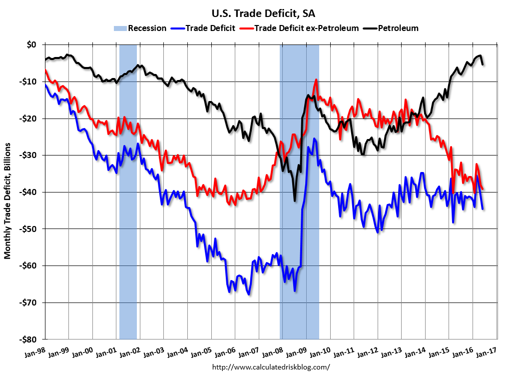 The blue line is the total deficit, and the black line is the petroleum deficit, and the red line is the trade deficit ex-petroleum products.
Oil imports averaged $39.38 in June, up from $34.19 in April, and down from $53.76 in June 2015. The petroleum deficit has generally been declining and is the major reason the overall deficit has declined a little since early 2012.
The trade deficit with China decreased to $29.8 billion in June, from $31.8 billion in June 2015. The deficit with China is a substantial portion of the overall deficit.


