 RSS Feed
 by Calculated Risk on 5/26/2016 08:33:00 AM
Thursday, May 26, 2016
Weekly Initial Unemployment Claims decrease to 268,000
The DOL reported:
In the week ending May 21, the advance figure for seasonally adjusted initial claims was 268,000, a decrease of 10,000 from the previous week's unrevised level of 278,000. The 4-week moving average was 278,500, an increase of 2,750 from the previous week's unrevised average of 275,750.The previous week was unrevised.
There were no special factors impacting this week's initial claims. This marks 64 consecutive weeks of initial claims below 300,000, the longest streak since 1973.
The following graph shows the 4-week moving average of weekly claims since 1971.
 Click on graph for larger image.
The dashed line on the graph is the current 4-week average. The four-week average of weekly unemployment claims increased to 278,500.
This was below the consensus forecast. The low level of claims suggests relatively few layoffs.
Wednesday, May 25, 2016
Thursday: Unemployment Claims, Durable Goods, Pending Home Sales
by Calculated Risk on 5/25/2016 08:05:00 PM
Thursday:
• At 8:30 AM ET, The initial weekly unemployment claims report will be released. The consensus is for 275 thousand initial claims, down from 278 thousand the previous week.
• Also at 8:30 AM, Durable Goods Orders for April from the Census Bureau. The consensus is for a 0.3% increase in durable goods orders.
• At 10:00 AM, Pending Home Sales Index for April. The consensus is for a 0.8% increase in the index.
• At 11:00 AM, Kansas City Fed Survey of Manufacturing Activity for May.
From Tim Duy: Should The Fed Tolerate 5% Unemployment?
In recent posts I highlighted the stagnant unemployment rate. I believe the Fed is on thin ice by raising rates when unemployment is moving sideways, especially when there exists evidence of substantial underemployment (see also this FEDS note). But there is also evidence of growing wage pressures, in particular the Atlanta Fed wage measure ...
...
It seems to me then that a central bank with a symmetric inflation target would choose to refrain from further rate hikes when progress toward full employment had clearly decelerated
Philly Fed: State Coincident Indexes increased in 39 states in April
by Calculated Risk on 5/25/2016 05:16:00 PM
From the Philly Fed:
he Federal Reserve Bank of Philadelphia has released the coincident indexes for the 50 states for April 2016. In the past month, the indexes increased in 39 states, decreased in seven, and remained stable in four, for a one-month diffusion index of 64. Over the past three months, the indexes increased in 42 states, decreased in seven, and remained stable in one, for a three-month diffusion index of 70Note: These are coincident indexes constructed from state employment data. An explanation from the Philly Fed:
The coincident indexes combine four state-level indicators to summarize current economic conditions in a single statistic. The four state-level variables in each coincident index are nonfarm payroll employment, average hours worked in manufacturing, the unemployment rate, and wage and salary disbursements deflated by the consumer price index (U.S. city average). The trend for each state’s index is set to the trend of its gross domestic product (GDP), so long-term growth in the state’s index matches long-term growth in its GDP.
 Click on graph for larger image.
This is a graph is of the number of states with one month increasing activity according to the Philly Fed. This graph includes states with minor increases (the Philly Fed lists as unchanged).
In April, 41 states had increasing activity including minor increases.
Five states have seen declines over the last 6 months, in order they are Wyoming (worst), North Dakota, Alaska, Louisiana and Oklahoma - mostly due to the decline in oil prices.
 Here is a map of the three month change in the Philly Fed state coincident indicators. This map was all red during the worst of the recession, and is mostly green now.
Source: Philly Fed.
Lawler: Table of Distressed Sales and All Cash Sales for Selected Cities in April
by Calculated Risk on 5/25/2016 12:11:00 PM
Economist Tom Lawler sent me the table below of short sales, foreclosures and all cash sales for selected cities in April.
On distressed: Total "distressed" share is down in all of these markets.
Short sales and foreclosures are down in all of these areas.
The All Cash Share (last two columns) is mostly declining year-over-year. As investors continue to pull back, the share of all cash buyers continues to decline.
| Short Sales Share | Foreclosure Sales Share | Total "Distressed" Share | All Cash Share | |||||
|---|---|---|---|---|---|---|---|---|
| Apr- 2016 | Apr- 2015 | Apr- 2016 | Apr- 2015 | Apr- 2016 | Apr- 2015 | Apr- 2016 | Apr- 2015 | |
| Las Vegas | 4.5% | 7.2% | 7.1% | 8.3% | 11.6% | 15.5% | 28.1% | 30.4% |
| Reno** | 2.0% | 6.0% | 3.0% | 5.0% | 5.0% | 11.0% | ||
| Phoenix | 1.6% | 2.5% | 2.4% | 3.8% | 3.9% | 6.3% | 23.8% | 25.3% |
| Sacramento | 3.1% | 5.6% | 3.4% | 6.6% | 6.5% | 12.2% | 17.7% | 18.4% |
| Minneapolis | 2.0% | 2.9% | 7.0% | 9.2% | 9.0% | 12.1% | 12.0% | 14.0% |
| Mid-Atlantic | 3.5% | 4.5% | 11.1% | 12.9% | 14.6% | 17.3% | 17.2% | 17.2% |
| So. California* | 2.5% | 3.5% | 3.4% | 4.4% | 5.9% | 7.9% | 21.3% | 23.8% |
| Bay Area CA* | 3.7% | 5.2% | 20.2% | 21.5% | ||||
| Florida SF | 2.6% | 4.0% | 10.4% | 19.4% | 13.1% | 23.4% | 31.2% | 37.1% |
| Florida C/TH | 1.2% | 2.0% | 7.1% | 14.7% | 8.3% | 16.7% | 60.2% | 65.4% |
| Miami MSA SF | 3.4% | 6.3% | 12.2% | 18.5% | 15.6% | 24.7% | 32.0% | 37.9% |
| Miami MSA C/TH | 1.3% | 2.4% | 10.1% | 18.4% | 11.3% | 20.8% | 62.8% | 68.6% |
| Tampa MSA SF | 2.9% | 4.6% | 11.4% | 20.5% | 14.3% | 25.1% | 30.0% | 34.4% |
| Tampa MSA C/TH | 1.4% | 2.8% | 6.8% | 15.5% | 8.2% | 18.3% | 55.1% | 60.9% |
| Chicago (city) | 14.0% | 20.3% | ||||||
| Northeast Florida | 18.7% | 28.6% | ||||||
| Spokane | 7.2% | 16.2% | ||||||
| Rhode Island | 10.4% | 16.6% | ||||||
| Richmond VA | 9.6% | 11.5% | 18.0% | 18.2% | ||||
| Tucson | 26.8% | 27.1% | ||||||
| S.C. Wisconsin | 14.6% | 18.3% | ||||||
| Knoxville | 19.9% | 23.0% | ||||||
| Peoria | 18.0% | 17.3% | ||||||
| Omaha | 14.5% | 16.4% | ||||||
| Pensacola | 27.3% | 32.3% | ||||||
| Memphis* | 12.4% | 15.9% | ||||||
| Springfield IL** | 8.1% | 10.2% | ||||||
| *share of existing home sales, based on property records **Single Family Only | ||||||||
FHFA: House Prices increased 0.7% in March, New Zip Code HPI Data
by Calculated Risk on 5/25/2016 09:18:00 AM
From the FHFA: U.S. House Prices Rise 1.3 Percent in First Quarter; 19 Consecutive Quarterly Increases
U.S. house prices rose 1.3 percent in the first quarter of 2016 according to the Federal Housing Finance Agency (FHFA) House Price Index (HPI). This is the nineteenth consecutive quarterly price increase in the purchase-only, seasonally adjusted index. House prices rose 5.7 percent from the first quarter of 2015 to the first quarter of 2016. This is the fourth consecutive year in which prices grew more than 5 percent. FHFA's seasonally adjusted monthly index for March was up 0.7 percent from February. The HPI is calculated using home sales price information from mortgages sold to, or guaranteed by, Fannie Mae and Freddie Mac. ...And on local HPIs:
"While the overall appreciation rate was robust in the first quarter, home price appreciation was somewhat less widespread than in recent quarters," said FHFA Supervisory Economist Andrew Leventis. "Twelve states and the District of Columbia saw price declines in the quarter—the most areas to see price depreciation since the fourth quarter of 2013. Although most declines were modest, such declines are notable given the pervasive and extraordinary appreciation we have been observing for many years."
While the purchase-only HPI rose 5.7 percent from the first quarter of 2015 to the first quarter of 2016, prices of other goods and services were nearly unchanged. The inflation-adjusted price of homes rose approximately 5.6 percent over the latest year.
emphasis added
With this quarter's release, FHFA is publishing a set of experimental annual house price indexes for five-digit ZIP codes across the country from 1975―2015. The indexes are constructed using the typical "repeat-transactions" methodology. Unlike FHFA's other price indexes, however, the five-digit ZIP code measures are annual price measures, meaning that a single index value is produced for each year. As discussed in FHFA Working Paper 16-01, the new indexes may be valuable to analysts seeking data on localized home price movements.I'm checking on my zip code!
MBA: "Purchase Applications Increase and Refis Hold Steady in Latest MBA Weekly Survey"
by Calculated Risk on 5/25/2016 07:00:00 AM
From the MBA: Purchase Applications Increase and Refis Hold Steady in Latest MBA Weekly Survey
Mortgage applications increased 2.3 percent from one week earlier, according to data from the Mortgage Bankers Association’s (MBA) Weekly Mortgage Applications Survey for the week ending May 20, 2016.
...
The Refinance Index increased 0.4 percent from the previous week. The seasonally adjusted Purchase Index increased 5 percent from one week earlier. The unadjusted Purchase Index increased 4 percent compared with the previous week and was 17 percent higher than the same week one year ago.
...
The average contract interest rate for 30-year fixed-rate mortgages with conforming loan balances ($417,000 or less) increased to 3.85 percent from 3.82 percent, with points increasing to 0.37 from 0.34 (including the origination fee) for 80 percent loan-to-value ratio (LTV) loans.
emphasis added
 Click on graph for larger image.
The first graph shows the refinance index since 1990.
Refinance activity was higher in 2015 than in 2014, but it was still the third lowest year since 2000.
Refinance activity increased a little this year when rates declined.
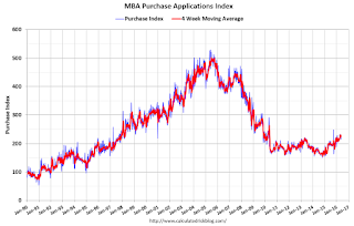 The second graph shows the MBA mortgage purchase index.
 According to the MBA, the unadjusted purchase index is 17% higher than a year ago.
Tuesday, May 24, 2016
Chemical Activity Barometer increased in May
by Calculated Risk on 5/24/2016 07:42:00 PM
Wednesday:
• At 7:00 AM ET, he Mortgage Bankers Association (MBA) will release the results for the mortgage purchase applications index.
• At 9:00 AM, FHFA House Price Index for March 2016. This was originally a GSE only repeat sales, however there is also an expanded index. The consensus is for a 0.5% month-to-month increase for this index.
From the ACC: Chemical Activity Barometer Accelerated for Third Consecutive Month
The Chemical Activity Barometer (CAB), a leading economic indicator created by the American Chemistry Council (ACC), expanded 1.0 percent in May following a revised 0.8 percent increase in April and 0.1 percent increase in March. All data is measured on a three-month moving average (3MMA). Accounting for adjustments, the CAB remains up 2.3 percent over this time last year, a marked deceleration of activity from one year ago when the barometer logged a 2.7 percent year-over-year gain from 2014. On an unadjusted basis the CAB jumped 0.3 percent in May, following a solid 1.7 percent gain in April.This is a leading indicator for industrial production and suggests increases in Industrial Production later this year.
...
Applying the CAB back to 1919, it has been shown to provide a lead of two to 14 months, with an average lead of eight months at cycle peaks as determined by the National Bureau of Economic Research. The median lead was also eight months. At business cycle troughs, the CAB leads by one to seven months, with an average lead of four months. The median lead was three months. The CAB is rebased to the average lead (in months) of an average 100 in the base year (the year 2012 was used) of a reference time series. The latter is the Federal Reserve’s Industrial Production Index.
New Home Prices
by Calculated Risk on 5/24/2016 03:08:00 PM
As part of the new home sales report, the Census Bureau reported the number of homes sold by price and the average and median prices.
From the Census Bureau: "The median sales price of new houses sold in April 2016 was $321,100; the average sales price was $379,800."
The following graph shows the median and average new home prices.
 Click on graph for larger image.
During the housing bust, the builders had to build smaller and less expensive homes to compete with all the distressed sales. When housing started to recovery - with limited finished lots in recovering areas - builders moved to higher price points to maximize profits.
The average price in April 2016 was $379,800 and the median price was $321,100. Both are above the bubble high (this is due to both a change in mix and rising prices).
The median is at a new high.
The second graph shows the percent of new homes sold by price.
 Less than 2% of new homes sold were under $150K in April 2016. This is down from 30% in 2002. The under $150K new home is probably going away.
The $400K+ bracket has increased significantly.
Comments on April New Home Sales
by Calculated Risk on 5/24/2016 12:41:00 PM
The new home sales report for April was very strong at 619,000 on a seasonally adjusted annual rate basis (SAAR), and combined sales for January, February and March were revised up by 44 thousand SAAR.
This was the highest sales rate since January 2008.
Sales were up 23.8% year-over-year (YoY) compared to April 2015. And sales are up 9.0% year-to-date compared to the same period in 2015.
Earlier: New Home Sales increased sharply to 619,000 Annual Rate in April.
 Click on graph for larger image.
This graph shows new home sales for 2015 and 2016 by month (Seasonally Adjusted Annual Rate). Sales to date are up 9.0% year-over-year, mostly because of the strong sales in April.
Overall I expect lower growth this year, probably in the 4% to 8% range. Slower growth is likely this year because Houston (and other oil producing areas) will have a problem this year. Inventory of existing homes is increasing quickly and prices will probably decline in those areas. And that means new home construction will slow in those areas too.
And here is another update to the "distressing gap" graph that I first started posting a number of years ago to show the emerging gap caused by distressed sales. Now I'm looking for the gap to close over the next several years.
 The "distressing gap" graph shows existing home sales (left axis) and new home sales (right axis) through April 2016. This graph starts in 1994, but the relationship had been fairly steady back to the '60s.
Following the housing bubble and bust, the "distressing gap" appeared mostly because of distressed sales.
I expect existing home sales to move more sideways, and I expect this gap to slowly close, mostly from an increase in new home sales.
However, this assumes that the builders will offer some smaller, less expensive homes. If not, then the gap will persist.
 Another way to look at this is a ratio of existing to new home sales.
This ratio was fairly stable from 1994 through 2006, and then the flood of distressed sales kept the number of existing home sales elevated and depressed new home sales. (Note: This ratio was fairly stable back to the early '70s, but I only have annual data for the earlier years).
In general the ratio has been trending down, and this ratio will probably continue to trend down over the next several years.
Note: Existing home sales are counted when transactions are closed, and new home sales are counted when contracts are signed. So the timing of sales is different.
NY Fed: Household Debt Increased in Q1 2016, Delinquency Rates Declined
by Calculated Risk on 5/24/2016 11:10:00 AM
The Q1 report was released today: Household Debt and Credit Report.
From the NY Fed: Household Debt Steps Up, Delinquencies Drop
Household indebtedness continued to advance during the first three months of 2016 according to the Federal Reserve Bank of New York’s Quarterly Report on Household Debt and Credit, which was released today. ...
The bulk of the $136 billion (1.1 percent) aggregate debt increase came from mortgages, which increased $120 billion from the fourth quarter of 2015 to a four and a half year high. The median credit score for newly originating mortgages increased slightly, and 58 percent of all new mortgage dollars went to borrowers with credit scores over 760. ...
Overall repayment rates generally improved in the first quarter of this year. Five percent of outstanding debt was in some stage of delinquency, the lowest amount since the second quarter of 2007.
...
"Delinquency rates and the overall quality of outstanding debt continue to improve," said Wilbert van der Klaauw, senior vice president at the New York Fed. "The proportion of overall debt that becomes newly delinquent has been on a steady downward trend and is at its lowest level since our series began in 1999. This improvement is in large part driven by mortgages."
emphasis added
 Click on graph for larger image.
Here are two graphs from the report:
The first graph shows aggregate consumer debt increased in Q1. Household debt peaked in 2008, and bottomed in Q2 2013.
Mortgage debt increased in Q1, from the NY Fed:
Mortgage balances, the largest component of household debt, increased in the first quarter. Mortgage balances shown on consumer credit reports stood at $8.37 trillion, a $120 billion increase from the fourth quarter of 2015. Balances on home equity lines of credit (HELOC) dropped by $2 billion, to $485 billion. Non-housing debt balances rose somewhat in the first quarter; increases of $7 billion and $29 billion in auto and student loans, respectively, were offset by a $21 billion decline in credit card balances.
 The second graph shows the percent of debt in delinquency. The percent of delinquent debt is declining, although there is still a large percent of debt 90+ days delinquent (Yellow, orange and red).
 The overall delinquency rate decreased in Q1 to 5.0%. From the NY Fed:
Overall delinquency rates improved in 2016Q1. As of March 31, 5.0% of outstanding debt was in some stage of delinquency. Of the $613 billion of debt that is delinquent, $436 billion is seriously delinquent (at least 90 days late or “severely derogatory”).There are a number of credit graphs at the NY Fed site.


