by Calculated Risk on 3/08/2016 01:15:00 PM
Tuesday, March 08, 2016
Demographics: Renting vs. Owning
Note; This is an update to a post I wrote last year.
It was six years ago that we started discussing the turnaround for apartments. Then, in January 2011, I attended the NMHC Apartment Strategies Conference in Palm Springs, and the atmosphere was very positive.
The drivers in 2011 were 1) very low new supply, and 2) strong demand (favorable demographics, and people moving from owning to renting).
The move "from owning to renting" is mostly over, and demographics for apartments are still positive - but less favorable than 6 years ago. Also much more supply has come online. Slowing demand and more supply for apartments is why I think growth in multi-family starts will slow this year (or maybe be flat compared to 2015).
On demographics, a large cohort had been moving into the 20 to 29 year old age group (a key age group for renters). Going forward, a large cohort will be moving into the 30 to 39 age group (a key for ownership).
Note: Household formation would be a better measure than population, but reliable data for households is released with a long lag.

This graph shows the longer term trend for three key age groups: 20 to 29, 25 to 34, and 30 to 39 (the groups overlap).
This graph is from 1990 to 2060 (all data from BLS: current to 2060 is projected).
We can see the surge in the 20 to 29 age group (red). Once this group exceeded the peak in earlier periods, there was an increase in apartment construction. This age group will peak in 2018 (until the 2030s), and the 25 to 34 age group (orange, dashed) will peak in 2023. This suggests demand for apartments will soften in a few years.
For buying, the 30 to 39 age group (blue) is important (note: see Demographics and Behavior for some reasons for changing behavior). The population in this age group is increasing, and will increase significantly over the next decade.
This demographics is positive for home buying, and this is a key reason I expect single family housing starts to continue to increase in coming years.
Phoenix Real Estate in February: Sales down 3%, Inventory down slightly
by Calculated Risk on 3/08/2016 10:28:00 AM
This is a key distressed market to follow since Phoenix saw a large bubble / bust followed by strong investor buying.
For the fifteenth consecutive month, inventory was down year-over-year in Phoenix.
The Arizona Regional Multiple Listing Service (ARMLS) reports (table below):
1) Overall sales in February were down 2.6% year-over-year.
2) Cash Sales (frequently investors) were down to 29.0% of total sales.
3) Active inventory is now down 0.7% year-over-year.
More inventory (a theme in 2014) - and less investor buying - suggested price increases would slow sharply in 2014. And prices increases did slow in 2014, only increasing 2.4% according to Case-Shiller.
In 2015, with falling inventory, prices increased a little faster - Prices were up 6.3% in 2015 according to Case-Shiller. Inventory is something to watch in 2016!
| February Residential Sales and Inventory, Greater Phoenix Area, ARMLS | ||||||
|---|---|---|---|---|---|---|
| Sales | YoY Change Sales | Cash Sales | Percent Cash | Active Inventory | YoY Change Inventory | |
| Feb-2008 | 3,445 | --- | 650 | 18.9% | 57,3051 | --- |
| Feb-2009 | 5,477 | 59.0% | 2,188 | 39.9% | 52,013 | -9.2% |
| Feb-2010 | 6,595 | 20.4% | 2,997 | 45.4% | 42,388 | -18.5% |
| Feb-2011 | 7,171 | 8.7% | 3,776 | 52.7% | 40,666 | -4.1% |
| Feb-2012 | 7,249 | 1.1% | 3,616 | 49.9% | 23,736 | -41.6% |
| Feb-2013 | 6,618 | -8.7% | 3,053 | 46.1% | 21,718 | -8.5% |
| Feb-2014 | 5,476 | -17.3% | 1,939 | 35.4% | 29,899 | 37.7% |
| Feb-2015 | 5,970 | 9.0% | 1,784 | 29.9% | 27,382 | -8.4% |
| Feb-2016 | 5,816 | -2.6% | 1,688 | 29.0% | 27,202 | -0.7% |
| 1 February 2008 probably included pending listings | ||||||
NFIB: Small Business Optimism Index decreased in February
by Calculated Risk on 3/08/2016 09:02:00 AM
From the National Federation of Independent Business (NFIB): Small Business Optimism Falls Again This Month
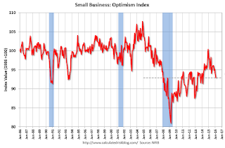
The Index of Small Business Optimism fell 1 point from January, falling to 92.9. None of the 10 Index components posted a gain, six posted small declines, and four were unchanged. ...
Reported job creation reversed in February, with an average employment change per firm falling to a decline in employment of -0.12 workers per firm. ...
emphasis added
 Click on graph for larger image.
This graph shows the small business optimism index since 1986.
The index decreased to 92.9 in February.
Monday, March 07, 2016
Tuesday: Small Business Optimism
by Calculated Risk on 3/07/2016 07:01:00 PM
Tuesday:
• At 9:00 AM ET, NFIB Small Business Optimism Index for February.

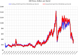
This graph shows WTI and Brent spot oil prices from the EIA. (Prices today added). According to Bloomberg, WTI is at $37.84 per barrel today, and Brent is at $40.84
Prices really collapsed at the end of 2014 - and then rebounded a little - and then collapsed again.
This puts the recent price increase into perspective!
Update: Framing Lumber Prices down about 15% Year-over-year
by Calculated Risk on 3/07/2016 03:24:00 PM
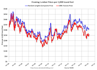
Here is another graph on framing lumber prices. Early in 2013 lumber prices came close to the housing bubble highs.
The price increases in early 2013 were due to a surge in demand (more housing starts) and supply constraints (framing lumber suppliers were working to bring more capacity online).
Prices didn't increase as much early in 2014 (more supply, smaller "surge" in demand).
In 2015, even with the pickup in U.S. housing starts, prices were down year-over-year. Note: Multifamily starts do not use as much lumber as single family starts, and there was a surge in multi-family starts.
Overall the decline in prices is probably due to more supply, and less demand from China.

This graph shows two measures of lumber prices: 1) Framing Lumber from Random Lengths through February 2016 (via NAHB), and 2) CME framing futures.
Right now Random Lengths prices are down about 13% from a year ago, and CME futures are down around 16% year-over-year.
Las Vegas Real Estate in February: Sales Increased 9% YoY, Inventory Up Slightly
by Calculated Risk on 3/07/2016 11:01:00 AM
This is a key distressed market to follow since Las Vegas has seen the largest price decline of any of the Case-Shiller composite 20 cities.
The Greater Las Vegas Association of Realtors reported Local Housing Market in Good Shape Heading into Spring, GLVAR Reports
According to GLVAR, the total number of existing local homes, condominiums and townhomes sold in February was 2,676, up from 2,452 in February of 2015. Compared to the same month one year ago, 7.5 percent more homes and 15.8 percent more condos and townhomes sold in February.1) Overall sales were up 9.1% year-over-year.
...
By the end of February, GLVAR reported 7,328 single-family homes listed without any sort of offer. That’s up a mere 0.2 percent from one year ago. For condos and townhomes, the 2,267 properties listed without offers in February represented a 6.5 percent decrease from one year ago.
GLVAR continued to report annual declines in distressed sales and increasing numbers of traditional home sales, where lenders are not controlling the transaction. In February, 6.6 percent of all local sales were short sales – when lenders allow borrowers to sell a home for less than what they owe on the mortgage. That’s down from 9.3 percent of all sales one year ago. Another 8.6 percent of all February sales were bank-owned, down from 9.7 percent one year ago.
emphasis added
2) The percent of cash sales decreased year-over-year from 37.4% in Feb 2015 to 31.4% in Feb 2016. This has been trending down.
3) Non-contingent inventory for single-family homes was up 0.2% year-over-year. The table below shows the year-over-year change for non-contingent inventory in Las Vegas. Inventory is important to watch - if inventory starts increasing again, then price increases will slow.
| Las Vegas: Year-over-year Change in Non-contingent Single-Family Inventory | |
|---|---|
| Month | YoY |
| Jan-13 | -58.3% |
| Feb-13 | -53.4% |
| Mar-13 | -42.1% |
| Apr-13 | -24.1% |
| May-13 | -13.2% |
| Jun-13 | 3.7% |
| Jul-13 | 9.0% |
| Aug-13 | 41.1% |
| Sep-13 | 60.5% |
| Oct-13 | 73.4% |
| Nov-13 | 77.4% |
| Dec-13 | 78.6% |
| Jan-14 | 96.2% |
| Feb-14 | 107.3% |
| Mar-14 | 127.9% |
| Apr-14 | 103.1% |
| May-14 | 100.6% |
| Jun-14 | 86.2% |
| Jul-14 | 55.2% |
| Aug-14 | 38.8% |
| Sep-14 | 29.5% |
| Oct-14 | 25.6% |
| Nov-14 | 20.0% |
| Dec-14 | 18.0% |
| Jan-15 | 12.9% |
| Feb-15 | 15.8% |
| Mar-15 | 12.2% |
| Apr-15 | 7.6% |
| May-15 | 7.8% |
| Jun-15 | 4.3% |
| Jul-15 | 5.1% |
| Aug-15 | 3.5% |
| Sep-15 | -0.8% |
| Oct-15 | -7.1% |
| Nov-15 | -5.2% |
| Dec-15 | -11.2% |
| Jan-16 | 0.6% |
| Feb-16 | 0.2% |
Black Knight January Mortgage Monitor
by Calculated Risk on 3/07/2016 08:01:00 AM
Black Knight Financial Services (BKFS) released their Mortgage Monitor report for January today. According to BKFS, 5.09% of mortgages were delinquent in January, up from 4.78% in December. BKFS reported that 1.30% of mortgages were in the foreclosure process.
This gives a total of 6.39% delinquent or in foreclosure.
Press Release: Black Knight’s Mortgage Monitor: Declining Interest Rates Boost Refinanceable Population by 1.5 Million in First Six Weeks of 2016; $20 Billion in Potential Annual Savings
Today, the Data & Analytics division of Black Knight Financial Services, Inc. (NYSE: BKFS) released its latest Mortgage Monitor Report, based on data as of the end of January 2016. After mortgage interest rates fell by 30 basis points in the first six weeks of 2016, Black Knight revisited its recent analysis of the population of refinanceable borrowers that could both qualify for and benefit from refinancing their 30year mortgages. Using broad-based eligibility criteria, Black Knight found this population has grown significantly since the start of the year. As Black Knight Data & Analytics Senior Vice President Ben Graboske explained, millions of mortgage holders could potentially save thousands of dollars per year by refinancing at today’s rates.
“When Black Knight last looked at the refinanceable population just two months ago, there were 5.2 million potential candidates, and that number was on the decline,” said Graboske. “That analysis was shortly after the Federal Reserve raised its target rate by 25 basis points, at which time the prevailing wisdom was that mortgage interest rates would rise in response. Global economic shocks then sent investors looking for the safety of U.S. Treasuries, driving down yields on benchmark 10-year bonds. Mortgage interest rates began to fall in defiance of prevailing wisdom, and the refinanceable population grew by 30 percent in the first six weeks of 2016. As a result, an additional 1.5 million mortgage holders could now likely both qualify for and benefit from refinancing, bringing the total number of potential refinance candidates to 6.7 million.
emphasis added
 Click on graph for larger image.
This graph from Black Knight shows their estimate of refinance candidates.
From Black Knight:
Recent interest rate declines have given 1.5 million additional borrowers incentive to refinance
The total refinanceable population of 6.7 million has grown by 30 percent in just the first six weeks of 2016
This drastic rise above the 5.2 million potential refinance candidates is driven by the number of borrowers with current interest rates is in the 4.5 percent range
 An on the increase in delinquencies from Black Knight (calendar driven):
This January’s delinquency rate increase appears to be primarily calendar-drivenThere is much more in the mortgage monitor.
Sunday month-ends typically result in delinquency rate increases as servicers are unable to process any payments made on the last two calendar days of the month
The five largest monthover-month increases seen in the past three years have all come in months ending on a Sunday
It is typical to see a partial, but not full, recovery the following month
Sunday, March 06, 2016
Sunday Night Futures
by Calculated Risk on 3/06/2016 07:56:00 PM
From Ben Leubsdorf at the WSJ: The Hurdles to Getting U.S. Workers Off the Sidelines
The labor-force participation rate, which stood at 66% on the eve of the recession [slumped] to a 38-year low of 62.4% last fall ... Now the strongest run of hiring since the end of the 1990s is drawing would-be job seekers off the sidelines, pushing the rate steadily up since September. It hit 62.9% in February.Long term trends and demographics suggest the participation rate will continue to decline.
But powerful forces independent of the business cycle are exerting a strong downward pressure, with the wave of baby-boomer retirements topping the list. The participation rate may keep climbing in the short term, but many private and government economists believe it will resume its decline soon enough.
Weekend:
• Schedule for Week of March 6, 2016
• Update: Labor Force Participation
Monday:
• At 10:00 AM ET, The Fed will release the monthly Labor Market Conditions Index (LMCI).
From CNBC: Pre-Market Data and Bloomberg futures: currently S&P futures are down 7 and DOW futures are down 48 (fair value).
Oil prices were up over the last week with WTI futures at $36.21 per barrel and Brent at $39.00 per barrel. A year ago, WTI was at $50, and Brent was at $60 - so prices are down about 30% year-over-year.
Here is a graph from Gasbuddy.com for nationwide gasoline prices. Nationally prices are at $1.82 per gallon (down about $0.65 per gallon from a year ago).
Update: Labor Force Participation
by Calculated Risk on 3/06/2016 11:11:00 AM
Note: By request, I'm updating the graphs in this post from last year.
A significant decline in the participation rate was expected based on demographics (there is an ongoing debate about how much is due to demographics, and how much of the decline is cyclical - however, as I've pointed out many times, a careful analysis suggests most of the decline is due to demographics).
But what about the decline in the prime working age labor force participation rate?
Each month I post the following graph of the participation rate and employment-population rate for prime working age (25 to 54 years old) workers. The following graph is through the February report.

The 25 to 54 participation rate increased in February to 81.2%, and the 25 to 54 employment population ratio increased to 77.8%.
A couple of key points:
1) Analyzing and forecasting the labor force participation requires looking at a number of factors. Everyone is aware that there is a large cohort has moved into the 50 to 70 age group, and that that has pushing down the overall participation rate. Another large cohort has been moving into the 16 to 24 year old age group - and many in this cohort are staying in school (a long term trend that has accelerated recently) - and that is another key factor in the decline in the overall participation rate.
2) But there are other long term trends. One of these trends is for a decline in the participation rate for prime working age men (25 to 54 years old). For some reasons, see: Possible Reasons for the Decline in Prime-Working Age Men Labor Force Participation and on demographics from researchers at the Atlanta Fed: "Reasons for the Decline in Prime-Age Labor Force Participation"
First, here is a graph of the participation rate by 5 year age groups for the years 2000, 2005, 2010, and 2015.
1) the participation rate for the "prime working age" (25 to 54) is fairly flat (the six highest participation rates).
2) However, the lowest participation rate is for the 50 to 54 age group.
3) And notice that the participation rate for EACH prime age group was declining BEFORE the recession. (Dark blue is January 2000, and light blue is January 2005).
Everyone is aware that there large cohorts moving into retirement - and a large cohort in the 20 to 24 age group - but there has also been in a shift in the prime working age groups.

Since the lowest prime participation is for the 50 to 54 age group (the second lowest is for the 25 to 29 age group), lets focus on those two groups. The 50 to 54 age group is the red line (now the second largest percentage of the prime working age) and the 25 to 29 age group is the blue line (now the largest percentage). Just these shifts in prime demographics would lead to a somewhat lower prime working age participation rate. Overall, the impact of this shift is small compared to long term trends.
Special Update Comment: The 25 to 29 age group is now the largest group in the prime working age. This is probably a reason productivity has been low - these people are in more entry level jobs at this point of their careers. Productivity was also low when the baby boomers were in their 20s. It appears demographics is important for productivity too.
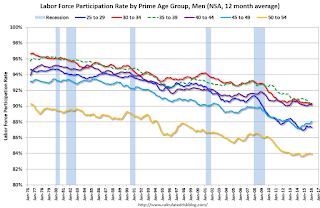
Lets focus on just one age group and just for men to look at the long term trend.

This fourth graph shows the 40 to 44 year old men participation rate since 1976 (note the scale doesn't start at zero to better show the change).
There is a clear downward trend, and a researcher looking at this trend in the year 2000 might have predicted the 40 to 44 year old men participation rate would about the level as today (see trend line).
Clearly there are other factors than "economic weakness" causing this downward trend. I listed some reasons a few months ago, and new research from Pew Research suggests stay-at-home dads is one of the reasons: Growing Number of Dads Home with the Kids

Note: This is a rolling 12 month average to remove noise (data is NSA), and the scale doesn't start at zero to show the change.
Clearly there is a downward trend for all 5 year age groups. When arguing about the decline in the prime participation rate, we need to take these long term trends into account.

The bottom line is that the participation rate was declining for prime working age workers before the recession, there the key is understand and adjusting for the long term trend..
Here is a look at the participation rate of women in the prime working age groups over time.

Note: This is a rolling 12 month average to remove noise (data is NSA), and the scale doesn't start at zero to show the change.
For women, the participation rate increased significantly until the late 90s, and then started declining slowly. This is a more complicated story than for men, and that is why I used prime working age men to show the gradual downward decline in participation that has been happening for decades (and is not just recent economic weakness).

The bottom line is that the participation rate was declining for prime working age workers before the recession, there are several reasons for this decline (not just recent "economic weakness") and the prime working age participation rate is probably close to expected without the recession.
Saturday, March 05, 2016
Schedule for Week of March 6, 2016
by Calculated Risk on 3/05/2016 08:12:00 AM
This will be a very light week for economic data.
10:00 AM ET: The Fed will release the monthly Labor Market Conditions Index (LMCI).
3:00 PM: Consumer Credit for January from the Federal Reserve. The consensus is for an increase of $16.5 billion in credit.
9:00 AM ET: NFIB Small Business Optimism Index for February.
7:00 AM ET: The Mortgage Bankers Association (MBA) will release the results for the mortgage purchase applications index.
8:30 AM: The initial weekly unemployment claims report will be released. The consensus is for 275 thousand initial claims, down from 278 thousand the previous week.
10:00 AM: The Q4 Quarterly Services Report from the Census Bureau.
12:00 PM: Q4 Flow of Funds Accounts of the United States from the Federal Reserve.
2:00 PM: The Monthly Treasury Budget Statement for February.
No economic releases scheduled.


