by Calculated Risk on 3/06/2016 11:11:00 AM
Sunday, March 06, 2016
Update: Labor Force Participation
Note: By request, I'm updating the graphs in this post from last year.
A significant decline in the participation rate was expected based on demographics (there is an ongoing debate about how much is due to demographics, and how much of the decline is cyclical - however, as I've pointed out many times, a careful analysis suggests most of the decline is due to demographics).
But what about the decline in the prime working age labor force participation rate?
Each month I post the following graph of the participation rate and employment-population rate for prime working age (25 to 54 years old) workers. The following graph is through the February report.

The 25 to 54 participation rate increased in February to 81.2%, and the 25 to 54 employment population ratio increased to 77.8%.
A couple of key points:
1) Analyzing and forecasting the labor force participation requires looking at a number of factors. Everyone is aware that there is a large cohort has moved into the 50 to 70 age group, and that that has pushing down the overall participation rate. Another large cohort has been moving into the 16 to 24 year old age group - and many in this cohort are staying in school (a long term trend that has accelerated recently) - and that is another key factor in the decline in the overall participation rate.
2) But there are other long term trends. One of these trends is for a decline in the participation rate for prime working age men (25 to 54 years old). For some reasons, see: Possible Reasons for the Decline in Prime-Working Age Men Labor Force Participation and on demographics from researchers at the Atlanta Fed: "Reasons for the Decline in Prime-Age Labor Force Participation"
First, here is a graph of the participation rate by 5 year age groups for the years 2000, 2005, 2010, and 2015.
1) the participation rate for the "prime working age" (25 to 54) is fairly flat (the six highest participation rates).
2) However, the lowest participation rate is for the 50 to 54 age group.
3) And notice that the participation rate for EACH prime age group was declining BEFORE the recession. (Dark blue is January 2000, and light blue is January 2005).
Everyone is aware that there large cohorts moving into retirement - and a large cohort in the 20 to 24 age group - but there has also been in a shift in the prime working age groups.

Since the lowest prime participation is for the 50 to 54 age group (the second lowest is for the 25 to 29 age group), lets focus on those two groups. The 50 to 54 age group is the red line (now the second largest percentage of the prime working age) and the 25 to 29 age group is the blue line (now the largest percentage). Just these shifts in prime demographics would lead to a somewhat lower prime working age participation rate. Overall, the impact of this shift is small compared to long term trends.
Special Update Comment: The 25 to 29 age group is now the largest group in the prime working age. This is probably a reason productivity has been low - these people are in more entry level jobs at this point of their careers. Productivity was also low when the baby boomers were in their 20s. It appears demographics is important for productivity too.
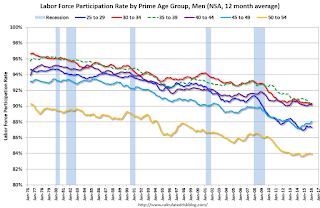
Lets focus on just one age group and just for men to look at the long term trend.

This fourth graph shows the 40 to 44 year old men participation rate since 1976 (note the scale doesn't start at zero to better show the change).
There is a clear downward trend, and a researcher looking at this trend in the year 2000 might have predicted the 40 to 44 year old men participation rate would about the level as today (see trend line).
Clearly there are other factors than "economic weakness" causing this downward trend. I listed some reasons a few months ago, and new research from Pew Research suggests stay-at-home dads is one of the reasons: Growing Number of Dads Home with the Kids

Note: This is a rolling 12 month average to remove noise (data is NSA), and the scale doesn't start at zero to show the change.
Clearly there is a downward trend for all 5 year age groups. When arguing about the decline in the prime participation rate, we need to take these long term trends into account.

The bottom line is that the participation rate was declining for prime working age workers before the recession, there the key is understand and adjusting for the long term trend..
Here is a look at the participation rate of women in the prime working age groups over time.

Note: This is a rolling 12 month average to remove noise (data is NSA), and the scale doesn't start at zero to show the change.
For women, the participation rate increased significantly until the late 90s, and then started declining slowly. This is a more complicated story than for men, and that is why I used prime working age men to show the gradual downward decline in participation that has been happening for decades (and is not just recent economic weakness).

The bottom line is that the participation rate was declining for prime working age workers before the recession, there are several reasons for this decline (not just recent "economic weakness") and the prime working age participation rate is probably close to expected without the recession.


