 RSS Feed
 by Calculated Risk on 11/08/2015 09:40:00 AM
Sunday, November 08, 2015
2016: Preliminary Housing Forecasts
Towards the end of each year I collect some housing forecasts for the following year, and it looks like analysts are optimistic for 2016 (many more forecasts will be added).
First a review of the previous three years ...
Here is a summary of forecasts for 2015. In 2015, new home sales will probably be just over 500 thousand, and total housing starts will be something over 1.1 million. It is early, but CoreLogic, Zillow and the MBA were very close on New Home sales, and CoreLogic, MetroStudy, MBA and Zillow were all close on starts.
Here is a summary of forecasts for 2014. In 2014, new home sales were 437 thousand, and total housing starts were 1.003 million. No one was close on New Home sales (all way too optimistic), and Michelle Meyer (Merrill Lynch) and Fannie Mae were the closest on housing starts (about 10% too high). In 2014, many analysts underestimated the impact of higher mortgage rates and higher new home prices on new home sales and starts.
Here is a summary of forecasts for 2013. In 2013, new home sales were 429 thousand, and total housing starts were 925 thousand. Barclays were the closest on New Home sales followed by David Crowe (NAHB). Fannie Mae and the NAHB were the closest on housing starts.
The table below shows a few forecasts for 2016 (I'll add many more of the next several weeks).
From Fannie Mae: Housing Forecast: October 2015
From NAHB: housing and economic forecast.
UCLA Ziman Center.
Note: For comparison, new home sales in 2015 will probably be just over 500 thousand, and total housing starts over 1.1 million.
I haven't worked up a forecast yet for 2016, however I think the NAHB forecast for new home sales is too high - as is the UCLA forecast for housing starts.
| Housing Forecasts for 2016 | ||||
|---|---|---|---|---|
| New Home Sales (000s) | Single Family Starts (000s) | Total Starts (000s) | House Prices1 | |
| Fannie Mae | 562 | 827 | 1,224 | 4.9%2 |
| NAHB | 642 | 877 | 1,255 | |
| UCLA Ziman Center | 1,420 | |||
| 1Case-Shiller unless indicated otherwise 2FHFA Purchase-Only Index | ||||
Saturday, November 07, 2015
Schedule for Week of November 8th
by Calculated Risk on 11/07/2015 08:11:00 AM
The key economic report this week is October retail sales on Friday.
10:00 AM ET: The Fed will release the monthly Labor Market Conditions Index (LMCI).
9:00 AM ET: NFIB Small Business Optimism Index for October.
10:00 AM: Monthly Wholesale Trade: Sales and Inventories for August. The consensus is for a 0.1% increase in inventories.
The Federal Government and Banks will be closed in observance of Veterans Day. The market will be open.
7:00 AM ET: The Mortgage Bankers Association (MBA) will release the results for the mortgage purchase applications index.
8:30 AM: The initial weekly unemployment claims report will be released. The consensus is for 266 thousand initial claims, down from 276 thousand the previous week.
 10:00 AM: Job Openings and Labor Turnover Survey for September from the BLS.
 This graph shows job openings (yellow line), hires (purple), Layoff, Discharges and other (red column), and Quits (light blue column) from the JOLTS.
Jobs openings decreased in August to 5.370 million from 5.668 million in July.
The number of job openings (yellow) were up 9% year-over-year, and Quits were up 9% year-over-year.
2:00 PM: The Monthly Treasury Budget Statement for October.
6:00 PM: Speech by Fed Vice Chairman Stanley Fischer, The Transmission of Exchange Rate Changes to Output and Inflation, At the Conference on Monetary Policy Implementation and Transmission in the Post-Crisis Period, Washington, D.C.
8:30 AM: The Producer Price Index for October from the BLS. The consensus is for a 0.2% increase in prices, and a 0.1% increase in core PPI.
 8:30 AM ET: Retail sales for October will be released.
This graph shows retail sales since 1992 through September 2015. This is monthly retail sales and food service, seasonally adjusted (total and ex-gasoline). On a monthly basis, retail sales were up 0.1% from August to September (seasonally adjusted), and sales were up 2.4% from September 2014.
The consensus is for retail sales to increase 0.3% in October, and to increase 0.4% ex-autos.
10:00 AM: Manufacturing and Trade: Inventories and Sales (business inventories) report for September. The consensus is for no change in inventories.
10:00 AM: University of Michigan's Consumer sentiment index (preliminary for November). The consensus is for a reading of 92.0, up from 90.0 in October.
Friday, November 06, 2015
NAHB: Builder Confidence increases for the 55+ Housing Market in Q3
by Calculated Risk on 11/06/2015 04:41:00 PM
This is a quarterly index that was released last week by the the National Association of Home Builders (NAHB). This index is similar to the overall housing market index (HMI). The NAHB started this index in Q4 2008 (during the housing bust), so the readings were initially very low
From the NAHB: 55+ Housing Market Remains Strong in Third Quarter
uilder confidence in the single-family 55+ housing market remains strong in the third quarter of 2015 with a reading of 60, up three points from the previous quarter, according to the National Association of Home Builders' (NAHB) 55+ Housing Market Index (HMI) released today. This is the sixth consecutive quarter with a reading above 50.
“Builders have a positive outlook on the 55+ housing market,” said Timothy McCarthy, chairman of NAHB's 55+ Housing Industry Council and managing partner of Traditions of America in Radnor, Pa. “In fact, the markets for single-family, apartments and condos are all doing quite well, and we expect that trend to continue.”
...
“Like the overall housing market, we continue to see steady, positive growth in the 55+ market,” said NAHB Chief Economist David Crowe. “With the economy and job growth continuing to improve gradually, many consumers are now able to sell their current homes at a suitable price, enabling them to buy or rent in a 55+ community.”
emphasis added
 Click on graph for larger image.
This graph shows the NAHB 55+ Single Family HMI through Q3 2015. And reading above 50 indicates that more builders view conditions as good than as poor. The index increased to 60 in Q3 up from 57 in Q2.
There are two key drivers in addition to the improved economy: 1) there is a large cohort moving into the 55+ group, and 2) the homeownership rate typically increases for people in the 55 to 70 year old age group. So demographics should be favorable for the 55+ market.
Public and Private Sector Payroll Jobs: Carter, Reagan, Bush, Clinton, Bush, Obama
by Calculated Risk on 11/06/2015 01:31:00 PM
By request, here is another update of an earlier post through the October employment report.
NOTE: Several readers have asked if I could add a lag to these graphs (obviously a new President has zero impact on employment for the month they are elected). But that would open a debate on the proper length of the lag, so I'll just stick to the beginning of each term.
Note: We frequently use Presidential terms as time markers - we could use Speaker of the House, or any other marker.
Important: There are many differences between these periods. Overall employment was smaller in the '80s, however the participation rate was increasing in the '80s (younger population and women joining the labor force), and the participation rate is generally declining now. But these graphs give an overview of employment changes.
First, here is a table for private sector jobs. The top two private sector terms were both under President Clinton. Reagan's 2nd term saw about the same job growth as during Carter's term. Note: There was a severe recession at the beginning of Reagan's first term (when Volcker raised rates to slow inflation) and a recession near the end of Carter's term (gas prices increased sharply and there was an oil embargo).
| Term | Private Sector Jobs Added (000s) |
|---|---|
| Carter | 9,041 |
| Reagan 1 | 5,360 |
| Reagan 2 | 9,357 |
| GHW Bush | 1,510 |
| Clinton 1 | 10,884 |
| Clinton 2 | 10,073 |
| GW Bush 1 | -844 |
| GW Bush 2 | 381 |
| Obama 1 | 2,018 |
| Obama 2 | 7,2501 |
| 133 months into 2nd term: 10,545 pace. | |
The first graph shows the change in private sector payroll jobs from when each president took office until the end of their term(s). President George H.W. Bush only served one term, and President Obama is in the third year of his second term.
Mr. G.W. Bush (red) took office following the bursting of the stock market bubble, and left during the bursting of the housing bubble. Mr. Obama (blue) took office during the financial crisis and great recession. There was also a significant recession in the early '80s right after Mr. Reagan (yellow) took office.
There was a recession towards the end of President G.H.W. Bush (purple) term, and Mr Clinton (light blue) served for eight years without a recession.
 Click on graph for larger image.
The first graph is for private employment only.
The employment recovery during Mr. G.W. Bush's (red) first term was sluggish, and private employment was down 844,000 jobs at the end of his first term. At the end of Mr. Bush's second term, private employment was collapsing, and there were net 463,000 private sector jobs lost during Mr. Bush's two terms.
Private sector employment increased slightly under President G.H.W. Bush (purple), with 1,510,000 private sector jobs added.
Private sector employment increased by 20,955,000 under President Clinton (light blue), by 14,717,000 under President Reagan (yellow), and 9,041,000 under President Carter (dashed green).
There were only 2,018,000 more private sector jobs at the end of Mr. Obama's first term. Thirty three months into Mr. Obama's second term, there are now 9,268,000 more private sector jobs than when he initially took office.
 A big difference between the presidencies has been public sector employment. Note the bumps in public sector employment due to the decennial Census in 1980, 1990, 2000, and 2010.
 The public sector grew during Mr. Carter's term (up 1,304,000), during Mr. Reagan's terms (up 1,414,000), during Mr. G.H.W. Bush's term (up 1,127,000), during Mr. Clinton's terms (up 1,934,000), and during Mr. G.W. Bush's terms (up 1,744,000 jobs).
However the public sector has declined significantly since Mr. Obama took office (down 591,000 jobs). These job losses have mostly been at the state and local level, but more recently at the Federal level. This has been a significant drag on overall employment.
And a table for public sector jobs. Public sector jobs declined the most during Obama's first term, and increased the most during Reagan's 2nd term.
| Term | Public Sector Jobs Added (000s) |
|---|---|
| Carter | 1,304 |
| Reagan 1 | -24 |
| Reagan 2 | 1,438 |
| GHW Bush | 1,127 |
| Clinton 1 | 692 |
| Clinton 2 | 1,242 |
| GW Bush 1 | 900 |
| GW Bush 2 | 844 |
| Obama 1 | -702 |
| Obama 2 | 1111 |
| 133 months into 2nd term, 161 pace | |
Looking forward, I expect the economy to continue to expand through 2016 (at least), so I don't expect a sharp decline in private employment as happened at the end of Mr. Bush's 2nd term (In 2005 and 2006 I was warning of a coming recession due to the bursting of the housing bubble).
For the public sector, the cutbacks are clearly over at the state and local levels, and it appears cutbacks at the Federal level are over. Right now I'm expecting some increase in public employment during Obama's 2nd term, but nothing like what happened during Reagan's second term.
Below is a table of the top three presidential terms for private job creation (they also happen to be the three best terms for total non-farm job creation).
Clinton's two terms were the best for both private and total non-farm job creation, followed by Reagan's 2nd term.
Currently Obama's 2nd term is on pace to be the 2nd best ever for private job creation. However, with very few public sector jobs added, Obama's 2nd term is only on pace to be the fourth best for total job creation.
Note: Only 111 thousand public sector jobs have been added during the first thirty three months of Obama's 2nd term (following a record loss of 702 thousand public sector jobs during Obama's 1st term). This is less than 8% of the public sector jobs added during Reagan's 2nd term!
| Top Employment Gains per Presidential Terms (000s) | ||||
|---|---|---|---|---|
| Rank | Term | Private | Public | Total Non-Farm |
| 1 | Clinton 1 | 10,884 | 692 | 11,576 |
| 2 | Clinton 2 | 10,073 | 1,242 | 11,315 |
| 3 | Reagan 2 | 9,357 | 1,438 | 10,795 |
| Obama 21 | 7,250 | 111 | 7,361 | |
| Pace2 | 10,545 | 161 | 10,707 | |
| 133 Months into 2nd Term 2Current Pace for Obama's 2nd Term | ||||
The last table shows the jobs needed per month for Obama's 2nd term to be in the top three presidential terms.
| Average Jobs needed per month (000s) for remainder of Obama's 2nd Term | ||||
|---|---|---|---|---|
| to Rank | Private | Total | ||
| #1 | 242 | 281 | ||
| #2 | 188 | 264 | ||
| #3 | 140 | 229 | ||
Comments: Strong October Employment Report, Seasonal Retail Hiring at Record Level
by Calculated Risk on 11/06/2015 09:55:00 AM
This was a strong employment report with 271,000 jobs added, and employment gains for August and September combined were revised up slightly.
Also wages increased, from the BLS: "In October, average hourly earnings for all employees on private nonfarm payrolls rose by 9 cents to $25.20, following little change in September (+1 cent). Hourly earnings have risen by 2.5 percent over the year."
Earlier: October Employment Report: 271,000 Jobs, 5.0% Unemployment Rate
A few more numbers: Total employment is now 4.3 million above the previous peak. Total employment is up 13.0 million from the employment recession low.
Private payroll employment increased 268,000 from August to September, and private employment is now 4.7 million above the previous peak. Private employment is up 13.5 million from the recession low.
In October, the year-over-year change was 2.81 million jobs.
Seasonal Retail Hiring
According to the BLS employment report, retailers hired seasonal workers in October at the highest level since 1999.
 Click on graph for larger image.
Typically retail companies start hiring for the holiday season in October, and really increase hiring in November. Here is a graph that shows the historical net retail jobs added for October, November and December by year.
This graph really shows the collapse in retail hiring in 2008. Since then seasonal hiring has increased back close to more normal levels. Note: I expect the long term trend will be down with more and more internet holiday shopping.
Retailers hired 214.5 thousand workers (NSA) net in October. This is the all time record. Note: this is NSA (Not Seasonally Adjusted).
This suggests retailers are optimistic about the holiday season. Note: There is a decent correlation between October seasonal retail hiring and holiday retail sales.
Employment-Population Ratio, 25 to 54 years old
 Since the overall participation rate declined recently due to cyclical (recession) and demographic (aging population, younger people staying in school) reasons, here is the employment-population ratio for the key working age group: 25 to 54 years old.
In the earlier period the participation rate for this group was trending up as women joined the labor force. Since the early '90s, the participation rate moved more sideways, with a downward drift starting around '00 - and with ups and downs related to the business cycle.
The 25 to 54 participation rate increased in October to 80.7%, and the 25 to 54 employment population ratio was unchanged at 77.2%. The participation rate for this group might increase a little more (or at least stabilize for a couple of years) - although the participation rate has been trending down for this group since the late '90s.
Average Hourly Earnings
 This graph is based on “Average Hourly Earnings” from the Current Employment Statistics (CES) (aka "Establishment") monthly employment report. Note: There are also two quarterly sources for earnings data: 1) “Hourly Compensation,” from the BLS’s Productivity and Costs; and 2) the Employment Cost Index which includes wage/salary and benefit compensation.
The graph shows the nominal year-over-year change in "Average Hourly Earnings" for all private employees. Nominal wage growth was unchanged at 2.5% YoY - and although the series is noisy - it does appear wage growth is trending up.
Note: CPI has been running under 2%, so there has been some real wage growth.
Part Time for Economic Reasons
 From the BLS report:
The number of persons employed part time for economic reasons (sometimes referred to as involuntary part-time workers) edged down by 269,000 to 5.8 million in October. These individuals were working part time because their hours had been cut back or because they were unable to find a full-time job. Over the past 12 months, the number of persons employed part time for economic reasons has declined by 1.2 million.The number of persons working part time for economic reasons decreased in October to 5.77 million from 6.04 million from in September. This is the lowest level since June 2008, however the level suggests slack still in the labor market.
These workers are included in the alternate measure of labor underutilization (U-6) that declined to 9.8% in October (lowest level since May 2008).
Unemployed over 26 Weeks
 This graph shows the number of workers unemployed for 27 weeks or more.
 According to the BLS, there are 2.14 million workers who have been unemployed for more than 26 weeks and still want a job. This was up slightly from 2.10 million in September.
This is generally trending down, but is still high.
State and Local Government
 This graph shows total state and government payroll employment since January 2007. (Note: Scale doesn't start at zero to better show the change.)
 In October 2015, state and local governments added 5 thousand jobs. State and local government employment is now up 212,000 from the bottom, but still 546,000 below the peak.
State and local employment is now increasing. And Federal government layoffs appear to have ended and, with the budget deal, Federal employment will probably increase in 2016. (Federal payrolls decreased by 2,000 in October, and Federal employment is up 1,000 year-to-date).
Overall this was a strong employment report for October.
October Employment Report: 271,000 Jobs, 5.0% Unemployment Rate
by Calculated Risk on 11/06/2015 08:30:00 AM
From the BLS:
Total nonfarm payroll employment increased by 271,000 in October, and the unemployment rate was essentially unchanged at 5.0 percent, the U.S. Bureau of Labor Statistics reported today. Job gains occurred in professional and business services, health care, retail trade, food services and drinking places, and construction.
...
The change in total nonfarm payroll employment for August was revised from +136,000 to +153,000, and the change for September was revised from +142,000 to +137,000. With these revisions, employment gains in August and September combined were 12,000 more than previously reported.
...
In October, average hourly earnings for all employees on private nonfarm payrolls rose by 9 cents to $25.20, following little change in September (+1 cent). Hourly earnings have risen by 2.5 percent over the year.
emphasis added
 Click on graph for larger image.
The first graph shows the monthly change in payroll jobs, ex-Census (meaning the impact of the decennial Census temporary hires and layoffs is removed - mostly in 2010 - to show the underlying payroll changes).
Total payrolls increased by 271 thousand in October (private payrolls increased 268 thousand).
Payrolls for August and September were revised up by a combined 12 thousand.
 This graph shows the year-over-year change in total non-farm employment since 1968.
In October, the year-over-year change was 2.81 million jobs.
That is a solid year-over-year gain.
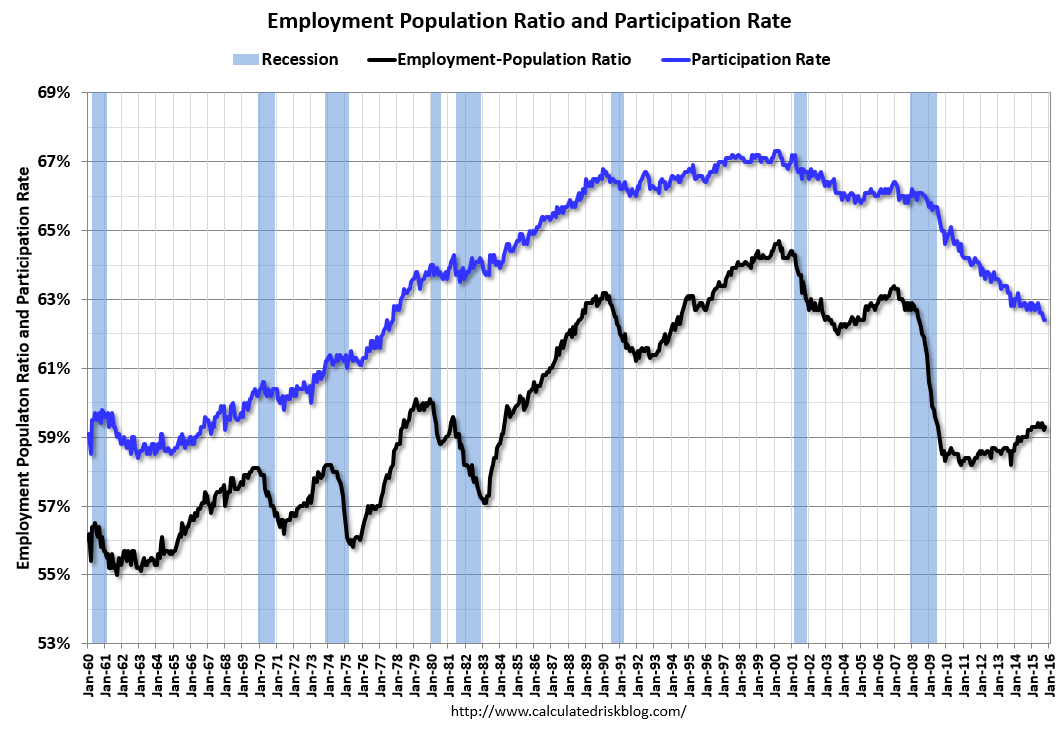 The third graph shows the employment population ratio and the participation rate.
The Labor Force Participation Rate was unchanged in October at 62.4%. This is the percentage of the working age population in the labor force. A large portion of the recent decline in the participation rate is due to demographics.
The Employment-Population ratio increased to 59.3% (black line).
I'll post the 25 to 54 age group employment-population ratio graph later.
 The fourth graph shows the unemployment rate.
 The unemployment rate declined in October to 5.0%.
This was well above expectations of 190,000 jobs, and revisions were up, and there was a pick up in wage growth ... a strong report.
I'll have much more later ...
Thursday, November 05, 2015
Friday: Jobs, Jobs, Jobs
by Calculated Risk on 11/05/2015 07:17:00 PM
Everyone will be looking at job creation, the unemployment rate and wages in the October employment report. Two other keys will be seasonal retail hiring in October, and revisions to prior months.
For several years, back revisions tended to be positive in the October report, but the upward revisions have been getting smaller. Here are the two-month revisions released in the last six October employment reports:
2009: Total +91,000 "The change in total nonfarm payroll employment for August was revised from -201,000 to -154,000, and the change for September was revised from -263,000 to -219,000."
2010: Total +110,000 "The change in total nonfarm payroll employment for August was revised from -57,000 to -1,000, and the change for September was revised from -95,000 to -41,000."
2011: Total +98,000 "The change in total nonfarm payroll employment for August was revised from +57,000 to +104,000, and the change for September was revised from +103,000 to +158,000."
2012: Total +84,000 "The change in total nonfarm payroll employment for August was revised from +142,000 to +192,000, and the change for September was revised from +114,000 to +148,000."
2013: Total +60,000 "The change in total nonfarm payroll employment for August was revised from +193,000 to +238,000, and the change for September was revised from +148,000 to +163,000."
2014: Total +31,000 "The change in total nonfarm payroll employment for August was revised from +180,000 to +203,000, and the change for September was revised from +248,000 to +256,000."
Friday:
• At 8:30 AM ET, the Employment Report for October. The consensus is for an increase of 190,000 non-farm payroll jobs added in October, up from the 142,000 non-farm payroll jobs added in September. The consensus is for the unemployment rate to decrease to 5.0%.
• At 3:00 PM, Consumer Credit for September from the Federal Reserve. The consensus is consumer credit increased by $18.0 billion in September.
Fannie: REO inventory declined in Q3, Down 34% Year-over-year
by Calculated Risk on 11/05/2015 03:59:00 PM
The continued decrease in the number of our seriously delinquent single-family loans has resulted in a reduction in the number of REO acquisitions in the first nine months of 2015 as compared with the first nine months of 2014.Fannie is unable to currently market about 40% of their inventory (see table 32 on page 62 for status).
We continue to manage our REO inventory to appropriately manage costs and maximize sales proceeds. However, we are unable to market and sell a large portion of our inventory, primarily due to occupancy and state or local redemption or confirmation periods, which extends the amount of time it takes to bring our properties to a marketable state and eventually dispose of them. This results in higher foreclosed property expenses, which include costs related to maintaining the property and ensuring that the property is vacant. Before we market our foreclosed properties, we may choose to repair them in order to maximize the sales price and increase the likelihood that an owner occupant will purchase. In some cases, we engage in third party sales at foreclosure, which allow us to avoid maintenance and other REO expenses we would have incurred had we acquired the property.
emphasis added
Fannie and Freddie are still working through the backlog of loans made during the housing bubble, mostly in judicial foreclosure states.
 Click on graph for larger image.
Here is a graph of Fannie and Freddie Real Estate Owned (REO).
REO inventory decreased in Q3 for both Fannie and Freddie, and combined inventory is down 35% year-over-year. For Freddie, this is the lowest level of REO since Q4 2007. For Fannie, this is the lowest level since Q2 2008.
Short term delinquencies are at normal levels, but there are still a number of properties in the foreclosure process with long time lines in judicial foreclosure states.
Hotels: The modest impact of Airbnb
by Calculated Risk on 11/05/2015 01:41:00 PM
Hotels are on pace for the best year ever in terms of occupancy, even with competition from online sharing sites like Airbnb. Here is an article from HotelNewsNow: NYC hoteliers report modest Airbnb impact
The report, titled “Airbnb and impacts on the New York City lodging market and economy” and conducted by HVS Consulting and Valuation for the Hotel Association of New York City, breaks down losses to the New York City hotel industry and local economy attributable to Airbnb specifically. The study results showed losses of $451 million in direct revenue; $136 million in ancillary losses, such as food and beverage; construction losses of $1 billion; indirect effects of $102 million; induced effects of $115 million and $227 million in taxes.So far the impact has been modest and most hotels in the U.S. are seeing record occupancy (see below).
The $451 million in lost hotel revenue assumes all Airbnb customers would have otherwise booked a hotel room. ...
Hoteliers interviewed by HNN for this article did not comment directly on HVS’ findings. But by and large, hoteliers agreed they aren’t necessarily feeling the same effects as outlined in the HVS analysis when it comes to loss of rate and occupancy.
The key reasons for record occupancy are travel is up significantly, and there were few new hotels built following the financial crisis (limited inventory growth). However, lodging investment is up 39% year-over-year, and there will be new hotels coming.
My guess is the CRUNCH for online sharing will come when there are more hotels, and when the economy slows down again. I suspect the online sharing sites will come under serious pressure from both hoteliers and local tax collecting agencies when the occupancy rate starts to decline (in addition to neighbor complaints). But for now it is good times for all.
And here is weekly update on hotel occupancy from HotelNewsNow.com: STR: US results for week ending 31 October
The U.S. hotel industry recorded positive results in the three key performance measurements during the week of 25-31 October 2015, according to data from STR, Inc.The following graph shows the seasonal pattern for the hotel occupancy rate using the four week average. Hotels are now in the Fall business travel season.
In year-over-year measurements, the industry’s occupancy increased 1.2% to 62.3%. Average daily rate for the week was up 5.1% to US$120.46. Revenue per available room increased 6.4% to finish the week at US$75.06.
emphasis added
 The red line is for 2015, dashed orange is 2014, blue is the median, and black is for 2009 - the worst year since the Great Depression for hotels. Purple is for 2000.
I added 2001 (yellow) to show the impact of 9/11/2001 on hotel occupancy. Occupancy was already down in 2001 due to the recession, and really collapsed following 9/11.
For 2015, the 4-week average of the occupancy rate is solidly above the median for 2000-2007, and above last year.
Right now 2015 is above 2000 (best year for hotels), and 2015 will probably be the best year ever for hotels.
Occupancy Year-to-date:
1) 2015 67.6%
2) 2000 67.0%
3) 2014 66.4%
Data Source: Smith Travel Research, Courtesy of HotelNewsNow.com
NFP: Goldman Employment Preview
by Calculated Risk on 11/05/2015 10:42:00 AM
Yesterday I discussed several employment indicators: Preview: Employment Report for October
Here are some excerpts from a research piece by Goldman Sachs economist Chris Mischaikow:
Based on better-than-expected labor market data this week, we have revised up our forecast for October nonfarm payroll growth to 190k from 175k previously.
...
Our baseline expectation is for the unemployment rate to remain at 5.1%. The labor force participation rate (LFPR) declined by two-tenths in September, and we expect a modest rebound from this larger-than-usual decline. ... However, this remains a close call given that the unemployment rate is currently at 5.051% on an unrounded basis.
We forecast average hourly earnings (AHE) for all employees to increase 0.3%. ... we think that the year-on-year change in all-employee AHE will increase to 2.3%. This would mark the fastest year-over-year pace of growth on an unrounded basis in AHE since October 2009.


