 RSS Feed
 by Calculated Risk on 3/31/2015 07:17:00 PM
Tuesday, March 31, 2015
Wednesday: Auto Sales, ADP Employment, ISM Mfg, Construction Spending and more
Wednesday:
• 7:00 AM ET, the Mortgage Bankers Association (MBA) will release the results for the mortgage purchase applications index.
• At 8:15 AM, the ADP Employment Report for March. This report is for private payrolls only (no government). The consensus is for 225,000 payroll jobs added in March, up from 212,000 in February.
• At 10:00 AM, the ISM Manufacturing Index for March. The consensus is for a decrease to 52.5 from 52.9 in February. The ISM manufacturing index indicated expansion in February at 52.9%. The employment index was at 51.4%, and the new orders index was at 52.5%.
• At 10:00 AM, Construction Spending for February. The consensus is for a 0.2% increase in construction spending.
• Early: Reis Q1 2015 Office Survey of rents and vacancy rates.
• All day: Light vehicle sales for March. The consensus is for light vehicle sales to increase to 16.8 million SAAR in March from 16.2 million in February (Seasonally Adjusted Annual Rate).
Fannie Mae: Mortgage Serious Delinquency rate declined in February, Lowest since September 2008
by Calculated Risk on 3/31/2015 04:36:00 PM
Fannie Mae reported today that the Single-Family Serious Delinquency rate declined slightly in February to 1.83% from 1.86% in January. The serious delinquency rate is down from 2.27% in February 2014, and this is the lowest level since September 2008.
The Fannie Mae serious delinquency rate peaked in February 2010 at 5.59%.
Last week, Freddie Mac reported that the Single-Family serious delinquency rate was declined in February to 1.81%. Freddie's rate is down from 2.29% in February 2014, and is at the lowest level since December 2008. Freddie's serious delinquency rate peaked in February 2010 at 4.20%.
Note: These are mortgage loans that are "three monthly payments or more past due or in foreclosure".
 Click on graph for larger image
The Fannie Mae serious delinquency rate has fallen 0.44 percentage points over the last year - the pace of improvement has slowed - and at that pace the serious delinquency rate will be close to 1% in late 2016.
The "normal" serious delinquency rate is under 1%, so maybe serious delinquencies will be close to normal at the end of 2016. This elevated delinquency rate is mostly related to older loans - the lenders are still working through the backlog, especially in judicial foreclosure states like Florida.
Restaurant Performance Index shows Expansion in February
by Calculated Risk on 3/31/2015 02:18:00 PM
Here is a minor indicator I follow from the National Restaurant Association: Softer sales offset by stronger optimism in February's RPI
Despite dampened sales and customer traffic levels as a result of extreme weather in parts of the country, the National Restaurant Association’s Restaurant Performance Index (RPI) held relatively steady in February. The RPI stood at 102.6 in February, down slightly from a level of 102.7 in January.
In addition, February marked the 24th consecutive month in which the RPI stood above 100, which signifies expansion in the index of key industry indicators.
“With same-store sales and customer traffic levels being impacted by challenging weather conditions in parts of the country, the Current Situation component of the RPI declined in February,” said Hudson Riehle, senior vice president of the Research and Knowledge Group for the Association. “However, this was offset by a solid improvement in the Expectations component of the index, as restaurant operators are increasingly optimistic about business conditions in the months ahead. As a result, the overall RPI held relatively steady in February.”
emphasis added
 Click on graph for larger image.
The index decreased to 102.6 in February, down from 102.7 in January. (above 100 indicates expansion).
Restaurant spending is discretionary, so even though this is "D-list" data, I like to check it every month. This is another solid reading - and it is likely restaurants are benefiting from lower gasoline prices and are having to raise wages - a little - to attract and retain workers.
A Comment on House Prices: Real Prices and Price-to-Rent Ratio in January
by Calculated Risk on 3/31/2015 11:19:00 AM
The expected slowdown in year-over-year price increases has occurred. In October 2013, the National index was up 10.9% year-over-year (YoY). In January 2015, the index was up 4.5% YoY. However the YoY change has only declined slightly over the last five months.
Looking forward, I expect the YoY increases for the indexes to move more sideways (as opposed to down). Two points: 1) I don't expect (as some) for the indexes to turn negative YoY (in 2015) , and 2) I think most of the slowdown on a YoY basis is now behind us. This slowdown in price increases was expected by several key analysts, and I think it was good news for housing and the economy.
In the earlier post, I graphed nominal house prices, but it is also important to look at prices in real terms (inflation adjusted). Case-Shiller, CoreLogic and others report nominal house prices. As an example, if a house price was $200,000 in January 2000, the price would be close to $275,000 today adjusted for inflation (38%). That is why the second graph below is important - this shows "real" prices (adjusted for inflation).
It has been almost ten years since the bubble peak. In the Case-Shiller release this morning, the National Index was reported as being 7.9% below the bubble peak. However, in real terms, the National index is still about 21% below the bubble peak.
Nominal House Prices
 The first graph shows the monthly Case-Shiller National Index SA, the monthly Case-Shiller Composite 20 SA, and the CoreLogic House Price Indexes (through January) in nominal terms as reported.
In nominal terms, the Case-Shiller National index (SA) is back to May 2005 levels, and the Case-Shiller Composite 20 Index (SA) is back to December 2004 levels, and the CoreLogic index (NSA) is back to February 2005.
Real House Prices
 The second graph shows the same three indexes in real terms (adjusted for inflation using CPI less Shelter). Note: some people use other inflation measures to adjust for real prices.
In real terms, the National index is back to June 2003 levels, the Composite 20 index is back to March 2003, and the CoreLogic index back to April 2003.
In real terms, house prices are back to 2003 levels.
Price-to-Rent
In October 2004, Fed economist John Krainer and researcher Chishen Wei wrote a Fed letter on price to rent ratios: House Prices and Fundamental Value. Kainer and Wei presented a price-to-rent ratio using the OFHEO house price index and the Owners' Equivalent Rent (OER) from the BLS.
 Here is a similar graph using the Case-Shiller National, Composite 20 and CoreLogic House Price Indexes.
This graph shows the price to rent ratio (January 1998 = 1.0).
On a price-to-rent basis, the Case-Shiller National index is back to May 2003 levels, the Composite 20 index is back to December 2002 levels, and the CoreLogic index is back to March 2003.
In real terms, and as a price-to-rent ratio, prices are mostly back to 2003 levels - and maybe moving a little sideways now.
Case-Shiller: National House Price Index increased 4.5% year-over-year in January
by Calculated Risk on 3/31/2015 09:15:00 AM
S&P/Case-Shiller released the monthly Home Price Indices for January ("January" is a 3 month average of November, December and January prices).
This release includes prices for 20 individual cities, two composite indices (for 10 cities and 20 cities) and the monthly National index.
Note: Case-Shiller reports Not Seasonally Adjusted (NSA), I use the SA data for the graphs.
From S&P: Rise in Home Prices Paced by Denver, Miami, and Dallas According to the S&P/Case-Shiller Home Price Indices
Data released today for January 2015 show that home prices continued their rise across the country over the last 12 months. However, monthly data reveal slowing increases and seasonal weakness. ... Both the 10-City and 20-City Composites saw year-over-year increases in January compared to December. The 10-City Composite gained 4.4% year-over-year, up from 4.3% in December. The 20-City Composite gained 4.6% year-over-year, compared to a 4.4% increase in December. The S&P/Case-Shiller U.S. National Home Price Index, which covers all nine U.S. census divisions, recorded a 4.5% annual gain in January 2015 versus a 4.6% increase in December 2014.
...
The National index declined for the fifth consecutive month in January, reporting a -0.1% change for the month. Both the 10- and 20-City Composites reported virtually flat month-over-month changes. Of the nine cities that reported increases, Charlotte, Miami, and San Diego led all cities in January with increases of 0.7%. San Francisco reported the largest decrease of all 20 cities, with a month over-month decrease of -0.9%. Seattle and Washington D.C. reported decreases of -0.5%. U
...
“The combination of low interest rates and strong consumer confidence based on solid job growth, cheap oil and low inflation continue to support further increases in home prices” says David M. Blitzer, Managing Director and Chairman of the Index Committee for S&P Dow Jones Indices. “Regional patterns in recent months continue: strength in the west and southwest paced by Denver and Dallas with results ahead of the national index in the California cities, the Pacific Northwest and Las Vegas. The northeast and Midwest are mostly weaker than the national index.
 Click on graph for larger image.
 The first graph shows the nominal seasonally adjusted Composite 10, Composite 20 and National indices (the Composite 20 was started in January 2000).
The Composite 10 index is off 15.9% from the peak, and up 0.9% in January (SA).
The Composite 20 index is off 14.9% from the peak, and up 0.9% (SA) in January.
The National index is off 7.9% from the peak, and up 0.5% (SA) in January. The National index is up 24.3% from the post-bubble low set in Dec 2011 (SA).
 The second graph shows the Year over year change in all three indices.
The Composite 10 SA is up 4.4% compared to January 2014.
The Composite 20 SA is up 4.6% year-over-year..
The National index SA is up 4.5% year-over-year.
Prices increased (SA) in all 20 of the 20 Case-Shiller cities in January seasonally adjusted. (Prices increased in 9 of the 20 cities NSA) Prices in Las Vegas are off 41.4% from the peak, and prices in Denver and Dallas are at new highs (SA).
This was close to the consensus forecast for a 4.6% YoY increase for the National index. I'll have more on house prices later.
Monday, March 30, 2015
Tuesday: Case-Shiller House Prices, Chicago PMI
by Calculated Risk on 3/30/2015 07:51:00 PM
From the WSJ: Fed’s Fischer Floats Ideas for Regulating Shadow Banks
The Federal Reserve’s No. 2 official floated a series of ideas for regulating nonbank financial companies, the latest indication that top U.S. policy makers are focusing on risks in the so-called shadow banking sector.Tuesday:
“While there has been progress on the financial reform front, we should not be complacent about the stability of the financial system,” said Fed Vice Chairman Stanley Fischer in remarks prepared for a conference here hosted by the Federal Reserve Bank of Atlanta. He noted existing rules create an incentive for risky activities to move into less-regulated financial firms and said “we should expect that further reforms will certainly be needed down the road.”
• 9:00 AM ET, the S&P/Case-Shiller House Price Index for January. Although this is the January report, it is really a 3 month average of November, December and January prices. The consensus is for a 4.6% year-over-year increase in the National Index for January. The Zillow forecast is for the National Index to increase 4.6% year-over-year in January, and for prices to increase 0.5% month-to-month seasonally adjusted.
• At 9:45 AM, the Chicago Purchasing Managers Index for March. The consensus is for a reading of 50.2, up from 45.8 in February.
Demographics and GDP: 2% is the new 4%
by Calculated Risk on 3/30/2015 03:08:00 PM
Note: This is a repeat of a post I wrote early this year. Based on some recent comments I've seen, I think this is worth repeating.
For amusement, I checked out the WSJ opinion page comments on the Q4 GDP report. As usual, the WSJ opinion is pure politics - but it does bring up an excellent point (that the WSJ conveniently ignores).
First, from the WSJ opinion page:
The fourth quarter report means that growth for all of 2014 clocked in at 2.4%, which is the best since 2.5% in 2010. It also means another year, an astonishing ninth in a row, in which the economy did not grow by 3%.This period of low growth isn't "astonishing". First, usually following a recession, there is a brief period of above average growth - but not this time due to the financial crisis and need for households to deleverage. So we didn't see a strong bounce back (sluggish growth was predicted on the blog for the first years of the recovery).
And overall, we should have been expecting slower growth this decade due to demographics - even without the housing bubble-bust and financial crisis (that the WSJ opinion page missed).
One simple way to look at the change in GDP is as the change in the labor force, times the change in productivity. If the labor force is growing quickly, GDP will be higher with the same gains in productivity. And the opposite is true.
So here is a graph of the year-over-year change in the labor force since 1950 (data from the BLS).
 Click on graph for larger image
The data is noisy - because of changes in population controls and the business cycle - but the pattern is clear as indicated by the dashed red trend line. The labor force has been growing slowly recently after declining for some time.
We could also look at just the prime working age population - I've pointed out before the that prime working age population has just started growing again after declining for a few years (see Prime Working-Age Population Growing Again)
Now here is a look at GDP for the same period.
 The GDP data (year-over-year quarterly) is also noisy, and the dashed blue line shows the trend.
 GDP was high in the early 50s - and early-to-mid 60s because of government spending (Korean and Vietnam wars). As in example, in 1951, national defense added added 6.5 percentage points to GDP. Of course we don't want another war ...
Now lets put the two graphs together.
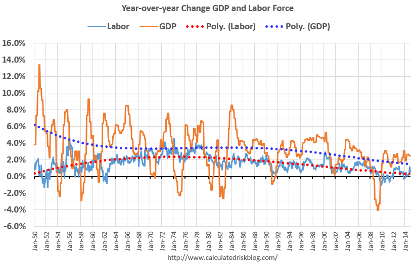 It isn't a surprise. Other than the early period with a boost from government spending, the growth in GDP has been tracking the growth in the labor force pretty well. The difference in growth between the dashed blue and red lines is due to gains in productivity.
The good news is that will change going forward (prime working age population will grow faster next decade). The bad news is the political hacks will continue to ignore demographics.
Right now, due to demographics, 2% GDP growth is the new 4%.
NAR: Pending Home Sales Index increased 3.1% in February, up 12% year-over-year
by Calculated Risk on 3/30/2015 10:08:00 AM
From the NAR: Pending Home Sales Rise in February Behind Solid Gains in Midwest, West
The Pending Home Sales Index, a forward-looking indicator based on contract signings, rose 3.1 percent to 106.9 in February from a slight downward revision of 103.7 in January and is now 12.0 percent above February 2014 (95.4). The index is at its highest level since June 2013 (109.4), has increased year-over-year for six consecutive months and is above 100 – considered an average level of activity – for the 10th consecutive month.This was well above the consensus forecast, but as expected by housing economist Tom Lawler.
...
The PHSI in the Northeast fell 2.3 percent to 81.7 in February, but is 4.1 percent above a year ago. In the Midwest the index leaped 11.6 percent to 110.4 in February, and is now 13.8 percent above February 2014.
Pending home sales in the South decreased 1.4 percent to an index of 120.2 in February, but is still 10.8 percent above last February. The index in the West climbed 6.6 percent in February to 102.1 (highest since June 2013 at 111.4) and is now 18.3 percent above a year ago.
Note: Contract signings usually lead sales by about 45 to 60 days, so this would usually be for closed sales in March and April.
Personal Income increased 0.4% in February, Spending increased 0.1%
by Calculated Risk on 3/30/2015 08:30:00 AM
The BEA released the Personal Income and Outlays report for February:
Personal income increased $58.6 billion, or 0.4 percent ... in February, according to the Bureau of Economic Analysis. Personal consumption expenditures (PCE)increased $11.8 billion, or 0.1 percent.The following graph shows real Personal Consumption Expenditures (PCE) through February 2015 (2009 dollars). Note that the y-axis doesn't start at zero to better show the change.
...
Real PCE -- PCE adjusted to remove price changes -- decreased 0.1 percent in February, in contrast to an increase of 0.2 percent in January. ... The price index for PCE increased 0.2 percent in February, in contrast to a decrease of 0.4 percent in January. The PCE price index, excluding food and energy, increased 0.1 percent in February, the same increase as in January.
The February price index for PCE increased 0.3 percent from February a year ago. The February PCE price index, excluding food and energy, increased 1.4 percent from February a year ago.
 Click on graph for larger image.
The dashed red lines are the quarterly levels for real PCE.
The increase in personal income was higher than expected, The increase in PCE was below the 0.2% increase consensus.
On inflation: The PCE price index increased 0.3 percent year-over-year due to the sharp decline in oil prices. The core PCE price index (excluding food and energy) increased 1.4 percent year-over-year in February.
Using the two-month method to estimate Q1 PCE growth, PCE was increasing at a 2.0% annual rate in Q1 2015 (using the mid-month method, PCE was increasing 0.8%). This is a slowdown in PCE.
Sunday, March 29, 2015
Monday: Personal Income and Outlays, Pending Home Sales, Dallas Fed Mfg
by Calculated Risk on 3/29/2015 08:08:00 PM
From the NY Times: A Deadline for Greece, and U.S. Jobs Data
Greece hopes to gain approval on Monday for a detailed list of economic changes that its international creditors have demanded ...Monday:
... recent economic data has been anemic, and it is likely that hiring has not kept up with the blistering pace of gains reached in late 2014. In fact, some economists say hiring could fall below the 200,000 level because of a combination of bad weather and weakness in certain sectors like drilling and energy production.
• 8:30 AM ET, Personal Income and Outlays for February. The consensus is for a 0.3% increase in personal income, and for a 0.2% increase in personal spending. And for the Core PCE price index to increase 0.1%.
• At 10:00 AM, the Pending Home Sales Index for February. The consensus is for a 0.3% increase in the index.
• At 10:30 AM, Dallas Fed Manufacturing Survey for March.
Weekend:
• Schedule for Week of March 29, 2015
• Lawler: Possible Upside Surprise for Pending Home Sales Index
• Merrill and Nomura Forecasts for March Employment Report
From CNBC: Pre-Market Data and Bloomberg futures: currently S&P futures are down slightly and DOW futures are flat (fair value).
Oil prices were up slightly over the last week with WTI futures at $48.34 per barrel and Brent at $55.97 per barrel. A year ago, WTI was at $101, and Brent was at $106 - so prices are down 50% or so year-over-year.
Below is a graph from Gasbuddy.com for nationwide gasoline prices. Nationally prices are up to $2.42 per gallon (down more than $1.10 per gallon from a year ago). Prices in California are now declining following a refinery fire in February and a strike that is now over.
If you click on "show crude oil prices", the graph displays oil prices for WTI, not Brent; gasoline prices in most of the U.S. are impacted more by Brent prices.
| Orange County Historical Gas Price Charts Provided by GasBuddy.com |


