by Calculated Risk on 5/20/2014 07:28:00 PM
Tuesday, May 20, 2014
Wednesday: FOMC Minutes, Architecture Billings Index
From Professor Tim Duy: Dudley Revisits Exit Strategy
Today New York Federal Reserve President William Dudley gave what was both an interesting and depressing speech. Interesting in that he provides some new thoughts on the exit strategy. Depressing in that he outlines a case for persistently low interest rates. One wonders why, given such an outlook, the Fed is so firmly focused on the exit strategy to begin with, rather than accelerating the pace of the recovery.Wednesday:
...
Bottom Line: Dudley reinforces expectations that the low rate environment will persist long into the future. The data flow is not providing reason to think otherwise at this point; we would need to see higher inflation numbers coupled with real reason to believe labor market slack was rapidly evaporating, probably in the form of stronger wage growth. It remains interesting that the Fed does not view their own outlook as reason to accelerate the pace of activity. They seem relatively content to accept what they themselves acknowledge is a ongoing disappointment.
• At 7:00 AM ET, the Mortgage Bankers Association (MBA) will release the results for the mortgage purchase applications index.
• During the day, the AIA's Architecture Billings Index for April (a leading indicator for commercial real estate).
• At 11:30 AM, Fed Chair Janet Yellen Speaks, Commencement Remarks, At the New York University Commencement, New York, New York
• At 2:00 PM, FOMC Minutes for the Meeting of April 29-30, 2014.
Apartments: Supply and Demand
by Calculated Risk on 5/20/2014 02:39:00 PM
Time flies! It was four years ago that we started discussing the turnaround for apartments. Then, in January 2011, I attended the NMHC Apartment Strategies Conference in Palm Springs, and the atmosphere was very positive.
The drivers were 1) very low new supply, and 2) strong demand (favorable demographics, and people moving from owning to renting).
Demographics are still favorable, but my sense is the move "from owning to renting" has slowed. And more supply is now coming online.
On demographics, a large cohort has been moving into the 20 to 34 year old age group (a key age group for renters). Also, in 2015, based on Census Bureau projections, the two largest 5 year cohorts will be 20 to 24 years old, and 25 to 29 years old (the largest cohorts will no longer be the "boomers"). Note: Household formation would be a better measure than population, but reliable data for households is released with a long lag.
 Click on graph for larger image.
This graph shows the population in the 20 to 34 year age group has been increasing. This is actual data from the Census Bureau for 1985 through 2010, and current projections from the Census Bureau from 2015 through 2035.
The circled area shows the recent and projected increase for this group.
From 2020 to 2030, the population for this key rental age group is expected to remain mostly unchanged.
This favorable demographic is a key reason I've been positive on the apartment sector for the last several years - and I expect new apartment construction to stay strong for several more years.
And on supply, the table below shows the number of 5+ units started and completed per year since 1990 (Completions matter for supply). New supply will probably increase by 250,000 to 260,000 units this year - and increase further in 2015 since it can take over a year from start to completion for large complexes. Note: This doesn't include houses converted to rentals - and that is a substantial number in recent years.
This suggests new supply will probably balance demand soon, and that means vacancy rates are probably close to a bottom.
| 5+ Units, Starts and Completions (000s)1 | ||
|---|---|---|
| Year | Completions | Starts |
| 1990 | 297.3 | 260.4 |
| 1991 | 216.6 | 137.9 |
| 1992 | 158.0 | 139.0 |
| 1993 | 127.1 | 132.6 |
| 1994 | 154.9 | 223.5 |
| 1995 | 212.4 | 244.1 |
| 1996 | 251.3 | 270.8 |
| 1997 | 247.1 | 295.8 |
| 1998 | 273.9 | 302.9 |
| 1999 | 299.3 | 306.6 |
| 2000 | 304.7 | 299.1 |
| 2001 | 281.0 | 292.8 |
| 2002 | 288.2 | 307.9 |
| 2003 | 260.8 | 315.2 |
| 2004 | 286.9 | 303.0 |
| 2005 | 258.0 | 311.4 |
| 2006 | 284.2 | 292.8 |
| 2007 | 253.0 | 277.3 |
| 2008 | 277.2 | 266.0 |
| 2009 | 259.8 | 97.3 |
| 2010 | 146.5 | 104.3 |
| 2011 | 129.9 | 167.3 |
| 2012 | 157.6 | 233.9 |
| 2013 | 186.2 | 293.7 |
| 20142 | 240.0 | 334.0 |
| 1 5+ units is close to the number of units built for rent each year. | ||
| 2 Pace through April 2014, completions will probably be above 240,000 for 2014 | ||
Fed's Dudley: Expect Long Run Fed Funds Rate to be well below the 4¼ percent average level with 2 percent inflation
by Calculated Risk on 5/20/2014 01:23:00 PM
An important speech from NY Fed President William Dudley: The Economic Outlook and Implications for Monetary Policy. A few excerpts on housing:
On the housing side, residential investment has stalled out over the past few quarters. Although I expected some slowing due to the rise in mortgage rates in the middle of 2013, the extent of the slowdown has surprised me given that the recent pace of housing starts—roughly 1 million per year—is far below what is consistent with the economy’s underlying demographic trends.On the Fed Funds rate:
I think housing has been weaker than anticipated because several significant headwinds persist for this sector. First, mortgage credit is still not readily available to households with lower credit scores. Second, some people are coping with higher student loan debt burdens that have delayed their entry into the housing market as first-time homebuyers. This, in turn, makes it more difficult for existing homeowners to sell and trade-up. Third, there may be some ongoing difficulties increasing housing supply. The housing downturn was very deep and protracted. It takes time to shift resources back into this area. Also, in some markets house prices still appear to be below the cost of building a new home. Thus, in those markets, it remains uneconomic to undertake new home construction. Although I expect that the housing recovery will resume, the pace will likely be slow, especially relative to past economic recoveries.
I expect that the level of the federal funds rate consistent with 2 percent PCE inflation over the long run is likely to be well below the 4¼ percent average level that has applied historically when inflation was around 2 percent. Precisely how much lower is difficult to say at this point in time.And on monetary policy:
emphasis added
The next question I wish to consider is how the Fed will likely manage its balance sheet as the taper process is completed and lift-off eventually occurs. Unlike previous normalizations of monetary policy, which only involved the level of short-term rates, this prospective tightening cycle also involves considerations with respect to the size and composition of our balance sheet. The Committee stated in its June 2011 exit principles that changes in short-term rates will be the primary means for adjusting monetary policy post-liftoff, not discretionary shifts in the balance sheet. In other words, the balance sheet will be set on automatic pilot. I believe this approach still very much applies.
However, the language in the June 2011 exit principles concerning agency mortgage-backed securities (MBS) sales no longer applies. As Chairman Bernanke noted in the press conference following the June 2013 FOMC meeting: “While participants continue to think that in the long run the Federal Reserve’s portfolio should consist predominantly of Treasury securities, a strong majority now expects that the Committee will not sell agency mortgage-backed securities during the process of normalizing monetary policy.” The balance sheet would shrink post-lift-off as Treasury securities matured and mortgages were prepaid, but outright agency MBS sales are no longer contemplated during the process of monetary policy normalization.
Also, I think that the language in the June 2011 exit principles with respect to reinvestment needs to be revisited. The exit principles state: “To begin the process of policy normalization, the Committee will likely first cease reinvesting some or all payments of principal on the securities holdings in the SOMA.” There are two considerations that suggest to me that ending the reinvestments prior to lift-off may not be the best strategy. First, such a decision might complicate our communications regarding the process of normalization. Ending reinvestments as an initial step risks inadvertently bringing forward any tightening of financial conditions as this might foreshadow the impending lift-off date for rates in a manner inconsistent with the Committee’s intention.
Second, when conditions permit, it would be desirable to get off the zero lower bound in order to regain some monetary policy flexibility. This goal would argue for lift-off occurring first followed by the end of reinvestment, rather than vice versa. Delaying the end of reinvestment puts the emphasis where it needs to be—getting off the zero lower bound for interest rates. In my opinion, this is far more important than the consequences of the balance sheet being a little larger for a little longer
Philly Fed: State Coincident Indexes increased in 47 states in April
by Calculated Risk on 5/20/2014 10:50:00 AM
From the Philly Fed:
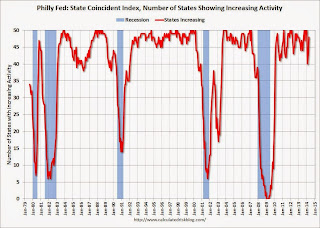
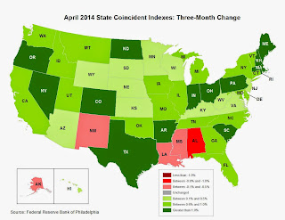
The Federal Reserve Bank of Philadelphia has released the coincident indexes for the 50 states for April 2014. In the past month, the indexes increased in 47 states, decreased in two, and remained stable in one, for a one-month diffusion index of 90. Over the past three months, the indexes increased in 45 states and decreased in five, for a three-month diffusion index of 80.Note: These are coincident indexes constructed from state employment data. An explanation from the Philly Fed:
The coincident indexes combine four state-level indicators to summarize current economic conditions in a single statistic. The four state-level variables in each coincident index are nonfarm payroll employment, average hours worked in manufacturing, the unemployment rate, and wage and salary disbursements deflated by the consumer price index (U.S. city average). The trend for each state’s index is set to the trend of its gross domestic product (GDP), so long-term growth in the state’s index matches long-term growth in its GDP.
 Click on graph for larger image.
This is a graph is of the number of states with one month increasing activity according to the Philly Fed. This graph includes states with minor increases (the Philly Fed lists as unchanged).
In April, 48 states had increasing activity(including minor increases). This measure declined sharply during the winter, but is now back to normal for a recovery.
 Here is a map of the three month change in the Philly Fed state coincident indicators. This map was all red during the worst of the recession, and is mostly green again.
Zillow: Negative Equity declines further in Q1 2014
by Calculated Risk on 5/20/2014 09:35:00 AM
From Zillow: Negative Equity Continues to Fall, Concentrated in Bottom Tier
According to the first quarter Zillow Negative Equity Report, the national negative equity rate continued to decline to 18.8 percent, down 12.6 percentage points from its 31.4 percent peak in the first quarter of 2012. Negative equity has fallen for eight consecutive quarters as home values have risen. The national negative equity rate fell from 25.4 percent in the first quarter of 2013 and 19.4 percent in the fourth quarter, while the pace of annual home value growth slowed to 5.7 percent in the first quarter of 2014, from 6.6 percent at the end of the fourth quarter of 2013. However, more than 9.7 million homeowners with a mortgage still remain underwater.The following graph from Zillow shows negative equity by Loan-to-Value (LTV) in Q1 2014 compared to Q1 2013.
emphasis added
 Click on graph for larger image.
From Zillow:
Figure6Figure 6 shows the loan-to-value (LTV) distribution for homeowners with a mortgage in 2014 Q1 versus 2013 Q1. The bulk of underwater homeowners, roughly 47 percent, are underwater by up to 20 percent of their loan value, and will soon cross over into positive equity territory. However they will still be effectively underwater, as they will not gain enough of a profit in the sale of their current house to pay the expenses and down payment associated with buying a new home.Almost half of the borrowers with negative equity have a LTV of 100% to 120% (the light red columns). Most of these borrowers are current on their mortgages - and they have probably either refinanced with HARP or the loans are well seasoned (most of these properties were purchased in the 2004 through 2006 period, so borrowers have been current for eight years or so). In a few years, these borrowers will have positive equity.
The key concern is all those borrowers with LTVs above 140% (about 6.2% of properties with a mortgage according to Zillow). It will take many years to return to positive equity ... and a large percentage of these properties will eventually be distressed sales (short sales or foreclosures).
Note: CoreLogic will release their Q1 negative equity report in the next couple of weeks. For Q4, CoreLogic reported there were 6.5 million properties with negative equity, and that will be down further in Q1 2014.
Monday, May 19, 2014
Amusing: A False Story on Auto Inventory
by Calculated Risk on 5/19/2014 09:25:00 PM
For fun, an interesting story from Barry Ritholtz: The Truth About Auto Sales
This week, an e-mail landed in my inbox with the header “Unsold Cars.” ...From Snopes.com: Unsold Cars
Normally, I would have deleted the e-mail without a second thought. But several things about it warranted further notice.
The first were aerial photos of thousands of cars. Wow, this really was a lot of cars.
The second was the phrase “Timestamp: Friday, May 16th, 2014,” which suggests that these photos were brand new.
What struck me was how familiar it all looked. Maybe that was because I posted those same photos on The Big Picture blog and Business Insider in February 2009.
The origin of the photos was a Jan. 16, 2009, article in the Guardian by Nick Mead. Note that this was smack in the middle of the financial crisis, when anything purchased on credit simply froze
Claim: Photographs show thousands and thousands of unsold cars deteriorating until they are scrapped.From Matt Hardigree at Jalopnik.com That Zero Hedge Article On Unsold Cars Is Bullshit
FALSE
The visuals are strong, the headline is clear, and you almost don't have to read the article to viscerally understand the problem. I, more than anyone, get the appeal of this story because it seems to largely rip off an article I wrote — including the images and headline — more than five years ago (which itself was largely a rehash of a Guardian article)....Glad to see people knock this down so quickly. Unfortunately stories like this never really die ... and the original story hasn't been corrected.
I would think that most intelligent people would read this and obviously see the flaws but, alas, I've had enough emails about it this morning that I feel the need to refute it. And since it's a (bad) copy of something I wrote, I have an extra responsibility to kill this misunderstanding before it has a chance to spread.
Weekly Update: Housing Tracker Existing Home Inventory up 6.8% year-over-year on May 19th
by Calculated Risk on 5/19/2014 03:01:00 PM
Here is another weekly update on housing inventory ...
There is a clear seasonal pattern for inventory, with the low point for inventory in late December or early January, and then usually peaking in mid-to-late summer.
The Realtor (NAR) data is monthly and released with a lag (the most recent data was for March). However Ben at Housing Tracker (Department of Numbers) has provided me some weekly inventory data for the last several years.
 Click on graph for larger image.
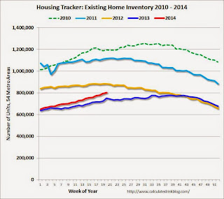
This graph shows the Housing Tracker reported weekly inventory for the 54 metro areas for 2010, 2011, 2012, 2013 and 2014.
In 2011 and 2012, inventory only increased slightly early in the year and then declined significantly through the end of each year.
In 2013 (Blue), inventory increased for most of the year before declining seasonally during the holidays. Inventory in 2013 finished up 2.7% YoY compared to 2012.
Inventory in 2014 (Red) is now 6.8% above the same week in 2013.
Inventory is still very low - still below the level in 2012 (yellow) when prices started increasing - but this increase in inventory should slow house price increases.
Note: One of the key questions for 2014 will be: How much will inventory increase? My guess is inventory will be up 10% to 15% year-over-year by the end of 2014 (inventory would still be below normal).
CoreLogic on Housing: "Cash Sales Share Shows Clear Downward Year-Over-Year Trend"
by Calculated Risk on 5/19/2014 12:05:00 PM
From CoreLogic: Cash Sales Made up 40 Percent of Total Home Sales in February
Cash sales made up 40.2 percent of total home sales in February 2014, down from 43.7 percent the previous year and 40.8 percent the previous month. Cash sales share comparisons should be made on a year-over-year basis due to the seasonal nature of the housing market , and by that measurement, the trend in cash sales is clearly down. Prior to the housing crisis, the cash sales share of total home sales averaged approximately 25 percent. The peak occurred in January 2011, when cash transactions made up 46.2 percent of total home sales.Reports that cash sales were up sharply in 2014 were incorrect. This fits with data from Tom Lawler.
And a post from Sam Khater at CoreLogic: REO Inventory Rising Once Again
After reaching a trough in August of 2013 of 375,000 properties, the number of real estate owned (REO) properties increased 15 percent to 430,000 as of March 2014 (Figure 1). The increase in REO properties was broad based, rising in 46 states. While the increase was moderate nationally, some states had large increases. Idaho led the way with the stock of REO properties nearly doubling between August 2013 and March 2014. Maryland had the 2nd largest increase in the number of REO properties, which increased 78 percent, followed by Nevada (up 70 percent), Oregon (up 47 percent) and North Dakota (up 42 percent).
The rise in REOs across most states reflects several inter-related factors ...
 This graph from CoreLogic shows the recent increase in REOs.
Note: The number of REOs at Fannie and Freddie was down slightly in Q1, but has increased in recent quarters. The FDIC reported a slight decrease in REOs in Q4 (dollars). So most of the recent increase in REOs reported by CoreLogic was probably due to private label (the worst of the worst).
LA area Port Traffic: Up year-over-year in April
by Calculated Risk on 5/19/2014 11:08:00 AM
Container traffic gives us an idea about the volume of goods being exported and imported - and possibly some hints about the trade report for April since LA area ports handle about 40% of the nation's container port traffic.
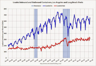
The following graphs are for inbound and outbound traffic at the ports of Los Angeles and Long Beach in TEUs (TEUs: 20-foot equivalent units or 20-foot-long cargo container).
To remove the strong seasonal component for inbound traffic, the first graph shows the rolling 12 month average.
 Click on graph for larger image.
On a rolling 12 month basis, inbound traffic was up 0.9% compared to the rolling 12 months ending in March. Outbound traffic was up 0.6% compared to 12 months ending in March.
Inbound traffic has generally been increasing, and outbound traffic has been moving up a little recently after moving sideways.
The 2nd graph is the monthly data (with a strong seasonal pattern for imports).
 Usually imports peak in the July to October period as retailers import goods for the Christmas holiday, and then decline sharply and bottom in February or March (depending on the timing of the Chinese New Year).
Imports and exports were up solidly year-over-year in April, and this was an all time high for exports for the month of April.
Imports were close to the all time high for April (set in April 2006), and it is possible that imports will be at a record high later this year.
Congratulations to Breanna Grow, the 2014 recipient of the Doris "Tanta" Dungey scholarship!
by Calculated Risk on 5/19/2014 09:34:00 AM
Congratulations to Breanna Grow, the 2014 recipient of the Doris "Tanta" Dungey scholarship!

Here is a picture of Ms. Grow with Tanta's mother (via Tanta's sister Cathy).
A happy day for Tanta's family!
Note: For new readers, Tanta was my co-blogger from from Dec 2006 through November 2008. Please see: Sad News: Tanta Passes Away, NY Times: Doris Dungey, Prescient Finance Blogger, Dies at 47 and much more at In Memoriam: Doris "Tanta" Dungey and on the scholarship.
You can make an additional contribution to the Doris Dungey Endowed Scholarship.


