by Calculated Risk on 3/26/2013 06:41:00 PM
Tuesday, March 26, 2013
Forecasts: Solid Vehicle Sales in March
Note: The automakers will report March vehicle sales this coming Monday, April 1st. Here are a few forecasts:
From Reuters: US industry March auto sales tracking above 15 mln -Toyota exec
"So far, this month of March looks to be very good for all manufacturers," [Bob Carter, Toyota's senior vice president for U.S. auto operations] told industry executives at a conference ahead of the New York auto show. He said industry sales are tracking up 6.6 percent in March, with an annual rate of 15.2 million to 15.3 million vehicles.From TrueCar: March 2013 New Car Sales Expected to Be Up Almost Five Percent According to TrueCar; March 2013 SAAR at 15.42M, Highest March SAAR Since 2007
The March 2013 forecast translates into a Seasonally Adjusted Annualized Rate ("SAAR") of 15.42 million new car sales ... up from 14.1 million in March 2012.From Kelley Blue Book: March New-Car Sales To Hit Highest Monthly Total Since August 2007 According To Kelley Blue Book
New-car sales will remain steady at a 15.2 million seasonally adjusted annual rate (SAAR) in March.And from Reuters: U.S. auto sales could rise 8 pct in March -research firms
Sales of new cars and trucks in March are expected to rise to 1,465,100 vehicles, while the annual sales pace is forecast to hit 15.3 million vehicles, J.D. Power and LMC said in a joint report released on Thursday. Since November, the annual rate has ranged from 15.3 million to 15.5 million.It appears auto sales were solid in March, and this suggests decent consumer spending growth in Q1.
Note: Most forecasts were for auto sales growth to slow in 2013 to around 4% growth or 15.0 million units. Based on the first few months, it appears sales will be stronger than expected this year.
Earlier:
• Case-Shiller: Comp 20 House Prices increased 8.1% year-over-year in January
• Real House Prices, Price-to-Rent Ratio, City Prices relative to 2000
• New Home Sales at 411,000 SAAR in February
• A few comments on New Home Sales
A few comments on New Home Sales
by Calculated Risk on 3/26/2013 02:56:00 PM
When the new home sales report was released for January, showing a large increase in the annualized sales rate, I cautioned not to read too much into that number. It was just one month of data, and January is seasonally the weakest month of the year with the largest positive seasonal adjustment.
Now that we have two months of data for 2013, one way to look at the growth rate is to use not seasonally adjusted (NSA) year-to-date data.
According to the Census Bureau, there have been 63 thousand new homes sold in 2013, up about 19% from the 53 thousand sold in January and February of 2012. That is a solid increase in sales. Note: For 2013, estimates are sales will increase to around 450 to 460 thousand, or an increase of around 22% to 25% on an annual basis from the 368 thousand in 2012.
As I mentioned last month, although there has been a large increase in the sales rate, sales are still near the lows for previous recessions. This suggest significant upside over the next few years (based on estimates of household formation and demographics, I expect sales to increase to 750 to 800 thousand over the next several years). Also housing is historically the best leading indicator for the economy, and this is one of the reasons I think The future's so bright, I gotta wear shades.
And here is another update to the "distressing gap" graph that I first started posting over four years ago to show the emerging gap caused by distressed sales. Now I'm looking for the gap to start to close over the next few years.
 Click on graph for larger image.
The "distressing gap" graph shows existing home sales (left axis) and new home sales (right axis) through February 2013. This graph starts in 1994, but the relationship has been fairly steady back to the '60s.
Following the housing bubble and bust, the "distressing gap" appeared mostly because of distressed sales. The flood of distressed sales kept existing home sales elevated, and depressed new home sales since builders weren't able to compete with the low prices of all the foreclosed properties.
I don't expect much of an increase in existing home sales (distressed sales will slowly decline and be offset by more conventional sales). But I do expect this gap to close - mostly from an increase in new home sales.
 Another way to look at this is a ratio of existing to new home sales.
This ratio was fairly stable from 1994 through 2006, and then the flood of distressed sales kept the number of existing home sales elevated and depressed new home sales. (Note: This ratio was fairly stable back to the early '70s, but I only have annual data for the earlier years).
In general the ratio has been trending down, and I expect this ratio to trend down over the next several years as the number of distressed sales declines and new home sales increase.
Note: Existing home sales are counted when transactions are closed, and new home sales are counted when contracts are signed. So the timing of sales is different.
Real House Prices, Price-to-Rent Ratio, City Prices relative to 2000
by Calculated Risk on 3/26/2013 12:12:00 PM
Case-Shiller, CoreLogic and others report nominal house prices, and it is also useful to look at house prices in real terms (adjusted for inflation) and as a price-to-rent ratio.
As an example, if a house price was $200,000 in January 2000, the price would be close to $275,000 today adjusted for inflation. This is why economist also look at real house prices (inflation adjusted).
Nominal House Prices
 The first graph shows the quarterly Case-Shiller National Index SA (through Q4 2012), and the monthly Case-Shiller Composite 20 SA and CoreLogic House Price Indexes (through January) in nominal terms as reported.
In nominal terms, the Case-Shiller National index (SA) is back to Q2 2003 levels (and also back up to Q3 2010), and the Case-Shiller Composite 20 Index (SA) is back to November 2003 levels, and the CoreLogic index (NSA) is back to January 2004.
Real House Prices
 The second graph shows the same three indexes in real terms (adjusted for inflation using CPI less Shelter). Note: some people use other inflation measures to adjust for real prices.
In real terms, the National index is back to October 1999 levels, the Composite 20 index is back to December 2000, and the CoreLogic index back to February 2001.
In real terms, most of the appreciation in the last decade is gone.
Price-to-Rent
In October 2004, Fed economist John Krainer and researcher Chishen Wei wrote a Fed letter on price to rent ratios: House Prices and Fundamental Value. Kainer and Wei presented a price-to-rent ratio using the OFHEO house price index and the Owners' Equivalent Rent (OER) from the BLS.
 Here is a similar graph using the Case-Shiller National, Composite 20 and CoreLogic House Price Indexes.
This graph shows the price to rent ratio (January 1998 = 1.0).
On a price-to-rent basis, the Case-Shiller National index is back to Q4 1999 levels, the Composite 20 index is back to December 2000 levels, and the CoreLogic index is back to February 2001.
In real terms - and as a price-to-rent ratio - prices are mostly back to early 2000 levels.
Nominal Prices: Cities relative to Jan 2000
 The last graph shows the bubble peak, the post bubble minimum, and current nominal prices relative to January 2000 prices for all the Case-Shiller cities in nominal terms.
As an example, at the peak, prices in Phoenix were 127% above the January 2000 level. Then prices in Phoenix fell slightly below the January 2000 level, and are now up 27% above January 2000 (I'll look at this in real terms later). Some cities - like Denver - are close to the peak level. Other cities, like Atlanta and Detroit, are below the January 2000 level.
New Home Sales at 411,000 SAAR in February
by Calculated Risk on 3/26/2013 10:18:00 AM
The Census Bureau reports New Home Sales in February were at a seasonally adjusted annual rate (SAAR) of 411 thousand. This was down from a revised 431 thousand SAAR in January (revised down from 437 thousand).
The first graph shows New Home Sales vs. recessions since 1963. The dashed line is the current sales rate.
"Sales of new single-family houses in February 2013 were at a seasonally adjusted annual rate of 411,000, according to estimates released jointly today by the U.S. Census Bureau and the Department of Housing and Urban Development. This is 4.6 percent below the revised January rate of 431,000, but is 12.3 percent above the February 2012 estimate of 366,000.
 Click on graph for larger image in graph gallery.
The second graph shows New Home Months of Supply.
The months of supply increased in February to 4.4 months from 4.2 months in January.
The all time record was 12.1 months of supply in January 2009.
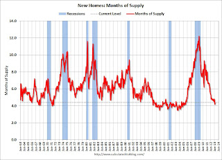 This is now in the normal range (less than 6 months supply is normal).
"The seasonally adjusted estimate of new houses for sale at the end of February was 152,000. This represents a supply of 4.4 months at the current sales rate."On inventory, according to the Census Bureau:
"A house is considered for sale when a permit to build has been issued in permit-issuing places or work has begun on the footings or foundation in nonpermit areas and a sales contract has not been signed nor a deposit accepted."Starting in 1973 the Census Bureau broke this down into three categories: Not Started, Under Construction, and Completed.
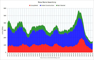 This graph shows the three categories of inventory starting in 1973.
The inventory of completed homes for sale is just above the record low. The combined total of completed and under construction is also just above the record low.
The last graph shows sales NSA (monthly sales, not seasonally adjusted annual rate).
In February 2013 (red column), 33 thousand new homes were sold (NSA). Last year 30 thousand homes were sold in February. This was the eight weakest February since this data has been tracked. The high for February was 109 thousand in 2005, and the low for February was 22 thousand in 2011.
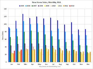
This was below expectations of 425,000 sales in February, but still a fairly solid report. I'll have more soon ...
Case-Shiller: Comp 20 House Prices increased 8.1% year-over-year in January
by Calculated Risk on 3/26/2013 09:18:00 AM
S&P/Case-Shiller released the monthly Home Price Indices for January ("January" is a 3 month average of November, December and January).
This release includes prices for 20 individual cities, and two composite indices (for 10 cities and 20 cities).
Note: Case-Shiller reports Not Seasonally Adjusted (NSA), I use the SA data for the graphs.
From S&P: Home Prices Accelerate in January 2013 According to the S&P/Case-Shiller Home Price Indices
Data through January 2013, released today by S&P Dow Jones Indices for its S&P/Case-Shiller Home Price Indices ... showed average home prices increased 7.3% for the 10-City Composite and 8.1% for the 20-City Composite in the 12 months ending in January 2013.
“The two headline composites posted their highest year-over-year increases since summer 2006,” says David M. Blitzer, Chairman of the Index Committee at S&P Dow Jones Indices. “This marks the highest increase since the housing bubble burst."
...
In January 2013, nine cities -- Atlanta, Charlotte, Las Vegas, Los Angeles, Miami, New York, Phoenix, San Francisco and Tampa -- and both Composites posted positive monthly returns. Dallas was the only MSAwhere the level remained flat.
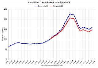 Click on graph for larger image.
 The first graph shows the nominal seasonally adjusted Composite 10 and Composite 20 indices (the Composite 20 was started in January 2000).
The Composite 10 index is off 29.3% from the peak, and up 1.0% in January (SA). The Composite 10 is up 7.3% from the post bubble low set in Feb 2012 (SA).
The Composite 20 index is off 28.4% from the peak, and up 1.0% (SA) in January. The Composite 20 is up 8.1% from the post-bubble low set in Jan 2012 (SA).
 The second graph shows the Year over year change in both indices.
The Composite 10 SA is up 7.3% compared to January 2012.
The Composite 20 SA is up 8.1% compared to January 2012. This was the eight consecutive month with a year-over-year gain since 2010 (when the tax credit boosted prices temporarily). This was the largest year-over-year gain for the Composite 20 index since 2006.
Prices increased (SA) in 20 of the 20 Case-Shiller cities in January seasonally adjusted (prices increased in 9 of 20 cities NSA). Prices in Las Vegas are off 55.9% from the peak, and prices in Denver only off 2.0% from the peak.
This was close to the consensus forecast for a 8.2% YoY increase. I'll have more on prices later.
LPS: Mortgage delinquencies decreased in February
by Calculated Risk on 3/26/2013 08:15:00 AM
According to the First Look report for February to be released today by Lender Processing Services (LPS), the percent of loans delinquent decreased in February compared to January, and declined about 6.5% year-over-year. Also the percent of loans in the foreclosure process declined further in February and were down significantly over the last year.
LPS reported the U.S. mortgage delinquency rate (loans 30 or more days past due, but not in foreclosure) decreased to 6.80% from 7.03% in January. Note: the normal rate for delinquencies is around 4.5% to 5%.
The percent of loans in the foreclosure process declined to 3.38% in February from 3.41% in January.
The number of delinquent properties, but not in foreclosure, is down about 8% year-over-year (301,000 fewer properties delinquent), and the number of properties in the foreclosure process is down 21% or 449,000 properties year-over-year.
The percent (and number) of loans 90+ days delinquent and in the foreclosure process is still very high, but the number of loans in the foreclosure process is now steadily declining.
LPS will release the complete mortgage monitor for February in early April.
| LPS: Percent Loans Delinquent and in Foreclosure Process | |||
|---|---|---|---|
| Feb 2013 | Jan 2013 | Feb 2012 | |
| Delinquent | 6.80% | 7.03% | 7.28% |
| In Foreclosure | 3.38% | 3.41% | 4.20% |
| Number of properties: | |||
| Number of properties that are 30 or more, and less than 90 days past due, but not in foreclosure: | 1,927,000 | 1,974,000 | 2,002,000 |
| Number of properties that are 90 or more days delinquent, but not in foreclosure: | 1,483,000 | 1,531,000 | 1,709,000 |
| Number of properties in foreclosure pre-sale inventory: | 1,694,000 | 1,703,000 | 2,143,000 |
| Total Properties | 5,104,000 | 5,208,000 | 5,854,000 |
Monday, March 25, 2013
Tuesday: New Home Sales, Case-Shiller House Prices, Durable Goods
by Calculated Risk on 3/25/2013 08:16:00 PM
This will be an interesting case to watch, from Reuters: Stockton, California bankruptcy eligibility trial starts
As the biggest U.S. city to file for bankruptcy, the outcome for Stockton will be an important test case for the $3.7 trillion U.S. municipal debt market. The hearing is expected to last most of this week.Usually employees, including pensions, come before bondholders and insurers in a bankruptcy case. But I don't know all the details of this case and I'm looking forward to reading the ruling.
Stockton, along with Jefferson County in Alabama and smaller San Bernardino, California, has said its bondholders will be asked to take losses.
...
Lawyers for bondholders and insurers, which will have to repay investors for any capital losses, argue the decision by Stockton to not seek to impair its largest creditor, the California Public Employees' Retirement System, shows a lack of good faith - a reason that should block Stockton's request for bankruptcy protection under federal bankruptcy law.
Tuesday economic releases:
• At 8:30 AM ET, Durable Goods Orders for February from the Census Bureau. The consensus is for a 3.5% increase in durable goods orders.
• At 9:00 AM, the S&P/Case-Shiller House Price Index for January will be released. The consensus is for a 8.2% year-over-year increase in the Composite 20 index (NSA) for January. The Zillow forecast is for the Composite 20 to increase 8.0% year-over-year, and for prices to increase 0.8% month-to-month seasonally adjusted.
• At 10:00 AM, New Home Sales for February from the Census Bureau. The consensus is for a decrease in sales to 425 thousand Seasonally Adjusted Annual Rate (SAAR) in February from 437 thousand in January. Even with the forecast decline in sales rate, this would be a 16% year-over-year increase in sales.
• Also at 10:00 AM, the Richmond Fed Survey of Manufacturing Activity for March. The consensus is for a reading of 5.5 for this survey, down from 6.0 in February (Above zero is expansion).
• Also at 10:00 AM, the Conference Board's consumer confidence index for March. The consensus is for the index to decrease to 69.0.
Existing Home Inventory is up 7.5% year-to-date on March 25th
by Calculated Risk on 3/25/2013 03:57:00 PM
Weekly Update: One of key questions for 2013 is Will Housing inventory bottom this year?. Since this is a very important question, I'm tracking inventory weekly this year.
In normal times, there is a clear seasonal pattern for inventory, with the low point for inventory in late December or early January, and then peaking in mid-to-late summer.
The NAR data is monthly and released with a lag. However Ben at Housing Tracker (Department of Numbers) has provided me some weekly inventory data for the last several years. This is displayed on the graph below as a percentage change from the first week of the year (to normalize the data).
In 2010 (blue), inventory followed the normal seasonal pattern, however in 2011 and 2012, there was only a small increase in inventory early in the year, followed by a sharp decline for the rest of the year.
So far - through March 25th - inventory is increasing faster than in 2011 and 2012. Housing Tracker reports inventory is down -21.2% compared to the same week in 2012 - still a rapid year-over-year decline.
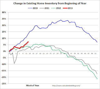 Click on graph for larger image.
Note: the data is a little weird for early 2011 (spikes down briefly).
In 2010, inventory was up 15% by the end of March, and close to 20% by the end of April.
For 2011 and 2012, inventory only increased about 5% at the peak and then declined for the remainder of the year.
So far in 2013, inventory is up 7.5% (above the peak percentage increase for 2011 and 2012) Right now I think inventory will not bottom until 2014, but it is still possible that inventory will bottom this year.
Bernanke: Central Banker policies are not "beggar-thy-neighbor"
by Calculated Risk on 3/25/2013 01:23:00 PM
This is a response to some analysts who think central bankers are currently following a "beggar-thy-neighbor" policy. Fed Chaiman Bernanke disagrees (so do I).
From Fed Chairman Ben Bernanke: Monetary Policy and the Global Economy. A few excerpts:
The uncoordinated abandonment of the gold standard in the early 1930s gave rise to the idea of "beggar-thy-neighbor" policies. According to this analysis, as put forth by important contemporary economists like Joan Robinson, exchange rate depreciations helped the economy whose currency had weakened by making the country more competitive internationally.5 Indeed, the decline in the value of the pound after 1931 was associated with a relatively early recovery from the Depression by the United Kingdom, in part because of some rebound in exports. However, according to this view, the gains to the depreciating country were equaled or exceeded by the losses to its trading partners, which became less internationally competitive--hence, "beggar thy neighbor." Over time, so-called competitive depreciations became associated in the minds of historians with the tariff wars that followed the passage of the Smoot-Hawley tariff in the United States. Both types of policies were decried--and in some textbooks, still are--as having prolonged the Depression by disrupting trade patterns while leading to an ultimately fruitless and destructive battle over shrinking international markets.
Economists still agree that Smoot-Hawley and the ensuing tariff wars were highly counterproductive and contributed to the depth and length of the global Depression. However, modern research on the Depression, beginning with the seminal 1985 paper by Barry Eichengreen and Jeffrey Sachs, has changed our view of the effects of the abandonment of the gold standard.6 Although it is true that leaving the gold standard and the resulting currency depreciation conferred a temporary competitive advantage in some cases, modern research shows that the primary benefit of leaving gold was that it freed countries to use appropriately expansionary monetary policies. By 1935 or 1936, when essentially all major countries had left the gold standard and exchange rates were market-determined, the net trade effects of the changes in currency values were certainly small. Yet the global economy as a whole was much stronger than it had been in 1931. The reason was that, in shedding the strait jacket of the gold standard, each country became free to use monetary policy in a way that was more commensurate with achieving full employment at home. Moreover, and critically, countries also benefited from stronger growth in trading partners that purchased their exports. In sharp contrast to the tariff wars, monetary reflation in the 1930s was a positive-sum exercise, whose benefits came mainly from higher domestic demand in all countries, not from trade diversion arising from changes in exchange rates.
The lessons for the present are clear. Today most advanced industrial economies remain, to varying extents, in the grip of slow recoveries from the Great Recession. With inflation generally contained, central banks in these countries are providing accommodative monetary policies to support growth. Do these policies constitute competitive devaluations? To the contrary, because monetary policy is accommodative in the great majority of advanced industrial economies, one would not expect large and persistent changes in the configuration of exchange rates among these countries. The benefits of monetary accommodation in the advanced economies are not created in any significant way by changes in exchange rates; they come instead from the support for domestic aggregate demand in each country or region. Moreover, because stronger growth in each economy confers beneficial spillovers to trading partners, these policies are not "beggar-thy-neighbor" but rather are positive-sum, "enrich-thy-neighbor" actions.
Dallas Fed: Regional Manufacturing Activity increased in March
by Calculated Risk on 3/25/2013 10:45:00 AM
From the Dallas Fed: Texas Manufacturing Activity Picks Up
Texas factory activity increased in March, according to business executives responding to the Texas Manufacturing Outlook Survey. The production index, a key measure of state manufacturing conditions, rose from 6.2 to 9.9, indicating a slightly faster pace of output growth. The share of manufacturers noting a decrease in production fell to its lowest level in two years.All of the regional manufacturing surveys released so far have indicated expansion in March, and this suggests a pickup in overall manufacturing following a weak period over the last 6 to 8 months.
Other survey measures also suggested a pickup in manufacturing activity, with the new orders and shipments indexes moving up strongly in March after dipping in February. The new orders index came in at 8.7, up from 2.8, and the shipments index rose 8 points to 10.6.
Perceptions of broader business conditions improved in March. The general business activity index rose from 2.2 to 7.4, reaching its highest level in a year. The company outlook index moved up from 6.3 to 9.6.
Labor market indicators remained mixed. The employment index has been in positive territory so far in 2013 and edged up to 2.6 in March. ... The hours worked index remained slightly negative but ticked up to from –3 to –2.4.
emphasis added


