by Calculated Risk on 9/26/2012 03:20:00 PM
Wednesday, September 26, 2012
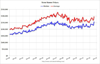
New Home Prices: Average Highest since 2008
As part of the new home sales report, the Census Bureau reported that the average price for new homes increased to the highest level since August 2008.
From the Census Bureau: "The median sales price of new houses sold in August 2012 was $256,900; the average sales price was $295,300."
The following graph shows the median and average new home prices.
 Click on graph for larger image.
During the bust, the builders had to build smaller and less expensive homes to compete with all the distressed sales. With fewer foreclosures now, it appears the builders are moving to slightly higher price points.
The second graph shows the percent of new home sales by price. At the peak of the housing bubble, almost 40% of new homes were sold for more than $300K - and over 20% were sold for over $400K.
 The percent of home over $300K declined to 20% in January 2009. Now it has rebounded to around 35%. And less than 10% were under $150K.
Earlier:
• New Home Sales at 373,000 SAAR in August
• New Home Sales and Distressing Gap
• New Home Sales graphs
New Home Sales and Distressing Gap
by Calculated Risk on 9/26/2012 12:51:00 PM
New home sales have averaged 362,000 on an annual rate basis through August. That means sales are on pace to increase 18% from last year (and based on the last few months, sales will probably increase more than 20% this year).
Here is a table showing sales and the change from the previous year since the peak in 2005:
| Year | New Home Sales (000s) | Change |
|---|---|---|
| 2005 | 1,283 | |
| 2006 | 1,051 | -18% |
| 2007 | 776 | -26% |
| 2008 | 485 | -38% |
| 2009 | 375 | -23% |
| 2010 | 323 | -14% |
| 2011 | 306 | -5% |
| 20121 | 362 | 18% |
| 12012 pace through July. | ||
But even with a 20%+ increase this year, 2012 will be the 3rd lowest year since the Census Bureau started tracking new home sales in 1963. This year will be above 2010 and 2011, and it is possible - with a fairly strong last four months - that sales will be close to the level in 2009.
Given the current low level of sales, and current market conditions (supply and demand), sales will probably continue to increase over the next few years. I don't expect sales to increase to 2005 levels, but something close to 800,000 is possible once the number of distressed sales declines to more normal levels.
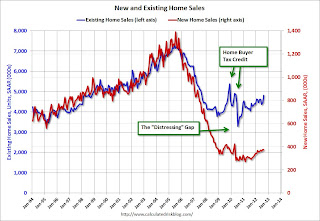
Here is an update to the distressing gap graph.
 Click on graph for larger image.
This "distressing gap" graph that shows existing home sales (left axis) and new home sales (right axis) through August. This graph starts in 1994, but the relationship has been fairly steady back to the '60s.
Following the housing bubble and bust, the "distressing gap" appeared mostly because of distressed sales. The flood of distressed sales has kept existing home sales elevated, and depressed new home sales since builders haven't been able to compete with the low prices of all the foreclosed properties.
I don't expect much of an increase in existing home sales (distressed sales will slowly decline and be offset by more conventional sales). But I do expect this gap to close - mostly from an increase in new home sales.
Note: Existing home sales are counted when transactions are closed, and new home sales are counted when contracts are signed. So the timing of sales is different.
Earlier:
• New Home Sales at 373,000 SAAR in August
• New Home Sales graphs
New Home Sales at 373,000 SAAR in August
by Calculated Risk on 9/26/2012 10:00:00 AM
The Census Bureau reports New Home Sales in August were at a seasonally adjusted annual rate (SAAR) of 373 thousand. This was down slightly from a revised 374 thousand SAAR in July (revised up from 372 thousand). Sales in June were revised up.
The first graph shows New Home Sales vs. recessions since 1963. The dashed line is the current sales rate.
Sales of new single-family houses in August 2012 were at a seasonally adjusted annual rate of 373,000... This is 0.3 percent below the revised July rate of 374,000, but is 27.7 percent above the August 2011 estimate of 292,000.
 Click on graph for larger image in graph gallery.
The second graph shows New Home Months of Supply.
The months of supply was unchanged in August at 4.5 months. July was revised down from 4.6 months.
The all time record was 12.1 months of supply in January 2009.
 This is now in the normal range (less than 6 months supply is normal).
The seasonally adjusted estimate of new houses for sale at the end of August was 141,000. This represents a supply of 4.5 months at the current sales rate.On inventory, according to the Census Bureau:
"A house is considered for sale when a permit to build has been issued in permit-issuing places or work has begun on the footings or foundation in nonpermit areas and a sales contract has not been signed nor a deposit accepted."Starting in 1973 the Census Bureau broke this down into three categories: Not Started, Under Construction, and Completed.
 This graph shows the three categories of inventory starting in 1973.
The inventory of completed homes for sale was at a record low 38,000 units in August. The combined total of completed and under construction is at the lowest level since this series started.
The last graph shows sales NSA (monthly sales, not seasonally adjusted annual rate).
In August 2012 (red column), 31 thousand new homes were sold (NSA). Last year only 25 thousand homes were sold in August. This was the third weakest August since this data has been tracked. The high for August was 110 thousand in 2005.
 Even though sales are still very low, new home sales have clearly bottomed. New home sales have averaged 362 thousand SAAR over the first 8 months of 2012, after averaging under 300 thousand for the previous 18 months. Most of the recent revisions have been up too.
This was below expectations of 380,000, but this was another fairly solid report and indicates an ongoing sluggish recovery in residential investment.
MBA: Mortgage Refinance Activity increases as mortgage rates fall to new survey lows
by Calculated Risk on 9/26/2012 07:03:00 AM
From the MBA: Mortgage Rates Drop to New Survey Lows
The Refinance Index increased 3 percent from the previous week to the highest level in six weeks. The seasonally adjusted Purchase Index increased 1 percent from one week earlier.
The average contract interest rate for 30-year fixed-rate mortgages with conforming loan balances ($417,500 or less) decreased to 3.63 percent, the lowest rate in the history of the survey, from 3.72 percent, with points decreasing to 0.41 from 0.45 (including the origination fee) for 80 percent loan-to-value ratio (LTV) loans.
 Click on graph for larger image.
The first graph shows the MBA mortgage purchase index. The purchase index has been mostly moving sideways over the last two years.
So far the purchase index has not indicated an increase in purchase activity, although the recent Fed survey of loan officers suggested there has been some increase.
 The second graph shows the refinance index.
The refinance activity is at the highest level in six weeks and has been generally moving up over the last year.
Tuesday, September 25, 2012
Wednesday: New Home Sales
by Calculated Risk on 9/25/2012 08:53:00 PM
A couple of "zingers" from the WSJ: Seven Zingers in Sheila Bair’s New Book
On Mr. Paulson not having time to meet with her early on: “Clearly, the former CEO of Goldman Sachs didn’t think the head of an agency that insured $100,000 bank deposits was worth his time. That would change...”On Wednesday:
Ms. Bair got zinged herself by a protester outside the Treasury building during TARP negotiations, mistaking her for a “fat cat” banker as she exited. “How much did that suit cost?” the protester asked. $139 at Macy’s, Bair replied.
• At 7:00 AM ET, The Mortgage Bankers Association (MBA) will release the mortgage purchase applications index. Look for record low mortgage rates and some pickup in refinance activity.
• At 10:00 AM, the Census Bureau will release the New Home Sales report for August. The consensus is for an increase in sales to 380 thousand Seasonally Adjusted Annual Rate (SAAR) in August from 372 thousand in July. Watch for possible upgrades to the sales rates for previous months.
A question for the September economic prediction contest:
DOT: Vehicle Miles Driven decreased 0.3% in July
by Calculated Risk on 9/25/2012 05:54:00 PM
The Department of Transportation (DOT) reported today:
Travel on all roads and streets changed by -0.3% (-0.8 billion vehicle miles) for July 2012 as compared with July 2011. Travel for the month is estimated to be 258.3 billion vehicle miles.The following graph shows the rolling 12 month total vehicle miles driven.
Cumulative Travel for 2012 changed by +0.9% (14.8 billion vehicle miles).
The rolling 12 month total is still mostly moving sideways.
 Click on graph for larger image.
In the early '80s, miles driven (rolling 12 months) stayed below the previous peak for 39 months.
Currently miles driven has been below the previous peak for 56 months - and still counting.
The second graph shows the year-over-year change from the same month in the previous year.
 Gasoline prices peaked in April at close to $4.00 per gallon, and then started falling.
Gasoline prices were down in July to an average of $3.50 per gallon according to the EIA. Last year, prices in July averaged $3.70 per gallon - and even with the decline in gasoline prices, miles driven declined year-over-year in July.
Just looking at gasoline prices suggest miles driven will be down in August too.
However, as I've mentioned before, gasoline prices are just part of the story. The lack of growth in miles driven over the last 4+ years is probably also due to the lingering effects of the great recession (high unemployment rate and lack of wage growth), the aging of the overall population (over 55 drivers drive fewer miles) and changing driving habits of young drivers. With all these factors, it may be years before we see a new peak in miles driven.
Earlier on house prices:
• Case-Shiller: House Prices increased 1.2% year-over-year in July
• House Price Comments, Real House Prices, Price-to-Rent Ratio
Misc: Richmod Fed Mfg Survey Improves, Consumer Confidence increases
by Calculated Risk on 9/25/2012 04:06:00 PM
Catching up on a few earlier releases ...
• From the Richmond Fed: Manufacturing Activity Ticked Up in September; New Orders Turned Positive
In September, the seasonally adjusted composite index of manufacturing activity — our broadest measure of manufacturing — gained thirteen points to 4 from August's reading of −9. Among the index's components, shipments rose eight points to 9, new orders picked up twenty-seven points to end at 7, and the jobs index held steady at −5.This expansion followed three months of contraction in this index and was better than expected.
• From the Conference Board: Consumer Confidence Index® Increases in September. Index Improves Nine Points
The Conference Board Consumer Confidence Index®, which had declined in August, improved in September. The Index now stands at 70.3 (1985=100), up from 61.3 in August.This was above expectations.
• From the FHFA: FHFA House Price Index Up 0.2 Percent in July
U.S. house prices rose 0.2 percent on a seasonally adjusted basis from June to July, according to the Federal Housing Finance Agency’s monthly House Price Index. ... For the 12 months ending in July, U.S. prices rose 3.7 percent.Earlier on house prices:
• Case-Shiller: House Prices increased 1.2% year-over-year in July
• House Price Comments, Real House Prices, Price-to-Rent Ratio
Philly Fed: State Coincident Indexes in August show weakness
by Calculated Risk on 9/25/2012 02:00:00 PM
From the Philly Fed:
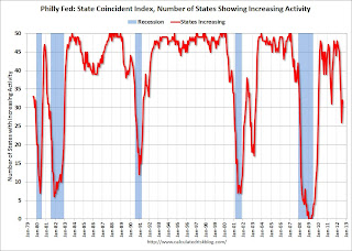
The Federal Reserve Bank of Philadelphia has released the coincident indexes for the 50 states for August 2012. In the past month, the indexes increased in 25 states, decreased in 12 states, and remained stable in 13 states, for a one-month diffusion index of 26. Over the past three months, the indexes increased in 28 states, decreased in 16 states, and remained stable in six states, for a three-month diffusion index of 24.Note: These are coincident indexes constructed from state employment data. From the Philly Fed:
The coincident indexes combine four state-level indicators to summarize current economic conditions in a single statistic. The four state-level variables in each coincident index are nonfarm payroll employment, average hours worked in manufacturing, the unemployment rate, and wage and salary disbursements deflated by the consumer price index (U.S. city average). The trend for each state’s index is set to the trend of its gross domestic product (GDP), so long-term growth in the state’s index matches long-term growth in its GDP.
 Click on graph for larger image.
This is a graph is of the number of states with one month increasing activity according to the Philly Fed. This graph includes states with minor increases (the Philly Fed lists as unchanged).
In August, 32 states had increasing activity, up from 26 in July. The last four months have been weak following eight months of widespread growth geographically.
 Here is a map of the three month change in the Philly Fed state coincident indicators. This map was all red during the worst of the recession.
 And the map was all green just earlier this year.
Now there are a number of red states again.
Earlier on house prices:
• Case-Shiller: House Prices increased 1.2% year-over-year in July
• House Price Comments, Real House Prices, Price-to-Rent Ratio
House Price Comments, Real House Prices, Price-to-Rent Ratio
by Calculated Risk on 9/25/2012 11:08:00 AM
Case-Shiller reported the second consecutive year-over-year (YoY) gain in their house price indexes since 2010 - and the increase back in 2010 was related to the housing tax credit. Excluding the tax credit, the previous YoY increase was back in 2006. The YoY increase in July suggests that house prices probably bottomed earlier this year (the YoY change lags the turning point for prices).
On a Not Seasonally Adjusted (NSA) basis, the Case-Shiller 10-City composite is up 7.4% from the post-bubble low earlier this year, and the 20-City is up 7.8% from the post-bubble low. That is a significant increase, and even when NSA prices start to decline month-over-month in the September or October reports, I expect that house prices will remain above the recent low.
On a seasonally adjusted (SA) basis, prices are up 3.7% and 4.0% from the March lows for the 10-city and 20-city composite indexes.
However, no one should expect the strong price increases to continue. The Case-Shiller Composite 20 index NSA was up 1.6% from June to July. However a large portion of that increase was seasonal. On a Seasonally Adjusted (SA) basis, the Composite 20 index was up 0.4%. That is a 5% annualized rate - and that will probably not continue. I suspect much of the increase over the last few months was a "bounce off the bottom" and prices increases over the next year or two will probably be more gradual.
Here is another update to a few graphs: Case-Shiller, CoreLogic and others report nominal house prices, and it is also useful to look at house prices in real terms (adjusted for inflation) and as a price-to-rent ratio. Real prices, and the price-to-rent ratio, are back to late 1999 to 2000 levels depending on the index.
Nominal House Prices
 Click on graph for larger image.
The first graph shows the quarterly Case-Shiller National Index SA (through Q2 2012), and the monthly Case-Shiller Composite 20 SA and CoreLogic House Price Indexes (through July) in nominal terms as reported.
In nominal terms, the Case-Shiller National index (SA) is back to Q1 2003 levels (and also back up to Q4 2010), and the Case-Shiller Composite 20 Index (SA) is back to July 2003 levels, and the CoreLogic index (NSA) is back to December 2003.
Real House Prices
 The second graph shows the same three indexes in real terms (adjusted for inflation using CPI less Shelter). Note: some people use other inflation measures to adjust for real prices.
In real terms, the National index is back to mid-1999 levels, the Composite 20 index is back to July 2000, and the CoreLogic index back to February 2001.
In real terms, most of the appreciation early in the last decade is gone.
Price-to-Rent
In October 2004, Fed economist John Krainer and researcher Chishen Wei wrote a Fed letter on price to rent ratios: House Prices and Fundamental Value. Kainer and Wei presented a price-to-rent ratio using the OFHEO house price index and the Owners' Equivalent Rent (OER) from the BLS.
 Here is a similar graph using the Case-Shiller National, Composite 20 and CoreLogic House Price Indexes.
This graph shows the price to rent ratio (January 1998 = 1.0).
On a price-to-rent basis, the Case-Shiller National index is back to Q3 1999 levels, the Composite 20 index is back to June 2000 levels, and the CoreLogic index is back to February 2001.
In real terms - and as a price-to-rent ratio - prices are mostly back to late 1990s or early 2000 levels.
Case-Shiller: House Prices increased 1.2% year-over-year in July
by Calculated Risk on 9/25/2012 09:00:00 AM
S&P/Case-Shiller released the monthly Home Price Indices for July (a 3 month average of May, June and July).
This release includes prices for 20 individual cities, and two composite indices (for 10 cities and 20 cities).
Note: Case-Shiller reports NSA, I use the SA data.
From S&P: Home Prices Increase Again in July 2012 According to the S&P/Case-Shiller Home Price Indices
Data through July 2012, released today by S&P Dow Jones Indices for its S&P/Case-Shiller Home Price Indices ... showed average home prices increased by 1.5% for the 10-City Composite and by 1.6% for the 20-City Composite in July versus June 2012. For the third consecutive month, all 20 cities and both Composites recorded positive monthly changes. It would have been a fourth had prices not fallen by 0.6% in Detroit back in April.
The 10- and 20-City Composites posted annual returns of +0.6% and +1.2% in July 2012, up from their unchanged and +0.6% annual rates posted for June 2012. Fifteen of the 20 MSAs and both Composites posted better annual returns in July as compared to June 2012.
...
“Home prices increased again in July,” says David M. Blitzer, Chairman of the Index Committee at S&P Dow Jones Indices. “All 20 cities and both Composites were up on the month for the third time in a row. Even better, 16 of the 20 cities and both Composites rose over the last year. Atlanta remains the weakest city but managed to cut the annual loss to just under 10%.
“Among the cities, Miami and Phoenix are both well off their bottoms with positive monthly gains since the end of 2011. Many of the markets we follow have seen some decent recovery from their respective lows – San Francisco up 20.4%, Detroit up 19.7%, Phoenix up 17.0% and Minneapolis up 16.5%, to name the top few. These were some of the markets that were hit the hardest when the housing bubble burst in 2006.
 Click on graph for larger image.
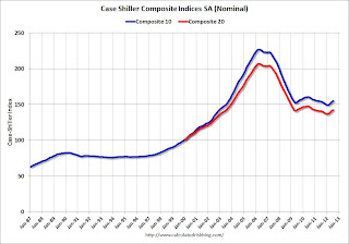
 The first graph shows the nominal seasonally adjusted Composite 10 and Composite 20 indices (the Composite 20 was started in January 2000).
The Composite 10 index is off 31.7% from the peak, and up 0.4% in July (SA). The Composite 10 is up 3.7% from the post bubble low set in March (SA).
The Composite 20 index is off 31.2% from the peak, and up 0.4% (SA) in July. The Composite 20 is up 4.0% from the post-bubble low set in March (SA).
 The second graph shows the Year over year change in both indices.
The Composite 10 SA is up 0.6% compared to July 2011.
The Composite 20 SA is up 1.2% compared to July 2011. This was the second year-over-year gain since 2010 (when the tax credit boosted prices temporarily).
The third graph shows the price declines from the peak for each city included in S&P/Case-Shiller indices.
 Prices increased (SA) in 18 of the 20 Case-Shiller cities in July seasonally adjusted (all 20 cities increased NSA). Prices in Las Vegas are off 59.8% from the peak, and prices in Dallas only off 5.9% from the peak. Note that the red column (cumulative decline through July 2012) is above previous declines for all cities.
This was at the consensus forecast and the recent change to a year-over-year increase is significant. I'll have more on prices later.


