by Calculated Risk on 12/23/2010 11:58:00 AM
Thursday, December 23, 2010
Comments on November Personal Income and Outlays Report
The BEA released the Personal Income and Outlays report for November this morning.
Personal income increased $42.3 billion, or 0.3 percent ... Personal consumption expenditures (PCE) increased $43.3 billion, or 0.4 percent.The following graph shows real Personal Consumption Expenditures (PCE) through November (2005 dollars). Note that the y-axis doesn't start at zero to better show the change.
...
Real PCE -- PCE adjusted to remove price changes -- increased 0.3 percent in November, compared with an increase of 0.5 percent in October.
 Click on graph for large image.
The quarterly change in PCE is based on the change from the average in one quarter, compared to the average of the preceding quarter.
The two-month method of estimating real PCE growth for Q4 (a fairly accurate method), suggests real PCE growth of 4.3% in Q4! So this looks like a pretty strong quarter for growth in personal consumption. The last time real PCE grew at more than 4% was in 2006.
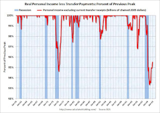
Also personal income less transfer payments increased again in November. This increased to $9,305 billion (SAAR, 2005 dollars) from $9,282 billion in October. This measure had stalled out over the summer.
 This graph shows real personal income less transfer payments as a percent of the previous peak. This has been slow to recover - and is still 4.5% below the previous peak - but personal income less transfer payments is growing again.
Some of the increase in spending came from a decline in the personal saving rate, but overall this was a positive report and suggests solid GDP growth in Q4 (3% or higher).
New Home Sales weak in November
by Calculated Risk on 12/23/2010 10:00:00 AM
The Census Bureau reports New Home Sales in November were at a seasonally adjusted annual rate (SAAR) of 290 thousand. This is up from a revised 275 thousand in October.
 Click on graph for larger image in new window.
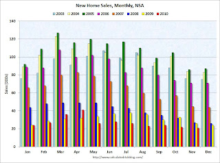
The first graph shows monthly new home sales (NSA - Not Seasonally Adjusted or annualized).
Note the Red columns for 2010. In November 2010, 21 thousand new homes were sold (NSA). This is a new record low for November.
The previous record low for the month of November was 26 thousand in 1966 and 2009; the record high was 86 thousand in November 2005.
 The second graph shows New Home Sales vs. recessions since 1963. The dashed line is the current sales rate.
Sales of new single-family houses in November 2010 were at a seasonally adjusted annual rate of 290,000 ... This is 5.5 percent (±16.2%)* above the revised October rate of 275,000, but is 21.2 percent (±13.3%) below the November 2009 estimate of 368,000And another long term graph - this one for New Home Months of Supply.
 Months of supply decreased to 8.2 in November from 8.8 in October. The all time record was 12.4 months of supply in January 2009. This is still high (less than 6 months supply is normal).
The seasonally adjusted estimate of new houses for sale at the end of November was 197,000. This represents a supply of 8.2 months at the current sales rate.
 The final graph shows new home inventory.
 The 290 thousand annual sales rate for November is just above the all time record low in August (274 thousand). This was the weakest November on record and below the consensus forecast of 300 thousand.
This was another very weak report.
Weekly Initial Unemployment Claims at 420,000
by Calculated Risk on 12/23/2010 08:30:00 AM
The DOL reports on weekly unemployment insurance claims:
In the week ending Dec. 18, the advance figure for seasonally adjusted initial claims was 420,000, a decrease of 3,000 from the previous week's revised figure of 423,000. The 4-week moving average was 426,000, an increase of 2,500 from the previous week's revised average of 423,500.
 Click on graph for larger image in new window.
This graph shows the 4-week moving average of weekly claims since January 2000.
The dashed line on the graph is the current 4-week average. The four-week average of weekly unemployment claims increased this week by 3,000 to 426,000.
In general the four-week moving average has been declining ... and that is good news.
Wednesday, December 22, 2010
Public Pensions: An Alabama Town as a Possible Future
by Calculated Risk on 12/22/2010 10:33:00 PM
Two stories on Prichard, Ala ...
From the NY Times: Alabama Town’s Failed Pension Is a Warning
Prichard did something that pension experts say they have never seen before: it stopped sending monthly pension checks to its 150 retired workers, breaking a state law requiring it to pay its promised retirement benefits in full.And from the WSJ: Chapter 9 Weighed in Pension Woes
Prichard proposed capping benefits to current retirees at about $200 a month, down from monthly payments of as much as $3,000. "That's not a hair cut, that's a scalping," said Larry Voit, who represented a group of 40 retired city workers in Prichard, population 27,500.Prichard's pension was in far worse shape than most public plans, but the outcome in Prichard could serve as a guide for other plans ...
Earlier:
• November Existing Home Sales: 4.68 million SAAR, 9.5 months of supply
• Existing Home Inventory increases 5.4% Year-over-Year
Older Workers and the Lump of Labor Fallacy
by Calculated Risk on 12/22/2010 06:58:00 PM
Paula Span writes an excellent piece about older workers in the NY Times: Toil and Trouble
“There are some pretty striking changes going on,” said John Rother, AARP executive vice president for policy.Paula Span notes that this trend has been going on for some time, and can't just be blamed on necessity.
I’ll say. Sifting through the data from the Bureau of Labor Statistics, AARP analysts found that the number of workers ages 75 and older (meaning they’re employed or seeking employment) has grown to about 1.3 million in 2009, from just under half a million in 1989. That’s still a small sliver of the population over age 75, just 7.3 percent, but a big jump from the 1989 labor force participation rate of 4.3 percent.
 Click on graph for larger image in graph gallery.
This graph is from my posts on Labor Force Participation Rate: What will happen? and Labor Force Participation Trends, Over 55 Age Groups
The graph shows the participation rate for several over 55 age groups. The red line is the '55 and over' total seasonally adjusted. All of the other age groups are Not Seasonally Adjusted (NSA).
The participation rate is trending up for all older age groups.
Unfortunately Span concluded:
So to that Wisconsin reader who grumped, “Too many older people (professors, Morley Safer, etc.) continue to work for selfish reasons, thereby taking jobs from the young and unemployed” — I’m afraid you ain’t seen nothin’ yet.That is a classic lump of labor fallacy. This is a common error people make with immigration - that immigrants displace other workers, when in fact immigration increases the size of the economy. I suspect we will see more and more of this age related "lump of labor" fallacy. The number of jobs in the economy is not fixed, and people staying in the work force just means the economy will be larger.
Question #9 for 2011: Inflation
by Calculated Risk on 12/22/2010 04:20:00 PM
Over the weekend I posted some questions for next year: Ten Economic Questions for 2011. I'll try to add some predictions, or at least some thoughts for each question - working backwards - before the end of year.
Remember, I have no crystal ball and I'm sure many people will disagree, especially about inflation. There are some people who have been predicting an imminent sharp rise in inflation for almost 2 years (it is always just around the corner). And many people argue that the standard inflation measures don't capture what they are actually seeing. I understand - each household has their own inflation measure, but we need to use some sort of aggregate measure.
Here was the question ...
9) Inflation: With all the slack in the system, will the U.S. inflation rate stay below target? Will there be any spillover from rising inflation rates in China and elsewhere?
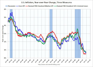
First lets look at the current situation. Over the last 12 months, several key measures of inflation have shown small increases: CPI (Consumer Price Index) rose 1.1%, the median CPI increased 0.5%, the trimmed-mean CPI increased 0.8%, core CPI (less food and energy) increased 0.8%, and core PCE prices increased 1.2% (Q3 2009 to Q3 2010).
 Click on graph for larger image in graph gallery.
This graph shows core CPI, median CPI and trimmed-mean CPI on a year-over-year basis.
They all show that inflation has been falling, and that measured inflation is up less than 1% year-over-year.
This makes sense because of the slack in the system (unemployment rate, capacity utilization, residential vacancy rates and more). Also inflation expectation measures are not indicating a significant increase in inflation.
It does appear that residential vacancy rates are now falling (from high levels), and rents appear to have bottomed, but it doesn't appear that rents will be rising rapidly any time soon.
For more on inflation, and a discussion of inflation measures, see Dr. Dave Altig's post today: An inflation (or lack thereof) chart show. Altig concludes:
I believe this is basically the bottom line: whether we look at headline inflation (straight-up, component-by-component, or in terms of the long-run trend), core inflation measures (of virtually any sensible variety), or inflation expectations (survey or market based), there is little a hint of building inflationary pressure.I agree with Dr. Altig. My view is:
• I think the inflation rate (by these measures) will stay below the Fed's 2% target throughout 2011 (I'll guess close to 1%).
• I think rising prices in China, and rising commodity prices (like oil at $90 per barrel), will cause little spillover into U.S. inflation in 2011.
Ten Questions:
• Question #1 for 2011: House Prices
• Question #2 for 2011: Residential Investment
• Question #3 for 2011: Delinquencies and Distressed house sales
• Question #4 for 2011: U.S. Economic Growth
• Question #5 for 2011: Employment
• Question #6 for 2011: Unemployment Rate
• Question #7 for 2011: State and Local Governments
• Question #8 for 2011: Europe and the Euro
• Question #9 for 2011: Inflation
• Question #10 for 2011: Monetary Policy
Misc: Oil over $90, Bonds Sell-off in Ireland and Greece, Q3 GDP
by Calculated Risk on 12/22/2010 02:19:00 PM
• From the WSJ: Oil Passes $90 as Supplies Tighten
And from Professor Hamilton, a discussion about the impact of oil prices on economic growth from a couple weeks ago: Worrying about oil prices
• Yields are rising again in Ireland and Greece. The Ireland 10-year bond yield is up to 8.97%, the highest level since the "bailout". And the Greece 10-year bond yield is over 12% for the first time since the crisis in May. Something to watch. It seems another blowup in Europe is just around the corner.
• Q3 real GDP growth was revised up slightly to 2.6% from 2.5% (annualized rate). The key changes were that Personal consumption expenditures (PCE) growth was revised down to 2.4% from 2.8%, and changes in private inventories were estimated to contribute 1.61 percentage points to GDP growth compared to 1.30 percentage points in the 2nd estimate. This means final demand was slightly weaker than originally reported, and the increase in inventory slightly higher.
Existing Home Inventory increases 5.4% Year-over-Year
by Calculated Risk on 12/22/2010 11:15:00 AM
Earlier the NAR released the existing home sales data for November; here are a couple more graphs ...
The first graph shows the year-over-year (YoY) change in reported existing home inventory and months-of-supply. Inventory is not seasonally adjusted, so it really helps to look at the YoY change.
IMPORTANT: On a seasonal basis, inventory usually bottoms in December and January, and then will start increasing again in February and March. Since the NAR "months-of-supply" metric uses Seasonally Adjusted (SA) sales, but Not Seasonally Adjusted (NSA) inventory, this seasonal decline in inventory will lead to a lower "months-of-supply" in December and January. I expect inventory in December to decline to around 3.4 million units, and the months-of-supply to fall to the mid-to-high 8s.
The key is to recognize the seasonal pattern, and watch the YoY change in inventory.
 Click on graph for larger image in graph gallery.
Although inventory decreased from October to November, inventory increased 5.4% YoY in November.
The year-over-year increase in inventory is especially bad news because the reported inventory is very high (3.71 million), and the 9.5 months of supply in November is well above normal.
 By request - the second graph shows existing home sales Not Seasonally Adjusted (NSA).
The red columns are for 2010.
Sales NSA were slightly above the level in 2008, but well below the level in other years.
The bottom line: Sales were weak in November - below consensus and close to Tom Lawler's forecast - and existing home sales will continue to be weak for some time.
Inventory is very high, and the year-over-year increase in inventory is very concerning. The high level of inventory will continue to put downward pressure on house prices.
November Existing Home Sales: 4.68 million SAAR, 9.5 months of supply
by Calculated Risk on 12/22/2010 10:00:00 AM
The NAR reports: Existing-Home Sales Resume Uptrend with Stable Prices
Existing-home sales, which are completed transactions that include single-family, townhomes, condominiums and co-ops, rose 5.6 percent to a seasonally adjusted annual rate of 4.68 million in November from 4.43 million in October, but are 27.9 percent below the cyclical peak of 6.49 million in November 2009, which was the initial deadline for the first-time buyer tax credit.
...
Total housing inventory at the end of November fell 4.0 percent to 3.71 million existing homes available for sale, which represents a 9.5-month supply at the current sales pace, down from a 10.5-month supply in October.
 Click on graph for larger image in new window.
This graph shows existing home sales, on a Seasonally Adjusted Annual Rate (SAAR) basis since 1993.
Sales in November 2010 (4.68 million SAAR) were 5.6% higher than last month, and were 27.9% lower than November 2009.
 The second graph shows nationwide inventory for existing homes.
According to the NAR, inventory decreased to 3.71 million in November from 3.86 million in October. The all time record high was 4.58 million homes for sale in July 2008.
Inventory is not seasonally adjusted and there is a clear seasonal pattern with inventory peaking in the summer and declining in the fall. I'll have more on inventory later ...
 The last graph shows the 'months of supply' metric.
Months of supply decreased to 9.5 months in November from 10.5 months in October. This is very high and suggests prices, as measured by the repeat sales indexes like Case-Shiller and CoreLogic, will continue to decline.
These weak numbers are below the consensus of 4.85 million SAAR, are are close to what I expected (Lawler's forecast was 4.61 million). I'll have more later.
MBA: Mortgage Refinance activity declines sharply
by Calculated Risk on 12/22/2010 07:54:00 AM
The MBA reports: Mortgage Applications Decrease in Latest MBA Weekly Survey
The Refinance Index decreased 24.6 percent from the previous week. The Refinance Index has declined six straight weeks and is at its lowest level since the week ending April 30, 2010. The seasonally adjusted Purchase Index decreased 2.5 percent from one week earlier.
...
The average contract interest rate for 30-year fixed-rate mortgages increased to 4.85 percent from 4.84 percent, with points decreasing to 0.96 from 1.33 (including the origination fee) for 80 percent loan-to-value (LTV) ratio loans.
 Click on graph for larger image in new window.
This graph shows the MBA Purchase Index and four week moving average since 1990.
The four-week moving average of the purchase index is at about the levels of 1997 - and about 17% below the levels of April this year - suggesting weak existing home sales through January 2011.


