by Calculated Risk on 11/30/2010 08:06:00 PM
Tuesday, November 30, 2010
Hamilton: Europe and China: is this deja vu all over again?
Earlier on house prices:
• Case-Shiller: Broad-based Declines in Home Prices in Q3
• Real House Prices, Q3 2010
Professor Hamilton presents several charts on rising bond yields in Europe, the decline in China's stock market, and the appreciation of the dollar. Hamilton asks: Europe and China: is this deja vu all over again?
If this is deja vu all over again, what might we expect next? What happened last spring was a flight to the dollar as a seemingly safe refuge. And there's been some appreciation of the dollar with the latest events as well, with more to come if history repeats itself.Hamilton didn't mention the U.S. stock market, but as the dollar strengthened against the euro in the spring, and the Shanghai composite sold off about 25% from the peak in mid-April, the S&P 500 also sold off about 15% from the peak in April. Currently the Shanghai is off about 10% from the peak in early November. I don't know if this will be deja vu all over again ...
But this is a slower-moving and broader wave than the first one. And tsunamis pack much more power than a simple crashing breaker.
Europe Update and more
by Calculated Risk on 11/30/2010 04:16:00 PM
On Europe:
• From the WSJ: Fresh Round of 'Stress Tests' Planned for European Banks
The [first stress] tests were largely discredited by revelations that they lacked rigor, including a Wall Street Journal report in September that the tests understated some banks' holdings of potentially risky sovereign bonds. ... "There was some variety in terms of rigor and application of [the initial] tests," European Economic and Monetary Affairs Commissioner Olli Rehn said in Brussels.Oh yeah. Ireland's banks passed the initial stress tests in July! And we know how that worked out.
• From the Financial Times: Trichet hints at more bond purchases. The Financial Times quotes European Central Bank president Jean-Claude Trichet as saying “pundits are under-estimating the determination of governments” and “I don’t think that financial stability in the eurozone, given what I know, could really be called into question.”
• From Bloomberg: Italy-Germany 10-Year Yield Spread Reaches 200 Points, Widest Since 1997. That is just a sample of the headlines on European bonds. And everyone is trying to figure out how to add "B" to PIIGS.
And on a more positive note ...
• The Chicago PMI for November (released this morning) was stronger than expected. Production (at 62.5) "reached its highest level since February 2005", and new orders (67.2) increased "to a level not seen since 2007. The employment index increased to 56.3 from 54.6 in October. This continues the trend of stronger reports recently. I'll have an employment preview on Thursday, and I'll probably take the over again this month (consensus is 145,000 non-farm payroll jobs).
Rumor: WikiLeaks to release BofA documents?
by Calculated Risk on 11/30/2010 02:23:00 PM
From Andy Greenberg at Forbes yesterday: WikiLeaks’ Julian Assange Wants To Spill Your Corporate Secrets (ht Robert)
Early next year, Julian Assange says, a major American bank will suddenly find itself turned inside out. Tens of thousands of its internal documents will be exposed on Wikileaks.org ... The data dump will lay bare the finance firm’s secrets on the Web for every customer, every competitor, every regulator to examine and pass judgment on.And from Andy Greenberg today: Is Bank Of America WikiLeaks’ Next Target?
[A]n eagle-eyed reader has sent me a link to a quote from a Computer World interview with Assange from October of 2009, which, if true, may contain a clue to that bank’s identity:“At the moment, for example, we are sitting on five gigabytes from Bank of America, one of the executive’s hard drives,” he said. “Now how do we present that? It’s a difficult problem. We could just dump it all into one giant Zip file, but we know for a fact that has limited impact. To have impact, it needs to be easy for people to dive in and search it and get something out of it.”
Real House Prices, Q3 2010
by Calculated Risk on 11/30/2010 12:04:00 PM
This morning, S&P reported that there were "broad based" house price declines in Q3. And earlier this month, CoreLogic reported that house prices declined 1.8% in September.
The following graph shows the Case-Shiller National index (quarterly), the Case-Shiller Composite 20 index, and the CoreLogic House Price Index in real terms (adjusted for inflation using CPI less shelter).
 Click on graph for larger image in new window.
In real terms, all three indexes are back to 2000 / 2001 prices. The real Case-Shiller national index is at a new cycle low, and the real Case-Shiller Composite 20 and real CoreLogic indexes are just above the cycle low (and will be at new lows soon).
A few key points:
• In many areas - if the population is increasing - house prices increase slightly faster than inflation over time, so there is an upward slope in real prices.
• Even if real prices are still too high, they are much closer to the eventual bottom than the top in 2005. This isn't like in 2005 when prices were way out of the normal range.
• With high levels of inventory, prices will probably fall some more. (My forecast earlier this year was for 5% to 10% additional price declines on the repeat sales indexes).
Case-Shiller: Broad-based Declines in Home Prices in Q3
by Calculated Risk on 11/30/2010 09:00:00 AM
S&P/Case-Shiller released the monthly Home Price Indices for September (actually a 3 month average of July, August and September).
This includes prices for 20 individual cities, and two composite indices (10 cities and 20 cities), and the quarterly national index.
Note: Case-Shiller reports NSA, I use the SA data.
From S&P: Broad-based Declines in Home Prices in the 3rd Quarter of 2010
Data through September 2010, released today by Standard & Poor’s for its S&P/Case-Shiller Home Price Indices ... show that the U.S. National Home Price Index declined 2.0% in the third quarter of 2010, after having risen 4.7% in the second quarter. Nationally, home prices are 1.5% below their year-earlier levels. In September, 18 of the 20 MSAs covered by S&P/Case-Shiller Home Price Indices and both monthly composites were down; and only the two composites and five MSAs showed year-over-year gains. While housing prices are still above their spring 2009 lows, the end of the tax incentives and still active foreclosures appear to be weighing down the market.
 Click on graph for larger image in new window.
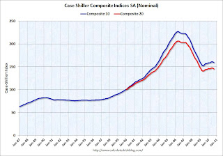
 The first graph shows the nominal seasonally adjusted Composite 10 and Composite 20 indices (the Composite 20 was started in January 2000).
The Composite 10 index is off 29.8% from the peak, and down 0.7% in September(SA).
The Composite 20 index is off 29.6% from the peak, and down 0.8% in September (SA).
 The second graph shows the Year over year change in both indices.
The Composite 10 is up 1.5% compared to September 2009.
The Composite 20 is up 0.5% compared to September 2009.
Case-Shiller reported that nationally home prices are 1.5% below their year-earlier levels. The year-over-year increases in the composite indexes are slowing, and will probably be negative later this year.
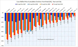
The third graph shows the price declines from the peak for each city included in S&P/Case-Shiller indices.
 Prices increased (SA) in only 1 of the 20 Case-Shiller cities in September seasonally adjusted. Only Wash, D.C. saw a price increase (SA) in September, and that was very small.
 Prices in Las Vegas are off 57.6% from the peak, and prices in Dallas only off 8.1% from the peak.
Prices are now falling - and falling just about everywhere. And it appears there are more price declines coming (based on inventory levels and anecdotal reports).
Monday, November 29, 2010
Restaurant Performance Index highest in three years
by Calculated Risk on 11/29/2010 10:45:00 PM
This is one of several industry specific indexes I track each month.
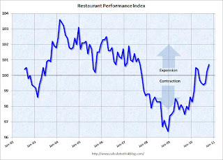
 Click on graph for larger image in new window.
Unfortunately the data for this index only goes back to 2002.
Note: Any reading above 100 shows expansion for this index.
From the National Restaurant Association (NRA): Restaurant Performance Index highest in three years
"The National Restaurant Association’s Restaurant Performance Index in October reached 100.7. This is the highest level for the index in over three years, since September 2007, and reflects a strengthening environment of consumer spending at restaurants." said Hudson Riehle, senior vice president of the Research and Knowledge Group for the National Restaurant Association.
Restraurants are a discretionary expense, and this expansion suggests consumers are becoming more confident.
DOT: Vehicle miles driven increased in September
by Calculated Risk on 11/29/2010 05:49:00 PM
The Department of Transportation (DOT) reported that vehicle miles driven in September were up 1.5% compared to September 2009:
Travel on all roads and streets changed by +1.5% (3.7 billion vehicle miles) for September 2010 as compared with September 2009.
Cumulative Travel for 2010 changed by +0.5% (11.1 billion vehicle miles).
 Click on graph for larger image in new window.
This graph shows the rolling 12 month total vehicle miles driven.
On a rolling 12 month basis, vehicle miles driven have only increased slightly from the bottom of the recession.
Miles driven are still 1.6% below the peak in 2007. This is another indicator of a sluggish recovery. And this report was for September when oil prices were in the mid $70s per barrel. Oil prices moved up to the mid $80s today, and that might impact miles driven in December.
Home Sales: Distressing Gap
by Calculated Risk on 11/29/2010 02:12:00 PM
Here is an update to a graph I've been posting for several years. This graph shows existing home sales (left axis) and new home sales (right axis) through October. This graph starts in 1994, but the relationship has been fairly steady back to the '60s. Then along came the housing bubble and bust, and the "distressing gap" appeared (due mostly to distressed sales).
Note: it is important to note that existing home sales are counted when transactions are closed, and new home sales are counted when contracts are signed. So the timing of sales is different.
 Click on graph for larger image in new window.
Initially the gap was caused by the flood of distressed sales. This kept existing home sales elevated, and depressed new home sales since builders couldn't compete with the low prices of all the foreclosed properties.
The two spikes in existing home sales were due primarily to the homebuyer tax credits (the initial credit in 2009, followed by the 2nd credit in 2010). There were also two smaller bumps for new home sales related to the tax credits.
Now the gap is mostly because of the continuing flood of distressed sales (both foreclosures and short sales).
In a few years - when the excess housing inventory is absorbed and the number of distressed sales has declined significantly - I expect existing home-to-new home sales to return to this historical relationship.
We can guess at the levels: The median turnover for existing homes is just over 6% of all owner occupied homes per year, and with about 75 million owner occupied homes that would suggest close to 5 million sales per year (no one should expect existing home sales to be over 7 million units per year any time soon!). And that would suggest new home sales at just over 800 thousand per year when the market eventually recovers (not 1.2 or 1.3 million per year). This fits with this analysis: The Impact of the Declining Homeownership Rate.
Dallas Fed manufacturing survey shows activity increased in November
by Calculated Risk on 11/29/2010 10:30:00 AM
From the Dallas Fed: Texas Manufacturing Activity Strengthens Further
Texas factory activity increased in November, according to business executives responding to the Texas Manufacturing Outlook Survey. The production index, a key measure of state manufacturing conditions, was positive for the third consecutive month and came in at a reading of 13, up from 7 in October.The following graph compares the regional Fed surveys through November with the ISM manufacturing index through October. The ISM manufacturing index for November will be released on Wednesday, Dec 1st.
All other manufacturing activity indicators also rose, posting their best month since May. The new orders and shipments indexes turned positive after five months of negative readings.
...
Labor market indicators picked up this month. The employment index rose from –4 to 6, reaching its highest level since May, and hours worked increased for the first time in four months.
 Click on graph for larger image in new window.
The New York and Philly Fed surveys are averaged together (dashed green, through November), and averaged five Fed surveys (blue, through November) including New York, Philly, Richmond, Dallas and Kansas City.
The Institute for Supply Management (ISM) PMI (red) is through October (right axis).
With the exception of the NY Fed survey (Empire state), all the regional surveys showed a pickup in manufacturing activity in November.
Europe Update
by Calculated Risk on 11/29/2010 08:58:00 AM
Weekly Posts:
• Schedule for Week of Nov 28th
• A Summary for Week ending November 27th
The European markets are off about 1% this morning.
The yield on the Ireland 10-year bond is up to 9.25%.
The yield on the Portugal 10-year bond is up to 7.02%.
The yield on the Spain 10-year bond is up to 5.36%.
Roubini suggests Portugal should seek a bailout: "Go now to the IMF to borrow money now" (in Portugese)
And from Reuters: Greece Gets Loan Repayment Extension to 2021
Greece will have until 2021 to repay its 110 billion euro ($145.7 billion) EU/IMF bailout loan, the country's finance minister said on Monday.Update: from Paul Krugman: Not Waving But Drowning
In return, Greece will have to pay a higher fixed interest rate of about 5.8 percent from 5.5 percent...
It’s as if we’re having the following dialogue:
“Ireland really can’t afford to pay these debts.”
“Here’s a credit line!”
“No, really, we just can’t afford to pay.”
“Here’s a credit line!”
It really is like watching a car wreck.


