by Calculated Risk on 6/26/2015 12:37:00 PM
Friday, June 26, 2015
Are Multi-Family Housing Starts near a peak?
I'm wondering if multi-family housing starts are near a peak. The architecture billings index for multi-family residential market was negative for the fourth consecutive month, and that suggests a slowdown for new apartment construction later this year.
That doesn't mean apartment construction will slow sharply, especially since demographics are still favorable for apartments (as discussed below). But multi-family construction might move sideways.
However the NMHC Market Tightness Index was still favorable for apartments in Q1, but not as favorable as a few years ago.
Note: Parts of this post are from previous posts.

The first graph shows single (blue) and multi-family (red) housing starts for the last several years.
Multi-family is volatile month-to-month, but it does appear that growth is slowing. Of course multi-family permits were very high last month, so we might see another pickup in starts.
This has been quite a boom for apartments. It was five years ago that we started discussing the turnaround for apartments. Then, in January 2011, I attended the NMHC Apartment Strategies Conference in Palm Springs, and the atmosphere was very positive.
The drivers were 1) very low new supply, and 2) strong demand (favorable demographics, and people moving from owning to renting).
Demographics are still favorable, but my sense is the move "from owning to renting" has slowed. And more supply has been coming online.
On demographics, a large cohort has been moving into the 20 to 34 year old age group (a key age group for renters). Also, in 2015, based on Census Bureau projections, the two largest 5 year cohorts are 20 to 24 years old, and 25 to 29 years old (the largest cohorts are no longer be the "boomers"). Note: Household formation would be a better measure than population, but reliable data for households is released with a long lag.
 Click on graph for larger image.
This graph shows the population in the 20 to 34 year age group has been increasing. This is actual data from the Census Bureau for 1985 through 2010, and current projections from the Census Bureau from 2015 through 2035.
The circled area shows the recent and projected increase for this group.
From 2020 to 2030, the population for this key rental age group is expected to remain mostly unchanged.
This favorable demographic is a key reason I've been positive on the apartment sector for the last five years - and I expect new apartment construction to stay relatively strong for a few more years.
And on supply, here is the graph comparing multi-family starts and completions. Since it usually takes over a year on average to complete a multi-family project, there is a lag between multi-family starts and completions. Completions are important because that is new supply added to the market, and starts are important because that is future new supply (units under construction is also important for employment).
These graphs use a 12 month rolling total for NSA starts and completions.

The rolling 12 month total for starts (blue line) increased steadily over the last few years, and completions (red line) have lagged behind - but completions have been catching up (more deliveries), and will continue to follow starts up (completions lag starts by about 12 months).
Note that the blue line (multi-family starts) might be starting to move more sideways.
Whereas multi-family starts were only up slightly in May (NSA), mutli-family completions were up 60%!
Completions will continue to rise - with more supply coming on the market - even if starts do move sideways.
And looking forward on demographics ...

This graph is from 1990 to 2060 (all data from BLS: current to 2060 is projected).
We can see the surge in the 20 to 29 age group (red). Once this group exceeded the peak in earlier periods, there was an increase in apartment construction. This age group will peak in 2018 (until the 2030s), and the 25 to 34 age group (orange, dashed) will peak in 2023. This suggests demand for apartments will soften starting around 2020 +/-.
For buying, the 30 to 39 age group (blue) is important (note: see Demographics and Behavior for some reasons for changing behavior). The population in this age group is increasing, and will increase significantly over the next 10+ years.
This demographics is positive for home buying, and this is a key reason I expect single family housing starts to continue to increase in coming years.
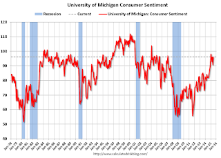
Final June Consumer Sentiment increases to 96.1
by Calculated Risk on 6/26/2015 10:03:00 AM
Thursday, June 25, 2015
DOT: Vehicle Miles Driven increased 3.9% year-over-year in April, Rolling 12 Months at All Time High
by Calculated Risk on 6/25/2015 08:35:00 PM
The Department of Transportation (DOT) reported:
Travel on all roads and streets changed by 3.9% (10.2 billion vehicle miles) for April 2015 as compared with April 2014.The following graph shows the rolling 12 month total vehicle miles driven to remove the seasonal factors.
Travel for the month is estimated to be 267.9 billion vehicle miles.
The seasonally adjusted vehicle miles traveled for April 2015 is 262.4 billion miles, a 3.7% (9.5 billion vehicle miles) increase over April 2014.
The rolling 12 month total is moving up, after moving sideways for several years.
 Click on graph for larger image.
In the early '80s, miles driven (rolling 12 months) stayed below the previous peak for 39 months.
Miles driven (rolling 12) had been below the previous peak for 85 months - an all time record - before reaching a new high for miles driven in January.
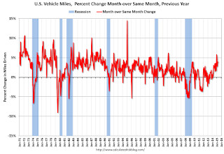
The second graph shows the year-over-year change from the same month in the previous year.
 In April 2015, gasoline averaged of $2.56 per gallon according to the EIA. That was down significantly from April 2014 when prices averaged $3.74 per gallon.
 Gasoline prices aren't the only factor - demographics is also key. However, with lower gasoline prices, miles driven - on a rolling 12 month basis - is at a new high.
Update: "Scariest jobs chart ever"
by Calculated Risk on 6/25/2015 04:18:00 PM
During the recent recession, every month I posted a graph showing the percent jobs lost during the recession compared to previous post-WWII recessions.
Some people started calling this the "scariest jobs chart ever".
I retired the graph in May 2014 when employment finally exceeded the pre-recession peak (now April 2014 with revisions).
I was asked if I could post an update to the graph, and here it is.
This graph shows the job losses from the start of the employment recession, in percentage terms, compared to previous post WWII recessions. Since exceeding the pre-recession peak in April 2014, employment is now 2.4% above the previous peak.
Note: most previous recessions end on the graph when employment reached a new peak, although I continued the 2001 recession too. The downturn at the end of the 2001 recession is the beginning of the 2007 recession. I don't expect a downturn for employment any time soon (unlike in 2007 when I was forecasting a recession).
Freddie Mac: Mortgage Serious Delinquency rate declined in May
by Calculated Risk on 6/25/2015 01:17:00 PM
Freddie Mac reported that the Single-Family serious delinquency rate declined in May to 1.58%, down from 1.66% in April. Freddie's rate is down from 2.10% in May 2014, and the rate in May was the lowest level since November 2008.
Freddie's serious delinquency rate peaked in February 2010 at 4.20%.
These are mortgage loans that are "three monthly payments or more past due or in foreclosure".
Note: Fannie Mae will report their Single-Family Serious Delinquency rate for May in a few days.

Although the rate is declining, the "normal" serious delinquency rate is under 1%.
The serious delinquency rate has fallen 0.52 percentage points over the last year, and at that rate of improvement, the serious delinquency rate will not be below 1% until late 2016.
So even though delinquencies and distressed sales are declining, I expect an above normal level of Fannie and Freddie distressed sales through 2016 (mostly in judicial foreclosure states).


