 RSS Feed
 by Calculated Risk on 8/06/2014 12:11:00 PM
Wednesday, August 06, 2014
U.S. Births increased in 2013 after Declining for Five Consecutive Years
This provisional data for 2013 was released in May and shows a possible impact of the great recession ...
From the National Center for Health Statistics: Births: Preliminary Data for 2013. The NCHS reports:
The 2013 preliminary number of U.S. births was 3,957,577, slightly more (4,736) than in 2012. ...The most amazing data is on teen births (see 2nd graph below).
The general fertility rate was 62.9 births per 1,000 women aged 15–44, down slightly from 2012 and a record low.
Here is a long term graph of annual U.S. births through 2013 ...
 Click on graph for larger image.
Births had declined for five consecutive years, and are about 8.3% below the peak in 2007 (births in 2007 were at the all time high - even higher than during the "baby boom"). I suspect certain segments of the population were under stress before the recession started - like construction workers - and even more families were in distress in 2008 through 2012. And this led to fewer babies.
Notice that the number of births started declining a number of years before the Great Depression started. Many families in the 1920s were under severe stress long before the economy collapsed. By 1933 births were down by almost 23% from the early '20s levels.
Of course economic distress isn't the only reason births decline - look at the huge decline following the baby boom that was driven by demographics. But it is not surprising that the number of births slow or decline during tough economic times - but that appears to be over now.
 The second graph is from the NCHS report and shows births per 1,000 women by teen age group. From the NCHS:
 The number of births to teenagers aged 15–19 in 2013 was 274,641, also down 10% from 2012 and the lowest number of teen births ever reported for the United States. The 2013 number of births was 38% less than in 2007 (444,899), the most recent high, and 57% less than in 1970, the all-time peak year for the number of teen births (644,708).Far fewer teens births is great news (and is probably related to the much higher enrollment rates).
Another key trends ... women are waiting longer to have babies:
The birth rate for women aged 20–24 was 81.2 births per 1,000 women in 2013, down 2% from the previous record low rate in 2012 (83.1). Since 2007, the rate for women in this age group has declined steadily at nearly 4% per year.Waiting longer to have children makes sense (see: Demographics and Behavior) and we should expect a baby boom in a few years as the largest cohorts move into the 25 to 34 years old age groups. (for largest cohorts, see: Census Bureau: Largest 5-year Population Cohort is now the "20 to 24" Age Group).
The 2013 preliminary birth rate for women aged 30–34 was 98.7 births per 1,000 women, up 1% from the rate in 2012 (97.3). The number of births to women in their early 30s also increased in 2013, by 2%. The rate for women aged 35–39 was 49.6 births per 1,000 women, up 3% from 2012 (48.3), reaching the highest rate for this age group since 1963. The number of births to women in their late 30s increased 3% in 2013.
P.S. I expect that as families have babies, they will tend to buy homes (as opposed to rent)! The demographics are favorable for renting now (see: The Favorable Demographics for Apartments), but eventually the demographics will be more positive for home ownership.
Trade Deficit decreased in June to $41.5 Billion
by Calculated Risk on 8/06/2014 08:30:00 AM
The Department of Commerce reported:
[T]otal June exports of $195.9 billion and imports of $237.4 billion resulted in a goods and services deficit of $41.5 billion, down from $44.7 billion in May, revised. June exports were $0.3 billion more than May exports of $195.6 billion. June imports were $2.9 billion less than May imports of $240.3 billion.The trade deficit was smaller than the consensus forecast of $45.0 billion.
The first graph shows the monthly U.S. exports and imports in dollars through June 2014.
 Click on graph for larger image.
Imports decreased and exports increased in June.
Exports are 18% above the pre-recession peak and up 3% compared to June 2013; imports are about 2% above the pre-recession peak, and up about 5% compared to June 2013.
The second graph shows the U.S. trade deficit, with and without petroleum, through June.
 The blue line is the total deficit, and the black line is the petroleum deficit, and the red line is the trade deficit ex-petroleum products.
Oil imports averaged $96.41 in June, up from $96.12 in May, and down from $96.87 in June 2013. The petroleum deficit has generally been declining and is the major reason the overall deficit has declined since early 2012.
The trade deficit with China increased to $30.1 billion in June, from $26.7 billion in June 2013.
MBA: Mortgage Refinance Applications Increase in Latest MBA Weekly Survey
by Calculated Risk on 8/06/2014 07:00:00 AM
From the MBA: Refinance Applications, Share Increase in Latest MBA Weekly Survey
Mortgage applications increased 1.6 percent from one week earlier, according to data from the Mortgage Bankers Association’s (MBA) Weekly Mortgage Applications Survey for the week ending August 1, 2014. ...
The Refinance Index increased 4 percent from the previous week. The seasonally adjusted Purchase Index decreased 1 percent from one week earlier. ...
...
The average contract interest rate for 30-year fixed-rate mortgages with conforming loan balances ($417,000 or less) increased to 4.35 percent from 4.33 percent, with points decreasing to 0.22 from 0.24 (including the origination fee) for 80 percent loan-to-value ratio (LTV) loans.
emphasis added
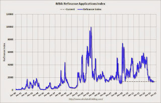 Click on graph for larger image.
The first graph shows the refinance index.
The refinance index is down 74% from the levels in May 2013.
As expected, refinance activity is very low this year.
 The second graph shows the MBA mortgage purchase index.
 According to the MBA, the unadjusted purchase index is down about 14% from a year ago.
Tuesday, August 05, 2014
Wednesday: Trade Deficit
by Calculated Risk on 8/05/2014 08:38:00 PM
The ISM manufacturing survey is almost always released before the BLS employment report for the same month, and frequently the ISM non-manufacturing survey also precedes the employment report. This didn't happen for July since the employment report was released on Friday August 1st.
Now that the surveys have been released, the ISM surveys suggested fairly strong hiring in July.
The ISM manufacturing employment index increased in July to 58.2%, from 52.8% in June. A historical correlation between the ISM manufacturing employment index and the BLS employment report for manufacturing, suggests that private sector manufacturing payroll jobs increased about 25,000 in July.
The ISM non-manufacturing employment index increased in July to 56.0%, up from 54.4% in June. A historical correlation between the ISM non-manufacturing index and the BLS employment report for non-manufacturing, suggests that private sector payroll jobs for non-manufacturing increased by about 232,000 in July.
Taken together, these surveys suggested around 257,000 jobs added in July - well above the 198,000 private sector jobs reported by the BLS. Of course these surveys indicate the number of firms hiring, not the number of people hired - and the relationship is "noisy" with timing issues too - but this is another positive employment indicator.
Wednesday:
• At 7:00 AM ET, the Mortgage Bankers Association (MBA) will release the results for the mortgage purchase applications index.
• At 8:30 AM, the Trade Balance report for June from the Census Bureau. The consensus is for the U.S. trade deficit to be at $45.0 billion in June from $44.4 billion in May.
Phoenix Real Estate in July: Sales down 17%, Cash Sales down Sharply, Inventory up 35%
by Calculated Risk on 8/05/2014 04:42:00 PM
This is a key distressed market to follow since Phoenix saw a large bubble / bust followed by strong investor buying.
The Arizona Regional Multiple Listing Service (ARMLS) reports (table below):
1) Overall sales in July were down 17% year-over-year and at the lowest for June since 2008.
2) Cash Sales (frequently investors) were down about 43% to less than 25% of total sales. Non-cash sales were down only about 3% year-over-year. So the decline in sales is probably mostly due to less investor buying.
3) Active inventory is now increasing rapidly and is up 35% year-over-year - and at the highest level for July since 2011 (when prices bottomed in Phoenix).
Inventory has clearly bottomed in Phoenix (A major theme for housing in 2013). And more inventory (a theme this year) - and less investor buying - suggests price increases should slow sharply in 2014.
According to Case-Shiller, Phoenix house prices bottomed in August 2011 (mostly flat for all of 2011), and then increased 23% in 2012, and another 15% in 2013. Those large increases were probably due to investor buying, low inventory and some bounce back from the steep price declines in 2007 through 2010. Now, with more inventory, price increases should flatten out in 2014.
As an example, the Phoenix Case-Shiller index through May shows prices up less than 1% in 2014, and the Zillow index shows Phoenix prices up slightly year-to-date through June.
| July Residential Sales and Inventory, Greater Phoenix Area, ARMLS | ||||||
|---|---|---|---|---|---|---|
| Sales | YoY Change Sales | Cash Sales | Percent Cash | Active Inventory | YoY Change Inventory | |
| Jul-08 | 5,9741 | --- | --- | --- | 54,5272 | --- |
| Jul-09 | 9,095 | 52.2% | 3,269 | 35.9% | 38,024 | ---2 |
| Jul-10 | 7,101 | -21.9% | 2,901 | 40.9% | 42,887 | 12.8% |
| Jul-11 | 8,397 | 18.3% | 3,779 | 45.0% | 27,663 | -35.5% |
| Jul-12 | 7,152 | -14.8% | 3,214 | 44.9% | 20,384 | -26.3% |
| Jul-13 | 8,214 | 14.8% | 2,944 | 35.8% | 20,049 | -1.6% |
| Jul-14 | 6,790 | -17.3% | 1,681 | 24.8% | 27,081 | 35.1% |
| 1 July 2008 does not include manufactured homes, ~100 more 2 July 2008 Inventory includes pending | ||||||


