by Calculated Risk on 6/23/2014 03:58:00 PM
Monday, June 23, 2014
Weekly Update: Housing Tracker Existing Home Inventory up 13.6% year-over-year on June 23rd
Here is another weekly update on housing inventory ...
There is a clear seasonal pattern for inventory, with the low point for inventory in late December or early January, and then usually peaking in mid-to-late summer.
The Realtor (NAR) data is monthly and released with a lag (the most recent data released this morning was for May). However Ben at Housing Tracker (Department of Numbers) has provided me some weekly inventory data for the last several years.
 Click on graph for larger image.
This graph shows the Housing Tracker reported weekly inventory for the 54 metro areas for 2010, 2011, 2012, 2013 and 2014.
In 2011 and 2012, inventory only increased slightly early in the year and then declined significantly through the end of each year.
In 2013 (Blue), inventory increased for most of the year before declining seasonally during the holidays. Inventory in 2013 finished up 2.7% YoY compared to 2012.
Inventory in 2014 (Red) is now 13.6% above the same week in 2013. (Note: There are differences in how the data is collected between Housing Tracker and the NAR).
I expect inventory to be above the same week in 2012 at the end of the month (prices bottomed in early 2012). This increase in inventory should slow price increases, and might lead to price declines in some areas.
Note: One of the key questions for 2014 will be: How much will inventory increase? My guess was inventory would be up 10% to 15% year-over-year at the end of 2014. Right now it looks like inventory might increase more than I expected.
Black Knight (formerly LPS): House Price Index up 0.9% in April, Up 6.4% year-over-year
by Calculated Risk on 6/23/2014 02:16:00 PM
Notes: I follow several house price indexes (Case-Shiller, CoreLogic, Black Knight (formerly LPS), Zillow, FHFA, FNC and more). The timing of different house prices indexes can be a little confusing. Black Knight uses the current month closings only (not a three month average like Case-Shiller or a weighted average like CoreLogic), excludes short sales and REOs, and is not seasonally adjusted.
From LPS: U.S. Home Prices Up 0.9 Percent for the Month; Up 6.4 Percent Year-Over-Year
Today, the Data and Analytics division of Black Knight Financial Services (formerly the LPS Data & Analytics division) released its latest Home Price Index (HPI) report, based on February 2014 residential real estate transactions. ... The Black Knight HPI represents the price of non-distressed sales by taking into account price discounts for REO and short sales.The year-over-year increases have been getting steadily smaller for the last 7 months - as shown in the table below:
| Month | YoY House Price Increase |
|---|---|
| Jan-13 | 6.7% |
| Feb-13 | 7.3% |
| Mar-13 | 7.6% |
| Apr-13 | 8.1% |
| May-13 | 7.9% |
| Jun-13 | 8.4% |
| Jul-13 | 8.7% |
| Aug-13 | 9.0% |
| Sep-13 | 9.0% |
| Oct-13 | 8.8% |
| Nov-13 | 8.5% |
| Dec-13 | 8.4% |
| Jan-14 | 8.0% |
| Feb-14 | 7.6% |
| Mar-14 | 7.0% |
| Apr-14 | 6.4% |
The LPS HPI is off 12.0% from the peak in June 2006.
Note: The press release has data for the 20 largest states, and 40 MSAs.
LPS shows prices off 43.3% from the peak in Las Vegas, off 36.2% in Orlando, and 32.5% off from the peak in Riverside-San Bernardino, CA (Inland Empire). Prices are at new highs in Colorado and Texas (Denver, Austin, Dallas, Houston and San Antonio metros). Prices are also at new highs in San Jose, CA and in Nashville, TN.
Note: Case-Shiller for April will be released tomorrow.
Comments on Existing Home Sales
by Calculated Risk on 6/23/2014 12:05:00 PM
The two key numbers in the existing home sales report right now are: 1) inventory, and 2) the percent of distressed sales.
The most important number in the report each month is inventory. This morning the NAR reported that inventory was up 6.0% year-over-year in May. This is a smaller increase than other sources suggest, and it is important to note that the NAR inventory data is "noisy" (and difficult to forecast based on other data). A few other points:
• The headline NAR inventory number is NOT seasonally adjusted (and there is a clear seasonal pattern).
• Inventory is still very low, and with the low level of inventory, there is still upward pressure on prices.
• I expect inventory to increase in 2014, and I expect the year-over-year increase to be in the 10% to 15% range by the end of 2014 (maybe even higher).
 Click on graph for larger image.
The NAR does not seasonally adjust inventory, even though there is a clear seasonal pattern. Trulia chief economist Jed Kolko sent me the seasonally adjusted inventory.
This shows that inventory bottomed in January 2013 (on a seasonally adjusted basis), and inventory is now up about 9.4% from the bottom. On a seasonally adjusted basis, inventory was up slightly in May compared to April.
Important: The NAR reports active listings, and although there is some variability across the country in what is considered active, many "contingent short sales" are not included. "Contingent short sales" are strange listings since the listings were frequently NEVER on the market (they were listed as contingent), and they hang around for a long time - they are probably more closely related to shadow inventory than active inventory. However when we compare inventory to 2005, we need to remember there were no "short sale contingent" listings in 2005. In the areas I track, the number of "short sale contingent" listings is also down sharply year-over-year.
Another key point: The NAR reported total sales were down 5.0% from May 2013, but normal equity sales were probably up from May 2013, and distressed sales down sharply. The NAR reported that 11% of sales were distressed in May (from a survey that is far from perfect):
Distressed homes – foreclosures and short sales – accounted for 11 percent of May sales, down from 18 percent in May 2013. Eight percent of May sales were foreclosures and three percent were short sales.Last year the NAR reported that 18% of sales were distressed sales.
A rough estimate: Sales in May 2013 were reported at 5.15 million SAAR with 18% distressed. That gives 927 thousand distressed (annual rate), and 4.22 million equity / non-distressed. In May 2014, sales were 4.89 million SAAR, with 11% distressed. That gives 538 thousand distressed - a decline of 42% from May 2013 - and 4.35 million equity. Although this survey isn't perfect, this suggests distressed sales were down sharply - and normal sales up slightly (even with less investor buying).
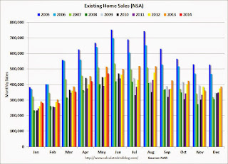
The following graph shows existing home sales Not Seasonally Adjusted (NSA).
 Click on graph for larger image.
Sales NSA in May (red column) were below the level of sales in May 2013, and above sales for 2008 through 2012.
Overall this report was a solid report.
Earlier:
• Existing Home Sales in May: 4.89 million SAAR, Inventory up 6.0% Year-over-year
Existing Home Sales in May: 4.89 million SAAR, Inventory up 6.0% Year-over-year
by Calculated Risk on 6/23/2014 10:00:00 AM
The NAR reports: Existing-Home Sales Heat Up in May, Inventory Levels Continue to Improve
Total existing-home sales, which are completed transactions that include single-family homes, townhomes, condominiums and co-ops, rose 4.9 percent to a seasonally adjusted annual rate of 4.89 million in May from an upwardly-revised 4.66 million in April, but remain 5.0 percent below the 5.15 million-unit level in May 2013. ...
Total housing inventory at the end of May climbed 2.2 percent to 2.28 million existing homes available for sale, which represents a 5.6-month supply at the current sales pace, down slightly from 5.7 months in April. Unsold inventory is 6.0 percent higher than a year ago, when there were 2.15 million existing homes available for sale.
 Click on graph for larger image.
This graph shows existing home sales, on a Seasonally Adjusted Annual Rate (SAAR) basis since 1993.
Sales in May (4.89 million SAAR) were 4.9% higher than last month, but were 5.0% below the May 2013 rate.
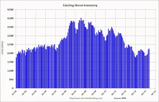
The second graph shows nationwide inventory for existing homes.
 According to the NAR, inventory increased to 2.28 million in May from 2.23 million in April. Inventory is not seasonally adjusted, and inventory usually increases from the seasonal lows in December and January, and peaks in mid-to-late summer.
The third graph shows the year-over-year (YoY) change in reported existing home inventory and months-of-supply. Since inventory is not seasonally adjusted, it really helps to look at the YoY change. Note: Months-of-supply is based on the seasonally adjusted sales and not seasonally adjusted inventory.
 Inventory increased 6.0% year-over-year in May compared to May 2013.
 Months of supply was at 5.6 months in May.
This was above expectations of sales of 4.75 million. For existing home sales, the key number is inventory - and inventory is still low, but up solidly year-over-year. I'll have more later ...
Chicago Fed: "Economic growth picked up in May"
by Calculated Risk on 6/23/2014 08:30:00 AM
The Chicago Fed released the national activity index (a composite index of other indicators): Index shows economic growth picked up in May
Led by improvements in production-related indicators, the Chicago Fed National Activity Index (CFNAI) increased to +0.21 in May from –0.15 in April. Three of the four broad categories of indicators that make up the index made positive contributions to the index in May, and three of the four categories increased from April.This graph shows the Chicago Fed National Activity Index (three month moving average) since 1967.
The index’s three-month moving average, CFNAI-MA3, decreased to +0.18 in May from +0.31 in April, marking its third consecutive reading above zero. May’s CFNAI-MA3 suggests that growth in national economic activity was somewhat above its historical trend. The economic growth reflected in this level of the CFNAI-MA3 suggests limited inflationary pressure from economic activity over the coming year.
emphasis added
 Click on graph for larger image.
This suggests economic activity was somewhat above the historical trend in May (using the three-month average).
According to the Chicago Fed:
What is the National Activity Index? The index is a weighted average of 85 indicators of national economic activity drawn from four broad categories of data: 1) production and income; 2) employment, unemployment, and hours; 3) personal consumption and housing; and 4) sales, orders, and inventories.
A zero value for the index indicates that the national economy is expanding at its historical trend rate of growth; negative values indicate below-average growth; and positive values indicate above-average growth.


