by Calculated Risk on 5/06/2014 09:32:00 AM
Tuesday, May 06, 2014
CoreLogic: House Prices up 11.1% Year-over-year in March
Notes: This CoreLogic House Price Index report is for March. The recent Case-Shiller index release was for February. The CoreLogic HPI is a three month weighted average and is not seasonally adjusted (NSA).
From CoreLogic: CoreLogic Reports Home Prices Rise by 11.1 Percent Year Over Year in March
Home prices nationwide, including distressed sales, increased 11.1 percent in March 2014 compared to March 2013. This change represents 25 months of consecutive year-over-year increases in home prices nationally. On a month-over-month basis, home prices nationwide, including distressed sales, increased 1.4 percent in March 2014 compared to February 2014.
Excluding distressed sales, home prices nationally increased 9.5 percent in March 2014 compared to March 2013 and 0.9 percent month over month compared to February 2014. Distressed sales include short sales and real estate owned (REO) transactions.
“March data on new and existing home sales was weaker than expected and is a cause for concern as we enter the spring buying season,” said Dr. Mark Fleming, chief economist for CoreLogic. “Interest rate-disenfranchised potential sellers are adding to the existing shadow inventory, while buyers who can't find what they want to buy are on the sidelines creating a new kind of 'shadow demand.' This supply and demand imbalance continues to drive home prices higher, even though transaction volumes are lower than expected.”
 Click on graph for larger image.
 This graph shows the national CoreLogic HPI data since 1976. January 2000 = 100.
The index was up 1.4% in March, and is up 11.1% over the last year. This index is not seasonally adjusted, so this was a strong month-to-month gain during the "weak" season.
 The second graph is from CoreLogic. The year-over-year comparison has been positive for twenty five consecutive months suggesting house prices bottomed early in 2012 on a national basis (the bump in 2010 was related to the tax credit).
I expect the year-over-year increases to continue to slow.
Trade Deficit decreased in March to $40.4 Billion
by Calculated Risk on 5/06/2014 08:44:00 AM
The Department of Commerce reported this morning:
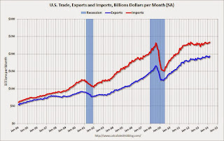
[T]otal March exports of $193.9 billion and imports of $234.3 billion resulted in a goods and services deficit of $40.4 billion, down from $41.9 billion in February, revised. March exports were $3.9 billion more than February exports of $190.0 billion. March imports were $2.5 billion more than February imports of $231.8 billion.The trade deficit was close to the consensus forecast of $40.2 billion.
The first graph shows the monthly U.S. exports and imports in dollars through March 2014.
 Click on graph for larger image.
Both imports and exports increased in March.
Exports are 17% above the pre-recession peak and up 5% compared to March 2013; imports are about 1% above the pre-recession peak, and up about 5% compared to March 2013.
The second graph shows the U.S. trade deficit, with and without petroleum, through March.
 The blue line is the total deficit, and the black line is the petroleum deficit, and the red line is the trade deficit ex-petroleum products.
Oil imports averaged $93.91 in March, up from $90.21 in February, and down from $96.95 in March 2013. The petroleum deficit has generally been declining and is the major reason the overall deficit has declined since early 2012.
The trade deficit with China increased to $20.4 billion in March, from $17.9 billion in March 2013. About half of the trade deficit is related to China.
Overall it appears trade is picking up slightly.
Monday, May 05, 2014
Q1 2014 GDP Details on Residential and Commercial Real Estate
by Calculated Risk on 5/05/2014 08:26:00 PM
Tuesday:
• At 8:30 AM ET, Trade Balance report for March from the Census Bureau. The consensus is for the U.S. trade deficit to be at $40.2 billion in March from $42.3 billion in February.
The BEA released the underlying details for the Q1 advance GDP report.
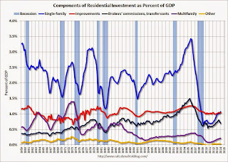
The first graph is for Residential investment (RI) components as a percent of GDP. According to the Bureau of Economic Analysis, RI includes new single family structures, multifamily structures, home improvement, Brokers’ commissions and other ownership transfer costs, and a few minor categories (dormitories, manufactured homes).
A few key points:
1) Investment in single family structures is now back to being the top category for the first time in 22 quarters. Home improvement was the top category for twenty one consecutive quarters following the housing bust ... but now investment in single family structures is the top category once again.
2) Even though investment in single family structures has increased significantly from the bottom, single family investment is still very low - and still below the bottom for previous recessions. I expect further increases over the next few years.
3) Look at the contribution from Brokers’ commissions and other ownership transfer costs. This is the category mostly related to existing home sales (this is the contribution to GDP from existing home sales). If existing home sales decline due to fewer foreclosures, this will have little impact on total residential investment.
 Click on graph for larger image.
Investment in home improvement was at a $179 billion Seasonally Adjusted Annual Rate (SAAR) in Q1 (just over 1.0% of GDP). Investment in single family structures was $184 billion (SAAR) (almost 1.1% of GDP).
The second graph shows investment in offices, malls and lodging as a percent of GDP. Office, mall and lodging investment has increased recently, but from a very low level.
Investment in offices is down about 49% from the recent peak (as a percent of GDP) and increasing slowly. The office vacancy rate is still very high, so any increase in investment will probably be small.
 Investment in multimerchandise shopping structures (malls) peaked in 2007 and is down about 57% from the peak (note that investment includes remodels, so this will not fall to zero). The vacancy rate for malls is still very high, so investment will probably stay low for some time.
Lodging investment peaked at 0.31% of GDP in Q3 2008 and is down about 60%. With the hotel occupancy rate close to normal, it is likely that hotel investment will probably continue to increase.
These graphs show there is currently very little investment in offices, malls and lodging - but that investment is starting to increase. And residential investment is generally increasing, but from a very low level.
Weekly Update: Housing Tracker Existing Home Inventory up 8.6% year-over-year on May 5th
by Calculated Risk on 5/05/2014 04:38:00 PM
Here is another weekly update on housing inventory ...
There is a clear seasonal pattern for inventory, with the low point for inventory in late December or early January, and then usually peaking in mid-to-late summer.
The Realtor (NAR) data is monthly and released with a lag (the most recent data was for March). However Ben at Housing Tracker (Department of Numbers) has provided me some weekly inventory data for the last several years.
 Click on graph for larger image.
This graph shows the Housing Tracker reported weekly inventory for the 54 metro areas for 2010, 2011, 2012, 2013 and 2014.
In 2011 and 2012, inventory only increased slightly early in the year and then declined significantly through the end of each year.
In 2013 (Blue), inventory increased for most of the year before declining seasonally during the holidays. Inventory in 2013 finished up 2.7% YoY compared to 2012.
Inventory in 2014 (Red) is now 8.6% above the same week in 2013.
Inventory is still very low - still below the level in 2012 (yellow) when prices started increasing - but this increase in inventory should slow house price increases.
Note: One of the key questions for 2014 will be: How much will inventory increase? My guess is inventory will be up 10% to 15% year-over-year by the end of 2014 (inventory would still be below normal).
Construction Employment: Pace of Hiring Increasing
by Calculated Risk on 5/05/2014 01:19:00 PM
Here is an excerpt from a post I wrote in 2012: Where are the construction jobs?
Back in 2006, I predicted we'd see construction job losses in the seven figures. All through 2006 and into 2007, I was constantly asked: "Where are the construction job losses you predicted?"And from Michelle Meyer last year on the lag between activity and construction employment: Construction Coming Back and other researchers More Research on Construction Employment
And then it started ... and the BLS reported construction employment fell 2.27 million from peak to trough. No one asks that question any more.
There were several reasons why construction jobs didn't decline at the same time as housing starts. First, construction includes residential, commercial and other construction (like roads). Even after housing starts began to collapse, commercial real estate was still booming and workers shifted from residential to commercial (many commercial projects have long time frames - and many developers remained in denial). Also some construction workers are paid in cash (illegal immigrants), and these workers weren't counted on the BLS payrolls.
Now people are asking "Where are the construction jobs?"
Oh, Grasshopper ... the construction jobs are coming.
Now is appears the pace of hiring is starting to pickup:
| Annual Change in Construction Payroll jobs (000s) | |
|---|---|
| Year | Total Construction Jobs |
| 2002 | -85 |
| 2003 | 127 |
| 2004 | 290 |
| 2005 | 416 |
| 2006 | 152 |
| 2007 | -195 |
| 2008 | -789 |
| 2009 | -1,047 |
| 2010 | -192 |
| 2011 | 144 |
| 2012 | 114 |
| 2013 | 156 |
| 20141 | 124 |
| 1Change through April, 372 thousand annualized rate | |
 This graph shows total construction employment as reported by the BLS (not just residential).
Since construction employment bottomed in January 2011, construction payrolls have increased by 568 thousand.
Historically there is a lag between an increase in activity and more hiring - and it appears hiring should pickup significant in 2014.


