 RSS Feed
 by Calculated Risk on 4/04/2014 03:28:00 PM
Friday, April 04, 2014
Comment on Jobs Recovery and Policy
The U.S. achieved a minor milestone today with the number of private sector payroll jobs finally exceeding the pre-recession peak. This raises a few of key points:
1) This doesn't include growth of the labor force and population.
2) Total employment is still below the pre-recession peak because of all the public sector layoffs (see previous post for a table of annual public sector job losses). Total employment should be above the pre-recession peak this summer.
3) Even though it took 6+ years to exceed the previous employment peak, this is actually better than most recoveries from a financial crisis. (Note: this recovery was during a period of declining participation - partially due to demographics - and that makes this milestone even better).
 From Josh Lehner today: Getting There. Financial Crises Edition.
[T]he graph compares employment loss for Carmen Reinhart and Ken Rogoff’s so-called Big 5 financial crises with the U.S. Great Depression and Great Recession. Using Reinhart and Rogoff’s great work on historical financial crises, our office previously looked into comparing the Great Recession with these historical financial crises to see how the current cycle stacked up. Overall the Great Recession was your “garden-variety, severe financial crisis” as Rogoff once said, but in terms of employment, the U.S. has actually done fairly well when compared with these other, major crises. Not good enough overall to avoid mass unemployment and lackluster growth, but in the context of historical financial crises, the U.S. employment picture is better than most.Point 3 is critically important for policy.
In 2009, many of us argued the current recovery would be sluggish because of the causes of the recession (a housing bust that led to a financial crisis). This is why I never understood why projects needed to be "shovel ready" to be included in the early 2009 stimulus package. Look at the construction job losses in the previous post, clearly infrastructure investment could have been spread out over several more years.
Unfortunately, when the stimulus was being introduced, many opponents argued the economy would recover quickly without the stimulus (obviously poor economic analysis). Even the Obama administration mostly thought the recovery would happen sooner (hence the unfortunate pivot to austerity).
Even today some policymakers don't understand what happened. As an example, from U.S. Congressman Kevin Brady (R-TX), chairman of the Joint Economic Committee: “That it took six long years for America's economy to simply return to break even for Main Street jobs is compelling proof of President Obama's disappointing economic leadership." Unfortunately that shows the "chairman of the Joint Economic Committee" is ignorant of the nature of recoveries from a financial crisis. Very sad.
What we should actually be doing is asking why the recovery was this good relative to other financial crisis. What did we do correctly? And what did we do wrong?
Wrong is easy - some of the stimulus was a clear mistake. As an example, the tax credit for business investment - when there was already too much supply - was a mistake. And research by Atif Mian and Amir Sufi suggests that "cash for clunkers" wasn't effective:
[A]lmost all of the additional purchases under the program were pulled forward from the very near future; the effect of the program on auto purchases is almost completely reversed by as early as March 2010 – only seven months after the program ended. The effect of the program on auto purchases was significantly more short-lived than previously suggested. We also find no evidence of an effect on employment, house prices, or household default rates in cities with higher exposure to the program.And of course I vigorously opposed the expensive and ineffective housing tax credit that was originally proposed by Senators Johnny Isakson (R) and Joe Lieberman (I). I opposed the tax credit early and often. The tax credit for buying new homes was especially dumb. A key problem during the housing bust was the excess supply of vacant housing units, and incentivizing people to buy new homes (and add to the supply) made no sense at all.
But clearly most of the stimulus was effective, and I think more infrastructure investment (help with construction employment) - and more aid to states (keep more teachers, police and firefighters employed) - would have been very helpful.
Luckily the track record of the Federal Reserve was better than for fiscal policy makers. Although Bernanke was slow to recognize what was happening - and he underestimated the severity of the crisis (remember "contained to subprime"?) - when he finally understood what was happening, the Fed was very effective. Bernanke's critics argued that his policies would lead to inflation (wrong) and a collapse in the dollar against other currencies (also wrong).
The key points are this recovery is better than most from a financial crisis and policymakers did many of the correct things (although they could have done better).
Construction and Government Payrolls
by Calculated Risk on 4/04/2014 01:29:00 PM
The following table shows the net payroll jobs added per year for construction and government jobs. Construction was the hardest hit sector during (and before) the recession, and construction employment is now up 532 thousand from the bottom.
Government employment is still falling (state and local employment has bottomed, but Federal employment is still declining). Combined there are about 2.3 million fewer construction and government jobs compared to before the recession started.
| Annual Change in Construction and Government Payroll jobs (000s) | ||
|---|---|---|
| Year | Construction Jobs | Government |
| 2002 | -85 | 233 |
| 2003 | 127 | -42 |
| 2004 | 290 | 147 |
| 2005 | 416 | 186 |
| 2006 | 152 | 209 |
| 2007 | -195 | 288 |
| 2008 | -789 | 180 |
| 2009 | -1047 | -74 |
| 2010 | -192 | -219 |
| 2011 | 144 | -317 |
| 2012 | 114 | -58 |
| 2013 | 156 | -34 |
| 20141 | 88 | -13 |
| 1through March 2014 | ||
 This graph shows total construction employment as reported by the BLS (not just residential).
Since construction employment bottomed in January 2011, construction payrolls have increased by 532 thousand - but there are still 1.76 million fewer construction jobs now than at the peak in 2006.
Historically there is a lag between an increase in activity and more hiring - and it appears hiring should pickup in 2014.
Comments on Employment Report
by Calculated Risk on 4/04/2014 10:19:00 AM
First, a milestone: Private payroll employment increased 192 thousand in March and private employment is now 110 thousand above the previous peak (total employment is still 437 thousand below the peak in January 2008). Of course the labor force has continued to increase over the last 6+ years, and there are still millions of workers unemployed - so the economy still has a long way to go.
Important: Although this was a slow recovery compared to most previous recessions, this was actually a relatively fast recovery compared to recessions following a severe financial crisis. It is easy to complain about policy makers, but we have to recognize that some policies actually helped ease the pain for millions of workers. There is more work to do, but no sentient being would want to return to the policies of 2001 through 2006 that caused the crisis!
There will be another milestone this summer when total non-farm employment will be above the pre-recession high (the unprecedented large number of government layoffs have held back total employment).
Overall this was a decent employment report. Hopefully job growth will be averaging over 200,000 jobs per month soon. The economy added 533 thousand jobs in Q1 this year compared to 618 thousand in Q1 2013 - not far behind last year considering the severe winter this year. I still expect stronger employment growth in 2014 than in 2013 even with the relatively poor start to the year.
Earlier: March Employment Report: 192,000 Jobs, 6.7% Unemployment Rate
Employment-Population Ratio, 25 to 54 years old
 Since the participation rate declined recently due to cyclical (recession) and demographic (aging population) reasons, an important graph is the employment-population ratio for the key working age group: 25 to 54 years old.
In the earlier period the employment-population ratio for this group was trending up as women joined the labor force. The ratio has been mostly moving sideways since the early '90s, with ups and downs related to the business cycle.
The 25 to 54 participation rate was unchanged in March at 81.2%, and the 25 to 54 employment population ratio increased to 76.7%. As the recovery continues, I expect the participation rate for this group to increase.
Percent Job Losses During Recessions

This graph shows the job losses from the start of the employment recession, in percentage terms - this time aligned at maximum job losses. At the recent pace of improvement, it appears employment will be back to pre-recession levels mid-year (Of course this doesn't include population growth).
In the earlier post, the graph showed the job losses aligned at the start of the employment recession.
Part Time for Economic Reasons
 From the BLS report:
The number of persons employed part time for economic reasons (sometimes referred to as involuntary part-time workers) was little changed at 7.4 million in March. These individuals were working part time because their hours had been cut back or because they were unable to find full-time work.This suggests significantly slack in the labor market. These workers are included in the alternate measure of labor underutilization (U-6) that increased slightly to 12.7% in March from 12.6% in February.
Unemployed over 26 Weeks
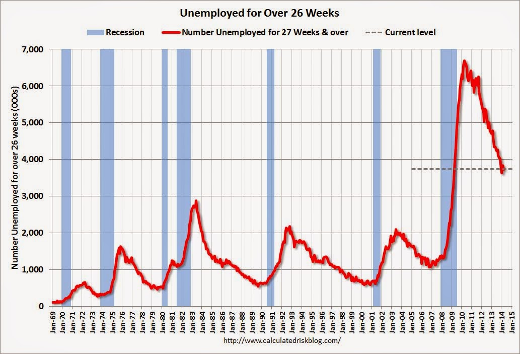 This graph shows the number of workers unemployed for 27 weeks or more.
 According to the BLS, there are 3.739 million workers who have been unemployed for more than 26 weeks and still want a job. This was down from 3.849 in February. This is trending down, but is still very high.
Long term unemployment remains one of the key labor problems in the US.
State and Local Government
 This graph shows total state and government payroll employment since January 2007. State and local governments lost jobs for four straight years. (Note: Scale doesn't start at zero to better show the change.)
 In March 2014, state and local governments added 9,000 jobs.
It appears state and local employment employment has bottomed. Of course Federal government layoffs are ongoing.
All things considered, this was a solid report. Hopefully, now that the severe weather is behind us, the pace of employment growth will pick up.
March Employment Report: 192,000 Jobs, 6.7% Unemployment Rate
by Calculated Risk on 4/04/2014 08:30:00 AM
From the BLS:
Total nonfarm payroll employment rose by 192,000 in March, and the unemployment rate was unchanged at 6.7 percent, the U.S. Bureau of Labor Statistics reported today.
...
The change in total nonfarm payroll employment for January was revised from +129,000 to +144,000, and the change for February was revised from +175,000 to +197,000. With these revisions, employment gains in January and February were 37,000 higher than previously reported.
 Click on graph for larger image.
The headline number was below expectations of 206,000 payroll jobs added.
The first graph shows the job losses from the start of the employment recession, in percentage terms, compared to previous post WWII recessions. The dotted line is ex-Census hiring.
This shows the depth of the recent employment recession - worse than any other post-war recession - and the relatively slow recovery due to the lingering effects of the housing bust and financial crisis.

Employment is 0.3% below the pre-recession peak (437 thousand fewer total jobs). Private employment is now above the pre-recession peak by 110 thousand and at a new all time high.
NOTE: The second graph is the change in payroll jobs ex-Census - meaning the impact of the decennial Census temporary hires and layoffs is removed to show the underlying payroll changes.
The third graph shows the employment population ratio and the participation rate.
The Labor Force Participation Rate was increased in March to 63.2%. This is the percentage of the working age population in the labor force.
 The participation rate is well below the 66% to 67% rate that was normal over the last 20 years, although a significant portion of the recent decline is due to demographics.
The Employment-Population ratio was increased in March at 58.9% (black line).
I'll post the 25 to 54 age group employment-population ratio graph later.
 The fourth graph shows the unemployment rate.
 The unemployment rate was unchanged in March at 6.7%.
This was a solid employment report, and including revisions, in line with expectations.
I'll have much more later ...
Thursday, April 03, 2014
Friday: Employment Report
by Calculated Risk on 4/03/2014 07:20:00 PM
From Goldman Sachs economist David Mericle:
"We forecast a 200,000 increase in nonfarm payrolls in March ... We expect that the unemployment rate declined to 6.6% ...Friday:
As growth accelerates later in 2014, we expect the trend rate of payrolls growth to rise to about 225,000 per month."
• At 8:30 AM ET the BLS will release the Employment Report for March. The consensus is for an increase of 206,000 non-farm payroll jobs in March, up from the 175,000 non-farm payroll jobs added in February.
The consensus is for the unemployment rate to decline to 6.6% in March.
 This graph shows the percentage of payroll jobs lost during post WWII recessions through February.
The economy has added 8.7 million private sector jobs since employment bottomed in February 2010 (8.0 million total jobs added including all the public sector layoffs).
There are still 129 thousand fewer private sector jobs now than when the recession started in 2007, and it is very likely that private employment now exceeds the pre-recession peak.


