by Calculated Risk on 4/29/2012 02:01:00 PM
Sunday, April 29, 2012
Unofficial Problem Bank list declines to 930 Institutions
This is an unofficial list of Problem Banks compiled only from public sources.
Here is the unofficial problem bank list for April 27, 2012. (table is sortable by assets, state, etc.)
Changes and comments from surferdude808:
Very busy week for the Unofficial Problem Bank List because of failures and the FDIC releasing its enforcement actions through March. In all, there were 17 removals and eight additions that leave the list with 930 institutions with assets of $361.7 billion. A year ago, the list held 984 institutions with assets of $422.1 billion. At 930 institutions, it is the lowest weekly count since December 24, 2010 when 919 institutions were on the list. During April 2012, there were 16 additions and 34 removals including 25 action terminations, six failures, and three unassisted mergers. For the month, the institution count fell by 18 to 930 and assets dropped by $15.8 billion to $361.7 billion.Yesterday:
Five banks were closed this Friday, which is the most in one night since five were closed nearly a year ago on April 29, 2011. This week is the 17th of the year and, for the past five years, it has been the third most active for closings at 4.2 institutions after the 44th week (mid-November) at 4.75 closings and 30th week (late July) at 4.5 closings. Removals from failure this week include Plantation Federal Bank, Pawleys Island, SC ($486 million); Inter Savings Bank, fsb D/B/A Interbank, fsb, Maple Grove, MN ($482 million); Bank of the Eastern Shore, Cambridge, MD ($167 million); HarVest Bank of Maryland, Gaithersburg, MD ($164 million); Palm Desert National Bank, Palm Desert, CA ($126 million).
There was one unassisted merger -- Brazos Valley Bank, National Association, College Station, TX ($112 million), which merged with American Momentum Bank, Tampa, FL. Action terminations include Opus Bank, Irvine, CA ($2.4 billion); Heritage Oaks Bank, Paso Robles, CA ($983 million); North Valley Bank, Redding, CA ($901 million); Citizens Bank of Mukwonago, Mukwonago, WI ($651 million); Northeast Bank, Minneapolis, MN ($352 million); Union State Bank, Pell City, AL ($275 million); The Peoples State Bank, Ellettsville, IN ($177 million); Quoin Financial Bank, Miller, SD ($131 million), Clarke County State Bank, Osceola, IA ($110 million); Americas United Bank, Glendale, CA ($100 million); and First State Bank of Kiester, Kiester, MN.
This week there were eight additions including Hudson Valley Bank, National Association, Stamford, CT ($2.8 billion Ticker: HVB); Macon Bank, Inc., Franklin, NC ($874 million); State Bank of Countryside, Countryside, IL ($728 million); Omaha State Bank, Omaha, NE ($292 million); Friends Bank, New Smyrna Beach, FL ($123 million Ticker: FRIE); Peoples State Bank, Lake City, FL ($74 million); Waterman State Bank, Waterman, IL ($48 million); and Colorado Valley Bank, SSB, La Grange, TX ($30 million).
Other changes include Prompt Corrective Action Orders being issued against Truman Bank, St. Louis, MO ($315 million) and Syringa Bank, Boise, ID ($197 million).
• Summary for Week ending April 27th
• Schedule for Week of April 29th
• The upward slope of Real House Prices
Recovery Measures
by Calculated Risk on 4/29/2012 08:01:00 AM
By request, here is an update to four key indicators used by the NBER for business cycle dating: GDP, Employment, Industrial production and real personal income less transfer payments.
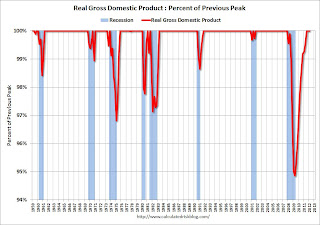
Note: The following graphs are all constructed as a percent of the peak in each indicator. This shows when the indicator has bottomed - and when the indicator has returned to the level of the previous peak. If the indicator is at a new peak, the value is 100%.
These graphs show that several major indicators are still significantly below the pre-recession peaks.
 Click on graph for larger image.
This graph is for real GDP through Q1 2012. Real GDP returned to the pre-recession peak in Q3 2011, and has been at new post recession highs for three consecutive quarters.
At the worst point, real GDP was off 5.1% from the 2007 peak.
 Real GDP has performed better than other indicators ...
This graph shows real personal income less transfer payments as a percent of the previous peak through February (March data will be released Monday).
This measure was off 10.7% at the trough.
Real personal income less transfer payments is still 4.2% below the previous peak.
 The third graph is for industrial production through March.
Industrial production was off over 17% at the trough, and has been one of the stronger performing sectors during the recovery.
However industrial production is still 4.1% below the pre-recession peak.
 The final graph is for employment. This is similar to the graph I post every month comparing percent payroll jobs lost in several recessions.
Payroll employment is still 3.8% below the pre-recession peak.
All of these indicators collapsed in 2008 and early 2009, and only real GDP is back to the pre-recession peak. It is possible that industrial production will be back to the pre-recession peak in early 2013, but employment and personal income less transfer payments have a long way to go.
Yesterday:
• Summary for Week ending April 27th
• Schedule for Week of April 29th
• The upward slope of Real House Prices
Saturday, April 28, 2012
The upward slope of Real House Prices
by Calculated Risk on 4/28/2012 04:14:00 PM
A year ago, Dave Altig asked Just how out of line are house prices?. Dr. Altig's post featured both a price-to-rent graph and a real house price graph originally from the NY Times based on Professor Robert Shiller's work.
The price-to-rent ratio graph Dr Altig presented seemed to show that house prices were getting back to normal, but the graph based on Professor Shiller's work seemed to suggest that house prices could fall much further. Below is an updated graph from Shiller through Q4 2011.
The Shiller graph has suggested to many observers that house prices track inflation (i.e. that house prices adjusted for inflation are stable - except for bubbles). Last year I pointed out the slope depends on the data series used, and that if Professor Shiller had used either Corelogic or the Freddie Mac house prices series, before Case-Shiller was available, there would a greater upward slope to his graph.
An upward slope to real prices makes sense to me as I've argued before: "In many areas - if the population is increasing - house prices increase slightly faster than inflation over time, so there is an upward slope for real prices."
 Click on graph for larger image in new window.
This is the updated graph from Professor Shiller.
For the underlying data for the NY Times graphic, please see Professor Shiller's Irrational Exuberance website.
It is important to realize that Professor Shiller used the quarterly Case-Shiller National index starting in 1987. From 1975 through 1986 he used what is now called the FHFA index. He used other price indexes in earlier periods.
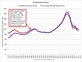 The second graph shows the National Case-Shiller real prices and the CoreLogic HPI real prices (adjusted for CPI just like Shiller). For Q1, I used the February Corelogic index value.
The FHFA index used by Shiller was based on a small percentage of transactions back in the '70s. If we look at the CoreLogic index instead, there is a clear upward slope to real house prices.
If Professor Shiller had used the Freddie Mac quarterly index back to 1970 (instead of the PHCPI), there would be more of an upward slope to his graph too. So it is important to understand that for earlier periods the data is probably less accurate.
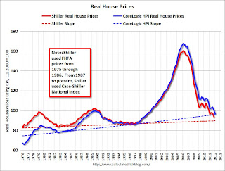 The third graph shows the upward slope for both real price indexes. Even the Shiller "Irrational Exuberance" real price index has an upward slope (about 0.5% per year) - and the CoreLogic upward slope is steeper (about 1.5% per year).
Right now the real CoreLogic HPI is only slightly above the trend line (it could overshoot), and the Case-Shiller national index will probably be just above the trend line when the Q1 data is released.
This would suggest nominal prices are at the bottom (and real prices are close too). This is one reason I think the Case-Shiller and Corelogic house prices indexes probably stopped falling, NSA, in March 2012 (the March data will be released next month).
Earlier:
• Summary for Week ending April 27th
• Schedule for Week of April 29th
Schedule for Week of April 29th
by Calculated Risk on 4/28/2012 01:02:00 PM
Earlier:
• Summary for Week Ending April 27th
The key report for this week will be the April employment report to be released on Friday, May 4th. Other key reports include the ISM manufacturing index and vehicle sales on Tuesday, and the ISM non-manufacturing (service) index on Thursday.
In Europe, the ECB meets on Thursday, and France and Greece hold elections next Sunday, May 6th.
8:30 AM ET: Personal Income and Outlays for March. The consensus is for a 0.3% increase in personal income in March, and a 0.4% increase in personal spending, and for the Core PCE price index to increase 0.2%.
9:45 AM: Chicago Purchasing Managers Index for April. The consensus is for a decrease to 60.8, down from 62.2 in March.
10:00 AM: Q1 Housing Vacancies and Homeownership report from the Census Bureau. As a reminder: Be careful with the Housing Vacancies and Homeownership report. This report is frequently mentioned by analysts and the media to track the homeownership rate, and the homeowner and rental vacancy rates. However, based on the initial evaluation, it appears the vacancy rates are too high.
2:00 PM: The April 2012 Senior Loan Officer Opinion Survey on Bank Lending Practices from the Federal Reserve.
All day: Light vehicle sales for April. Light vehicle sales are expected to increase to 14.4 million from 14.3 million in March (Seasonally Adjusted Annual Rate).
 This graph shows light vehicle sales since the BEA started keeping data in 1967. The dashed line is the March sales rate.
 TrueCar is forecasting:
The April 2012 forecast translates into a Seasonally Adjusted Annualized Rate (SAAR) of 14.6 million new car sales, up from 13.2 million in April 2011 and up from 14.4 million in March 2012Edmund.com is forecasting:
April auto sales will continue at the strong pace set in the first quarter for an estimated Seasonally Adjusted Annual Rate (SAAR) this month of 14.4 million light vehicles
 10:00 AM ET: ISM Manufacturing Index for April.
 Here is a long term graph of the ISM manufacturing index. The consensus is for a slight decrease to 53.0 from 53.4 in March.
10:00 AM: Construction Spending for March. The consensus is for a 0.5% increase in construction spending.
7:00 AM: The Mortgage Bankers Association (MBA) will release the mortgage purchase applications index. This index has been weak this year, although this does not include all the cash buyers.
8:15 AM: The ADP Employment Report for April. This report is for private payrolls only (no government). The consensus is for 178,000 payroll jobs added in April, down from the 209,000 reported last month.
10:00 AM: Manufacturers' Shipments, Inventories and Orders (Factory Orders) for March. The consensus is for a 1.6% decrease in orders.
8:30 AM: The initial weekly unemployment claims report will be released. The consensus is for claims to decline to 378,000 from 388,000 last week.
9:00 AM: Ceridian-UCLA Pulse of Commerce Index™ This is the diesel fuel index for April (a measure of transportation).
 10:00 AM: ISM non-Manufacturing Index for April. The consensus is for a decrease to 55.9 from 56.0 in March. Note: Above 50 indicates expansion, below 50 contraction.
This graph shows the ISM non-manufacturing index (started in January 2008) and the ISM non-manufacturing employment diffusion index.
10:00 AM: Trulia Price & Rent Monitors for April. This is the new index from Trulia that uses asking prices adjusted both for the mix of homes listed for sale and for seasonal factors.
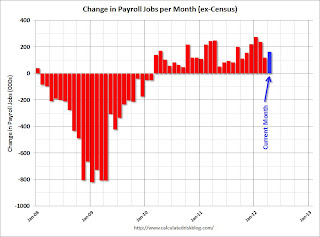 8:30 AM: Employment Report for April. The consensus is for an increase of 165,000 non-farm payroll jobs in April, up from the 120,000 jobs added in March.
The consensus is for the unemployment rate to remain unchanged at 8.2%.
This second employment graph shows the percentage of payroll jobs lost during post WWII recessions through March.
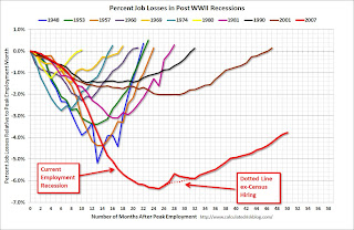 The economy has added 3.58 million jobs since employment bottomed in February 2010 (4.05 million private sector jobs added, and 474 thousand public sector jobs lost).
There are still 4.8 million fewer private sector jobs now than when the recession started in 2007. (5.2 million fewer total nonfarm jobs).
Summary for Week ending April 27th
by Calculated Risk on 4/28/2012 08:05:00 AM
The GDP report was weaker than expected with 2.2% real GDP growth annualized in Q1 (expectations were for 2.5%). This is disappointing growth, but final demand was a little better than overall GDP. Personal consumption expenditures increased at a 2.9% annual rate in Q1, and residential investment (RI) increased at a 19.1% annual rate. Weather probably boosted PCE and RI - and PCE growth at this rate is not sustainable without more income growth - but this was still decent.
Naturally most of the GDP commentary was pretty negative, but I was a little more sanguine. I expect some of the drag to diminish over the next couple of quarters - as an example, investment in non-residential structures was negative in Q1, however, based on the architecture billing index, I expect the drag from other non-residential categories (offices, malls) to end mid-year. And there was another negative contribution from government spending at all levels. However, it appears the drag from state and local governments will end mid-year (after declining for almost 3 years).
A bright spot - and perhaps the key story - is that residential investment is continuing to increase, and I expect this to continue all year (although the recovery in RI will still be sluggish compared to previous recoveries). Since RI is the best leading indicator for the economy, this suggests no recession this year. Still, overall, this was a weak GDP report.
The new home sales report for March was solid and is further confirmation that the recovery for the housing industry has started. New home sales are up about 17% from the weakest three month period during the housing bust. That is a significant improvement, even if the absolute levels are still very low. The debate is now about the strength of the recovery, not whether there is a recovery. My view is housing will remain sluggish for some time, and I expect 2012 to be another historically weak year, but better than 2011.
Another key report was the Case-Shiller house price index for February. This showed house prices fell to new post-bubble lows (I expect further declines in the March report), but we are starting to see some improvement in the year-over-year change. House prices are important for the economy, and I'm watching closely for signs that prices have stopped falling.
The NMHC Apartment index showed further tightening (suggesting falling vacancy rates and rising rents), and the consumer sentiment index increased. For manufacturing, the Richmond Fed index increased, however the Kansas City Fed manufacturing index showed slower growth.
Here is a summary in graphs:
• Real GDP increased at 2.2% annual rate in Q1

Click on graph for larger image.
The GDP report was weaker than expected, however, on a positive note, final demand was decent. Personal consumption expenditures increased at a 2.9% annual rate in Q1, and residential investment increased at a 19.1% annual rate. Weather probably provided a boost to GDP - and PCE growth at this rate is not sustainable without more income growth - but this was still decent.
 Residential Investment as a percent of GDP is still near record lows, but it is increasing. Usually RI bounces back quickly following a recession, but this time there is a wide bottom because of the excess supply of existing vacant housing units.
Last year the increase in RI was mostly from multifamily and home improvement investment. Now the increase is probably from most categories including single family. I'll break down Residential Investment (RI) into components after the GDP details are released this coming week.
• New Home Sales in March at 328,000 Annual Rate
 The Census Bureau reports New Home Sales in March were at a seasonally adjusted annual rate (SAAR) of 328 thousand. This was down from a revised 353 thousand SAAR in February (revised up sharply from 313 thousand). December and January were revised up too.
This graph shows New Home Sales vs. recessions since 1963. The dashed line is the current sales rate.
Starting in 1973 the Census Bureau broke inventory down into three categories: Not Started, Under Construction, and Completed.
 This graph shows the three categories of inventory starting in 1973.
The inventory of completed homes for sale was at a record low 48,000 units in March. The combined total of completed and under construction is at the lowest level since this series started.
Even though sales are still very low, new home sales have clearly bottomed. New home sales have averaged 335 thousand SAAR over the last 5 months, after averaging under 300 thousand for the previous 18 months. All of the recent revisions have been up too. This was a solid report and above the consensus forecast.
• Case Shiller: House Prices fall to new post-bubble lows in February NSA
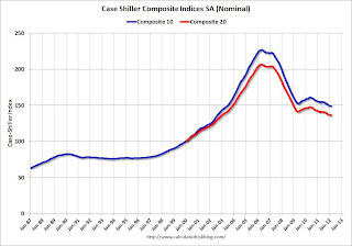 S&P/Case-Shiller released the monthly Home Price Indices for February (a 3 month average of December, January and February).
The first graph shows the nominal seasonally adjusted Composite 10 and Composite 20 indices (the Composite 20 was started in January 2000).
The Composite 10 index is off 34.2% from the peak, and up 0.2% in February (SA). The Composite 10 is at a new post bubble low Not Seasonally Adjusted.
The Composite 20 index is off 33.9% from the peak, and up 0.1% (SA) from January. The Composite 20 is also at a new post-bubble low NSA.
The second graph shows the price declines from the peak for each city included in S&P/Case-Shiller indices.
 Prices increased (SA) in 12 of the 20 Case-Shiller cities in February seasonally adjusted (only 3 cities increased NSA). Prices in Las Vegas are off 61.7% from the peak, and prices in Dallas only off 8.2% from the peak.
The NSA indexes are at new post-bubble lows - and the NSA indexes will continue to decline in March (this report was for the three months ending in February).
• Real House Prices and Price-to-Rent Ratio at late '90s Levels
Case-Shiller, CoreLogic and others report nominal house prices. It is also useful to look at house prices in real terms (adjusted for inflation) and as a price-to-rent ratio.
 This graph shows the quarterly Case-Shiller National Index SA (through Q4 2011), and the monthly Case-Shiller Composite 20 SA and CoreLogic House Price Indexes (through February) in real terms (adjusted for inflation using CPI less Shelter). Note: some people use other inflation measures to adjust for real prices.
In real terms, the National index is back to Q4 1998 levels, the Composite 20 index is back to January 2000, and the CoreLogic index back to May 1999.
In real terms, all appreciation in the '00s is gone.
In October 2004, Fed economist John Krainer and researcher Chishen Wei wrote a Fed letter on price to rent ratios: House Prices and Fundamental Value. Kainer and Wei presented a price-to-rent ratio using the OFHEO house price index and the Owners' Equivalent Rent (OER) from the BLS.
 Here is a similar graph using the Case-Shiller National, Composite 20 and CoreLogic House Price Indexes.
This graph shows the price to rent ratio (January 1998 = 1.0).
On a price-to-rent basis, the Case-Shiller National index is back to October 1998 levels, the Composite 20 index is back to February 2000 levels, and the CoreLogic index is back to June 1999.
In real terms - and as a price-to-rent ratio - prices are mostly back to late 1990s or early 2000 levels.
• ATA Trucking index Increased 0.2% in March
 From ATA: ATA Truck Tonnage Index Up 0.2% in March
Here is a long term graph that shows ATA's For-Hire Truck Tonnage index.
The dashed line is the current level of the index. The index is above the pre-recession level and up 2.7% year-over-year. More sluggish growth.
• NMHC Apartment Survey: Market Conditions Tighten in Q1 2012

From the National Multi Housing Council (NMHC): Market Conditions Improve For Apartment Industry
This graph shows the quarterly Apartment Tightness Index. Any reading above 50 indicates tightening from the previous quarter. The index has indicated tighter market conditions for the last nine quarters and suggests falling vacancy rates and or rising rents.
This fits with the recent Reis data showing apartment vacancy rates fell in Q1 2012 to 4.9%, down from 5.2% in Q4 2011, and 9.0% at the end of 2009. This is the lowest vacancy rate in the Reis survey in over 10 years.
This survey indicates demand for apartments is still strong. And even though multifamily starts increased in 2011, completions of apartments were near record lows - so supply was constrained. There will be more completions in 2012, but it looks like another strong year for the apartment industry.
• Consumer Sentiment increases slightly in April to 76.4
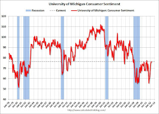 The final Reuters / University of Michigan consumer sentiment index for April increased slightly to 76.4, up from the preliminary reading of 75.7, and up from the March reading of 76.2.
This was above the consensus forecast of 75.7. Overall sentiment is still fairly weak - probably due to a combination of the high unemployment rate, high gasoline prices and sluggish economy - however sentiment has rebounded from the decline last summer.
• Other Economic Stories ...
• NAR: Pending home sales index increased in March
• FOMC Statement: Economy "expanding moderately"
• FOMC Forecasts and Bernanke Press Conference


