 RSS Feed
 by Calculated Risk on 6/20/2010 11:59:00 AM
Sunday, June 20, 2010
Weekly Summary and a Look Ahead
Two key housing reports will be released this week: existing home sales on Tuesday, and new home sales on Wednesday.
On Tuesday at 10 AM, the National Association for Realtors (NAR) will release the May existing home sales report. The consensus is for an increase to 6.2 million sales in May, at a seasonally adjusted annual rate (SAAR), from 5.77 million in April (SAAR). I'll take the under because I think there will be a larger than normal fallout from pending home sales. A key number in the release will be existing home inventory. Inventory surged in April, to over 4 million homes for sale, as sellers tried to take advantage of the homebuyer tax credit. I expect inventory to decline in May.
Also on Tuesday, the FHFA house price index, and the Richmond Fed survey will be released.
On Wednesday at 10 AM, the Census Bureau will release the May New Home sales report. The consensus is for a sharp decrease in sales to around 400K (SAAR), down from 504K in April. Since new home sales are reported when a contract is signed, April was the last month that reported sales will be positively impacted by the tax credit. The May AIA's Architecture Billings Index will also be released on Wednesday (a leading indicator for commercial real estate).
Also on Wednesday, the FOMC statement will be released at 2:15 PM ET (conclusion of 2 day meeting).
On Thursday, the May Durable Goods Orders will be released at 8:30 AM. The consensus is for a 1.2% decrease. Also on Thursday, the closely watched initial weekly unemployment claims will be released. Consensus is for a decline to 465K from 472K last week.
On Friday, the third estimate of the Q1 GDP report will be released at 8:30 AM. The consensus is for no significant change (3.0% annualized growth rate). And of course the FDIC will probably have another busy Friday afternoon ...
Note: Other reports that will probably be released this week include the Moodys/REAL Commercial Property Price Index (for April) and the HAMP May report.
And a summary of last week:
 Click on graph for larger image in new window.
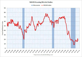
This graph shows the builder confidence index from the National Association of Home Builders (NAHB).
The housing market index (HMI) was at 17 in June. This was a sharp decline from 22 in May.
Note: any number under 50 indicates that more builders view sales conditions as poor than good.
 Total housing starts were at 593 thousand (SAAR) in May, down 10% from the revised April rate of 659,000 (revised down from 672 thousand), and up 24% from the all time record low in April 2009 of 477 thousand (the lowest level since the Census Bureau began tracking housing starts in 1959).
 Single-family starts collapsed 17.2% to 468,000 in May. This is 30% above the record low in January 2009 (360 thousand).
This was way below expectations (I took the under!), and is good news for the housing market longer term (there are too many housing units already), but bad news for the economy and employment short term.
From the Fed: Industrial production and Capacity Utilization
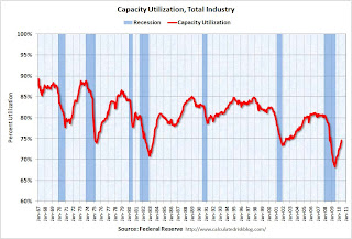 This graph shows Capacity Utilization. This series is up 9.4% from the record low set in June 2009 (the series starts in 1967).
 Capacity utilization at 73.7% is still far below normal - and 7.2% below the the pre-recession levels of 80.5% in November 2007.
Note: y-axis doesn't start at zero to better show the change.
Here is the Philadelphia Fed Index released this week: Business Outlook Survey.
 This graph shows the Philly index for the last 40 years.
The index has been positive for ten months now, but turned down "notably" in June.
This might suggest that growth in the manufacturing sector is slowing. Especially concerning is the slightly negative employment index.
 From the NAHB, framing lumber prices have collapsed since the end of April.
This graph shows two measures of lumber prices: 1) from Random Lengths (via NAHB), and 2) CME futures.
With so many mills shut down during the bust, the supply of lumber was way down - and prices surged early this year with a slight increase in construction activity. Now that construction has slowed - at the same time mills were coming back online (more supply) - prices have collapsed.
Note: the oil gusher continues ...
Best wishes to all.
On Fannie and Freddie REO Inventory
by Calculated Risk on 6/20/2010 08:36:00 AM
Binyamin Appelbaum writes in the New York Times: Cost of Seizing Fannie and Freddie Surges for Taxpayers
Fannie Mae and Freddie Mac took over a foreclosed home roughly every 90 seconds during the first three months of the year. They owned 163,828 houses at the end of March, a virtual city with more houses than Seattle. The mortgage finance companies, created by Congress to help Americans buy homes, have become two of the nation’s largest landlords.The REO inventory of Fannie and Freddie (and the FHA) are increasing rapidly, but this is only a portion of the total REO inventory. The worst loans were made outside of Fannie and Freddie.
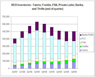
This graph shows the increase in Fannie, Freddie and FHA REOs through Q1 2010.
 Click on graph for larger image in new window.
Even with all the delays in foreclosure, the REO inventory has increased sharply over the last three quarters, from 135,868 at the end of Q2 2009, to 153,007 in Q3 2009, 172,357 at the end of Q4 2009 and now 209,500 at the end of Q4 2010.
These are new records for all three agencies.
However private label securities and banks and thrifts hold an even larger number of REOs. For more, see Tom Lawler's earlier post: REO: Agencies vs. Private Label and from James Hagerty at the WSJ in March writing about a Barclays Capital report: Supply of Foreclosed Homes on the Rise Again.
Here is the graph Tom Lawler constructed for REOs at the end of Q4 2009:
 Tom wrote:
 Putting the Fannie, Freddie, FHA, and private-label data (with the latter “grossed up” assuming LP covers 85% of the market) together; making a crude assumption of units of REO at banks and thrifts (and grossing the total up to reflect non-FDIC institutions), here is a crude look at the path of REO inventories by quarter from the end of 2007 through the end of 2009. These estimates would NOT be the full market, of course, but the general pattern would probably reflect the overall market.Although this graph is only through Q4 2009, notice that the Fannie, Freddie and FHA REO are just a small part of the total!
The major problem were the loans outside of Fannie and Freddie. From Tanta in 2008:
I think we can give Fannie and Freddie their due share of responsibility for the mess we're in, while acknowledging that they were nowhere near the biggest culprits in the recent credit bubble. They may finance most of the home loans in America, but most of the home loans in America aren't the problem; the problem is that very substantial slice of home loans that went outside the Fannie and Freddie box.Of course now Fannie, Freddie and FHA are almost the entire market, and unfortunately most of the bad loans being made today are insured by the FHA - but that is a different story.
Saturday, June 19, 2010
Housing Starts and the Unemployment Rate
by Calculated Risk on 6/19/2010 09:02:00 PM
An update on a theme ...  Click on graph for larger image in new window.
This graph shows single family housing starts and the unemployment rate through May (inverted).
You can see both the correlation and the lag. The lag is usually about 12 to 18 months, with peak correlation at a lag of 16 months for single unit starts. The 2001 recession was a business investment led recession, and the pattern didn't hold.
Usually housing starts and residential construction employment lead the economy out of a recession, but not this time because of the huge overhang of existing housing units. After rebounding a little in early '09, housing starts (blue) have mostly moved sideways.
This is what I expected when I first posted the above graph last summer. I wrote:
[T]here is still far too much existing home inventory, a sharp bounce back in housing starts is unlikely, so I think ... a rapid decline in unemployment is also unlikely.Usually near the end of a recession, residential investment (RI) picks up as the Fed lowers interest rates. This lead to job creation and also household formation - and that leads to even more demand for housing units - and more jobs, and more households - a virtuous cycle that usually helps the economy recovery.
Note: RI is mostly new home sales and home improvement.
However this time, with the huge overhang of existing housing units, this key sector isn't participating. So in this recovery there is less job creation, less household formation, and less demand for housing units than a normal recovery. This is sort of a circular trap for both GDP growth and employment.
Eventually the excess housing units will be absorbed - (progress is slowly being made, see Housing Stock and Flow) - but until then, this key sector will remain under pressure and I expect the recovery will be sluggish and the unemployment rate will stay elevated.
Summers cautious about recovery
by Calculated Risk on 6/19/2010 05:02:00 PM
From the Boston Globe: Summers cites recovery, risks
The US economy has probably begun a lasting recovery, but the outlook has become more uncertain in recent weeks ... said Lawrence Summers, President Obama’s top economic adviser.No one has a crystal ball, but Summers sure doesn't seem very confident.
...
Summers ... presented a cautious, measured view of economic conditions. For example, after expressing confidence that European policy makers would contain the government debt crisis and avoid another global financial crisis, he added that the assessment was “my best guess, and I could be wrong.’’
Or, when asked if the nation had achieved a self-sustaining recovery, Summers responded, “I think that’s the right presumption and my expectation. I wouldn’t be foolish enough to be certain.’’
Impact of Decennial Census on June Payroll Report
by Calculated Risk on 6/19/2010 01:05:00 PM
In a post last month I reviewed the impact of the decennial Census hiring on the payroll report. Here is an update ...
We can estimate the Census hiring using weekly payroll data from the Census bureau (ht Bob_in_MA). If we subtract the number of temporary 2010 Census workers in the week containing the 12th of the month, from the same week for the previous month - this provides a close estimate for the impact of the Census hiring.
The Census Bureau releases the actual number with the employment report.  Click on graph for larger image in new window.
This graph shows the number of Census workers paid each week. The red labels are the weeks of the BLS payroll survey.
So far the decennial Census payroll has decreased by 156 thousand this month, and will probably subtract 200 to 250 thousand from the payroll report (we will have a good estimate this coming Wednesday when the week ending June 12th is released).
When the employment report is released on July 2nd, a key number will be payroll jobs ex-Census (to understand the underlying trend). The headline number for June - including Census numbers - will probably be negative.


