 RSS Feed
 by Calculated Risk on 5/03/2010 10:28:00 AM
Monday, May 03, 2010
Private Construction Spending Declines in March
Overall construction spending increased in March, with a boost from public spending, however private construction spending - both residential and non-residential - declined in March. From the Census Bureau: March 2010 Construction at $847.3 Billion Annual Rate
The U.S. Census Bureau of the Department of Commerce announced today that construction spending during March 2010 was estimated at a seasonally adjusted annual rate of $847.3billion, 0.2 percent (±1.3%)* above the revised February estimate of $845.5 billion. ... Spending on private construction was at a seasonally adjusted annual rate of $550.8 billion, 0.9 percent (±1.4%)* below the revised February estimate of $555.7 billion.
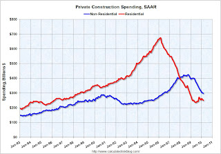 Click on graph for larger image in new window.
The first graph shows private residential and nonresidential construction spending since 1993. Note: nominal dollars, not inflation adjusted.
Private residential construction spending appears to have bottomed in early 2009, but has been mostly moving sideways since then. Residential spending is now 62.8% below the peak of early 2006.
Private non-residential construction spending continues to decline as major projects are completed. Non-residential spending is now 29.9% below the peak of late 2008.
 The second graph shows the year-over-year change for private residential and nonresidential construction spending.
Nonresidential spending is off 25.5% on a year-over-year (YoY) basis.
Residential construction spending is now up slightly from a year ago.
Private residential spending will probably exceed non-residential spending later this year - mostly because of continued declines in non-residential spending. Private consturction will be a weak sector for some time.
ISM Manufacturing Index Shows Expansion in April
by Calculated Risk on 5/03/2010 10:00:00 AM
PMI at 60.4% in April, up from 59.6% in March. Any reading above 50 shows expansion.
From the Institute for Supply Management: April 2010 Manufacturing ISM Report On Business®
Economic activity in the manufacturing sector expanded in April for the ninth consecutive month, and the overall economy grew for the 12th consecutive month, say the nation's supply executives in the latest Manufacturing ISM Report On Business®.This suggest the expansion in the manufacturing sector increased at a faster pace in April. Although slightly below expectations, this shows continued expansion in the manufacturing sector.
The report was issued today by Norbert J. Ore, CPSM, C.P.M., chair of the Institute for Supply Management™ Manufacturing Business Survey Committee. "The manufacturing sector grew for the ninth consecutive month during April. The rate of growth as indicated by the PMI is the fastest since June 2004 when the index hit 60.5 percent. Manufacturers continue to see extraordinary strength in new orders, as the New Orders Index has averaged 61.6 percent for the past 10 months. The signs for employment in the sector continue to improve as the Employment Index registered its fifth consecutive month of growth. Overall, the recovery in manufacturing continues quite strong, and the signs are positive for continued growth."
...
ISM's Employment Index registered 58.5 percent in April, which is 3.4 percentage points higher than the 55.1 percent reported in March. This is the fifth consecutive month of growth in manufacturing employment. An Employment Index above 49.8 percent, over time, is generally consistent with an increase in the Bureau of Labor Statistics (BLS) data on manufacturing employment.
emphasis added
March Personal Income up 0.3%, Spending Increases 0.6%
by Calculated Risk on 5/03/2010 08:33:00 AM
The BEA released Q1 data on Friday, and here is the March data from the BEA: Personal Income and Outlays, March 2010
Personal income increased $36.0 billion ... Personal consumption expenditures (PCE) increased $58.6 billion, or 0.6 percent.Once again spending increased much faster than income ... meaning the saving rate declined again.
...
Real PCE -- PCE adjusted to remove price changes -- increased 0.5 percent in March, the same increase as in February.
...
Personal saving -- DPI less personal outlays -- was $304.0 billion in March, compared with $332.2 billion in February. Personal saving as a percentage of disposable personal income was 2.7 percent in March, compared with 3.0 percent in February.
 Click on graph for large image.
This graph shows the saving rate starting in 1959 (using a three month trailing average for smoothing) through the March Personal Income report. The saving rate fell to 2.7% in March.
I still expect the saving rate to rise over the next couple of years slowing the growth in PCE.
The following graph shows real Personal Consumption Expenditures (PCE) through March (2005 dollars). Note that the y-axis doesn't start at zero to better show the change.
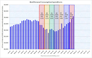 The quarterly change in PCE is based on the change from the average in one quarter, compared to the average of the preceding quarter.
The colored rectangles show the quarters, and the blue bars are the real monthly PCE.
The increase in PCE in March was strong and PCE increased 3.6% SAAR in Q1 2010. This increase in spending was driven by less saving and transfer payments.
The National Bureau of Economic Research (NBER) uses several measures to determine if the economy is in recession. One of the measures is real personal income less transfer payments (see NBER memo). This was flat in March at $9,039.4 billion (SAAR) compared to 9,037.5 billion in February, and is barely above the low of September 2009 ($9,000 billion).
 This graph shows real personal income less transfer payments since 1969.
This measure of economic activity is moving sideways - similar to what happened following the 2001 recession.
This is a solid report for PCE, but PCE growth is not sustainable without jobs and income growth.
Sunday, May 02, 2010
Greek Austerity: Can they do it?
by Calculated Risk on 5/02/2010 09:45:00 PM
Note: here is the weekly summary and a look ahead.
The bailout is official ...
From Bloomberg: Greece Gets $146 Billion Rescue on EU, IMF Austerity Package
From the NY Times: Greece Takes Its Bailout, but Doubts for the Region Persist
The austerity program is intended to reduce the deficit from 13.6% of GDP to 3% of GDP by 2012. This will be especially difficult because Greece is expected to be in a recession for most of that time (so GDP is shrinking).
Can it be done? It has been done before ...
From the IMF: The State of Public Finances Cross-Country Fiscal Monitor: November 2009 (ht JA) Click on table for larger image in new window.
The adjustment needed in many advanced economies will be difficult, but is not unprecedented. More than twenty advanced economies have achieved improvements in their structural primary balances of at least 5 percent of GDP at least once in the last four decades; ten of them have achieved improvements in excess of 10 percent of GDP in that period (Table 9). Of course, adjustment going forward will be more challenging than in some past episodes, because it will have to be undertaken in an environment of adverse demographics and potentially sluggish potential growth. Some past adjustment episodes in Europe also benefited from nominal exchange rate depreciation and the “carrot” of joining the euro, neither of which will apply in the future. The data also suggest that it has been hard for countries to maintain this adjustment: in most cases, the primary balance deteriorated in the period after consolidation ended. However, this may reflect in part the fact that as the debt ratio declines, smaller primary surpluses are required to stabilize it at its current level.Greece has done it before (as have several other countries), but this time they have to do it with 1) a shrinking economy, 2) poor demographics (aging population), and 3) no exchange rate depreciation. This will be a huge challenge.
Update to Fed Rent-to-House Price Graph
by Calculated Risk on 5/02/2010 06:00:00 PM
Last night I posted some excerpts from the just released 2004 FOMC transcripts showing there was some concern about a housing bubble in June 2004. A key graph, presented by Fed associate research director Stephen Oliner, showed the rent-to-price ratio through Q1 2004. Oliner used the OFHEO (now FHFA) house price index. Usually the invert is presented (price-to-rent).
Here is an update to that graph through Q4 2009. Click on graph for larger image in new window.
The arrow shows the rent-to-price ratio when Oliner warned that "even after you account for the fundamentals, there’s a part of the increase [in house prices] that is hard to explain".
Clearly the ratio was even more out of line with fundamentals in 2005.
But the OFHEO (now FHFA) price index is GSE mortgages only, and by far the worst loans were part of the Wall Street originate-to-distribute machine. Using the OFHEO house prices missed the worst loans. However the Case-Shiller index included these non-GSE transactions, so I added the blue line showing the rent-to-price ratio using the quarterly Case-Shiller National House Price index.
If the Fed had been paying attention to all house prices, the graph presented at the 2004 meeting would have been even more alarming. It was scary enough ...


