 RSS Feed
 by Calculated Risk on 12/10/2020 11:08:00 AM
Thursday, December 10, 2020
Cleveland Fed: Key Measures Show Inflation Softened in November
The Cleveland Fed released the median CPI and the trimmed-mean CPI this morning:
According to the Federal Reserve Bank of Cleveland, the median Consumer Price Index rose 0.1% November. The 16% trimmed-mean Consumer Price Index rose 0.1% in November. "The median CPI and 16% trimmed-mean CPI are measures of core inflation calculated by the Federal Reserve Bank of Cleveland based on data released in the Bureau of Labor Statistics’ (BLS) monthly CPI report".
Note: The Cleveland Fed released the median CPI details for November here. Car and Truck rentals and Lodging away from home increased sharply in November.
 Click on graph for larger image.
This graph shows the year-over-year change for these four key measures of inflation. On a year-over-year basis, the median CPI rose 2.3%, the trimmed-mean CPI rose 2.1%, and the CPI less food and energy rose 1.6%. Core PCE is for October and increased 1.4% year-over-year.
Overall inflation will not be a concern during the crisis.
CoreLogic: 1.6 Million Homes with Negative Equity in Q3 2020
by Calculated Risk on 12/10/2020 09:00:00 AM
From CoreLogic: Home Equity Reaches Record Highs: Homeowners Gained Over $1 Trillion in Equity in Q3 2020, CoreLogic Reports
CoreLogic® ... today released the Home Equity Report for the third quarter of 2020. The report shows U.S. homeowners with mortgages (which account for roughly 63% of all properties) have seen equity increase by 10.8% year over year, representing a collective equity gain of $1 trillion, and an average gain of $17,000 per homeowner, since the third quarter of 2019. This marks the largest average equity gain since the first quarter of 2014.
Despite the economic impact of the pandemic, home prices soared throughout the summer and fall. Appreciation reached its highest level since 2014 in the third quarter of 2020 as prospective homebuyers continued to compete for the low supply of homes on the market, pushing home equity to record levels. Equity gains are likely to persist over the next several months as strong home-purchase demand is expected to remain high and continue pushing prices up. However, the CoreLogic HPI Forecast shows home prices slowing over the next 12 months as new home construction and more existing for-sale homes ease supply pressures. This could moderate the pace of both home price growth and equity gains.
“Over the past year, strong home price growth has created a record level of home equity for homeowners,” said Dr. Frank Nothaft, chief economist for CoreLogic. “The average family with a home mortgage loan had $194,000 in home equity in the third quarter. This provides an important buffer to protect families if they experience financial difficulties, and is one reason for the generational-low in foreclosure rates reported in September.”
...
Negative equity, also referred to as underwater or upside down, applies to borrowers who owe more on their mortgages than their homes are currently worth. As of the third quarter of 2020, negative equity share, and the quarter-over-quarter and year-over-year changes, were as follows:
• Quarterly change: From the second quarter of 2020 to the third quarter of 2020, the total number of mortgaged homes in negative equity decreased by 6.9% to 1.6 million homes or 3% of all mortgaged properties.
• Annual change: In the third quarter of 2019, 2 million homes, or 3.7% of all mortgaged properties, were in negative equity. This number decreased by 18.3%, or 370,000 properties, in the third quarter of 2020 to 1.6 million mortgaged properties in negative equity.
• National aggregate value: The national aggregate value of negative equity was approximately $283.3 billion at the end of the third quarter of 2020. This is down quarter over quarter by approximately $2.2 billion, or 0.8%, from $285.5 billion in the second quarter of 2020, and down year over year by approximately $21.4 billion, or 7%, from $304.7 billion in the third quarter of 2019.
emphasis added
 Click on graph for larger image.
This graph from CoreLogic compares Q3 to Q2 2020 equity distribution by LTV. There are still quite a few properties with LTV over 125%. But most homeowners have a significant amount of equity. This is a very different picture than at the start of the housing bust when many homeowners had little equity.
On a year-over-year basis, the number of homeowners with negative equity has declined from 2.0 million to 1.6 million.
Weekly Initial Unemployment Claims increased sharply to 853,000
by Calculated Risk on 12/10/2020 08:45:00 AM
The DOL reported:
In the week ending December 5, the advance figure for seasonally adjusted initial claims was 853,000, an increase of 137,000 from the previous week's revised level. The previous week's level was revised up by 4,000 from 712,000 to 716,000. The 4-week moving average was 776,000, an increase of 35,500 from the previous week's revised average. The previous week's average was revised up by 1,000 from 739,500 to 740,500.This does not include the 427,609 initial claims for Pandemic Unemployment Assistance (PUA) that was up from 288,234 the previous week.
emphasis added
The following graph shows the 4-week moving average of weekly claims since 1971.
 Click on graph for larger image.
The dashed line on the graph is the current 4-week average. The four-week average of weekly unemployment claims increased to 776,000.
The previous week was revised up.
The second graph shows seasonally adjust continued claims since 1967 (lags initial by one week).
 At the worst of the Great Recession, continued claims peaked at 6.635 million, but then steadily declined.
Continued claims increased to 5,757,000 (SA) from 5,527,000 (SA) last week and will likely stay at a high level until the crisis abates.
Note: There are an additional 8,555,763 receiving Pandemic Unemployment Assistance (PUA) that decreased from 8,869,502 the previous week (there are questions about these numbers). This is a special program for business owners, self-employed, independent contractors or gig workers not receiving other unemployment insurance.
An additional 4,532,876 are receiving Pandemic Emergency Unemployment Compensation (PEUC) that decreased from 4,569,016 the previous week. These last two programs are set to expire on December 26th.
This was higher than expected.
BLS: CPI increased 0.2% in November, Core CPI Increased 0.2%
by Calculated Risk on 12/10/2020 08:33:00 AM
The Consumer Price Index for All Urban Consumers (CPI-U) increased 0.2 percent in November on a seasonally adjusted basis after being unchanged in October, the U.S. Bureau of Labor Statistics reported today. Over the last 12 months, the all items index increased 1.2 percent before seasonal adjustment.Overall inflation was slightly higher than expectations in November. I'll post a graph later today after the Cleveland Fed releases the median and trimmed-mean CPI.
...
The index for all items less food and energy increased 0.2 percent in November after being unchanged the prior month. The indexes for lodging away from home, household furnishings and operations, recreation, apparel, airline fares, and motor vehicle insurance all increased in November. The indexes for used cars and trucks, medical care, and new vehicles all declined over the month.
The all items index rose 1.2 percent for the 12 months ending November, the same increase as for the period ending October. The index for all items less food and energy rose 1.6 percent over the last 12 months, also the same increase as the period ending October. The food index rose 3.7 percent over the last 12 months, while the energy index fell 9.4 percent.
emphasis added
Wednesday, December 09, 2020
Thursday: CPI, Unemployment Claims, Q3 Flow of Funds
by Calculated Risk on 12/09/2020 09:28:00 PM
Thursday:
• At 8:30 AM ET, The initial weekly unemployment claims report will be released. The consensus is for 700,000 initial claims, down from 712,000 last week.
• Also at 8:30 AM, The Consumer Price Index for November from the BLS. The consensus is for a 0.1% increase in CPI, and a 0.2% increase in core CPI.
• At 12:00 PM, Q3 Flow of Funds Accounts of the United States from the Federal Reserve.
December 9 COVID-19 Test Results; Record 7-Day Cases, Hospitalizations, Over 3,000 Deaths
by Calculated Risk on 12/09/2020 07:44:00 PM
I'm looking forward to not posting this data in a few months. Please stay healthy!
The US is now averaging over 1 million tests per day. Based on the experience of other countries, for adequate test-and-trace (and isolation) to reduce infections, the percent positive needs to be well under 5% (probably close to 1%), so the US still needs to increase the number of tests per day significantly (or take actions to push down the number of new infections).
There were 1,454,192 test results reported over the last 24 hours.
There were 209,822 positive tests.
Over 21,000 US deaths have been reported so far in December. See the graph on US Daily Deaths here.
 Click on graph for larger image.
This data is from the COVID Tracking Project.
The percent positive over the last 24 hours was 14.4% (red line is 7 day average). The percent positive is calculated by dividing positive results by the sum of negative and positive results (I don't include pending).
And check out COVID Exit Strategy to see how each state is doing.
 The second graph shows the 7 day average of positive tests reported and daily hospitalizations.
Note that there were very few tests available in March and April, and many cases were missed, so the hospitalizations was higher relative to the 7-day average of positive tests in July.
• Record Hospitalizations (Over 106,000)
• Record 7 Day Average Cases
• Record 7 Day Average Deaths
By Request: Public and Private Sector Payroll Jobs During Presidential Terms
by Calculated Risk on 12/09/2020 01:11:00 PM
Note: I usually post this monthly, but I hesitated recently due to the COVID-19 pandemic. But I've received a number of requests lately - the recent numbers are ugly.
Here is another update of tracking employment during Presidential terms. We frequently use Presidential terms as time markers - we could use Speaker of the House, Fed Chair, or any other marker.
NOTE: Several readers have asked if I could add a lag to these graphs (obviously a new President has zero impact on employment for the month they are elected). But that would open a debate on the proper length of the lag, so I'll just stick to the beginning of each term.
Important: There are many differences between these periods. Overall employment was smaller in the '80s, however the participation rate was increasing in the '80s (younger population and women joining the labor force), and the participation rate is generally declining now. But these graphs give an overview of employment changes.
The first graph shows the change in private sector payroll jobs from when each president took office until the end of their term(s). Presidents Carter and George H.W. Bush only served one term.
Mr. G.W. Bush (red) took office following the bursting of the stock market bubble, and left during the bursting of the housing bubble. Mr. Obama (dark blue) took office during the financial crisis and great recession. There was also a significant recession in the early '80s right after Mr. Reagan (dark red) took office.
There was a recession towards the end of President G.H.W. Bush (light purple) term, and Mr. Clinton (light blue) served for eight years without a recession.
 Click on graph for larger image.
The first graph is for private employment only.
Mr. Trump is in Orange (46 months).
The employment recovery during Mr. G.W. Bush's (red) first term was sluggish, and private employment was down 824,000 jobs at the end of his first term. At the end of Mr. Bush's second term, private employment was collapsing, and there were net 387,000 private sector jobs lost during Mr. Bush's two terms.
Private sector employment increased by 20,970,000 under President Clinton (light blue), by 14,714,000 under President Reagan (dark red), 9,039,000 under President Carter (dashed green), 1,511,000 under President G.H.W. Bush (light purple), and 11,849,000 under President Obama (dark blue).
During the 46 months of Mr. Trump's term, the economy has lost 2,128,000 private sector jobs.
 A big difference between the presidencies has been public sector employment. Note: the bumps in public sector employment due to the decennial Census in 1980, 1990, 2000, 2010 and 2020.
The public sector grew during Mr. Carter's term (up 1,304,000), during Mr. Reagan's terms (up 1,414,000), during Mr. G.H.W. Bush's term (up 1,127,000), during Mr. Clinton's terms (up 1,934,000), and during Mr. G.W. Bush's terms (up 1,744,000 jobs). However the public sector declined significantly while Mr. Obama was in office (down 277,000 jobs).
During the 46 months of Mr. Trump's term, the economy has lost 870,000 public sector jobs.
 The third graph shows the progress towards the Trump goal of adding 10 million jobs over his 4 year term.
After 46 months of Mr. Trump's presidency, the economy has lost 2,998,000 jobs, about 12,581,000 behind the projection.
BLS: Job Openings "Little Changed" at 6.7 Million in October
by Calculated Risk on 12/09/2020 10:05:00 AM
From the BLS: Job Openings and Labor Turnover Summary
The number of job openings was little changed at 6.7 million on the last business day of October, the U.S. Bureau of Labor Statistics reported today. Hires were little changed at 5.8 million while total separations increased to 5.1 million. Within separations, the quits rate was unchanged at 2.2 percent while the layoffs and discharges rate increased to 1.2 percent.The following graph shows job openings (yellow line), hires (dark blue), Layoff, Discharges and other (red column), and Quits (light blue column) from the JOLTS.
emphasis added
This series started in December 2000.
Note: The difference between JOLTS hires and separations is similar to the CES (payroll survey) net jobs headline numbers. This report is for October, the most recent employment report was for November.
 Click on graph for larger image.
Note that hires (dark blue) and total separations (red and light blue columns stacked) are usually pretty close each month. This is a measure of labor market turnover. When the blue line is above the two stacked columns, the economy is adding net jobs - when it is below the columns, the economy is losing jobs.
The huge spikes in layoffs and discharges in March and April 2020 are labeled, but off the chart to better show the usual data.
Jobs openings increased in October to 6.652 million from 6.494 million in September.
The number of job openings (yellow) were down 9.0% year-over-year.
Quits were down 10% year-over-year. These are voluntary separations. (see light blue columns at bottom of graph for trend for "quits").
Job openings were little changed in September, and are down YoY - and quits are down sharply YoY.
MBA: Mortgage Applications Decrease in Latest Weekly Survey
by Calculated Risk on 12/09/2020 07:00:00 AM
From the MBA: Mortgage Applications Decrease in Latest MBA Weekly Survey
— Mortgage applications decreased 1.2 percent from one week earlier, according to data from the Mortgage Bankers Association’s (MBA) Weekly Mortgage Applications Survey for the week ending December 4, 2020. The previous week’s results included an adjustment for the Thanksgiving holiday.
... The Refinance Index increased 2 percent from the previous week and was 89 percent higher than the same week one year ago. The seasonally adjusted Purchase Index decreased 5 percent from one week earlier. The unadjusted Purchase Index increased 29 percentcompared with the previous week and was 22 percent higher than the same week one year ago.
“Refinance activity increased last week in response to mortgage rates for 30-year, 15-year, and FHA loans hitting their lowest levels in MBA’s survey. The increase in refinance applications was driven by FHA and VA refinances, while conventional activity fell slightly. The ongoing refinance wave has continued through the fall, with activity last week up 89 percent from a year ago,” said Joel Kan, MBA’s Associate Vice President of Economic and Industry Forecasting. “The purchase market is also poised to finish 2020 on a strong note. Applications fell slightly last week but were around 3 percent higher than the two weeks leading up to Thanksgiving. Reversing the recent trend, there was also a shift in the composition of purchase applications, with an increase in government loans pushing the average loan balance lower.”
...
The average contract interest rate for 30-year fixed-rate mortgages with conforming loan balances ($510,400 or less) decreased to a survey low of 2.90 percent from 2.92 percent, with points increasing to 0.35 from 0.31 (including the origination fee) for 80 percent loan-to-value ratio (LTV) loans.
emphasis added
 Click on graph for larger image.
The first graph shows the refinance index since 1990.
The refinance index has been very volatile recently depending on rates and liquidity.
But with record low rates, the index remains up significantly from last year.
 The second graph shows the MBA mortgage purchase index
According to the MBA, purchase activity is up 22% year-over-year unadjusted.
Note: Red is a four-week average (blue is weekly).
Tuesday, December 08, 2020
Wednesday: Job Openings
by Calculated Risk on 12/08/2020 09:53:00 PM
From Matthew Graham at Mortgage News Daily: Refi Rates Are Finally Back to All-Time Lows
For some lenders, it was last week. For others, it was today. After months of waiting and multiple successive reports of all-time lows from other sources, the average lender is now finally back in line with the actual all-time lows seen on August 4th, 2020. [Top Tier Scenarios 30YR FIXED: 2.80%]Wednesday:
emphasis added
• At 7:00 AM ET, The Mortgage Bankers Association (MBA) will release the results for the mortgage purchase applications index.
• At 10:00 AM, Job Openings and Labor Turnover Survey for October from the BLS.
December 8 COVID-19 Test Results; Record 7-Day Cases, Deaths, Hospitalizations
by Calculated Risk on 12/08/2020 07:50:00 PM
I'm looking forward to not posting this data in a few months. Please stay healthy!
The US is now averaging over 1 million tests per day. Based on the experience of other countries, for adequate test-and-trace (and isolation) to reduce infections, the percent positive needs to be well under 5% (probably close to 1%), so the US still needs to increase the number of tests per day significantly (or take actions to push down the number of new infections).
There were 1,398,336 test results reported over the last 24 hours.
There were 213,498 positive tests.
Over 18,000 US deaths have been reported so far in December. See the graph on US Daily Deaths here.
 Click on graph for larger image.
This data is from the COVID Tracking Project.
The percent positive over the last 24 hours was 15.3% (red line is 7 day average). The percent positive is calculated by dividing positive results by the sum of negative and positive results (I don't include pending).
And check out COVID Exit Strategy to see how each state is doing.
 The second graph shows the 7 day average of positive tests reported and daily hospitalizations.
Note that there were very few tests available in March and April, and many cases were missed, so the hospitalizations was higher relative to the 7-day average of positive tests in July.
• Record Hospitalizations (Over 104,000)
• Record 7 Day Average Cases
• Record 7 Day Average Deaths
Seattle Real Estate in November: Sales up 22% YoY, Inventory UP 27% YoY
by Calculated Risk on 12/08/2020 01:52:00 PM
Note: Inventory is down sharply in the Northwest almost everywhere except Seattle. And inventory is low in Seattle too.
The Northwest Multiple Listing Service reported Northwest MLS brokers say real estate activity across Washington remains strong
The Northwest MLS report summarizing November activity shows strong year-over-year (YOY) increases in closed sales (up about 23%) and prices (up 13.8%). Pending sales (mutually accepted offers) rose 7.9% from a year ago, and the year’s saga of depleted inventory continued last month with the number of total listings down nearly 43%.The press release is for the Northwest MLS area. There were 8,875 closed sales in November 2020, up 23.0% from 7,216 sales in November 2019.
...
Windermere Chief Economist Matthew Gardner said even though the housing market has started to show some signs of its traditional winter slowdown “activity remains higher than we would normally see at this time of year. This isn’t too surprising given the fact that the spring selling season was essentially cancelled due to COVID-19.”
emphasis added
In King County, sales were up 23% year-over-year, and active inventory was down 18% year-over-year.
In Seattle, sales were up 22.2% year-over-year, and inventory was up 27% year-over-year.. This puts the months-of-supply in Seattle at just 1.7 months.
NMHC: Rent Payment Tracker Shows Households Paying Rent Decreased 7.8% YoY in Early December
by Calculated Risk on 12/08/2020 11:52:00 AM
From the NMHC: NMHC Rent Payment Tracker Finds 75.4 Percent of Apartment Households Paid Rent as of December 6
The National Multifamily Housing Council (NMHC)’s Rent Payment Tracker found 75.4 percent of apartment households made a full or partial rent payment by December 6 in its survey of 11.5 million units of professionally managed apartment units across the country.
This is a 7.8 percentage point, or 894,864 household decrease from the share who paid rent through December 6, 2019 and compares to 80.4 percent that had paid by November 6, 2020. It should be noted that December 5th and 6th fell on a weekend in 2020 and therefore may not be a direct comparison to last year’s figures. These data encompass a wide variety of market-rate rental properties across the United States, which can vary by size, type and average rental price.
"While the initial rent collection figures for the first week of December are concerning, only a full month's results will paint a complete picture. However, it should not come as a surprise that a rising number of households are struggling to make ends meet. As the nation enters a winter with increasing COVID-19 case levels and even greater economic distress – as indicated by last week’s disquieting employment report - it is only a matter of time before both renters and housing providers reach the end of their resources,” said Doug Bibby, NMHC President.
emphasis added
This graph from the NMHC Rent Payment Tracker shows the percent of household making full or partial rent payments by the 6th of the month.
This is mostly for large, professionally managed properties.
The second graph shows full month payments through November.
CR Note: There are some timing issues month to month, but rent payments appear to be declining, and December is off to a slow start.
Las Vegas Real Estate in November: Sales up 28% YoY, Inventory down 54% YoY
by Calculated Risk on 12/08/2020 08:26:00 AM
This report is for closed sales in November; sales are counted at the close of escrow, so the contracts for these homes were mostly signed in September and October.
The Las Vegas Realtors reported Southern Nevada home prices set record for sixth straight month amid pandemic; LVR housing statistics for November 2020
LVR reported a total of 3,761 existing local homes, condos and townhomes were sold during November. Compared to the same time last year, November sales were up 26.1% for homes and up 34.7% for condos and townhomes.1) Overall sales were up 27.7% year-over-year to 3,761 in November 2020 from 2,946 in November 2019.
“Like other places around the country, we’re seeing multiple offers on properties listed for sale,” said 2020 LVR President Tom Blanchard, a longtime local REALTOR®. “The supply of available homes is very low, and demand is high. I hope the new year will bring some additional inventory as local homeowners start to feel more comfortable moving. We can easily absorb three or four times the current available inventory without tilting the scales of meeting our current demand for housing here in Southern Nevada.”
He said the number of local homes available for sale remains well below the six-month supply considered to be a balanced market. In fact, the sales pace in November equates to just over a one-month supply of homes available for sale, creating what Blanchard said is a local housing shortage.
By the end of November, LVR reported 3,756 single-family homes listed for sale without any sort of offer. That’s down 42.5% from one year ago. For condos and townhomes, the 1,288 properties listed without offers in November represent a 24.7% drop from one year ago.
…
Despite the coronavirus crisis and economic downturn, the number of so-called distressed sales remains near historically low levels. LVR reported that short sales and foreclosures combined accounted for just 0.8% of all existing local property sales in November. That compares to 2.0% of all sales one year ago, 2.6% two years ago and just under 5% three years ago.
emphasis added
2) Active inventory (single-family and condos) is down from a year ago, from a total of 8,242 in 2019 to 3,756 in November 2020. Note: Total inventory was down 54.4% year-over-year. And months of inventory is low.
3) Low level of distressed sales.
Monday, December 07, 2020
December 7 COVID-19 Test Results; Record 7-Day Deaths, Record Hospitalizations
by Calculated Risk on 12/07/2020 07:22:00 PM
I'm looking forward to not posting this data in a few months. Please stay healthy!
The US is now averaging over 1 million tests per day. Based on the experience of other countries, for adequate test-and-trace (and isolation) to reduce infections, the percent positive needs to be well under 5% (probably close to 1%), so the US still needs to increase the number of tests per day significantly (or take actions to push down the number of new infections).
There were 1,566,574 test results reported over the last 24 hours.
There were 180,193 positive tests.
Over 15,000 US deaths have been reported so far in December. See the graph on US Daily Deaths here.
 Click on graph for larger image.
This data is from the COVID Tracking Project.
The percent positive over the last 24 hours was 11.5% (red line is 7 day average). The percent positive is calculated by dividing positive results by the sum of negative and positive results (I don't include pending).
And check out COVID Exit Strategy to see how each state is doing.
 The second graph shows the 7 day average of positive tests reported and daily hospitalizations.
Note that there were very few tests available in March and April, and many cases were missed, so the hospitalizations was higher relative to the 7-day average of positive tests in July.
• Record Hospitalizations (Over 102,000)
• Record 7 Day Average Cases
• Record 7 Day Average Deaths
MBA Survey: "Share of Mortgage Loans in Forbearance Increases to 5.54%"
by Calculated Risk on 12/07/2020 06:26:00 PM
Note: This is as of November 29th.
From the MBA: Share of Mortgage Loans in Forbearance Remains Flat at 5.54%
he Mortgage Bankers Association's (MBA) latest Forbearance and Call Volume Survey revealed that the total number of loans now in forbearance remained unchanged relative to the prior week at 5.54% as of November 29, 2020. According to MBA's estimate, 2.8 million homeowners are in forbearance plans.
...
"After two weeks of increases, the share of loans in forbearance was unchanged for the week that included Thanksgiving. A small decline in forbearances for GSE loans was offset by increases for Ginnie Mae and portfolio loans," said Mike Fratantoni, MBA's Senior Vice President and Chief Economist. "While new forbearance requests declined for the week, exits slowed to a new low for the series."
Added Fratantoni, "The job market data for November showed an economic recovery that was slowing in response to the latest surge in COVID-19 cases. It is not surprising to see the rate of forbearance exits slow, as households that needed forbearance assistance in October may be in even greater need now."
...
By stage, 19.81% of total loans in forbearance are in the initial forbearance plan stage, while 77.90% are in a forbearance extension. The remaining 2.29% are forbearance re-entries.
emphasis added
 Click on graph for larger image.
This graph shows the percent of portfolio in forbearance by investor type over time. Most of the increase was in late March and early April, and has been trending down for the last few months.
The MBA notes: "Total weekly forbearance requests as a percent of servicing portfolio volume (#) decreased relative to the prior week: from 0.11% to 0.08%."
Leading Index for Commercial Real Estate Decreased in November
by Calculated Risk on 12/07/2020 01:35:00 PM
From Dodge Data Analytics: Dodge Momentum Index Steps Lower in November
The Dodge Momentum Index fell 2.6% in November to 123.3 (2000=100) from the revised October reading of 126.5. The Momentum Index, issued by Dodge Data & Analytics, is a monthly measure of the first (or initial) report for nonresidential building projects in planning, which have been shown to lead construction spending for nonresidential buildings by a full year. The institutional component of the Momentum Index fell 4.4%, while the commercial component lost 1.6%.
Since the expiration of support programs in the CARES Act, the economy has struggled to maintain traction and in its wake planning for nonresidential building projects has slowed. As the next wave of COVID-19 infections quickly approaches economic growth and job gains will ease further. Additionally, uncertainty over the potential for further federal stimulus has significantly complicated the recovery and will continue to negatively impact nonresidential building throughout the planning and construction processes.
emphasis added
 Click on graph for larger image.
This graph shows the Dodge Momentum Index since 2002. The index was at 123.3 in November, down from 126.5 in October.
According to Dodge, this index leads "construction spending for nonresidential buildings by a full year". This index suggests a decline in Commercial Real Estate construction through most of 2021.
Employment: November Diffusion Indexes
by Calculated Risk on 12/07/2020 11:31:00 AM
The employment diffusion indexes are useful in indicating how widespread job gains are in a given month.
For manufacturing, the diffusion index was at 58.6, down from 60.5 in October.
Think of this as a measure of how widespread job gains or losses are across industries. The further from 50 (above or below), the more widespread the job losses or gains reported by the BLS. From the BLS:
Figures are the percent of industries with employment increasing plus one-half of the industries with unchanged employment, where 50 percent indicates an equal balance between industries with increasing and decreasing employment.
 Click on graph for larger image.
Both indexes declined sharply in March 2020, and collapsed to new record lows in April, due to the impact from COVID-19.
Then the indexes increased as the economy bounced back.
Both indexes declined in October, but are still at decent levels, indicating job growth was fairly widespread across industries.
Black Knight Mortgage Monitor for October: "2020 On Pace to See More than 9 Million Refinance Transactions"
by Calculated Risk on 12/07/2020 11:25:00 AM
Black Knight released their Mortgage Monitor report for October today. According to Black Knight, 6.44% of mortgages were delinquent in October, down from 6.66% of mortgages in September, and up from 3.39% in October 2019. Black Knight also reported that 0.33% of mortgages were in the foreclosure process, down from 0.48% a year ago.
This gives a total of 6.77% delinquent or in foreclosure.
Press Release: 2020 On Pace to See More than 9 Million Refinance Transactions; 82% of Refinancing Borrowers Not Retained
Today, the Data & Analytics division of Black Knight, Inc. (NYSE:BKI) released its latest Mortgage Monitor Report, based upon the company’s industry-leading mortgage performance, real estate and public records datasets. This month, the company looked into Q3 2020 mortgage originations – with a focus on refinance lending – and mortgage servicers’ success in retaining the business of refinancing homeowners. As Black Knight Data & Analytics President Ben Graboske explained, while Q3 2020 quarterly origination volumes broke records across the board, retention rates have suffered amid the surge of lending activity.
“As our rate lock data had suggested last month, Q3 2020 originations hit record highs in purchase, refinance and overall lending as record-low mortgage rates and a delay to the normal spring home-buying season spurred both the purchase and refinance markets,” said Graboske. “Some 2.7 million homeowners refinanced their first-lien mortgages in the third quarter, bringing the total through September 2020 to 6.4 million. What’s more, consolidated rate lock data from Black Knight’s Compass Analytics and Optimal Blue divisions suggests that number could climb above 9 million by year’s end. And, with rates continuing to sit at record lows, refinance incentive remains at historic highs. As of the last week of November, 19.4 million 30-year mortgage holders could likely both qualify for and benefit from a refinance.
emphasis added
 Click on graph for larger image.
Here is a graph from the Mortgage Monitor that shows first lien refinance activity.
From Black Knight:
• Through the first three quarters of the year, some 6.4 million homeowners have refinanced their primary mortgage, with that number on pace to climb above 9 million by the end of the year
• While cash-out activity has ridden the wave higher, cash-outs only made up 27% of Q3 refinance lending, the lowest such share in seven years
• The average cash-out amount fell to $51,600 (from $63,000 in Q2), pushing the volume of equity withdrawn in Q3 to down $37 billion, the lowest such equity withdrawal volume since Q2 2019
• This suggests cashing out equity was a distant second priority to borrowers locking in record low rates as their primary driver to refinance
 And on delinquencies from Black Knight:
 • Delinquencies improved in October, falling to 6.44%, their lowest level since MarchThere is much more in the mortgage monitor.
• Despite five consecutive months of improvement, there are still nearly 2X as many delinquent mortgages (+1.6 million/+91%) as there were entering 2020
• Serious delinquencies (90+ Days) improved in October as well, but volumes remain at more than 5x (+1.8M) their pre-pandemic levels
• Though COVID-19 case rates are rising across the country, new delinquencies remain below the three-month average and have been unaffected by these surges, at least for now
Seven High Frequency Indicators for the Economy
by Calculated Risk on 12/07/2020 08:50:00 AM
These indicators are mostly for travel and entertainment. It will interesting to watch these sectors recover as the vaccine is distributed.
IMPORTANT: Be safe now - if all goes well, we could all be vaccinated by Q2 2021.
----- Airlines: Transportation Security Administration -----
The TSA is providing daily travel numbers.
 Click on graph for larger image.
This data shows the seven day average of daily total traveler throughput from the TSA for 2019 (Blue) and 2020 (Red).
The dashed line is the percent of last year for the seven day average.
This data is as of December 6th.
The seven day average is down 65.5% from last year (34.5% of last year). (Dashed line)
There had been a slow increase from the bottom, but has declined following the Thanksgiving week holiday.
----- Restaurants: OpenTable -----
The second graph shows the 7 day average of the year-over-year change in diners as tabulated by OpenTable for the US and several selected cities.
 Thanks to OpenTable for providing this restaurant data:
This data is updated through December 5, 2020.
This data is "a sample of restaurants on the OpenTable network across all channels: online reservations, phone reservations, and walk-ins. For year-over-year comparisons by day, we compare to the same day of the week from the same week in the previous year."
Note that this data is for "only the restaurants that have chosen to reopen in a given market". Since some restaurants have not reopened, the actual year-over-year decline is worse than shown.
Note that dining is generally lower in the northern states - Illinois, Pennsylvania, and New York - but declining in the southern states.
----- Movie Tickets: Box Office Mojo -----
 This data shows domestic box office for each week (red) and the maximum and minimum for the previous four years. Data is from BoxOfficeMojo through December 3rd.
Note that the data is usually noisy week-to-week and depends on when blockbusters are released.
Movie ticket sales have picked up slightly over the last couple of months, and were at $16 million last week (compared to usually around $200 million per week).
Some movie theaters have reopened (probably with limited seating).
----- Hotel Occupancy: STR -----
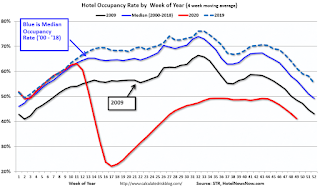 This graph shows the seasonal pattern for the hotel occupancy rate using the four week average.
The red line is for 2020, dash light blue is 2019, blue is the median, and black is for 2009 (the worst year since the Great Depression for hotels - prior to 2020).
This data is through November 28th. Hotel occupancy is currently down 28.5% year-over-year.
Notes: Y-axis doesn't start at zero to better show the seasonal change.
Since there is a seasonal pattern to the occupancy rate, we can track the year-over-year change in occupancy to look for any improvement. This table shows the year-over-year change since the week ending Sept 19, 2020:
This suggests no improvement over the last 11 weeks.
----- Gasoline Supplied: Energy Information Administration -----
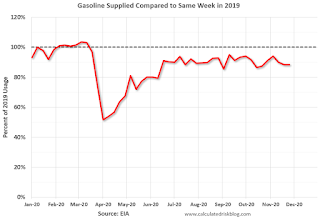 This graph, based on weekly data from the U.S. Energy Information Administration (EIA), shows gasoline supplied compared to the same week last year of .
At one point, gasoline supplied was off almost 50% YoY.
As of November 27th, gasoline supplied was off about 11.7% YoY (about 88.3% of last year).
Note: People driving instead of flying might have boosted gasoline consumption over the summer.
----- Transit: Apple Mobility -----
This graph is from Apple mobility. From Apple: "This data is generated by counting the number of requests made to Apple Maps for directions in select countries/regions, sub-regions, and cities." This is just a general guide - people that regularly commute probably don't ask for directions.
There is also some great data on mobility from the Dallas Fed Mobility and Engagement Index. However the index is set "relative to its weekday-specific average over January–February", and is not seasonally adjusted, so we can't tell if an increase in mobility is due to recovery or just the normal increase in the Spring and Summer.
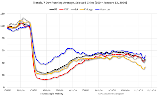 This data is through December 5th for the United States and several selected cities.
The graph is the running 7 day average to remove the impact of weekends.
IMPORTANT: All data is relative to January 13, 2020. This data is NOT Seasonally Adjusted. People walk and drive more when the weather is nice, so I'm just using the transit data.
According to the Apple data directions requests, public transit in the 7 day average for the US is at 46% of the January level. It is at 33% in Chicago, and 52% in Houston - and declining recently (the bump down and up was due to Thanksgiving).
----- New York City Subway Usage -----
Here is some interesting data on New York subway usage (HT BR).
 This graph is from Todd W Schneider. This is daily data for this year.
This data is through Friday, December 4th.
Schneider has graphs for each borough, and links to all the data sources.
He notes: "Data updates weekly from the MTA’s public turnstile data, usually on Saturday mornings".
The TSA is providing daily travel numbers.
 Click on graph for larger image.
This data shows the seven day average of daily total traveler throughput from the TSA for 2019 (Blue) and 2020 (Red).
The dashed line is the percent of last year for the seven day average.
This data is as of December 6th.
The seven day average is down 65.5% from last year (34.5% of last year). (Dashed line)
There had been a slow increase from the bottom, but has declined following the Thanksgiving week holiday.
The second graph shows the 7 day average of the year-over-year change in diners as tabulated by OpenTable for the US and several selected cities.
 Thanks to OpenTable for providing this restaurant data:
This data is updated through December 5, 2020.
This data is "a sample of restaurants on the OpenTable network across all channels: online reservations, phone reservations, and walk-ins. For year-over-year comparisons by day, we compare to the same day of the week from the same week in the previous year."
Note that this data is for "only the restaurants that have chosen to reopen in a given market". Since some restaurants have not reopened, the actual year-over-year decline is worse than shown.
Note that dining is generally lower in the northern states - Illinois, Pennsylvania, and New York - but declining in the southern states.
 This data shows domestic box office for each week (red) and the maximum and minimum for the previous four years. Data is from BoxOfficeMojo through December 3rd.
Note that the data is usually noisy week-to-week and depends on when blockbusters are released.
Movie ticket sales have picked up slightly over the last couple of months, and were at $16 million last week (compared to usually around $200 million per week).
Some movie theaters have reopened (probably with limited seating).
 This graph shows the seasonal pattern for the hotel occupancy rate using the four week average.
 The red line is for 2020, dash light blue is 2019, blue is the median, and black is for 2009 (the worst year since the Great Depression for hotels - prior to 2020).
This data is through November 28th. Hotel occupancy is currently down 28.5% year-over-year.
Notes: Y-axis doesn't start at zero to better show the seasonal change.
Since there is a seasonal pattern to the occupancy rate, we can track the year-over-year change in occupancy to look for any improvement. This table shows the year-over-year change since the week ending Sept 19, 2020:
| Week Ending | YoY Change, Occupancy Rate |
|---|---|
| 9/19 | -31.9% |
| 9/26 | -31.5% |
| 10/3 | -29.6% |
| 10/10 | -29.2% |
| 10/17 | -30.7% |
| 10/24 | -31.7% |
| 10/31 | -29.0% |
| 11/7 | -35.9% |
| 11/14 | -32.7% |
| 11/21 | -32.6% |
| 11/28 | -28.5% |
This suggests no improvement over the last 11 weeks.
 This graph, based on weekly data from the U.S. Energy Information Administration (EIA), shows gasoline supplied compared to the same week last year of .
At one point, gasoline supplied was off almost 50% YoY.
As of November 27th, gasoline supplied was off about 11.7% YoY (about 88.3% of last year).
Note: People driving instead of flying might have boosted gasoline consumption over the summer.
This graph is from Apple mobility. From Apple: "This data is generated by counting the number of requests made to Apple Maps for directions in select countries/regions, sub-regions, and cities." This is just a general guide - people that regularly commute probably don't ask for directions.
There is also some great data on mobility from the Dallas Fed Mobility and Engagement Index. However the index is set "relative to its weekday-specific average over January–February", and is not seasonally adjusted, so we can't tell if an increase in mobility is due to recovery or just the normal increase in the Spring and Summer.
 This data is through December 5th for the United States and several selected cities.
The graph is the running 7 day average to remove the impact of weekends.
IMPORTANT: All data is relative to January 13, 2020. This data is NOT Seasonally Adjusted. People walk and drive more when the weather is nice, so I'm just using the transit data.
According to the Apple data directions requests, public transit in the 7 day average for the US is at 46% of the January level. It is at 33% in Chicago, and 52% in Houston - and declining recently (the bump down and up was due to Thanksgiving).
Here is some interesting data on New York subway usage (HT BR).
 This graph is from Todd W Schneider. This is daily data for this year.
This data is through Friday, December 4th.
Schneider has graphs for each borough, and links to all the data sources.
He notes: "Data updates weekly from the MTA’s public turnstile data, usually on Saturday mornings".


