by Calculated Risk on 3/29/2013 08:46:00 AM
Friday, March 29, 2013
Personal Income increased 1.1% in February, Spending increased 0.7%
The BEA released the Personal Income and Outlays report for February:
Personal income increased $143.2 billion, or 1.1 percent ... in February, according to the Bureau of Economic Analysis. Personal consumption expenditures (PCE) increased $77.2 billion, or 0.7 percent.The following graph shows real Personal Consumption Expenditures (PCE) through February (2005 dollars). Note that the y-axis doesn't start at zero to better show the change.
...
Real PCE -- PCE adjusted to remove price changes -- increased 0.3 percent in February, the same increase as in January. ... PCE price index -- The price index for PCE increased 0.4 percent in February, compare with an increase of less than 0.1 percent in January. The PCE price index, excluding food and energy, increased 0.1 percent, compared with an increase of 0.2 percent.
...
Personal saving -- DPI less personal outlays -- was $310.9 billion in February, compared with $262.5 billion in January. The personal saving rate -- personal saving as a percentage of disposable personal income -- was 2.6 percent in February, compared with 2.2 percent in January.
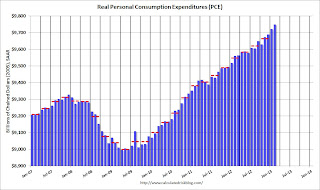 Click on graph for larger image.
The dashed red lines are the quarterly levels for real PCE. Both income and spending were above expectations in February, although some of the increase in spending was related to higher gasoline prices.
Using the two-month method to estimate Q1 PCE growth (first two months of the quarter), PCE was increasing at a 3.5% annual rate in Q1 2013 (using mid-month method, PCE was increasing at 3.2% rate). This suggests upward revisions to Q1 GDP forecasts.
Thursday, March 28, 2013
Friday: Personal Income and Outlays, Consumer Sentiment
by Calculated Risk on 3/28/2013 09:54:00 PM
Note: Markets Closed will be closed Friday in observance of the Good Friday Holiday.
Earlier the Chicago ISM reported:
The Chicago Purchasing Managers reported the Chicago Business Barometer veered downward, falling 4.4 points to 52.4 in March. After a strong start to the year, the Business Barometer was knocked back by steep declines in New Orders, Production, and another disappointing dip in Order Backlogs. All other Business Activity measures also declined in March, the exception being supplier lead times, which lengthened considerably.The employment index declined slightly to 55.1 from 55.7, and new orders were down sharply to 53.0 from 60.2 in February (above 50 is expansion).
Also, Catherine Rampell at the NY Times Economix brings us another reminder that the middle class is struggling: Median Household Income Down 7.3% Since Start of Recession
Median annual household income in February 2013 was $51,404, about 1.1 percent (or $590) lower than the January 2013 level of $51,994. The numbers are all pretax, and are adjusted for both inflation and seasonal changes.Friday economic releases:
February’s median annual household income was 5.6 percent lower than it was in June 2009, the month the recovery technically began; 7.3 percent lower than in December 2007, when the most recent recession officially started; and 8.4 percent lower than in January 2000, the earliest date that this statistical series became available.
• At 8:30 AM ET, Personal Income and Outlays for February. The consensus is for a 0.9% increase in personal income in February (following the sharp increase in December due to some people taking income early to avoid higher taxes, and then the subsequent sharp decline in January), and for 0.6% increase in personal spending. And for the Core PCE price index to increase 0.2%.
• At 9:55 AM, Reuter's/University of Michigan's Consumer sentiment index (final for March). The consensus is for a reading of 72.5.
• At 10:00 AM, the Regional and State Employment and Unemployment (Monthly) for February 2013 will be released.
Comments on Q4 GDP and Investment
by Calculated Risk on 3/28/2013 05:01:00 PM
The third estimate of Q4 GDP report was released this morning, and although GDP was revised up, growth was still very weak at a 0.4% annualized real rate in Q4. Personal consumption expenditures (PCE) were at a 1.8% annualized real growth rate; the third consecutive quarter with a sub 2% growth rate.
There were two significant drags on GDP in Q4, the changes in private inventories subtracted 1.52 percentage points, and government spending subtracted 1.41 percentage points. Inventories will probably rebound in Q1, but government spending (especially at the Federal level) will remain under pressure all year.
Overall this was a weak report, but with some underlying positives especially related to investment (a leading indicator). The following graph shows the contribution to GDP from residential investment, equipment and software, and nonresidential structures (3 quarter centered average). This is important to follow because residential investment tends to lead the economy, equipment and software is generally coincident, and nonresidential structure investment trails the economy.
For the following graph, red is residential, green is equipment and software, and blue is investment in non-residential structures. So the usual pattern - both into and out of recessions is - red, green, blue.
The dashed gray line is the contribution from the change in private inventories.
 Click on graph for larger image.
Residential Investment (RI) made a positive contribution to GDP in Q4 for the seventh consecutive quarter. Usually residential investment leads the economy, but that didn't happen this time because of the huge overhang of existing inventory, but now RI is contributing. The good news: Residential investment has clearly bottomed.
The ongoing positive contribution from RI to GDP is a significant story.
Equipment and software investment increased solidly in Q4, after decreasing in Q3. This followed twelve consecutive quarters with a positive contribution.
The contribution from nonresidential investment in structures was revised to a positive in Q4. Nonresidential investment in structures typically lags the recovery, however investment in energy and power has masked the ongoing weakness in office, mall and hotel investment (the underlying details will be released next week).
The increase in investment is a key positive looking forward.
The second graph shows the contribution to percent change in GDP for residential investment and state and local governments since 2005.
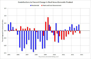 The blue bars are for residential investment (RI), and RI was a significant drag on GDP for several years. Now RI has added to GDP growth for the last 7 quarters (through Q4 2012).
However the drag from state and local governments is ongoing. Although not as large a negative as the worst of the housing bust (and much smaller spillover effects), this decline in state and local government spending has been relentless and unprecedented. I expect the drag from state and local governments to end, but the drag from Federal spending will be ongoing.
The key story is that residential investment is continuing to increase, and I expect this to continue. The change in private inventories will rebound in Q1, and I expect GDP to be closer to 3% this quarter. Since RI is the best leading indicator for the economy, this suggests no recession this year or in 2014 (with the usual caveats about Europe and policy errors in the US).
A comment on Jobs, Household Formation and New Residential Construction
by Calculated Risk on 3/28/2013 02:40:00 PM
Just a few thoughts based on some recent conversations: The key driver for new residential construction, both single family and rental properties, is household formation. And household formation is mostly driven by jobs. So jobs are the key driver for new residential construction.
But wait ... there are about 3 million fewer payroll jobs now than at the start of the recession. So why do we need any new housing units?
Two frequently mentioned reasons are more foreign buying (so jobs are not a driver), and that housing is not transportable, so some areas will need more housing. However many areas are seeing a pickup in construction (not just areas with better job growth). There probably is more foreign buying, especially in the gateway cities like New York, Miami (for South American buyers), and in California for Asian buyers, but that doesn't explain all of the apparent disconnect between total jobs and households.
I think the real reason for the changing ratio between total jobs and households is demographics.
In the decade from 1994 through 2003 (data started in 1994), the BLS reported the number of people "55 and over" and "not in the labor force" increased by 4.3 million. But in the last 9+ years, from January 2004 until February 2013, the BLS reports the number of people over 55 and not in the labor force increased by 8.1 million. So more older people are leaving the labor force.
And older people tend to live in smaller households (see from the Census Bureau: America’s Families and Living Arrangements: 2012), and this has pushed down the overall household size - even with some people doubling up. The overall mean household size in America is 2.55, but that falls to 2.29 for householders in the 55 to 59 age group, and 2.07 in the 60 to 64 age group, 1.91 in the 65 to 74 age group, and to 1.60 for those 75 and older.
This increase in the number of retired Americans with smaller household sizes means the relationship between jobs and households has changed over time. Models of the relationship of number of households to jobs have to be modified to include changing demographics - and this is one reason why the US needs more housing.
Kansas City Fed: Regional Manufacturing contracted slightly in March
by Calculated Risk on 3/28/2013 11:00:00 AM
This is the last of the regional manufacturing surveys for March, and the Kansas City region was the only area showing contraction. From the Kansas City Fed: Tenth District Manufacturing Survey Fell at a Slower Rate
The Federal Reserve Bank of Kansas City released the March Manufacturing Survey today. According to Chad Wilkerson, vice president and economist at the Federal Reserve Bank of Kansas City, the survey revealed that Tenth District manufacturing activity fell at a slower rate, but producers were considerably more optimistic about future months.Here is a graph comparing the regional Fed surveys and the ISM manufacturing index:
“Factory activity rebounded somewhat in March, although overall levels still remain sluggish. Contacts continued to cite uncertainty about healthcare costs and the overall economy as reasons for lower growth,” said Wilkerson. “However, the outlook for future activity was notably more positive than in previous months.”
The month-over-month composite index was -5 in March, up from -10 in February ... The composite index is an average of the production, new orders, employment, supplier delivery time, and raw materials inventory indexes. ... The production index increased from -11 to -1, and the shipments and new order indexes recorded levels of 0, the highest value in seven months. In contrast, the employment index posted its lowest level since July 2009, and the new orders for exports index also fell.
Most future factory indexes improved considerably in March. The future composite index jumped from 4 to 14, and the future production, shipments, new orders, and order backlog indexes also increased. The future employment index rose from 2 to 12, its highest level in six months.
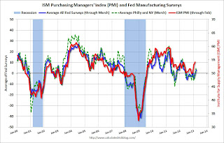 Click on graph for larger image.
The New York and Philly Fed surveys are averaged together (dashed green, through March), and five Fed surveys are averaged (blue, through March) including New York, Philly, Richmond, Dallas and Kansas City. The Institute for Supply Management (ISM) PMI (red) is through February (right axis).
The average of the five regional surveys was at the highest level since April 2012.
The ISM index for March will be released Monday, April 1st, and these surveys suggest a positive reading.
Weekly Initial Unemployment Claims increase to 357,000
by Calculated Risk on 3/28/2013 08:42:00 AM
The DOL reports:
In the week ending March 23, the advance figure for seasonally adjusted initial claims was 357,000, an increase of 16,000 from the previous week's revised figure of 341,000. The 4-week moving average was 343,000, an increase of 2,250 from the previous week's revised average of 340,750.This report included the annual revision.
The following graph shows the 4-week moving average of weekly claims since January 2000.
 Click on graph for larger image.
The dashed line on the graph is the current 4-week average. The four-week average of weekly unemployment claims increased to 343,000 - still near the post-recession low.
Weekly claims were above the 340,000 consensus forecast. Note: This might be the beginning of unemployment claims being impacted by the "sequestration" budget cuts.
Wednesday, March 27, 2013
Thursday: Initial Weekly Unemployment Claims, GDP, Chicago PMI
by Calculated Risk on 3/27/2013 09:39:00 PM
The banks open in Cyprus tomorrow with strict capital controls, from Reuters: G4S Readies Guards as Cypriot Banks Prepare to Open
The Central Bank said banks would open their doors at midday (6 a.m. EST) on Thursday after nearly two weeks when Cypriots could only get cash through limited ATM withdrawals.I doubt the controls will last only four days. The more important question is what happens to the economy and employment in Cyprus. The unemployment rate is already 14.7% in Cyprus and could double over the next couple of years.
A central bank official said Cypriots would be allowed to withdraw no more than 300 euros ($380) a day.
Yiangos Demetriou, head of internal audit at the Central Bank, said ... that the controls would allow unlimited use of credit cards within Cyprus, but set a limit of 5,000 euros per month abroad. He said the measures would last four days but could be reviewed.
Note: SIFMA recommends 2:00 PM market close on Thursday in observance of the Good Friday Holiday.
Thursday economic releases:
• At 8:30 AM ET, the initial weekly unemployment claims report will be released. The consensus is for claims to increase to 340 thousand from 336 thousand last week. The "sequester" budget cuts might start impacting weekly claims soon.
• Also at 8:30 AM, the BEA will release their third estimate of Q4 GDP. The consensus is that real GDP increased 0.6% annualized in Q4, revised up from 0.1% in the second estimate.
• At 9:45 AM, the Chicago Purchasing Managers Index for March. The consensus is for a decrease to 56.1, down from 56.8 in February.
• At 11:00 AM, the Kansas City Fed regional Manufacturing Survey for March will be released. This is the last of the regional surveys, and the consensus is for a reading of minus 3, up from minus 10 in February (below zero is contraction).
Analysts increase 2013 house price forecasts
by Calculated Risk on 3/27/2013 05:07:00 PM
I've been watching inventory closely, and in February I wrote: "if inventory keeps falling sharply, we might see stronger house price gains in 2013 than originally expected ...". Since then I've pointed out several analysts who have increased their house price forecasts for 2013.
Nick Timiraos at the WSJ lists more analysts today: Home Prices Seen Making Stronger Gains in 2013
Ivy Zelman, chief executive of research firm Zelman & Associates, said Wednesday she was now expecting prices to rise by 7% this year, up from earlier estimates of 6%, 5%, and 3%. ... She’s also calling for a 5% gain next year because she says the supply shortages and growing demand that fueled last year’s turnaround show no signs of easing.The key is inventory. In recent weeks, we've seen some increase in inventory (more than the usual seasonal increase), but inventory levels are still very low. Right now, unless inventory increases significantly over the next few months, it looks like prices will increase at about the same rate as in 2012.
John Burns, who runs a real-estate consulting firm in Irvine, Calif., is calling for a 9% gain in home prices this year, up from a 5% forecast late last year.
Among those who have revised up their forecasts in the last month are analysts at Morgan Stanley, Bank of America, Capital Economics and J.P. Morgan, which have taken their forecasts to 6-8%, from earlier predictions of 3-6%.
Although there are reasons for the low inventory - homeowners with negative equity can't sell, strong investor buying at the low end, homeowners not wanting to "sell at the bottom" to list a few - eventually higher prices will lead to more inventory coming on the market and smaller price increases.
Lawler: Single Family REO inventories down 23.4% in 2012
by Calculated Risk on 3/27/2013 02:31:00 PM
From economist Tom Lawler:
While Fannie Mae still hasn’t released its 2012 10-K, FHFA released its quarterly “Foreclosure Prevention Report” for Q4/2012, which includes data on foreclosure prevention activity, foreclosures, short sales/DILs, loan modifications, credit performance, and Real Estate Owned (REO) activity at Fannie Mae and Freddie Mac. ...
Here is a chart showing the SF REO Inventory of Fannie, Freddie, FHA, Private-Label Securities, and FDIC-Insured Institutions. For the latter, I assume that the average carrying value is 50% higher than that of the average for Fannie and Freddie.
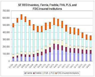 Click on graph for larger image.
SF REO inventories for these combined sectors were down 23.4% in 2012.
CR Note: Total REO is about half the level in 2008. In 2008 most of the REO was Private-Label Securities. The peak in 2010 was related to more foreclosure activity at Fannie, Freddie and the FHA.
The second graph is for just Fannie, Freddie and the FHA REO.
 REO at the "Fs" peaked in 2010, and is down about 35% since then.
Freddie Mac Mortgage Serious Delinquency rate declined in February, Lowest since mid-2009
by Calculated Risk on 3/27/2013 12:38:00 PM
Freddie Mac reported that the Single-Family Serious Delinquency rate declined in February to 3.15% from 3.20% in January. The serious delinquency rate is down from 3.57% a year ago (February 2012), and this is the lowest level since mid-2009.
The Freddie Mac serious delinquency rate peaked in February 2010 at 4.20%.
Fannie Mae hasn't reported for February yet.
Note: These are mortgage loans that are "three monthly payments or more past due or in foreclosure".
 Click on graph for larger image
Although this indicates some progress, the "normal" serious delinquency rate is under 1%. At the recent pace of improvement, it will take several years until the rates are back to normal.
NOTE: When Fannie Mae eventually releases their annual report for 2012, I'll post a graph of Real Estate Owned (REO) by Fannie, Freddie and the FHA (This is real estate that the agencies acquired through foreclosure or deed-in-lieu and haven't sold yet). Both Freddie and the FHA reported that their REO declined in Q4, and the combined total will be at the lowest level since 2009. Also the FDIC reported that the dollar value of REO for FDIC insured institutions declined in Q4, and it appears the private label REO declined too.
Pending Home Sales index declines in February
by Calculated Risk on 3/27/2013 10:05:00 AM
From the NAR: Pending Home Sales Slip on Constrained Inventory
The Pending Home Sales Index, a forward-looking indicator based on contract signings, slipped 0.4 percent to 104.8 in February from a downwardly revised 105.2 in January, but is 8.4 percent higher than February 2012 when it was 96.6. Contract activity has been above year-ago levels for the past 22 months; the data reflect contracts but not closings.Contract signings usually lead sales by about 45 to 60 days, so this would usually be for closed sales in March and April.
...
The PHSI in the Northeast declined 2.5 percent to 82.8 in February but is 6.8 percent above February 2012. In the Midwest the index rose 0.4 percent to 103.6 in February and is 13.2 percent higher than a year ago. Pending home sales in the South slipped 0.3 percent to an index of 118.8 in February but are 12.1 percent above February 2012. In the West the index increased 0.1 percent in February to 101.4 but is 0.8 percent below a year ago.
"The volume of home sales appears to be leveling off with the constrained inventory conditions, and the leveling of the index means little change is likely in the pace of sales over the next couple months," [Lawrence Yun , NAR chief economist] said.
As I've noted several times, with limited inventory at the low end and fewer foreclosures, we might see flat or even declining existing home sales. The key is that the number of conventional sales is increasing while foreclosures and short sales decline - and that is a sign of an improving market, even if total sales decline.
MBA: Mortgage Applications increase in latest survey
by Calculated Risk on 3/27/2013 08:31:00 AM
From the MBA: Mortgage Applications Increase in Latest MBA Weekly Survey
The Refinance Index increased 8 percent from the previous week. The seasonally adjusted Purchase Index increased 7 percent from one week earlier.
...
The average contract interest rate for 30-year fixed-rate mortgages with conforming loan balances ($417,500 or less) decreased to 3.79 percent from 3.82 percent, with points increasing to 0.44 from 0.38 (including the origination fee) for 80 percent loan-to-value ratio (LTV) loans.
...
The average contract interest rate for 30-year fixed-rate mortgages with jumbo loan balances (greater than $417,500) decreased to 3.90 percent from 3.95 percent, with points increasing to 0.42 from 0.36 (including the origination fee) for 80 percent LTV loans.
emphasis added
 Click on graph for larger image.
The first graph shows the refinance index.
There has been a sustained refinance boom for over a year.
Refinance activity will probably slow in 2013.
 The second graph shows the MBA mortgage purchase index. The 4-week average of the purchase index has generally been trending up (slowly) over the last year.
Tuesday, March 26, 2013
Wednesday: Pending Home Sales
by Calculated Risk on 3/26/2013 09:32:00 PM
The WSJ has an estimate of the losses for uninsured depositors in Cyprus: Cyprus Sets Bank Revamp Amid Protests
We are in no position to give you the exact amount this moment," [Central banker Panicos Demetriades] told reporters, referring to the amount that will be taken from large deposits at Bank of Cyprus, but he added "it's about 40%."Wednesday economic releases:
Based on estimates from government officials, the losses would affect some 19,000 deposit-holders at the Bank of Cyprus who, combined, hold some €8.01 billion ($10.30 billion) in uninsured deposits. Uninsured savers at Cyprus Popular Bank, who hold a combined €3.2 billion, will lose most of that.
"Realistically, very little will be returned," Finance Minister Michalis Sarris said in the interview broadcast on state television. "The amount [returned], could be 20%. Certainly, for depositors above €100,000 it could be a very significant blow," he said.
• At 7:00 AM ET, The Mortgage Bankers Association (MBA) will release the results for the mortgage purchase applications index.
• At 10:00 AM, Pending Home Sales Index for February. The consensus is for a 0.7% decrease in this index.
Earlier:
• Case-Shiller: Comp 20 House Prices increased 8.1% year-over-year in January
• Real House Prices, Price-to-Rent Ratio, City Prices relative to 2000
• New Home Sales at 411,000 SAAR in February
• A few comments on New Home Sales
Forecasts: Solid Vehicle Sales in March
by Calculated Risk on 3/26/2013 06:41:00 PM
Note: The automakers will report March vehicle sales this coming Monday, April 1st. Here are a few forecasts:
From Reuters: US industry March auto sales tracking above 15 mln -Toyota exec
"So far, this month of March looks to be very good for all manufacturers," [Bob Carter, Toyota's senior vice president for U.S. auto operations] told industry executives at a conference ahead of the New York auto show. He said industry sales are tracking up 6.6 percent in March, with an annual rate of 15.2 million to 15.3 million vehicles.From TrueCar: March 2013 New Car Sales Expected to Be Up Almost Five Percent According to TrueCar; March 2013 SAAR at 15.42M, Highest March SAAR Since 2007
The March 2013 forecast translates into a Seasonally Adjusted Annualized Rate ("SAAR") of 15.42 million new car sales ... up from 14.1 million in March 2012.From Kelley Blue Book: March New-Car Sales To Hit Highest Monthly Total Since August 2007 According To Kelley Blue Book
New-car sales will remain steady at a 15.2 million seasonally adjusted annual rate (SAAR) in March.And from Reuters: U.S. auto sales could rise 8 pct in March -research firms
Sales of new cars and trucks in March are expected to rise to 1,465,100 vehicles, while the annual sales pace is forecast to hit 15.3 million vehicles, J.D. Power and LMC said in a joint report released on Thursday. Since November, the annual rate has ranged from 15.3 million to 15.5 million.It appears auto sales were solid in March, and this suggests decent consumer spending growth in Q1.
Note: Most forecasts were for auto sales growth to slow in 2013 to around 4% growth or 15.0 million units. Based on the first few months, it appears sales will be stronger than expected this year.
Earlier:
• Case-Shiller: Comp 20 House Prices increased 8.1% year-over-year in January
• Real House Prices, Price-to-Rent Ratio, City Prices relative to 2000
• New Home Sales at 411,000 SAAR in February
• A few comments on New Home Sales
A few comments on New Home Sales
by Calculated Risk on 3/26/2013 02:56:00 PM
When the new home sales report was released for January, showing a large increase in the annualized sales rate, I cautioned not to read too much into that number. It was just one month of data, and January is seasonally the weakest month of the year with the largest positive seasonal adjustment.
Now that we have two months of data for 2013, one way to look at the growth rate is to use not seasonally adjusted (NSA) year-to-date data.
According to the Census Bureau, there have been 63 thousand new homes sold in 2013, up about 19% from the 53 thousand sold in January and February of 2012. That is a solid increase in sales. Note: For 2013, estimates are sales will increase to around 450 to 460 thousand, or an increase of around 22% to 25% on an annual basis from the 368 thousand in 2012.
As I mentioned last month, although there has been a large increase in the sales rate, sales are still near the lows for previous recessions. This suggest significant upside over the next few years (based on estimates of household formation and demographics, I expect sales to increase to 750 to 800 thousand over the next several years). Also housing is historically the best leading indicator for the economy, and this is one of the reasons I think The future's so bright, I gotta wear shades.
And here is another update to the "distressing gap" graph that I first started posting over four years ago to show the emerging gap caused by distressed sales. Now I'm looking for the gap to start to close over the next few years.
 Click on graph for larger image.
The "distressing gap" graph shows existing home sales (left axis) and new home sales (right axis) through February 2013. This graph starts in 1994, but the relationship has been fairly steady back to the '60s.
Following the housing bubble and bust, the "distressing gap" appeared mostly because of distressed sales. The flood of distressed sales kept existing home sales elevated, and depressed new home sales since builders weren't able to compete with the low prices of all the foreclosed properties.
I don't expect much of an increase in existing home sales (distressed sales will slowly decline and be offset by more conventional sales). But I do expect this gap to close - mostly from an increase in new home sales.
 Another way to look at this is a ratio of existing to new home sales.
This ratio was fairly stable from 1994 through 2006, and then the flood of distressed sales kept the number of existing home sales elevated and depressed new home sales. (Note: This ratio was fairly stable back to the early '70s, but I only have annual data for the earlier years).
In general the ratio has been trending down, and I expect this ratio to trend down over the next several years as the number of distressed sales declines and new home sales increase.
Note: Existing home sales are counted when transactions are closed, and new home sales are counted when contracts are signed. So the timing of sales is different.
Real House Prices, Price-to-Rent Ratio, City Prices relative to 2000
by Calculated Risk on 3/26/2013 12:12:00 PM
Case-Shiller, CoreLogic and others report nominal house prices, and it is also useful to look at house prices in real terms (adjusted for inflation) and as a price-to-rent ratio.
As an example, if a house price was $200,000 in January 2000, the price would be close to $275,000 today adjusted for inflation. This is why economist also look at real house prices (inflation adjusted).
Nominal House Prices
 The first graph shows the quarterly Case-Shiller National Index SA (through Q4 2012), and the monthly Case-Shiller Composite 20 SA and CoreLogic House Price Indexes (through January) in nominal terms as reported.
In nominal terms, the Case-Shiller National index (SA) is back to Q2 2003 levels (and also back up to Q3 2010), and the Case-Shiller Composite 20 Index (SA) is back to November 2003 levels, and the CoreLogic index (NSA) is back to January 2004.
Real House Prices
 The second graph shows the same three indexes in real terms (adjusted for inflation using CPI less Shelter). Note: some people use other inflation measures to adjust for real prices.
In real terms, the National index is back to October 1999 levels, the Composite 20 index is back to December 2000, and the CoreLogic index back to February 2001.
In real terms, most of the appreciation in the last decade is gone.
Price-to-Rent
In October 2004, Fed economist John Krainer and researcher Chishen Wei wrote a Fed letter on price to rent ratios: House Prices and Fundamental Value. Kainer and Wei presented a price-to-rent ratio using the OFHEO house price index and the Owners' Equivalent Rent (OER) from the BLS.
 Here is a similar graph using the Case-Shiller National, Composite 20 and CoreLogic House Price Indexes.
This graph shows the price to rent ratio (January 1998 = 1.0).
On a price-to-rent basis, the Case-Shiller National index is back to Q4 1999 levels, the Composite 20 index is back to December 2000 levels, and the CoreLogic index is back to February 2001.
In real terms - and as a price-to-rent ratio - prices are mostly back to early 2000 levels.
Nominal Prices: Cities relative to Jan 2000
 The last graph shows the bubble peak, the post bubble minimum, and current nominal prices relative to January 2000 prices for all the Case-Shiller cities in nominal terms.
As an example, at the peak, prices in Phoenix were 127% above the January 2000 level. Then prices in Phoenix fell slightly below the January 2000 level, and are now up 27% above January 2000 (I'll look at this in real terms later). Some cities - like Denver - are close to the peak level. Other cities, like Atlanta and Detroit, are below the January 2000 level.
New Home Sales at 411,000 SAAR in February
by Calculated Risk on 3/26/2013 10:18:00 AM
The Census Bureau reports New Home Sales in February were at a seasonally adjusted annual rate (SAAR) of 411 thousand. This was down from a revised 431 thousand SAAR in January (revised down from 437 thousand).
The first graph shows New Home Sales vs. recessions since 1963. The dashed line is the current sales rate.
"Sales of new single-family houses in February 2013 were at a seasonally adjusted annual rate of 411,000, according to estimates released jointly today by the U.S. Census Bureau and the Department of Housing and Urban Development. This is 4.6 percent below the revised January rate of 431,000, but is 12.3 percent above the February 2012 estimate of 366,000.
 Click on graph for larger image in graph gallery.
The second graph shows New Home Months of Supply.
The months of supply increased in February to 4.4 months from 4.2 months in January.
The all time record was 12.1 months of supply in January 2009.
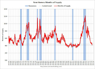 This is now in the normal range (less than 6 months supply is normal).
"The seasonally adjusted estimate of new houses for sale at the end of February was 152,000. This represents a supply of 4.4 months at the current sales rate."On inventory, according to the Census Bureau:
"A house is considered for sale when a permit to build has been issued in permit-issuing places or work has begun on the footings or foundation in nonpermit areas and a sales contract has not been signed nor a deposit accepted."Starting in 1973 the Census Bureau broke this down into three categories: Not Started, Under Construction, and Completed.
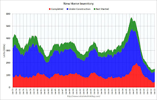 This graph shows the three categories of inventory starting in 1973.
The inventory of completed homes for sale is just above the record low. The combined total of completed and under construction is also just above the record low.
The last graph shows sales NSA (monthly sales, not seasonally adjusted annual rate).
In February 2013 (red column), 33 thousand new homes were sold (NSA). Last year 30 thousand homes were sold in February. This was the eight weakest February since this data has been tracked. The high for February was 109 thousand in 2005, and the low for February was 22 thousand in 2011.
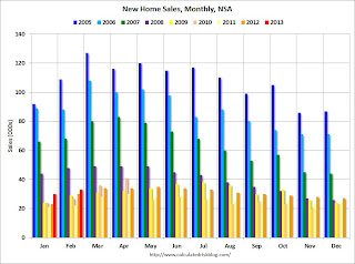
This was below expectations of 425,000 sales in February, but still a fairly solid report. I'll have more soon ...
Case-Shiller: Comp 20 House Prices increased 8.1% year-over-year in January
by Calculated Risk on 3/26/2013 09:18:00 AM
S&P/Case-Shiller released the monthly Home Price Indices for January ("January" is a 3 month average of November, December and January).
This release includes prices for 20 individual cities, and two composite indices (for 10 cities and 20 cities).
Note: Case-Shiller reports Not Seasonally Adjusted (NSA), I use the SA data for the graphs.
From S&P: Home Prices Accelerate in January 2013 According to the S&P/Case-Shiller Home Price Indices
Data through January 2013, released today by S&P Dow Jones Indices for its S&P/Case-Shiller Home Price Indices ... showed average home prices increased 7.3% for the 10-City Composite and 8.1% for the 20-City Composite in the 12 months ending in January 2013.
“The two headline composites posted their highest year-over-year increases since summer 2006,” says David M. Blitzer, Chairman of the Index Committee at S&P Dow Jones Indices. “This marks the highest increase since the housing bubble burst."
...
In January 2013, nine cities -- Atlanta, Charlotte, Las Vegas, Los Angeles, Miami, New York, Phoenix, San Francisco and Tampa -- and both Composites posted positive monthly returns. Dallas was the only MSAwhere the level remained flat.
 Click on graph for larger image.
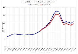
 The first graph shows the nominal seasonally adjusted Composite 10 and Composite 20 indices (the Composite 20 was started in January 2000).
The Composite 10 index is off 29.3% from the peak, and up 1.0% in January (SA). The Composite 10 is up 7.3% from the post bubble low set in Feb 2012 (SA).
The Composite 20 index is off 28.4% from the peak, and up 1.0% (SA) in January. The Composite 20 is up 8.1% from the post-bubble low set in Jan 2012 (SA).
 The second graph shows the Year over year change in both indices.
The Composite 10 SA is up 7.3% compared to January 2012.
The Composite 20 SA is up 8.1% compared to January 2012. This was the eight consecutive month with a year-over-year gain since 2010 (when the tax credit boosted prices temporarily). This was the largest year-over-year gain for the Composite 20 index since 2006.
Prices increased (SA) in 20 of the 20 Case-Shiller cities in January seasonally adjusted (prices increased in 9 of 20 cities NSA). Prices in Las Vegas are off 55.9% from the peak, and prices in Denver only off 2.0% from the peak.
This was close to the consensus forecast for a 8.2% YoY increase. I'll have more on prices later.
LPS: Mortgage delinquencies decreased in February
by Calculated Risk on 3/26/2013 08:15:00 AM
According to the First Look report for February to be released today by Lender Processing Services (LPS), the percent of loans delinquent decreased in February compared to January, and declined about 6.5% year-over-year. Also the percent of loans in the foreclosure process declined further in February and were down significantly over the last year.
LPS reported the U.S. mortgage delinquency rate (loans 30 or more days past due, but not in foreclosure) decreased to 6.80% from 7.03% in January. Note: the normal rate for delinquencies is around 4.5% to 5%.
The percent of loans in the foreclosure process declined to 3.38% in February from 3.41% in January.
The number of delinquent properties, but not in foreclosure, is down about 8% year-over-year (301,000 fewer properties delinquent), and the number of properties in the foreclosure process is down 21% or 449,000 properties year-over-year.
The percent (and number) of loans 90+ days delinquent and in the foreclosure process is still very high, but the number of loans in the foreclosure process is now steadily declining.
LPS will release the complete mortgage monitor for February in early April.
| LPS: Percent Loans Delinquent and in Foreclosure Process | |||
|---|---|---|---|
| Feb 2013 | Jan 2013 | Feb 2012 | |
| Delinquent | 6.80% | 7.03% | 7.28% |
| In Foreclosure | 3.38% | 3.41% | 4.20% |
| Number of properties: | |||
| Number of properties that are 30 or more, and less than 90 days past due, but not in foreclosure: | 1,927,000 | 1,974,000 | 2,002,000 |
| Number of properties that are 90 or more days delinquent, but not in foreclosure: | 1,483,000 | 1,531,000 | 1,709,000 |
| Number of properties in foreclosure pre-sale inventory: | 1,694,000 | 1,703,000 | 2,143,000 |
| Total Properties | 5,104,000 | 5,208,000 | 5,854,000 |
Monday, March 25, 2013
Tuesday: New Home Sales, Case-Shiller House Prices, Durable Goods
by Calculated Risk on 3/25/2013 08:16:00 PM
This will be an interesting case to watch, from Reuters: Stockton, California bankruptcy eligibility trial starts
As the biggest U.S. city to file for bankruptcy, the outcome for Stockton will be an important test case for the $3.7 trillion U.S. municipal debt market. The hearing is expected to last most of this week.Usually employees, including pensions, come before bondholders and insurers in a bankruptcy case. But I don't know all the details of this case and I'm looking forward to reading the ruling.
Stockton, along with Jefferson County in Alabama and smaller San Bernardino, California, has said its bondholders will be asked to take losses.
...
Lawyers for bondholders and insurers, which will have to repay investors for any capital losses, argue the decision by Stockton to not seek to impair its largest creditor, the California Public Employees' Retirement System, shows a lack of good faith - a reason that should block Stockton's request for bankruptcy protection under federal bankruptcy law.
Tuesday economic releases:
• At 8:30 AM ET, Durable Goods Orders for February from the Census Bureau. The consensus is for a 3.5% increase in durable goods orders.
• At 9:00 AM, the S&P/Case-Shiller House Price Index for January will be released. The consensus is for a 8.2% year-over-year increase in the Composite 20 index (NSA) for January. The Zillow forecast is for the Composite 20 to increase 8.0% year-over-year, and for prices to increase 0.8% month-to-month seasonally adjusted.
• At 10:00 AM, New Home Sales for February from the Census Bureau. The consensus is for a decrease in sales to 425 thousand Seasonally Adjusted Annual Rate (SAAR) in February from 437 thousand in January. Even with the forecast decline in sales rate, this would be a 16% year-over-year increase in sales.
• Also at 10:00 AM, the Richmond Fed Survey of Manufacturing Activity for March. The consensus is for a reading of 5.5 for this survey, down from 6.0 in February (Above zero is expansion).
• Also at 10:00 AM, the Conference Board's consumer confidence index for March. The consensus is for the index to decrease to 69.0.


