 RSS Feed
 by Calculated Risk on 2/13/2013 08:48:00 AM
Wednesday, February 13, 2013
Retail Sales increased 0.1% in January
On a monthly basis, retail sales increased 0.1% from December to January (seasonally adjusted), and sales were up 4.7% from January 2012. From the Census Bureau report:
The U.S. Census Bureau announced today that advance estimates of U.S. retail and food services sales for January, adjusted for seasonal variation and holiday and trading-day differences, but not for price changes, were $416.6 billion, an increase of 0.1 percent from the previous month and 4.4 percent above January 2012. ... The November to December 2012 percent change was unrevised from +0.5 percent.
 Click on graph for larger image.
Sales for December were unrevised at a 0.5% gain.
This graph shows retail sales since 1992. This is monthly retail sales and food service, seasonally adjusted (total and ex-gasoline).
Retail sales are up 25.7% from the bottom, and now 9.9% above the pre-recession peak (not inflation adjusted)
 The second graph shows the same data, but just since 2006 (to show the recent changes).
 Retail sales ex-autos increased 0.2%.
Excluding gasoline, retail sales are up 22.8% from the bottom, and now 10.3% above the pre-recession peak (not inflation adjusted).
The third graph shows the year-over-year change in retail sales and food service (ex-gasoline) since 1993.
Retail sales ex-gasoline increased by 4.8% on a YoY basis (4.4% for all retail sales).
 This was at the consensus forecast of a 0.1% increase, and might indicate some slowdown in retail spending growth related to the payroll tax increase.
Tuesday, February 12, 2013
Wednesday: Retail Sales
by Calculated Risk on 2/12/2013 08:44:00 PM
On the deficit, from Jed Graham at investors.com:
Here's a pretty important fact that virtually everyone in Washington seems oblivious to: The federal deficit has never fallen as fast as it's falling now without a coincident recession.This fits with the graph I posted last week:
To be specific, CBO expects the deficit to shrink from 8.7% of GDP in fiscal 2011 to 5.3% in fiscal 2013 if the sequester takes effect and to 5.5% if it doesn't. Either way, the two-year deficit reduction — equal to 3.4% of the economy if automatic budget cuts are triggered and 3.2% if not — would stand far above any other fiscal tightening since World War II.
Until the aftermath of the Great Recession, there were only three such periods in which the deficit shrank by a cumulative 2% of GDP or more. The 1960-61 and 1969-70 episodes both helped bring about a recession.
 Click on graph for larger image.
This graph shows the actual (purple) budget deficit each year as a percent of GDP, and an estimate for the next ten years based on estimates from the Congressional Budget Office (CBO).
The CBO deficit estimates are even lower than my projections.
After 2015, the deficit will start to increase again according to the CBO, but as I've noted before, we really don't want to reduce the deficit much faster than this path over the next few years, because that will be too much of a drag on the economy.
Wednesday economic releases:
• At 7:00 AM ET, the Mortgage Bankers Association (MBA) will release the results for the mortgage purchase applications index.
• At 8:30 AM ET, Retail sales for January will be released. The consensus is for retail sales to increase 0.1% in January, and to increase 0.2% ex-autos.
• 10:00 AM, the Manufacturing and Trade: Inventories and Sales (business inventories) report for December will be released. The consensus is for a 0.3% increase in inventories.
Lawler: Table of Short Sales and Foreclosures for Selected Cities in January
by Calculated Risk on 2/12/2013 03:40:00 PM
Economist Tom Lawler sent me the table below of short sales and foreclosures for several selected cities in January.
Look at the right two columns in the table below (Total "Distressed" Share for Jan 2013 compared to Jan 2012). In every area that reports distressed sales, the share of distressed sales is down year-over-year - and down significantly in most areas.
Also there has been a decline in foreclosure sales just about everywhere. Look at the middle two columns comparing foreclosure sales for Jan 2013 to Jan 2012. Foreclosure sales have declined in all these areas, and some of the declines have been stunning (the Nevada sales were impacted by a new foreclosure law).
Also there has been a shift from foreclosures to short sales. In most areas, short sales now out number foreclosures (Minneapolis is an exception).
I think this is important: Imagine that the number of total existing home sales doesn't change over the next year - some people would argue that is "bad" news and the housing market isn't recovering. But also imagine that the share of distressed sales declines 20%, and conventional sales increase to make up the difference. That would be a positive sign - and that is what appears to be happening.
An example would be Sacramento (I posted data on Sacramento yesterday). In Sacramento, total sales were down 9% in Jan 2013 compared to Jan 2012, but conventional sales were up 51%! I'd say that market is still unhealthy, but recovering.
| Short Sales Share | Foreclosure Sales Share | Total "Distressed" Share | ||||
|---|---|---|---|---|---|---|
| 13-Jan | 12-Jan | 13-Jan | 12-Jan | 13-Jan | 12-Jan | |
| Las Vegas | 36.2% | 28.1% | 12.5% | 45.5% | 48.7% | 73.6% |
| Reno | 41.0% | 37.0% | 10.0% | 40.0% | 51.0% | 77.0% |
| Phoenix | 17.6% | 29.8% | 16.2% | 27.9% | 33.8% | 57.7% |
| Sacramento | 30.3% | 32.1% | 14.2% | 34.5% | 44.5% | 66.6% |
| Minneapolis | 10.6% | 16.2% | 32.3% | 39.0% | 42.9% | 55.2% |
| Mid-Atlantic (MRIS) | 13.1% | 16.4% | 12.7% | 16.9% | 25.8% | 33.3% |
| Hampton Roads | 34.9% | 37.2% | ||||
| Charlotte | 18.1% | 21.0% | ||||
| Metro Detroit | 36.3% | 54.5% | ||||
| Memphis* | 25.9% | 36.6% | ||||
| *share of existing home sales, based on property records | ||||||
More Research on Construction Employment
by Calculated Risk on 2/12/2013 12:24:00 PM
A key economic question this year is how many construction jobs will be added. Here are a few excerpts from analysis Kris Dawsey and Hui Shan at Goldman Sachs: Housing Sector Jobs Poised for a Comeback
Although many indicators of housing activity improved during 2012, employment in the sector remains close to post-bubble lows. Looking only at residential construction jobs, employment declined by 1.5 million (-42%) from its peak in 2006 to its recent trough in early 2011 and edged up only a modest 100 thousand since then. However, direct residential construction employment is only a part of all residential investment-related employment. Adding in housing-related employment in manufacturing, wholesale trade, retailing, and finance & real estate, employment dropped by 2.8 million (-31%) from its peak, and gained a bit less than 300 thousand from its trough to the present ...So their analysis suggests construction companies have been increasing hours worked for current employees, but now they need to hire more workers.
[R]eal residential investment declined somewhat more sharply than housing-related employment in the downturn, resulting in a decline in real value added per residential investment-related worker, according to our proxy measure, from more than $80,000 in 2006 to a bit less than $60,000 in Q4:2012, in chained 2005 dollars. This pattern of declining productivity during a downturn is called "labor hoarding" by economists (although labor hoarding is probably not what most people think of during a period of sharp job cuts) and reflects businesses' reluctance to fire workers at a rate commensurate with the decline in their sales.
The flip side of this phenomenon is more sluggish employment growth than would otherwise be the case once business activity turns around. On top of the only modest turnaround in activity, this secondary effect also argues for only a modest rebound in residential investment-related employment early on in the recovery. However, this effect may shortly be coming to an end. Hours per worker in the construction industry now exceed pre-crisis highs, suggesting that room to increase output on the "intensive margin" (i.e. more hours per worker) is diminishing, and that pushing on the "extensive margin" (hiring more workers) will likely account for a larger share of future increases in residential investment output.
...
Given that we expect real residential investment to continue growing at a roughly stable 10%-15% rate in 2013 and 2014, and that the effects of labor hoarding should be dissipating, what is our forecast for residential investment-related employment growth over the coming several years? In order to answer this question, we estimated two different econometric models: (1) an error correction model of national-level real residential investment and residential investment-related employment, and (2) a state-level panel analysis of the relationship between construction activity and employment. Both models suggest an increase in the rate of housing-related employment growth in 2013 and 2014 relative to 2012, probably to a rate around 25 to 30k per month.
emphasis added
Earlier articles on construction employment:
• From Michelle Meyer at Merrill Lynch: Construction Coming Back
• From Jed Kolko at Trulia: Here are the “Missing” Construction Jobs
• From Professor Tim Duy at EconomistsView: Employment Report Nothing If Not Consistent
BLS: Job Openings "little changed" in December
by Calculated Risk on 2/12/2013 10:05:00 AM
From the BLS: Job Openings and Labor Turnover Summary
There were 3.6 million job openings on the last business day of December, little changed from November ...The following graph shows job openings (yellow line), hires (dark blue), Layoff, Discharges and other (red column), and Quits (light blue column) from the JOLTS.
The level of total nonfarm job openings was 2.4 million at the end of the recession in June 2009.
...
The number of quits was 2.2 million in December compared to 1.8 million at the end of the recession in June 2009.
This series started in December 2000.
Note: The difference between JOLTS hires and separations is similar to the CES (payroll survey) net jobs headline numbers. This report is for December, the most recent employment report was for January.
 Click on graph for larger image.
Notice that hires (dark blue) and total separations (red and light blue columns stacked) are pretty close each month. This is a measure of turnover. When the blue line is above the two stacked columns, the economy is adding net jobs - when it is below the columns, the economy is losing jobs.
Jobs openings decreased in December to 3.617 million, down from 3.790 million in November. The number of job openings (yellow) has generally been trending up, but openings are only up 2% year-over-year compared to December 2011.
Quits decreased slightly in December, and quits are up 7% year-over-year. These are voluntary separations. (see light blue columns at bottom of graph for trend for "quits").
Not much changes month-to-month in this report, but the trend suggests a gradually improving labor market.
NFIB: Small Business Optimism Index increases slightly in January, Still very low
by Calculated Risk on 2/12/2013 08:50:00 AM
From the National Federation of Independent Business (NFIB): Small-Business Owner Confidence Barely Budges
Small-business owner confidence continues to drag, according to the National Federation of Independent Business (NFIB) Small Business Optimism Index. The Index gained 0.9 points, rising to 88.9, failing to regain the losses caused by last month’s “fiscal cliff” scare. Expectations for improved business conditions increased by five points, but remain overwhelmingly low—negative 30 percent—the fourth lowest reading in survey history. Actual job creation and job creation plans improved nominally, but still not enough to keep up with population growth.
 Click on graph for larger image.
This graph shows the small business optimism index since 1986. The index increased to >88.9 in January from 88.0 in December.
Note: Small businesses have a larger percentage of real estate and retail related companies than the overall economy. This index remains low.
Monday, February 11, 2013
Nikkei Opens Up Sharply following Finance Ministers Price Target
by Calculated Risk on 2/11/2013 07:31:00 PM
Imagine Jack Lew (Treasury Secretary nominee) or Fed Chairman Ben Bernanke announcing a price target for the DOW or S&P500 ... that seems extremely unlikley. But in Japan ...
From MarketWatch: Japan stocks rally on yen in post-holiday return
Japan stocks surged in early Tuesday trade, as investors returned from a three-day weekend to find the yen at yet another fresh multiyear low, with the Nikkei Stock Average jumping 2.5% to 11,432.29, and the Topix up 2%.And from the Japan Times: Japan’s economic minister wants Nikkei to surge 17% to 13,000 by March
Economic and fiscal policy minister Akira Amari said Saturday the government will step up economic recovery efforts so that the benchmark Nikkei index jumps an additional 17 percent to 13,000 points by the end of March.Felix Salmon likes the idea: When the finance minister targets stock prices
“It will be important to show our mettle and see the Nikkei reach the 13,000 mark by the end of the fiscal year (March 31),” Amari said in a speech.
The Nikkei 225 stock average, which last week climbed to its highest level since September 2008, finished at 11,153.16 on Friday.
“We want to continue taking (new) steps to help stock prices rise” further, Amari stressed ...
I like this move: it shows imagination, and the upside is much bigger than the downside. The worst that can happen is that it doesn’t work, and the stock market ends up doing what the stock market would have done anyway; the best that can happen is that it helps accelerate the broad recovery that everybody in Japan is hoping for this year.CR Note: I don't think this is a good policy idea ...
What’s more, Amari is not the first policymaker to talk about targeting asset prices. Minneapolis Fed president Narayana Kocherlakota, for instance, said quite clearly in 2011 that stock prices “are really going to be a central ingredient in the recovery process”, adding:
In this kind of post financial crisis, post net worth driven recession, it makes sense to be thinking about asset value as a way to try to generate more stimulus than you do in a typical recession.In other words, don’t look to government spending for stimulus: Japan, of course, has learned that lesson the hard way. Instead, simply goose the stock market instead.
There are risks to this approach: if it works too well, you create a bubble — and when a bubble bursts, that can hurt confidence much more than a rising stock market helped it. But for the time being, the Japanese stock market still looks cheap, both on an absolute basis and in terms of its p/e ratio. Now’s no time to worry about overheating. Instead, Japan’s fiscal and monetary policymakers are working together to try to make the country as bullish and successful as possible. I’d do the same thing, if I were them.
Las Vegas Real Estate: Sales and Inventory decreased year-over-year in January
by Calculated Risk on 2/11/2013 04:13:00 PM
This is a key distressed market to follow since Las Vegas has seen the largest price decline of any of the Case-Shiller composite 20 cities.
The Greater Las Vegas Association of Realtors (GLVAR) reported (Most data via Tom Lawler):
• Residential home sales by realtors in the Las Vegas metro area totaled 2,821 in January, down 21.4% from last January’s pace
• Bank-owned properties were 12.5% of last month’s sales, down from 45.5% last January, while last month’s short-sales share were 36.2%, up from 28.1% a year ago.
• All-cash transactions were 56.2% of last month’s sales, up from 52.5% last January.
• Total listings in January totaled 17,910, down 0.9% from December and down 23.1% from a year ago. However single family home listings without offers were down over 58% from a year ago. A large number of the homes listed for sales are "short sale pending".
• Short sales are about three times foreclosures now. We've seen a shift from foreclosures to short sales in most areas (not just in areas with new foreclosure laws). Note: Some of the surge in short sales last month might have been due to sellers pushing to beat the expiration of the Mortgage Debt Relief Act of 2007, and there was a decline in January. The Act was extended as part of the fiscal deal, so the number of short sales should remain high in 2013.
• The decline in overall sales is because of fewer foreclosure sales. As the market slowly recovers, the number of distressed sales should fall and the number of conventional sales should rise.
Overall this is a slowly improving distressed market. Note: The median price was up 27.1% from a year ago, but I suggest using the repeat sales indexes because the median is impacted by the mix.
Fed's Yellen: "A Painfully Slow Recovery for America's Workers"
by Calculated Risk on 2/11/2013 01:21:00 PM
From Fed Vice Chair Janet Yellen: A Painfully Slow Recovery for America's Workers: Causes, Implications, and the Federal Reserve's Response. Some excerpts on the slow recovery:
In trying to account for why this recovery has been so weak, it is helpful to first consider several important factors that have in the past supported most economic recoveries. By this I don't mean everything that contributes to economic growth, but rather those things that typically play a key role when the U.S. economy is recovering from recession. Think of these as the tailwinds that usually promote a recovery.CR Note: The first missing tailwind is fiscal policy. Even as the Federal government provided some stimulus, state and local governments cut back significant for four consecutive years. And for the last couple of years, we've also seen austerity at the Federal level - and that will probably continue. The good news is the cutbacks at the state and local level are probably mostly over.
The first tailwind I'll mention is fiscal policy. History shows that fiscal policy often helps to support an economic recovery. Some of this fiscal stimulus is automatic, and intended to be. The income loss that individuals and businesses suffer in a recession is partly offset when their tax bills fall as well. Government spending on unemployment benefits and other safety-net programs rises in recessions, helping individuals hurt by the downturn and also supporting consumer spending and the broader economy by replacing lost income. These automatic declines in tax collections and increases in government spending are often supplemented with discretionary fiscal action--tax rate cuts, spending on infrastructure and other goods and services, and extended unemployment benefits. These discretionary fiscal policy actions are typically a plus for growth in the years just after a recession. For example, following the severe 1981-82 recession, discretionary fiscal policy contributed an average of about 1 percentage point per year to real GDP growth over the subsequent three years.
However, discretionary fiscal policy hasn't been much of a tailwind during this recovery. In the year following the end of the recession, discretionary fiscal policy at the federal, state, and local levels boosted growth at roughly the same pace as in past recoveries, as exhibit 3 indicates. But instead of contributing to growth thereafter, discretionary fiscal policy this time has actually acted to restrain the recovery. State and local governments were cutting spending and, in some cases, raising taxes for much of this period to deal with revenue shortfalls. At the federal level, policymakers have reduced purchases of goods and services, allowed stimulus-related spending to decline, and have put in place further policy actions to reduce deficits. ...
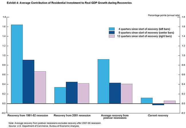
A second tailwind in most recoveries is housing. Residential investment creates jobs in construction and related industries. Before the Great Recession, housing investment added an average of 1/2 percentage point to real GDP growth in the two years after each of the previous four recessions, considerably more than its contribution to growth at other times.
During this recovery, in contrast, residential investment, on net, has contributed very little to growth since the recession ended. The reasons are easy to understand, given the central role that housing played in the Great Recession. Following an extended boom in construction driven in large part by overly loose mortgage lending standards and unrealistic expectations for future home price increases, the housing market collapsed--sales and prices plunged and mortgage credit was sharply curtailed. Tight mortgage credit conditions are continuing to make it difficult for many families to buy homes, despite record-low mortgage interest rates that have helped make housing very affordable. I'm encouraged by recent improvement in the residential sector, but the contribution of housing investment to overall economic activity remains considerably below the average seen in past recoveries, as exhibit 4 shows.
Beyond the direct effects on residential investment, the extraordinary collapse in house prices resulted in a huge loss of household wealth--at last count, net home equity is still down 40 percent, or about $5 trillion, from 2005. ...
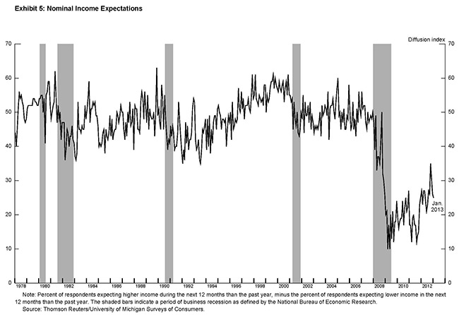
Another important tailwind in most economic recoveries is one that tends to be taken for granted--the faith most of us have, based on history and personal experience, that recessions are temporary and that the economy will soon get back to normal. Even during recessions, households' expectations for income growth tend to be reasonably stable, which provides support for overall spending. In the most recent recession, however, surveys suggest that consumers sharply revised down their prospects for future income growth and have only partially adjusted up their expectations since then (exhibit 5).
The recovery has also encountered some unusual headwinds. The fiscal and financial crisis in Europe has resulted in a euro-area recession and contributed to slower global growth. Europe's difficulties have blunted what had been strong growth in U.S. exports earlier in the recovery by sapping demand worldwide.
The next missing tailwind has been a focus of this blog: Residential investment (RI). RI has finally turned the corner and has started to contribute to the economy. Looking forward, I expect growth to improve over the next few years, although growth will be slowed by the fiscal agreement and other Federal austerity in 2013.
Sacramento January House Sales: Conventional Sales up 51% year-over-year
by Calculated Risk on 2/11/2013 09:27:00 AM
Note: I've been following the Sacramento market to look for changes in the mix of house sales in a distressed area over time (conventional, REOs, and short sales). The Sacramento Association of REALTORS® started breaking out REOs in May 2008, and short sales in June 2009.
Over the last two years there was a dramatic shift from REO to short sales, and the percentage of distressed sales declined.
Note: The percent of short sales declined in January because some sellers pushed to close in 2012 before the "Mortgage Debt Relief Act of 2007" expired. The Act was extended for one year as part of the fiscal agreement. (Usually cancelled debt is considered income, but some mortgage debt was exlcuded as part of the Act).
This data suggests continued improvement in the Sacramento market.
In January 2013, 44.5% of all resales (single family homes and condos) were distressed sales. This was down from 51.5% last month, and down from 66.6% in January 2012. This is the lowest percentage of distressed sales - and therefore the highest percentage of conventional sales - since the association started tracking the data.
The percentage of REOs stayed increased to 14.2%, and the percentage of short sales decreased to 30.3%.
Here are the statistics.
 Click on graph for larger image.
This graph shows the percent of REO sales, short sales and conventional sales.
There has been an increase in conventional sales recently, and there were twice as many short sales as REO sales in January.
Total sales were down from January 2012, but conventional sales were up 51% compared to the same month last year. This is exactly what we expect to see in an improving distressed market - flat or even declining overall sales as distressed sales decline, and conventional sales increase.
Active Listing Inventory for single family homes declined 61.1% from last January.
Cash buyers accounted for 37.4% of all sales (frequently investors), and median prices were up sharply year-over-year (the mix has changed).
This continues to move in the right direction, although the market is still in distress. A "normal" market would be mostly blue on the graph, and this market is a long way from "normal". We are seeing a similar pattern in other distressed areas, with a move to more conventional sales, and a shift from REO to short sales. This is a sign of a recovering market.
A Compendium of Tanta's Posts
by Calculated Risk on 2/11/2013 09:02:00 AM
Reader Mike kindly sent me all of the links to Tanta's posts in 2007 and 2008, and I'd like to share the updated list.
Note: Tanta was very knowledgeable about the mortgage industry - and many other topics - and she was my blogging partner in 2007 and 2008.
Here is the updated list: Compendium of Tanta's Posts
And other reading:
The Compleat UberNerd
CR writes: Sad News: Tanta Passes Away
NY Times: Doris Dungey, Prescient Finance Blogger, Dies at 47
WaPo: Doris J. Dungey; Blogger Chronicled Mortgage Crisis
Tanta: In Memoriam
Sunday, February 10, 2013
Sunday Night Futures
by Calculated Risk on 2/10/2013 09:39:00 PM
On oil prices from Jim Hamilton: Dude, where's my cheap gas?
Those who have been told that oil production is booming may be wondering why the prices of oil and gasoline are climbing again.Monday:
...[Several graphs]
It's obvious from the above price charts that it makes no economic sense to add gallons of ethane or propane to gallons of crude oil to try to summarize global oil supply. But growth of natural gas liquids has been a key factor in the reported increases in "world oil supply" over the last few years and is also a key component of recent optimistic assessments of future oil production by Leonardo Maugeri and the IEA.
There is no question that the boom in production of natural gas liquids is providing a great benefit to industrial users of ethylene. But if you're waiting for it to lower the price you pay for gasoline at the pump, you may have to wait a while longer.
• At 1:00 PM ET: Speech by Fed Vice Chair Janet Yellen, "A Painfully Slow Recovery for America's Workers: Causes, Implications, and the Federal Reserve's Response"
Weekend:
• Summary for Week Ending Feb 8th
• Schedule for Week of Feb 10th
The Nikkei is closed for National Foundation Day, and the Hang Seng and Shanghai are closed for New Year.
From CNBC: Pre-Market Data and Bloomberg futures: the S&P futures and DOW futures are up slightly.
Oil prices have been mixed recently with WTI futures down to $95.76 per barrel and Brent up to $118.88 per barrel. Gasoline prices are up almost 30 cents over the last few weeks.
Timiraos: "FHA Gets Scrutiny"
by Calculated Risk on 2/10/2013 06:29:00 PM
This is excellent article on the FHA from Nick Timiraos at the WSJ: FHA Gets Scrutiny as It Looks for a Hand
The Federal Housing Administration, a significant backer of new mortgage lending over the past five years, is facing billions of dollars in potential losses, as many loans that it guaranteed during the recession have soured. The agency's independent audit last fall showed that at its current pace, the FHA would exhaust its reserves and need $16 billion from the U.S. government to cover projected losses.The last two sentences refer to the owner financed "DAPs" or "downpayment assistance programs". I wrote extensively about DAPs during the bubble - were the owner "donated" the downpayment to the buyer through a third party "charity". The FHA tried to eliminate insuring those loans, the IRS called the programs a "scam", but Congress kept the program in place until 2008. Many of those loans went bad, significantly hurting the FHA's (and eventually taxpayers) finances. Of course the FHA also insured loans while house prices declined, and a large number of those loans defaulted too.
That would be a blow because since its creation in 1934, the agency has never required Treasury assistance. The FHA doesn't issue mortgages. Instead, it insures lenders against losses on loans that meet its standards. ...
... the FHA never relaxed its standards during the boom and didn't insure the toxic mortgages that inflated the housing bubble.
Before the bubble burst, lenders considered the FHA's standards too stringent, and in 2006 the agency's share of the home-purchase market fell below 5%. The FHA requires borrowers to prove they earn enough to make their monthly mortgage payment—thereby ruling out "liar loans." It backs mostly fixed-rate loans—meaning no teaser rates.
...
The most problematic loans are those insured from 2007-09, particularly from a program that allowed home sellers to make "gifts" of down payments to buyers through nonprofit groups. FHA officials belatedly prevailed on Congress to pull the plug on those risky lending programs in 2008.
Some of my posts on DAPs: from 2006: Housing: IRS Raps DAPs, 2007: FHA to Ban DAPs and 2008: Ding-Dong! The DAP Is Dead. And from Tanta in 2007: DAP for UberNerds. Tanta concluded:
Supporting DAPs means supporting property sellers--particularly but not limited to builders and developers--and the "entrepreneurs" who form "nonprofits" to extract fees from naive homebuyers, not to mention loan originators who pocket higher commissions, with the risk being carried by government insurance. It is, precisely, the kind of sleazy, conflict-ridden, self-serving "initiative," overtly "faith-based" or its sort-of secular equivalent "dream-based," that thrives in an environment where regulation is dismantled or unenforced and "government" is bashed with one hand and milked with the other. It is an "innovation" just like plainer, older-fashioned forms of money-laundering are "innovations." It takes a profound ideological blindness to march behind the DAP banner in the name of "helping first time homebuyers."And now we are seeing the consequences of that bad policy. DAPs aren't the only reason the FHA is facing a shortfall, but they played a key role in damaging the FHA's finances.
Gasoline Prices increase to $4 per gallon in California
by Calculated Risk on 2/10/2013 02:43:00 PM
The roller coaster ride for gasoline prices continues ...
From the Daily Democrat: Gas prices hit $4 in California
Gas prices are above or near an average of $4 a gallon statewide, and are already well over that dreaded mark in Southern California. GasBuddy.com showed gas selling for $4.01 on Thursday, while the AAA listed the state average at $3.99 -- a jump of three cents from Wednesday, 22 cents from a week ago and 37 cents from last month.Below is a graph from Gasbuddy.com for nationwide gasoline prices. Nationally prices are up over 30 cents per gallon from the low in January, and up sharply over the last two weeks.
... the record of $4.67 was reached on Oct. 9 [2012] ...
The skyrocketing prices could level off in a week or so, then ease for a few months before beginning their usual climb before Memorial Day.
"My forecast is for gasoline prices in California to level off, then go back down before Valentine's Day to an average of $3.90 per gallon," analyst Bob van der Valk said. "The good news is refineries are going to get back online in the next six weeks and gasoline prices will level off and perhaps go back down below $4 per gallon."
If you click on "show crude oil prices", the graph displays oil prices for WTI, not Brent; gasoline prices in most of the U.S. are impacted more by Brent prices.
| Orange County Historical Gas Price Charts Provided by GasBuddy.com |
"Sequester" Budget Cuts appear more likely
by Calculated Risk on 2/10/2013 10:29:00 AM
A key policy goal right now is to minimize short term austerity since the deficit as a percent of GDP is already shrinking quickly, and the deficit should continue to shrink over the next few years. So my view has been that something would be worked out on the "sequester" that would minimize immediate spending cuts.
It appears I may be wrong, and the "sequester" cuts might happen on March 1st.
From the LA Times: Automatic budget cuts are almost certain
In less than a month, a budget ax is set to fall on the federal government, indiscriminately chopping funding for the military and slicing money for various programs, including preschools and national parks.This is a significant amount of short term drag, especially combined with the increase in payroll taxes (part of "fiscal agreement").
The $85 billion in cuts that would take effect from March 1 through September — the first installment of $1.2 trillion in reductions over the next decade — would strike just about every agency and service in an attempt to ease the budget deficit.
The slashing, part of an automatic process known as sequestration, would affect the economy, government workers and average Americans in ways big and small.
...
Economists project the budget cuts would reduce the nation's total economic output by about 0.6 percentage points this year, a significant hit when growth remains sluggish.
Brad Plumer at the WaPo describes how the sequester cuts would work:
The sequester, recall, will cut $85.3 billion from the federal budget in 2013 and affect everything except Social Security, Medicaid, a few targeted anti-poverty programs, and the ongoing wars. The Pentagon budget would face an immediate 7.3 percent cut and domestic discretionary programs would be cut by more than 5 percent. The key feature of the cuts is that they would affect all agencies and programs equally ...Here is the White House fact sheet on some of the cuts.
This is obviously bad policy. First, the US doesn't need immediate spending cuts (if anything, with a 7.9% unemployment rate, we need additional short term spending), and second, we don't need indiscriminate cuts. No one supports these specific cuts, but they might happen anyway ...
Saturday, February 09, 2013
Unofficial Problem Bank list declines to 820 Institutions
by Calculated Risk on 2/09/2013 04:55:00 PM
Note: The first unofficial problem bank list was published in August 2009 with 389 institutions. The number of unofficial problem banks grew steadily and peaked at 1,002 institutions on June 10, 2011. The list has been declining since then.
Here is the unofficial problem bank list for Feb 8, 2013.
Changes and comments from surferdude808:
Two publicly traded organizations announced this week the termination of enforcement actions issued by the FDIC. The removals leave the Unofficial Problem Bank list at 820 institutions with assets of $305.0 billion. A year ago, the list held 958 institutions with assets of $ 389.6 billion.CR Note: The FDIC's official problem bank list is comprised of banks with a CAMELS rating of 4 or 5, and the list is not made public. (CAMELS is the FDIC rating system, and stands for Capital adequacy, Asset quality, Management, Earnings, Liquidity and Sensitivity to market risk. The scale is from 1 to 5, with 1 being the strongest.)
The removals were The Home Savings and Loan Company, Youngstown, OH ($1.8 billion Ticker: UCFC) and The Palmetto Bank, Greenville, SC ($1.1 billion Ticker: PLMT).
On Thursday, SNL securities published an interesting article “Private capital investments in failed banks rare, but cheaper for FDIC” that found private capital investors acquired 40 failed banks from the FDIC since it issued a policy statement on private capital acquiring failed banks on August 26, 2009. While private capital deals only cost the FDIC a median 25 cents on the dollar compared to 27 cents with existing bank buyers, private investor only acquired 11 percent of the 361 failures since the policy statement issuance. Thus, private capital has not been that successful in acquiring many failed banks from the FDIC.
Next week, we anticipate for the OCC to release its enforcement action activity through mid-January 2013.
As a substitute for the CAMELS ratings, surferdude808 is using publicly announced formal enforcement actions, and also media reports and company announcements that suggest to us an enforcement action is likely, to compile a list of possible problem banks in the public interest.
When the list was increasing, the official and "unofficial" counts were about the same. Now with the number of problem banks declining, the unofficial list is lagging the official list. This probably means regulators are changing the CAMELS rating on some banks before terminating the formal enforcement actions.
Earlier:
• Summary for Week Ending Feb 8th
• Schedule for Week of Feb 10th
Schedule for Week of Feb 10th
by Calculated Risk on 2/09/2013 01:11:00 PM
Earlier:
• Summary for Week Ending Feb 8th
The key reports for this week will be the January retail sales report on Wednesday, and January Industrial Production on Friday.
Also for manufacturing, the February NY Fed (Empire state) survey will be released on Friday.
1:00 PM ET: Speech by Fed Vice Chair Janet Yellen, "A Painfully Slow Recovery for America's Workers: Causes, Implications, and the Federal Reserve's Response"
7:30 AM ET: NFIB Small Business Optimism Index for January. The consensus is for an increase to 89.5 from 88.0 in December.
 10:00 AM: Job Openings and Labor Turnover Survey for December from the BLS.
 This graph shows job openings (yellow line), hires (purple), Layoff, Discharges and other (red column), and Quits (light blue column) from the JOLTS.
Jobs openings increased slightly in November to 3.676 million, up from 3.665 million in October. The number of job openings (yellow) has generally been trending up, and openings are up about 12% year-over-year compared to November 2011.
7:00 AM: The Mortgage Bankers Association (MBA) will release the results for the mortgage purchase applications index.
 8:30 AM ET: Retail sales for January will be released.
This graph shows monthly retail sales and food service, seasonally adjusted (total and ex-gasoline) through December. Retail sales are up 25.4% from the bottom, and now 9.7% above the pre-recession peak (not inflation adjusted)
The consensus is for retail sales to increase 0.1% in January, and to increase 0.2% ex-autos.
10:00 AM: Manufacturing and Trade: Inventories and Sales (business inventories) report for December. The consensus is for a 0.3% increase in inventories.
8:30 AM: The initial weekly unemployment claims report will be released. The consensus is for claims to decrease to 360 thousand from 366 thousand last week.
8:30 AM: NY Fed Empire Manufacturing Survey for February. The consensus is for a reading of minus 2.0, up from minus 7.8 in January (below zero is contraction).
 9:15 AM: The Fed will release Industrial Production and Capacity Utilization for January.
This shows industrial production since 1967 through December.
The consensus is for a 0.3% increase in Industrial Production in January, and for Capacity Utilization to increase to 78.9%.
9:55 AM: Reuter's/University of Michigan's Consumer sentiment index (preliminary for February). The consensus is for a reading of 75.0, up from 73.8.
Summary for Week ending February 9th
by Calculated Risk on 2/09/2013 08:01:00 AM
This was a light week for economic data. The key release was the December trade report showing a smaller than expected trade deficit, and suggesting upwards revisions to the Q4 GDP report. From Brad Plumer at the WaPo: Good news! The economy probably didn’t shrink last quarter, after all
[N]ew trade data released Friday suggests that the U.S. economy actually grew between October and December.Not a big change, but probably a change in the sign! (minus to positive)
When the Bureau of Economic Analysis initially calculated fourth-quarter GDP, it assumed that the U.S. trade deficit had actually widened ... As a result, many analysts expect the government to show positive growth when the BEA revises its numbers next month. Capital Economics projects that the U.S. economy actually grew at a 0.2 percent annualized pace in the fourth quarter of 2012, while Macroeconomic Advisers is expecting 0.5 percent growth.
Other data was also positive: the 4-week average of initial weekly unemployment claims dropped to the lowest level in almost five years, and the ISM service survey showed expansion.
Not much data, but mostly positive.
And here is a summary of last week in graphs:
• Trade Deficit declined in December to $38.5 Billion
The Department of Commerce reported:
[T]otal December exports of $186.4 billion and imports of $224.9 billion resulted in a goods and services deficit of $38.5 billion, down from $48.6 billion in November, revised. December exports were $3.9 billion more than November exports of $182.5 billion. December imports were $6.2 billion less than November imports of $231.1 billion.The trade deficit was much smaller than the consensus forecast of $46.0 billion.
This graph shows the U.S. trade deficit, with and without petroleum, through December.
 The blue line is the total deficit, and the black line is the petroleum deficit, and the red line is the trade deficit ex-petroleum products.
The decrease in the trade deficit in December was due to both a decline in petroleum and non-petroleum products.
Oil averaged $95.16 in December, down from $97.45 per barrel in November. But most of the decline in the value of petroleum imports was due to a sharp decline in the volume of imports.
Notes: The trade deficit might have been skewed by the LA port strike that started in late November and ended in early December. This does suggest an upward revision to Q4 GDP.
• ISM Non-Manufacturing Index indicates expansion in January
From the Institute for Supply Management: January 2013 Non-Manufacturing ISM Report On Business®
 The January ISM Non-manufacturing index was at 55.2%, down from 55.7% in December. The employment index increased in January to 57.5%, up from 55.3% in December. Note: Above 50 indicates expansion, below 50 contraction.
 This graph shows the ISM non-manufacturing index (started in January 2008) and the ISM non-manufacturing employment diffusion index.
This was slightly above the consensus forecast of 55.0% and indicates slightly slower expansion in January than in December.
• Weekly Initial Unemployment Claims at 366,000
 The DOL reported:
In the week ending February 2, the advance figure for seasonally adjusted initial claims was 366,000, a decrease of 5,000 from the previous week's revised figure of 371,000. The 4-week moving average was 350,500, a decrease of 2,250 from the previous week's revised average of 352,750.The dashed line on the graph is the current 4-week average. The four-week average of weekly unemployment claims decreased to 350,500.
Weekly claims were above the 360,000 consensus forecast, however the 4-week average is at the lowest level since early 2008.
Friday, February 08, 2013
Hotels: Occupancy Rate near pre-recession levels
by Calculated Risk on 2/08/2013 08:00:00 PM
Another update on hotels from HotelNewsNow.com: STR: US results for week ending 2 February
In year-over-year comparisons, occupancy was up 3.6 percent to 53.5 percent, average daily rate rose 6.0 percent to US$106.64 and revenue per available room increased 9.8 percent to US$57.06.The 4-week average of the occupancy rate is close to normal levels.
Note: ADR: Average Daily Rate, RevPAR: Revenue per Available Room.
The following graph shows the seasonal pattern for the hotel occupancy rate using the four week average.
 Click on graph for larger image.
The red line is for 2013, yellow is for 2012, blue is "normal" and black is for 2009 - the worst year since the Great Depression for hotels.
The occupancy rate will continue to increase over the next couple of months as business travel picks up in the Spring. This is a key period for the hotel industry, and the occupancy rate has improved from the same period last year - and is close to pre-recession levels.
Data Source: Smith Travel Research, Courtesy of HotelNewsNow.com
AAR: Rail Traffic "mixed" in January
by Calculated Risk on 2/08/2013 02:57:00 PM
From the Association of American Railroads (AAR): AAR Reports Mixed Rail Traffic for January, and Week Ending February 2
Intermodal traffic in January 2013 totaled 1,168,630 containers and trailers, up 5.3 percent (58,303 units) compared with January 2012. Carloads originated in January totaled 1,339,604 carloads, down 6.3 percent (90,199 carloads) compared with the same month last year. Carloads excluding coal and grain were up 1.8 percent (12,731 carloads) in January 2013 over January 2012.
In January, six of the 20 commodity groups posted increases compared with the same month last year, including: petroleum and petroleum products, up 54.1 percent or 22,892 carloads; crushed stone, gravel and sand, up 6.1 percent or 4,732 carloads, and lumber and wood products, up 14.6 percent or 2,032 carloads. Commodities with carload declines in January were led by coal, down 14.5 percent or 91,593 carloads; grain, down 11 percent or 11,337 carloads, and iron and steel scrap, down 18.7 percent or 4,675 carloads.
“The New Year brought a continuation of an old pattern: weakness in coal, strength in intermodal and petroleum products, and mixed results for everything else,” said AAR Senior Vice President John T. Gray. “Railroads recently announced that they expect to reinvest significantly in 2013 — an estimated $24.5 billion for the year — back into their systems. They’re making these investments because they are confident that demand for freight transportation, over the long term, will continue to grow.”
emphasis added
 Click on graph for larger image.
This graph shows U.S. average weekly rail carloads (NSA). Green is 2013.
In non-seasonally adjusted terms, U.S. railroads averaged 267,921 carloads per week in January 2013 — for a total of 1,339,604 carloads for the month — down 6.3% (90,199 carloads for the month) from January 2012. In percentage terms, it was the biggest year-over-year monthly decline since November 2009.Note that building related commodities were up.
If you’ve been paying any attention at all for the past year, you can probably guess the main reason why overall carloads were down in January. Coal carloads totaled 538,878 for the month, down 14.5% (91,593 carloads) from January 2012. ...
Excluding coal and grain, U.S. rail carloads were up 1.8% (12,731 carloads) in January 2013 over January 2012
The second graph is for intermodal traffic (using intermodal or shipping containers):
 Graphs reprinted with permission.
Intermodal traffic is near peak levels (black line).
U.S. railroads originated 1,168,630 intermodal containers and trailers in January 2013, up 5.3% (58,303 units) over January 2012 and an average of 233,726 per week. That’s easily the highest weekly average of any January in history.Intermodal will probably set a new record in 2013.


