 RSS Feed
 by Calculated Risk on 9/24/2010 03:23:00 PM
Friday, September 24, 2010
DOT: Vehicle Miles driven increase slightly in July
The Department of Transportation (DOT) reported that vehicle miles driven in June were up 0.8% compared to July 2009:
Travel on all roads and streets changed by 0.8% (2.2 billion vehicle miles) for July 2010 as compared with July 2009.
Cumulative Travel for 2010 changed by 0.2% (2.9 billion vehicle miles).
 Click on graph for larger image in new window.
This graph shows the rolling 12 month total vehicle miles driven.
On a rolling 12 month basis, vehicle miles driven are mostly moving sideways. Miles driven are still 1.8% below the peak in 2007.
Back in 2008, vehicle miles turned strongly negative on a "month over the same month of the prior year" basis, and that was one of the pieces of data that helped me correctly predict oil prices would decline sharply in the 2nd half of 2008. So far we haven't seen a sharp decline in vehicle miles - but we also haven't seen a strong increase.
Early next year this will be the longest period with the rolling 12-months miles driven below the previous peak since the DOT started tracking this series. The current longest slump followed the 1979 oil crisis and lasted for 40 months (starting in 1979 and lasting through the recession of the early '80s).
Home Sales: Distressing Gap
by Calculated Risk on 9/24/2010 01:31:00 PM
By request, here is an update - this graph shows existing home sales (left axis) and new home sales (right axis) through August. This graph starts in 1994, but the relationship has been fairly steady back to the '60s. Then along came the housing bubble and bust, and the "distressing gap" appeared (due partially to distressed sales).
Note: it is important to note that existing home sales are counted when transaction are closed, and new home sales are counted when contracts are signed. So the timing of sales is different.
 Click on graph for larger image in new window.
Initially the gap was caused by the flood of distressed sales. This kept existing home sales elevated, and depressed new home sales since builders couldn't compete with the low prices of all the foreclosed properties.
The two spikes in existing home sales were due primarily to the first time homebuyer tax credit (the initial credit last year, followed by the extension to April 30th / close by June 30th). There were also two smaller bumps for new home sales related to the tax credit.
Since new home sales are reported when contracts are signed, the 2nd spike for new home sales was in April and then sales collapsed in May. The 2nd spike for existing home sales was in May and June, and then existing home sales collapsed in July.
I expect that eventually this gap will be closed. However that will only happen after the huge overhang of existing inventory (especially distressed inventory) is significantly reduced.
New Home Sales August 2010 (Repeat with graphs)
by Calculated Risk on 9/24/2010 10:58:00 AM
Note: I apologize for the technical difficulties this AM.
The Census Bureau reports New Home Sales in August were at a seasonally adjusted annual rate (SAAR) of 288 thousand. This is unchanged from July.
 Click on graph for larger image in new window.
The first graph shows monthly new home sales (NSA - Not Seasonally Adjusted or annualized).
Note the Red columns for 2010. In August 2010, 25 thousand new homes were sold (NSA). This is a new record low for August.
The previous record low for the month of August was 34 thousand in 1981; the record high was 110 thousand in August 2005.
 The second graph shows New Home Sales vs. recessions for the last 47 years. The dashed line is the current sales rate.
Sales of new single-family houses in August 2010 were at a seasonally adjusted annual rate of 288,000, according to estimates released jointly today by the U.S. Census Bureau and the Department of Housing and Urban Development. This is unchanged (±16.7%)* from the revised July rate of 288,000 and is 28.9 percent (±11.0%) below the August 2009 estimate of 405,000.And another long term graph - this one for New Home Months of Supply.
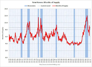 Months of supply decreased to 8.6 in August from 8.7 in July. The all time record was 12.4 months of supply in January 2009. This is still very high (less than 6 months supply is normal).
The seasonally adjusted estimate of new houses for sale at the end of August was 206,000. This represents a supply of 8.6 months at the current sales rate.
 The final graph shows new home inventory.
 The 288 thousand annual sales rate for August is just above the all time record low in May (282 thousand). This was another very weak report. New home sales are important for the economy and jobs - and this indicates that residential investment will be a sharp drag on GDP in Q3.
New Home Sales: Unchanged from July, Worst August on Record
by Calculated Risk on 9/24/2010 10:00:00 AM
NOTE: My host (Google) is not uploading images this morning - I'm working on a fix. You can follow the links to the images.
The Census Bureau reports New Home Sales in August were at a seasonally adjusted annual rate (SAAR) of 288 thousand. This is unchanged from July.
Here is the graph for New Home Sales NSA.
The first graph shows monthly new home sales (NSA - Not Seasonally Adjusted or annualized).
Note the Red columns for 2010. In August 2010, 25 thousand new homes were sold (NSA). This is a new record low for August.
The previous record low for the month of August was 34 thousand in 1981; the record high was 110 thousand in August 2005.
The second graph shows New Home Sales vs. recessions for the last 47 years.
Sales of new single-family houses in August 2010 were at a seasonally adjusted annual rate of 288,000, according to estimates released jointly today by the U.S. Census Bureau and the Department of Housing and Urban Development. This is unchanged (±16.7%)* from the revised July rate of 288,000 and is 28.9 percent (±11.0%) below the August 2009 estimate of 405,000.And another long term graph - this one for New Home Months of Supply.
The third graph is for Months of Supply
Months of supply decreased to 8.6 in August from 8.7 in July. The all time record was 12.4 months of supply in January 2009. This is still very high (less than 6 months supply is normal).
The seasonally adjusted estimate of new houses for sale at the end of August was 206,000. This represents a supply of 8.6 months at the current sales rate.The final graph shows new home inventory.
The 288 thousand annual sales rate for August is just above the all time record low in May (282 thousand). This was another very weak report. New home sales are important for the economy and jobs - and this indicates that residential investment will be a sharp drag on GDP in Q3.
Note: Sorry for the technical problems.
Durable Goods Orders decreased 1.3% in August
by Calculated Risk on 9/24/2010 08:30:00 AM
From the Census Bureau:
New orders for manufactured durable goods in August decreased $2.5 billion or 1.3 percent to $191.2 billion, the U.S. Census Bureau announced today. Down three of the last four months, this decrease followed a 0.7 percent July increase. Excluding transportation, new orders increased 2.0 percent. Excluding defense, new orders decreased 1.2 percent.This was below the consensus for a decline of 1.0%.
...
Shipments of manufactured durable goods in August, down following two consecutive monthly increases, decreased $3.1 billion or 1.5 percent to $197.9 billion.
Next up: New home sales at 10 AM ET.
Thursday, September 23, 2010
Obama pushes China on exchange rate
by Calculated Risk on 9/23/2010 10:09:00 PM
From David Sanger at the NY Times: With Warning, Obama Presses Chinese Leader on Currency
President Obama increased pressure on China to immediately revalue its currency on Thursday, devoting most of a two-hour meeting with China’s prime minister to the issue and sending the message, according to one of his top aides, that if “the Chinese don’t take actions, we have other means of protecting U.S. interests.”The old imbalances have returned - as the trade data and west coast port traffic data show - but I don't have much confidence that the Chinese will take action.
But Prime Minister Wen Jiabao barely budged ...
European Bond Spreads
by Calculated Risk on 9/23/2010 06:54:00 PM
Here is a look at European bond spreads from the Atlanta Fed weekly Financial Highlights released today (graph as of Sept 22nd):
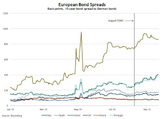 Click on graph for larger image in new window.
From the Atlanta Fed:
European bond spreads have for the most part risen and remain elevated since the August FOMC meeting.As of today, the Ireland-to-German spread has increased to 418 bps, and the Portugal-to-German spread has increased to 402 bps - both new records.
Note: The Atlanta Fed data is a couple days old. Nemo has links to the current data on the sidebar of his site.
And from Liz Alderman at the NY Times: In Europe, a Mood of Austerity and Anxiety. And some video interviews from different countries ...
Philly Fed State Coincident Indexes
by Calculated Risk on 9/23/2010 04:09:00 PM
 Click on map for larger image.
Here is a map of the three month change in the Philly Fed state coincident indicators. Forty states are showing increasing three month activity. The index decreased in 6 states, and was unchanged in 4.
Based on the one month data, this three month activity map be turning red again.
Here is the Philadelphia Fed state coincident index release for August.
In the past month, the indexes increased in 27 states, decreased in 16, and remained unchanged in seven for a one-month diffusion index of 22. Over the past three months, the indexes increased in 40 states, decreased in six, and remained unchanged in four (California, Iowa, Indiana, and Missouri) for a three-month diffusion index of 68.
 The second graph is of the monthly Philly Fed data of the number of states with one month increasing activity.
 The indexes increased in 27 states, decreased in 16, and remained unchanged in 7. Note: this graph includes states with minor increases (the Philly Fed lists as unchanged).
This is the fewest number of states showing increasing activity since January of this year.
Hotel Occupancy Rate: Just below 2008 levels
by Calculated Risk on 9/23/2010 02:03:00 PM
Hotel occupancy is one of several industry specific indicators I follow ...
From HotelNewsNow.com: STR: US hotels back on track in weekly results
Overall, the industry’s occupancy increased 6.7% to 63.5%, average daily rate was up 1.8% to US$100.25, and revenue per available room ended the week up 8.6% to US$63.66.The following graph shows the four week moving average for the occupancy rate by week for 2008, 2009 and 2010 (and a median for 2000 through 2007).
 Click on graph for larger image in new window.
Notes: the scale doesn't start at zero to better show the change. The graph shows the 4-week average, not the weekly occupancy rate.
On a 4-week basis, occupancy is up 6.8% compared to last year (the worst year since the Great Depression) and 5.7% below the median for 2000 through 2007.
The occupancy rate has fallen below the levels of 2008 again - and 2008 was a tough year for the hotel industry!
Important: Even though the occupancy rate is close to 2008 levels, 2010 is a much more difficult year. The average daily rate (ADR) is off more than 10% from 2008 levels - so even with the similar occupancy rates, hotel room revenue is off sharply compared to two years ago.
Data Source: Smith Travel Research, Courtesy of HotelNewsNow.com
Existing Home Inventory increases 1.5% Year-over-Year
by Calculated Risk on 9/23/2010 11:28:00 AM
Earlier the NAR released the existing home sales data for August; here are a couple more graphs ...
The first graph shows the year-over-year (YoY) change in reported existing home inventory and months-of-supply. Inventory is not seasonally adjusted, so it really helps to look at the YoY change.  Click on graph for larger image in new window.
Although inventory decreased slightly from July 2010 to August 2010, inventory increased 1.5% YoY in August.
Note: Usually July is the peak month for inventory.
The year-over-year increase in inventory is especially bad news because the reported inventory is already historically very high (around 4 million), and the 11.6 months of supply in August is far above normal.
Based on the MBA mortgage purchase applications index, it appears there will be little increase in sales over the next couple of months (sales will probably remain in the low-to-mid 4 million SAAR range). That means we will see double digit months-of-supply for some time - and that suggests house prices will continue to fall.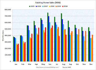 By request - the second graph shows existing home sales Not Seasonally Adjusted (NSA).
The red columns are for 2010. Sales for the last two months are significantly below the previous years, and sales will probably be well below the previous years for the remainder of 2010.
The bottom line: Sales were very weak in August - almost exactly at the levels I expected - and will continue to be weak for some time. Inventory is very high, and that will put downward pressure on house prices.
Existing Home Sales at 4.1 million SAAR, 11.6 months of supply
by Calculated Risk on 9/23/2010 10:00:00 AM
The NAR reports: Existing-Home Sales Move Up in August
Existing-home sales, which are completed transactions that include single-family, townhomes, condominiums and co-ops, increased 7.6 percent to a seasonally adjusted annual rate of 4.13 million in August from an upwardly revised 3.84 million in July, but remain 19.0 percent below the 5.10 million-unit pace in August 2009.
...
Total housing inventory at the end of August slipped 0.6 percent to 3.98 million existing homes available for sale, which represents an 11.6-month supply at the current sales pace, down from a 12.5-month supply in July.
 Click on graph for larger image in new window.
This graph shows existing home sales, on a Seasonally Adjusted Annual Rate (SAAR) basis since 1993.
Sales in August 2010 (4.13 million SAAR) were 7.6% higher than last month, and were 19.0% lower than August 2009 (5.1 million SAAR).
 The second graph shows nationwide inventory for existing homes.
According to the NAR, inventory decreased slightly to 3.98 million in August from 4.01 million in July. The all time record high was 4.58 million homes for sale in July 2008.
Inventory is not seasonally adjusted and there is a clear seasonal pattern with inventory increasing in the spring and into the summer. I'll have more on inventory later ...
 The last graph shows the 'months of supply' metric.
Months of supply decreased to 11.6 months in August from 12.5 months in July. This is extremely high and suggests prices, as measured by the repeat sales indexes like Case-Shiller and CoreLogic, will continue to decline.
These weak numbers are exactly what I expected. Ignore the median price! Double digit supply and the low sales rate are the key stories. I'll have more ...
Weekly Initial Unemployment Claims increase
by Calculated Risk on 9/23/2010 08:30:00 AM
The DOL reports on weekly unemployment insurance claims:
In the week ending Sept. 18, the advance figure for seasonally adjusted initial claims was 465,000, an increase of 12,000 from the previous week's revised figure of 453,000. The 4-week moving average was 463,250, a decrease of 3,250 from the previous week's revised average of 466,500.
 Click on graph for larger image in new window.
This graph shows the 4-week moving average of weekly claims since January 2000.
The dashed line on the graph is the current 4-week average. The four-week average of weekly unemployment claims decreased this week by 3,250 to 463,250.
The 4-week moving average has been moving sideways at an elevated level for about 10 months - and that suggests a weak job market.
Wednesday, September 22, 2010
Oops! No mortgage and still foreclosed on
by Calculated Risk on 9/22/2010 10:42:00 PM
From Harriet Johnson Brackey at the Sun Sentinel: Man's home sold out from under him in foreclosure mistake (ht Clint)
When Jason Grodensky bought his modest Fort Lauderdale home last December, he paid cash. But seven months later, he was surprised to learn that Bank of America had foreclosed on the house, even though Grodensky did not have a mortgage.Talk about a foreclosure error. I'm surprised a notice wasn't posted on the front door. At least the property wasn't sold to another party on the court house steps - imagine if that 3rd party had shown up with an eviction notice.
Grodensky knew nothing about the foreclosure until July, when he learned that the title to his home had been transferred to a [Fannie Mae]. ... Bank of America has acknowledged the error and will correct it at its own expense, said spokeswoman Jumana Bauwens.
Existing Home Sales Preview
by Calculated Risk on 9/22/2010 07:39:00 PM
Last month it was obvious that the consensus forecast for existing home sales was way too high. For July, the consensus was 4.65 million on a seasonally adjusted annual rate (SAAR) basis, and the National Association of Realtors (NAR) reported sales of 3.83 million SAAR (the lowest sales rate in almost 15 years).
Tomorrow (Thursday), the NAR will report existing home sales for August at 10 AM ET (existing home sales are counted when transactions close). The consensus is for an increase to 4.1 million (SAAR) in August from 3.83 million in July, and down sharply from the 5.1 million SAAR in August 2009.
Housing economist Tom Lawler is also projecting 4.1 million SAAR.
Other key numbers will be the the level of inventory and months-of-supply.
Excluding July, the last time sales were this low was in 1997. And based on the MBA purchase index, I don't expect much of a sales increase in September or October either.
HAMP data for August
by Calculated Risk on 9/22/2010 05:18:00 PM
From Treasury: HAMP Servicer Performance Report Through August 2010
And here is the HUD Housing Scorecard.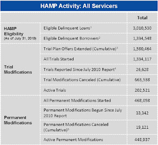 Click on table for larger image in new window.
About 468 thousand modifications are now "permanent" - up from 422 thousand last month - and 663 thousand trial modifications have been cancelled.
The pace of new trial modifications has slowed sharply from over 150,000 in September 2009 to under 18,000 in August. The program has slowed way down. The second graph shows the aged trials (greater than 6 months) as a percent of total trials.
According to HAMP, there are 202,521 "active trials", down from 255,934 last month.
The shows that the HAMP servicers have made progress on getting borrowers out of "modification limbo" - although the trial program was originally designed to be for 3 months - so maybe the measurement should be 4 months (instead of 6 months).
Debt-to-income ratios
If we look at the HAMP program stats (see page 3), the median front end DTI (debt to income) before modification was 44.9% - the same as last month. And the back end DTI1 was an astounding 79.9%.
This means that for the median borrower, about 80% of the borrower's income went to servicing debt. And the median is 63.5% after the modification.
These borrowers still have too much debt, even after the modification - and that suggests an eventual high redefault rate. There have been 18,773 redefaults already. It would be nice to see percent defaults by months from when the "permanent modification" started.
1 Back end DTI from HAMP:
Ratio of total monthly debt payments (including mortgage principal and interest, taxes, insurance, homeowners association and/or condo fees, plus payments on installment debts, junior liens, alimony, car lease payments and investment property payments) to monthly gross income.
Temporary Decennial Census workers almost gone
by Calculated Risk on 9/22/2010 01:41:00 PM
Next week I'll have an estimate of the impact of the temporary decennial hiring and layoffs on the September employment report.
It is worth noting that the Census came in well under budget, and the temporary workers are almost all gone. One of the reasons the Census came in under budget was because of the quality of temporary workers hired (a small benefit from the high unemployment rate).
This month also marks the end of the weekly payroll report from the Census Bureau: "These data will continue through the end of September with the last release of data being the week of Sept. 26-Oct. 2." Click on graph for larger image in new window.
This graph shows the number of Census workers paid each week. The red labels are the weeks of the BLS payroll survey.
The temporary Census payroll decreased to 9,820 last week, and September will be the last month with a significant impact on the employment report.
Housing Starts and the Unemployment Rate
by Calculated Risk on 9/22/2010 11:14:00 AM
An update by request ... Click on graph for larger image in new window.
This graph shows single family housing starts and the unemployment rate through August (inverted).
You can see both the correlation and the lag. The lag is usually about 12 to 18 months, with peak correlation at a lag of 16 months for single unit starts. The 2001 recession was a business investment led recession, and the pattern didn't hold.
Housing starts (blue) rebounded a little last year,and then moved sideways for some time, before declining again in May.
This is what I expected when I first posted the above graph over a year ago. I wrote:
[T]here is still far too much existing home inventory, a sharp bounce back in housing starts is unlikely, so I think ... a rapid decline in unemployment is also unlikely.Usually near the end of a recession, residential investment1 (RI) picks up as the Fed lowers interest rates. This leads to job creation and also household formation - and that leads to even more demand for housing units - and more jobs, and more households - a virtuous cycle that usually helps the economy recover.
However this time, with the huge overhang of existing housing units, this key sector isn't participating. So in this recovery there is less job creation, less household formation, and less demand for housing units than in a normal recovery. This is sort of a circular trap for both GDP growth and employment that will persist until the excess housing units are absorbed.
Although there are other factors impacting the unemployment rate, the weakness in RI is one of the reasons I expect the unemployment rate to tick up over the next several months.
1 RI is mostly new home sales and home improvement.
AIA: Architecture Billings Index shows contraction in August
by Calculated Risk on 9/22/2010 08:30:00 AM
Note: This index is a leading indicator for new Commercial Real Estate (CRE) investment.
Reuters reports that the American Institute of Architects’ Architecture Billings Index increased to 48.2 in August from 47.9 in July. Any reading below 50 indicates contraction.
Project cancellations continue to be the main roadblock to recovery for the construction sector, the group said.The ABI press release is not online yet.
 Click on graph for larger image in new window.
This graph shows the Architecture Billings Index since 1996. The index has remained below 50, indicating falling demand, since January 2008.
Note: Nonresidential construction includes commercial and industrial facilities like hotels and office buildings, as well as schools, hospitals and other institutions.
According to the AIA, there is an "approximate nine to twelve month lag time between architecture billings and construction spending" on non-residential construction. So there will probably be further declines in CRE investment into 2011.
MBA: Mortgage Purchase Activity declines slightly
by Calculated Risk on 9/22/2010 07:12:00 AM
The MBA reports: Mortgage Applications Decrease in Latest MBA Weekly Survey
The Refinance Index decreased 0.9 percent from the previous week, which is the third straight weekly decrease. The seasonally adjusted Purchase Index decreased 3.3 percent from one week earlier.
...
The average contract interest rate for 30-year fixed-rate mortgages decreased to 4.44 percent from 4.47 percent, with points decreasing to 0.81 from 1.08 (including the origination fee) for 80 percent loan-to-value (LTV) ratio loans.
 Click on graph for larger image in new window.
This graph shows the MBA Purchase Index and four week moving average since 1990.
Purchase applications have declined for two consecutive weeks after rising slightly from the lows in July. Purchase applications are at about the levels of 1996 or 1997, suggesting existing home sales (closed transactions) in August, September and even October, will be weak. (Lawler's estimate is existing home sales will be around 4.1 million SAAR in August - to be reported Thursday)
Tuesday, September 21, 2010
On the GMAC Foreclosure Stories
by Calculated Risk on 9/21/2010 08:31:00 PM
I was going to ignore this, but I realized Tanta had written some informative and entertaining pieces that will help everyone understand the issues.
First an update from Bloomberg earlier today: Ally Says GMAC Mortgage Mishandled Affidavits on Foreclosures
Ally Financial Inc., whose GMAC Mortgage unit halted evictions in 23 states amid allegations of mishandled affidavits, said its filings contained no false claims about home loans.The basic facts are:
The “defect” in affidavits used to support evictions was “technical” and was discovered by the company, Gina Proia, an Ally spokeswoman, said in an e-mailed statement.
This is great for the lawyers (fighting foreclosure), and costly for the lender, but this is nothing new - except that GMAC must not have been paying attention!
The best reporting on the GMAC story comes from 2007 (just change the name of the lender) - and you can learn all about affidavits from Tanta's posts:
And what Tanta wrote in 2007 applies to the GMAC stories:
To summarize: there were dollars on the table encouraging secondary market participants to get real sloppy. ... The big news here is that the true cost of doing business is belatedly showing up. I happen to think that's a more important story than was originally reported.Another amazing story is that three years later all these lenders haven't realized how sloppy the original work was!
Note that all of these stories were for non-GSE lenders and/or loans that were in private label MBS. These guys tried to cut corners everywhere, and they are now paying the price for being sloppy. They deserve to be ridiculed ...


