 RSS Feed
 by Calculated Risk on 9/11/2010 03:05:00 PM
Saturday, September 11, 2010
Paper: Housing and the Business Cycle
From Steven Gjerstad and Vernon Smith in the WSJ: Why We're in for a Long, Hard Economic Slog (ht MrM)
In the Great Depression and in every recession since, recovery of residential construction has preceded recovery in every other sector, and its recovery has been far larger in percentage terms than the recovery in any other major sector.This is something I've been writing about since I started the blog in 2005, but it is worth repeating ... even though Residential Investment usually only accounts for around 5% GDP, it isn't the size of the sector, but the contribution during the recovery that matters - and housing is usually the largest contributor to economic and employment growth early in a recovery.
Applied to the Great Recession, it appears that those who see signs of a recovery may be grasping at straws.
But not this time because of the large number of excess housing units.
Here is the paper from Steven Gjerstad and Vernon Smith: Household expenditure cycles and economic cycles, 1920 – 2010
This has key implications for policy. As an example, a policy (like the housing tax credit) that encourages adding to the housing stock (new home construction) is a clear mistake, whereas policies that are aimed at household creation (jobs) or at least household preservation (like extended unemployment benefits) make more sense. Also policies aimed at supporting house prices - keeping the price above the market clearing price - are counterproductive and also a mistake.
Early Review of Byron Wien's "Ten Surprises" List for 2010
by Calculated Risk on 9/11/2010 11:49:00 AM
I saw this article at CNBC yesterday: Outlook Gloomy at Secret Billionaire Meeting
For 25 years, legendary Wall Street strategist Byron Wien, now with The Blackstone Group, has held summer meetings with high net worth individuals to get their outlook on the global economy and investing. This year’s group, totaling fifty individuals and including more than 10 billionaires, was decidedly pessimistic on the U.S. economy ...That reminded me to check on Byron Wien's The Surprises of 2010 list.
Note: For anyone not familiar with the list, Wien tries to make predictions that are generally out of the consensus view - he has been doing this for 24 years, and usually gets more than half right.
It looks like this will be an off year for the "Surprises" list ...
A quick review of Wien's possible surprises:
1. The United States economy grows at a stronger than expected 5% real rate during the year and the unemployment level drops below 9%. ...
CR: Not Likely.
2. The Federal Reserve decides the economy is strong enough for them to move away from zero interest rate policy. In a series of successive hikes beginning in the second quarter the Federal funds rate reaches 2% by year-end.
CR: Not Gonna Happen.
3. Heavy borrowing by the U.S. Treasury and some reluctance by foreign central banks to keep buying notes and bonds drives the yield on the 10-year Treasury above 5.5%. ...
CR: Not Gonna Happen
4. In a roller coaster year the Standard and Poor’s 500 rallies to 1300 in the first half and then runs out of steam and declines to 1000, ending where it started at 1115.10. ...
CR: Missed on the high, but the general idea of a trading range has been correct so far.
5. Because it is significantly undervalued on a purchasing power parity basis, the dollar rallies against the yen and the euro. It exceeds 100 on the yen and the euro drops below $1.30 as the long slide of the greenback is interrupted.
CR: Right on the euro, wrong on the yen.
6. Japan stands out as the best performing major industrialized market in the world as its currency weakens and its exports improve. Investors focus on the attractive valuations of dozens of medium sized companies in a market selling at one quarter of its 1989 high. The Nikkei 225 rises above 12,000
CR: The Nikkei did rally to 11,200 before falling sharply, but I think this counts as a miss.
7. Believing he must be a leader in climate control initiatives, President Obama endorses legislation favorable for nuclear power development. ...
CR: Didn't happen.
8. The improvement in the U.S. economy energizes the Obama administration. The White House undergoes some reorganization and regains its momentum. ...
CR: Not likely this year.
9. When it finally passes, financial service legislation, like the health care bill, proves to be softer on the industry than originally feared. ...
CR: I think this was right.
10. Civil unrest in Iran reaches a crescendo. Ayatollah Khomeini pushes out Mahmoud Ahmadinejad in favor of a more public relations adept leader. Economic improvement becomes the key issue and anti-Israel rhetoric subsides.
CR: Sounds good, but very unlikely.
2009 was Wien's best year (he reviews 2009 here), but it looks like 2010 will be his worst.
Unofficial Problem Bank List increases to 849 institutions
by Calculated Risk on 9/11/2010 08:43:00 AM
Note: this is an unofficial list of Problem Banks compiled only from public sources.
Here is the unofficial problem bank list for September 10, 2010.
Changes and comments from surferdude808:
After six additions and one removal, the Unofficial Problem Bank List includes 849 institutions with aggregate assets of $415.3 billion, up from 844 institutions with assets of $412 billion last week.The FDIC has only closed one bank over the last three weeks - but the additions keep coming!
The additions include First National Community Bank, Dunmore, PA ($1.3 billion Ticker: FNCB); Pacific Mercantile Bank, Costa Mesa, CA ($1.1 billion Ticker: PMBC); Community Shores Bank, Muskegon, MI ($262 million Ticker: CSHB); First American State Bank, Greenwood, CO ($244 million); Service1st Bank of Nevada, Las Vegas, NV ($232 million Ticker: WLBC); and Bank of the Eastern Shore, Cambridge, MD ($223 million).
The removal is the failed Horizon Bank ($188 million). Next week, we anticipate for the OCC to release its actions for August.
Friday, September 10, 2010
Austan Goolsbee, Comedian
by Calculated Risk on 9/10/2010 10:27:00 PM
Via Politico in October 2009 (link here if embed doesn't load)
"Number one on the list we wanted to make sure - [whisper] all the Clinton people got their jobs back - to do something to help the country."
“The unemployment rate is at 9.7% ... Have some sympathy for those people that are unemployed, because when Rahm Emanuel sees my comments from this evening, I am going to be one of them.”
Bank Failure #119: Horizon Bank, Bradenton, Florida
by Calculated Risk on 9/10/2010 06:25:00 PM
It's reach, overextended.
Federal eclipse.
by Soylent Green is People
From the FDIC: Bank of the Ozarks, Little Rock, Arkansas, Assumes All of the Deposits of Horizon Bank, Bradenton, Florida
As of June 30, 2010, Horizon Bank had approximately $187.8 million in total assets and $164.6 million in total deposits. ... The FDIC estimates that the cost to the Deposit Insurance Fund (DIF) will be $58.9 million. ... Horizon Bank is the 119th FDIC-insured institution to fail in the nation this year, and the twenty-third in Florida. The last FDIC-insured institution closed in the state was Community National Bank at Bartow, Bartow, on August 20, 2010.After taking two weeks off, the FDIC is back in action.
Hotel Occupancy Rate: Just above 2008 levels
by Calculated Risk on 9/10/2010 03:08:00 PM
Hotel occupancy is one of several industry specific indicators I follow ...
From HotelNewsNow.com: STR: US hotel results week ending 4 Sept. 2010
In year-over-year comparisons, occupancy increased 7.5 percent to 57.4 percent, average daily rate was up 2.1 percent to US$94.37, and revenue per available room rose 9.7 percent to US$54.16.The following graph shows the four week moving average for the occupancy rate by week for 2008, 2009 and 2010 (and a median for 2000 through 2007).
This was the 13th consecutive week the U.S. reported overall ADR increases. Before this trend emerged, ADR in decreased 74 of the past 76 weeks.
 Click on graph for larger image in new window.
Notes: the scale doesn't start at zero to better show the change. The graph shows the 4-week average, not the weekly occupancy rate.
On a 4-week basis, occupancy is up 8.1% compared to last year (the worst year since the Great Depression) and 3.5% below the median for 2000 through 2007.
The occupancy rate is just above the levels of 2008 - but 2008 was a tough year for the hotel industry!
Data Source: Smith Travel Research, Courtesy of HotelNewsNow.com
Update on Government Employment Graphs
by Calculated Risk on 9/10/2010 01:25:00 PM
Yesterday I posted a couple of graphs of government payroll employment since 1976 as a response to some comments to Menzie Chinn's post at Econbrowser: The "Ever-Expanding" Government Sector, Illustrated
There were a few questions ... (Please remember I was just answering some question to Menzie's post - not trying to start a huge debate - but I do think data helps to define the issues.)
Q: Does this include active duty military?
A: No. The payroll data is from the BLS and is for civilian employment only.
Q: Does this include government contractors?
A: Government contractors are private employers. The headcount would be included in the BLS report, but not as government employees.
Q: The graphs show that Federal government payroll employment (ex-military) has been declining over the last 35 years - and state and local has been mostly flat. But what about the pay (including benefits)?
A: I don't have that data, but the following graph is based on BEA data and shows the Federal (and defense spending) and state and local spending as a percent of GDP. But this doesn't include any unfunded future liabilities. Click on graph for larger image.
There has been a surge in defense spending, but Federal spending ex-defense and state and local spending has been fairly flat (but as I noted above, underfunded future liabilities - like state and local underfunded pension plans - don't show up).
I'm guessing the next question will be how the Federal stimulus spending shows up in the BEA reports. So here is the answer from the BEA:
BEA tracks the portion of federal government sector receipts and expenditures in the national income and product accounts that are affected by the provisions of the ARRA. Many of the ARRA-funded transactions—such as grants, transfers, and tax cuts—are not directly included in gross domestic product (GDP), because GDP only includes government spending on goods and services. However, these transactions affect GDP indirectly by providing resources to households, businesses, and state and local governments to fund personal consumption expenditures, business investment, and state and local government spending.Now back to the economy.
Wholesales Inventories increase 1.3% in July
by Calculated Risk on 9/10/2010 10:07:00 AM
From the Census Bureau:
Total inventories of merchant wholesalers, except manufacturers’ sales branches and offices, after adjustment for seasonal variations but not for price changes, were $405.0 billion at the end of July, up 1.3 percent ...
The July inventories/sales ratio for merchant wholesalers, except manufacturers’ sales branches and offices, based on seasonally adjusted data, was 1.16.
 Click on graph for larger image in new window.
 Usually we focus on Manufacturers' Inventories and Manufacturers' inventory-to-sales ratio, but the wholesale inventory report shows the same thing - the inventory adjustment is over.
This increase could be spun two ways. First from CNBC:
U.S. wholesale inventories surged by the largest amount in two years in July ... in a sign firms were anticipating enough demand to boost stock this summer.That sounds like good news.
The alternative view (my view) is that inventories are now a little too high - and that wholesalers will now cut back a little on orders.
Goolsbee to chair Council of Economic Advisers
by Calculated Risk on 9/10/2010 08:44:00 AM
From the WSJ: Goolsbee to Lead Council of Economic Advisers
President Barack Obama will name Austan Goolsbee, a longtime adviser and an architect of his campaign's economic message, to be chairman of the White House Council of Economic Advisers at a White House press conference Friday, an administration official said Thursday night.Tanta, my former co-blogger, once wrote about Goolsbee (back in 2007): Dr. Goolsbee: I’ll Stop Impersonating an Economist If You Quit Underwriting Mortgage Loans
Tanta's post was very funny - but it isn't funny that Goolsbee demonstrated a lack of understanding about the housing market.
Thursday, September 09, 2010
From Loan Modification Purgatory to Foreclosure Hell
by Calculated Risk on 9/09/2010 10:27:00 PM
David Lazarus has an interesting foreclosure story in the LA Times: Suddenly, their house is taken over
A few details:
The couple fell behind on their mortgage payments (he works in construction). Wells Fargo put them in a HAMP three month trial modification program in December, and they made all their payments.
After the three months were up, Ellen Kahara said, they were told by Wells that their case was still under review and that they should keep making the $1,400 payments. They did.On August 18th there was a knock on the door - it was the new owner who had bought the home at foreclosure!
The bank continued requesting paperwork as part of its review process. ... The Kaharas received a letter from Wells dated Aug. 11 saying that their application for a permanent loan modification had been rejected. The letter said the Kaharas would have 30 days to discuss other options available to them.
"No foreclosure sale will be conducted and you will not lose your home during this 30-day period," the letter said.
Obviously Wells Fargo made a huge mistake with the foreclosure, but perhaps just as outrageous is how they strung the couple along for months - collecting seven or eight monthly payments - and then finally denied the permanent modification when they were ready to foreclose.
Double Digit Unemployment Rate early next year?
by Calculated Risk on 9/09/2010 06:44:00 PM
From Ethan Harris, Bank of America North American Economist, and others, Growth recession, Sept 3rd:
"[F]or most of 2010 and 2011, employment growth is not expected to keep up with the rise in the labor force, which means the unemployment rate heads north. We expect a steady increase to 10.1% by the second quarter with a slow fall slightly below 10.0% by the end of 2011."From Ed McKelvey, Goldman Sachs senior economist today:
"[W]e expect payroll gains to slow to 25,000 per month (ex Census workers) and the jobless rate to drift up to 10% over the next half year."With growth slowing in the 2nd half (and into 2011), this means the unemployment rate will probably tick up too (unless the participation rate falls further). I've been expecting the unemployment rate to stay elevated, and probably increase further - and the main reason is the same as for the BofA and Goldman analysts: the general slowing economy.
Weekly Update on European Bond Spreads
by Calculated Risk on 9/09/2010 02:29:00 PM
Here is a look at European bond spreads from the Atlanta Fed weekly Financial Highlights released today (graph as of Sept 7th): Click on graph for larger image in new window.
From the Atlanta Fed:
Peripheral European bond spreads (over German bonds) have risen since the August FOMC meeting.Note: The Atlanta Fed data is a couple days old. Nemo has links to the current data on the sidebar of his site. The bond spreads have eased slightly over the last couple of days.
Irish and Portuguese bond spreads are currently at all-time highs, while the spread for Greek bonds remains extremely elevated.
Since the August FOMC meeting, the 10-year Greece-to-German bond spread has risen by 146 basis points (bps) ... through September 7. Similarly, with other European peripherals’ spreads, Portugal’s is higher by 99 bps during the period, and Spain’s is up by 20 bps.
Note: A big story today was the report that Deutsche Bank is seeking to raise 9 billion euros.
Government Employment since 1976
by Calculated Risk on 9/09/2010 12:23:00 PM
Menzie Chinn at Econbrowser posted a graph of total government employment over the last decade: The "Ever-Expanding" Government Sector, Illustrated
In response to the comments to his post, here are a couple of additional graphs: Click on graph for larger image.
This graph shows federal, state, and local government employment as a percent of the civilian noninstitutional population since 1976 (all data from the BLS).
Federal government employment has decreased over the last 35 years (mostly in the 1990s), state government employment has been flat, and local government employment has increased.
Note the small spikes very 10 years. That is the impact of the decennial census. The second graph shows government employment excluding education as a percent of the civilian noninstitutional.
The percent of federal and state government employment (ex-education) have all declined. Local government employment has been steady - so overall government employment (ex-education) as a percent of the civilian population is down over the last 35 years.
Trade Deficit declines in July
by Calculated Risk on 9/09/2010 09:11:00 AM
The Census Bureau reports:
[T]otal July exports of $153.3 billion and imports of $196.1 billion resulted in a goods and services deficit of $42.8 billion, down from $49.8 billion in June, revised.
 Click on graph for larger image.
The first graph shows the monthly U.S. exports and imports in dollars through June 2010.
Although imports declined in July, imports have been increasing much faster than exports.
The second graph shows the U.S. trade deficit, with and without petroleum, through July.
 The blue line is the total deficit, and the black line is the petroleum deficit, and the red line is the trade deficit ex-petroleum products.
The decrease in the deficit in July was across the board, although the oil deficit only declined slightly. And the trade gap with China declined slightly to $25.92 billion from $26.15 billion in June - essentially unchanged.
This is the 2nd largest monthly trade deficit since the 2008 collapse in trade.
Weekly Initial Unemployment Claims decline
by Calculated Risk on 9/09/2010 08:30:00 AM
UPDATE: BofA noted this morning that 9 states reported delays in filing jobless claims because of labor day weekend ... so the actual was probably higher (ht Brian)
The DOL reports on weekly unemployment insurance claims:
In the week ending Sept. 4, the advance figure for seasonally adjusted initial claims was 451,000, a decrease of 27,000 from the previous week's revised figure of 478,000. The 4-week moving average was 477,750, a decrease of 9,250 from the previous week's revised average of 487,000.
 Click on graph for larger image in new window.
This graph shows the 4-week moving average of weekly claims since January 2000.
The dashed line on the graph is the current 4-week average. The four-week average of weekly unemployment claims decreased this week by 9,250 to 477,750.
Claims for last week were revised up from 472,000 to 478,000.
This is the lowest level for weekly claims since early July, but it is still very high - and the current level of the 4-week average suggests a weak job market.
Wednesday, September 08, 2010
The Frugal are Losers Too
by Calculated Risk on 9/08/2010 08:34:00 PM
From Graham Bowley at the NY Times: Debtors Feast at the Expense of the Frugal
For example, anyone keeping $500,000 in a 12-month certificate of deposit earning a rate of 1.5 percent annually — one of the best savings rates available nationally these days — would earn $7,500 a year, hardly enough to live on. Just three years ago, that same investment would have generated $26,250.Obviously retired people, living on bond yields, are taking a hit as bonds mature. And this is pushing some conservative investors into riskier assets too.
... Anyone investing $500,000 in 10-year Treasuries at current yields would earn $13,500 a year.
The BEA has been reporting that Personal interest income has been falling since Sept 2008, and I expect interest income will fall further as bonds and CDs mature.
Lawler: Again on Existing Home Months’ Supply: What’s “Normal?”
by Calculated Risk on 9/08/2010 04:49:00 PM
CR Note: This is from economist Tom Lawler.
It has become “common practice” when talking about the “months’ supply” of existing homes for sale for folks to say that the “normal” months’ supply, or the months’ supply that means it is neither a “buyers” or a “sellers” market, is around 6 to 7 months. Yet here is the history of months’ supply for existing SF homes from the National Association of Realtors.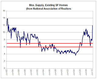 Click on graph for larger image in new window.
As one can see, this “metric” actually has not been in the six-to-seven month range very often. From mid-1982 through 1992, the months’ supply measure was above seven months in all but a handful of months, while from 1998 to the spring of 2006 it was always below six months.
The measure, of course, is quite volatile, and sorta weird in that the inventory number (the numerator) is not seasonally adjusted while the sales data (the denominator) is seasonally adjusted. The measure also can be extremely volatile as sales tend to be impacted more by “special factors” (weather, tax credits, etc.) than listings.
But the measure is only one of many measures that may be “indicative” of “excess” supply, and it probably isn’t even close to the best measure. However, it is the most timely, so folks watch it closely – but sometimes place WAY to much meaning in month-to-month swings.
CR Note: The above was from economist Tom Lawler.
From CR: I'm one of the people who has called 6 to 7 months a "normal" months-of-supply. As the graph above shows, it is hard to define a normal based on the last 30 years.
I've heard the 6 to 7 months metric for years - and it fits the data I have. Perhaps the idea that 6 to 7 months is "normal" comes from new home inventory. This graph shows new home inventory back to 1963 (unfortunately Tom Lawler's graph only goes back to 1982).
For new homes, it does look like around 6 months supply is normal. I suspect if the existing home graph went back to the '60s, something like 6 months would be normal.
Lawler's caution is something to keep in mind. But double digit months-of-supply is clearly very high.
Consumer Credit Declines in July
by Calculated Risk on 9/08/2010 03:09:00 PM
The Federal Reserve reports:
In July, total consumer credit decreased at an annual rate of 1-3/4 percent. Revolving credit decreased at an annual rate of 6-1/4
percent, and nonrevolving credit increased at an annual rate of 1/2 percent.
 Click on graph for larger image in new window.
This graph shows the increase in consumer credit since 1978. The amounts are nominal (not inflation adjusted).
Revolving credit (credit card debt) is off 15.2% from the peak. Non-revolving debt (auto, furniture, and other loans) is off 1.1% from the peak. Note: Consumer credit does not include real estate debt.
Fed's Beige Book: Continued growth, but "widespread signs of a deceleration"
by Calculated Risk on 9/08/2010 02:00:00 PM
Note: This is based on information collected on or before August 30, 2010.
From the Federal Reserve: Beige book
Reports from the twelve Federal Reserve Districts suggested continued growth in national economic activity during the reporting period of mid-July through the end of August, but with widespread signs of a deceleration compared with preceding periods.And on real estate:
...
Manufacturing activity expanded further on balance, although the pace of growth appeared to be slower than earlier in the year. Most Districts reported further gains in production activity and sales across a broad spectrum of manufacturing industries. However, New York, Richmond, Atlanta, and Chicago noted that the overall pace of growth slowed, while Philadelphia, Cleveland, and Kansas City reported that demand softened compared with the previous reporting period.
Activity in residential real estate markets declined further. Most District reports highlighted evidence of very low or declining home sales, which many attributed to a sustained lull following the expiration of the homebuyer tax credit at the end of June. Some Districts, such as New York and Dallas, noted that the expiration of the tax credit created especially weak conditions for lower-priced homes, while others, including Philadelphia and Kansas City, identified the high end of the market as the primary weak spot. Residential construction activity declined in most areas in response to weak demand.Pretty weak, but still growing in August.
...
Demand for commercial, industrial, and retail space generally remained depressed. Vacancy rates stayed at elevated levels in general and rose further in a few Districts, placing substantial downward pressure on rents.
BLS: Job Openings increases in July, Low Labor Turnover
by Calculated Risk on 9/08/2010 10:00:00 AM
Note: The temporary decennial Census hiring and layoffs has distorted this series over the last few months. The total separations has increased, but that includes the temporary Census workers that were let go.
From the BLS: Job Openings and Labor Turnover Summary
There were 3.0 million job openings on the last business day of July 2010, the U.S. Bureau of Labor Statistics reported today. The job openings rate increased over the month to 2.3 percent. The hires rate (3.3 percent) and the separations rate (3.4 percent) were unchanged....Note: The difference between JOLTS hires and separations is similar to the CES (payroll survey) net jobs headline numbers. The CES (Current Employment Statistics, payroll survey) is for positions, the CPS (Current Population Survey, commonly called the household survey) is for people.
The following graph shows job openings (purple), hires (blue), Total separations (include layoffs, discharges and quits) (red) and Layoff, Discharges and other (yellow) from the JOLTS.
Unfortunately this is a new series and only started in December 2000.
 Click on graph for larger image in new window.
Notice that hires (blue) and separations (red) are pretty close each month. In July, about 4.4 million people lost (or left) their jobs, and 4.23 million were hired (this is the labor turnover in the economy) for a loss of 168,000 jobs in July (this includes Census jobs lost).
The employment report (revised) showed a loss of only 54,000 jobs in July, and usually these numbers are pretty close, so this is a little puzzling. I expect some revisions to one or both reports.
When the hires (blue line) is above total separations, the economy is adding net jobs, when the blue line is below total separations (as in July), the economy is losing net jobs.
It appears job openings are still trending up, however labor turnover is still fairly low.


