 RSS Feed
 by Calculated Risk on 8/20/2010 07:04:00 PM
Friday, August 20, 2010
Bank Failure #114: ShoreBank, Chicago, Illinois
From the FDIC: Urban Partnership Bank, Chicago, Illinois, Assumes All of the Deposits of ShoreBank, Chicago, Illinois
As of June 30, 2010, ShoreBank had approximately $2.16 billion in total assets and $1.54 billion in total deposits. ... The FDIC estimates that the cost to the Deposit Insurance Fund (DIF) will be $367.7 million. ... ShoreBank is the 114th FDIC-insured institution to fail in the nation this year, and the fifteenth in Illinois. The last FDIC-insured institution closed in the state was Palos Bank and Trust Company, Palos Heights, on August 13, 2010.This was no surprise (in the works for some time and rumored this morning). That makes four today ...
Bank Failures #111 to #113: Florida and Virginia
by Calculated Risk on 8/20/2010 06:15:00 PM
From the FDIC: CenterState Bank of Florida, National Association, Winter Haven, Florida, Acquires All the Deposits of Two Banks in Florida
As of June 30, 2010, Community National Bank At Bartow had total assets of $67.9 million and total deposits of $63.7 million; and Independent National Bank had total assets of $156.2 million and total deposits of $141.9 million. ... The FDIC estimates that the cost to the Deposit Insurance Fund (DIF) for Community National Bank At Bartow will be $10.3 million; and for Independent National Bank, $23.2 million. ... These closings bring the total for the year to 112 banks in the nation, and the twenty-first and twenty-second in Florida.From the FDIC: River Community Bank, National Association, Martinsville, Virginia, Assumes All of the Deposits of Imperial Savings and Loan Association, Martinsville, Virginia
As of June 30, 2010, Imperial Savings and Loan Association had approximately $9.4 million in total assets and $10.1 million in total deposits ... The FDIC estimates that the cost to the Deposit Insurance Fund (DIF) will be $3.5 million. ... Imperial Savings and Loan Association is the 113th FDIC-insured institution to fail in the nation this year, and the first in Virginia.
Huge miss coming on Existing Home Sales?
by Calculated Risk on 8/20/2010 03:20:00 PM
MarketWatch is reporting the consensus for July existing home sales is 4.85 million SAAR (seasonally adjusted annual rate).
And from Dow Jones: Week Ahead
"July existing-home sales ... likely declined 4.3% from June"June sales were reported as 5.37 million, so a decline of 4.3% would be 5.14 million SAAR.
Note: July existing home sales will be reported next Tuesday.
Housing economist Tom Lawler's preliminary forecast was 3.95 million SAAR (based on a bottom up analysis).
Many of the regional reports showed sales declines of 20% or more from July 2009 when the NAR reported sales of 5.14 million SAAR. A 20% decline from July 2009 would be in the low 4 millions ...
Maybe the MarketWatch and Dow Jones consensus numbers are incorrect (other numbers will be released later today), or there is probably going to be a big miss next Tuesday. Take the WAY under!
Next week will be VERY busy - I'll have more in the weekly preview on Sunday.
HAMP data for July
by Calculated Risk on 8/20/2010 11:43:00 AM
From Treasury: HAMP Servicer Performance Report Through July 2010
And here is the HUD Housing Scorecard. Click on table for larger image in new window.
About 422 thousand modifications are now "permanent" - up from 389 thousand last month - and 617 thousand trial modifications have been cancelled - up sharply from 521 thousand last month.
According to HAMP, there are 255,934 "active trials", down from 364,077 last month. There is still a large number of borrowers in limbo since only 165 thousand trials were started over the last 5 months. I expect another large number of cancellations in August. The second graph shows the cumulative HAMP trial programs started.
Notice that the pace of new trial modifications has slowed sharply from over 150,000 in September to under 17,00 in July. The program is winding down ...
Debt-to-income ratios
If we look at the HAMP program stats (see page 3), the median front end DTI (debt to income) before modification was 44.8% - the same as last month. And the back end DTI was an astounding 79.7 (about the same as last month).
Think about that for a second: for the median borrower, about 80% of the borrower's income went to servicing debt. And the median is 63.5% after the modification.
These borrowers are still up to their eyeballs in debt after the modification.
Summary:
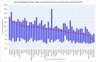
State Unemployment Rates: Generally unchanged in July
by Calculated Risk on 8/20/2010 10:00:00 AM
 Click on graph for larger image in new window.
This graph shows the high and low unemployment rates for each state (and D.C.) since 1976. The red bar is the current unemployment rate (sorted by the current unemployment rate).
Eleven states now have double digit unemployment rates. A number of other states are close..
Nevada set a new series high at 14.3% and now has the highest state unemployment rate. Michigan held the top spot for over 4 years until May.
From the BLS: Regional and State Employment and Unemployment Summary
Regional and state unemployment rates were little changed in July. Eighteen states and the District of Columbia recorded unemployment rate decreases, 14 states registered rate increases, and 18 states had no change, the U.S. Bureau of Labor Statistics reported today.
...
Nevada again reported the highest unemployment rate among the states, 14.3 percent in July. The rate in Nevada also set a new series high. (All region, division, and state series begin in 1976.) The states with the next highest rates were Michigan, 13.1 percent, and California, 12.3 percent. North Dakota continued to register the lowest jobless rate, 3.6 percent, followed by South Dakota and Nebraska, 4.4 and 4.7 percent, respectively.
emphasis added
A story on buying and flipping foreclosed homes
by Calculated Risk on 8/20/2010 08:37:00 AM
Here is a story from Walter Hamilton and Alejandro Lazo at the LA Times on the growing number of investors trying to buy and flip foreclosed homes at the court house steps: Professional investors move into flipping foreclosed homes
On a recent day, [Bruce] Norris steered his sport utility vehicle into the driveway of a 3,300-square-foot McMansion on a corner lot in Moreno Valley. The front lawn was brown and the backyard was littered with garbage. But the windows were intact and there was no visible damage -- far better than many foreclosures.
Aiming for an all-important look inside, Norris rang the doorbell and delivered the bad news to the teenage boy who answered the door that the home was scheduled to be sold that day.
"Do you mind if I poke around a little bit to see what kind of condition it's in?" Norris asked, angling his body to get a glimpse of the living room.
...
In the end, no one bought the home. The sale was delayed after the owner filed for bankruptcy protection.
Thursday, August 19, 2010
Hotel Occupancy Rate: Almost back to 2008 levels
by Calculated Risk on 8/19/2010 10:01:00 PM
Hotel occupancy is one of several industry specific indicators I follow ...
From HotelNewsNow.com: STR: Chain-scale segments report RevPAR boost
Overall, the industry’s occupancy increased 6.9% to 68.3%, ADR rose 1.9% to US$98.88, and RevPAR increased 9.0% to US$67.52.The following graph shows the four week moving average for the occupancy rate by week for 2008, 2009 and 2010 (and a median for 2000 through 2007).
 Click on graph for larger image in new window.
Notes: the scale doesn't start at zero to better show the change. The graph shows the 4-week average, not the weekly occupancy rate.
On a 4-week basis, occupancy is up 6.8% compared to last year (the worst year since the Great Depression) and 3.7% below the median for 2000 through 2007.
The occupancy rate is almost back to the levels of 2008 - and 2008 was a tough year for the hotel industry!
NOTE: The supply of rooms in the survey is up just over 2% from last year. The increase in the occupancy rate is from an increase in demand - although this is still fairly weak.
Data Source: Smith Travel Research, Courtesy of HotelNewsNow.com
European Bond Spreads: Rising Again
by Calculated Risk on 8/19/2010 06:04:00 PM
Here is a look at European bond spreads from the Atlanta Fed weekly Financial Highlights released today (graph as of Aug 18th):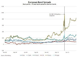 Click on graph for larger image in new window.
From the Atlanta Fed:
Peripheral European bond spreads over German bonds remain volatile and elevated.As of today, the Greece-to-German spread has widened to 834 bps (peaked at 963 bps in May) and the Ireland-to-German spread has increased to 293 bps (peaked at 306 bps in May).
Since August 9, the 10-year Greece-to-German bond spread has risen 93 basis points (bps) through August 17. Likewise, Portugal’s bond spreads rose 32 bps, Italy’s rose 16 bps, Spain’s rose 21 bps, and Ireland’s rose 42 bps during the same period.
The spreads are below the peak of the crisis in May, but above the level when the stress test results were released.
Note: The Atlanta Fed data is a couple days old. Nemo has links to the current data on the sidebar of his site.
Moody's: Commercial Real Estate Price Index declines 4% in June
by Calculated Risk on 8/19/2010 02:22:00 PM
Moody's reported (via Bloomberg) today that the Moody’s/REAL All Property Type Aggregate Index declined 4% in June. This is a repeat sales measure of commercial real estate prices.
Below is a comparison of the Moodys/REAL Commercial Property Price Index (CPPI) and the Case-Shiller composite 20 index.
Notes: Beware of the "Real" in the title - this index is not inflation adjusted. Moody's CRE price index is a repeat sales index like Case-Shiller - but there are far fewer commercial sales - and that can impact prices. Click on graph for larger image in new window.
CRE prices only go back to December 2000.
The Case-Shiller Composite 20 residential index is in blue (with Dec 2000 set to 1.0 to line up the indexes).
It is important to remember that the number of transactions is very low and there are a large percentage of distressed sales.
Commercial real estate values are now down 41.3% from the peak in late 2007.
As I've noted every month, this is a very thin market that is skewed by distressed sales. For more, see John Murray at PIMCO's caution about the CPPI index: PIMCO U.S. Commercial Real Estate Project and MIT Professor David Geltner comments that appear on the Real Estate Analytics LLC website on the lower right under "Professor's Corner".
Note: there is also a new CRE index from CoStar, see: CoStar: Commercial Real Estate Prices decline sharply in June
Census Bureau: 24.1 million homeowners had primary mortgage rates above 6% in 2009
by Calculated Risk on 8/19/2010 01:02:00 PM
The Census Bureau released a number of tables from the 2009 American Housing Survey today (report to be released in October).
The survey showed:
 Click on graph for larger image in new window.
This graph shows the number of primary mortgages by interest rate.
Only 6.2 million of primary mortgages were under 5% (as of 2009). This will increase in 2010, but quite a few homeowners had primary mortgage interest rates above 6%. And the BEA recently reported that the effective rate on all mortgages was still above 6% in Q2.
Of course many of these homeowners have second mortgages, or they can't qualify to refinance because or low property values or insufficient income.
It must be very frustrating for these homeowners when they see that Freddie Mac is reporting, via MarketWatch: Fixed-rate mortgages break record low
The 30-year fixed-rate mortgage averaged 4.42% for the week ending Aug. 19, a record low since Freddie started tracking the rate in 1971.There were at least 10.9 million homeowners with 2nd mortgages and another 800 thousand the 3 or more mortgages. Unfortunately that data includes another 5 million homeowners with the number of mortgages not reported.
There is much more data in the tables.
Philly Fed Index shows contraction in August, first time since July 2009
by Calculated Risk on 8/19/2010 10:00:00 AM
Here is the Philadelphia Fed Index: Business Outlook Survey
The survey’s broadest measure of manufacturing conditions, the diffusion index of current activity, decreased from a reading of 5.1 in July to ‐7.7 in August. The index turned negative, marking a period of declining monthly activity for the first time since July 2009 (see Chart). Indexes for new orders and
shipments also suggest a slowing this month; the new orders index fell slightly, to ‐7.1, while the shipments index turned negative, declining to ‐4.5. Indicating weakness, indexes for both delivery times and unfilled orders remained negative this month.
The percentage of firms reporting a decline in employment (23 percent) was higher than the percentage (20 percent) reporting an increase. More concerning was the significant drop in the average employee workweek index from 1.7 in July to ‐17.1 in August.
emphasis added
 Click on graph for larger image in new window.
This graph shows the Philly index for the last 40 years.
This index turned down sharply in June and July and was negative in August for the first time since July 2009.
These surveys are timely, but noisy. However this is further evidence of a 2nd half slowdown.
Weekly initial unemployment claims at 500,000, highest since November 2009
by Calculated Risk on 8/19/2010 08:30:00 AM
The DOL reports on weekly unemployment insurance claims:
In the week ending Aug. 14, the advance figure for seasonally adjusted initial claims was 500,000, an increase of 12,000 from the previous week's revised figure of 488,000. The 4-week moving average was 482,500, an increase of 8,000 from the previous week's revised average of 474,500.
...
The advance number for seasonally adjusted insured unemployment during the week ending Aug. 7 was 4,478,000, a decrease of 13,000 from the preceding week's revised level of 4,491,000.
 Click on graph for larger image in new window.
This graph shows the 4-week moving average of weekly claims since January 2000.
The four-week average of weekly unemployment claims increased this week by 8,000 to 482,500.
The dashed line on the graph is the current 4-week average. This is the highest level for initial claims - and also for the 4-week average - since November 2009.
Wednesday, August 18, 2010
California furloughs back on, Oregon deficit widens
by Calculated Risk on 8/18/2010 07:30:00 PM
From Bob Egelko at the San Francisco Chronicle: Furloughs back on starting this Friday
The state Supreme Court allowed Gov. Arnold Schwarzenegger on Wednesday to resume unpaid furloughs of 144,000 state employees for three days a month, starting this Friday ... The governor ordered the new round of furloughs in late July, claiming executive authority to cut costs while the state faces a $19 billion deficit.And from Michelle Cole at The Oregonian: With projected revenues dropping by as much as $1 billion, Oregon leaders debate what to do (ht Scott)
On Tuesday, Gov. Ted Kulongoski advised legislative leaders, school superintendents and agency directors that state economists expect tax collections to be down significantly more than the $577 million shortfall projected in May. ... Now state economists believe revenues will shrivel by an additional $200 million to $500 million, prompting Kulongoski to send a flurry of letters and notices warning of more cuts to schools and state services.Just a couple reminders that there are more state and local cuts coming ...
Jim the Realtor: "Comp Killer"
by Calculated Risk on 8/18/2010 03:51:00 PM
No, it is not a rap song ...
This is a story from Jim the Realtor about how one REO in a higher mid-priced area of San Diego (North Pacific Beach) has frozen the market. The list prices in this area were all over $500 per sq ft, and this REO sold for under $400 per sq ft.
Comp killer.
The REO is an older home, but with nice interior upgrades and an ocean view. Yeah - the yard needs work.
Refinance Activity, Mortgage Rates and Effective Rate
by Calculated Risk on 8/18/2010 01:11:00 PM
The MBA reported this morning on the surge in refinance activity:
The Refinance Index increased 17.1 percent from the previous week and was the highest Refinance Index observed in the survey since the week ending May 15, 2009. ... The refinance share of mortgage activity increased to 81.4 percent of total applications from 78.1 percent the previous week, which is the highest refinance share observed since January 2009.
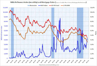 Click on graph for larger image in new window.
The first graph shows the MBA's refinance index (monthly) and the the 30 year fixed rate mortgage interest rate and one year ARM rate, from the Freddie Mac Primary Mortgage Market Survey®.
As mortgage rates have fallen, there has been a surge in refinance activity. But it is still well below the activity during the 2009 refinance boom, or in 2002/2003. It takes lower and lower rates to get people to refi - and many borrowers have insufficient equity (or negative equity) or inadequate income to refi.
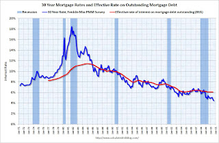 The second graph shows the 30 year fixed rate mortgage interest rate from the Freddie Mac Primary Mortgage Market Survey®.
 The red line is a quarterly estimate from the BEA of the effective rate of interest on all outstanding mortgages (Owner- and Tenant-occupied residential housing through Q2 2010).
The effective rate on outstanding mortgages is at a series low of just over 6%, but the rate is moving down slowly since so many borrowers can't refinance because they do not qualify (either because the property value is too low or their incomes are insufficient).
Because of the difference between current mortgage rates and the effective rate, many people are pushing for programs to help unqualified borrowers to refinance. As an example, PIMCO's Bill Gross suggested
Mr. Gross said the U.S. could easily refinance every current mortgage borrower, who is paying a rate above 5%, with a loan backed by Fannie Mae, Freddie Mac, and the Federal Housing Administration, returning tens of billions in savings.This will not happen unless the private lenders write down the principal - and that is very unlikely.
AIA: Architecture Billings Index shows contraction in July
by Calculated Risk on 8/18/2010 09:36:00 AM
Note: This index is a leading indicator for new Commercial Real Estate (CRE) investment.
The Business Times reports that the American Institute of Architects’ Architecture Billings Index increased to 47.9 in July from 46 in June. Any reading below 50 indicates contraction.
'We continue to receive a mixed bag of feedback on the condition of the design market, from improving to flat to being paralysed by uncertainty,' said AIA Chief Economist Kermit Baker.The ABI press release is not online yet.
 Click on graph for larger image in new window.
This graph shows the Architecture Billings Index since 1996. The index has remained below 50, indicating falling demand, since January 2008.
Note: Nonresidential construction includes commercial and industrial facilities like hotels and office buildings, as well as schools, hospitals and other institutions.
According to the AIA, there is an "approximate nine to twelve month lag time between architecture billings and construction spending" on non-residential construction. So there will probably be further declines in CRE investment into 2011.
MBA: Mortgage refinance activity increases sharply, Purchase activity declines
by Calculated Risk on 8/18/2010 07:17:00 AM
The MBA reports: Refinance Activity Increases to Highest Level Since May 2009 in Latest MBA Weekly Survey
The Refinance Index increased 17.1 percent from the previous week and was the highest Refinance Index observed in the survey since the week ending May 15, 2009. The seasonally adjusted Purchase Index decreased 3.4 percent from one week earlier.
...
The average contract interest rate for 30-year fixed-rate mortgages increased to 4.60 percent from 4.57 percent, with points increasing to 0.92 from 0.89 (including the origination fee) for 80 percent loan-to-value (LTV) ratio loans.
 Click on graph for larger image in new window.
This graph shows the MBA Purchase Index and four week moving average since 1990.
After falling sharply in May, the purchase index has been moving sideways for about three months. The index is 42% below the level of the last week of April (and about 32% below the last week of April using the 4-week average).
This recent collapse in the purchase index has already shown up as a decline in new home sales (counted when the contract is signed), and will show up in the July and August existing home sales report (July sales to be reported next week).
Tuesday, August 17, 2010
NY Fed: Total Household Debt down 6.4% from the peak in 2008
by Calculated Risk on 8/17/2010 10:46:00 PM
This is a new quarterly report from the NY Fed ...
From the NY Fed: New York Fed Releases New Report, Web Page on Household Credit Conditions in U.S., Select States Showing Decline in Consumer Indebtedness
The Federal Reserve Bank of New York today announced the release of a new Quarterly Report on Household Debt and Credit and an accompanying web page. The report shows that households steadily reduced aggregate consumer indebtedness over the past seven quarters. In the second quarter of 2010, they owed 6.4 percent less than they did in 2008, the peak year for indebtedness.Here is the report: Quarterly Report on Household Debt and Credit
Additionally, for the first time since early 2006, the share of total household debt in some stage of delinquency declined, from 11.9 percent to 11.2 percent. However, the number of people with a new bankruptcy noted on their credit reports rose 34 percent during the second quarter, considerably higher than the 20 percent increase typical of the second quarter in recent years.
...
The next quarterly reports are expected to be released on November 8, 2010, February 14, 2011, May 9, 2011 and August 8, 2011.
And some data and graphs.
 Click on graph for larger image in new window.
From the NY Fed:
Aggregate consumer debt continued to decline in the second quarter, continuing its trend of the previous six quarters. As of June 30, 2010, total consumer indebtedness was $11.7 trillion, a reduction of $812 billion (6.5%) from its peak level at the close of 2008Q3, and $178 billion (1.5%) below its March 31, 2010 level. Household mortgage indebtedness has declined 6.4%, and home equity lines of credit (HELOCs) have fallen 4.4% since their respective peaks in 2008Q3 and 2009Q1. Excluding mortgage and HELOC balances, consumer indebtedness fell 1.5% in the quarter and, after having fallen for six consecutive quarters, stands at $2.31 trillion, 8.4% below its 2008Q4 peak.

For the first time since early 2006, total household delinquency rates declined in 2010Q2. As of June 30, 11.4% of outstanding debt was in some stage of delinquency, compared to 11.9% on March 31. and 11.2% a year ago. Currently about $1.3 trillion of consumer debt is delinquent and $986 billion is seriously delinquent (at least 90 days late or "severely derogatory"). Delinquent balances are now down 2.9% from a year ago, but serious delinquencies are up 3.1%.
Housing Starts and the Unemployment Rate
by Calculated Risk on 8/17/2010 07:08:00 PM
An update on a theme ...  Click on graph for larger image in new window.
This graph shows single family housing starts and the unemployment rate through July (inverted).
You can see both the correlation and the lag. The lag is usually about 12 to 18 months, with peak correlation at a lag of 16 months for single unit starts. The 2001 recession was a business investment led recession, and the pattern didn't hold.
Usually housing starts and residential construction employment lead the economy out of a recession, but not this time because of the huge overhang of existing housing units. After rebounding a little - mostly because of the home buyers tax credit - housing starts (blue) have moved mostly sideways (and down some recently).
This is what I expected when I first posted the above graph a year ago. I wrote:
[T]here is still far too much existing home inventory, a sharp bounce back in housing starts is unlikely, so I think ... a rapid decline in unemployment is also unlikely.Usually near the end of a recession, residential investment (RI) picks up as the Fed lowers interest rates. This leads to job creation and also household formation - and that leads to even more demand for housing units - and more jobs, and more households - a virtuous cycle that usually helps the economy recovery.
Note: RI is mostly new home sales and home improvement.
However this time, with the huge overhang of existing housing units, this key sector isn't participating. So in this recovery there is less job creation, less household formation, and less demand for housing units than a normal recovery. This is sort of a circular trap for both GDP growth and employment.
This is one of the reasons I expect the unemployment rate to tick up over the next several months.
Regional Reports: Home Sales fell sharply in July
by Calculated Risk on 8/17/2010 03:30:00 PM
From DataQuick:
A total of 18,946 new and resale homes were sold in Los Angeles, Riverside, San Diego, Ventura, San Bernardino and Orange counties in July. That was down 20.6 percent from 23,871 in June, and down 21.4 percent from 24,104 for July 2009, according to MDA DataQuick of San Diego.Other reports show similar declines as home sales fell sharply all across the country in July. We are now seeing double-digit months of supply nationwide - and we might even see the months of supply metric reach 1 year. The previous months-of-supply high for this downturn was 11.2 months in 2008.
This was the slowest July since 2007, when 17,867 homes were sold, and the second-slowest since July 1995, when 16,225 sold.
Housing economist Thomas Lawler's preliminary estimate for existing home sales in July is 3.95 million SAAR. If so, this would be fewest sales since 1996. Lawler's estimate for inventory in July was 4.04 million (although it is a bit of a mystery how the NAR calculates inventory). That would mean 12.3 months of supply!
A normal housing market usually has under 6 months of supply. The following graph shows the relationship between supply and house prices (using Case-Shiller).
 Click on graph for larger image in new window.
This graph show months of supply and the annualized change in the Case-Shiller Composite 20 house price index.
Below 6 months of supply (blue line) house prices are typically rising (black line).
Above 6 or 7 months of supply, house prices are usually falling. This isn't perfect - it is just a guideline. Over the last year, there have been many programs aimed at supporting house prices, and house prices increased slightly even with higher than normal supply. However those programs have mostly ended.
The dashed red line is the estimate for months of supply in July. Through the roof! And I expect we will see double-digit months-of-supply for a number of months.
This is a key reason why I expect house prices to fall further later this year as measured by the Case-Shiller and CoreLogic repeat sales house price indexes, although I don't expect huge declines like in 2008.


