by Calculated Risk on 6/28/2021 08:15:00 AM
Monday, June 28, 2021
Seven High Frequency Indicators for the Economy
These indicators are mostly for travel and entertainment. It will interesting to watch these sectors recover as the pandemic subsides.
The TSA is providing daily travel numbers.
 Click on graph for larger image.
This data shows the seven day average of daily total traveler throughput from the TSA for 2019 (Light Blue), 2020 (Blue) and 2021 (Red).
The dashed line is the percent of 2019 for the seven day average.
This data is as of June 27th.
The seven day average is down 23.7% from the same day in 2019 (76.3% of 2019). (Dashed line)
There was a slow increase from the bottom - and TSA data has picked up in 2021.
The second graph shows the 7 day average of the year-over-year change in diners as tabulated by OpenTable for the US and several selected cities.
 Thanks to OpenTable for providing this restaurant data:
This data is updated through June 26, 2021.
This data is "a sample of restaurants on the OpenTable network across all channels: online reservations, phone reservations, and walk-ins. For year-over-year comparisons by day, we compare to the same day of the week from the same week in the previous year."
Note that this data is for "only the restaurants that have chosen to reopen in a given market". Since some restaurants have not reopened, the actual year-over-year decline is worse than shown.
Dining picked up during the holidays, then slumped with the huge winter surge in cases. Dining is picking up again, and was up slightly in US (7-day average compared to 2019). Florida and Texas are above 2019 levels.
 This data shows domestic box office for each week and the median for the years 2016 through 2019 (dashed light blue).
 Note that the data is usually noisy week-to-week and depends on when blockbusters are released.
Movie ticket sales were at $70 million last week, down about 79% from the median for the week.
 This graph shows the seasonal pattern for the hotel occupancy rate using the four week average.
 The red line is for 2021, black is 2020, blue is the median, dashed purple is 2019, and dashed light blue is for 2009 (the worst year on record for hotels prior to 2020).
Occupancy is now above the horrible 2009 levels and weekend occupancy (leisure) has been solid.
This data is through June 19th. Hotel occupancy is currently down 10% compared to same week in 2019). Note: Occupancy was up year-over-year, since occupancy declined sharply at the onset of the pandemic. However, the 4-week average occupancy is still down from normal levels.
Notes: Y-axis doesn't start at zero to better show the seasonal change.
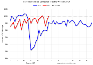
 This graph, based on weekly data from the U.S. Energy Information Administration (EIA), shows gasoline supplied compared to the same week of 2019.
Blue is for 2020. Red is for 2021.
As of June 18th, gasoline supplied was down slightly compared to the same week in 2019 (about 99.7% of the same week in 2019).
Four weeks ago was the only week this year when gasoline supplied was up compared to the same week in 2019.
This graph is from Apple mobility. From Apple: "This data is generated by counting the number of requests made to Apple Maps for directions in select countries/regions, sub-regions, and cities." This is just a general guide - people that regularly commute probably don't ask for directions.
There is also some great data on mobility from the Dallas Fed Mobility and Engagement Index. However the index is set "relative to its weekday-specific average over January–February", and is not seasonally adjusted, so we can't tell if an increase in mobility is due to recovery or just the normal increase in the Spring and Summer.
 This data is through June 26th for the United States and several selected cities.
The graph is the running 7 day average to remove the impact of weekends.
IMPORTANT: All data is relative to January 13, 2020. This data is NOT Seasonally Adjusted. People walk and drive more when the weather is nice, so I'm just using the transit data.
According to the Apple data directions requests, public transit in the 7 day average for the US is at 96% of the January 2020 level and moving up.
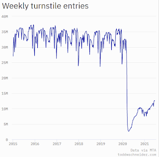
Here is some interesting data on New York subway usage (HT BR).
 This graph is from Todd W Schneider. This is weekly data since 2015.
 This data is through Friday, June 25th.
Schneider has graphs for each borough, and links to all the data sources.
He notes: "Data updates weekly from the MTA’s public turnstile data, usually on Saturday mornings".
Sunday, June 27, 2021
Sunday Night Futures
by Calculated Risk on 6/27/2021 07:30:00 PM
Weekend:
• Schedule for Week of June 27, 2021
Monday:
• At 10:30 AM ET, Dallas Fed Survey of Manufacturing Activity for June. This is the last of the regional surveys for June.
From CNBC: Pre-Market Data and Bloomberg futures S&P 500 are up 8 and DOW futures are up 88 (fair value).
Oil prices were up over the last week with WTI futures at $74.11 per barrel and Brent at $76.24 per barrel. A year ago, WTI was at $40, and Brent was at $41 - so WTI oil prices are UP over 75% year-over-year (oil prices collapsed at the beginning of the pandemic).
Here is a graph from Gasbuddy.com for nationwide gasoline prices. Nationally prices are at $3.09 per gallon. A year ago prices were at $2.18 per gallon, so gasoline prices are up $0.91 per gallon year-over-year.
June 27th COVID-19 New Cases, Vaccinations, Hospitalizations
by Calculated Risk on 6/27/2021 03:41:00 PM
This data is from the CDC.
According to the CDC, on Vaccinations.
Total doses administered: 323,327,328, as of a week ago 317,966,408. Average daily doses last week: 0.77 million.
| COVID Metrics | ||||
|---|---|---|---|---|
| Today | Yesterday | Week Ago | Goal | |
| Percent over 18, One Dose | 66.0% | 65.9% | 65.4% | ≥70.0%1,2 |
| Fully Vaccinated (millions) | 153.0 | 152.2 | 149.7 | ≥1601 |
| New Cases per Day3,4🚩 | 11,466 | 11,537 | 11,017 | ≤5,0002 |
| Hospitalized3 | 11,389 | 12,125 | 12,879 | ≤3,0002 |
| Deaths per Day3,4🚩 | 310 | 294 | 269 | ≤502 |
| 1 America's Goal by July 4th, 2my goals to stop daily posts, 37 day average for Cases, Hospitalized, and Deaths 4Cases and Deaths updated Mon - Fri 🚩 Increasing week-over-week | ||||
KUDOS to the residents of the 16 states and D.C. that have already achieved the 70% goal: Vermont, Hawaii and Massachusetts are at 80%+, and Connecticut, Maine, New Jersey, Rhode Island, Pennsylvania, New Mexico, Maryland, California, Washington, New Hampshire, New York, Illinois, Virginia and D.C. are all over 70%.
Next up are Delaware at 69.7%, Minnesota at 69.6%, Colorado at 69.4%, Oregon at 69.4%, Wisconsin at 65.1%, Nebraska at 64.8%, and Florida at 64.0%.
 Click on graph for larger image.
This graph shows the daily (columns) and 7 day average (line) of positive tests reported.
This data is from the CDC.
Q2 2021 Update: Unofficial Problem Bank list Decreased to 65 Institutions
by Calculated Risk on 6/27/2021 08:29:00 AM
The FDIC's official problem bank list is comprised of banks with a CAMELS rating of 4 or 5, and the list is not made public (just the number of banks and assets every quarter). Note: Bank CAMELS ratings are also not made public.
CAMELS is the FDIC rating system, and stands for Capital adequacy, Asset quality, Management, Earnings, Liquidity and Sensitivity to market risk. The scale is from 1 to 5, with 1 being the strongest.
As a substitute for the CAMELS ratings, surferdude808 is using publicly announced formal enforcement actions, and also media reports and company announcements that suggest to us an enforcement action is likely, to compile a list of possible problem banks in the public interest.
DISCLAIMER: This is an unofficial list, the information is from public sources only, and while deemed to be reliable is not guaranteed. No warranty or representation, expressed or implied, is made as to the accuracy of the information contained herein and same is subject to errors and omissions. This is not intended as investment advice. Please contact CR with any errors.
Here are the quarterly changes and a few comments from surferdude808:
Update on the Unofficial Problem Bank List through June 25, 2021. Since the last update at the end of March 2021, the list decreased by two to 65 institutions after four additions and six removals. Assets decreased by $7.2 billion to $51.8 billion, with the change entirely from a $7.2 billion decrease because of updated asset figures through March 31, 2021. During the first quarter of 2021, assets at Deutsche Bank Trust Company Americas declined by $7.6 billion.
A year ago, the list held 64 institutions with assets of $52.4.6 billion. Additions this month included The First National Bank of Albany, Albany, TX ($614 million); The City National Bank of Colorado City, Colorado City, TX ($180 million); Amory Federal Savings and Loan Association, Amory, MS ($79 million); and Transact Bank, National Association, Denver, CO ($21 million). Removals included Texas Champion Bank, Corpus Christi, TX ($393 million); The First National Bank and Trust Company of Vinita, Vinita, OK ($285 million); Business Bank of Texas, N.A., Austin, TX ($100 million); The Farmers Bank, Carnegie, OK ($76 million); The First National Bank of Tahoka, Tahoka, TX ($57 million); and State Bank of Nauvoo, Nauvoo, IL ($34 million).
On May 26, 2021, the FDIC released first quarter results and provided an update on the Official Problem Bank List. In that release, the FDIC said there were 54 institutions with assets of $55 billion on the official list, little changed from the 55 institutions with assets of $54 billion a quarter earlier.
With the conclusion of the second quarter, we bring an updated transition matrix to detail how banks are transitioning off the Unofficial Problem Bank List. Since we first published the Unofficial Problem Bank List on August 7, 2009 with 389 institutions, 1,777 institutions have appeared on a weekly or monthly list since then. Only 3.7 percent of the banks that have appeared on a list remain today as 1,712 institutions have transitioned through the list. Departure methods include 1,008 action terminations, 411 failures, 274 mergers, and 19 voluntary liquidations. Of the 389 institutions on the first published list, only 3 or less than 1.0 percent, still have a troubled designation more than ten years later. The 411 failures represent 23.1 percent of the 1,777 institutions that have made an appearance on the list. This failure rate is well above the 10-12 percent rate frequently cited in media reports on the failure rate of banks on the FDIC's official list.
Saturday, June 26, 2021
June 26th COVID-19 New Cases, Vaccinations, Hospitalizations
by Calculated Risk on 6/26/2021 05:22:00 PM
This data is from the CDC.
According to the CDC, on Vaccinations.
Total doses administered: 322,123,103, as of a week ago 317,117,797. Average daily doses last week: 0.72 million.
| COVID Metrics | ||||
|---|---|---|---|---|
| Today | Yesterday | Week Ago | Goal | |
| Percent over 18, One Dose | 65.9% | 65.8% | 65.3% | ≥70.0%1,2 |
| Fully Vaccinated (millions) | 152.2 | 151.3 | 149.1 | ≥1601 |
| New Cases per Day3,4🚩 | 11,512 | 11,342 | 11,365 | ≤5,0002 |
| Hospitalized3 | 12,125 | 12,235 | 13,344 | ≤3,0002 |
| Deaths per Day3,4🚩 | 294 | 287 | 274 | ≤502 |
| 1 America's Goal by July 4th, 2my goals to stop daily posts, 37 day average for Cases, Hospitalized, and Deaths 4Cases and Deaths updated Mon - Fri 🚩 Increasing week-over-week | ||||
KUDOS to the residents of the 16 states and D.C. that have already achieved the 70% goal: Vermont, Hawaii and Massachusetts are at 80%+, and Connecticut, New Jersey, Maine, Rhode Island, Pennsylvania, New Mexico, California, Maryland, Washington, New Hampshire, New York, Illinois, Virginia and D.C. are all over 70%.
Next up are Minnesota at 69.6%, Delaware at 69.5%, Colorado at 69.3%, Oregon at 69.2%, Wisconsin at 65.0%, Nebraska at 64.8%, and Florida at 64.0%.
 Click on graph for larger image.
This graph shows the daily (columns) and 7 day average (line) of positive tests reported.
This data is from the CDC.
Schedule for Week of June 27, 2021
by Calculated Risk on 6/26/2021 08:11:00 AM
The key report scheduled for this week is the June employment report to be released on Friday.
Other key reports include the June ISM Manufacturing survey, June Vehicle Sales, April Case-Shiller house prices, and the Trade Deficit for May.
10:30 AM: Dallas Fed Survey of Manufacturing Activity for June. This is the last of the regional surveys for June.
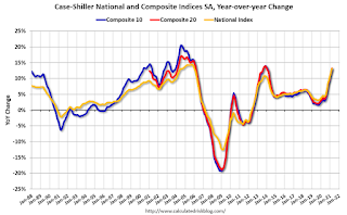
 9:00 AM: S&P/Case-Shiller House Price Index for April.
This graph shows the year-over-year change in the seasonally adjusted National Index, Composite 10 and Composite 20 indexes through the most recent report (the Composite 20 was started in January 2000).
The consensus is for a 12.3% year-over-year increase in the Comp 20 index for April.
9:00 AM: FHFA House Price Index for April 2021. This was originally a GSE only repeat sales, however there is also an expanded index.
7:00 AM ET: The Mortgage Bankers Association (MBA) will release the results for the mortgage purchase applications index.
8:15 AM: The ADP Employment Report for June. This report is for private payrolls only (no government). The consensus is for 600,000 payroll jobs added in June, down from 978,000 lost in May.
9:45 AM: Chicago Purchasing Managers Index for June.
10:00 AM: Pending Home Sales Index for May. The consensus is for a 0.8% increase in the index.
8:30 AM: The initial weekly unemployment claims report will be released. The consensus is for a decrease to 400 thousand from 411 thousand last week.
10:00 AM: ISM Manufacturing Index for June. The consensus is for the ISM to be at 61.5, up from 61.2 in May. The employment index was at 50.9% in May, and the new orders index was at 67.0%.
10:00 AM: Construction Spending for May. The consensus is for a 0.4% increase in construction spending.
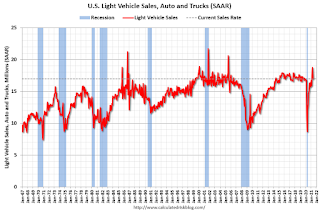
 Late in the day: Light vehicle sales for June.
The consensus is for light vehicle sales to be 17.1 million SAAR in June, up from 17.0 million in May (Seasonally Adjusted Annual Rate).
This graph shows light vehicle sales since the BEA started keeping data in 1967. The dashed line is the sales rate for last month.
Wards Auto is forecasting sales of 15.8 million SAAR in June.
 8:30 AM: Employment Report for June. The consensus is for 675,000 jobs added, and for the unemployment rate to decrease to 5.6%.
There were 559,000 jobs added in May, and the unemployment rate was at 5.8%.
This graph shows the job losses from the start of the employment recession, in percentage terms.
The current employment recession was by far the worst recession since WWII in percentage terms, but currently is not as severe as the worst of the "Great Recession".
 8:30 AM: Trade Balance report for May from the Census Bureau.
 This graph shows the U.S. trade deficit, with and without petroleum, through the most recent report. The blue line is the total deficit, and the black line is the petroleum deficit, and the red line is the trade deficit ex-petroleum products.
The consensus is the trade deficit to be $70.8 billion. The U.S. trade deficit was at $68.9 billion the previous month.
Friday, June 25, 2021
Real Personal Income less Transfer Payments Above Previous Peak
by Calculated Risk on 6/25/2021 03:41:00 PM
Government transfer payments decreased in May compared to April, but were still almost $1.0 trillion (on SAAR basis) above the February 2020 level (pre-pandemic) Note: Seasonal adjustment doesn't make sense with one time payments, but that is how the data is presented.
This table shows the amount of unemployment insurance and "Other" transfer payments since February 2020 (pre-crisis level). The increase in "Other" was mostly due to parts of the relief acts including direct payments.
| Selected Transfer Payments Billions of dollars, SAAR | ||
|---|---|---|
| Other | Unemployment Insurance | |
| Feb-20 | $506 | $28 |
| Mar-20 | $515 | $74 |
| Apr-20 | $3,379 | $493 |
| May-20 | $1,360 | $1,356 |
| Jun-20 | $758 | $1,405 |
| Jul-20 | $760 | $1,331 |
| Aug-20 | $692 | $636 |
| Sep-20 | $936 | $359 |
| Oct-20 | $732 | $304 |
| Nov-20 | $620 | $281 |
| Dec-20 | $654 | $304 |
| Jan-21 | $2,355 | $556 |
| Feb-21 | $778 | $535 |
| Mar-21 | $4,748 | $541 |
| Apr-21 | $1,404 | $495 |
| May-21 | $865 | $459 |
A key measure of the health of the economy (Used by NBER in recession dating) is Real Personal Income less Transfer payments.
 Click on graph for larger image.
This graph shows real personal income less transfer payments since 1990.
This measure of economic activity increased 0.4% in May, compared to April, and was up 0.8% compared to February 2020 (previous peak).
This is the first of the key NBER measures - GDP, Employment, Industrial Production, Real Personal Income less Transfer Payments - that is above pre-recession levels. GDP will be above pre-recession levels in Q2.
June 25th COVID-19 New Cases, Vaccinations, Hospitalizations
by Calculated Risk on 6/25/2021 03:33:00 PM
According to the CDC, on Vaccinations.
Total doses administered: 321,199,379, as of a week ago 316,048,776. Average daily doses: 0.74 million.
| COVID Metrics | ||||
|---|---|---|---|---|
| Today | Yesterday | Week Ago | Goal | |
| Percent over 18, One Dose | 65.8% | 65.7% | 65.1% | ≥70.0%1,2 |
| Fully Vaccinated (millions) | 151.6 | 151.3 | 148.5 | ≥1601 |
| New Cases per Day3,4🚩 | 11,512 | 11,342 | 11,365 | ≤5,0002 |
| Hospitalized3 | 12,235 | 12,329 | 13,538 | ≤3,0002 |
| Deaths per Day3,4🚩 | 294 | 287 | 274 | ≤502 |
| 1 America's Goal by July 4th, 2my goals to stop daily posts, 37 day average for Cases, Hospitalized, and Deaths 4Cases and Deaths updated Mon - Fri 🚩 Increasing week-over-week | ||||
KUDOS to the residents of the 16 states and D.C. that have already achieved the 70% goal: Vermont, Hawaii and Massachusetts are at 80%+, and Connecticut, New Jersey, Maine, Rhode Island, Pennsylvania, New Mexico, California, Maryland, Washington, New Hampshire, New York, Illinois, Virginia and D.C. are all over 70%.
Next up are Minnesota at 69.5%, Delaware at 69.4%, Colorado at 69.2%, Oregon at 69.1%, Wisconsin at 64.9%, Nebraska at 64.8%, and South Dakota at 63.8%.
 Click on graph for larger image.
This graph shows the daily (columns) and 7 day average (line) of positive tests reported.
This data is from the CDC.
Q2 GDP Forecasts: 8% to 10%
by Calculated Risk on 6/25/2021 11:58:00 AM
From BofA:
Weak home sales, trade, and inventories this week led us to take down our 2Q GDP tracking estimate back down to 10% qoq saar. [June 25 estimate]From Goldman Sachs:
emphasis added
The May increase in services consumption was softer than our previous assumptions, and we lowered our Q2 GDP tracking estimate by ¼pp to 8.5% (qoq ar). [June 25 estimate]From the NY Fed Nowcasting Report
The New York Fed Staff Nowcast stands at 3.4% for 2021:Q2 and 4.1% for 2021:Q3. [June 25 estimate]And from the Altanta Fed: GDPNow
The GDPNow model estimate for real GDP growth (seasonally adjusted annual rate) in the second quarter of 2021 is 8.3 percent on June 25, down from 9.7 percent on June 24. [June 25 estimate]
Black Knight: Number of Homeowners in COVID-19-Related Forbearance Plans Increased Slightly
by Calculated Risk on 6/25/2021 10:25:00 AM
Note: Both Black Knight and the MBA (Mortgage Bankers Association) are putting out weekly estimates of mortgages in forbearance.
This data is as of June 22nd.
From Andy Walden at Black Knight: Common, Marginal, Mid-Month Increase of Number of Forbearance Plans This Week
In what’s become a common trend of marginal mid-month increases, the number of active forbearance plans ticked up slightly from last week.
According to the weekly snapshot of Black Knight’s McDash Flash daily loan-level performance dataset, 2.06 million homeowners – representing 3.9% of mortgaged properties – remain in COVID-19 related forbearance plans.
While the total number of plans rose by 1,000 since last Tuesday, the population is still down 6% from the same time last month. That’s as compared to last week’s 5.4% monthly rate of improvement.
A 10,000 decline in the number of active GSE forbearance plans and a 7,000 drop in FHA/VA plans were both more than offset by a rise of 18,000 among portfolio and privately held mortgages.
Click on graph for larger image.
Meanwhile, starts edged lower this week and were 7% below their previous 4-week average. Likewise, removals hit their lowest level in five weeks and extension activity was down as well.
That said, more than 300K plans are still scheduled for quarterly reviews between now and next Wednesday, which could lead to more exits. We should all be expecting more activity one way or another as we near the 4th of July.
emphasis added


