 RSS Feed
 by Calculated Risk on 12/10/2020 07:35:00 PM
Thursday, December 10, 2020
December 10 COVID-19 Test Results; Record 7-Day Cases, Hospitalizations, Deaths
I'm looking forward to not posting this data in a few months. Please stay healthy!
The US is now averaging well over 1 million tests per day. Based on the experience of other countries, for adequate test-and-trace (and isolation) to reduce infections, the percent positive needs to be under 5% (probably close to 1%), so the US has far too many daily cases - and percent positive - to do effective test-and-trace.
There were 1,532,713 test results reported over the last 24 hours.
There were 214,118 positive tests.
Over 24,000 US deaths have been reported so far in December. See the graph on US Daily Deaths here.
 Click on graph for larger image.
This data is from the COVID Tracking Project.
The percent positive over the last 24 hours was 14.0% (red line is 7 day average). The percent positive is calculated by dividing positive results by the sum of negative and positive results (I don't include pending).
And check out COVID Exit Strategy to see how each state is doing.
 The second graph shows the 7 day average of positive tests reported and daily hospitalizations.
Note that there were very few tests available in March and April, and many cases were missed, so the hospitalizations was higher relative to the 7-day average of positive tests in July.
• Record Hospitalizations (Over 107,000)
• Record 7 Day Average Cases
• Record 7 Day Average Deaths
Fed's Flow of Funds: Household Net Worth Increased $3.8 Trillion in Q3
by Calculated Risk on 12/10/2020 01:25:00 PM
The Federal Reserve released the Q3 2020 Flow of Funds report today: Flow of Funds.
The net worth of households and nonprofits rose to $123.5 trillion in the third quarter of 2020. The value of directly and indirectly held corporate equities increased $2.8 trillion and the value of real estate increased $0.4 trillion.
Household debt increased 5.6 percent at an annual rate in the third quarter of 2020. Consumer credit grew at an annual rate of 1.9 percent, while mortgage debt (excluding charge-offs) grew at an annual rate of 5.6 percent.
 Click on graph for larger image.
The first graph shows Households and Nonprofit net worth as a percent of GDP.
With the sharp decline in GDP in Q2, net worth as a percent of GDP increased sharply. This reversed somewhat in Q3 as GDP bounced back (even as net worth increased)
This includes real estate and financial assets (stocks, bonds, pension reserves, deposits, etc) net of liabilities (mostly mortgages). Note that this does NOT include public debt obligations.
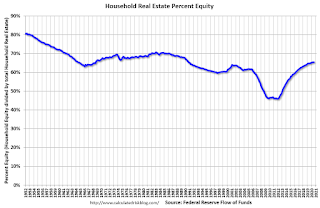 This graph shows homeowner percent equity since 1952.
Household percent equity (as measured by the Fed) collapsed when house prices fell sharply in 2007 and 2008.
In Q3 2020, household percent equity (of household real estate) was at 65.5% - unchanged from Q2.
Note: about 30.3% of owner occupied households had no mortgage debt as of April 2010. So the approximately 50+ million households with mortgages have less than 65.5% equity - and about 1.6 million homeowners still have negative equity.
 The third graph shows household real estate assets and mortgage debt as a percent of GDP. Note this graph was impacted by the sharp decline in Q2 GDP.
Mortgage debt increased by $158 billion in Q3.
Mortgage debt is still down from the peak during the housing bubble, and, as a percent of GDP is at 51.0% - down from Q2 - and down from a peak of 73.5% of GDP during the housing bubble.
The value of real estate, as a percent of GDP, decreased in Q3 as GDP bounced back, and is above the average of the last 30 years.
 This graph shows homeowner percent equity since 1952.
 Household percent equity (as measured by the Fed) collapsed when house prices fell sharply in 2007 and 2008.
In Q3 2020, household percent equity (of household real estate) was at 65.5% - unchanged from Q2.
Note: about 30.3% of owner occupied households had no mortgage debt as of April 2010. So the approximately 50+ million households with mortgages have less than 65.5% equity - and about 1.6 million homeowners still have negative equity.
 The third graph shows household real estate assets and mortgage debt as a percent of GDP. Note this graph was impacted by the sharp decline in Q2 GDP.
Mortgage debt increased by $158 billion in Q3.
Mortgage debt is still down from the peak during the housing bubble, and, as a percent of GDP is at 51.0% - down from Q2 - and down from a peak of 73.5% of GDP during the housing bubble.
The value of real estate, as a percent of GDP, decreased in Q3 as GDP bounced back, and is above the average of the last 30 years.
Hotels: Occupancy Rate Declined 37.9% Year-over-year
by Calculated Risk on 12/10/2020 12:32:00 PM
From HotelNewsNow.com: STR: US hotel results for week ending 5 December
U.S. weekly hotel occupancy increased slightly from the previous week, according to the latest data from STR through 5 December.Since there is a seasonal pattern to the occupancy rate - see graph below - we can track the year-over-year change in occupancy to look for any improvement. This table shows the year-over-year change since the week ending Sept 19, 2020:
29 November through 5 December 2020 (percentage change from comparable week in 2019):
• Occupancy: 37.4% (-37.9%)
• Average daily rate (ADR): US$86.21 (-33.1%)
• Revenue per available room (RevPAR): US$32.23 (-58.4%)
With slightly higher demand after Thanksgiving, occupancy improved after several weeks of lowering levels. With a tougher year-over-year comparable, however, the country’s RevPAR decline was its worst since late June.
emphasis added
| Week Ending | YoY Change, Occupancy Rate |
|---|---|
| 9/19 | -31.9% |
| 9/26 | -31.5% |
| 10/3 | -29.6% |
| 10/10 | -29.2% |
| 10/17 | -30.7% |
| 10/24 | -31.7% |
| 10/31 | -29.0% |
| 11/7 | -35.9% |
| 11/14 | -32.7% |
| 11/21 | -32.6% |
| 11/28 | -28.5% |
| 11/28 | -37.9% |
This suggests no improvement over the last 3 months.
The following graph shows the seasonal pattern for the hotel occupancy rate using the four week average.
 Click on graph for larger image.
The red line is for 2020, dash light blue is 2019, blue is the median, and black is for 2009 (the worst year since the Great Depression for hotels - before 2020).
Seasonally we'd expect the occupancy rate to decline into the new year.
Note: Y-axis doesn't start at zero to better show the seasonal change.
Cleveland Fed: Key Measures Show Inflation Softened in November
by Calculated Risk on 12/10/2020 11:08:00 AM
The Cleveland Fed released the median CPI and the trimmed-mean CPI this morning:
According to the Federal Reserve Bank of Cleveland, the median Consumer Price Index rose 0.1% November. The 16% trimmed-mean Consumer Price Index rose 0.1% in November. "The median CPI and 16% trimmed-mean CPI are measures of core inflation calculated by the Federal Reserve Bank of Cleveland based on data released in the Bureau of Labor Statistics’ (BLS) monthly CPI report".
Note: The Cleveland Fed released the median CPI details for November here. Car and Truck rentals and Lodging away from home increased sharply in November.
 Click on graph for larger image.
This graph shows the year-over-year change for these four key measures of inflation. On a year-over-year basis, the median CPI rose 2.3%, the trimmed-mean CPI rose 2.1%, and the CPI less food and energy rose 1.6%. Core PCE is for October and increased 1.4% year-over-year.
Overall inflation will not be a concern during the crisis.
CoreLogic: 1.6 Million Homes with Negative Equity in Q3 2020
by Calculated Risk on 12/10/2020 09:00:00 AM
From CoreLogic: Home Equity Reaches Record Highs: Homeowners Gained Over $1 Trillion in Equity in Q3 2020, CoreLogic Reports
CoreLogic® ... today released the Home Equity Report for the third quarter of 2020. The report shows U.S. homeowners with mortgages (which account for roughly 63% of all properties) have seen equity increase by 10.8% year over year, representing a collective equity gain of $1 trillion, and an average gain of $17,000 per homeowner, since the third quarter of 2019. This marks the largest average equity gain since the first quarter of 2014.
Despite the economic impact of the pandemic, home prices soared throughout the summer and fall. Appreciation reached its highest level since 2014 in the third quarter of 2020 as prospective homebuyers continued to compete for the low supply of homes on the market, pushing home equity to record levels. Equity gains are likely to persist over the next several months as strong home-purchase demand is expected to remain high and continue pushing prices up. However, the CoreLogic HPI Forecast shows home prices slowing over the next 12 months as new home construction and more existing for-sale homes ease supply pressures. This could moderate the pace of both home price growth and equity gains.
“Over the past year, strong home price growth has created a record level of home equity for homeowners,” said Dr. Frank Nothaft, chief economist for CoreLogic. “The average family with a home mortgage loan had $194,000 in home equity in the third quarter. This provides an important buffer to protect families if they experience financial difficulties, and is one reason for the generational-low in foreclosure rates reported in September.”
...
Negative equity, also referred to as underwater or upside down, applies to borrowers who owe more on their mortgages than their homes are currently worth. As of the third quarter of 2020, negative equity share, and the quarter-over-quarter and year-over-year changes, were as follows:
• Quarterly change: From the second quarter of 2020 to the third quarter of 2020, the total number of mortgaged homes in negative equity decreased by 6.9% to 1.6 million homes or 3% of all mortgaged properties.
• Annual change: In the third quarter of 2019, 2 million homes, or 3.7% of all mortgaged properties, were in negative equity. This number decreased by 18.3%, or 370,000 properties, in the third quarter of 2020 to 1.6 million mortgaged properties in negative equity.
• National aggregate value: The national aggregate value of negative equity was approximately $283.3 billion at the end of the third quarter of 2020. This is down quarter over quarter by approximately $2.2 billion, or 0.8%, from $285.5 billion in the second quarter of 2020, and down year over year by approximately $21.4 billion, or 7%, from $304.7 billion in the third quarter of 2019.
emphasis added
 Click on graph for larger image.
This graph from CoreLogic compares Q3 to Q2 2020 equity distribution by LTV. There are still quite a few properties with LTV over 125%. But most homeowners have a significant amount of equity. This is a very different picture than at the start of the housing bust when many homeowners had little equity.
On a year-over-year basis, the number of homeowners with negative equity has declined from 2.0 million to 1.6 million.
Weekly Initial Unemployment Claims increased sharply to 853,000
by Calculated Risk on 12/10/2020 08:45:00 AM
The DOL reported:
In the week ending December 5, the advance figure for seasonally adjusted initial claims was 853,000, an increase of 137,000 from the previous week's revised level. The previous week's level was revised up by 4,000 from 712,000 to 716,000. The 4-week moving average was 776,000, an increase of 35,500 from the previous week's revised average. The previous week's average was revised up by 1,000 from 739,500 to 740,500.This does not include the 427,609 initial claims for Pandemic Unemployment Assistance (PUA) that was up from 288,234 the previous week.
emphasis added
The following graph shows the 4-week moving average of weekly claims since 1971.
 Click on graph for larger image.
The dashed line on the graph is the current 4-week average. The four-week average of weekly unemployment claims increased to 776,000.
The previous week was revised up.
The second graph shows seasonally adjust continued claims since 1967 (lags initial by one week).
 At the worst of the Great Recession, continued claims peaked at 6.635 million, but then steadily declined.
Continued claims increased to 5,757,000 (SA) from 5,527,000 (SA) last week and will likely stay at a high level until the crisis abates.
Note: There are an additional 8,555,763 receiving Pandemic Unemployment Assistance (PUA) that decreased from 8,869,502 the previous week (there are questions about these numbers). This is a special program for business owners, self-employed, independent contractors or gig workers not receiving other unemployment insurance.
An additional 4,532,876 are receiving Pandemic Emergency Unemployment Compensation (PEUC) that decreased from 4,569,016 the previous week. These last two programs are set to expire on December 26th.
This was higher than expected.
BLS: CPI increased 0.2% in November, Core CPI Increased 0.2%
by Calculated Risk on 12/10/2020 08:33:00 AM
The Consumer Price Index for All Urban Consumers (CPI-U) increased 0.2 percent in November on a seasonally adjusted basis after being unchanged in October, the U.S. Bureau of Labor Statistics reported today. Over the last 12 months, the all items index increased 1.2 percent before seasonal adjustment.Overall inflation was slightly higher than expectations in November. I'll post a graph later today after the Cleveland Fed releases the median and trimmed-mean CPI.
...
The index for all items less food and energy increased 0.2 percent in November after being unchanged the prior month. The indexes for lodging away from home, household furnishings and operations, recreation, apparel, airline fares, and motor vehicle insurance all increased in November. The indexes for used cars and trucks, medical care, and new vehicles all declined over the month.
The all items index rose 1.2 percent for the 12 months ending November, the same increase as for the period ending October. The index for all items less food and energy rose 1.6 percent over the last 12 months, also the same increase as the period ending October. The food index rose 3.7 percent over the last 12 months, while the energy index fell 9.4 percent.
emphasis added
Wednesday, December 09, 2020
Thursday: CPI, Unemployment Claims, Q3 Flow of Funds
by Calculated Risk on 12/09/2020 09:28:00 PM
Thursday:
• At 8:30 AM ET, The initial weekly unemployment claims report will be released. The consensus is for 700,000 initial claims, down from 712,000 last week.
• Also at 8:30 AM, The Consumer Price Index for November from the BLS. The consensus is for a 0.1% increase in CPI, and a 0.2% increase in core CPI.
• At 12:00 PM, Q3 Flow of Funds Accounts of the United States from the Federal Reserve.
December 9 COVID-19 Test Results; Record 7-Day Cases, Hospitalizations, Over 3,000 Deaths
by Calculated Risk on 12/09/2020 07:44:00 PM
I'm looking forward to not posting this data in a few months. Please stay healthy!
The US is now averaging over 1 million tests per day. Based on the experience of other countries, for adequate test-and-trace (and isolation) to reduce infections, the percent positive needs to be well under 5% (probably close to 1%), so the US still needs to increase the number of tests per day significantly (or take actions to push down the number of new infections).
There were 1,454,192 test results reported over the last 24 hours.
There were 209,822 positive tests.
Over 21,000 US deaths have been reported so far in December. See the graph on US Daily Deaths here.
 Click on graph for larger image.
This data is from the COVID Tracking Project.
The percent positive over the last 24 hours was 14.4% (red line is 7 day average). The percent positive is calculated by dividing positive results by the sum of negative and positive results (I don't include pending).
And check out COVID Exit Strategy to see how each state is doing.
 The second graph shows the 7 day average of positive tests reported and daily hospitalizations.
Note that there were very few tests available in March and April, and many cases were missed, so the hospitalizations was higher relative to the 7-day average of positive tests in July.
• Record Hospitalizations (Over 106,000)
• Record 7 Day Average Cases
• Record 7 Day Average Deaths
By Request: Public and Private Sector Payroll Jobs During Presidential Terms
by Calculated Risk on 12/09/2020 01:11:00 PM
Note: I usually post this monthly, but I hesitated recently due to the COVID-19 pandemic. But I've received a number of requests lately - the recent numbers are ugly.
Here is another update of tracking employment during Presidential terms. We frequently use Presidential terms as time markers - we could use Speaker of the House, Fed Chair, or any other marker.
NOTE: Several readers have asked if I could add a lag to these graphs (obviously a new President has zero impact on employment for the month they are elected). But that would open a debate on the proper length of the lag, so I'll just stick to the beginning of each term.
Important: There are many differences between these periods. Overall employment was smaller in the '80s, however the participation rate was increasing in the '80s (younger population and women joining the labor force), and the participation rate is generally declining now. But these graphs give an overview of employment changes.
The first graph shows the change in private sector payroll jobs from when each president took office until the end of their term(s). Presidents Carter and George H.W. Bush only served one term.
Mr. G.W. Bush (red) took office following the bursting of the stock market bubble, and left during the bursting of the housing bubble. Mr. Obama (dark blue) took office during the financial crisis and great recession. There was also a significant recession in the early '80s right after Mr. Reagan (dark red) took office.
There was a recession towards the end of President G.H.W. Bush (light purple) term, and Mr. Clinton (light blue) served for eight years without a recession.
 Click on graph for larger image.
The first graph is for private employment only.
Mr. Trump is in Orange (46 months).
The employment recovery during Mr. G.W. Bush's (red) first term was sluggish, and private employment was down 824,000 jobs at the end of his first term. At the end of Mr. Bush's second term, private employment was collapsing, and there were net 387,000 private sector jobs lost during Mr. Bush's two terms.
Private sector employment increased by 20,970,000 under President Clinton (light blue), by 14,714,000 under President Reagan (dark red), 9,039,000 under President Carter (dashed green), 1,511,000 under President G.H.W. Bush (light purple), and 11,849,000 under President Obama (dark blue).
During the 46 months of Mr. Trump's term, the economy has lost 2,128,000 private sector jobs.
 A big difference between the presidencies has been public sector employment. Note: the bumps in public sector employment due to the decennial Census in 1980, 1990, 2000, 2010 and 2020.
The public sector grew during Mr. Carter's term (up 1,304,000), during Mr. Reagan's terms (up 1,414,000), during Mr. G.H.W. Bush's term (up 1,127,000), during Mr. Clinton's terms (up 1,934,000), and during Mr. G.W. Bush's terms (up 1,744,000 jobs). However the public sector declined significantly while Mr. Obama was in office (down 277,000 jobs).
During the 46 months of Mr. Trump's term, the economy has lost 870,000 public sector jobs.
 The third graph shows the progress towards the Trump goal of adding 10 million jobs over his 4 year term.
After 46 months of Mr. Trump's presidency, the economy has lost 2,998,000 jobs, about 12,581,000 behind the projection.


