 RSS Feed
 by Calculated Risk on 7/31/2020 12:24:00 PM
Friday, July 31, 2020
Early Q3 GDP Forecasts
Important: GDP is reported at a seasonally adjusted annual rate (SAAR). Also, even if activity is flat in Q3 compared to June, GDP will show a significant increase in Q3 over Q2 because of the sharp decline in April.
From Merrill Lynch:
We look for GDP to grow by 15.0% qoq saar in 3Q. We forecast a contraction of -5.7% in 2020, followed by a 2.8% rebound 2021. [July 31 estimate]And from the Altanta Fed: GDPNow
emphasis added
The initial GDPNow model estimate for real GDP growth (seasonally adjusted annual rate) in the third quarter of 2020 is 11.9 percent on July 31. On July 30, the U.S. Bureau of Economic Analysis released its initial estimate of second-quarter real GDP growth as -32.9 percent, 0.8 percentage points below the final GDPNow model nowcast released on July 29. [July 31 estimate]
Real Personal Income less Transfer Payments
by Calculated Risk on 7/31/2020 10:03:00 AM
NOTE: All of these numbers are on a seasonally adjusted annual rate basis (SAAR).
In the Personal Income & Outlays report for June, the BEA noted that "Personal income decreased $222.8 billion (1.1 percent) in June". This decrease in Personal Income was due to a decrease in transfer payments.
Transfer payments decreased by $0.5 trillion in June (SAAR), after decreasing by $1.2 trillion in May, and increasing by $3.3 trillion in April.
Unemployment insurance increased from $74 billion in March (SAAR), to $473 billion in April, to $1.31 trillion in May, to $1.42 trillion in June..
And "Other" decreased by $611 billion in June (SAAR).
Without the decrease in transfer payments, Personal Income in June would have increased about 1.0%.
A key measure of the health of the economy (Used by NBER in recession dating) is Real Personal Income less Transfer payments.
 Click on graph for larger image.
This graph shows real personal income less transfer payments since 1990.
This measure of economic activity decreased 2.9% in March, compared to February, and another 6.1% in April (compared to March).
This measure increased 1.5% in May compared to April, and increased 1.4% in June, but is still down 5.8% compared to February (pre-recession).
Black Knight: Number of Homeowners in COVID-19-Related Forbearance Plans Decreased Slightly as of July 28th
by Calculated Risk on 7/31/2020 09:45:00 AM
Note: Both Black Knight and the MBA (Mortgage Bankers Association) are putting out weekly estimates of mortgages in forbearance.
This data is as of Tuesday, July 28th.
From Loans in Forbearance Fell by 17K This Week; National Forbearance Rate Drops to 7.7%
 Click on graph for larger image.
CR Note: There will be another disaster relief package soon, but we might see an increase in forbearance activity next week as we wait for additional relief.
From Loans in Forbearance Fell by 17K This Week; National Forbearance Rate Drops to 7.7%
The latest data from the McDash Flash Forbearance Tracker shows that the number of loans in forbearance fell by 17K this week, dropping the national forbearance rate to 7.7%. There are now 4.1M loans that remain in active forbearance as of July 28th. While noticeable declines were seen among GSE (-30K) loans as well as loans held in portfolio and private labeled securities (-5K), FHA/VA forbearances rose for the third consecutive week (+18K) reaching their highest level since early July.
emphasis added
 Click on graph for larger image.
CR Note: There will be another disaster relief package soon, but we might see an increase in forbearance activity next week as we wait for additional relief.
Personal Income decreased 1.1% in June, Spending increased 5.6%
by Calculated Risk on 7/31/2020 08:39:00 AM
The BEA released the Personal Income and Outlays report for June:
Personal income decreased $222.8 billion (1.1 percent) in June according to estimates released today by the Bureau of Economic Analysis. Disposable personal income (DPI) decreased $255.3 billion (1.4 percent) and personal consumption expenditures (PCE) increased $737.7 billion (5.6 percent).The June PCE price index increased 0.8 percent year-over-year and the June PCE price index, excluding food and energy, increased 0.9 percent year-over-year.
Real DPI decreased 1.8 percent in June and Real PCE increased 5.2 percent. The PCE price index increased 0.4 percent. Excluding food and energy, the PCE price index increased 0.2 percent.
The following graph shows real Personal Consumption Expenditures (PCE) through June 2020 (2012 dollars). Note that the y-axis doesn't start at zero to better show the change.
 Click on graph for larger image.
The dashed red lines are the quarterly levels for real PCE.
Personal income was less than expected, and the increase in PCE was at expectations.
This graph illustrates why reported GDP will increase in Q3. Note the red line for Q2 (the quarterly level of PCE). Even if PCE stayed at the June level in Q3, there would be a significant increase in Q3.
Thursday, July 30, 2020
Friday: Personal Income and Outlays
by Calculated Risk on 7/30/2020 09:53:00 PM
Friday:
• At 8:30 AM ET, Personal Income and Outlays, June 2020. The consensus is for a 0.5% decrease in personal income, and for a 5.5% increase in personal spending. And for the Core PCE price index to increase 0.2%.
• At 9:45 AM, Chicago Purchasing Managers Index for July.
• At 10:00 AM, University of Michigan's Consumer sentiment index (Final for July). The consensus is for a reading of 72.9.
July 30 COVID-19 Test Results
by Calculated Risk on 7/30/2020 06:21:00 PM
The US is now reporting over 700,000 tests per day. Based on the experience of other countries, the percent positive needs to be well under 5% to really push down new infections, so the US still needs to increase the number of tests per day significantly (or take actions to push down the number of new infections).
There were 819,270 test results reported over the last 24 hours.
There were 69,917 positive tests.
The seven day average of daily deaths has moved higher for the 15th consecutive day to close to 1,100 per day. See the graph on US Daily Deaths here.
 Click on graph for larger image.
This data is from the COVID Tracking Project.
The percent positive over the last 24 hours was 8.5% (red line).
For the status of contact tracing by state, check out testandtrace.com.
And check out COVID Exit Strategy to see how each state is doing.
Year-over-year and Quarterly Change in Real GDP
by Calculated Risk on 7/30/2020 01:26:00 PM
The following graph shows real GDP quarterly (blue, annualized), and the year-over-year (YoY) change in real GDP (red).
The worst quarterly change in real GDP during the Great Recession was -8.4% annualized in Q4 2008.
The worst YoY change in real change during the Great recession was -3.9% in Q2 2009.
Annualized real GDP was at -32.9% in Q2 2020, and the YoY change in real GDP was -9.5%.
Note that the tax changes at the end of 2017 had minimal impact on GDP (maybe boosted slightly), and also, as shown earlier, there was no investment boom following the tax changes.
 Click on graph for larger image.
There will be some bounce back for GDP in Q3. The worst month for economic activity was in April 2020, and the economy bounced back in May and June.
Even if there is no further increase in economic activity in the July, August and September - compared to June - GDP will increase because April was so bad.
Hotels: Occupancy Rate Declined 38% Year-over-year
by Calculated Risk on 7/30/2020 11:35:00 AM
From HotelNewsNow.com: STR: US hotel results for week ending 25 July
U.S. hotel performance data for the week ending 25 July showed slightly higher occupancy and room rates from the previous week, according to STR.The following graph shows the seasonal pattern for the hotel occupancy rate using the four week average.
19-25 July 2020 (percentage change from comparable week in 2019):
• Occupancy: 48.1% (-37.9%)
• Average daily rate (ADR): US$99.24 (-27.3%)
• Revenue per available room (RevPAR): US$47.75 (-54.8%)
U.S. occupancy has risen week over week for 14 of the last 15 weeks, although growth in demand (room nights sold) has slowed.
emphasis added
As STR noted, the occupancy rate has increased week-to-week in "14 of the last 15 weeks". The increases in occupancy have slowed and are well below the level for this week last year of 78%.
 Click on graph for larger image.
The red line is for 2020, dash light blue is 2019, blue is the median, and black is for 2009 (the worst year probably since the Great Depression for hotels).
Usually hotel occupancy starts to pick up seasonally in early June and decline towards the end of summer. So some of the recent pickup might be seasonal (summer travel). Note that summer occupancy usually peaks at the end of July or in early August.
According to STR, the improvement appears related mostly to leisure travel as opposed to business travel.
Note: Y-axis doesn't start at zero to better show the seasonal change.
Comments on Weekly Unemployment Claims
by Calculated Risk on 7/30/2020 10:37:00 AM
A few comments:
On a monthly basis, in normal times, most analysts focus on initial unemployment claims for the BLS reference week of the employment report. For July, the BLS reference week was July 12th through the 18th, and initial claims for that week were released last week.
However, continued claims are probably much more useful now. Continued claims released with a one week lag, so continued claims for the reference week were released this week. The week-to-week increase in continued claims suggests some weakness in the July employment report, but continued claims were still down over 2 million from the reference week in June.
Note that a couple of states have not released Pandemic Unemployment Assistance (PUA) claims this week, so the number of PUA claims is too low. However, there may also be processing delays that are impacting the numbers.
Continued claims increased last week to 17,018,000 (SA) from 16,151,000 (SA) the previous week. Continued claims are down 7.9 million from the peak, suggesting a large number of people have returned to their jobs (as the last two employment reports showed). Continued claims NSA increased to 16,881,463 from 16,344,706 the previous week - and the seasonal adjustment may be off this year due to the pandemic.
There are another 12,413,322 people receiving continued PUA.
The following graph shows regular initial unemployment claims (blue) and PUA claims (red) since early February.
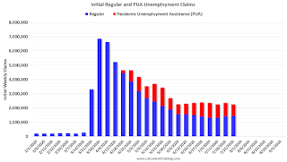 Click on graph for larger image.
This was the 19th consecutive week with extraordinarily high initial claims.
It is likely that we are starting to see some layoffs associated with the end of some early Payroll Protection Plan (PPP) participants.
We are probably seeing some layoffs in states with more COVID cases.
Note that these states don't have to lockdown to see a decline in economic activity. As Merrill Lynch economists noted: "Most of the slowdown occurred due to voluntary social distancing rather than lockdown policies."
Q2 GDP: Investment
by Calculated Risk on 7/30/2020 10:19:00 AM
Investment has been weak for some time, and slumped in Q1, and fell off a cliff in Q2 along with the overall economy.
The first graph below shows the contribution to GDP from residential investment,
equipment and software, and nonresidential structures (3 quarter trailing
average). This is important to follow because residential investment tends to
lead the economy, equipment and software is generally coincident, and
nonresidential structure investment trails the economy.
In the graph, red is residential, green is equipment and software, and blue is
investment in non-residential structures. So the usual pattern - both into and
out of recessions is - red, green, blue.
Of course - with the sudden economic stop due to COVID-19 - the usual pattern
doesn't apply.
The dashed gray line is the contribution from the change in private
inventories.
 Click on graph for larger image.
Residential investment (RI) decreased at a 38.7% annual rate in Q2.
Equipment investment decreased at a 37.7% annual rate, and investment in
non-residential structures decreased at a 34.9% annual rate.
On a 3 quarter trailing average basis, RI (red) is down solidly, equipment (green)
is strongly negative, and nonresidential structures (blue) is also down.
I'll post more on the components of non-residential investment once the
supplemental data is released.
 The second graph shows residential investment as a percent of GDP.
Residential Investment as a percent of GDP decreased slightly in Q2 (this means RI slumped slightly more than the overall economy in Q2). RI as a
percent of GDP is close to the bottom of the previous recessions - and prior to
the pandemic, I expected RI to continue to increase further in this cycle.
I'll break down Residential Investment into components after the GDP details are
released.
Note: Residential investment (RI) includes new single family structures,
multifamily structures, home improvement, broker's commissions, and a few minor
categories.
 The third graph shows non-residential investment in
structures, equipment and "intellectual property products".
Investment in equipment declined more than the overall economy.
The third graph shows non-residential investment in
structures, equipment and "intellectual property products".
Investment in equipment declined more than the overall economy.


