by Calculated Risk on 2/26/2020 03:24:00 PM
Wednesday, February 26, 2020
New Home Prices
As part of the new home sales report released today, the Census Bureau reported the number of homes sold by price and the average and median prices.
From the Census Bureau: "The median sales price of new houses sold in January 2020 was $348,200. The average sales price was $402,300."
The following graph shows the median and average new home prices.

During the housing bust, the builders had to build smaller and less expensive homes to compete with all the distressed sales. When housing started to recovery - with limited finished lots in recovering areas - builders moved to higher price points to maximize profits.
The average price in January 2020 was $402,300, and the median price was $348,200.
The second graph shows the percent of new homes sold by price.

The $400K+ bracket increased significantly since the housing recovery started, but has been holding steady recently. Still, a majority of new homes (about 55%) in the U.S., are in the $200K to $400K range.
A few Comments on January New Home Sales
by Calculated Risk on 2/26/2020 11:08:00 AM
New home sales for January were reported at 764,000 on a seasonally adjusted annual rate basis (SAAR). Sales for the previous three months were revised up, combined.
This was the highest sales rate since July 2007.
Earlier: New Home Sales increase to 764,000 Annual Rate in January.

This graph shows new home sales for 2019 and 2020 by month (Seasonally Adjusted Annual Rate).
The year-over-year comparison are fairly easy in the first half of 2020, and sales were up 18.6% YoY in January.
And here is another update to the "distressing gap" graph that I first started posting a number of years ago to show the emerging gap caused by distressed sales.
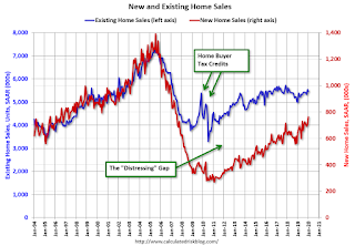
Following the housing bubble and bust, the "distressing gap" appeared mostly because of distressed sales.
Even though distressed sales are down significantly, following the bust, new home builders focused on more expensive homes - so the gap closed slowly.
Now the gap is mostly closed, and I expect it to close a little more. However, this assumes that the builders will offer some smaller, less expensive homes.
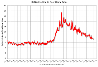
This ratio was fairly stable from 1994 through 2006, and then the flood of distressed sales kept the number of existing home sales elevated and depressed new home sales. (Note: This ratio was fairly stable back to the early '70s, but I only have annual data for the earlier years).
In general the ratio has been trending down since the housing bust - and is getting close to the historical ratio - and I expect this ratio will trend down a little more.
Note: Existing home sales are counted when transactions are closed, and new home sales are counted when contracts are signed. So the timing of sales is different.
New Home Sales increase to 764,000 Annual Rate in January
by Calculated Risk on 2/26/2020 10:13:00 AM
The Census Bureau reports New Home Sales in January were at a seasonally adjusted annual rate (SAAR) of 764 thousand.
The previous three months were revised up, combined.
"Sales of new single‐family houses in January 2020 were at a seasonally adjusted annual rate of 764,000, according to estimates released jointly today by the U.S. Census Bureau and the Department of Housing and Urban Development. This is 7.9 percent above the revised December rate of 708,000 and is 18.6 percent above the January 2019 estimate of 644,000."
emphasis added
 Click on graph for larger image.
The first graph shows New Home Sales vs. recessions since 1963. The dashed line is the current sales rate.
Even with the increase in sales over the last several years, new home sales are just at a normal level.
The second graph shows New Home Months of Supply.
 The months of supply decreased in January to 5.1 months from 5.5 months in December.
 The all time record was 12.1 months of supply in January 2009.
This is in the normal range (less than 6 months supply is normal).
"The seasonally‐adjusted estimate of new houses for sale at the end of January was 324,000. This represents a supply of 5.1 months at the current sales rate."
 On inventory, according to the Census Bureau:
 "A house is considered for sale when a permit to build has been issued in permit-issuing places or work has begun on the footings or foundation in nonpermit areas and a sales contract has not been signed nor a deposit accepted."Starting in 1973 the Census Bureau broke this down into three categories: Not Started, Under Construction, and Completed.
The third graph shows the three categories of inventory starting in 1973.
The inventory of completed homes for sale is still somewhat low, and the combined total of completed and under construction is close to normal.
 The last graph shows sales NSA (monthly sales, not seasonally adjusted annual rate).
In January 2020 (red column), 57 thousand new homes were sold (NSA). Last year, 49 thousand homes were sold in January
The all time high for January was 92 thousand in 2005, and the all time low for January was 21 thousand in 2011.
This was above expectations of 715 thousand sales SAAR, and sales in the three previous months were revised up, combined. This was a strong report with sales up 18.6% year-over-year. I'll have more later today.
MBA: Mortgage Applications Increased in Latest Weekly Survey
by Calculated Risk on 2/26/2020 07:00:00 AM
From the MBA: Mortgage Applications Increase in Latest MBA Weekly Survey
Mortgage applications increased 1.5 percent from one week earlier, according to data from the Mortgage Bankers Association’s (MBA) Weekly Mortgage Applications Survey for the week ending February 21, 2020. This week’s results include an adjustment for the Washington Birthday (Presidents’ Day) Holiday.
... The Refinance Index decreased 1 percent from the previous week and was 152 percent higher than the same week one year ago. The seasonally adjusted Purchase Index increased 6 percent from one week earlier. The unadjusted Purchase Index decreased 1 percent compared with the previous week and was 10 percent higher than the same week one year ago.
...
“Last week appears to have been the calm before the storm. Weaker readings on economic growth caused a slight drop in mortgage rates, bringing them back to their level two weeks ago, but applications overall moved 1.5 percent higher,” said Mike Fratantoni, MBA’s Senior Vice President and Chief Economist. “Refinance applications for conventional loans dropped a bit, but FHA refinances increased more than 22 percent. Purchase volume remained strong, supported both by low rates and the increased pace of construction over the past few months. With housing supply at low levels, new inventory is a positive development for prospective homebuyers.”
Added Fratantoni, “As fears regarding the coronavirus have increased, Treasury yields have dropped to record lows this week amid the ensuing financial market volatility. Next week’s results will show the impact this drop in Treasuries had on mortgage activity.”
...
The average contract interest rate for 30-year fixed-rate mortgages with conforming loan balances ($510,400 or less) decreased to 3.73 percent from 3.77 percent, with points decreasing to 0.27 from 0.28 (including the origination fee) for 80 percent loan-to-value ratio (LTV) loans.
emphasis added
 Click on graph for larger image.
The first graph shows the refinance index since 1990.
With lower rates, we saw a sharp increase in refinance activity, but mortgage rates would have to decline further to see a 2012 size refinance boom.
 The second graph shows the MBA mortgage purchase index
According to the MBA, purchase activity is up 10% year-over-year.
Tuesday, February 25, 2020
Wednesday: New Home Sales
by Calculated Risk on 2/25/2020 08:18:00 PM
Wednesday:
• At 7:00 AM ET, The Mortgage Bankers Association (MBA) will release the results for the mortgage purchase applications index.
• At 10:00 AM, New Home Sales for January from the Census Bureau. The consensus is for 715 thousand SAAR, up from 694 thousand in December.
Real House Prices and Price-to-Rent Ratio in December
by Calculated Risk on 2/25/2020 05:07:00 PM
Here is the post earlier on Case-Shiller: Case-Shiller: National House Price Index increased 3.8% year-over-year in December
It has been almost thirteen years since the bubble peak. In the Case-Shiller release today, the seasonally adjusted National Index (SA), was reported as being 15.8% above the previous bubble peak. However, in real terms, the National index (SA) is still about 6.6% below the bubble peak (and historically there has been an upward slope to real house prices). The composite 20, in real terms, is still 14.0% below the bubble peak.
The year-over-year growth in prices increased to 3.8% nationally, as expected with lower mortgage rates and fewer homes for sell.
Usually people graph nominal house prices, but it is also important to look at prices in real terms (inflation adjusted). Case-Shiller and others report nominal house prices. As an example, if a house price was $200,000 in January 2000, the price would be close to $291,000 today adjusted for inflation (45%). That is why the second graph below is important - this shows "real" prices (adjusted for inflation).
Nominal House Prices
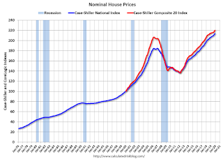
In nominal terms, the Case-Shiller National index (SA)and the Case-Shiller Composite 20 Index (SA) are both at new all times highs (above the bubble peak).
Real House Prices

In real terms, the National index is back to March 2005 levels, and the Composite 20 index is back to July 2004.
In real terms, house prices are at 2004/2005 levels.
Price-to-Rent
In October 2004, Fed economist John Krainer and researcher Chishen Wei wrote a Fed letter on price to rent ratios: House Prices and Fundamental Value. Kainer and Wei presented a price-to-rent ratio using the OFHEO house price index and the Owners' Equivalent Rent (OER) from the BLS.

This graph shows the price to rent ratio (January 2000 = 1.0). The price-to-rent ratio has been moving sideways recently.
On a price-to-rent basis, the Case-Shiller National index is back to March 2004 levels, and the Composite 20 index is back to November 2003 levels.
In real terms, prices are back to late 2004 levels, and the price-to-rent ratio is back to late 2003, early 2004.
FDIC: Fewer Problem banks, Residential REO Declined in Q4
by Calculated Risk on 2/25/2020 11:45:00 AM
The FDIC released the Quarterly Banking Profile for Q4 2019 today:
For the 5,177 commercial banks and savings institutions insured by the Federal Deposit Insurance Corporation (FDIC), aggregate net income totaled $55.2 billion in fourth quarter 2019, a decline of $4.1 billion (6.9 percent) from a year ago. The decline in net income was led by lower net interest income and higher expenses. Financial results for fourth quarter 2019 are included in the FDIC's latest Quarterly Banking Profile released today.
...
The Number of Banks on the "Problem Bank List" Remained Low: The number of problem banks fell from 55 to 51 during the fourth quarter, the lowest number of problem banks since fourth quarter 2006. Total assets of problem banks declined from $48.8 billion in the third quarter to $46.2 billion.
The Deposit Insurance Fund's Reserve Ratio Stood at 1.41 Percent: The Deposit Insurance Fund (DIF) balance totaled $110.3 billion in the fourth quarter, up $1.4 billion from the end of last quarter. The quarterly increase was led by assessment income and interest earned on investment securities held by the DIF. The reserve ratio remained unchanged from the previous quarter at 1.41 percent.
Mergers and New Bank Openings Continued in the Fourth Quarter: During the fourth quarter, three new banks opened, 77 institutions were absorbed by mergers, and three banks failed.
emphasis added
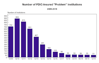 Click on graph for larger image.
The FDIC reported the number of problem banks declined slightly.
This graph from the FDIC shows the number of problem banks declined to 51 institutions from 60 at the end of 2018.
Note: The number of assets for problem banks increased significantly in 2018 when Deutsche Bank Trust Company Americas was added to the list (it must still be on the list given the assets of problem banks).
 The dollar value of 1-4 family residential Real Estate Owned (REOs, foreclosure houses) declined from $2.65 billion in Q4 2018 to $2.27 billion in Q4 2019. This is the lowest level of REOs since Q1 2006.
This graph shows the nominal dollar value of Residential REO for FDIC insured institutions. Note: The FDIC reports the dollar value and not the total number of REOs.
Since REOs are reported in dollars, and house prices have increased, FDIC REOs are probably close to a bottom.
Update: A few comments on the Seasonal Pattern for House Prices
by Calculated Risk on 2/25/2020 11:10:00 AM
CR Note: This is a repeat of earlier posts with updated graphs.
A few key points:
1) There is a clear seasonal pattern for house prices.
2) The surge in distressed sales during the housing bust distorted the seasonal pattern.
3) Even though distressed sales are down significantly, the seasonal factor is based on several years of data - and the factor is now overstating the seasonal change (second graph below).
4) Still the seasonal index is probably a better indicator of actual price movements than the Not Seasonally Adjusted (NSA) index.
For in depth description of these issues, see former Trulia chief economist Jed Kolko's article "Let’s Improve, Not Ignore, Seasonal Adjustment of Housing Data"
Note: I was one of several people to question the change in the seasonal factor (here is a post in 2009) - and this led to S&P Case-Shiller questioning the seasonal factor too (from April 2010). I still use the seasonal factor (I think it is better than using the NSA data).

This graph shows the month-to-month change in the NSA Case-Shiller National index since 1987 (through December 2019). The seasonal pattern was smaller back in the '90s and early '00s, and increased once the bubble burst.
The seasonal swings have declined since the bubble.

The swings in the seasonal factors have started to decrease, and I expect that over the next several years - as recent history is included in the factors - the seasonal factors will move back towards more normal levels.
However, as Kolko noted, there will be a lag with the seasonal factor since it is based on several years of recent data.
Richmond Fed: Manufacturing Activity Softened in February
by Calculated Risk on 2/25/2020 10:13:00 AM
From the Richmond Fed: Manufacturing Activity Softened in February
Fifth District manufacturing activity softened in February, according to the most recent survey from the Richmond Fed. The composite index fell from 20 in January to −2 in February. All three components of the composite index — shipments, new orders, and employment — moved lower from January. Firms also reported a decrease in backlog of orders. Still, the index for local business conditions remained positive, and manufacturers were optimistic that activity would improve in the coming months.
Survey results suggest that firms saw continued growth in employment and wages in February. However firms continued to struggle to find workers with the necessary skills, as this index dropped to −35.
emphasis added
Case-Shiller: National House Price Index increased 3.8% year-over-year in December
by Calculated Risk on 2/25/2020 09:13:00 AM
S&P/Case-Shiller released the monthly Home Price Indices for December ("December" is a 3 month average of October, November and December prices).
This release includes prices for 20 individual cities, two composite indices (for 10 cities and 20 cities) and the monthly National index.
Note: Case-Shiller reports Not Seasonally Adjusted (NSA), I use the SA data for the graphs.
From S&P: S&P CoreLogic Case-Shiller Index Shows Growth in Annual Home Price Gains to End 2019
The S&P CoreLogic Case-Shiller U.S. National Home Price NSA Index, covering all nine U.S. census divisions, reported a 3.8% annual gain in December, up from 3.5% in the previous month. The 10-City Composite annual increase came in at 2.4%, up from 2.0% in the previous month. The 20-City Composite posted a 2.9% year-over-year gain, up from 2.5% in the previous month.
Phoenix, Charlotte and Tampa reported the highest year-over-year gains among the 20 cities. In December, Phoenix led the way with a 6.5% year-over-year price increase, followed by Charlotte with a 5.3% increase and Tampa with a 5.2% increase. Twelve of the 20 cities reported greater price increases in the year ending December 2019 versus the year ending November 2019.
...
The National Index posted a month-over-month increase of 0.1%, while the 10-City Composite posted a 0.1% increase and the 20-City Composite did not post any gains before seasonal adjustment in December. After seasonal adjustment, the National Index posted a month-over-month increase of 0.5%, while the 10-City and 20-City Composites both posted 0.4% increases. In December, 10 of 20 cities reported increases before seasonal adjustment while 19 of 20 cities reported increases after seasonal adjustment.
"The U.S. housing market continued its trend of stable growth in December,” says Craig J. Lazzara, Managing Director and Global Head of Index Investment Strategy at S&P Dow Jones Indices. “December’s results bring the National Composite Index to a 3.8% increase for calendar 2019. This marks eight consecutive years of increasing housing prices (an increase which is echoed in our 10- and 20-City Composites). At the national level, home prices are 59% above the trough reached in February 2012, and 15% above their pre-financial crisis peak. Results for 2019 were broad-based, with gains in every city in our 20-City Composite.
emphasis added
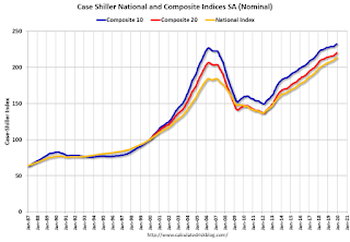 Click on graph for larger image.
 The first graph shows the nominal seasonally adjusted Composite 10, Composite 20 and National indices (the Composite 20 was started in January 2000).
The Composite 10 index is up 2.6% from the bubble peak, and up 0.4% in December (SA) from November.
The Composite 20 index is 6.5% above the bubble peak, and up 0.4% (SA) in December.
The National index is 15% above the bubble peak (SA), and up 0.5% (SA) in December. The National index is up 59% from the post-bubble low set in December 2011 (SA).
 The second graph shows the Year over year change in all three indices.
The Composite 10 SA is up 2.4% compared to December 2018. The Composite 20 SA is up 2.9% year-over-year.
The National index SA is up 3.5% year-over-year.
Note: According to the data, prices increased in 19 of 20 cities month-over-month seasonally adjusted.
I'll have more later.


