by Calculated Risk on 1/26/2018 07:02:00 PM
Friday, January 26, 2018
Oil Rigs "US oil rigs were up sharply"
A few comments from Steven Kopits of Princeton Energy Advisors LLC on Jan 26, 2017:
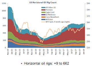
• Total US oil rigs were up sharply, +12 to 759
• Horizontal oil rigs were similarly up, +9 to 662
• All of the gain comes from the Permian, up 18 rigs in total
...
• The oil price continues to rise, with WTI above $66, even as the Brent spread has fallen below $5.
 Click on graph for larger image.
CR note: This graph shows the US horizontal rig count by basin.
Graph and comments Courtesy of Steven Kopits of Princeton Energy Advisors LLC.
Philly Fed: State Coincident Indexes increased in 37 states in December
by Calculated Risk on 1/26/2018 01:25:00 PM
From the Philly Fed:
The Federal Reserve Bank of Philadelphia has released the coincident indexes for the 50 states for December 2017. Over the past three months, the indexes increased in 42 states and decreased in eight, for a three-month diffusion index of 68. In the past month, the indexes increased in 37 states, decreased in 10, and remained stable in three, for a one-month diffusion index of 54.Note: These are coincident indexes constructed from state employment data. An explanation from the Philly Fed:
emphasis added
The coincident indexes combine four state-level indicators to summarize current economic conditions in a single statistic. The four state-level variables in each coincident index are nonfarm payroll employment, average hours worked in manufacturing by production workers, the unemployment rate, and wage and salary disbursements deflated by the consumer price index (U.S. city average). The trend for each state’s index is set to the trend of its gross domestic product (GDP), so long-term growth in the state’s index matches long-term growth in its GDP.
 Click on map for larger image.
Here is a map of the three month change in the Philly Fed state coincident indicators. This map was all red during the worst of the recession, and all or mostly green during most of the recent expansion.
Recently several states have turned red.
Source: Philly Fed.
Note: For complaints about red / green issues, please contact the Philly Fed.
 And here is a graph is of the number of states with one month increasing activity according to the Philly Fed. This graph includes states with minor increases (the Philly Fed lists as unchanged).
In December, 38 states had increasing activity (including minor increases).
The downturn in 2015 and 2016, in the number of states increasing, was mostly related to the decline in oil prices.
The reason for the mid-to-late 2017 sharp decrease in the number of states with increasing activity is unclear.
Q4 GDP: Investment
by Calculated Risk on 1/26/2018 11:11:00 AM
The first graph below shows the contribution to GDP from residential investment, equipment and software, and nonresidential structures (3 quarter trailing average). This is important to follow because residential investment tends to lead the economy, equipment and software is generally coincident, and nonresidential structure investment trails the economy.
In the graph, red is residential, green is equipment and software, and blue is investment in non-residential structures. So the usual pattern - both into and out of recessions is - red, green, blue.
The dashed gray line is the contribution from the change in private inventories.

Residential investment (RI) increased at a 11.6% annual rate in Q3. Equipment investment increased at a 11.4% annual rate, and investment in non-residential structures increased at a 1.4% annual rate.
On a 3 quarter trailing average basis, RI (red) is unchanged, equipment (green) is positive, and nonresidential structures (blue) is unchanged.
Recently RI has been soft, but picked up in Q4.
I'll post more on the components of non-residential investment once the supplemental data is released.

Residential Investment as a percent of GDP increased in Q4, and has generally been increasing. RI as a percent of GDP is only just above the bottom of the previous recessions - and I expect RI to continue to increase for the next couple of years.
The increase is primarily coming from single family investment and the boom in home remodeling.
I'll break down Residential Investment into components after the GDP details are released.
Note: Residential investment (RI) includes new single family structures, multifamily structures, home improvement, broker's commissions, and a few minor categories.

BEA: Real GDP increased at 2.6% Annualized Rate in Q4
by Calculated Risk on 1/26/2018 08:36:00 AM
From the BEA: Gross Domestic Product: Fourth Quarter 2017 (Advance Estimate)
Real gross domestic product (GDP) increased at an annual rate of 2.6 percent in the fourth quarter of 2017, according to the "advance" estimate released by the Bureau of Economic Analysis. In the third quarter, real GDP increased 3.2 percent.The advance Q4 GDP report, with 2.6% annualized growth, was below expectations.
...
The increase in real GDP in the fourth quarter reflected positive contributions from personal consumption expenditures (PCE), nonresidential fixed investment, exports, residential fixed investment, state and local government spending, and federal government spending that were partly offset by a negative contribution from private inventory investment. Imports, which are a subtraction in the calculation of GDP, increased.
The deceleration in real GDP growth in the fourth quarter reflected a downturn in private inventory investment that was partly offset by accelerations in PCE, exports, nonresidential fixed investment, state and local government spending, and federal government spending, and an upturn in residential fixed investment. Imports, which are a subtraction in the calculation of GDP, turned up.
emphasis added
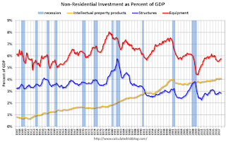
Personal consumption expenditures (PCE) increased at 3.8% annualized rate in Q4, up from 2.2% in Q3. Residential investment (RI) increased at a 11.6% pace. Equipment investment increased at a 11.4% annualized rate, and investment in non-residential structures decreased at a 1.4% pace.
I'll have more later ...
Thursday, January 25, 2018
Friday: GDP, Durable Goods
by Calculated Risk on 1/25/2018 08:22:00 PM
Friday:
• At 8:30 AM ET, Gross Domestic Product, 4th quarter 2017 (Advance estimate). The consensus is that real GDP increased 2.9% annualized in Q4, down from 3.2% in Q3.
• Also at 8:30 AM, Durable Goods Orders for November from the Census Bureau. The consensus is for a 0.8% increase in durable goods orders.
Q4 GDP Forecasts
by Calculated Risk on 1/25/2018 05:13:00 PM
The advance estimate of Q4 GDP will be released tomorrow, Friday, January 26th. The consensus is that real GDP increased 2.9% annualized in Q4, down from 3.2% in Q3.
Here are a couple of estimates, from the Altanta Fed: GDPNow
The final GDPNow model forecast for real GDP growth (seasonally adjusted annual rate) in the fourth quarter of 2017 is 3.4 percent on January 25, unchanged from January 18.From the NY Fed Nowcasting Report
The New York Fed Staff Nowcast stands at 3.9% for 2017:Q4 and 3.1% for 2018:Q1.CR Note: It looks likely that GDP will be around or over 3% again in Q4.
A few Comments on December New Home Sales
by Calculated Risk on 1/25/2018 12:34:00 PM
New home sales for December were reported at 625,000 on a seasonally adjusted annual rate basis (SAAR). This was well below the consensus forecast, and the three previous months were revised down significantly.
On an annual basis, sales were up 8.3% in 2017 compared to 2016. This was a solid year-over-year gain. Here is a table of new home sales since the bubble peak in 2005.
| New Home Sales (000s) | ||
|---|---|---|
| New Home Sales | Change | |
| 2005 | 1,283 | --- |
| 2006 | 1,051 | -18.1% |
| 2007 | 776 | -26.2% |
| 2008 | 485 | -37.5% |
| 2009 | 375 | -22.7% |
| 2010 | 323 | -13.9% |
| 2011 | 306 | -5.3% |
| 2012 | 368 | 20.3% |
| 2013 | 429 | 16.6% |
| 2014 | 437 | 1.9% |
| 2015 | 501 | 14.7% |
| 2016 | 561 | 12.0% |
| 2017 | 608 | 8.3% |
Sales were up 14.1% year-over-year in December.
Earlier: New Home Sales decrease to 625,000 Annual Rate in December.
 Click on graph for larger image.
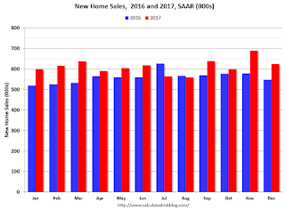
This graph shows new home sales for 2016 and 2017 by month (Seasonally Adjusted Annual Rate).
For 2017, new home sales are up 8.3% compared to 2016.
And here is another update to the "distressing gap" graph that I first started posting a number of years ago to show the emerging gap caused by distressed sales. Now I'm looking for the gap to close over the next several years.
 The "distressing gap" graph shows existing home sales (left axis) and new home sales (right axis) through December 2017. This graph starts in 1994, but the relationship had been fairly steady back to the '60s.
 Following the housing bubble and bust, the "distressing gap" appeared mostly because of distressed sales. The gap has persisted even though distressed sales are down significantly, since new home builders focused on more expensive homes.
I expect existing home sales to move more sideways, and I expect this gap to slowly close, mostly from an increase in new home sales.
However, this assumes that the builders will offer some smaller, less expensive homes. If not, then the gap will persist.
 Another way to look at this is a ratio of existing to new home sales.
This ratio was fairly stable from 1994 through 2006, and then the flood of distressed sales kept the number of existing home sales elevated and depressed new home sales. (Note: This ratio was fairly stable back to the early '70s, but I only have annual data for the earlier years).
In general the ratio has been trending down since the housing bust, and this ratio will probably continue to trend down over the next several years.
Note: Existing home sales are counted when transactions are closed, and new home sales are counted when contracts are signed. So the timing of sales is different.
Kansas City Fed: Regional Manufacturing Activity "Growth Strengthened Further" in January
by Calculated Risk on 1/25/2018 11:00:00 AM
From the Kansas City Fed: Tenth District Manufacturing Growth Strengthened Further
The Federal Reserve Bank of Kansas City released the January Manufacturing Survey today. According to Chad Wilkerson, vice president and economist at the Federal Reserve Bank of Kansas City, the survey revealed that growth in Tenth District manufacturing activity strengthened further, and expectations for future activity increased.So far all of the regional Fed surveys have been solid in January, although only the Kansas City index has been above the December levels (most indexes suggest slower growth in January than in December).
“We saw faster growth this month despite some firms noting negative effects from extremely cold weather, and several price indexes rose considerably,” said Wilkerson.
...
The month-over-month composite index was 16 in January, higher than 13 in December and 15 in November. The composite index is an average of the production, new orders, employment, supplier delivery time, and raw materials inventory indexes. Growth in factory activity improved at both durable and non-durable goods plants, particularly for machinery, aircraft, chemicals, and plastics. Most month-over-month indexes also increased. The shipments, new orders, and order backlog indexes all rose moderately. The employment index inched higher from 16 to 18, while the production index was unchanged. The raw materials inventory index climbed from 7 to 15, and the finished goods inventory index moved into positive territory.
emphasis added
New Home Sales decrease to 625,000 Annual Rate in December
by Calculated Risk on 1/25/2018 10:19:00 AM
The Census Bureau reports New Home Sales in December were at a seasonally adjusted annual rate (SAAR) of 625 thousand.
The previous three months combined were revised down significantly.
"Sales of new single-family houses in December 2017 were at a seasonally adjusted annual rate of 625,000, according to estimates released jointly today by the U.S. Census Bureau and the Department of Housing and Urban Development. This is 9.3 percent below the revised November rate of 689,000, but is 14.1 percent above the December 2016 estimate of 548,000.
An estimated 608,000 new homes were sold in 2017. This is 8.3 percent above the 2016 figure of 561,000.
emphasis added
 Click on graph for larger image.
The first graph shows New Home Sales vs. recessions since 1963. The dashed line is the current sales rate.
Even with the increase in sales over the last several years, new home sales are still somewhat low historically.
The second graph shows New Home Months of Supply.
 The months of supply increased in December to 5.7 months from 4.9 months in November.
 The all time record was 12.1 months of supply in January 2009.
This is in the normal range (less than 6 months supply is normal).
"The seasonally-adjusted estimate of new houses for sale at the end of December was 295,000. This represents a supply of 5.7 months at the current sales rate."
 On inventory, according to the Census Bureau:
 "A house is considered for sale when a permit to build has been issued in permit-issuing places or work has begun on the footings or foundation in nonpermit areas and a sales contract has not been signed nor a deposit accepted."Starting in 1973 the Census Bureau broke this down into three categories: Not Started, Under Construction, and Completed.
The third graph shows the three categories of inventory starting in 1973.
The inventory of completed homes for sale is still low, and the combined total of completed and under construction is also low.
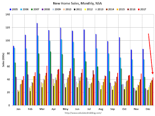
 The last graph shows sales NSA (monthly sales, not seasonally adjusted annual rate).
In December 2017 (red column), 43 thousand new homes were sold (NSA). Last year, 39 thousand homes were sold in December.
The all time high for December was 87 thousand in 2005, and the all time low for December was 23 thousand in 1966 and 2010.
This was well below expectations of 683,000 sales SAAR, and the previous months combined were revised down significantly. I'll have more later today.
Weekly Initial Unemployment Claims increase to 233,000
by Calculated Risk on 1/25/2018 08:34:00 AM
The DOL reported:
In the week ending January 20, the advance figure for seasonally adjusted initial claims was 233,000, an increase of 17,000 from the previous week's revised level. The previous week's level was revised down by 4,000 from 220,000 to 216,000. The 4-week moving average was 240,000, a decrease of 3,500 from the previous week's revised average. The previous week's average was revised down by 1,000 from 244,500 to 243,500.The previous week was revised down.
The claims taking procedures in Puerto Rico and in the Virgin Islands have still not returned to normal
emphasis added
The following graph shows the 4-week moving average of weekly claims since 1971.
 Click on graph for larger image.
The dashed line on the graph is the current 4-week average. The four-week average of weekly unemployment claims decreased to 240,000.
This was much lower than the consensus forecast. The low level of claims suggest relatively few layoffs.


