by Calculated Risk on 6/09/2016 04:34:00 PM
Thursday, June 09, 2016
Mortgage Equity Withdrawal Slightly Negative in Q1
Note: This is not Mortgage Equity Withdrawal (MEW) data from the Fed. The last MEW data from Fed economist Dr. Kennedy was for Q4 2008.
The following data is calculated from the Fed's Flow of Funds data (released today) and the BEA supplement data on single family structure investment. This is an aggregate number, and is a combination of homeowners extracting equity - hence the name "MEW", but there is still little (but increasing) MEW right now - and normal principal payments and debt cancellation (modifications, short sales, and foreclosures).
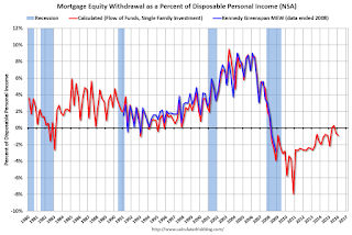
For Q1 2016, the Net Equity Extraction was a negative $30 billion, or a negative 0.9% of Disposable Personal Income (DPI) . MEW for Q2 and Q3 in 2015 was slightly positive - the first positive MEW since Q1 2008 - and MEW will probably be positive in Q2 and Q3 again this year too (there is a seasonal pattern for MEW).

This graph shows the net equity extraction, or mortgage equity withdrawal (MEW), results, using the Flow of Funds (and BEA data) compared to the Kennedy-Greenspan method.
Note: This data is still heavily impacted by debt cancellation and foreclosures.
The Fed's Flow of Funds report showed that the amount of mortgage debt outstanding increased by $17 billion in Q1.
The Flow of Funds report also showed that Mortgage debt has declined by almost $1.3 trillion since the peak. This decline is mostly because of debt cancellation per foreclosures and short sales, and some from modifications. There has also been some reduction in mortgage debt as homeowners paid down their mortgages so they could refinance.
With residential investment increasing, and a slower rate of debt cancellation, MEW will likely turn positive.
For reference:
Dr. James Kennedy also has a simple method for calculating equity extraction: "A Simple Method for Estimating Gross Equity Extracted from Housing Wealth". Here is a companion spread sheet (the above uses my simple method).
For those interested in the last Kennedy data included in the graph, the spreadsheet from the Fed is available here.
Fed's Flow of Funds: Household Net Worth increased in Q1
by Calculated Risk on 6/09/2016 12:24:00 PM
The Federal Reserve released the Q1 2016 Flow of Funds report today: Flow of Funds.
According to the Fed, household net worth increased in Q1 compared to Q4:
The net worth of households and nonprofits rose to $88.1 trillion during the first quarter of 2016. The value of directly and indirectly held corporate equities decreased $160 billion and the value of real estate rose $498 billion.Household net worth was at $88.1 trillion in Q1 2016, up from $87.2 trillion in Q4 2015.
The Fed estimated that the value of household real estate increased to $22.5 trillion in Q1. The value of household real estate is back to the bubble peak in early 2006 (not adjusted for inflation, and not including new construction).
 Click on graph for larger image.
The first graph shows Households and Nonprofit net worth as a percent of GDP. Household net worth, as a percent of GDP, is higher than the peak in 2006 (housing bubble), and above the stock bubble peak.
This includes real estate and financial assets (stocks, bonds, pension reserves, deposits, etc) net of liabilities (mostly mortgages). Note that this does NOT include public debt obligations.
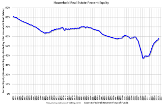
 This graph shows homeowner percent equity since 1952.
 Household percent equity (as measured by the Fed) collapsed when house prices fell sharply in 2007 and 2008.
In Q1 2016, household percent equity (of household real estate) was at 57.8% - up from Q4, and the highest since Q1 2006. This was because of an increase in house prices in Q1 (the Fed uses CoreLogic).
Note: about 30.3% of owner occupied households had no mortgage debt as of April 2010. So the approximately 50+ million households with mortgages have far less than 57.8% equity - and several million still have negative equity.
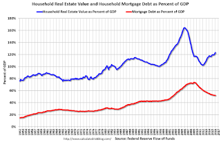
 The third graph shows household real estate assets and mortgage debt as a percent of GDP.
 Mortgage debt increased by $17 billion in Q1.
Mortgage debt has declined by $1.27 trillion from the peak. Studies suggest most of the decline in debt has been because of foreclosures (or short sales), but some of the decline is from homeowners paying down debt (sometimes so they can refinance at better rates).
The value of real estate, as a percent of GDP, was up in Q1, and is somewhat above the average of the last 30 years (excluding bubble).
CoreLogic: "268,000 US Homeowners Regained Equity in the First Quarter of 2016"
by Calculated Risk on 6/09/2016 10:25:00 AM
From CoreLogic: CoreLogic Reports 268,000 US Homeowners Regained Equity in the First Quarter of 2016
CoreLogic ... today released a new analysis showing 268,000 homeowners regained equity in Q1 2016, bringing the total number of mortgaged residential properties with equity at the end of Q1 2016 to approximately 46.7 million, or 92 percent of all mortgaged properties. Nationwide, home equity increased year over year by $762 billion in Q1 2016.On states:
The total number of mortgaged residential properties with negative equity stood at 4 million, or 8 percent of all homes with a mortgage, in Q1 2016. This is a decrease of 6.2 percent quarter over quarter from 4.3 million homes, or 8.5 percent, in Q4 2015 and a decrease of 21.5 percent year over year from 5.1 million homes, or 10.3 percent, compared with Q1 2015. ...
For the homes in negative equity status, the national aggregate value of negative equity was $299.5 billion at the end of Q1 2016, falling approximately $11.8 billion, or 3.8 percent, from $311.3 billion in Q4 2015. On a year-over-year basis, the value of negative equity declined overall from $340 billion in Q1 2015, representing a decrease of 11.8 percent in 12 months.
...
“In just the last four years, equity for homeowners with a mortgage has nearly doubled to $6.9 trillion,” said Frank Nothaft, chief economist for CoreLogic. “The rapid increase in home equity reflects the improvement in home prices, dwindling distressed borrowers and increased principal repayment. These are all positive factors that will provide support to both household balance sheets and the overall economy.”
emphasis added
Nevada had the highest percentage of homes in negative equity at 17.5 percent, followed by Florida (15 percent), Illinois (14.4 percent), Rhode Island (13.3 percent) and Maryland (12.9 percent). Combined, these top five states account for 30.2 percent of negative equity in the U.S., but only 16.5 percent of outstanding mortgages.
Weekly Initial Unemployment Claims decrease to 264,000
by Calculated Risk on 6/09/2016 08:33:00 AM
The DOL reported:
In the week ending June 4, the advance figure for seasonally adjusted initial claims was 264,000, a decrease of 4,000 from the previous week's revised level. The previous week's level was revised up by 1,000 from 267,000 to 268,000. The 4-week moving average was 269,500, a decrease of 7,500 from the previous week's revised average. The previous week's average was revised up by 250 from 276,750 to 277,000.The previous week was revised up to 268,000.
There were no special factors impacting this week's initial claims. This marks 66 consecutive weeks of initial claims below 300,000, the longest streak since 1973.
The following graph shows the 4-week moving average of weekly claims since 1971.
 Click on graph for larger image.
The dashed line on the graph is the current 4-week average. The four-week average of weekly unemployment claims decreased to 269,500.
This was lower than the consensus forecast. The low level of claims suggests relatively few layoffs.
Wednesday, June 08, 2016
Thursday: Unemployment Claims, Q1 Flow of Funds
by Calculated Risk on 6/08/2016 07:25:00 PM
Earlier today the Q1 Quarterly Services Report was released. Economist Joseph Brusuelas noted that this should boost Q1 PCE from 1.9% to 2.4% annualized growth rate. That should push up Q1 GDP a little more.
Thursday:
• At 8:30 AM ET, The initial weekly unemployment claims report will be released. The consensus is for 270 thousand initial claims, up from 267 thousand the previous week.
• At 10:00 AM, Monthly Wholesale Trade: Sales and Inventories for April. The consensus is for a 0.1% increase in inventories.
• At 12:00 PM, Q1 Flow of Funds Accounts of the United States from the Federal Reserve.
Lehner: "The Housing Trilemma"
by Calculated Risk on 6/08/2016 03:07:00 PM
Josh Lehner, at the Oregon Office of Economic Analysis, has an interesting post today: The Housing Trilemma
Every city wants to have a strong local economy, high quality of life and housing affordability for its residents. Unfortunately these three dimensions represent the Housing Trilemma. A city can achieve success on two but not all three at the same time. Underlying all of these tradeoffs are local policies as well.
Inspired by Kim-Mai Cutler and Cardiff Garcia, I set out to try and quantify the Housing Trilemma across the nation’s 100 largest metropolitan areas. It turns out to be very real. Just eight rank among the top half for all three dimensions of the Housing Trilemma. None rank among the Top 20 in all three. ...
 Click on graph for larger image.
The reason these tradeoffs exist is mostly, but not entirely, due to market forces. People want to live in cities with a strong economy and high quality of life. Increased demand for housing leads to higher prices and lower affordability. Nice places to live get their housing costs bid up due to strong demand. The opposite is true as well. Regions with underperforming economies and a lower quality of life do have better affordability.There is much more in the post.
Here is some data from Josh on the 100 largest MSAs - and how they rank on all three dimensions.
Zillow: Negative Equity Rate declined in Q1 2016
by Calculated Risk on 6/08/2016 12:19:00 PM
From Zillow: Q1 2016 Negative Equity Report: Rust Belt Overtakes Sand States as Nation's Nest of Negative Equity
The national negative equity rate – the share of all homeowners with a mortgage who are underwater, owing more on their mortgage than their home is worth – fell to 12.7 percent in the first quarter of 2016, according to the first quarter Zillow Negative Equity Report. The U.S. negative equity rate is down from 13.1 percent in Q4 2015 and 15.4 percent a year ago, and has fallen or stayed flat from the prior quarter for 16 straight quarters after peaking at 31.4 percent in Q1 2012 (figure 1).The following graph from Zillow shows a time series for negative equit.
emphasis added
 Click on graph for larger image.
From Zillow:
The steady decline in negative equity nationwide has been driven by a consistent recovery in home values over the past several years. But while home values have risen to some extent in a large majority of U.S. markets, some markets have recovered much more quickly than others, and the concentration of negative equity nationwide has shifted from the Southwest and Southeast to the Midwest
BLS: Job Openings increased in April
by Calculated Risk on 6/08/2016 10:07:00 AM
From the BLS: Job Openings and Labor Turnover Summary
The number of job openings was little changed at 5.8 million on the last business day of April, the U.S. Bureau of Labor Statistics reported today. Hires edged down to 5.1 million while separations were little changed at 5.0 million. Within separations, the quits rate was 2.0 percent, and the layoffs and discharges rate was 1.1 percent. ...The following graph shows job openings (yellow line), hires (dark blue), Layoff, Discharges and other (red column), and Quits (light blue column) from the JOLTS.
...
The number of quits was little changed in April at 2.9 million.
emphasis added
This series started in December 2000.
Note: The difference between JOLTS hires and separations is similar to the CES (payroll survey) net jobs headline numbers. This report is for April, the most recent employment report was for May.
 Click on graph for larger image.
Note that hires (dark blue) and total separations (red and light blue columns stacked) are pretty close each month. This is a measure of labor market turnover. When the blue line is above the two stacked columns, the economy is adding net jobs - when it is below the columns, the economy is losing jobs.
Jobs openings increased in April to 5.788 million from 5.670 million in March.
The number of job openings (yellow) are up 4% year-over-year compared to April 2015.
Quits are up 9% year-over-year. These are voluntary separations. (see light blue columns at bottom of graph for trend for "quits").
This is another strong report, and job openings were tied with the record high set in July 2015.
MBA: "Mortgage Applications Increase in Latest MBA Weekly Survey"
by Calculated Risk on 6/08/2016 07:00:00 AM
From the MBA: Mortgage Applications Increase in Latest MBA Weekly Survey
Mortgage applications increased 9.3 percent from one week earlier, according to data from the Mortgage Bankers Association’s (MBA) Weekly Mortgage Applications Survey for the week ending June 3, 2016. This week’s results include an adjustment to account for the Memorial Day holiday.
...
The Refinance Index increased 7 percent from the previous week. The seasonally adjusted Purchase Index increased 12 percent from one week earlier. The unadjusted Purchase Index decreased 12 percent compared with the previous week and was 6 percent lower than the same week one year ago.
...
The average contract interest rate for 30-year fixed-rate mortgages with conforming loan balances ($417,000 or less) decreased to 3.83 percent from 3.85 percent, with points decreasing to 0.33 from 0.36 (including the origination fee) for 80 percent loan-to-value ratio (LTV) loans.
emphasis added
 Click on graph for larger image.
The first graph shows the refinance index since 1990.
Refinance activity was higher in 2015 than in 2014, but it was still the third lowest year since 2000.
Refinance activity increased a little this year when rates declined.
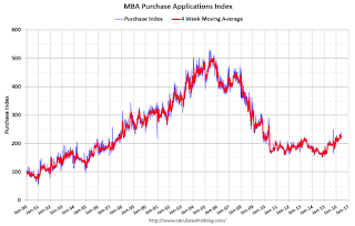
 The second graph shows the MBA mortgage purchase index.
Tuesday, June 07, 2016
U.S. Births decreased slightly in 2015
by Calculated Risk on 6/07/2016 04:08:00 PM
From the National Center for Health Statistics: Births: Preliminary Data for 2015. The NCHS reports:
The preliminary number of births for the United States in 2015 was 3,977,745, a decrease of less than 1% (0.3%) from 2014 (3,988,076). This decline followed the increase in births from 2013 to 2014, which was the first increase since 2007 ...Here is a long term graph of annual U.S. births through 2015 ...
The preliminary general fertility rate (GFR) for the United States also decreased less than 1% in 2015, to 62.5 births per 1,000 women aged 15–44, from 62.9 in 2014. This decline follows an increase in the rate from 2013 to 2014, the first increase since 2007.
 Click on graph for larger image.
Births had declined for five consecutive years prior to increasing in 2013 and 2014. Births are about 7.8% below the peak in 2007 (births in 2007 were at the all time high - even higher than during the "baby boom"). I suspect certain segments of the population were under stress before the recession started - like construction workers - and even more families were in distress in 2008 through 2012. And this led to fewer babies.
Notice that the number of births started declining a number of years before the Great Depression started. Many families in the 1920s were under severe stress long before the economy collapsed. By 1933 births were down by almost 23% from the early '20s levels.
Of course economic distress isn't the only reason births decline - look at the huge decline following the baby boom that was driven by demographics. But it is not surprising that the number of births slow or decline during tough economic times - but that is mostly over now.
 The second graph is from the NCHS report and shows births per 1,000 women by teen age group. From the NCHS:
 In 2015, the preliminary birth rates for teenagers aged 15–17 and 18–19 fell 9% and 7%, respectively, to 9.9 and 40.7 births per 1,000 women. These rates were yet another record low for both groups, from 10.9 and 43.8 in 2014. Since 2007, the rate for teenagers aged 15–17 has dropped 54%, and the rate for those aged 18–19 has dropped 43%. The number of births for teenagers aged 15–17 declined 8% from 2014 to 2015, and births to those aged 18–19 declined 7%.Far fewer teens births is great news (and is probably related to the much higher enrollment rates).
Another key trends ... women are waiting longer to have babies:
The preliminary birth rate for women aged 20–24 was 76.9 births per 1,000 women in 2015, declining 3% from the rate in 2014 (79.0), reaching yet another record low for the country. The rate for women in this age group has declined steadily by 27% since 2007. The number of births to women in their early 20s decreased 4% from 2014 to 2015.Waiting longer to have children makes sense (see: Demographics and Behavior) and we should expect a baby boom in a few years as the largest cohorts move into the 25 to 34 years old age groups.
The preliminary birth rate for women aged 30–34 in 2015 was steadily by 8%, but increased slightly from 2013 to 2014 (2). The 101.4 births per 1,000 women, an increase of less than 1% from number of births to women in their late 20s increased 1% from the rate in 2014 (100.8). The rate for this 2014 to 2015. group has increased steadily by 5% since 2011. The number of births to women in their early 30s also increased in 2015 by 1%. ... The rate for women aged 35–39 was 51.7 births per 1,000 women, up 1% from 2014 (51.0). The rate for this group has increased steadily by 13% since 2010
P.S. I expect that as families have babies, they will tend to buy homes (as opposed to rent)! The demographics are favorable for renting now, but the demographics are becoming more positive for home ownership.


