by Calculated Risk on 5/15/2015 06:27:00 PM
Friday, May 15, 2015
Lawler: Preliminary Table of Distressed Sales and Cash buyers for Selected Cities in April
Economist Tom Lawler sent me the preliminary table below of short sales, foreclosures and cash buyers for a few selected cities in April.
On distressed: Total "distressed" share is down in most of these markets mostly due to a decline in short sales (Mid-Atlantic is up year-over-year because of an increase in foreclosures in Baltimore).
Short sales are down in these areas.
The All Cash Share (last two columns) is declining year-over-year. As investors pull back, the share of all cash buyers will probably continue to decline.
From Lawler: Note: The Baltimore Metro area is included in the overall Mid-Atlantic region (covered by MRIS). I am showing it separately because a large portion of the YOY increase in the foreclosure share of home sales in the Mid-Atlantic region was attributable to the almost 85% YOY increase in foreclosure sales in the Baltimore Metro area.
| Short Sales Share | Foreclosure Sales Share | Total "Distressed" Share | All Cash Share | |||||
|---|---|---|---|---|---|---|---|---|
| Apr-15 | Apr-14 | Apr-15 | Apr-14 | Apr-15 | Apr-14 | Apr-15 | Apr-14 | |
| Las Vegas | 7.2% | 12.4% | 8.3% | 11.4% | 15.5% | 23.8% | 30.4% | 41.4% |
| Reno** | 6.0% | 15.0% | 5.0% | 6.0% | 11.0% | 21.0% | ||
| Phoenix | 2.5% | 4.0% | 3.8% | 6.5% | 6.3% | 10.5% | 25.3% | 32.2% |
| Minneapolis | 2.9% | 5.1% | 9.2% | 16.0% | 12.0% | 21.1% | ||
| Mid-Atlantic | 4.5% | 5.9% | 12.9% | 10.0% | 17.3% | 15.9% | 17.2% | 19.5% |
| Baltimore Metro | 4.3% | 5.8% | 20.7% | 13.8% | 25.0% | 19.6% | ||
| Orlando | 4.8% | 9.1% | 24.7% | 23.7% | 29.5% | 32.8% | 37.4% | 42.4% |
| Chicago (city) | 20.3% | 27.3% | ||||||
| Hampton Roads | 22.2% | 24.4% | ||||||
| Chicago (city) | 20.3% | 27.3% | ||||||
| Northeast Florida | 28.9% | 38.0% | ||||||
| Toledo | 30.2% | 33.4% | ||||||
| Tucson | 27.1% | 30.5% | ||||||
| Des Moines | 13.8% | 17.1% | ||||||
| Peoria | 17.3% | 21.2% | ||||||
| Georgia*** | 21.6% | 34.3% | ||||||
| Omaha | 16.4% | 19.7% | ||||||
| Richmond VA MSA | 11.5% | 15.4% | 18.2% | 22.5% | ||||
| Memphis | 16.1% | 17.3% | ||||||
| Springfield IL** | 10.3% | 13.2% | 17.9% | N/A | ||||
| *share of existing home sales, based on property records **Single Family Only ***GAMLS | ||||||||
Hotels: On Pace for Record Occupancy in 2015
by Calculated Risk on 5/15/2015 03:51:00 PM
From HotelNewsNow.com: STR: US hotel results for week ending 9 May
The U.S. hotel industry recorded positive results in the three key performance measurements during the week of 3-9 May 2015, according to data from STR, Inc.Note: ADR: Average Daily Rate, RevPAR: Revenue per Available Room.
In year-over-year measurements, the industry’s occupancy increased 1.3 percent to 67.0 percent. Average daily rate increased 4.8 percent to finish the week at US$120.59. Revenue per available room for the week was up 6.1 percent to finish at US$80.85.
emphasis added
The following graph shows the seasonal pattern for the hotel occupancy rate using the four week average.
Hotels are now in the Spring travel period and business travel is solid.
 Click on graph for larger image.
The red line is for 2015, dashed orange is 2014, blue is the median, and black is for 2009 - the worst year since the Great Depression for hotels. Purple is for 2000.
The 4-week average of the occupancy rate is solidly above the median for 2000-2007, and solidly above last year.
Right now 2015 is even above 2000 (best year for hotels) - and 2015 will probably be the best year on record for hotels. Note the solid gains for RevPAR too.
Data Source: Smith Travel Research, Courtesy of HotelNewsNow.com
Lawler: Early Read on Existing Home Sales in April
by Calculated Risk on 5/15/2015 12:47:00 PM
From housing economist Tom Lawler:
Based on available local realtor association/MLS reports from across the country, I estimate that US existing home sales as measured by the National Association of Realtors ran at a seasonally adjusted annual rate of 5.20 million in April, up 0.2% from March’s pace and up 9.5% from last April’s seasonally-adjusted pace.
On the inventory front, local realtor/MLS reports suggest that the monthly gain in the inventory of existing homes for sale last month was smaller than last April’s huge jump, and I project that the NAR’s existing home inventory estimate for April will be 2.23 million, up 11.5% from March but unchanged from last April. I should point out that the NAR’s inventory estimate for April has for many years showed a larger monthly gain – and the May estimate a smaller gain/larger decline – than local realtor/MLS reports would suggest. I’m not sure why, but the differences may reflect different “pull dates” for the publicly-released reports relative to the “NAR” reports realtor associations/MLS send to the NAR.
Finally, local realtor/MLS reports suggest that the median single-family home sales price for April as estimated by the NAR was up about 8.5% from last April.
CR Note: The NAR is scheduled to release April existing home sales on Thursday, May 21st.
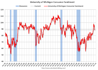
Preliminary May Consumer Sentiment declines to 88.6
by Calculated Risk on 5/15/2015 10:03:00 AM
Fed: Industrial Production decreased 0.3% in April
by Calculated Risk on 5/15/2015 09:23:00 AM
From the Fed: Industrial production and Capacity Utilization
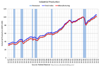
Industrial production decreased 0.3 percent in April for its fifth consecutive monthly loss. Manufacturing output was unchanged in April after recording an upwardly revised gain of 0.3 percent in March. In April, the index for mining moved down 0.8 percent, its fourth consecutive monthly decrease; a sharp fall in oil and gas well drilling has more than accounted for the overall decline in mining this year. The output of utilities fell 1.3 percent in April. At 105.2 percent of its 2007 average, total industrial production in April was 1.9 percent above its year-earlier level. Capacity utilization for the industrial sector decreased 0.4 percentage point in April to 78.2 percent, a rate that is 1.9 percentage points below its long-run (1972–2014) average.
emphasis added
 Click on graph for larger image.
This graph shows Capacity Utilization. This series is up 11.3 percentage points from the record low set in June 2009 (the series starts in 1967).
Capacity utilization at 78.2% is 1.9% below the average from 1972 to 2012 and below the pre-recession level of 80.8% in December 2007.
Note: y-axis doesn't start at zero to better show the change.
 The second graph shows industrial production since 1967.
Industrial production decreased 0.3% in April to 105.2. This is 25.6% above the recession low, and 4.4% above the pre-recession peak.
This was below expectations of no change, although March was revised up - and much of the decline over the last few months was due to the "a sharp fall in oil and gas well drilling".
Thursday, May 14, 2015
Friday: Industrial Production, Empire State Mfg, Consumer Sentiment
by Calculated Risk on 5/14/2015 06:43:00 PM
From Professor Tim Duy: Get Used To It
Bottom Line: We probably need to get used to the occasional negative GDP growth numbers in the context of overall expansion for the US economy. The concept of "stall speed" will need to be revised accordingly.Yes, due to demographics, 2% GDP growth is the new 4%.
Friday:
• At 8:30 AM ET, the NY Fed Empire State Manufacturing Survey for May. The consensus is for a reading of 5.0, up from -1.2 last month (above zero is expansion).
• At 9:15 AM, the The Fed will release Industrial Production and Capacity Utilization for April. The consensus is for no change in Industrial Production, and for Capacity Utilization to be unchanged at 78.4%.
At 10:00 AM, the University of Michigan's Consumer sentiment index (preliminary for May). The consensus is for a reading of 95.8, down from 95.9 in April.
Weekly Initial Unemployment Claims as a Percent of Labor Force
by Calculated Risk on 5/14/2015 03:21:00 PM
Earlier I mentioned that the 4-week moving average of weekly claims was the lowest since April 2000. And if the average falls just a little further, the average will be the lowest in over 40 years.
Of course that doesn't take into account the size of the labor force.
The following graph shows the 4-week moving average of weekly claims since 1967 as a percent of the labor force.
Click on graph for larger image.
As a percent of the labor force, weekly claims are at an all time record low.
Note: There is a general downward slope to weekly claims - interrupted by periods of recession. The downward slope is probably related to changes in hiring practices - such as background checks and drug tests, and maybe better planning.
CoStar: Commercial Real Estate prices increased in March
by Calculated Risk on 5/14/2015 01:11:00 PM
Here is a price index for commercial real estate that I follow.
From CoStar: Property Prices Surge Upward In the First Quarter Of 2015
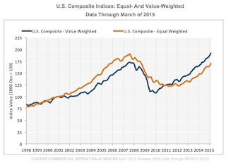
OMPOSITE PRICE INDICES CONTINUED TO RISE IN THE FIRST QUARTER OF 2015. ... The value-weighted U.S. Composite Index, which is influenced by high-quality assets in core markets, advanced by 4.7% in the first quarter of 2015 and is now 11% above the previous peak in 2007. The equal-weighted U.S. Composite Index, which weighs each transaction equally and therefore reflects the impact from more numerous smaller deals, rose 4.8% in the first quarter of 2015, although it remains 10% below its previous peak level.
ALL MAJOR PROPERTY TYPE AND REGIONAL INDICES ADVANCED AT DOUBLE- DIGIT ANNUAL RATES THROUGH MARCH 2015. As the CRE recovery extended to more markets and property types, all major property types and regional sectors posted double-digit annual gains through March 2015. The Multifamily Index has already fully recovered, eclipsing its previous peak, while the Retail and Industrial Indices advanced to within 10% of their previous peak levels and the Office Index remained 15% below its previous high-water mark in 2007. Among CCRSI’s regional indices, strong investor demand in core coastal metros propelled the Northeast Composite Index 6.1% above its prior peak, while the West Composite Index moved to within 8.4% of its prior peak in March 2015.
emphasis added
 Click on graph for larger image.
This graph from CoStar shows the the value-weighted U.S. Composite Index and the equal-weighted U.S. Composite Index indexes.
The value weighted index is at a record high, but the equal weighted is still 10.0% below the pre-recession peak.
There are indexes by sector and region too.
 The second graph shows the percent of distressed "pairs".
The distressed share is down from over 35% at the peak, but still a little elevated.
Note: These are repeat sales indexes - like Case-Shiller for residential - but this is based on far fewer pairs.
Research: "How Low Can House Prices Go?"
by Calculated Risk on 5/14/2015 09:55:00 AM
An FHFA paper from Alex Bogin, Senior Economist; Stephen Bruestle, Lecturer; William M. Doerner, Senior Economist How Low Can House Prices Go? Estimating a Conservative Lower Bound
The researchers have developed a conservative lower bound (CLB) for house prices. This tool could be used as part of stress testing banks (and could be applied to other countries like Canada and Australia that might have housing bubbles right now).
Abstract:
We develop a theoretically-based statistical technique to identify a conservative lower bound for house prices. Leveraging a model based upon consumer and investor incentives, we are able to explain the depth of housing market downturns at both the national and state level over a variety of market environments. This approach performs well in several historical back tests and has strong out-of-sample predictive ability. When back-tested, our estimation approach does not understate house price declines in any state over the 1987 to 2001 housing cycle and only understates declines in three states during the most recent financial crisis. This latter result is particularly noteworthy given that the post-2001 estimates are performed outof- sample. Our measure of a conservative lower bound is attractive because it (1) provides a leading indicator of the severity of future downturns and (2) allows trough estimates to dynamically adjust as markets conditions change. This estimation technique could prove particularly helpful in measuring the credit risk associated with portfolios of mortgage assets as part of evaluating static stress tests or designing dynamic stress tests.Conclusion:
Since the recent financial crisis, there has been an increasing focus on improving stress testing. Thus far, the stressed housing paths have been largely static in nature, essentially ignoring current market conditions. This paper proposes a conservative lower bound with a theoretical foundation that is supported by empirical evidence. Our CLB approach provides a dynamic path that would vary with market conditions. The regression results compare the efficacy of this approach relative to the historical precedent approach of Smith & Weiher across two different housing cycles where the underlying data cover house price transactions across the United States. As demonstrated, the CLB is able to adapt successfully to changing market conditions and acts as a leading indicator for future market downturns. In addition to accurately capturing the severity of downturns, it also allows estimated troughs to recover as markets return to baseline conditions. The approach performs well in both in-sample and out-of-sample historical back-testing. Although it is more complicated to implement than the Smith & Weiher method, the CLB reduces the potential for understating the extent of future state-level house price declines, allowing for more accurate stress testing.I'd like to see state and local estimates of the CLB right now!
Weekly Initial Unemployment Claims decreased to 264,000, Lowest 4-Week average in 15 years
by Calculated Risk on 5/14/2015 08:36:00 AM
The DOL reported:
In the week ending May 9, the advance figure for seasonally adjusted initial claims was 264,000, a decrease of 1,000 from the previous week's unrevised level of 265,000. The 4-week moving average was 271,750, a decrease of 7,750 from the previous week's unrevised average of 279,500. This is the lowest level for this average since April 22, 2000 when it was 266,750.The previous week was unrevised.
There were no special factors impacting this week's initial claims.
The following graph shows the 4-week moving average of weekly claims since January 2000.
 Click on graph for larger image.
The dashed line on the graph is the current 4-week average. The four-week average of weekly unemployment claims decreased to 271,750.
This was well below the consensus forecast of 276,000, and the low level of the 4-week average suggests few layoffs. This is the lowest 4-week average in 15 years (since April 2000).
Note: If the 4-week average falls to 266,000, it will be the lowest in 40 years!


