 RSS Feed
 by Calculated Risk on 12/08/2014 12:40:00 PM
Monday, December 08, 2014
Phoenix Real Estate in November: Sales down 4%, Cash Sales down Sharply, Inventory up only 3%
This is a key distressed market to follow since Phoenix saw a large bubble / bust followed by strong investor buying. These key markets hopefully show us changes in trends for sales and inventory.
The Arizona Regional Multiple Listing Service (ARMLS) reports (table below):
1) Overall sales in November were down 3.8% year-over-year.
2) Cash Sales (frequently investors) were down about 20% to 28.0% of total sales. Non-cash sales were up 5.0% year-over-year.
3) Active inventory is now up 2.5% year-over-year - and at about the same level as in November 2011 (in 2011 house prices bottomed in Phoenix). Note: This is the smallest year-over-year inventory increase this year, so the inventory build may be slowing.
More inventory (a theme this year) - and less investor buying - suggested price increases would slow sharply in 2014. And prices increases did slow ...
According to Case-Shiller, Phoenix house prices bottomed in August 2011 (mostly flat for all of 2011), and then increased 23% in 2012, and another 15% in 2013. Those large increases were probably due to investor buying, low inventory and some bounce back from the steep price declines in 2007 through 2010. Now, with more inventory, price increases have flattened out in 2014.
As an example, the Phoenix Case-Shiller index through September shows prices up less than 1% in 2014, and the Zillow index shows Phoenix prices up 3% over the last year.
| November Residential Sales and Inventory, Greater Phoenix Area, ARMLS | ||||||
|---|---|---|---|---|---|---|
| Sales | YoY Change Sales | Cash Sales | Percent Cash | Active Inventory | YoY Change Inventory | |
| Nov-08 | 4,417 | --- | 1,217 | 27.6% | 56,2271 | --- |
| Nov-09 | 7,494 | 69.7% | 2,572 | 34.3% | 40,372 | -28.2% |
| Nov-10 | 6,789 | -9.4% | 2,966 | 43.7% | 45,353 | 12.3% |
| Nov-11 | 7,147 | 5.3% | 3,245 | 45.4% | 26,798 | -40.9% |
| Nov-12 | 6,810 | -4.7% | 2,945 | 43.2% | 23,232 | -13.3% |
| Nov-13 | 5,181 | -23.9% | 1,761 | 34.0% | 26,762 | 15.2% |
| Nov-14 | 4,986 | -3.8% | 1,396 | 28.0% | 27,426 | 2.5% |
| 1 November 2008 probably includes pending listings | ||||||
More Employment Graphs: Duration of Unemployment, Unemployment by Education, Construction Employment and Diffusion Indexes
by Calculated Risk on 12/08/2014 10:38:00 AM
By request, a few more employment graphs ...
Here are the previous posts on the employment report:
• November Employment Report: 321,000 Jobs, 5.8% Unemployment Rate
• Employment Report Comments: Best Year for Employment since the '90s
 This graph shows the duration of unemployment as a percent of the civilian labor force. The graph shows the number of unemployed in four categories: less than 5 week, 6 to 14 weeks, 15 to 26 weeks, and 27 weeks or more.
The general trend is down for all categories, and both the "less than 5 weeks" and 6 to 14 weeks" are close to normal levels.
The long term unemployed is just below 1.8% of the labor force - the lowest since January 2009 - however the number (and percent) of long term unemployed remains a serious problem.
 This graph shows the unemployment rate by four levels of education (all groups are 25 years and older).
Unfortunately this data only goes back to 1992 and only includes one previous recession (the stock / tech bust in 2001). Clearly education matters with regards to the unemployment rate - and it appears all four groups are generally trending down.
Although education matters for the unemployment rate, it doesn't appear to matter as far as finding new employment.
Note: This says nothing about the quality of jobs - as an example, a college graduate working at minimum wage would be considered "employed".
 This graph shows total construction employment as reported by the BLS (not just residential).
Since construction employment bottomed in January 2011, construction payrolls have increased by 677 thousand.
 The BLS diffusion index for total private employment was at 69.7 in November, up from 63.8 in October.
For manufacturing, the diffusion index was at 63.0, down from 64.2 in October.
Think of this as a measure of how widespread job gains are across industries. The further from 50 (above or below), the more widespread the job losses or gains reported by the BLS. Above 60 is very good, close to 70 is great. From the BLS:
Figures are the percent of industries with employment increasing plus one-half of the industries with unchanged employment, where 50 percent indicates an equal balance between industries with increasing and decreasing employment.Job growth was widespread in November - another good sign.
Sunday, December 07, 2014
Sunday Night Futures
by Calculated Risk on 12/07/2014 08:22:00 PM
Monday:
• At 10:00 AM ET, the Fed will release the monthly Labor Market Conditions Index (LMCI).
Weekend:
• Schedule for Week of December 7th
• Decline in the Labor Force Participation Rate: Mostly Demographics and Long Term Trends
• The Future's so Bright ...
From CNBC: Pre-Market Data and Bloomberg futures: currently the S&P futures are up slightly and DOW futures are also up slightly (fair value).
Oil prices were down over the last week with WTI futures at $65.84 per barrel and Brent at $69.07 per barrel. A year ago, WTI was at $97, and Brent was at $112 - so prices are down 32% and 38% year-over-year respectively.
Below is a graph from Gasbuddy.com for nationwide gasoline prices. Nationally prices are around $2.68 per gallon (down about 60 cents from a year ago). If you click on "show crude oil prices", the graph displays oil prices for WTI, not Brent; gasoline prices in most of the U.S. are impacted more by Brent prices.
| Orange County Historical Gas Price Charts Provided by GasBuddy.com |
Decline in the Labor Force Participation Rate: Mostly Demographics and Long Term Trends
by Calculated Risk on 12/07/2014 12:48:00 PM
For several years, I've been arguing that "most of the recent decline in the participation rate" was due to demographics and other long term structural trends (like more education). Clearly this was an important issue because if most of the decline had been due to cyclical weakness, then we'd expect a significant increase in participation as the economy improved. If the decline was due to demographics and other long term trends, then the participation rate might keep falling (or flatten out for a period before declining again) as the economy improves.
Definitions from the BLS:
Labor force participation rate: The labor force as a percent of the civilian noninstitutional population.Basically the labor force participation rate is the percent of people, 16 years and older, in the labor force (employed or unemployed).
Labor Force: The labor force includes all persons classified as employed or unemployed in accordance with the definitions contained in this glossary.
Civilian noninstitutional population: Included are persons 16 years of age and older residing in the 50 States and the District of Columbia who are not inmates of institutions (for example, penal and mental facilities, homes for the aged), and who are not on active duty in the Armed Forces.
Most of the recent research supports my view. As an example, from Federal Reserve researchers Stephanie Aaronson, Tomaz Cajner, Bruce Fallick, Felix Galbis-Reig, Christopher L. Smith, and William Wascher: Labor Force Participation: Recent Developments and Future Prospects
The evidence we present in this paper suggests that much of the steep decline in the labor force participation rate since 2007 owes to ongoing structural influences that are pushing down the participation rate rather than a pronounced cyclical weakness related to potential jobseekers’ discouragement about the weak state of the labor market ...In June, Dean Baker wrote: The Question on People Leaving the Labor Force is 41-Year-Olds, Not 61-Year-Olds
[T]he story of people leaving the labor force is not primarily one of older workers who are near retirement age, it is primarily a story of prime age workers. ...This brings up a few key points:
It is difficult to envision any obvious reason why people in their prime working years would suddenly decide that they did not want to work other than the weakness of the labor market. Most of these workers will presumably come back into the labor market if they see opportunities for employment.
1) Analyzing and forecasting the labor force participation requires looking at a number of factors. Everyone is aware that there is a large cohort has moved into the 50 to 70 age group, and that that has pushing down the overall participation rate. Another large cohort has been moving into the 16 to 24 year old age group - and many in this cohort are staying in school (a long term trend that has accelerated recently) - and that is another key factor in the decline in the overall participation rate.
2) But there are other long term trends. One of these trends is for a decline in the participation rate for prime working age men (25 to 54 years old).
3) Although Dr. Baker argues that the decline in prime working age workers is due to "weakness of the labor market", this decline was happening long before the Great Recession. For some reasons, see: Possible Reasons for the Decline in Prime-Working Age Men Labor Force Participation and on demographics from researchers at the Atlanta Fed: "Reasons for the Decline in Prime-Age Labor Force Participation"
Lets take a look at Dean Bakers "41-Year-Olds". I used the BLS data on 40 to 44 year old men (only available Not Seasonally Adjusted since 1976). I choose men only to simplify.
 Click on graph for larger image.
This graph shows the 40 to 44 year old men participation rate since 1976 (note the scale doesn't start at zero to better show the change).
There is a clear downward trend, and a researcher looking at this trend in the year 2000 might have predicted the 40 to 44 year old men participation rate would about the level as today (see trend line).
Clearly there are other factors than "economic weakness" causing this downward trend. I listed some reasons a few months ago, and research from Pew Research suggests stay-at-home dads is one of the reasons: Growing Number of Dads Home with the Kids
Just looking at this graph, I don't think there are many "missing 41-Year-Old" men that will be returning to the labor force.
 The second graph shows the trends for each prime working age men 5-year age group.
Note: This is a rolling 12 month average to remove noise (data is NSA), and the scale doesn't start at zero to show the change.
Clearly there is a downward trend for all 5 year age groups. When arguing about how many workers are "missing", we need to take these long term trends into account.
 The third graph shows the same data but with the full scale (0% to 100%). The trend is still apparent, but the decline has been gradual.
The bottom line is that the participation rate was declining for prime working age workers before the recession, there are several reasons for this decline (not just recent "economic weakness") and many estimates of "missing workers" are probably way too high.
And here is a look at the participation rate of women in the prime working age groups over time.
 Click on graph for larger image.
This graph shows the trends for each prime working age women 5-year age group.
Note: This is a rolling 12 month average to remove noise (data is NSA), and the scale doesn't start at zero to show the change.
For women, the participation rate increased significantly until the late 90s, and then started declining slowly. This is a more complicated story than for men, and that is why I used prime working age men only in the previous graphs to show the gradual downward decline in participation that has been happening for decades (and is not just recent economic weakness).
 This graph shows the same data for women but with the full scale (0% to 100%). The upward participation until the late 80s is very clear, and the decline since then has been gradual.
To repeat: The bottom line is that the participation rate was declining for prime working age workers before the recession, there are several reasons for this decline (not just recent "economic weakness") and many estimates of "missing workers" are probably way too high.
Saturday, December 06, 2014
Schedule for Week of December 7th
by Calculated Risk on 12/06/2014 01:11:00 PM
The key economic report this week is November retail sales on Thursday.
Also the Census Bureau will release the Q3 Quarterly Services Report on Wednesday, and the Fed will release the Q2 Flow of Funds report on Thursday.
At 10:00 AM ET: The Fed will release the monthly Labor Market Conditions Index (LMCI).
7:30 AM ET: NFIB Small Business Optimism Index for November.
 10:00 AM: Job Openings and Labor Turnover Survey for October from the BLS.
 This graph shows job openings (yellow line), hires (purple), Layoff, Discharges and other (red column), and Quits (light blue column) from the JOLTS.
Jobs openings decreased in September to 4.735 million from 4.853 million in August.
The number of job openings (yellow) were up 20% year-over-year compared to September 2013, and Quits were up 16% year-over-year.
10:00 AM: Monthly Wholesale Trade: Sales and Inventories for October. The consensus is for a 0.2% increase in inventories.
Early: Trulia Price Rent Monitors for November. This is the index from Trulia that uses asking house prices adjusted both for the mix of homes listed for sale and for seasonal factors.
7:00 AM: The Mortgage Bankers Association (MBA) will release the results for the mortgage purchase applications index.
10:00 AM: The Q3 Quarterly Services Report from the Census Bureau.
2:00 PM ET: The Monthly Treasury Budget Statement for November.
8:30 AM: The initial weekly unemployment claims report will be released. The consensus is for claims to decrease to 296 thousand from 297 thousand.
 8:30 AM ET: Retail sales for November will be released.
This graph shows retail sales since 1992 through October 2014. This is monthly retail sales and food service, seasonally adjusted (total and ex-gasoline). On a monthly basis, retail sales decreased 0.3% from September to October (seasonally adjusted), and sales were up 4.1% from October 2013.
The consensus is for retail sales to increase 0.4% in November, and to increase 0.1% ex-autos.
10:00 AM: Manufacturing and Trade: Inventories and Sales (business inventories) report for September. The consensus is for a 0.3% increase in inventories.
12:00 PM: Q3 Flow of Funds Accounts of the United States from the Federal Reserve.
8:30 AM: The Producer Price Index for November from the BLS. The consensus is for a 0.1% decrease in prices, and a 0.1% increase in core PPI.
9:55 AM: Reuter's/University of Michigan's Consumer sentiment index (preliminary for December). The consensus is for a reading of 89.5, up from 88.8 in November.
Unofficial Problem Bank list declines to 407 Institutions
by Calculated Risk on 12/06/2014 08:01:00 AM
This is an unofficial list of Problem Banks compiled only from public sources.
Here is the unofficial problem bank list for Dec 5, 2014.
Changes and comments from surferdude808:
Very quiet week for changes to the Unofficial Problem Bank List as there was only one removal that pushed the list total down to 407 institutions with assets of $124.0 billion. A year ago, the list held 643 institutions with assets of $219.8 billion.CR Note: The first unofficial problem bank list was published in August 2009 with 389 institutions. The list peaked at 1,002 institutions on June 10, 2011, and is now down to 407.
The Federal Reserve terminated the Written Agreement issued against United Security Bank, Fresno, CA ($693 million Ticker: UBFO). We expect for minimal changes to the list next week.
The FDIC's official problem bank list is comprised of banks with a CAMELS rating of 4 or 5, and the list is not made public. (CAMELS is the FDIC rating system, and stands for Capital adequacy, Asset quality, Management, Earnings, Liquidity and Sensitivity to market risk. The scale is from 1 to 5, with 1 being the strongest.)
As a substitute for the CAMELS ratings, surferdude808 is using publicly announced formal enforcement actions, and also media reports and company announcements that suggest to us an enforcement action is likely, to compile a list of possible problem banks in the public interest.
When the list was increasing, the official and "unofficial" counts were about the same. Now with the number of problem banks declining, the unofficial list is lagging the official list. This probably means regulators are changing the CAMELS rating on some banks before terminating the formal enforcement actions.
Friday, December 05, 2014
The Future's so Bright ...
by Calculated Risk on 12/05/2014 04:47:00 PM
Almost two years ago I wrote The Future's so Bright .... In that post I outlined why I was becoming more optimistic. Now that 2014 is the best year for employment since the '90s, it is time for an update!
For new readers: I was very bearish on the economy when I started this blog in 2005 - back then I wrote mostly about housing (see: LA Times article and more here for comments about the blog). I started looking for the sun in early 2009, and now I'm more optimistic.
Here are some updates to the graphs I posted two years ago. Several of these graphs have changed direction since I wrote that post. As example, state and local government employment is now increasing, and household deleveraging is over (as predicted).
 Click on graph for larger image.
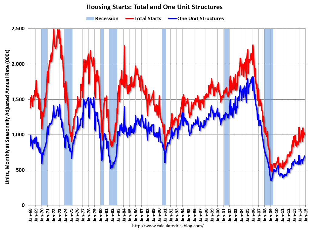
This graph shows total and single family housing starts. Even though starts have almost doubled from the bottom, starts are still way below the average level of 1.5 million per year from 1959 through 2000. As of October, starts are still close to the bottom for previous recessions.
Growth for starts in 2014 was slow, but that just means there is more growth ahead. Demographics and household formation suggests starts will increase to around 1.5 million over the next few years. That means starts will probably increase another 50% or so from the October 2014 level of 1 million starts (SAAR).
Residential investment and housing starts are usually the best leading indicator for the economy, so this suggests the economy will continue to grow over the next couple of years.
 This graph shows total state and government payroll employment since January 2007. State and local governments lost 129,000 jobs in 2009, 262,000 in 2010, 249,000 in 2011, and 33,000 in 2012.
In 2013, state and local government employment increased by 44,000 jobs.
This year, through November 2014, state and local employment is up 96,000. So, in the aggregate, state and local government layoffs are over - and the economic drag on the economy is over.
 And here is a graph on the US deficit. This graph, based on the CBO's recent projections, shows the actual (purple) budget deficit each year as a percent of GDP, and an estimate for the next ten years based on estimates from the CBO.
As we've been discussing, the US deficit as a percent of GDP has been declining, and will probably remain under 3% for several years.
Here are a couple of graph on household debt (and debt service):
 This graph from the the NY Fed shows aggregate household debt has increased for the last 5 quarters.
From the NY Fed: Household Debt Balances Increase as Deleveraging Period Concludes
Total cash flow from mortgage debt and nonmortgage debt combined (black dotted line) has turned slightly positive during the past four quarters, ending a five-year period of negative values, suggesting that, by this measure, the deleveraging process has ended; households have begun to use credit to supplement their cash flow again.There will be some more deleveraging ahead for certain households (mostly from foreclosures and distressed sales), but in the aggregate, household deleveraging is over.
emphasis added
 This graph is from the Fed's Q2 Household Debt Service and Financial Obligations Ratios. These ratios show the percent of disposable personal income (DPI) dedicated to debt service (DSR) and financial obligations (FOR) for households.
The overall Debt Service Ratio decreased in Q2, and is near the record low set in Q4 2012. Note: The financial obligation ratio (FOR) is also near a record low (not shown)
Also the DSR for mortgages (blue) are near the low for the last 30 years. This ratio increased rapidly during the housing bubble, and continued to increase until 2007. With falling interest rates, and less mortgage debt (mostly due to foreclosures), the mortgage ratio has declined significantly.
This data suggests household cash flow is in much better shape than several years ago.
 And for commercial real estate, here is the AIA Architecture Billings Index. This is usually a leading indicator for commercial real estate, and the readings over the last year suggest more increases in CRE investment in 2014 (except oil and power with the recent decline in oil prices).
Overall it appears the economy is poised for more growth.
And in the longer term I remain very optimistic.
Earlier this year, I posted some demographic data for the U.S., see: Census Bureau: Largest 5-year Population Cohort is now the "20 to 24" Age Group and The Future is still Bright!
I pointed out that "even without the financial crisis we would have expected some slowdown in growth this decade (just based on demographics). The good news is that will change soon."
Changes in demographics are an important determinant of economic growth, and although most people focus on the aging of the "baby boomer" generation, the movement of younger cohorts into the prime working age is another key story in coming years. Here is a graph of the prime working age population (this is population, not the labor force) from 1948 through October 2014.
 There was a huge surge in the prime working age population in the '70s, '80s and '90s - and the prime age population has been mostly flat recently (even declined a little).
The prime working age population peaked in 2007, and appears to have bottomed at the end of 2012. The good news is the prime working age group has started to grow again, and should be growing solidly by 2020 - and this should boost economic activity in the years ahead.
These young workers are well educated and tech savvy. And they will have babies and buy homes soon. For more, see from Joe Weisenthal: The Analyst Who Nailed The Housing Crash Is Quietly Revealing The Next Big Thing
Over two years ago I said that looking forward I was the most optimistic since the '90s. And things are only getting better. The future's so bright, I gotta wear shades.
Yes, the song was about nuclear holocaust ... but it was originally intended the way I'm using it.
Public and Private Sector Payroll Jobs: Carter, Reagan, Bush, Clinton, Bush, Obama
by Calculated Risk on 12/05/2014 01:29:00 PM
By request, here is an update on an earlier post through the November employment report.
Important: There are many differences between these periods. Overall employment was smaller in the '80s, however the participation rate was increasing in the '80s (younger population and women joining the labor force), and the participation rate is generally declining now. But these graphs give an overview of employment changes.
First, here is a table for private sector jobs. The top two private sector terms were both under President Clinton. Reagan's 2nd term saw about the same job growth as during Carter's term. Note: There was a severe recession at the beginning of Reagan's first term (when Volcker raised rates to slow inflation) and a recession near the end of Carter's term (gas prices increased sharply and there was an oil embargo).
| Term | Private Sector Jobs Added (000s) |
|---|---|
| Carter | 9,041 |
| Reagan 1 | 5,360 |
| Reagan 2 | 9,357 |
| GHW Bush | 1,510 |
| Clinton 1 | 10,885 |
| Clinton 2 | 10,070 |
| GW Bush 1 | -841 |
| GW Bush 2 | 379 |
| Obama 1 | 1,998 |
| Obama 2 | 4,7171 |
| 122 months into 2nd term: 10,290 pace. | |
1Currently Obama's 2nd term is on pace to be the 2nd best ever - only trailing Clinton's 1st term.
The first graph shows the change in private sector payroll jobs from when each president took office until the end of their term(s). President George H.W. Bush only served one term, and President Obama is in the second year of his second term.
Mr. G.W. Bush (red) took office following the bursting of the stock market bubble, and left during the bursting of the housing bubble. Mr. Obama (blue) took office during the financial crisis and great recession. There was also a significant recession in the early '80s right after Mr. Reagan (yellow) took office.
There was a recession towards the end of President G.H.W. Bush (purple) term, and Mr Clinton (light blue) served for eight years without a recession.
 Click on graph for larger image.
The first graph is for private employment only.
The employment recovery during Mr. G.W. Bush's (red) first term was sluggish, and private employment was down 841,000 jobs at the end of his first term. At the end of Mr. Bush's second term, private employment was collapsing, and there were net 462,000 private sector jobs lost during Mr. Bush's two terms.
Private sector employment increased slightly under President G.H.W. Bush (purple), with 1,510,000 private sector jobs added.
Private sector employment increased by 20,955,000 under President Clinton (light blue), by 14,717,000 under President Reagan (yellow), and 9,041,000 under President Carter (dashed green).
There were only 1,998,000 more private sector jobs at the end of Mr. Obama's first term. Twenty months into Mr. Obama's second term, there are now 6,715,000 more private sector jobs than when he initially took office.
 A big difference between the presidencies has been public sector employment. Note the bumps in public sector employment due to the decennial Census in 1980, 1990, 2000, and 2010.
 The public sector grew during Mr. Carter's term (up 1,304,000), during Mr. Reagan's terms (up 1,414,000), during Mr. G.H.W. Bush's term (up 1,127,000), during Mr. Clinton's terms (up 1,934,000), and during Mr. G.W. Bush's terms (up 1,744,000 jobs).
However the public sector has declined significantly since Mr. Obama took office (down 646,000 jobs). These job losses have mostly been at the state and local level, but more recently at the Federal level. This has been a significant drag on overall employment.
And a table for public sector jobs. Public sector jobs declined the most during Obama's first term, and increased the most during Reagan's 2nd term.
| Term | Public Sector Jobs Added (000s) |
|---|---|
| Carter | 1,304 |
| Reagan 1 | -24 |
| Reagan 2 | 1,438 |
| GHW Bush | 1,127 |
| Clinton 1 | 692 |
| Clinton 2 | 1,242 |
| GW Bush 1 | 900 |
| GW Bush 2 | 844 |
| Obama 1 | -713 |
| Obama 2 | 671 |
| 122 months into 2nd term, 146 pace | |
Looking forward, I expect the economy to continue to expand for the next few years, so I don't expect a sharp decline in private employment as happened at the end of Mr. Bush's 2nd term (In 2005 and 2006 I was warning of a coming recession due to the bursting of the housing bubble).
A big question is if the public sector layoffs have ended. The cutbacks are clearly over at the state and local levels, and it appears cutbacks at the Federal level have slowed. Right now I'm expecting some increase in public employment during Obama's 2nd term, but nothing like what happened during Reagan's second term.
Trade Deficit mostly unchanged in October at $43.4 Billion
by Calculated Risk on 12/05/2014 11:43:00 AM
Earlier the Department of Commerce reported:
The U.S. Census Bureau and the U.S. Bureau of Economic Analysis, through the Department of Commerce, announced today that the goods and services deficit was $43.4 billion in October, down $0.2 billion from $43.6 billion in September, revised. October exports were $197.5 billion, $2.3 billion more than September exports. October imports were $241.0 billion, $2.1 billion more than September imports.The trade deficit was larger than the consensus forecast of $41.5 billion.
The first graph shows the monthly U.S. exports and imports in dollars through October 2014.
 Click on graph for larger image.
Both imports and exports increased in October.
Exports are 19% above the pre-recession peak and up 2% compared to October 2013; imports are 4% above the pre-recession peak, and up about 3% compared to October 2013.
The second graph shows the U.S. trade deficit, with and without petroleum, through October.
 The blue line is the total deficit, and the black line is the petroleum deficit, and the red line is the trade deficit ex-petroleum products.
Oil imports averaged $88.47 in October, down from $92.54 in September, and down from $99.96 in October 2013. The petroleum deficit has generally been declining and is the major reason the overall deficit has declined since early 2012.
Note: There is a lag due to shipping and long term contracts, but oil prices will really decline over the next several reports!
The trade deficit with China increased to $32.5 billion in October, from $28.7 billion in October 2013. The deficit with China is a large portion of the overall deficit.
Employment Report Comments: Best Year for Employment since the '90s
by Calculated Risk on 12/05/2014 09:44:00 AM
Earlier: November Employment Report: 321,000 Jobs, 5.8% Unemployment Rate
Last month I posted a possible list of economic words for the year since I started this blog. This included "bubble", "subprime", "bailout" and more. For 2014 I suggested "employment", and for 2015 I'm hoping for "wages". 2014 has definitely been about jobs!
This was a strong employment report with 321,000 jobs added, and job gains for September and October were revised up. This was the tenth consecutive month over 200,000, and an all time record 50th consecutive month of job gains.
As always we shouldn't read too much into one month of data, but at the current pace (through November), the economy will add 2.89 million jobs this year (2.80 million private sector jobs). This is the best year since 1999 (and, for private employment, this might be the best year since 1997).
A few other positives: U-6 declined to 11.4% (an alternative measure for labor underutilization) and was at the lowest level since 2008, the number of part time workers for economic reasons declined (lowest since October 2008), and the number of long term unemployed declined to the lowest level since January 2009.
And there might even be an early hint of wage growth, from the BLS: "Average hourly earnings for all employees on private nonfarm payrolls rose by 9 cents to $24.66 in November. Over the year, average hourly earnings have risen by 2.1 percent. In November, average hourly earnings of private-sector production and nonsupervisory employees increased by 4 cents to $20.74."
With the unemployment rate at 5.8%, there is still little upward pressure on wages. Hopefully wage growth will pick up as the unemployment rate falls over the next couple of years.
A few more numbers:
Total employment increased 321,000 from October to November and is now 1.7 million above the previous peak. Total employment is up 10.4 million from the employment recession low.
Private payroll employment increased 314,000 from October to November, and private employment is now 2.1 million above the previous peak. Private employment is up 10.9 million from the recession low.
Through the first eleven months of 2014, the economy has added 2,650,000 payroll jobs - up from 2,247,000 added during the same period in 2013. My expectation at the beginning of the year was the economy would add between 2.4 and 2.7 million payroll jobs this year - I was a little low!
Year-over-year Change in Employment
 This graph shows the year-over-year change in total non-farm employment since 1968.
In November, the year-over-year change was 2.73 million jobs, and it appears the pace of hiring is increasing.
It seems very likely that 2014 will be the best year since 1999 for both total nonfarm and private sector employment growth.
Seasonal Retail Hiring
According to the BLS employment report, retailers hired seasonal workers in November at a solid pace, although slightly lower than in 2012.
 Click on graph for larger image.
Typically retail companies start hiring for the holiday season in October, and really increase hiring in November. Here is a graph that shows the historical net retail jobs added for October, November and December by year.
This graph really shows the collapse in retail hiring in 2008. Since then seasonal hiring has increased back close to more normal levels. Note: I expect the long term trend will be down with more and more internet holiday shopping.
This suggests retailers are reasonably optimistic about the holiday season. Note: There is a decent correlation between October seasonal retail hiring and holiday retail sales.
Employment-Population Ratio, 25 to 54 years old
 Since the overall participation rate declined recently due to cyclical (recession) and demographic (aging population, younger people staying in school) reasons, an important graph is the employment-population ratio for the key working age group: 25 to 54 years old.
In the earlier period the participation rate for this group was trending up as women joined the labor force. Since the early '90s, the participation rate moved more sideways, with a downward drift starting around '00 - and with ups and downs related to the business cycle.
The 25 to 54 participation rate was unchanged in November at 80.8%, and the 25 to 54 employment population ratio was unchanged at 76.9%. As the recovery continues, I expect the participation rate for this group to increase a little - although the participation rate has been trending down for this group since the late '90s.
Part Time for Economic Reasons
 From the BLS report:
The number of persons employed part time for economic reasons (sometimes referred to as involuntary part-time workers), at 6.9 million, changed little in November.The number of persons working part time for economic reasons decreased in November to 6.850 million from 7.027 million in October. This suggests slack still in the labor market. These workers are included in the alternate measure of labor underutilization (U-6) that decreased to 11.4% in November from 11.5% in October.
This is the lowest level for U-6 since September 2008.
Unemployed over 26 Weeks
 This graph shows the number of workers unemployed for 27 weeks or more.
 According to the BLS, there are 2.815 million workers who have been unemployed for more than 26 weeks and still want a job. This was down from 2.916 in October. This is trending down, but is still very high.
This is the lowest level for long term unemployed since January 2009.
State and Local Government
This graph shows total state and government payroll employment since January 2007. State and local governments lost jobs for four straight years. (Note: Scale doesn't start at zero to better show the change.) In November 2014, state and local governments added 2,000 jobs. State and local government employment is now up 157,000 from the bottom, but still 587,000 below the peak.
Clearly state and local employment is now increasing. And Federal government layoffs have slowed (payroll increased by 5 thousand in November), but Federal employment is still down 17,000 for the year.


