by Calculated Risk on 3/09/2013 05:12:00 PM
Saturday, March 09, 2013
Unofficial Problem Bank list declines to 805 Institutions
Here is the unofficial problem bank list for Mar 8, 2013.
Changes and comments from surferdude808:
The FDIC got back to closing a bank this week and terminated an action. In all, there were three removals this week that leave the Unofficial Problem Bank List at 805 institutions with assets of $296.4 billion. A year ago, the list held 956 institutions with assets of $383.4 billion.Earlier:
FDIC terminated the action against Bank of the Cascades, Bend, OR ($1.3 billion Ticker: CACB). Mojave Desert Bank, National Association, Mojave, CA ($104 million) merged through an unassisted acquisition with Mission Bank, Bakersfield, CA. As hard as it may be to believe, Georgia lost another bank this week, which is the 85th failure in the state at a cost of $11.4 billion since the on-set of the financial crisis. Frontier Bank, LaGrange, GA ($259 million Ticker: FIEC) failed after being under a Consent Order issued on February 15, 2012.
Next week, we anticipate the OCC will release its actions through mid-February 2013.
• Summary for Week Ending March 8th
• Schedule for Week of March 10th
Schedule for Week of March 10th
by Calculated Risk on 3/09/2013 01:11:00 PM
Earlier:
• Summary for Week Ending March 8th
The key reports for this week will be the February retail sales report on Wednesday, and February Industrial Production on Friday.
Also for manufacturing, the March NY Fed (Empire state) survey will be released on Friday.
For prices, CPI and PPI for February will be released.
No releases scheduled.
7:30 AM ET: NFIB Small Business Optimism Index for February. The consensus is for an increase to 89.5 from 88.0 in December.
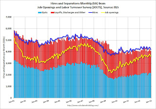 10:00 AM: Job Openings and Labor Turnover Survey for January from the BLS.
 This graph shows job openings (yellow line), hires (purple), Layoff, Discharges and other (red column), and Quits (light blue column) from the JOLTS.
Jobs openings decreased in December to 3.617 million, down from 3.790 million in November. The number of job openings (yellow) has generally been trending up, but openings are only up 2% year-over-year compared to December 2011.
7:00 AM: The Mortgage Bankers Association (MBA) will release the results for the mortgage purchase applications index.
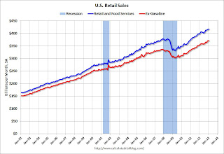 8:30 AM ET: Retail sales for February will be released.
This graph shows monthly retail sales and food service, seasonally adjusted (total and ex-gasoline) through January. Retail sales are up 25.7% from the bottom, and now 9.9% above the pre-recession peak (not inflation adjusted)
The consensus is for retail sales to increase 0.5% in February (boosted by higher gasoline prices), and to increase 0.5% ex-autos.
10:00 AM: Manufacturing and Trade: Inventories and Sales (business inventories) report for January. The consensus is for a 0.3% increase in inventories.
8:30 AM: The initial weekly unemployment claims report will be released. The consensus is for claims to increase to 350 thousand from 340 thousand last week.
8:30 AM: Producer Price Index for February. The consensus is for a 0.6% increase in producer prices (0.1% increase in core).
8:30 AM: Consumer Price Index for February. The consensus is for a 0.5% increase in CPI in February (due to higher gasoline prices) and for core CPI to increase 0.2%.
8:30 AM: NY Fed Empire Manufacturing Survey for March. The consensus is for a reading of 8.5, down from 10.0 in February (above zero is expansion).
 9:15 AM: The Fed will release Industrial Production and Capacity Utilization for February.
This shows industrial production since 1967 through January.
The consensus is for a 0.3% increase in Industrial Production in February, and for Capacity Utilization to increase to 79.3%.
9:55 AM: Reuter's/University of Michigan's Consumer sentiment index (preliminary for March). The consensus is for a reading of 77.7, up from 77.6.
Summary for Week ending March 8th
by Calculated Risk on 3/09/2013 08:49:00 AM
WARNING: Don sunglasses before reading! :-)
Clearly the economy was picking up before the sequestration budget cuts. We will find out over the next two months how much the budget cuts will slow the economy.
In a research note last night, Goldman Sachs economists asked: Are We Already over the Hump?
In our annual forecast rollout last November, we predicted that the US economy would move “over the hump” of fiscal contraction, with still-sluggish growth in most of 2013 followed by a gradual acceleration to an above-trend pace in late 2013 and 2014. But the recent data raise the tantalizing prospect that the “hump” may already have occurred. ... The most visible data point is the strong February employment report showing a nonfarm payroll gain of 236,000 and a drop in the unemployment rate to 7.7%. But arguably the more important one is the apparent resilience of consumer spending despite the $200bn tax increase that took effect in January. ... In our view, it is still too early to close the books on the early-2013 consumption slowdown. After all, we only have auto sales and consumer confidence in hand for February so far. And we still think that the weakness in federal spending will restrain growth in coming quarters. But if consumption picture holds up in light of upcoming data, a modest upward adjustment to our growth forecast would probably make sense.The key report for the week was the February employment report. The BLS reported 236,000 payroll jobs added and the unemployment rate declined to 7.7%; this is the lowest unemployment rate since 2008 (246,000 private sector jobs, and another 10,000 public sector jobs lost). Overall this was a solid report and above expectations, although there is still a long way to go.
emphasis added
The ISM non-manufacturing index (service) increased (highest since February 2012), weekly initial unemployment claims declined (lowest 4 week average since March 2008), the ADP employment report was above expectations, and mortgage delinquencies declined.
The only negative was the increase in the trade deficit, but overall the data was better than expected.
Here is a summary of last week in graphs:
• February Employment Report: 236,000 Jobs, 7.7% Unemployment Rate
 Click on graph for larger image.
"Total nonfarm payroll employment increased by 236,000 in February, and the unemployment rate edged down to 7.7 percent." The headline number was above expectations of 171,000 payroll jobs added. Employment for January was revised lower, but jobs added in December was revised higher.
NOTE: This graph is ex-Census meaning the impact of the decennial Census temporary hires and layoffs is removed to show the underlying payroll changes.
 The second graph shows the unemployment rate.
 The unemployment rate decreased to 7.7% from 7.9% in January.
The third graph shows the employment population ratio and the participation rate.
 The Labor Force Participation Rate decreased slightly to 63.5% in February (blue line. This is the percentage of the working age population in the labor force.
The participation rate is well below the 66% to 67% rate that was normal over the last 20 years, although a significant portion of the recent decline is due to demographics.
The Employment-Population ratio was unchanged at 58.6% in February (black line).
 The fourth graph shows the job losses from the start of the employment recession, in percentage terms, compared to previous post WWII recessions. The dotted line is ex-Census hiring.
This shows the depth of the recent employment recession - worse than any other post-war recession - and the relatively slow recovery due to the lingering effects of the housing bust and financial crisis.
This was a fairly solid employment report and better than expectations.
• ISM Non-Manufacturing Index indicates faster expansion in February
 The February ISM Non-manufacturing index was at 56.0%, up from 55.2% in January. The employment index decreased in February to 57.2%, down from 57.5% in January. Note: Above 50 indicates expansion, below 50 contraction.
 This graph shows the ISM non-manufacturing index (started in January 2008) and the ISM non-manufacturing employment diffusion index.
This was above the consensus forecast of 55.0% and indicates faster expansion in February than in January.
• Trade Deficit increased in January to $44.4 Billion
The first graph shows the monthly U.S. exports and imports in dollars through January 2013.
 "[T]otal January exports of $184.5 billion and imports of $228.9 billion resulted in a goods and services deficit of $44.4 billion, up from $38.1 billion in December, revised. January exports were $2.2 billion less than December exports of $186.6 billion. January imports were $4.1 billion more than December imports of $224.8 billion."
The trade deficit was above the consensus forecast of $43.0 billion.
Exports are 11% above the pre-recession peak and up 3.3% compared to January 2012; imports are near the pre-recession peak, and down 1% compared to January 2012.
The second graph shows the U.S. trade deficit, with and without petroleum, through January.
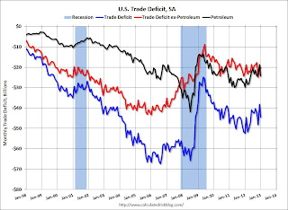 The blue line is the total deficit, and the black line is the petroleum deficit, and the red line is the trade deficit ex-petroleum products.
The increase in the trade deficit in January was mostly due to an increase in the volume of petroleum imports.
Oil averaged $94.08 per barrel in January, down slightly from $95.16 in December.
The trade deficit with China increased to $27.8 billion in January, up from $26.0 billion in January 2012. Most of the trade deficit is still due to oil and China.
• Weekly Initial Unemployment Claims decrease to 340,000
 This graph shows the 4-week moving average of weekly claims since January 2000.
"In the week ending March 2, the advance figure for seasonally adjusted initial claims was 340,000, a decrease of 7,000 from the previous week's revised figure of 347,000."
The dashed line on the graph is the current 4-week average. The four-week average of weekly unemployment claims decreased to 348,750 - this is the lowest level since March 2008.
Weekly claims were below the 355,000 consensus forecast. Note: Claims might increase soon due to the "sequestration" budget cuts.
• Q4 Flow of Funds: Household Mortgage Debt down $1.2 Trillion from Peak
The Federal Reserve released the Q4 2012 Flow of Funds report this week: Flow of Funds.
 This graph shows homeowner percent equity since 1952.
 Household percent equity (as measured by the Fed) collapsed when house prices fell sharply in 2007 and 2008.
In Q4 2012, household percent equity (of household real estate) was at 46.6% - up from Q3, and the highest since Q1 2008. This was because of both an increase in house prices in Q4 (the Fed uses CoreLogic) and a reduction in mortgage debt.
 This graph shows household real estate assets and mortgage debt as a percent of GDP.
 Mortgage debt declined by $6 billion in Q4. Mortgage debt has now declined by $1.2 trillion from the peak. Studies suggest most of the decline in debt has been because of foreclosures (or short sales), but some of the decline is from homeowners paying down debt (sometimes so they can refinance at better rates). It appears the rate of decline is slowing.
The value of real estate, as a percent of GDP, was up in Q4 (as house prices increased), but is just above the lows of the last 30 years. However household mortgage debt, as a percent of GDP, is still historically very high, suggesting still more deleveraging ahead for certain households.
• CoreLogic: House Prices up 9.7% Year-over-year in January
 From CoreLogic: CoreLogic Home Price Index Rises by Almost 10 Percent Year Over Year in January
This graph shows the national CoreLogic HPI data since 1976. January 2000 = 100.
The index was up 0.7% in January, and is up 9.7% over the last year.
The index is off 26.4% from the peak - and is up 10.1% from the post-bubble low set in February 2012.
Friday, March 08, 2013
Bank Failure #4 in 2013: Frontier Bank, LaGrange, Georgia
by Calculated Risk on 3/08/2013 06:20:00 PM
From the FDIC: HeritageBank of the South, Albany, Georgia, Assumes All of the Deposits of Frontier Bank, LaGrange, Georgia
As of December 31, 2012, Frontier Bank had approximately $258.8 million in total assets and $224.1 million in total deposits. ... The FDIC estimates that the cost to the Deposit Insurance Fund (DIF) will be $51.6 million. ... Frontier Bank is the fourth FDIC-insured institution to fail in the nation this year, and the first in Georgia.It is Friday! And this is the first failure in Georgia this year (it took until March for a bank to fail in Georgia - the economy must be improving!)
Earlier on the employment report:
• February Employment Report: 236,000 Jobs, 7.7% Unemployment Rate
• Employment Report Comments and more Graphs
• All Employment Graphs
AAR: Rail Traffic "mixed" in February
by Calculated Risk on 3/08/2013 03:16:00 PM
From the Association of American Railroads (AAR): AAR Reports Mixed Rail Traffic for February, Gains for Week Ending March 2
Intermodal traffic in February 2013 totaled 983,078 containers and trailers, up 10.5 percent (93,231 units) compared with February 2012. That percentage increase represents the biggest year-over-year monthly gain since December 2010. The weekly average of 245,770 intermodal units in February was the highest weekly average for any February in history.
Carloads originated in February totaled 1,113,843 carloads, down 1.1 percent (12,562 carloads) compared with the same month last year. However, carloads excluding coal and grain were up 4.5 percent (25,311 carloads) in February 2013 over February 2012.
“Rail intermodal traffic continues to grow. In February, year-over-year intermodal volume on U.S. railroads rose for the 39th straight week, and February saw the first double-digit year-over-year increase in two years,” said AAR Senior Vice President John T. Gray. “Shippers find intermodal appealing for a lot of reasons, including fuel savings, higher trucking costs, and service that has become much better in recent years.”
emphasis added
 Click on graph for larger image.
This graph from the Rail Time Indicators report shows U.S. average weekly rail carloads (NSA). Green is 2013.
Commodities with carload gains on U.S. railroads in February 2013 over February 2012 included many of the usual suspects, led by petroleum and petroleum products (up 21,326 carloads, or 64.2% ...); crushed stone, gravel, and sand (up 10,759 carloads, or 17.2%...); motor vehicles and parts (up 1,722 carloads, or 2.6% ...); and lumber and wood products (up 1,310 carloads, or 10.4% ...). ...Note that building related commodities were up.
Excluding coal and grain, U.S. rail carloads were up 4.5% (25,311 carloads) in February 2013 over February 2012
The second graph is for intermodal traffic (using intermodal or shipping containers):
 Graphs and excerpts reprinted with permission.
Intermodal traffic is almost off the chart ...
Excluding coal and grain, U.S. rail carloads were up 4.5% (25,311 carloads) in February 2013 over February 2012Intermodal will probably set a new record in 2013.
Earlier on the employment report:
• February Employment Report: 236,000 Jobs, 7.7% Unemployment Rate
• Employment Report Comments and more Graphs
• All Employment Graphs
Freddie Mac Mortgage Serious Delinquency rate declined in January, Lowest since mid-2009
by Calculated Risk on 3/08/2013 01:25:00 PM
Freddie Mac reported that the Single-Family Serious Delinquency rate declined in January to 3.20% from 3.25% in December 2012. The serious delinquency rate is down from 3.59% in January 2012, and this is the lowest level since mid-2009.
The Freddie Mac serious delinquency rate peaked in February 2010 at 4.20%.
Fannie Mae reported earlier that the Single-Family Serious Delinquency rate declined in January to 3.18% from 3.29% in December 2012
Note: These are mortgage loans that are "three monthly payments or more past due or in foreclosure".
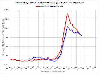 Click on graph for larger image
Although this indicates some progress, the "normal" serious delinquency rate is under 1%. At the recent pace of improvement, it will take several years until the rates are back to normal.
NOTE: When Fannie Mae releases their annual report for 2012, I'll post a graph of Real Estate Owned (REO) by Fannie, Freddie and the FHA (This is real estate that the agencies acquired through foreclosure or deed-in-lieu and haven't sold yet). Both Freddie and the FHA reported that their REO declined in Q4, and the combined total will be at the lowest level since 2009. Also the FDIC reported that the dollar value of REO for FDIC insured institutions declined in Q4, and it appears the private label REO declined too.
Earlier on the employment report:
• February Employment Report: 236,000 Jobs, 7.7% Unemployment Rate
• Employment Report Comments and more Graphs
• All Employment Graphs
Employment Report Comments and more Graphs
by Calculated Risk on 3/08/2013 10:30:00 AM
The 236 thousand payroll jobs added in February is from the establishment survey (a survey of businesses for payroll jobs), but the unemployment rate is from the household survey. To help understand the decline in the unemployment rate, here is some data from the household survey.
The "Population" is the Civilian Noninstitutional Population, or the number of people 16 and over who are "not inmates of institutions (for example, penal and mental facilities and homes for the aged) and who are not on active duty in the Armed Forces". This is increasing every month, and increased 165 thousand in February.
The Civilian Labor Force is based on the percentage of people who say they are either employed or unemployed. This yields the participation rate (the percentage of the civilian noninstitutional population that is in the labor force). The participation rate has declined recently due to both demographic reasons and the weak recovery from the financial crisis. Separating out the two reasons is difficult, see: Understanding the Decline in the Participation Rate and Further Discussion on Labor Force Participation Rate and Labor Force Participation Rate Update.
If the participation rate increases, then it would take more jobs to reduce the unemployment rate. If the participation rate continues to decline (or just flat lines for a couple of years), then it takes fewer jobs to reduce the unemployment rate.
According to the household survey, the economy added 170 thousand jobs (the establishment survey is better for jobs added), and there were 300 thousand fewer people unemployed - so the unemployment rate declined to the lowest level since 2008.
| Employment Status, Household Data (000s) | |||
|---|---|---|---|
| Jan | Feb | Change | |
| Population | 244,663 | 244,828 | 165 |
| Civilian Labor Force | 155,654 | 155,524 | -130 |
| Participation Rate | 63.62% | 63.52% | -0.10% |
| Employed | 143,322 | 143,492 | 170 |
| Unemployed | 12,332 | 12,032 | -300 |
| Unemployment Rate | 7.92% | 7.74% | -0.19% |
Employment-Population Ratio, 25 to 54 years old
 Click on graph for larger image.
Since the participation rate has declined recently due to cyclical (recession) and demographic (aging population) reasons, an important graph is the employment-population ratio for the key working age group: 25 to 54 years old.
In the earlier period the employment-population ratio for this group was trending up as women joined the labor force. The ratio has been mostly moving sideways since the early '90s, with ups and downs related to the business cycle.
This ratio should probably move close to 80% as the economy recovers. The ratio increased in February to 75.9% from 75.7% in January. This has generally been trending up - although the improvement stalled in 2012 - and the ratio is still very low.
Percent Job Losses During Recessions

This graph shows the job losses from the start of the employment recession, in percentage terms - this time aligned at maximum job losses.
In the earlier post, the graph showed the job losses aligned at the start of the employment recession.
This financial crisis recession was much deeper than other post WWII recessions, and the recovery has been slower (the recovery from the 2001 recession was slow too). However, if we compare to other financial crisis recoveries, this recovery has actually been better than most.
Part Time for Economic Reasons
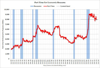 From the BLS report:
The number of persons employed part time for economic reasons, at 8.0 million, was essentially unchanged in February. These individuals were working part time because their hours had been cut back or because they were unable to find a full-time job.The number of part time workers increased in February to 7.99 from 7.97 million in January.
These workers are included in the alternate measure of labor underutilization (U-6) that declined slightly to 14.3% in February.
Unemployed over 26 Weeks
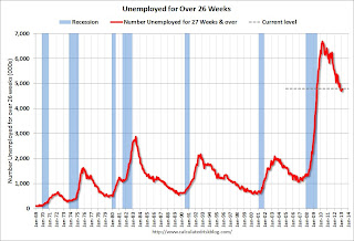 This graph shows the number of workers unemployed for 27 weeks or more.
 According to the BLS, there are 4.8 million workers who have been unemployed for more than 26 weeks and still want a job. This was up slightly from 4.71 million in January. This is generally trending down, but is still very high. Long term unemployment remains one of the key labor problems in the US.
State and Local Government
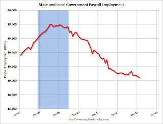 This graph shows total state and government payroll employment since January 2007. State and local governments lost jobs for four straight years. (Note: Scale doesn't start at zero to better show the change.)
 In February 2013, state and local governments lost another 10,000 jobs and have lost 27,000 jobs so far in 2013.
I think most of the state and local government layoffs are over, however state and local government employment is still trending down.
Of course the Federal government layoffs are ongoing with many more layoffs expected due to the sequestration spending cuts.
Overall this was a fairly solid report, but with the high unemployment rate, many workers unemployed for a long time, and the large number of part time workers, there is a long way to go.
February Employment Report: 236,000 Jobs, 7.7% Unemployment Rate
by Calculated Risk on 3/08/2013 08:30:00 AM
From the BLS:
Total nonfarm payroll employment increased by 236,000 in February, and the unemployment rate edged down to 7.7 percent ...
...
The change in total nonfarm payroll employment for December was revised from +196,000 to +219,000, and the change for January was revised from +157,000 to +119,000.
 Click on graph for larger image.
The headline number was above expectations of 171,000 payroll jobs added. Employment for January was revised lower, but jobs added in December was revised higher.
NOTE: This graph is ex-Census meaning the impact of the decennial Census temporary hires and layoffs is removed to show the underlying payroll changes.
The second graph shows the unemployment rate.
The unemployment rate decreased to 7.7% from 7.9% in January.
 The unemployment rate is from the household report and the household report showed only a small increase in employment.
The third graph shows the employment population ratio and the participation rate.
The Labor Force Participation Rate decreased slightly to 63.5% in February (blue line. This is the percentage of the working age population in the labor force.
 The participation rate is well below the 66% to 67% rate that was normal over the last 20 years, although a significant portion of the recent decline is due to demographics.
The Employment-Population ratio was also unchanged at 58.6% in February (black line). I'll post the 25 to 54 age group employment-population ratio graph later.
 The fourth graph shows the job losses from the start of the employment recession, in percentage terms, compared to previous post WWII recessions. The dotted line is ex-Census hiring.
This shows the depth of the recent employment recession - worse than any other post-war recession - and the relatively slow recovery due to the lingering effects of the housing bust and financial crisis.
This was a fairly solid employment report and better than expectations. I'll have much more later ...
Thursday, March 07, 2013
Friday: Jobs, Jobs, Jobs
by Calculated Risk on 3/07/2013 08:18:00 PM
Two comments: Net petroleum imports, and a house price forecast.
Early this morning I posted a graph showing the large net imports of petroleum. Many people have heard the the US is now a net exporter, but that is just of refined petroleum products. The US is still a very large importer of crude oil. For an explanation, see Jim Hamilton's U.S. net exports of petroleum products
"The first thing to understand about this number is that it refers only to net exports of refined petroleum products, calculated for example by subtracting the amount of gasoline that the U.S. imports from the amount of gasoline that we export. These imports or exports of refined products are far smaller in magnitude than the imports of crude oil, which is the raw material from which refined products are made."And a research note from Chris Flanagan, Michelle Meyer and Justin Borst at Merrill Lynch: Someone say house party?
Home prices continue to show momentum amid shrinking inventory and record high affordability, prompting us to revise up our forecast for home prices this year. We now expect national home prices, as defined by the S&P Case Shiller home price index, to increase 8.0% this year (q4/q4). This follows the 7.3% gain in 2012. ... our forecast now assumes faster near-term appreciation, but slower growth in the out years. Our forecast for the cumulative appreciation over the next ten years is little changed.Friday economic releases:
• At 8:30 AM ET, Employment Report for February will be released. The consensus is for an increase of 171,000 non-farm payroll jobs in February; the economy added 157,000 non-farm payroll jobs in January. The consensus is for the unemployment rate to decrease to 7.8% in February.
• At 10:00 AM, Monthly Wholesale Trade: Sales and Inventories for January. The consensus is for a 0.4% increase in inventories.
Employment Situation Preview
by Calculated Risk on 3/07/2013 04:38:00 PM
On Friday, at 8:30 AM ET, the BLS will release the employment report for February. The consensus is for an increase of 171,000 non-farm payroll jobs in February, and for the unemployment rate to decrease to 7.8% (from 7.9% in January).
Here is a summary of recent data:
• The ADP employment report showed an increase of 198,000 private sector payroll jobs in February. This was above expectations of 173,000 private sector payroll jobs added. The ADP report hasn't been very useful in predicting the BLS report for any one month, although the methodology changed last year. In general this suggests employment growth somewhat above expectations.
• The ISM manufacturing employment index declined in February to 52.6%, down from 54.0% in January. A historical correlation between the ISM manufacturing employment index and the BLS employment report for manufacturing, suggests that private sector BLS reported payroll jobs for manufacturing declined slightly in February.
The ISM non-manufacturing (service) employment index decreased slightly in February to 57.2%, down from 57.5% in January. A historical correlation between the ISM non-manufacturing employment index and the BLS employment report for services, suggests that private sector BLS reported payroll jobs for services increased about 250,000 in February.
Added together, the ISM reports suggests about 245,000 jobs added in November.
• Initial weekly unemployment claims averaged about 355,000 in February. This was up slightly from January, but near the lowest level since early 2008.
For the BLS reference week (includes the 12th of the month), initial claims were at 366,000; up from 335,000 in January.
• The final February Reuters / University of Michigan consumer sentiment index increased to 77.6, up from the January reading of 73.8. This is frequently coincident with changes in the labor market and stock market, but also strongly related to gasoline prices and other factors. This might suggest some increase in employment, but the level still suggests a weak labor market.
• The small business index from Intuit showed 15,000 payroll jobs added, down from 25,000 in January. This is disappointing.
• And on the unemployment rate from Gallup: Gallup's U.S. unemployment rate, without seasonal adjustment, increases to 8.0%
Gallup's unadjusted employment rate for the U.S. workforce was 8.0% for the month of February, a slight uptick from 7.8% in January, but down markedly from 9.1% in February 2012.Note: So far the Gallup numbers haven't been very useful in predicting the BLS unemployment rate.
Gallup's seasonally adjusted U.S. unemployment rate for February was 7.6%, a modest increase from 7.3% in January, but down a full percentage point from February 2012.
• Conclusion: The employment related data was mixed in February. The ADP and ISM reports suggest an increase in hiring, but the small business index was weak, and weekly claims were slightly higher in February than in January when the BLS reported 157,000 payroll jobs were added. There is always some randomness to the employment report, but my guess is around the consensus of 171,000 jobs.


