by Calculated Risk on 3/09/2013 08:49:00 AM
Saturday, March 09, 2013
Summary for Week ending March 8th
WARNING: Don sunglasses before reading! :-)
Clearly the economy was picking up before the sequestration budget cuts. We will find out over the next two months how much the budget cuts will slow the economy.
In a research note last night, Goldman Sachs economists asked: Are We Already over the Hump?
In our annual forecast rollout last November, we predicted that the US economy would move “over the hump” of fiscal contraction, with still-sluggish growth in most of 2013 followed by a gradual acceleration to an above-trend pace in late 2013 and 2014. But the recent data raise the tantalizing prospect that the “hump” may already have occurred. ... The most visible data point is the strong February employment report showing a nonfarm payroll gain of 236,000 and a drop in the unemployment rate to 7.7%. But arguably the more important one is the apparent resilience of consumer spending despite the $200bn tax increase that took effect in January. ... In our view, it is still too early to close the books on the early-2013 consumption slowdown. After all, we only have auto sales and consumer confidence in hand for February so far. And we still think that the weakness in federal spending will restrain growth in coming quarters. But if consumption picture holds up in light of upcoming data, a modest upward adjustment to our growth forecast would probably make sense.The key report for the week was the February employment report. The BLS reported 236,000 payroll jobs added and the unemployment rate declined to 7.7%; this is the lowest unemployment rate since 2008 (246,000 private sector jobs, and another 10,000 public sector jobs lost). Overall this was a solid report and above expectations, although there is still a long way to go.
emphasis added
The ISM non-manufacturing index (service) increased (highest since February 2012), weekly initial unemployment claims declined (lowest 4 week average since March 2008), the ADP employment report was above expectations, and mortgage delinquencies declined.
The only negative was the increase in the trade deficit, but overall the data was better than expected.
Here is a summary of last week in graphs:
• February Employment Report: 236,000 Jobs, 7.7% Unemployment Rate
 Click on graph for larger image.
"Total nonfarm payroll employment increased by 236,000 in February, and the unemployment rate edged down to 7.7 percent." The headline number was above expectations of 171,000 payroll jobs added. Employment for January was revised lower, but jobs added in December was revised higher.
NOTE: This graph is ex-Census meaning the impact of the decennial Census temporary hires and layoffs is removed to show the underlying payroll changes.
 The second graph shows the unemployment rate.
 The unemployment rate decreased to 7.7% from 7.9% in January.
The third graph shows the employment population ratio and the participation rate.
 The Labor Force Participation Rate decreased slightly to 63.5% in February (blue line. This is the percentage of the working age population in the labor force.
The participation rate is well below the 66% to 67% rate that was normal over the last 20 years, although a significant portion of the recent decline is due to demographics.
The Employment-Population ratio was unchanged at 58.6% in February (black line).
 The fourth graph shows the job losses from the start of the employment recession, in percentage terms, compared to previous post WWII recessions. The dotted line is ex-Census hiring.
This shows the depth of the recent employment recession - worse than any other post-war recession - and the relatively slow recovery due to the lingering effects of the housing bust and financial crisis.
This was a fairly solid employment report and better than expectations.
• ISM Non-Manufacturing Index indicates faster expansion in February
 The February ISM Non-manufacturing index was at 56.0%, up from 55.2% in January. The employment index decreased in February to 57.2%, down from 57.5% in January. Note: Above 50 indicates expansion, below 50 contraction.
 This graph shows the ISM non-manufacturing index (started in January 2008) and the ISM non-manufacturing employment diffusion index.
This was above the consensus forecast of 55.0% and indicates faster expansion in February than in January.
• Trade Deficit increased in January to $44.4 Billion
The first graph shows the monthly U.S. exports and imports in dollars through January 2013.
 "[T]otal January exports of $184.5 billion and imports of $228.9 billion resulted in a goods and services deficit of $44.4 billion, up from $38.1 billion in December, revised. January exports were $2.2 billion less than December exports of $186.6 billion. January imports were $4.1 billion more than December imports of $224.8 billion."
The trade deficit was above the consensus forecast of $43.0 billion.
Exports are 11% above the pre-recession peak and up 3.3% compared to January 2012; imports are near the pre-recession peak, and down 1% compared to January 2012.
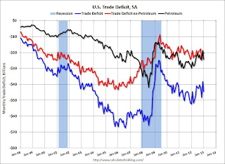
The second graph shows the U.S. trade deficit, with and without petroleum, through January.
 The blue line is the total deficit, and the black line is the petroleum deficit, and the red line is the trade deficit ex-petroleum products.
The increase in the trade deficit in January was mostly due to an increase in the volume of petroleum imports.
Oil averaged $94.08 per barrel in January, down slightly from $95.16 in December.
The trade deficit with China increased to $27.8 billion in January, up from $26.0 billion in January 2012. Most of the trade deficit is still due to oil and China.
• Weekly Initial Unemployment Claims decrease to 340,000
 This graph shows the 4-week moving average of weekly claims since January 2000.
"In the week ending March 2, the advance figure for seasonally adjusted initial claims was 340,000, a decrease of 7,000 from the previous week's revised figure of 347,000."
The dashed line on the graph is the current 4-week average. The four-week average of weekly unemployment claims decreased to 348,750 - this is the lowest level since March 2008.
Weekly claims were below the 355,000 consensus forecast. Note: Claims might increase soon due to the "sequestration" budget cuts.
• Q4 Flow of Funds: Household Mortgage Debt down $1.2 Trillion from Peak
The Federal Reserve released the Q4 2012 Flow of Funds report this week: Flow of Funds.
 This graph shows homeowner percent equity since 1952.
 Household percent equity (as measured by the Fed) collapsed when house prices fell sharply in 2007 and 2008.
In Q4 2012, household percent equity (of household real estate) was at 46.6% - up from Q3, and the highest since Q1 2008. This was because of both an increase in house prices in Q4 (the Fed uses CoreLogic) and a reduction in mortgage debt.
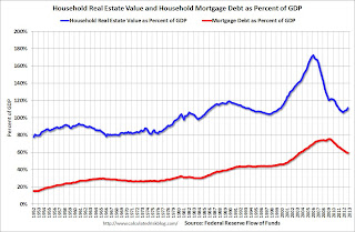
 This graph shows household real estate assets and mortgage debt as a percent of GDP.
 Mortgage debt declined by $6 billion in Q4. Mortgage debt has now declined by $1.2 trillion from the peak. Studies suggest most of the decline in debt has been because of foreclosures (or short sales), but some of the decline is from homeowners paying down debt (sometimes so they can refinance at better rates). It appears the rate of decline is slowing.
The value of real estate, as a percent of GDP, was up in Q4 (as house prices increased), but is just above the lows of the last 30 years. However household mortgage debt, as a percent of GDP, is still historically very high, suggesting still more deleveraging ahead for certain households.
• CoreLogic: House Prices up 9.7% Year-over-year in January
 From CoreLogic: CoreLogic Home Price Index Rises by Almost 10 Percent Year Over Year in January
This graph shows the national CoreLogic HPI data since 1976. January 2000 = 100.
The index was up 0.7% in January, and is up 9.7% over the last year.
The index is off 26.4% from the peak - and is up 10.1% from the post-bubble low set in February 2012.


