 RSS Feed
 by Calculated Risk on 3/12/2012 06:15:00 PM
Monday, March 12, 2012
Housing: Short Sales increase, Foreclosure Sales down Year-over-year
CR Note: This will be very useful data over the next several months as we try to track the impact of the mortgage servicer settlement. There are only a few areas where the MLS breaks down monthly sales by foreclosure, short sales and conventional (non-distressed) sale. I've been tracking the Sacramento market to watch for changes in the mix over time. (here was my post this weekend: Distressed House Sales using Sacramento Data for February)
Economist Tom Lawler sent me the following table today for several other areas. Lawler writes: "With the exception of Reno (the data for which I did NOT get directly from a realtor association/MLS), the foreclosure share of home sales was down from a year ago – in some cases by a lot – while the short-sales share of sales was up – in some cases significantly."
CR Note: For most of the areas (with the exception of Reno), the distressed share of sales is down from February 2011. The share of short sales has increased in most areas, while the share of foreclosure sales are down - and down significantly in some areas.
Note: The table is a percentage of total sales.
| Short Sales Share | Foreclosure Sales Share | Total "Distressed" Share | ||||
|---|---|---|---|---|---|---|
| 12-Feb | 11-Feb | 12-Feb | 11-Feb | 12-Feb | 11-Feb | |
| Las Vegas | 29.3% | 26.6% | 42.0% | 51.6% | 71.3% | 78.2% |
| Reno | 28.0% | 30.0% | 42.0% | 36.0% | 70.0% | 66.0% |
| Phoenix | 28.1% | 21.1% | 23.3% | 49.6% | 51.4% | 70.7% |
| Sacramento | 31.9% | 22.1% | 33.9% | 49.2% | 65.8% | 71.3% |
| Minneapolis | 15.0% | 13.6% | 42.3% | 47.9% | 57.3% | 61.5% |
| Mid-Atlantic (MRIS) | 16.4% | 14.5% | 17.5% | 27.2% | 33.9% | 41.7% |
Mortgage Settlement filed with Court
by Calculated Risk on 3/12/2012 03:16:00 PM
The documents are now available online here.
From the WSJ: Foreclosure-Abuse Settlement Formally Filed
Bank of America has by far the largest share of the settlement, at nearly $2.4 billion in cash payments, plus $7.6 billion of aid to troubled consumers and nearly $950 million in refinancing aid. Bank of America also reached a $1 billion settlement to resolve allegations that Countrywide Financial, which it acquired in 2008, issued loans to borrowers who didn't qualify for mortgage backed by the Federal Housing Administration, the government-run mortgage insurer.
J.P. Morgan is paying the second-largest share, at $1.1 billion in cash, plus $3.7 billion of aid to troubled homeowners and nearly $540 million in refinancing help. Wells Fargo is paying $1 billion in cash, plus $3.4 billion worth of assistance to troubled homeowners and $900 million in refinancing aid.
Citi is paying $413 million in cash, plus $1.4 billion in assistance to homeowners and $378 million in refinancing relief. Ally is making a cash payment of about $110 million, plus $185 million in consumer relief and $15 million in refinancing aid.
Report: New Bank Stress Test results expected by Thursday
by Calculated Risk on 3/12/2012 12:04:00 PM
From Nelson Schwartz at the NY Times: Latest Stress Tests Are Expected to Show Progress at Most Banks
[T]he Federal Reserve this week will release the results of its latest stress tests, which are expected to show broadly improved balance sheets at most institutions.The stress test scenario was announced last November and is outlined here.
...
Unlike the findings of the last round of stress tests, which ended last March, the results of this round will be made public by the Federal Reserve, with an announcement expected by Thursday.
The stress tests assumed the unemployment rate will rise to 13% in 2013, that the Dow Jones Total Stock Market Index will decline by more than 50% from the November level. The scenario assumed that house prices would fall another 20%+, and bottom at almost 47% down from the peak.
Note: The Fed uses the CoreLogic index for house prices, and the index has declined over 4% since the stress test scenario was released in November, and the index was off 34% from the peak as of January.
Report: Public transportation ridership increases 2.3% in 2011
by Calculated Risk on 3/12/2012 09:11:00 AM
From the APTA: 10.4 Billion Trips Taken On U.S. Public Transportation In 2011
According to a report released today by the American Public Transportation Association (APTA), Americans took 10.4 billion trips on public transportation in 2011, the second highest annual ridership since 1957. Only ridership in 2008, when gas rose to more than $4 a gallon, surpassed last year’s ridership. With an increase of 2.3 percent over the 2010 ridership, this was the sixth year in a row that more than 10 billion trips were taken on public transportation systems nationwide. During 2011, vehicle miles of travel (VMTs) declined by 1.2 percent.And below is a graph of gasoline prices. Gasoline prices bottomed in December and have been moving up again. Note: The graph below shows oil prices for WTI; gasoline prices in most of the U.S. are impacted more by Brent prices.
...
“Two top reasons for the increased ridership are higher gas prices and in certain areas, a recovering economy with more people returning to work,” said [APTA President and CEO Michael Melaniphy]. “Since nearly sixty percent of trips taken on public transportation are for work commutes, it’s not surprising to see ridership increase in areas where the economy has improved.”
| Orange County Historical Gas Price Charts Provided by GasBuddy.com |
Sunday, March 11, 2012
Report: Mortgage Settlement might be filed in court Monday
by Calculated Risk on 3/11/2012 09:39:00 PM
Nick Timiraos at the WSJ has some details about the settlement. He also writes that the settlement documents might be filed in court tomorrow.
Here is the online site for the mortgage settlement. Note the "National Mortgage Settlement (coming soon)" in the upper right.
From Timiraos: Mortgage Deal Is Built on Tradeoffs
Settlement documents, which could be filed in court as soon as Monday, will detail the formulas governing how banks gain credit for that aid, as well as new standards banks will have to follow when they deal with borrowers who face or go through foreclosure.
...
Of the total $25 billion settlement, around $5 billion will be paid as fines. An added $3 billion will be used to help homeowners who owe more than their homes are worth refinance. To pay the remaining $17 billion, banks will receive credits for helping troubled borrowers, of which $10 billion goes toward cutting loan balances for borrowers who are underwater, owing more than their homes are worth.
...
Banks can satisfy up to 10% of the $17 billion in credits, for example, by waiving the right to pursue deficiency judgments on mortgages that have recourse, such as home-equity loans. ... Banks can satisfy up to 5% of the credits by providing more generous relocation assistance to foreclosed homeowners.
Lawler: REO inventory of "the F's", PLS, and FDIC-insured institutions combined down about 21% last year
by Calculated Risk on 3/11/2012 06:05:00 PM
CR Note: On Friday I posted a graph of REO inventory (lender Real Estate Owned) for the Fs (Fannie, Freddie and the FHA). Economist Tom Lawler has added estimates for FDIC insured institutions and PLS (private label securities).
From Tom Lawler:
Below is a chart showing estimates of the SF REO inventory of the F’s, private-label ABS (from Barclays Capital), and FDIC-insured institutions. On the latter I have changed my estimation procedure. Rather than assume a constant carrying cost, I am assuming that the average carrying cost at FDIC insured institutions is 50% higher than the average for Fannie and Freddie. Both Fannie and Freddie’s average REO carrying costs have declined steadily over the past two years, and that’s probably true for banks as well.
Compared to the end of 2010, estimated REO inventories for the F’s, PLS, and FDIC-insured institutions combined at the end of 2011 were down about 21% to the lowest level since the end of 2007.
 Click on graph for larger image in new window.
More CR: As Tom Lawler has noted before: "This is NOT an estimate of total residential REO, as it excludes non-FHA government REO (VA, USDA, etc.), credit unions, finance companies, non-FDIC-insured banks and thrifts, and a few other lender categories." However this is the bulk of the 1-4 family REO - probably 90% or more. Rounding up the estimate (using 90%) suggests total REO is just around 520,000 in Q4.
REO inventories have declined over the last year. This was a combination of more sales and fewer acquisitions due to the slowdown in the foreclosure process. However there are many more foreclosures coming and I expect the REO inventory to start increasing again.
Yesterday:
• Summary for Week ending March 9th
• Schedule for Week of March 11th
Distressed House Sales using Sacramento Data for February
by Calculated Risk on 3/11/2012 01:31:00 PM
I've been following the Sacramento market to look for changes in the mix of house sales in a distressed area over time (conventional, REOs, and short sales). The Sacramento Association of REALTORS® started breaking out REOs in May 2008, and short sales in June 2009.
This will be interesting once something changes significantly. So far there has been a shift from REO to short sales, and the percentage of distressed sales has been declining gradually year-over-year. The percent of distressed sales in Sacramento decreased in February compared January; the normal seasonal pattern. Usually January has the largest percentage of short sales for the year.
In February 2012, 65.8% of all resales (single family homes and condos) were distressed sales. This was down from 71.2% in February 2011, and the lowest percentage of February distressed sales since Sacramento started breaking out the data.
Here are the statistics.
 Click on graph for larger image.
This graph shows the percent of REO sales, short sales and conventional sales. There is a seasonal pattern for conventional sales (stronger in the spring and summer), and distressed sales happen all year - so the percentage of distressed sales decreases every summer and the increases in the fall and winter.
There will be probably be more foreclosures following the mortgage servicer settlement, but it is possible the percent of conventional sales will be over 40% this summer for the first time since the crisis started.
Total sales were up 14.2% compared to February 2011. Active Listing Inventory declined 54.3% from last February, and total inventory, including "short sale contingent", was off 30% year-over-year.
Cash buyers accounted for 33.7% of all sales (frequently investors), and median prices are off 5.3% from last February.
This data might be helpful in determining when the market is improving. So far it looks like REO sales have declined, partially offset by an increase in short sales, and a small decline in the total percent of distressed sales. Also inventory has plummeted - even inventory including "short sale contingent" listings.
AAR: Rail Traffic "mixed" in February
by Calculated Risk on 3/11/2012 09:36:00 AM
From the Association of American Railroads (AAR): AAR Reports Mixed Results for February Rail Traffic
The Association of American Railroads (AAR) today reported U.S. rail carloads originated in February 2012 totaled 1,410,992, down 27,555 carloads or 1.9 percent, compared with February 2011. Intermodal volume in February 2012 was 1,122,458 containers and trailers, up 26,284 units or 2.4 percent compared with February 2011. February’s average of 224,492 intermodal units per week was the third highest ever for a February for U.S. railroads.
...
“If you exclude carloads of coal and grain, which are down for reasons that have little to do with the state of the economy, rail traffic in February was encouraging,” said AAR Senior Vice President John T. Gray. “Intermodal traffic was up for the 27th straight month, while carloads of a wide range of commodities—lumber, chemicals, petroleum, paper, steel and more—saw increases in February. Time will tell, but we’re hopeful it’s a sign of broad-based improvement in economic conditions.”
 Click on graph for larger image.
This graph shows U.S. average weekly rail carloads (NSA).
U.S. rail carloads totaled 1,410,992 in February 2012 (the five weeks ending March 3), down 1.9% (27,555 carloads) from the same period in 2011.According to the AAR, the decline in coal is because coal is being used less for electricity generation.
...
Coal was the main problem in February. U.S. railroads originated 592,316 carloads of coal in February 2012, down 70,583 carloads (10.6%) from February 2011. That’s the biggest year-over-year monthly percentage decline for coal since January 2010. U.S. rail carloads excludingcoal were up 5.5% (43,028 carloads) in February 2012 over February 2011.
The second graph is for intermodal traffic (using intermodal or shipping containers):
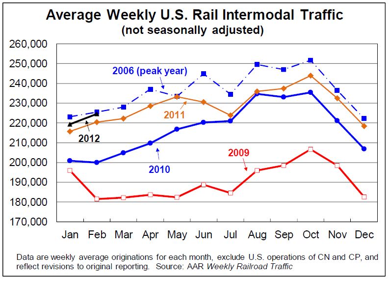 Graphs reprinted with permission.
Intermodal traffic is close to the peak year in 2006.
U.S. rail intermodal volume in February 2012 was 1,122,458 containers and trailers, up 2.4% (26,284 units) over February 2011 on a non-seasonally adjusted basis and the 27th straight year-over-year monthly increase. February’s average of 224,492 intermodal units per week was the third highest ever for a February for U.S. railroads (behind 2006 and 2007). Intermodal growth continues to be a function of increased globalization; the conversion of domestic all-truck to intermodal rail movements; better service due to more terminals and improved infrastructure; and other factors.
Yesterday:
• Summary for Week ending March 9th
• Schedule for Week of March 11th
Saturday, March 10, 2012
Construction Employment, Duration of Unemployment, Unemployment by Education and Diffusion Indexes
by Calculated Risk on 3/10/2012 08:01:00 PM
A few more graphs based on the February employment report. The first graph below shows the number of total construction payroll jobs in the U.S. including both residential and non-residential since 1969.
Construction employment decreased by 13 thousand jobs in February, but construction employment has increased 98 thousand since bottoming in January 2011. Last year was the first year with an increase in construction employment since 2006, and the first with an increase in residential construction employment since 2005.
Unfortunately this graph is a combination of both residential and non-residential construction employment. The BLS only started breaking out residential construction employment fairly recently (residential specialty trade contractors in 2001).
Usually residential investment (and residential construction) leads the economy out of recession, and non-residential construction usually lags the economy. Because this graph is a blend, it masks the usual pickup in residential construction following previous recessions. Of course residential construction didn't lead the economy this time because of the large excess supply of vacant homes.
 Click on graph for larger image.
Construction employment is generally increasing and construction will add to both GDP and employment growth in 2012.
As I've noted for years, there are usually two bottoms for housing following a bubble: 1) when housing starts, new home sales, and residential construction bottoms, and 2) when house prices bottom. It is pretty clear that the bottom is in for housing starts, new home sales and construction employment, and I think we are very close on prices.
 This graph shows the duration of unemployment as a percent of the civilian labor force. The graph shows the number of unemployed in four categories: less than 5 week, 6 to 14 weeks, 15 to 26 weeks, and 27 weeks or more.
All categories are moving down (the less than 5 week category is back to normal levels). The other categories are still high.
The the long term unemployed declined to 3.5% of the labor force - this is still very high, but the lowest since August 2009.
 This graph shows the unemployment rate by four levels of education (all groups are 25 years and older).
Unfortunately this data only goes back to 1992 and only includes one previous recession (the stock / tech bust in 2001). Clearly education matters with regards to the unemployment rate - and it appears all four groups are generally trending down.
Note: This says nothing about the quality of jobs - as an example, a college graduate working at minimum wage would be considered "employed".
 This is a little more technical. The BLS diffusion index for total private employment was at 57.9 in February and for manufacturing, the diffusion index was at 56.8. The index was revised up sharply for January - to the highest level since the '90s.
Think of this as a measure of how widespread job gains are across industries. The further from 50 (above or below), the more widespread the job losses or gains reported by the BLS. From the BLS:
Figures are the percent of industries with employment increasing plus one-half of the industries with unchanged employment, where 50 percent indicates an equal balance between industries with increasing and decreasing employment.It appears job growth is now fairly widespread across industries.
Earlier:
• Summary for Week ending March 9th
• Schedule for Week of March 11th
Employment posts yesterday:
• February Employment Report: 227,000 Jobs, 8.3% Unemployment Rate
• Employment Summary and Discussion
• All Employment Graphs
• An older post: Percent Job Losses: Great Recession and Great Depression
Unofficial Problem Bank list declines to 956 Institutions
by Calculated Risk on 3/10/2012 06:17:00 PM
This is an unofficial list of Problem Banks compiled only from public sources.
Here is the unofficial problem bank list for Mar 9, 2012. (table is sortable by assets, state, etc.)
Changes and comments from surferdude808:
Several changes resulted in the Unofficial Problem Bank List having 956 institutions with assets of $383.3 billion. This week there were four removals and one addition. Last year, the list had 964 institutions with assets of $420.7 billion. The removals include the failed New City Bank, Chicago, IL ($71 million); an unassisted merger of Americantrust Federal Savings Bank, Peru, IN ($99 million); and action terminations for Macatawa Bank, Holland, MI ($1.5 billion Ticker: MCBC) and Magyar Bank, New Brunswick, NJ ($526 million Ticker: MGYR). The addition this week is Bryan Bank & Trust, Richmond, GA ($240 million Ticker: SAVB), whose affiliate The Savannah Bank, National Association, Savannah, GA is also on the list. Next week, we anticipate the OCC will release its actions through mid-February 2012.Earlier:
• Summary for Week ending March 9th
• Schedule for Week of March 11th


