 RSS Feed
 by Calculated Risk on 5/03/2010 06:04:00 PM
Monday, May 03, 2010
Fed: Banks Keep Lending Standards Unchanged, Loan Demand Weakens Further
From the Fed: The April 2010 Senior Loan Officer Opinion Survey on Bank Lending Practices
The April survey indicated that most banks kept their lending standards unchanged in the first quarter, but that moderate net fractions of banks further tightened many terms on loans to businesses and households. ... The survey also indicated that loan demand generally weakened further.In general banks have stopped tightening lending standards, however demand continues to weaken. For commercial real estate, the banks are still tightening standards:
emphasis added
A significant number of domestic banks, on balance, continued to report having tightened standards on CRE loans. However, this net fraction was considerably smaller than in the January survey. As in the previous survey, domestic banks reported weaker demand for CRE loans, on net.And on a special question regarding the the use of CRE loan extensions:
In response to a special question, sizable fractions of both domestic and foreign respondents reported having increased their use of CRE loan extensions over the previous six months.This is similar to the last survey in January ... generally banks have ceased tightening lending standards (this is probably as tight as it gets for this cycle), but loan demand weakened further.
U.S. Light Vehicle Sales 11.2 Million SAAR in April
by Calculated Risk on 5/03/2010 03:28:00 PM
Based on an estimate from Autodata Corp, light vehicle sales were at a 11.21 million SAAR in April. This is up 21.8% from April 2009 (when sales were at the lowest level in 30 years), and down 4.6% from the March sales rate that was driven by incentives. Click on graph for larger image in new window.
This graph shows the historical light vehicle sales (seasonally adjusted annual rate) from the BEA (blue) and an estimate for April (red, light vehicle sales of 11.21 million SAAR from Autodata Corp). The second graph shows light vehicle sales since the BEA started keeping data in 1967.
Auto sales have recovered from the low levels of early 2009, but are still below the lowest point of the '90/'91 recession (even with a larger number of registered drivers).
This was slightly below most forecasts of around 11.5 million SAAR.
Q1: Office, Mall and Lodging Investment
by Calculated Risk on 5/03/2010 01:30:00 PM
Here are graphs of office, mall and lodging investment through Q1 2010 based on the underlying detail data released by the BEA today ...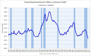 Click on graph for larger image in new window.
This graph shows investment in offices as a percent of GDP. Office investment as a percent of GDP peaked at 0.46% in Q3 2008 and has declined sharply to a new all time low (as a percent of GDP).
Reis reported that the office vacancy rate rose to the highest level since the early '90s in Q1 2010 at 17.2%, up from 17.0% in Q4 and 15.2% in Q1 2009. The peak vacancy rate following the 2001 recession was 16.9%. With the office vacancy rate still rising, office investment will probably decline further - although most of the decline in investment has already happened.
Office investment is usually the most overbuilt in a boom, but this time the office market struggled for a few years after the stock market bubble burst and there was comparatively more investment in malls and hotels. The second graph is for investment in malls.
Investment in multimerchandise shopping structures (malls) peaked in 2007 and has fallen by over 50% (note that investment includes remodels, so this will not fall to zero). Mall investment is also at an all time low (as a percent of GDP) and will probably continue to decline through 2010.
Reis reported that the mall vacancy rate in Q1 2010 was the highest on record at 8.9% for regional malls, and the highest since 1991 for strip malls.  The third graph is for lodging (hotels).
The recent boom in lodging investment was stunning. Lodging investment peaked at 0.32% of GDP in Q2 2008 and has fallen by almost 2/3rds already..
I expect lodging investment to continue to decline through at least 2010.
As projects are completed there will be little new investment in these categories for some time. Notice that investment in all three categories typically falls for a year or two after the end of a recession, and then usually recovers very slowly. Something similar will probably happen again, and there will not be a recovery in these categories until the vacancy rates fall significantly.
General Motors: Sales up 6.4% compared to April 2009
by Calculated Risk on 5/03/2010 11:09:00 AM
From MarketWatch: GM April U.S. sales up 6.4% to 183,997 vehicles and from GM: Chevrolet-Buick-GMC-Cadillac Sales Increase 20 Percent in April
Note: GM discontinued several brands, so total vehicle sales were up 6.4%.
Update: From MarketWatch: Ford U.S. April sales jump 24.7% to 167,542 units
Update2: from MarketWatch: Chrysler U.S. April sales increase 25%
Update3: from MarketWatch: Toyota U.S. April sales up 24.4% to 157,439 units
This is based on a very easy comparison: in April 2009 U.S. light vehicle sales fell 36% to 9.2 million (SAAR) from 14.4 million (SAAR) in April 2008. The sharp decline last year was due to the financial crisis, the recession, and reports of the then impending bankruptcy of GM and Chrysler (Chrysler filed for bankruptcy at the end of April, 2009, GM filed for bankruptcy on June 1, 2009).
I'll add reports from the other major auto companies as updates to this post.
NOTE: Once all the reports are released, I'll post a graph of the estimated total April sales (SAAR: seasonally adjusted annual rate) - usually around 4 PM ET. Most estimates are for a slight decrease from the 11.75 million SAAR in March.
Private Construction Spending Declines in March
by Calculated Risk on 5/03/2010 10:28:00 AM
Overall construction spending increased in March, with a boost from public spending, however private construction spending - both residential and non-residential - declined in March. From the Census Bureau: March 2010 Construction at $847.3 Billion Annual Rate
The U.S. Census Bureau of the Department of Commerce announced today that construction spending during March 2010 was estimated at a seasonally adjusted annual rate of $847.3billion, 0.2 percent (±1.3%)* above the revised February estimate of $845.5 billion. ... Spending on private construction was at a seasonally adjusted annual rate of $550.8 billion, 0.9 percent (±1.4%)* below the revised February estimate of $555.7 billion.
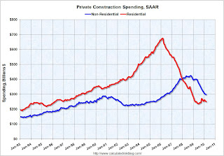 Click on graph for larger image in new window.
The first graph shows private residential and nonresidential construction spending since 1993. Note: nominal dollars, not inflation adjusted.
Private residential construction spending appears to have bottomed in early 2009, but has been mostly moving sideways since then. Residential spending is now 62.8% below the peak of early 2006.
Private non-residential construction spending continues to decline as major projects are completed. Non-residential spending is now 29.9% below the peak of late 2008.
 The second graph shows the year-over-year change for private residential and nonresidential construction spending.
Nonresidential spending is off 25.5% on a year-over-year (YoY) basis.
Residential construction spending is now up slightly from a year ago.
Private residential spending will probably exceed non-residential spending later this year - mostly because of continued declines in non-residential spending. Private consturction will be a weak sector for some time.
ISM Manufacturing Index Shows Expansion in April
by Calculated Risk on 5/03/2010 10:00:00 AM
PMI at 60.4% in April, up from 59.6% in March. Any reading above 50 shows expansion.
From the Institute for Supply Management: April 2010 Manufacturing ISM Report On Business®
Economic activity in the manufacturing sector expanded in April for the ninth consecutive month, and the overall economy grew for the 12th consecutive month, say the nation's supply executives in the latest Manufacturing ISM Report On Business®.This suggest the expansion in the manufacturing sector increased at a faster pace in April. Although slightly below expectations, this shows continued expansion in the manufacturing sector.
The report was issued today by Norbert J. Ore, CPSM, C.P.M., chair of the Institute for Supply Management™ Manufacturing Business Survey Committee. "The manufacturing sector grew for the ninth consecutive month during April. The rate of growth as indicated by the PMI is the fastest since June 2004 when the index hit 60.5 percent. Manufacturers continue to see extraordinary strength in new orders, as the New Orders Index has averaged 61.6 percent for the past 10 months. The signs for employment in the sector continue to improve as the Employment Index registered its fifth consecutive month of growth. Overall, the recovery in manufacturing continues quite strong, and the signs are positive for continued growth."
...
ISM's Employment Index registered 58.5 percent in April, which is 3.4 percentage points higher than the 55.1 percent reported in March. This is the fifth consecutive month of growth in manufacturing employment. An Employment Index above 49.8 percent, over time, is generally consistent with an increase in the Bureau of Labor Statistics (BLS) data on manufacturing employment.
emphasis added
March Personal Income up 0.3%, Spending Increases 0.6%
by Calculated Risk on 5/03/2010 08:33:00 AM
The BEA released Q1 data on Friday, and here is the March data from the BEA: Personal Income and Outlays, March 2010
Personal income increased $36.0 billion ... Personal consumption expenditures (PCE) increased $58.6 billion, or 0.6 percent.Once again spending increased much faster than income ... meaning the saving rate declined again.
...
Real PCE -- PCE adjusted to remove price changes -- increased 0.5 percent in March, the same increase as in February.
...
Personal saving -- DPI less personal outlays -- was $304.0 billion in March, compared with $332.2 billion in February. Personal saving as a percentage of disposable personal income was 2.7 percent in March, compared with 3.0 percent in February.
 Click on graph for large image.
This graph shows the saving rate starting in 1959 (using a three month trailing average for smoothing) through the March Personal Income report. The saving rate fell to 2.7% in March.
I still expect the saving rate to rise over the next couple of years slowing the growth in PCE.
The following graph shows real Personal Consumption Expenditures (PCE) through March (2005 dollars). Note that the y-axis doesn't start at zero to better show the change.
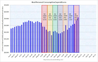 The quarterly change in PCE is based on the change from the average in one quarter, compared to the average of the preceding quarter.
The colored rectangles show the quarters, and the blue bars are the real monthly PCE.
The increase in PCE in March was strong and PCE increased 3.6% SAAR in Q1 2010. This increase in spending was driven by less saving and transfer payments.
The National Bureau of Economic Research (NBER) uses several measures to determine if the economy is in recession. One of the measures is real personal income less transfer payments (see NBER memo). This was flat in March at $9,039.4 billion (SAAR) compared to 9,037.5 billion in February, and is barely above the low of September 2009 ($9,000 billion).
 This graph shows real personal income less transfer payments since 1969.
This measure of economic activity is moving sideways - similar to what happened following the 2001 recession.
This is a solid report for PCE, but PCE growth is not sustainable without jobs and income growth.
Sunday, May 02, 2010
Greek Austerity: Can they do it?
by Calculated Risk on 5/02/2010 09:45:00 PM
Note: here is the weekly summary and a look ahead.
The bailout is official ...
From Bloomberg: Greece Gets $146 Billion Rescue on EU, IMF Austerity Package
From the NY Times: Greece Takes Its Bailout, but Doubts for the Region Persist
The austerity program is intended to reduce the deficit from 13.6% of GDP to 3% of GDP by 2012. This will be especially difficult because Greece is expected to be in a recession for most of that time (so GDP is shrinking).
Can it be done? It has been done before ...
From the IMF: The State of Public Finances Cross-Country Fiscal Monitor: November 2009 (ht JA) Click on table for larger image in new window.
The adjustment needed in many advanced economies will be difficult, but is not unprecedented. More than twenty advanced economies have achieved improvements in their structural primary balances of at least 5 percent of GDP at least once in the last four decades; ten of them have achieved improvements in excess of 10 percent of GDP in that period (Table 9). Of course, adjustment going forward will be more challenging than in some past episodes, because it will have to be undertaken in an environment of adverse demographics and potentially sluggish potential growth. Some past adjustment episodes in Europe also benefited from nominal exchange rate depreciation and the “carrot” of joining the euro, neither of which will apply in the future. The data also suggest that it has been hard for countries to maintain this adjustment: in most cases, the primary balance deteriorated in the period after consolidation ended. However, this may reflect in part the fact that as the debt ratio declines, smaller primary surpluses are required to stabilize it at its current level.Greece has done it before (as have several other countries), but this time they have to do it with 1) a shrinking economy, 2) poor demographics (aging population), and 3) no exchange rate depreciation. This will be a huge challenge.
Update to Fed Rent-to-House Price Graph
by Calculated Risk on 5/02/2010 06:00:00 PM
Last night I posted some excerpts from the just released 2004 FOMC transcripts showing there was some concern about a housing bubble in June 2004. A key graph, presented by Fed associate research director Stephen Oliner, showed the rent-to-price ratio through Q1 2004. Oliner used the OFHEO (now FHFA) house price index. Usually the invert is presented (price-to-rent).
Here is an update to that graph through Q4 2009. Click on graph for larger image in new window.
The arrow shows the rent-to-price ratio when Oliner warned that "even after you account for the fundamentals, there’s a part of the increase [in house prices] that is hard to explain".
Clearly the ratio was even more out of line with fundamentals in 2005.
But the OFHEO (now FHFA) price index is GSE mortgages only, and by far the worst loans were part of the Wall Street originate-to-distribute machine. Using the OFHEO house prices missed the worst loans. However the Case-Shiller index included these non-GSE transactions, so I added the blue line showing the rent-to-price ratio using the quarterly Case-Shiller National House Price index.
If the Fed had been paying attention to all house prices, the graph presented at the 2004 meeting would have been even more alarming. It was scary enough ...
Weekly Summary and a Look Ahead
by Calculated Risk on 5/02/2010 12:35:00 PM
The key economic report for the week will be the April Employment Report to be released on Friday.
On Monday the Personal Income and Outlays report for March will be released at 8:30 AM ET. This will also include the underlying details for the Q1 GDP report. At 10 AM ET, the ISM Manufacturing index for April will be released (expectations are for an increase to 61 from 59.6 in March) and Construction Spending for March (consensus is for another decline in spending).
Also on Monday, the automakers will report vehicle sales for April. Expectations are for a slight increase from the 11.75 million SAAR for light vehicles in March. The American Bankruptcy Institute will probably report personal bankruptcy filings for April too. This will probably show another "surge" in filings.
On Tuesday, the Census Bureau will release factory orders for March, and the NAR will release March Pending Home Sales at 10 AM (expect a tax credit related increase).
On Wednesday, the ADP employment report will be released (consensus is for an increase of 28K private sector jobs). This will probably be the first increase in the ADP employment report since the recession started. Also on Wednesday, the ISM non-manufacturing report for April will be released. Consensus is for an increase in the service sector.
On Thursday, the closely watched initial weekly unemployment claims will be released. Consensus is for a decline to 440K from 448K last week. Also the Q1 Productivity and Costs report will be released at 8:30 AM.
Also on Thursday, Fed Chairman Ben Bernanke will speak at 9:30 AM at the Chicago Federal Reserve Bank 46th Annual Conference on Bank Structure. There are some interesting topics being covered at the conference, including a discussion of The Future of the Housing GSEs.
And on Friday, the BLS will release the April Employment report at 8:30 AM. The consensus is for a gain of 200K in payroll jobs in April (about 100K from temporary census hiring), and for the unemployment rate to decline slightly to 9.6%. It will be important to remove the Census hiring to try to determine the underlying trend.
Also on Friday the Federal Reserve will release consumer credit for March (expectations are for another decline in credit), and of course the FDIC will probably have another busy Friday afternoon ...
The NMHC Apartment Tightness index for Q1 might be released with week. This is a leading indicator for apartment rents.
And a summary of last week:
From the BEA: Gross Domestic Product: First Quarter 2010. A couple of graphs ...
The first graph shows the rolling 4 quarter contribution to GDP from residential investment, equipment and software, and nonresidential structures. Red is residential, green is equipment and software, and blue is investment in non-residential structures. The usual pattern - both into and out of recessions is - red, green, blue.
 Click on graph for larger image in new window.
The key leading sector - residential investment - is lagging the recovery because of the huge overhang of existing inventory. Usually RI is a strong contributor to GDP growth and employment in the early stages of a recovery, but not this time - and this is a key reason why the recovery has been sluggish so far.
 The second graph shows real personal income less transfer payments as a percent of the previous peak.
Unlike the recovery in GDP, real personal income less transfer payments has barely increased and is still 6.6% below the pre-recession level.
The peak of the stimulus spending is in Q2 2010 (right now), and then the stimulus spending starts to taper off in the 2nd half of 2010. So underlying demand better increase soon - and that means jobs and incomes going forward.
The Fed's favorite house price indicator from First American CoreLogic’s LoanPerformance ...
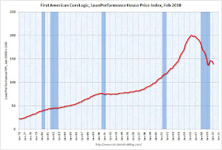 This graph shows the national LoanPerformance data since 1976. January 2000 = 100.
The index is up 0.3% over the last year and off 30.6% from the peak.
House prices are off 4.9% from the recent peak in August 2009 (although some of the decline is seasonal).
 This graph shows the nominal not seasonally adjusted Composite 10 and Composite 20 indices (the Composite 20 was started in January 2000).
The Composite 10 index is off 30.0% from the peak, and up slightly in February (SA).
The Composite 20 index is off 29.3% from the peak, and down slightly in February (SA).
 The next graph shows the price declines from the peak for each city included in S&P/Case-Shiller indices.
Prices decreased (SA) in 15 of the 20 Case-Shiller cities in February.
Prices in Las Vegas are off 55.7% from the peak, and prices in Dallas only off 6.0% from the peak.
The Census Bureau reported the homeownership and vacancy rates for Q1 2010 this morning.
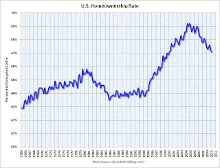 The homeownership rate declined to 67.1%. This is the lowest level since Q1 2000.
 Note: graph starts at 60% to better show the change.
The homeownership rate increased in the '90s and early '00s because of changes in demographics and "innovations" in mortgage lending. The increase due to demographics (older population) will probably stick, so I've been expecting the rate to decline to the 66% to 67% range - and not all the way back to 64% to 65%.
Best wishes to all.


