 RSS Feed
 by Calculated Risk on 4/23/2010 01:00:00 PM
Friday, April 23, 2010
Home Sales: Distressing Gap
First a comment on the seasonal adjustment ... on a Not Seasonally Adjusted (NSA) basis, the Census Bureau reported there were 38,000 new homes sold in March. That is up from 31,000 in March 2009.
Some (or all) of the increase was due to a one time event - the tax credit that expires in April. The Census Bureau doesn't know the number of homes sold due to the tax credit, so they report the Seasonally Adjusted Annual Rate (SAAR) assuming this is the underlying rate of sales. It isn't.
The April new home sales headline number will be distorted too, but the key is the actual underlying sales rate is much lower.
Note: remember the tax credit shows up in the new home sales numbers when the contract is signed (March and April), and in the existing home sales numbers when the transactions are closed (April through June).
The following graph shows existing home sales (left axis) and new home sales (right axis) through March. Click on graph for larger image in new window.
The initial gap was caused by the flood of distressed sales. This kept existing home sales elevated, and depressed new home sales since builders couldn't compete with the low prices of all the foreclosed properties.
The spike in existing home sales last year was due primarily to the first time homebuyer tax credit. Notice that there was also a bump last year in new home sales from the tax credit.
We are seeing another bump this year with the expiration of the extension of the tax credit.
The second graph shows the same information as a ratio - new home sales divided by existing home sales - through March 2010. The ratio increased because the tax credit impacts new home sales first. I suspect this ratio will be at or near the all time low later this year.
Eventually this ratio will return to the historical range of new home sales being around 15% to 20% of existing home sales. However it will probably take a number of years to return to a more normal market.
New Home Sales at 411K in March
by Calculated Risk on 4/23/2010 10:00:00 AM
The Census Bureau reports New Home Sales in March were at a seasonally adjusted annual rate (SAAR) of 411 thousand. This is an increase from the revised rate of 324 thousand in February (revised from 308 thousand). Click on graph for larger image in new window.
The first graph shows monthly new home sales (NSA - Not Seasonally Adjusted).
Note the Red columns for 2010. In March 2010, 38 thousand new homes were sold (NSA).
The record low for March was 31 thousand in 2009.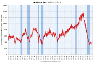 The second graph shows New Home Sales vs. recessions for the last 45 years.
Sales of new single-family houses in March 2010 were at a seasonally adjusted annual rate of 411,000 ... This is 26.9 percent (±21.1%) above the revised February rate of 324,000 and is 23.8 percent (±18.7%) above the March 2009 estimate of 332,000.And another long term graph - this one for New Home Months of Supply.
 Months of supply declined to 6.7 in March from 8.6 in February. This is significantly below the all time record of 12.4 months of supply set in January 2009, but still higher than normal.
The seasonally adjusted estimate of new houses for sale at the end of March was 228,000. This represents a supply of 6.7 months at the current sales rate.
 The final graph shows new home inventory.
 New home sales are counted when the contract is signed, so this pickup in activity is probably related to the tax credit. Note that that a few thousand extra sales NSA in March can make a huge difference in the SAAR.
Any further pickup in sales because of the tax credit will happen in April and then sales will probably decline again.
Greece Asks for Bailout
by Calculated Risk on 4/23/2010 08:32:00 AM
From Niki Kitsantonis and Matthew Saltmarsh at the NY Times: Greece Calls for Activation of Financial Rescue Package
Describing his country’s economy as “a sinking ship,” the Greek prime minister formally requested an international bailout on Friday ... The plan foresees up to €30 billion, or $40 billion, in loans from Greece’s euro-zone partners, as well as up to €15 billion from the International Monetary Fund.Not exactly a surprise ...
Late Night Greece Update
by Calculated Risk on 4/23/2010 01:36:00 AM
From the WSJ: Bonds Fall as Investors View Bailout and Default as Givens
The European Union's statistical authority said Thursday that Greece's 2009 budget deficit—already yawning—was wider than Athens had estimated. Also Thursday, Moody's Investors Service downgraded Greece's debt rating.And from The Times: Euro suffers as Greek credit rating takes another dive
Those twin developments sent Greek bond prices into a tailspin, a selloff that spread to bond markets in Portugal and Spain.
The euro skidded to its lowest level against the dollar in almost a year last night after Greece suffered another downgrade in its credit rating.The never ending saga ...
...
Sarah Carlson, Moody’s senior analyst for Greece, said: “It is unlikely that the rating will remain at A3, unless the Government’s actions can restore confidence in the markets and counteract the prevailing headwinds of high interest rates and low growth.
Thursday, April 22, 2010
Senate Panel: Rating Agencies Traded Fees for Ratings
by Calculated Risk on 4/22/2010 07:05:00 PM
From Kevin G. Hall and Chris Adams at McClatchy Newspapers:
Senate panel: Ratings agencies rolled over for Wall Street
A Senate panel investigating the causes of the nation's financial crisis on Thursday unveiled evidence that credit-ratings agencies knowingly gave inflated ratings to complex deals backed by shaky U.S. mortgages because of the fees they earned for giving such investment-grade ratings.I'm stunned but not surprised ...
S&P Concerned about Seasonal Adjustment for House Prices
by Calculated Risk on 4/22/2010 04:45:00 PM
From S&P: S&P Issues Statement, Publishes Research on Seasonally-Adjusted Home Price Index Data(PDF)
Economic data which are affected by the time of the year, or the seasons, are often adjusted to remove these effects to make it easier to identify underlying changes in the economy. Seasonal adjustment increases the unadjusted values in weak months and decreases the unadjusted values in strong months to eliminate regular seasonal patterns while leaving the underlying trend unaffected. For the S&P/Case-Shiller Home Price Indices, S&P reports two data sets – before seasonal adjustment and seasonally-adjusted. In some recent reports the two series have given conflicting signals, with the seasonally-adjusted series rising month-over-month and the unadjusted series declining. After reviewing the data, the S&P/Case-Shiller Home Price Index Committee believes that, for the present, the unadjusted series is a more reliable indicator and, thus, reports should focus on the year-over-year changes where seasonal shifts are not a factor. Additionally, if monthly changes are considered, the unadjusted series should be used.
 Click on graph for larger image in new window.
The Census X-12 program breaks down the unadjusted S&P/Case-Shiller Home Price index series into three components: trend, seasonal, and irregular. “Trend” represents the underlying trend in the data, “irregular” consists of changes with no apparent or regular pattern, and “seasonal” are the seasonal factors. Chart 2 shows the three series for the S&P/Case-Shiller Home Price 20-City Composite. The seasonal component shows the same regular pattern as on the first chart, and the trend shows the peak and subsequent drop in home prices. Beginning in January 2008, the irregular component became steadily larger. The increase in the size of the irregular component appears to be the cause of the increase in the seasonal factors ...Diana Olick mentioned this today: Even Good Housing Numbers Aren't Adding Up Right and the S&P note credits a recent note by David Rosenberg, chief economist at Gluskin Sheff. I first raised this issue in July 2009. The irregular components are just too large - and are apparently leading to a huge increase in the seasonal factors.
FHFA House Price Index Declines in February
by Calculated Risk on 4/22/2010 03:57:00 PM
The two house price indexes I usually use are from S&P Case-Shiller and First American Corelogic LoanPerformance (the one the Fed uses). The FHFA index is also a repeat sales index, but only includes GSE loans - and it has other issues too.
The LoanPerformance and Case-Shiller indexes for February will be released soon, but here is the FHFA index (and a graph of all three).
From Federal Housing Finance Agency (FHFA): U.S. Monthly House Price Index Declines 0.2 Percent from January to February
U.S. house prices fell 0.2 percent on a seasonally adjusted basis from January to February, according to the Federal Housing Finance Agency’s monthly House Price Index. The previously reported 0.6 percent decline in January was unchanged. For the 12 months ending in February, U.S. prices fell 3.4 percent. The U.S. index is 13.3 percent below its April 2007 peak.
The FHFA monthly index is calculated using purchase prices of houses backing mortgages that have been sold to or guaranteed by Fannie Mae or Freddie Mac.
 Click on graph for larger image in new window.
This graph shows the three indexes (note that LoanPeformance is NSA, Case-Shiller and FHFA are seasonally adjusted). FHFA is set to 100 in Jan 2000. The insert shows the movement of the three indexes since Jan 2008.
The FHFA index didn't match what we were seeing during the housing bubble, and I just wanted to point out why I focus on the other indexes now.
Hotel Occupancy increases 5.5% compared to same week in 2009
by Calculated Risk on 4/22/2010 01:15:00 PM
From HotelNewsNow.com: STR: Upper-upscale tops weekly numbers
Overall the U.S. industry’s occupancy increased 5.5 percent to 60.4 percent, ADR was up 1.4 percent to US$98.67, and RevPAR was up 7.0 percent to US$59.62.The following graph shows the occupancy rate for 2009 (the worst year since the Depression for hotel occupancy), 2010 and the median for 2000 through 2007.
 Click on graph for larger image in new window.
Notes: the scale doesn't start at zero, and holidays don't always line up.
The graph shows the distinct seasonal pattern for the occupancy rate; higher in the summer because of leisure/vacation travel, and lower on certain holidays.
The occupancy rate in 2010 has been ahead of 2009 for 8 of the last 9 weeks, and Average Daily Rate (ADR) is also up slightly. This is a little bit of good news for hotels, although the occupancy rate is still well below the normal level.
Data Source: Smith Travel Research, Courtesy of HotelNewsNow.com
More on Existing Home Sales and Inventory
by Calculated Risk on 4/22/2010 11:19:00 AM
Earlier the NAR released the existing home sales data for March; here are a couple more graphs ...
The first graph shows the year-over-year change in reported existing home inventory and months-of-supply. Click on graph for larger image in new window.
There was a rapid increase in inventory in the 2nd half of 2005 (that helped me call the peak of the bubble). Then the increase in inventory steadily slowed.
The YoY inventory has been decreasing for the last 20 months. However the YoY decline is getting smaller - only 1.8% in March.
This slow decline in the inventory is especially concerning with the large reported inventory and 8.0 months of supply in March - well above normal. Of course months of supply will decline over the next few months because of the increase in sales due to the tax credit, but this will be something to watch this summer and later this year. The second graph shows NSA monthly existing home sales for 2005 through 2010 (see Red columns for 2010).
Sales (NSA) in March 2010 were 19.6% higher than in March 2009, and also higher than in March 2008.
We will probably see an increase in sales in May and June - perhaps to the levels of 2006 or 2007 - because of the tax credit, however I expect to see existing home sales below last year in the 2nd half of this year.
Existing Home Sales increase in March
by Calculated Risk on 4/22/2010 10:00:00 AM
The NAR reports: Existing-Home Sales Rise
Existing-home sales, which are completed transactions that include single-family, townhomes, condominiums and co-ops, rose 6.8 percent to a seasonally adjusted annual rate of 5.35 million units in March from 5.01 million in February, and are 16.1 percent above the 4.61 million-unit level in March 2009.
...
Total housing inventory at the end of March rose 1.5 percent to 3.58 million existing homes available for sale, which represents an 8.0-month supply at the current sales pace, down from an 8.5-month supply in February.
 Click on graph for larger image in new window.
This graph shows existing home sales, on a Seasonally Adjusted Annual Rate (SAAR) basis since 1993.
Sales in March 2010 (5.35 million SAAR) were 6.8% higher than last month, and were 16.1% higher than March 2009 (4.61 million SAAR).
Sales surged last November when many first-time homebuyers rushed to beat the initial expiration of the tax credit. There will probably be another increase in May and June this year, although that will be probably be smaller than the November increase. Note: existing home sales are counted at closing, so even though contracts must be signed in April to qualify for the tax credit, buyers have until June 30th to close.
 The second graph shows nationwide inventory for existing homes.
According to the NAR, inventory increased to 3.58 million in March from 3.53 million in February. The all time record high was 4.57 million homes for sale in July 2008.
Inventory is not seasonally adjusted and there is a clear seasonal pattern - inventory should increase further in the spring. This was the 20th consecutive month of reported year-over-year decline in inventory, but the decline was only 1.8% from March 2009.
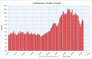 The last graph shows the 'months of supply' metric.
Months of supply decreased to 8.0 months in March.
A normal market has under 6 months of supply, so this is high - and probably excludes some substantial shadow inventory.
I'll have more later ...


