by Calculated Risk on 12/22/2009 02:16:00 PM
Tuesday, December 22, 2009
More on Falling House Prices
Yesterday I mentioned that the Fed's favorite house price index showed prices fell in October.
However most people follow the Case-Shiller index, and the October Case-Shiller house price index will not be released until next Tuesday. Although Case-Shiller is an average of three months, I think that index will probably show a price decline too.
The following graph shows the LoanPerformance index (with and without foreclosures) and the Case-Shiller Composite 20 index in real terms (all adjusted with CPI less Shelter). Click on graph for larger image in new window.
It is interesting to look at the sharp decline in the index with foreclosures at the end of 2008 - this was what housing economist Tom Lawler described as "destickification" in the high foreclosure areas.
Notice the LoanPerformance price index without foreclosures (in red) is now at the lowest level since September 2002 in real terms (inflation adjusted).
This isn't like 2005 when prices were way out of the normal range by most measures - and it is possible that total prices have bottomed (although I think prices will fall further), but prices ex-foreclosures probably still have a ways to go - even with all the government programs aimed at supporting house prices.
Philly Fed State Coincident Indicators Show Improvement
by Calculated Risk on 12/22/2009 11:59:00 AM
Here is a little more positive data ... Click on map for larger image.
Here is a map of the three month change in the Philly Fed state coincident indicators. Twenty five states are showing declining three month activity. The index increased in 20 states, and was unchanged in 5.
Here is the Philadelphia Fed state coincident index release for November.
In the past month, the indexes increased in 26 states, decreased in 16, and remained unchanged in eight (Colorado, Idaho, Indiana, Louisiana, New Jersey, Oklahoma, Oregon, and Utah) for a one-month diffusion index of 20. Over the past three months, the indexes increased in 20 states, decreased in 25, and remained unchanged in five (California, Iowa, New Mexico, Pennsylvania, and Rhode Island) for a three-month diffusion index of -10.
 The second graph is of the monthly Philly Fed data of the number of states with one month increasing activity. Based on this indicator, most of the U.S. was in recession from about December 2007 through October 2009 - although the graph shows the recession ending in July 2009 (based on other data).
Note: this graph includes states with minor increases (the Philly Fed lists as unchanged).
A majority of states were showing increasing activity in November for the first time since the beginning of the recession.
More on Existing Home Sales
by Calculated Risk on 12/22/2009 10:54:00 AM
Earlier the NAR released the existing home sales data for November; here are a couple more graphs ... and a few comments.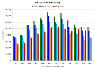 Click on graph for larger image in new window.
This graph shows NSA monthly existing home sales for 2005 through 2009 (see Red columns for 2009).
Sales (NSA) in November were much higher than in November 2007 and 2008, and were at the same level as November 2006.
Of course - as I noted earlier - many of these transactions in November were due to first-time homebuyers rushing to beat the expiration of the tax credit (that has now been extended).
Note: Existing home sales play an important role in the economy because they allow people to move for new job opportunies, or to move to larger or smaller homes for various reasons. It is the reason that people move that contributes to the economy; churning homes does nothing except generate some fees and commissions. Nothing has been added to the housing stock or the wealth of the nation.
The way to think of existing home sales is as grease for the economy. Once you have enough - probably around 4.5 to 5.0 million units per year - any extra is just a waste.
What matters for the economy are new home sales, housing starts and residential investment. And there has been little improvement in these key indicators - and there will not be any until the huge overhang of excess inventory is reduced.
This really shows up on the following graph: 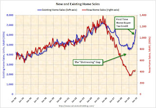 This graph shows existing home sales (left axis) through November, and new home sales (right axis) through October.
The initial gap was caused by the flood of distressed sales. This kept existing home sales elevated, and depressed new home sales since builders couldn't compete with the low prices of all the foreclosed properties.
The recent spike in existing home sales was due primarily to the first time homebuyer tax credit.
A few more comments:
Existing Home Sales up Sharply in November
by Calculated Risk on 12/22/2009 10:00:00 AM
The NAR reports: Another Big Gain in Existing-Home Sales as Buyers Respond to Tax Credit
Existing-home sales – including single-family, townhomes, condominiums and co-ops – rose 7.4 percent to a seasonally adjusted annual rate of 6.54 million units in November from 6.09 million in October, and are 44.1 percent higher than the 4.54 million-unit pace in November 2008. Current sales remain at the highest level since February 2007 when they hit 6.55 million.
...
Total housing inventory at the end of November declined 1.3 percent to 3.52 million existing homes available for sale, which represents a 6.5-month supply at the current sales pace, down from an 7.0-month supply in October.
 Click on graph for larger image in new window.
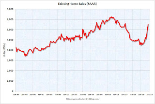
This graph shows existing home sales, on a Seasonally Adjusted Annual Rate (SAAR) basis since 1993.
Sales in Nov 2009 (6.54 million SAAR) were 7.4% higher than last month, and were 44% higher than Nov 2008 (4.54 million SAAR).
Of course many of the transactions in November were due to first-time homebuyers rushing to beat the initial expiration of the tax credit (that has now been extended). This has pushed sales far above the historical normal level; based on normal turnover, existing home sales would be in the 4.5 to 5.0 million SAAR range.
 The second graph shows nationwide inventory for existing homes. According to the NAR, inventory decreased to 3.52 million in November from 3.57 million in October. The all time record was 4.57 million homes for sale in July 2008. This is not seasonally adjusted.
Typically inventory peaks in July or August, so this decline is mostly seasonal.
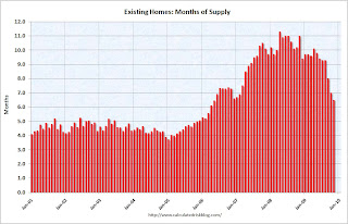 The third graph shows the 'months of supply' metric for the last six years.
Months of supply declined to 6.5 months in November.
A normal market has under 6 months of supply, so this is still high - and especially considering sales were artificially boosted by the tax credit. I'll have more soon ...
Q3 GDP Revised Down to 2.2%
by Calculated Risk on 12/22/2009 08:28:00 AM
Real gross domestic product -- the output of goods and services produced by labor and property located in the United States -- increased at an annual rate of 2.2 percent in the third quarter of 2009 ...GDP was revised down from the advance estimated of 3.5% to the preliminary estimate of 2.8%, and now to 2.2%.
Personal consumption expenditures (PCE) were revised down to 2.8% from 2.9%.
And investment in nonresidential structures was revised down to -18.4% from -15.1% (aka falling off a cliff).
Monday, December 21, 2009
House Price Indices: Case-Shiller and LoanPerformance
by Calculated Risk on 12/21/2009 10:51:00 PM
Earlier today I mentioned that the Fed started using First American CoreLogic's LoanPerformance House Price Index last year for the Flow of Funds report.
And also that LoanPerformance announced today that house prices fell 0.7% in October.
Since most people have been following Case-Shiller, here is a graph of the LoanPerformance index (with and without foreclosures) and the Case-Shiller Composite 20 index. Click on graph for larger image in new window.
This graph shows the three indices with January 2000 = 100.
The indices mostly move together over time. Notice how the total LoanPerformance index fell further than the index excluding foreclosures - and also rebounded more.
The Case-Shiller index will probably show a decline in October - although Case-Shiller is an average of three months, so it might be a small decrease. The question is how much further will prices fall?
TARP Deadbeat List Grows to 55
by Calculated Risk on 12/21/2009 07:31:00 PM
From the WaPo: Number of delinquent bailed-out banks rises
A growing number of the recipients face financial problems and have been unable to pay the government. Fifteen banks failed to make the required payments in May, federal data show. The number climbed to 33 banks in August, and 55 banks that failed to make the dividend payments due Nov. 17.Here is the report from the Treasury.
And in excel format under Dividend and Interest Reports.
There are three permanent deadbeats on the list: CIT Group (filed bankruptcy and wiped out its $2.3 billion in TARP debt), UCBH Holdings Inc. was seized by the FDIC (TARP lost $298.7 million), and Pacific Coast National Bank was also seized by the FDIC (TARP lost $4.1 million).
Remember when the TARP capital was supposed to only go to "healthy" financial institutions?
LoanPerformance: House Prices Fall 0.7% in October
by Calculated Risk on 12/21/2009 04:53:00 PM
The Fed's favorite house price indicator from First American CoreLogic’s LoanPerformance ...
From LoanPerformance: Annual Home Prices Continue to Depreciate
On a month-over-month basis ... national home prices declined by -0.7 percent in October 2009 compared to September 2009.Prices are now falling again. It might take a month or two for this to show up in the Case-Shiller index because it is an average over three months.
...
"We are continuing to see improvements in the year-over-year home price change as prices have remained relatively stable since April," said Mark Fleming, chief economist for First American CoreLogic. "The crutches of government support for the housing market have stimulated demand and restricted supply in 2009. How these government supports are removed in 2010 will be critical to the continued stability of the housing market."
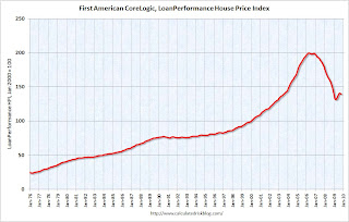 Click on graph for larger image in new window.
 This graph shows the national LoanPerformance data since 1976. January 2000 = 100.
The index is off 7.9% over the last year, and off 30.1% from the peak.
The index has declined for two consecutive months (-0.16% in September and -0.68% in October). I'll have some comparisons to Case-Shiller later, but it appears house prices are now falling again.
More on Temporary Help
by Calculated Risk on 12/21/2009 02:43:00 PM
First a chart that is being circulated by some of the more optimistic forecasters: Click on graph for larger image.
This chart compares the monthly change in temporary help services (shifted 4 months into the future) and the monthly change in total employment. Sure enough temporary help tends to lead total employment.
Note: chart uses three month average change. Source: BLS.
A number of analysts are now forecasting a surge in employment in early 2010 partially based on this chart.
This surge in temporary help is following the usual pattern as Louis Uchitelle notes in the NY Times: Labor Data Show Surge in Hiring of Temp Workers
The hiring of temporary workers has surged, suggesting that the nation’s employers might soon take the next step, bringing on permanent workers, if they can just convince themselves that the upturn in the economy will be sustained.And that is the real question: what comes next.
...
"When a job comes open now, our members fill it with a temp, or they extend a part-timer’s hours, or they bring in a freelancer — and then they wait to see what will happen next,” said William J. Dennis Jr., director of research for the National Federation of Independent Business.
I've been forecasting a strong second half for GDP since late Spring, so I'm not surprised about the pickup in Q3 and Q4 GDP. This increase in GDP has been driven by the stimulus spending, some inventory restocking, and some export growth.
But my concern is about 2010.
And this is the concern of the hiring managers mentioned in the article:
If this restocking of shelves and warehouses were to stop or slow next year, a possibility that concerns Mr. Littlefield and Ms. Baker, then the temps, freelancers and contract workers they and many other employers now use would have a harder time moving from casual to regular employment.If the recovery stalls or even slows - as I expect - then employment will not pick up sharply.
For more, including some cautionary comments from a BLS economist on using temporary help, see Tom Abate's article in the San Francisco Chronicle. And for a graph of temporary help vs. the unemployment rate, see my earlier post on Temporary Help.
Moody's: CRE Prices Off 1.5% in October
by Calculated Risk on 12/21/2009 12:23:00 PM
From Bloomberg: U.S. Commercial Real Estate Index Falls 1.5%
The Moody’s/REAL Commercial Property Price Indices fell 1.5 percent in October from September, according to data compiled by Bloomberg. Prices fell 36 percent from a year ago and are 44 percent below the peak in October 2007.Here is a comparison of the Moodys/REAL Commercial Property Price Index (CPPI) and the Case-Shiller composite 20 index.
Notes: Beware of the "Real" in the title - this index is not inflation adjusted. Moody's CRE price index is a repeat sales index like Case-Shiller - but there are far fewer commercial sales - and that can impact prices.
 Click on graph for larger image in new window.
CRE prices only go back to December 2000.
The Case-Shiller Composite 20 residential index is in blue (with Dec 2000 set to 1.0 to line up the indexes).
CRE prices peaked in late 2007 and have fallen 44% from the peak and are now back to September 2002 levels. The pace of the price declines has slowed.
Notices that CRE trails residential (this is usually true for activity, but also for prices here), and that CRE prices fall quicker than residential (residential prices tend to be sticky).


