by Calculated Risk on 8/07/2009 04:22:00 PM
Friday, August 07, 2009
Freddie Mac: House Price Improvement "Largely Seasonal"
Freddie Mac Press Release:
Freddie Mac had a positive net worth of $8.2 billion at June 30, 2009. As a result, no additional funding was required from Treasury under the terms of the Senior Preferred Stock Purchase Agreement (Purchase Agreement) for the second quarter.No mention of the amount of nonperforming loans.
...
Provision for credit losses was $5.2 billion for the second quarter of 2009, compared to $8.8 billion for the first quarter of 2009. The decrease was driven by a reduced rate of growth in the company's loan loss reserve due to the recent modest national home price improvements, which the company believes to be largely seasonal.
emphasis added
Consumer Credit Declines in June
by Calculated Risk on 8/07/2009 03:30:00 PM
From MarketWatch: June consumer credit down for 5th straight month
U.S. consumers reduced their debt in June for the fifth consecutive month, the Federal Reserve reported Friday. Total seasonally adjusted consumer debt fell $10.29 billion, or at a 4.9% annual rate, in June to $2.502 trillion. Consumer credit fell in eight of the past nine months.
 Click on graph for larger image in new window.
This graph shows the year-over-year (YoY) change in consumer credit. Consumer credit is off 2.8% over the last 12 months. The record YoY decline was 1.9% in 1991 - and that record has been shattered.
Note: Consumer credit does not include real estate debt.
Colonial BancGroup SEC Filing: Target of Criminal Investigation, Possible FDIC Seizure
by Calculated Risk on 8/07/2009 01:26:00 PM
From a SEC 8-K filed this morning:
On August 6, 2009, The Colonial BancGroup, Inc. (the Company or BancGroup) was informed by the U.S. Department of Justice that it is the target of a federal criminal investigation relating to the Company’s mortgage warehouse lending division and related alleged accounting irregularities. The Company has been informed that the alleged accounting irregularities relate to more than one year’s audited financial statements and regulatory financial reporting, and the Company’s Board of Directors and Audit Committee are making every effort to determine the impact of these alleged accounting irregularities on the Company’s financial statements and regulatory financial reporting. The Company intends to cooperate with the investigation.Here is the press release.
Earlier in 2009, BancGroup provided documents to the Special Inspector General for the Troubled Asset Relief Program (SIGTARP) in response to a subpoena issued by SIGTARP.
Also, the SEC has issued subpoenas to BancGroup seeking documents related to, among other things, BancGroup’s disclosures related to its participation in the U.S. Treasury Department’s Troubled Asset Relief Program and BancGroup’s disclosures respecting accounting for loan loss reserves. BancGroup has provided, and continues to provide, documents in response to these subpoenas.
On August 5, 2009, the Alabama State Banking Department provided notice to Colonial Bank that the Alabama State Banking Board will meet on August 12, 2009, at which time Colonial Bank will be asked to consent to the Superintendent’s exercise of his statutory authority to appoint the FDIC as receiver or conservator for the Bank if and when the Superintendent deems such appointment to be necessary. In the meantime, the Company continues to explore all possible capital-raising alternatives that would position it and Colonial Bank to comply with the requirements of the Orders to Cease and Desist to which they are subject.
emphasis added
Employment-Population Ratio, Part Time Workers, Average Workweek
by Calculated Risk on 8/07/2009 11:20:00 AM
Note: Several analysts follow the average workweek series to look for the end of a recession. The idea is that companies will increase the work week before they start hiring, so the average weekly hours might increase as a recession ends. The small increase in July will be viewed as a possible indicator. Other employment measures that are used to judge the end of a recession are the four-week moving average of initial unemployment claims (has fallen significantly) and the diffusion index (previous post).
A few more graphs based on the (un)employment report ...
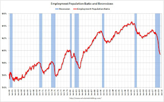
Employment-Population Ratio Click on graph for larger image in new window.
This graph show the employment-population ratio; this is the ratio of employed Americans to the adult population.
Note: the graph doesn't start at zero to better show the change.
The general upward trend from the early '60s was mostly due to women entering the workforce. As an example, in 1964 women were about 32% of the workforce, today the percentage is close to 50%.
This measure fell slightly in July to 59.4%, the lowest level since the early '80s. This also shows the weak recovery following the 2001 recession - and the current cliff diving!
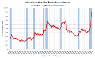
Part Time for Economic Reasons
From the BLS report:
The number of persons working part time for economic reasons (sometimes referred to as involuntary part-time workers) was little changed in July at 8.8 million. The number of such workers rose sharply in the fall and winter but has been little changed for 4 consecutive months.Note: "This category includes persons who would like to work full time but were working part time because their hours had been cut back or because they were unable to find full-time jobs."
 The number of workers only able to find part time jobs (or have had their hours cut for economic reasons) is at 8.8 million. This is slightly below the peak of 9.1 million in May.
Note: the U.S. population is significantly larger today (about 305 million) than in the early '80s (about 228 million) when the number of part time workers almost reached 7 million. That is the equivalent of about 9.3 million today, so population adjusted this wasn't quite a record.
Average Weekly Hours
From the BLS report:
In July, the average workweek of production and nonsupervisory workers on private nonfarm payrolls edged up by 0.1 hour to 33.1 hours. The manufacturing workweek increased by 0.3 hour to 39.8 hours. Factory overtime was unchanged at 2.9 hours.
 The average weekly hours has been declining since the early '60s, but usually falls faster during a recession. Average weekly hours in June was at the lowest level since the series began in 1964, and the uptick in July was very small.
Note: the graph doesn't start at zero to better show the change.
Earlier employment posts today:
Unemployment: Stress Tests, Unemployed over 26 Weeks, Diffusion Index
by Calculated Risk on 8/07/2009 09:06:00 AM
Note: earlier Employment post: Employment Report: 247K Jobs Lost, 9.4% Unemployment Rate . The earlier post includes a comparison to previous recessions.
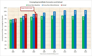
Stress Test Scenarios Click on graph for larger image in new window.
This graph shows the unemployment rate compared to the stress test economic scenarios on a quarterly basis as provided by the regulators to the banks (no link).
This is a quarterly forecast: the Unemployment Rate for Q3 just includes July, and will probably move higher. Once again, the unemployment rate is already higher than the "more adverse" scenario.
Note also that the unemployment rate has already exceeded the peak of the "baseline scenario".
Unemployed over 26 Weeks
The DOL report yesterday showed seasonally adjusted insured unemployment at 6.3 million, down from a peak of about 6.9 million. This raises the question of how many unemployed workers have exhausted their regular unemployment benefits (Note: most are still receiving extended benefits, although this is about to change).
The monthly BLS report provides data on workers unemployed for 27 or more weeks, and here is a graph ... The blue line is the number of workers unemployed for 27 weeks or more. The red line is the same data as a percent of the civilian workforce.
According to the BLS, there are almost 5.0 million workers who have been unemployed for more than 26 weeks (and still want a job). This is 3.2% of the civilian workforce.
Notice the peak happens after a recession ends, and the of long term unemployed peaked about 18 months after the end of the last two recessions (because of the jobless recovery). This suggests that even if the current recession officially ended this month, the number of long term unemployed would probably continue to rise through the end of 2010.
Diffusion Index
Here is a look at how "widespread" the job losses are using the employment diffusion index from the BLS.
In July, job losses continued in many of the major industry sectors.
BLS, July Employment Report
 The BLS diffusion index is a measure of how widespread changes in employment are. Some people think it measures the percent of industries increasing employment, but that isn't quite correct.
From the BLS handbook:
The diffusion indexes for private nonfarm payroll employment are based on estimates for 278 industries, while the manufacturing indexes are based on estimates for 84 industries. Each component series is assigned a value of 0, 50, or 100 percent, depending on whether its employment showed a decrease, no change, or an increase over a given period. The average (mean) value is then calculated, and this percent is the diffusion index number.Think of this as a measure of how widespread the job losses are across industries. The further from 50 (above or below), the more widespread the job losses or gains reported by the BLS.
Before last Summer, the all industries employment diffusion index was in the 40s, suggesting that job losses were limited to a few industries. However starting in September the diffusion index plummeted. In March, the index hit 19.6, suggesting job losses were very widespread. The index has recovered since then to 30.1 in July, suggesting job losses are not as widespread across industries as in March - but losses continue in many industries.
The manufacturing diffusion index fell even further, from 40 in May 2008 to just 6 in January 2009. The manufacturing index has rebounded to 22.3 in July, indicating some improvement, but still widespread job losses across manufacturing industries.
Employment Report: 247K Jobs Lost, 9.4% Unemployment Rate
by Calculated Risk on 8/07/2009 08:30:00 AM
From the BLS:
Nonfarm payroll employment continued to decline in July (-247,000), and the unemployment rate was little changed at 9.4 percent, the U.S. Bureau of Labor Statistics reported today. The average monthly job loss for May through July (-331,000) was about half the average decline for November through April (-645,000). In July, job losses continued in many of the major industry sectors.
 Click on graph for larger image.
This graph shows the unemployment rate and the year over year change in employment vs. recessions.
Nonfarm payrolls decreased by 247,000 in July. The economy has lost almost 5.7 million jobs over the last year, and 6.66 million jobs during the 19 consecutive months of job losses.
The unemployment rate declined slightly to 9.4 percent.
Year over year employment is strongly negative.
 The second graph shows the job losses from the start of the employment recession, in percentage terms (as opposed to the number of jobs lost).
For the current recession, employment peaked in December 2007, and this recession was a slow starter (in terms of job losses and declines in GDP).
However job losses have really picked up over the last year, and the current recession is now the 2nd worst recession since WWII in percentage terms (and the 1948 recession recovered very quickly) - and also in terms of the unemployment rate (only early '80s recession was worse).
With fewer job losses ("only" a rate of 3 million job losses per year), and the dip in unemployment rate, this will be consider an improvement. It is still a weak employment report. Much more to come ...
Thursday, August 06, 2009
Google Maps Shows Foreclosure Status
by Calculated Risk on 8/06/2009 08:58:00 PM
Note: some of the data appears out of date - but if the data was updated regularly this would be a useful tool.
Healdsburg Housing Bubble directs me to a Google maps feature that shows houses in various states of distress.
The distress ranges from delinquent payments, to homes that will be auctioned off, to REOs. It appears that Google uses several vendors for the data, and some of the vendors charge for more information.
Here is a look at a section of New York and New Jersey. Click on the red dots for more info (some data is free depending on the vendor). Use the map here, or click on View larger map and enter your own zip code.
View Larger Map
Fannie Mae: $14.8 Billion Loss, Requests $10.7 Billion from Treasury
by Calculated Risk on 8/06/2009 06:03:00 PM
Fannie Mae Press Release: Loss of $14.8 Billion Driven by Credit-Related Expenses
Fannie Mae (FNM/NYSE) reported a loss of $14.8 billion, ... in the second quarter of 2009, compared with a loss of $23.2 billion, ... in the first quarter of 2009. Second-quarter results were driven primarily by $18.8 billion of credit-related expenses, reflecting the ongoing impact of adverse conditions in the housing market, as well as the economic recession and rising unemployment. Credit-related expenses were partially offset by fair value gains. The company also reported a substantial decrease in impairment losses on investment securities, which was due in part to the adoption of new accounting guidance.Fannie Mae has reserved seating at the confessional. NPLs of $171.0 billion. Wow.
Taking into account unrealized gains on available-for-sale securities during the second quarter and an adjustment to our deferred tax assets due to the new accounting guidance, the loss resulted in a net worth deficit of $10.6 billion as of June 30, 2009. As a result, on August 6, 2009, the Director of the Federal Housing Finance Agency (FHFA), which has been acting as our conservator since September 6, 2008, submitted a request for $10.7 billion from the U.S. Department of the Treasury on our behalf under the terms of the senior preferred stock purchase agreement between Fannie Mae and the Treasury in order to eliminate our net worth deficit. FHFA has requested that Treasury provide the funds on or prior to September 30, 2009.
...
Credit-related expenses, which are the total provision for credit losses plus foreclosed property expense, were $18.8 billion, compared with $20.9 billion in the first quarter of 2009. Our provision for credit losses was $18.2 billion, compared with $20.3 billion in the first quarter of 2009. The reduction in the provision for credit losses in the second quarter was attributable to a slower rate of increase in both our estimated default rate and average loss severity, or average initial charge-off per default, as compared with the first quarter. Our provision exceeded net charge-offs of $4.8 billion by $13.4 billion, as we continued to build our combined loss reserves, which represent our current estimate of probable losses inherent in our guaranty book of business as of June 30, 2009.
Combined loss reserves were $55.1 billion on June 30, 2009, up from $41.7 billion on March 31, 2009, and $24.8 billion on December 31, 2008. ...
We are experiencing increases in delinquency and default rates for our entire guaranty book of business, including on loans with fewer risk layers. Risk layering is the combination of risk characteristics that could increase the likelihood of default, such as higher loan-to-value ratios, lower FICO credit scores, higher debt-to-income ratios and adjustable-rate mortgages. This general deterioration in our guaranty book of business is a result of the stress on a broader segment of borrowers due to the rise in unemployment and the decline in home prices. Certain states, higher risk loan categories and our 2006 and 2007 loan vintages continue to account for a disproportionate share of our foreclosures and chargeoffs.
Total nonperforming loans in our guaranty book of business were $171.0 billion on June 30, 2009, compared with $144.9 billion on March 31, 2009, and $119.2 billion on December 31, 2008. The carrying value of our foreclosed properties was $6.2 billion, compared with $6.4 billion on March 31, 2009, and $6.6 billion on December 31, 2008.
emphasis added
Residential Investment Components in Q2
by Calculated Risk on 8/06/2009 03:50:00 PM
More from the supplemental GDP tables released yesterday ...
Residential investment (RI), according to the Bureau of Economic Analysis (BEA), includes new single family structures, multifamily structures, home improvement, broker's commissions, and a few minor categories.
Back in Q4 2008 - for the first time ever - investment in home improvements exceeded investment in new single family structures. This has continued through Q2 2009. Click on graph for larger image in new window.
This graph shows the various components of RI as a percent of GDP for the last 50 years. The most important components are investment in single family structures followed by home improvement.
Investment in home improvement was at a $153.3 billion Seasonally Adjusted Annual Rate (SAAR) in Q2, significantly above investment in single family structures of $92.8 billion (SAAR).
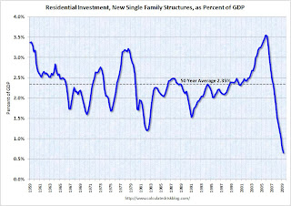
Let's take a closer look at these two key components of RI: As everyone knows, investment in single family structures has fallen off a cliff. This is the component of RI that gets all the media attention - although usually from stories about single family starts and new home sales.
Currently investment in single family structures is at 0.66% of GDP, significantly below the average of the last 50 years of 2.35% - and almost half of the previous record low in 1982 of 1.20%.
And on home improvement: The third graph shows home improvement investment as a percent of GDP.
Home improvement is at 1.08% of GDP, well off the high of 1.31% in Q4 2005 - but just back to the average of the last 50 years of 1.07%.
This would seem to suggest there remains downside risk to home improvement spending. Home Depot and Lowes announce results in the middle of August, and this might be something to watch.
NOTE: Home improvement is a rough estimate by the BEA - and could be lower. Also, there could be changes in spending patterns leading to a higher percentage of GDP on home improvement.
Foreclosures: One Giant Wave, Still Building
by Calculated Risk on 8/06/2009 12:59:00 PM
Note: Graph is for Orange County only.
From Matt Padilla at the O.C. Register: Foreclosure wave gathers momentum
“To say there is a second wave implies the (current) wave has receded,” [Sam Khater, senior economist, First American CoreLogic] “I don’t see that the wave has receded.”
 Click on graph for larger image in new window.
This graph is from Matt based on data from American CoreLogic.
Khater said ... federal and state efforts have mostly delayed foreclosures, preventing few. ... So to tune out the noise, just look at the 90-day rate. In Khater’s view it shows “one giant wave.”UPDATE: Matt provided me with the definitions:
90 day delinquency rate: "everything 3 months late or more. Likely includes most all Foreclosures in Process. The categories are not separate."
Foreclosure Rate is actual foreclosures in process: "Everything with NOD and Trustee's Sale filing."
REO Rate: "Everything foreclosed but still held by bank or servicer. This category is separate from other two."


