 RSS Feed
 by Calculated Risk on 6/13/2005 12:04:00 AM
Monday, June 13, 2005
Trade Deficit, Housing and more
In today's post on Angry Bear, I looked at the impact of the strong Euro on the US trade deficit with the European Union: "The Euro and the Trade Deficit".
Also, Greg Ip has an excellent article on housing in the WSJ today: "What Happens If Real Estate Goes Bust". A couple of excerpts:
If housing prices do fall, what would it mean for the economy? "A housing bust would be worse [than the stock bust]," says Kenneth Rogoff, an economics professor at Harvard University and former chief economist at the International Monetary Fund.And these interesting statistics:
Homes are collateral for about $7.7 trillion in mortgage and home-equity debt, whereas total margin debt in investors' stock brokerage accounts is only $194 billion. For the same reason, a decline in housing prices would put more bank loans at risk; mortgages make up 40% of the assets of U.S. commercial banks, mortgage-backed securities another 16% and stocks less than 1%.UPDATE: Oops, I forgot the "more" in the title. That can wait for another post!
Best to all!
Sunday, June 12, 2005
UCLA Anderson Forecast: June 21, 2005
by Calculated Risk on 6/12/2005 01:20:00 AM
Just a headsup. Dr. Leamer will present his quarterly forecast on June 21st. It sounds like the housing bubble will be the main topic. The UCLA Anderson forecast is typically one of the most accurate.
I'm confident there will be substantial news coverage.
JUNE 2005 ECONOMIC OUTLOOK
What Goes Up Might Come Down
How Long Can This Hot Housing Market Last?
UCLA - Ackerman Grand Ballroom
Tuesday, June 21, 2005
7:00am - 11:30am
Overview
The current level of hype about real estate bears a worrisome resemblance to the dot.com bubble of the late nineties. Financial companies tout no-money-down interest-only loans as a way of extending speculators' purchasing power, and developers pitch new developments to buyers the way Wall Street analysts used to pitch new IPOs. According to the National Association of Realtors, over a third of total sales in 2004 were to families buying a second home--most for 'investment' purposes.
While housing activity levels are still high from a historical perspective, there are signs that the market is starting to slow. Appreciation rates and sales rates have peaked, and some markets have seen a rapid increase in inventory levels. The recent Fed warning regarding inflation has sent mortgage rates up.
How long can this market last? Are we in for a soft landing or a crash? Who is likely to be left holding the bag when the smoke clears? These are the questions --among many others--about the California and National housing markets that we will attempt to answer at the Conference.
Saturday, June 11, 2005
Housing: Starting to "Chill"?
by Calculated Risk on 6/11/2005 12:06:00 PM
From the Sacramento Bee: "More houses 'for sale' a sign of market chill?" A few excerpts:
The number of capital region homes on the market has risen to its highest level since November 2001, suggesting the market might be seeing the first signs of cooling.So inventories are climbing.
"Inventory is up because of the psychological effect of the media reporting on the 'bubble,' " said Jeff Culbertson, who heads Coldwell Banker's capital region operations, of the barrage of news on a possible price bubble in housing. "Some of those people (investors) bought those properties two years ago and have seen a 50 percent increase in value. A lot of them are saying, 'I rode this up, and maybe I'll relocate my equity someplace else now.' "And from Analyst Pat Veling, president of Real Data Strategies Inc. on inventories:
"I'm surprised it's happening in the (prime) home buying and selling season, but we need to cool the market's jets a bit because it's going far too far, and far too fast, and we don't want the market to collapse under its own weight like it did in the early 1990s."But this could just be a one month anomaly.
Last fall the number of homes for sale in some Southern California markets shot up as sales dropped, causing some to conclude a downturn had begun. Since then, sales have picked up and inventory remains relatively low amid rising prices.So it is too early to tell. But this quote is funny:
"It's too early to panic, for sure," said housing analyst Greg Paquin, president of the Folsom-based Gregory Group.I hope Mr. Paquin lets us know when it is time to "panic"!
Trade Deficit Projection: A Review
by Calculated Risk on 6/11/2005 01:11:00 AM
This month I started to build a simple model to project the trade deficit. I didn't make as much progress as I had hoped, but the first two components (oil imports and China) were somewhat close.
First, I projected oil imports. And then I projected the trade deficit with China.
My model projected $19.3 B Not Seasonally Adjusted (NSA) in energy related petroleum product imports. The actual number was $18.94 B (see Exhibit 17). This is an error of just under 2%.
For the trade balance with China, my model projected a deficit of $15.1B. The actual number (see Exhibit 14) was $14.7B or an error of 2.7%.
Here are each of the components and how the model performed:
| ITEM | Projection | Actual | Error |
| US Exports to China | $3.4B | $3.4B | 0 |
| US Imports from China | $18.5B | $18.12B | 2.1% |
| US Trade Deficit: China | $15.1B | $14.7B | 2.7% |
| Oil: Contract Price BBL | $45.70 | $44.76 | 2.1% |
| Oil: BBLs Crude | 328.6M | 313.8M | 4.7% |
| Oil: Price Other BBL | $52.56 | $50.77 | 3.5% |
| Oil: BBLs Other | 82M | 96.5M | 15% |
| ERPP Total NSA | $19.3B | $18.94B | 1.9% |
UPDATE: I found an error in the oil model. I used 31 days for April to estimate the quantity of Crude. The actual Q(crude) should have been 318 million BBL, or an error of 1.3% (instead of 4.7%). The overall oil imports projection should have been $18.83B vs. actual of $18.94B. That is a dumb error!
I didn't have a good method for estimating "Other" energy related petroleum products. As I wrote: "The good news is that the larger percentage errors for "Other" are not very important for the overall ERPP."
There is much more to do!
Friday, June 10, 2005
Interest Only Loans across the US
by Calculated Risk on 6/10/2005 02:09:00 PM
MSNBC provides a table from LoanPerformance of interest only mortgages as a share of total mortgages for the 50 largest metro areas in 2004. Apparently many of these loans are both Interest Only (IO) and Adjustable Rate Mortgages (ARMs). As MSNBC cautioned:
"... borrowers may be able to buy a more expensive house than they might otherwise afford.MSNBC also quoted some recent data from BusinessWeek:
Trouble is, when borrowers do have to start making principal payments -- after anywhere from 2 years to 10 years -- the monthly payment could jump by up to 50%, or even more if the index for the adjustable rate rises as well."
BusinessWeek Online has also obtained new data from Fannie Mae and Freddie Mac that lend credence to the LoanPerformance numbers. They show that, in April, going by dollar volume, interest-only loans accounted for 35% of the adjustable-rate mortgages in securities sold by Fannie Mae and 39% of the adjustable-rate loans in securities sold by Freddie Mac. That represents a sharp increase for both giants, which buy mortgages from lenders and then repackage them as securities for sale to investors.Yesterday Kash looked at the percentage of ARMs and suggested that it appears
As recently as January, 2004, only 10% of adjustable-rate mortgages in securities sold by Fannie classified as interest-only.
"... people have decided to pay more for their house than they can afford with a fixed-rate mortgage."And he concluded that
"we shouldn't find it surprising if millions of recent home buyers soon find themselves unable to afford to live in their own houses."It is no surprise that a bubble state metro area like San Diego is at the top of the list. But, as a recent story noted, Georgia leads the nation in IOs. That seems unusual.
Interest-Only Loans Across the U.S. Metro Area Interest-Only Mortgages As Share of Total, 2004
San Diego 47.6%
Atlanta 45.5%
San Francisco 45.3%
Denver 43.4%
Oakland 43.1%
See table for next 45 metro areas: MSNBC article.
US Trade Deficit: $57 Billion for April
by Calculated Risk on 6/10/2005 02:23:00 AM
The U.S. Census Bureau and the U.S. Bureau of Economic Analysis released the monthly trade balance report today for April:
"... total April exports of $106.4 billion and imports of $163.4 billion resulted in a goods and services deficit of $57.0 billion, $3.4 billion more than the $53.6 billion in March, revised.Note: all numbers are seasonally adjusted.
April exports were $3.1 billion more than March exports of $103.4 billion.
April imports were $6.5 billion more than March imports of $156.9 billion."

Click on graph for larger image.
This graph shows the monthly trade balances for 2003, 2004 and 2005 and depicts the worsening year over year trade imbalance. The April trade deficit worsened as exports increased $3.1 Billion and imports increased $6.5 Billion.
The recent increase in oil prices had an impact on the April trade deficit. The average contract price for oil jumped from $41.14 in March to $44.76 in April. This is a new record for the import contract price, exceeding the old record of $41.79 set in October.
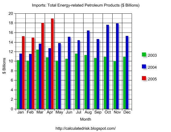
This graph shows total petroleum imports (NSA) per month for 2003, 2004 and the first four months of 2005. Petroleum imports were about 30% of the trade deficit or about 1.5% of GDP. Even without petroleum imports, the trade deficit would be close to 4% of GDP - a serious problem.
April is the 4th largest trade deficit ever. The trade deficit has been over $50 billion 11 times - the last 11 months in a row.
Thursday, June 09, 2005
America's Debt Binge
by Calculated Risk on 6/09/2005 08:22:00 PM
The Federal Reserve released their quarterly Flow of Funds report today for Q1 2005. The summary: America's debt binge continued.
Borrowing in the first quarter was at an all time high of $2.4 Trillion (annualized) for all sectors. That is double the quarterly borrowing of just 3 years ago.
The leading offenders by percentage debt growth (annualized): State and Local Governments at 16.2%, the Federal Government at 13.8% (2nd worst quarter in almost 20 years), and household home mortgages at 10.6% (down from 2004 levels).
The surprise is the surge in State and Local borrowing. The $271 Billion annualized rate of borrowing is almost double any quarter in the last few years.
With approximately $600 Billion in new debt in Q1 (reported as $2.4 Trillion annualized) and GDP growth of approximately $50B for Q1 (current dollars - see table 3) is the United States just buying growth with debt?
Wednesday, June 08, 2005
Housing Indicators
by Calculated Risk on 6/08/2005 09:12:00 PM
Here are a couple of sites I'm following to check the pulse of the housing market (still tachycardia!):
The Mortgage Banker's Association issues the results of a weekly survey on mortgage applications. The MBAA's seasonally adjusted Purchase Index (PI) is a guide to ongoing purchase loan applications.
Click on graph for larger image.
This is a graph of the PI for the first week of each month since January 2004. Clearly purchase activity has been very stable. The most recent release shows the PI at 479.3, a slight increase from the previous week.
The MBAA also provides a Composite Index (jumps around based on percentage of ReFis), a Refinancing Index and more. They also provide percentages on refinancing and adjusted rate mortgages. Interesting stuff.
The National Association of Home Builders (and Wells Fargo) provide a monthly House Market Index. This is new (UPDATE: tea points out this is not new, here is the historical data) and is based on surveys of home builders. The index currently shows steady interest in new homes.
Tuesday, June 07, 2005
Income Inequality vs. Growth
by Calculated Risk on 6/07/2005 08:55:00 PM
Dr. DeLong directs us to a letter from Greg Mankiw (former chairman of President Bush's Council of Economic Advisers) to the New York Times. In the letter, Mankiw concluded:
Here's the lesson: If policy makers' primary goal is to reduce income inequality, they should put the economy through the wringer. But if they want economic prosperity for all, they should avoid focusing on the politics of envy.Dr. DeLong provides two graphs showing that Dr. Mankiw is wrong. There is extensive research on this subject to support Dr. DeLong's position that the relationship between growth and income inequality is inconclusive. At the extreme, there is no question that income and wealth inequality lead to slower growth (I'll let the reader think about this). But the US is far from that extreme.
So this is primarily a normative question: What kind of society do we want? Do we want a more egalitarian society where two people of equal talent, drive and risk tolerance can achieve similar economic success? Or do we want a more hereditary society? That is the primary question.
Another question is the appropriate public policy with regards to income inequality. At the least we should do nothing. In fact, shouldn't all Americans agree with this statement (from Tax Law Professor Geier)?
"...the government should not be intervening through the tax system to make the gap between the very rich and everyone else actually greater than it otherwise is (in the absence of tax)."But, according to Professor Geier that is exactly what the current tax law does:
"The distribution of the tax burden worsens inequality because there is less income inequality before annual tax bills are paid than after they are paid."To be charitable to Mankiw: Maybe we now know why Mankiw was a champion of Bush's tax policy - he erroneously thought income inequality leads to faster growth.
UPDATE: Via Dr. DeLong: WSJ.com - As Rich-Poor Gap Widens in the U.S., Class Mobility Stalls EXCERPTS:
The promise that a child born in poverty isn't trapped there remains a staple of America's self-portrait....
Although Americans still think of their land as a place of exceptional opportunity... the evidence suggests otherwise....
'The U.S. and Britain appear to stand out as the least mobile societies among the rich countries studied,'
When the Bubble will Burst
by Calculated Risk on 6/07/2005 03:30:00 PM
In March 2003, physicists Didier Sornette (UCLA) and Wei-Xing Zhou (East China University of Science & Technology) correctly predicted that the UK housing bubble would "burst" in mid-2004. At that time they argued the US housing market was not yet a bubble.
This week the physicists released a new paper "Is There a Real-Estate Bubble in the US?". They now conclude that there is a bubble in the US, it is widespread, but that the turning point is still a year away:
"We conclude that the turning point of the bubble will probably occur around mid-2006."Their analysis looks for "positive feedbacks" that result in faster-than-exponential growth in prices. They divide states into three groups: 22 (including DC) existing bubble states (red), 8 new bubble states (purple) and 21 non-bubble states (green). The following map shows these states:

Click on map for larger image.
The paper includes several interesting graphs of price trajectories for bubble and non-bubble states. Maybe Dr. Polley is right about Peoria!


