 RSS Feed
 by Calculated Risk on 6/18/2021 02:50:00 PM
Friday, June 18, 2021
The Housing Conundrum
I've seen several housing booms and busts in my life. The biggest boom was the housing bubble in the mid-'00s, and the worst bust followed the bubble. Booms and bust have always been frequent in real estate.
My Spidey senses are tingling again, however it isn't obvious why this time - or what the outcome will be.
In general, demographics are very favorable for home buying. In Housing and Demographics: The Next Big Shift, I presented these graphs:
 Click on graph for larger image.
This graph shows the longer term trend for three key age groups: 20 to 29, 25 to 34, and 30 to 39 (the groups overlap).
This graph is from 1990 to 2060 (all data from BLS: current to 2060 is projected).
We can see the surge in the 20 to 29 age group last decade (red). Once this group exceeded the peak in earlier periods, there was an increase in apartment construction. This age group peaked in 2018 / 2019 (until the 2030s), and the 25 to 34 age group (orange, dashed) will peak around 2023.
For buying, the 30 to 39 age group (blue) is important (note: see Demographics and Behavior for some reasons for changing behavior). The population in this age group is increasing, and will increase further over this decade.
The current demographics are now very favorable for home buying - and will remain positive for most of the decade.
And on the supply side for demographics:
 This graph shows the longer term trend for two key age groups: 60 to 79, and 80+.
This graph is from 2010 to 2060 (all data from BLS: current to 2060 is projected).
The next big housing shift will be when the Baby Boom generation starts to downsize and move to retirement communities. No cohort is monolithic - some people will age-in-place until they pass away, others will move in with family (or family will move in with their parents), and some will move to retirement communities.
There is no magic age that people reach and start to transition, but looking at prior generations, it seems to start when people are around 80 years old.
The leading edge of the Baby Boom generation is currently 75 (born in 1946), and these people will be turning 80 in 2026.
The peak of the boomers will be turning 80 in 2035 or so, and the tail end turning 80 in 2044 (born in 1964).
My sense is there will be a pickup in Boomers selling their homes in the 2nd half of the 2020s and lasting until 2040 or so.
However, we also have to note that demographics have been dismal recently. Housing economist Tom Lawler send me a note yesterday that was a follow-up to his previous email Lawler: Update on the Dismal Demographics of 2020; "Smallest Population increase since 1918"
Provisional data from the CDC suggest that from April 1 of last year to April 1 of this year the so-called “natural” increase in the US population was barely positive. Provisional data show US births over the 12 month period ending March 2021 at 3.565 million, and US deaths over that period at 3.521 million.Another positive for the housing market is the near record low mortgage rates.
 This graph from MortgageNewsDaily shows the 30 year mortgage rate since 1971.
Currently 30 year rates are around 3.25%, up from around 2.75% last year, but still near record lows.
And lending standards have been fairly solid, although there has been some loosening in recent years - like increases in allowable DTI (debt-to-income ratio). Delinquencies are low (not counting loans in forbearance due to the pandemic).
And we haven't seen a huge increase in equity extraction, meaning that most homeowners have substantial equity in their homes (so even if prices decline, there won't be cascading price declines).
And housing inventory is near record lows. In Some thoughts on Housing Inventory, I outlined some of the reasons why inventory is so low.
With solid demographics, low mortgage rates, and record low inventory, it is no surprise that house prices are increasing rapidly.
 This graph below shows existing home months-of-supply (inverted, from the NAR) vs. the seasonally adjusted month-to-month price change in the Case-Shiller National Index (both since January 1999 through March 2021).
There is a clear relationship, and this is no surprise (but interesting to graph). If months-of-supply is high, prices decline. If months-of-supply is very low (like now), prices rise quickly.
In March, the months-of-supply was at 2.1 months, and the Case-Shiller National Index (SA) increased 1.5% month-over-month (a month-over-month record). The black arrow points to the March dot.
In the April existing home sales report released last month, the NAR reported months-of-supply increased to 2.4 month in April. There is a seasonal pattern to inventory, but this is still very low - and prices are increasing sharply.
In the April existing home sales report released last month, the NAR reported months-of-supply increased to 2.4 month in April. There is a seasonal pattern to inventory, but this is still very low - and prices are increasing sharply.
So why the concern?
 Here is a similar graph using the Case-Shiller National and Composite 20 House Price Indexes.
This graph shows the price to rent ratio (January 2000 = 1.0). This suggested prices were way too high during the housing bubble, and also suggests prices might be high now - but not as high as the housing bubble.
If we factor in low rates, demographics, and if low supply persists (I think inventory will increase this year), maybe prices are only a little out of line.
Here is another measure - house prices to the Median Household income.
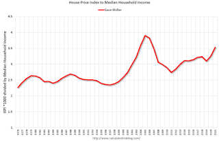 This graph uses the year end Case-Shiller house price index - and the nominal median household income through 2020 (from the Census Bureau). 2021 median income is estimated at a 5% gain.
This graph shows the ratio of house price indexes divided by the Median Household Income through 2021 (the HPI is first multiplied by 1000).
This uses the year end National Case-Shiller index since 1976 (2021 estimated).
House price appear elevated relative to incomes, but still well below the levels of the housing bubble.
In 2012, housing economist Tom Lawler dug through some data and calculated that real prices increased 0.83% per year (See: Lawler: On the upward trend in Real House Prices)
In my previous posts, I tracked the bottom of real prices over time. This graph shows the peaks over time (the trend lines are 0.83% and 1.1%).
 This graph shows there have been four surges in real prices since the early '70s. One in the late '70s, one in the late '80s, the housing bubble, and the current surge in prices.
It is important to note that nationally nominal house prices did not decline following the surges in the '70s and '80s. However, there were regional declines.
Since homeowners are concerned about nominal prices (not real prices), I wasn't concerned in December 2018, when Professor Shiller wrote in the NY Times: The Housing Boom Is Already Gigantic. How Long Can It Last?
Here were my comments on Shiller's article in 2018:
During the housing bubble, the difference between a slight upward slope in real prices (0.2% per year according to Shiller's index) and a slightly larger increase in real prices using other indexes (probably between 1% and 1.5% per year) didn't make any difference; there was obviously a huge bubble in house prices. But when comparing price "booms" over time, there is a huge difference.
If we use 1.5% per year for real price increases, the current "boom" in prices would be the fourth largest since the 1970s (and only about half the size of the late '70s and late '80s price boom), and if we use a 1.0% real increase, the current "boom" is on the same order as the late '70s and '80s price booms.
No big deal, and definitely not a "gigantic" boom in house prices.
Since I wrote that post in 2018, house prices have increased 19% nationally (from November 2018 to March 2021) according to the Case-Shiller index. Prices in Phoenix are up 31%, and in Seattle and San Diego, up about 26% since that Shiller article was written.
And prices are still increasing quickly.
Now, I'd argue house prices are too high based on historical fundamentals. I wouldn't call this a "bubble" because of the lack of both speculation and loose lending (see: Is there a New Housing Bubble?). But I am concerned about house prices.
Now, I'd argue house prices are too high based on historical fundamentals. I wouldn't call this a "bubble" because of the lack of both speculation and loose lending (see: Is there a New Housing Bubble?). But I am concerned about house prices.
And there doesn't appear to be any end in sight to the sharp increases in house prices. Goldman Sachs economists' model is projecting double digit price gain in 2021 and 2022:
Strong demand for housing looks sustainable. Even before the pandemic, demographic tailwinds and historically-low mortgage rates had pushed demand to high levels. ... consumer surveys indicate that household buying intentions are now the highest in 20 years. ... mortgage lending standards have remained fairly tight. With demographic trends still strong, mortgage rates very low, housing affordability still high, and household wealth as a share of income at the highest level in US history, demand should remain strong.The recent price increases make sense from a supply and demand perspective, but prices do seem too high. And I suppose the frenzy is bothering me.
The supply picture offers no quick fixes to the shortage of available homes ... The resulting picture is one of a persistent supply-demand imbalance in the years ahead. ... [Our] model suggests that rising prices will only gradually reduce affordability enough to dampen demand and mitigate the supply-demand imbalance. As a result, the model projects double-digit price gains both this year and next.


