 RSS Feed
 by Calculated Risk on 4/30/2021 04:27:00 PM
Friday, April 30, 2021
Fannie Mae: Mortgage Serious Delinquency Rate Decreased in March
Fannie Mae reported that the Single-Family Serious Delinquency decreased to 2.58% in March, from 2.76% in February. The serious delinquency rate is up from 0.66% in March 2020.
These are mortgage loans that are "three monthly payments or more past due or in foreclosure".
The Fannie Mae serious delinquency rate peaked in February 2010 at 5.59% following the housing bubble, and peaked at 3.32% in August 2020 during the pandemic.
 Click on graph for larger image
By vintage, for loans made in 2004 or earlier (2% of portfolio), 5.66% are seriously delinquent (down from 5.90% in February). For loans made in 2005 through 2008 (2% of portfolio), 9.65% are seriously delinquent (down from 10.01%), For recent loans, originated in 2009 through 2021 (96% of portfolio), 2.13% are seriously delinquent (down from 2.29%). So Fannie is still working through a few poor performing loans from the bubble years.
Mortgages in forbearance are counted as delinquent in this monthly report, but they will not be reported to the credit bureaus.
This is very different from the increase in delinquencies following the housing bubble. Lending standards have been fairly solid over the last decade, and most of these homeowners have equity in their homes - and they will be able to restructure their loans once they are employed.
Note: Freddie Mac reported earlier.
April 30th COVID-19 Vaccinations, New Cases, Hospitalizations; Lowest 7-Day Average New Cases Since October 2020
by Calculated Risk on 4/30/2021 03:56:00 PM
Note: I'm looking forward to not posting this daily! I've been posting this data daily for over a year, and I'll stop once all three of these criteria are met:
1) 70% of the population over 18 has had at least one dose of vaccine, and
2) new cases are under 5,000 per day, and
3) hospitalizations are below 3,000.
According to the CDC, 240.2 million doses have been administered. 39.0% of the population over 18 is fully vaccinated, and 55.4% of the population over 18 has had at least one dose (142.9 million people over 18 have had at least one dose).
And check out COVID Act Now to see how each state is doing.
Almost 19,500 US deaths were reported so far in April due to COVID.
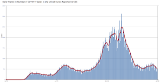
 Click on graph for larger image.
This graph shows the daily (columns) 7 day average (line) of positive tests reported.
Note: The ups and downs during the Winter surge were related to reporting delays due to the Thanksgiving and Christmas holidays.
This data is from the CDC.
 Click on graph for larger image.
This graph shows the daily (columns) 7 day average (line) of positive tests reported.
Note: The ups and downs during the Winter surge were related to reporting delays due to the Thanksgiving and Christmas holidays.
This data is from the CDC.
The 7-day average is 51,736, down from 52,528 yesterday, and down from the recent peak of 69,881 on April 13, 2021. This is the lowest since October 12, 2020, but well above the post-summer surge low of 34,668.
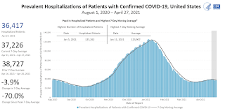
The second graph shows the number of people hospitalized.
 This data is also from the CDC.
The CDC cautions that due to reporting delays, the area in grey will probably increase.
The second graph shows the number of people hospitalized.
 This data is also from the CDC.
The CDC cautions that due to reporting delays, the area in grey will probably increase.
The current 7-day average is 36,716, down from 37,226 reported yesterday, and well above the post-summer surge low of 23,000.
Early Q2 GDP Forecasts: 10%
by Calculated Risk on 4/30/2021 12:19:00 PM
From Goldman Sachs:
We launched our Q2 GDP tracking estimate at +10.5% (qoq ar). [Apr 30 estimate]From the NY Fed Nowcasting Report
emphasis added
The New York Fed Staff Nowcast stands at 5.3% for 2021:Q2. [Apr 30 estimate]And from the Altanta Fed: GDPNow
The GDPNow model estimate for real GDP growth (seasonally adjusted annual rate) in the second quarter of 2021 is 10.4 percent on April 30. [Apr 30 estimate]
Real Personal Income less Transfer Payments
by Calculated Risk on 4/30/2021 10:29:00 AM
Government transfer payments increased sharply in March compared to February, and were $4.8 trillion (on SAAR basis) above the February 2020 level (pre-pandemic). Most of the increase in transfer payments - compared to the levels prior to the crisis - is from unemployment insurance and "other" (includes direct payments).
This table shows the amount of unemployment insurance and "Other" transfer payments since February 2020 (pre-crisis level). The increase in "Other" was mostly due to parts of the relief acts including direct payments.
There was a large increase in "Other" in March due to the American Rescue Plan Act.
A key measure of the health of the economy (Used by NBER in recession dating) is Real Personal Income less Transfer payments.
 Click on graph for larger image.
This graph shows real personal income less transfer payments since 1990.
This measure of economic activity increased 0.9% in March, compared to February, and was down 1.2% compared to February 2020 (previous peak).
 Another way to look at this data is as a percent of the previous peak.
Real personal income less transfer payments was off 8.1% in April 2020. That was a larger decline than the worst of the great recession.
Currently personal income less transfer payments are still off 1.2% (dashed line).
| Selected Transfer Payments Billions of dollars, SAAR | ||
|---|---|---|
| Other | Unemployment Insurance | |
| Feb-20 | $506 | $28 |
| Mar-20 | $515 | $74 |
| Apr-20 | $3,379 | $493 |
| May-20 | $1,360 | $1,356 |
| Jun-20 | $758 | $1,405 |
| Jul-20 | $760 | $1,331 |
| Aug-20 | $692 | $636 |
| Sep-20 | $936 | $359 |
| Oct-20 | $732 | $304 |
| Nov-20 | $620 | $281 |
| Dec-20 | $654 | $304 |
| Jan-21 | $2,357 | $556 |
| Feb-21 | $782 | $535 |
| Mar-21 | $4,751 | $541 |
A key measure of the health of the economy (Used by NBER in recession dating) is Real Personal Income less Transfer payments.
 Click on graph for larger image.
This graph shows real personal income less transfer payments since 1990.
This measure of economic activity increased 0.9% in March, compared to February, and was down 1.2% compared to February 2020 (previous peak).
 Another way to look at this data is as a percent of the previous peak.
Real personal income less transfer payments was off 8.1% in April 2020. That was a larger decline than the worst of the great recession.
Currently personal income less transfer payments are still off 1.2% (dashed line).
Black Knight: Number of Homeowners in COVID-19-Related Forbearance Plans Increased Slightly
by Calculated Risk on 4/30/2021 10:10:00 AM
Note: Both Black Knight and the MBA (Mortgage Bankers Association) are putting out weekly estimates of mortgages in forbearance.
This data is as of April 27th.
From Black Knight: A Jump in Portfolio/Pls Forbearances Breaks Eight-Week Improvement Streak
New data from our McDash Flash Forbearance Tracker showed an increase in forbearance volumes for the first time in nine weeks. Mid-month increases have been relatively common in recent months, and despite the 20,000 weekly increase in forbearance plans, plan volumes are still down 228,000 (-8.9%) from the same time last month.
We saw continued improvement among GSE (-9,000) and FHA/VA forbearances (-2,000), but these decreases were more than offset by an increase of 31,000 forbearance plans among portfolio-held and privately securitized mortgages.
Click on graph for larger image.
More than 200,000 plans are still set to expire in April. With less than a week remaining in the month, the opportunity still remains for additional improvement in late April/early May. As of April 27, there are 2.33 million (4.4% of) homeowners in COVID-19 related forbearance plans, including 2.6% of GSE, 7.8% of FHA/VA and 5% of portfolio/PLS loans.
With the large amount of plans up for review in the next week, it’ll be worth watching these numbers going into May. We’ll have another update here on our blog next Friday, May 7.
emphasis added

Personal Income increased 21.1% in March, Spending increased 4.2%
by Calculated Risk on 4/30/2021 08:36:00 AM
The BEA released the Personal Income and Outlays report for March:
Personal income increased $4.21 trillion (21.1 percent) in March according to estimates released today by the Bureau of Economic Analysis. Disposable personal income (DPI) increased $4.18 trillion (23.6 percent) and personal consumption expenditures (PCE) increased $616.0 billion (4.2 percent).The March PCE price index increased 2.3 percent year-over-year and the March PCE price index, excluding food and energy, increased 1.8 percent year-over-year.
Real DPI increased 23.0 percent in March and Real PCE increased 3.6 percent; goods increased 7.3 percent and services increased 1.7 percent. The PCE price index increased 0.5 percent. Excluding food and energy, the PCE price index increased 0.4 percent .
emphasis added
The following graph shows real Personal Consumption Expenditures (PCE) through March 2021 (2012 dollars). Note that the y-axis doesn't start at zero to better show the change.
 Click on graph for larger image.
The dashed red lines are the quarterly levels for real PCE.
Personal income was slightly above expectations (boosted by American Rescue Act), and the increase in PCE was at expectations.
Thursday, April 29, 2021
Friday: Personal Income and Outlays
by Calculated Risk on 4/29/2021 09:00:00 PM
Friday:
• At 8:30 AM ET, Personal Income and Outlays, March 2021. The consensus is for a 20.1% increase in personal income, and for a 4.2% increase in personal spending. And for the Core PCE price index to increase 0.3%.
• At 9:45 AM, Chicago Purchasing Managers Index for April.
• At 10:00 AM, University of Michigan's Consumer sentiment index (Final for April). The consensus is for a reading of 87.5.
Freddie Mac: Mortgage Serious Delinquency Rate decreased in March
by Calculated Risk on 4/29/2021 05:51:00 PM
Freddie Mac reported that the Single-Family serious delinquency rate in March was 2.34%, down from 2.52% in February. Freddie's rate is up from 0.60% in March 2020.
Freddie's serious delinquency rate peaked in February 2010 at 4.20% following the housing bubble, and peaked at 3.17% in August 2020 during the pandemic.
These are mortgage loans that are "three monthly payments or more past due or in foreclosure".
 Click on graph for larger image
Mortgages in forbearance are being counted as delinquent in this monthly report, but they will not be reported to the credit bureaus.
This is very different from the increase in delinquencies following the housing bubble. Lending standards have been fairly solid over the last decade, and most of these homeowners have equity in their homes - and they will be able to restructure their loans once (if) they are employed.
Also - for multifamily - delinquencies were at 0.17%, up from 0.14% in February, and up more than double from 0.08% in March 2020.
April 29th COVID-19 Vaccinations, New Cases, Hospitalizations; Lowest 7-Day Average New Cases Since October 2020
by Calculated Risk on 4/29/2021 03:49:00 PM
Note: I'm looking forward to not posting this daily! I've been posting this data daily for over a year, and I'll stop once all three of these criteria are met:
1) 70% of the population over 18 has had at least one dose of vaccine, and
2) new cases are under 5,000 per day, and
3) hospitalizations are below 3,000.
According to the CDC, 237.4 million doses have been administered. 38.4% of the population over 18 is fully vaccinated, and 54.9% of the population over 18 has had at least one dose (141.8 million people over 18 have had at least one dose).
And check out COVID Act Now to see how each state is doing.
Over 18,500 US deaths were reported so far in April due to COVID.
 Click on graph for larger image.
This graph shows the daily (columns) 7 day average (line) of positive tests reported.
Note: The ups and downs during the Winter surge were related to reporting delays due to the Thanksgiving and Christmas holidays.
This data is from the CDC.
 Click on graph for larger image.
This graph shows the daily (columns) 7 day average (line) of positive tests reported.
Note: The ups and downs during the Winter surge were related to reporting delays due to the Thanksgiving and Christmas holidays.
This data is from the CDC.
The 7-day average is 52,528, down from 54,010 yesterday, and down from the recent peak of 69,881 on April 13, 2021. This is the lowest since October 12, 2020, but well above the post-summer surge low of 34,668.
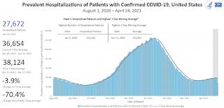
The second graph shows the number of people hospitalized.
 This data is also from the CDC.
The CDC cautions that due to reporting delays, the area in grey will probably increase.
The second graph shows the number of people hospitalized.
 This data is also from the CDC.
The CDC cautions that due to reporting delays, the area in grey will probably increase.
The current 7-day average is 37,226, down from 37,606 reported yesterday, and well above the post-summer surge low of 23,000.
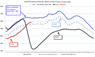
Hotels: Occupancy Rate Down 17% Compared to Same Week in 2019
by Calculated Risk on 4/29/2021 01:02:00 PM
Note: The year-over-year occupancy comparisons are easy, since occupancy declined sharply at the onset of the pandemic. However, occupancy is still down significantly from normal levels.
The occupancy rate is down 17% compared to the same week in 2019.
From CoStar: STR: US Weekly Hotel Occupancy Flat From Prior Week
U.S. weekly hotel occupancy remained flat from the previous week, according to STR‘s latest data through April 24.The following graph shows the seasonal pattern for the hotel occupancy rate using the four week average.
April 18-24, 2021:
• Occupancy: 57.3%
• Average daily rate (ADR): US$108.10
• Revenue per available room (RevPAR): US$61.93
Overall industry occupancy will likely remain plateaued until the summer leisure travel boom, but there has been noticeable uptick in weekday occupancy, which is indicative of increased business travel. ADR was up slightly from the previous week, and the Luxury, Midscale and Economy classes have each recovered more than 90% of their 2019 ADR levels.
emphasis added
 Click on graph for larger image.
The red line is for 2021, black is 2020, blue is the median, and dashed light blue is for 2009 (the worst year on record for hotels prior to 2020).
Occupancy is now slightly above the horrible 2009 levels.
Note: Y-axis doesn't start at zero to better show the seasonal change.
Note: Y-axis doesn't start at zero to better show the seasonal change.
A Few Comments on Q1 GDP
by Calculated Risk on 4/29/2021 11:36:00 AM
Earlier from the BEA: Gross Domestic Product, First Quarter 2021 (Advance Estimate)
Real gross domestic product (GDP) increased at an annual rate of 6.4 percent in the first quarter of 2021, according to the "advance" estimate released by the Bureau of Economic Analysis. In the fourth quarter of 2020, real GDP increased 4.3 percent.On a Q1-over-Q1 basis, GDP was up 0.4%.
emphasis added
 Click on graph for larger image.
This graph shows the percent decline in real GDP from the previous peak (currently the previous peak was in Q4 2019).
This graph is through Q1 2021, and real GDP is currently off 0.9% from the previous peak.
The advance Q1 GDP report, at 6.4% annualized, was slightly below expectations, largely due to a decline in private inventories.
Personal consumption expenditures (PCE) increased at a 10.7% annualized rate in Q1, due, in part, to the American Rescue Plan Act.
The second graph below shows the contribution to GDP from residential investment, equipment and software, and nonresidential structures (3 quarter trailing average). This is important to follow because residential investment tends to lead the economy, equipment and software is generally coincident, and nonresidential structure investment trails the economy.
In the graph, red is residential, green is equipment and software, and blue is investment in non-residential structures. So the usual pattern - both into and out of recessions is - red, green, blue.
Of course - with the sudden economic stop due to COVID-19 - the usual pattern doesn't apply.
The dashed gray line is the contribution from the change in private inventories.
 Residential investment (RI) increased at a 10.8% annual rate in Q1.
Equipment investment increased at a 16.7% annual rate, and investment in
non-residential structures decreased at a 4.8% annual rate (after getting crushed over the previous year)..
Residential investment (RI) increased at a 10.8% annual rate in Q1.
Equipment investment increased at a 16.7% annual rate, and investment in
non-residential structures decreased at a 4.8% annual rate (after getting crushed over the previous year)..The contribution to Q1 GDP from investment in private inventories was -2.64 percentage points (this will likely be a positive for Q2).
On a 3 quarter trailing average basis, RI (red) is up solidly, equipment (green) is also up solidly, and nonresidential structures (blue) is down.
On a 3 quarter trailing average basis, RI (red) is up solidly, equipment (green) is also up solidly, and nonresidential structures (blue) is down.
I'll post more on the components of non-residential investment once the
supplemental data is released.
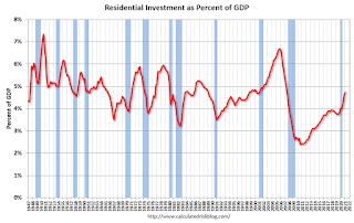 The second graph shows residential investment as a percent of GDP.
Residential Investment as a percent of GDP increased in Q1.
I'll break down Residential Investment into components after the GDP details are released.
Note: Residential investment (RI) includes new single family structures, multifamily structures, home improvement, broker's commissions, and a few minor categories.
 The third graph shows non-residential investment in
structures, equipment and "intellectual property products".
The third graph shows non-residential investment in
structures, equipment and "intellectual property products".
Investment in non-residential structures declined in Q1 as a percent GDP, and will probably be weak for some time (hotel occupancy is still low, office and mall vacancy rates are high).
NAR: Pending Home Sales Increased 1.9% in March
by Calculated Risk on 4/29/2021 10:03:00 AM
From the NAR: Pending Home Sales Grow 1.9% in March
Pending home sales increased in March, snapping two consecutive months of declines, according to the National Association of Realtors®. All but one of the four major U.S. regions experienced month-over-month gains in March, while each area recorded year-over-year growth.This was below expectations for this index. Note: Contract signings usually lead sales by about 45 to 60 days, so this would usually be for closed sales in April and May.
The Pending Home Sales Index (PHSI), a forward-looking indicator of home sales based on contract signings, rose 1.9% to 111.3 in March. Year-over-year, contract signings jumped 23.3%, with the difference due in large part to the pandemic-induced lockdown in March 2020. An index of 100 is equal to the level of contract activity in 2001.
...
The Northeast PHSI rose 6.1% to 97.9 in March, a 16.7% increase from a year ago. In the Midwest, the index fell 3.7% to 98.6 last month, up 14.1% from March 2020.
Pending home sales transactions in the South jumped 2.9% to an index of 137.2 in March, up 27.9% from March 2020. The index in the West grew 2.9% in March to 94.5, up 29.8% from a year prior.
emphasis added
Weekly Initial Unemployment Claims at 553,000
by Calculated Risk on 4/29/2021 08:39:00 AM
The DOL reported:
In the week ending April 24, the advance figure for seasonally adjusted initial claims was 553,000, a decrease of 13,000 from the previous week's revised level. The previous week's level was revised up by 19,000 from 547,000 to 566,000. The 4-week moving average was 611,750, a decrease of 44,000 from the previous week's revised average. This is the lowest level for this average since March 14, 2020 when it was 225,500. The previous week's average was revised up by 4,750 from 651,000 to 655,750.This does not include the 121,749 initial claims for Pandemic Unemployment Assistance (PUA) that was down from 133,358 the previous week.
emphasis added
The following graph shows the 4-week moving average of weekly claims since 1971.
 Click on graph for larger image.
The dashed line on the graph is the current 4-week average. The four-week average of weekly unemployment claims decreased to 651,000.
The previous week was revised up.
Regular state continued claims decreased to 3,813,109 (SA) from 3,886,198 (SA) the previous week.
Note: There are an additional 6,974,068 receiving Pandemic Unemployment Assistance (PUA) that decreased from 7,309,604 the previous week (there are questions about these numbers). This is a special program for business owners, self-employed, independent contractors or gig workers not receiving other unemployment insurance. And an additional 5,192,711 receiving Pandemic Emergency Unemployment Compensation (PEUC) down from 5,605,935.
Weekly claims were higher than the consensus forecast.
BEA: Real GDP increased at 6.4% Annualized Rate in Q1
by Calculated Risk on 4/29/2021 08:33:00 AM
From the BEA: Gross Domestic Product, First Quarter 2021 (Advance Estimate)
Real gross domestic product (GDP) increased at an annual rate of 6.4 percent in the first quarter of 2021, according to the "advance" estimate released by the Bureau of Economic Analysis. In the fourth quarter of 2020, real GDP increased 4.3 percent. ...The advance Q1 GDP report, with 6.4% annualized growth, was slightly below expectations.
The increase in real GDP in the first quarter reflected increases in personal consumption expenditures (PCE), nonresidential fixed investment, federal government spending, residential fixed investment, and state and local government spending that were partly offset by decreases in private inventory investment and exports. Imports, which are a subtraction in the calculation of GDP, increased.
emphasis added
I'll have more later ...
Wednesday, April 28, 2021
Thursday: GDP, Unemployment Claims, Pending Home Sales
by Calculated Risk on 4/28/2021 09:00:00 PM
Thursday:
• At 8:30 AM ET, The initial weekly unemployment claims report will be released. The consensus is for a decrease to 525 thousand from 547 thousand last week.
• Also at 8:30 AM, Gross Domestic Product, 1st quarter 2021 (Advance estimate). The consensus is that real GDP increased 6.5% annualized in Q1, up from 4.3% in Q4.
• At 10:00 AM, Pending Home Sales Index for March. The consensus is for a 6.0% increase in the index.
April 28th COVID-19 Vaccinations, New Cases, Hospitalizations
by Calculated Risk on 4/28/2021 03:46:00 PM
Note: I'm looking forward to not posting this daily! I've been posting this data daily for over a year, and I'll stop once all three of these criteria are met:
1) 70% of the population over 18 has had at least one dose of vaccine, and
2) new cases are under 5,000 per day, and
3) hospitalizations are below 3,000.
According to the CDC, 234.6 million doses have been administered. 37.8% of the population over 18 is fully vaccinated, and 54.5% of the population over 18 has had at least one dose (140.8 million people over 18 have had at least one dose).
And check out COVID Act Now to see how each state is doing.
Almost 18,000 US deaths were reported so far in April due to COVID.
 Click on graph for larger image.
This graph shows the daily (columns) 7 day average (line) of positive tests reported.
Note: The ups and downs during the Winter surge were related to reporting delays due to the Thanksgiving and Christmas holidays.
This data is from the CDC.
 Click on graph for larger image.
This graph shows the daily (columns) 7 day average (line) of positive tests reported.
Note: The ups and downs during the Winter surge were related to reporting delays due to the Thanksgiving and Christmas holidays.
This data is from the CDC.
The 7-day average is 53,934, down from 55,080 yesterday, and down from the recent peak of 69,878 on April 13, 2021. This is the lowest since March 21st, but well above the post-summer surge low of 34,668.
The second graph shows the number of people hospitalized.
 This data is also from the CDC.
The CDC cautions that due to reporting delays, the area in grey will probably increase.
The second graph shows the number of people hospitalized.
 This data is also from the CDC.
The CDC cautions that due to reporting delays, the area in grey will probably increase.
The current 7-day average is 37,606, up from 37,092 reported yesterday, and well above the post-summer surge low of 23,000.
FOMC Statement: No Policy Change, Upgrade to Outlook
by Calculated Risk on 4/28/2021 02:05:00 PM
Fed Chair Powell press conference video here starting at 2:30 PM ET.
FOMC Statement:
The Federal Reserve is committed to using its full range of tools to support the U.S. economy in this challenging time, thereby promoting its maximum employment and price stability goals.
The COVID-19 pandemic is causing tremendous human and economic hardship across the United States and around the world. Amid progress on vaccinations and strong policy support, indicators of economic activity and employment have strengthened. The sectors most adversely affected by the pandemic remain weak but have shown improvement. Inflation has risen, largely reflecting transitory factors. Overall financial conditions remain accommodative, in part reflecting policy measures to support the economy and the flow of credit to U.S. households and businesses.
The path of the economy will depend significantly on the course of the virus, including progress on vaccinations. The ongoing public health crisis continues to weigh on the economy, and risks to the economic outlook remain.
The Committee seeks to achieve maximum employment and inflation at the rate of 2 percent over the longer run. With inflation running persistently below this longer-run goal, the Committee will aim to achieve inflation moderately above 2 percent for some time so that inflation averages 2 percent over time and longer‑term inflation expectations remain well anchored at 2 percent. The Committee expects to maintain an accommodative stance of monetary policy until these outcomes are achieved. The Committee decided to keep the target range for the federal funds rate at 0 to 1/4 percent and expects it will be appropriate to maintain this target range until labor market conditions have reached levels consistent with the Committee's assessments of maximum employment and inflation has risen to 2 percent and is on track to moderately exceed 2 percent for some time. In addition, the Federal Reserve will continue to increase its holdings of Treasury securities by at least $80 billion per month and of agency mortgage‑backed securities by at least $40 billion per month until substantial further progress has been made toward the Committee's maximum employment and price stability goals. These asset purchases help foster smooth market functioning and accommodative financial conditions, thereby supporting the flow of credit to households and businesses.
In assessing the appropriate stance of monetary policy, the Committee will continue to monitor the implications of incoming information for the economic outlook. The Committee would be prepared to adjust the stance of monetary policy as appropriate if risks emerge that could impede the attainment of the Committee's goals. The Committee's assessments will take into account a wide range of information, including readings on public health, labor market conditions, inflation pressures and inflation expectations, and financial and international developments.
Voting for the monetary policy action were Jerome H. Powell, Chair; John C. Williams, Vice Chair; Thomas I. Barkin; Raphael W. Bostic; Michelle W. Bowman; Lael Brainard; Richard H. Clarida; Mary C. Daly; Charles L. Evans; Randal K. Quarles; and Christopher J. Waller.
emphasis added
House Prices and Inventory
by Calculated Risk on 4/28/2021 09:30:00 AM
Watching existing home "for sale" inventory is very helpful. As an example, the increase in inventory in late 2005 helped me call the top for housing.
And the decrease in inventory eventually helped me correctly call the bottom for house prices in early 2012, see: The Housing Bottom is Here.
And in 2015, it appeared the inventory build in several markets was ending, and that boosted price increases.
In 2020, with the pandemic, inventory dropped to record lows, and prices really increased (record low mortgage rates and demographics were factors too).
I don't have a crystal ball, but watching inventory helps understand the housing market.
 Click on graph for larger image.
This graph below shows existing home months-of-supply (from the NAR) vs. the seasonally adjusted month-to-month price change in the Case-Shiller National Index (both since January 1999 through February 2021).
There is a clear relationship, and this is no surprise (but interesting to graph). If months-of-supply is high, prices decline. If months-of-supply is low, prices rise.
In February, months-of-supply was at 2.0 months, and the Case-Shiller National Index increased 1.1% month-over-month. The arrow points to the February dot.
In the existing home sales report released last week, the NAR reported months-of-supply at 2.1 months in March. There is a seasonal pattern to inventory, but this is just above the record low of 1.9 months for December 2020 and January 2021 - and prices are increasing sharply.
In the existing home sales report released last week, the NAR reported months-of-supply at 2.1 months in March. There is a seasonal pattern to inventory, but this is just above the record low of 1.9 months for December 2020 and January 2021 - and prices are increasing sharply.
MBA: Mortgage Applications Decrease in Latest Weekly Survey
by Calculated Risk on 4/28/2021 07:00:00 AM
From the MBA: Mortgage Applications Decrease in Latest MBA Weekly Survey
Mortgage applications decreased 2.5 percent from one week earlier, according to data from the Mortgage Bankers Association’s (MBA) Weekly Mortgage Applications Survey for the week ending April 23, 2021.
... The Refinance Index decreased 1 percent from the previous week and was 18 percent lower than the same week one year ago. The seasonally adjusted Purchase Index decreased 5 percent from one week earlier. The unadjusted Purchase Index decreased 4 percent compared with the previous week and was 34 percent higher than the same week one year ago.
“Mortgage applications decreased last week, even as mortgage rates dropped for the third week in a row. The 30-year fixed rate was down 3 basis points to 3.17 percent, which is still 32 basis points higher than the low reported in December 2020. Even with a few weeks of lower rates, most borrowers have likely already refinanced, which is why activity has decreased in seven of the last eight weeks,” said Joel Kan, MBA’s Associate Vice President of Economic and Industry Forecasting. “The purchase market’s recent slide comes despite a strengthening economy and labor market. Activity is still above year-ago levels, but accelerating home-price growth and low inventory has led to a decline in purchase applications in four of the last five weeks.”
...
The average contract interest rate for 30-year fixed-rate mortgages with conforming loan balances ($548,250 or less) decreased to 3.17 percent from 3.20 percent, with points decreasing to 0.30 from 0.36 (including the origination fee) for 80 percent loan-to-value ratio (LTV) loans.
emphasis added
 Click on graph for larger image.
The first graph shows the refinance index since 1990.
With low rates, the index remains elevated, but below recent levels since mortgage rates have moved up from the record lows.
The second graph shows the MBA mortgage purchase index
 According to the MBA, purchase activity is up 34% year-over-year unadjusted.
Note: Until the 2nd half of May, the MBA index will be up sharply year-over-year since purchase activity collapsed in late March 2020 in the early weeks of the pandemic.
Note: Red is a four-week average (blue is weekly).
Tuesday, April 27, 2021
Wednesday: FOMC Announcement
by Calculated Risk on 4/27/2021 09:00:00 PM
From Matthew Graham at MortgageNewsDaily: Mortgage Rates Continue Edging Slightly Higher From Recent Lows
Mortgage rates have fallen almost every single day in April. By the end of last week, that meant the average lender was offering the lowest conventional 30yr fixed rates in more than a month. The first two days of the current week have taken rates in the other direction, albeit at a very modest pace.Wednesday:
...
To be fair, sub-3% rates are currently available--especially for purchases--but they're the exception. The average lender is closer to 3.125% on refi transactions, and 3.25% for cash-out refis. Well-qualified borrowers who are willing to pay points (aka, higher closing costs in exchange for a lower rate) can easily get under 3%. [30 Year Fixed Average 3.14%]
• At 7:00 AM ET, The Mortgage Bankers Association (MBA) will release the results for the mortgage purchase applications index.
• At 2:00 PM, FOMC Meeting Announcement. No change to policy is expected at this meeting.
• At 2:30 PM, Fed Chair Jerome Powell holds a press briefing following the FOMC announcement.
Zillow Case-Shiller House Price Forecast: "Red Hot", 12.8% YoY in March
by Calculated Risk on 4/27/2021 05:00:00 PM
The Case-Shiller house price indexes for February were released today. Zillow forecasts Case-Shiller a month early, and I like to check the Zillow forecasts since they have been pretty close.
From Matthew Speakman at Zillow: February 2021 Case-Shiller Results & Forecast: Red Hot
Already rising at a blistering pace, home price appreciation pressed higher in February as competition for housing remained red hot.
...
As more signs emerge that the economy’s recovery is gathering steam, a wave of eager buyers – many of them seeking their first home purchase – remain determined to find their next home. But with relatively few for-sale homes on the market, bidding wars have become increasingly common, pushing sale prices higher and leading homes to sell at a record pace. In the near-term, it appears unlikely that these upward price pressures will relent meaningfully, particularly as recent retreats in mortgage rates offer many home shoppers increased buying power. However, after pausing in February, home listing activity has shown a meaningful improvement in recent weeks and some recent signs suggest that the historically tight inventory pressures may finally be starting to ease. Should those signs materialize, the meteoric rise in home prices may finally have a reason to come back down to earth. For now, red hot home price appreciation shows few signs of cooling.
Monthly growth in March as reported by Case-Shiller is expected to slow slightly from February in both of the smaller 10- and 20-city composite indices, and accelerate slightly in the national index. Annual growth is expected to accelerate across the board. S&P Dow Jones Indices is expected to release data for the March S&P CoreLogic Case-Shiller Indices on Tuesday, May 25.
emphasis added
 The Zillow forecast is for the year-over-year change for the Case-Shiller National index to be at 12.8% in March, up from 12.0% in February.
 The Zillow forecast is for the 20-City index to be up 12.7% YoY in March from 11.9% in February, and for the 10-City index to increase to be up 12.3% YoY compared to 11.7% YoY in February.
April 27th COVID-19 Vaccinations, New Cases, Hospitalizations; Vaccinations have Slowed
by Calculated Risk on 4/27/2021 04:30:00 PM
Note: I'm looking forward to not posting this daily! I've been posting this data daily for over a year, and I'll stop once all three of these criteria are met:
1) 70% of the population over 18 has had at least one dose of vaccine,
2) new cases are under 5,000 per day, and
3) hospitalizations are below 3,000.
According to the CDC, 232.4 million doses have been administered. 37.3% of the population over 18 is fully vaccinated, and 54.2% of the population over 18 has had at least one dose (139.9 million people over 18 have had at least one dose).
And check out COVID Act Now to see how each state is doing.
Almost 17,500 US deaths were reported so far in April due to COVID.
 Click on graph for larger image.
This graph shows the daily (columns) 7 day average (line) of positive tests reported.
Note: The ups and downs during the Winter surge were related to reporting delays due to the Thanksgiving and Christmas holidays.
This data is from the CDC.
 Click on graph for larger image.
This graph shows the daily (columns) 7 day average (line) of positive tests reported.
Note: The ups and downs during the Winter surge were related to reporting delays due to the Thanksgiving and Christmas holidays.
This data is from the CDC.
The 7-day average is 55,186, down from 56,013 yesterday, and down from the recent peak of 69,878 on April 13, 2021. This is also below the summer surge peak of 67,337 on July 23, 2020.
The second graph shows the number of people hospitalized.
 This data is also from the CDC.
The CDC cautions that due to reporting delays, the area in grey will probably increase.
The second graph shows the number of people hospitalized.
 This data is also from the CDC.
The CDC cautions that due to reporting delays, the area in grey will probably increase.
The current 7-day average is 37,092, up from 36,654 reported yesterday, and well above the post-summer surge low of 23,000.
Las Vegas Visitor Authority for March: No Convention Attendance, Visitor Traffic Down 40% Compared to 2019
by Calculated Risk on 4/27/2021 02:42:00 PM
From the Las Vegas Visitor Authority: March 2021 Las Vegas Visitor Statistics
March 2021 saw the highest visitation since Feb of last year as the destination welcomed more than 2.2M visitors, up nearly 45% MoM. With travel reduced last March due to the initial shutdown, year‐over‐year (YoY) comparisons show a 45.7% increase while a comparison to pre‐COVID 2019 monthly metrics shows visitation down roughly ‐40% from March 2019.
Hotel occupancy ramped up to 55.5%, up 13.5 pts MoM, as Weekend occupancy reached 77.7% (up 14.9 pts MoM) and Midweek occupancy reached 47.8% (up 15.7% MoM).
 Click on graph for larger image.
 The first graph shows visitor traffic for 2019 (blue), 2020 (orange) and 2021 (red).
Visitor traffic was down 39.7% compared to the same month in 2019.
Convention traffic was non-existent again in March, and was down 100% compared to March 2019.
There has been no convention traffic since March 2020.
I'll add a graph of convention traffic once conventions start to reopen.
Note: A convention is scheduled for early June (HT MS): "Informa Markets, organizers of the World of Concrete, has received approval from the Nevada Department of Business and Industry to move forward with its 2021 in-person edition. The event is scheduled to be held June 8-10, 2021 at the Las Vegas Convention Center."
Real House Prices and Price-to-Rent Ratio in February
by Calculated Risk on 4/27/2021 11:14:00 AM
Here is the post earlier on Case-Shiller: Case-Shiller: National House Price Index increased 12.0% year-over-year in February
It has been fifteen years since the bubble peak. In the Case-Shiller release today, the seasonally adjusted National Index (SA), was reported as being 31% above the previous bubble peak. However, in real terms, the National index (SA) is about 4% above the bubble peak (and historically there has been an upward slope to real house prices). The composite 20, in real terms, is still 5% below the bubble peak.
The year-over-year growth in prices increased to 12.0% nationally.
Usually people graph nominal house prices, but it is also important to look at prices in real terms (inflation adjusted). Case-Shiller and others report nominal house prices. As an example, if a house price was $200,000 in January 2000, the price would be over $295,000 today adjusted for inflation (48%). That is why the second graph below is important - this shows "real" prices (adjusted for inflation).
Nominal House Prices
 The first graph shows the monthly Case-Shiller National Index SA, and the monthly Case-Shiller Composite 20 SA (through February) in nominal terms as reported.
In nominal terms, the Case-Shiller National index (SA) and the Case-Shiller Composite 20 Index (SA) are both at new all times highs (above the bubble peak).
Real House Prices
 The second graph shows the same two indexes in real terms (adjusted for inflation using CPI less Shelter). Note: some people use other inflation measures to adjust for real prices.
In real terms, the National index is 4% above the bubble peak, and the Composite 20 index is back to mid-2005.
In real terms, house prices are at 2005 levels.
Note that inflation was negative for a few months last year, and that also boosted real prices.
Price-to-Rent
In October 2004, Fed economist John Krainer and researcher Chishen Wei wrote a Fed letter on price to rent ratios: House Prices and Fundamental Value. Kainer and Wei presented a price-to-rent ratio using the OFHEO house price index and the Owners' Equivalent Rent (OER) from the BLS.
 Here is a similar graph using the Case-Shiller National and Composite 20 House Price Indexes.
This graph shows the price to rent ratio (January 2000 = 1.0). The price-to-rent ratio had been moving mostly sideways, but picked up recently.
On a price-to-rent basis, the Case-Shiller National index is back to January 2005 levels, and the Composite 20 index is back to June 2004 levels.
In real terms, prices are back to 2005 levels, and the price-to-rent ratio is back to late 2004.
HVS: Q1 2021 Homeownership and Vacancy Rates
by Calculated Risk on 4/27/2021 10:36:00 AM
The Census Bureau released the Residential Vacancies and Homeownership report for Q1 2021.
It is likely the results of this survey were significantly distorted by the pandemic.
This report is frequently mentioned by analysts and the media to track household formation, the homeownership rate, and the homeowner and rental vacancy rates. However, there are serious questions about the accuracy of this survey.
This survey might show the trend, but I wouldn't rely on the absolute numbers. Analysts probably shouldn't use the HVS to estimate the excess vacant supply or household formation, or rely on the homeownership rate, except as a guide to the trend.
"National vacancy rates in the first quarter 2021 were 6.8 percent for rental housing and 0.9 percent for homeowner housing. The rental vacancy rate of 6.8 percent was not statistically different from the rate in the first quarter 2020 (6.6 percent) and 0.3 percentage points higher than the rate in the fourth quarter 2020 (6.5 percent). The homeowner vacancy rate of 0.9 percent was 0.2 percentage points lower than the rate in the first quarter 2020 (1.1 percent) and 0.1 percentage points lower than the rate in the fourth quarter 2020 (1.0 percent)
The homeownership rate of 65.6 percent was not statistically different from the rate in the first quarter 2020 (65.3 percent) and not statistically different from the rate in the fourth quarter 2020 (65.8 percent). "
 Click on graph for larger image.
The Red dots are the decennial Census homeownership rates for April 1st 1990, 2000 and 2010. The Census Bureau will released data for 2020 soon.
The HVS homeownership rate decreased to 65.6% in Q1, from 65.8% in Q4.
The results in Q2 through Q4 of 2020 were distorted by the pandemic.
 The HVS homeowner vacancy increased to 0.9% from 1.0% in Q4.
 Once again - this probably shows the general trend, but I wouldn't rely on the absolute numbers.
 The rental vacancy rate increased to 6.8% in Q1 from 6.5% in Q4.
The quarterly HVS is the most timely survey on households, but there are many questions about the accuracy of this survey.
Case-Shiller: National House Price Index increased 12.0% year-over-year in February
by Calculated Risk on 4/27/2021 09:11:00 AM
S&P/Case-Shiller released the monthly Home Price Indices for February ("February" is a 3 month average of December, January and February prices).
This release includes prices for 20 individual cities, two composite indices (for 10 cities and 20 cities) and the monthly National index.
From S&P: S&P Corelogic Case-Shiller Index Reports 12.0% Annual Home Price Gain in February 2021
The S&P CoreLogic Case-Shiller U.S. National Home Price NSA Index, covering all nine U.S. census divisions, reported a 12.0% annual gain in February, up from 11.2% in the previous month. The 10-City Composite annual increase came in at 11.7%, up from 10.9% in the previous month. The 20-City Composite posted an 11.9% year-over-year gain, up from 11.1% in the previous month.
Phoenix, San Diego, and Seattle reported the highest year-over-year gains among the 20 cities in February. Phoenix led the way with a 17.4% year-over-year price increase, followed by San Diego with a 17.0% increase and Seattle with a 15.4% increase. Nineteen of the 20 cities reported higher price increases in the year ending February 2021 versus the year ending January 2021.
...
Before seasonal adjustment, the U.S. National Index posted an 1.1% month-over-month increase, while the 10-City and 20-City Composites both posted increases of 1.1% and 1.2% respectively in February. After seasonal adjustment, the U.S. National Index posted a month-over-month increase of 1.1%, and the 10-City and 20-City Composites both posted increases of 1.1% and 1.2% respectively as well. In February, all 20 cities reported increases before and after seasonal adjustments.
“Strong home price gains continued in February 2021,” says Craig J. Lazzara, Managing Director and Global Head of Index Investment Strategy at S&P DJI. The National Composite Index marked its ninth month of accelerating prices with a 12.0% gain from year-ago levels, up from 11.2% in January. This acceleration is also reflected in the 10- and 20-City Composites (up 11.7% and 11.9%, respectively). The market’s strength continues to be broadly-based: all 20 cities rose, and 19 cities gained more in the 12 months ended in February than they had gained in the 12 months ended in January.
“More than 30 years of S&P CoreLogic Case-Shiller data help us to put February’s results into historical context. The National Composite’s 12.0% gain is the highest recorded since February 2006, exactly 15 years ago, and lies comfortably in the top decile of historical performance. Housing’s strength is reflected across all 20 cities; February’s price gains in every city are above that city’s median level, and rank in the top quartile of all reports in 18 cities.
emphasis added
 Click on graph for larger image.
 The first graph shows the nominal seasonally adjusted Composite 10, Composite 20 and National indices (the Composite 20 was started in January 2000).
The Composite 10 index is up 1.1% in February (SA) from January.
The Composite 20 index is up 1.2% (SA) in February.
The National index is 31% above the bubble peak (SA), and up 1.1% (SA) in February. The National index is up 77% from the post-bubble low set in December 2011 (SA).
 The second graph shows the year-over-year change in all three indices.
The Composite 10 SA is up 11.7% compared to February 2020. The Composite 20 SA is up 11.9% year-over-year.
The National index SA is up 12.0% year-over-year.
Price increases were at expectations. I'll have more later.
Monday, April 26, 2021
Tuesday: Case-Shiller House Prices, Richmond Fed Mfg, Q1 2021 Housing Vacancies and Homeownership
by Calculated Risk on 4/26/2021 09:00:00 PM
Tuesday:
• At 9:00 AM ET, S&P/Case-Shiller House Price Index for February. The consensus is for a 11.6% year-over-year increase in the Comp 20 index for February.
• Also at 9:00 AM, FHFA House Price Index for February. This was originally a GSE only repeat sales, however there is also an expanded index.
• At 10:00 AM, Richmond Fed Survey of Manufacturing Activity for April. This is the last of regional manufacturing surveys for April.
• Also at 10:00 AM, the Q1 2021 Housing Vacancies and Homeownership from the Census Bureau.
April 26th COVID-19 Vaccinations, New Cases, Hospitalizations; 7-Day Average Cases Lowest Since March 21st
by Calculated Risk on 4/26/2021 05:01:00 PM
Note: I'm looking forward to not posting this daily! I've been posting this data daily for over a year, and I'll stop once all three of these criteria are met:
1) 70% of the population over 18 has had at least one dose of vaccine,
2) new cases are under 5,000 per day, and
3) hospitalizations are below 3,000.
According to the CDC, 230.8 million doses have been administered. 37.0% of the population over 18 is fully vaccinated, and 53.9% of the population over 18 has had at least one dose (139.2 million people over 18 have had at least one dose).
And check out COVID Act Now to see how each state is doing.
Almost 17,000 US deaths were reported so far in April due to COVID.
 Click on graph for larger image.
This graph shows the daily (columns) 7 day average (line) of positive tests reported.
Note: The ups and downs during the Winter surge were related to reporting delays due to the Thanksgiving and Christmas holidays.
This data is from the CDC.
 Click on graph for larger image.
This graph shows the daily (columns) 7 day average (line) of positive tests reported.
Note: The ups and downs during the Winter surge were related to reporting delays due to the Thanksgiving and Christmas holidays.
This data is from the CDC.
The 7-day average is 54,406, down from 57,197 yesterday, and down from the recent peak of 69,878 on April 13, 2021. This is also below the summer surge peak of 67,337 on July 23, 2020.
The second graph shows the number of people hospitalized.
 This data is also from the CDC.
The CDC cautions that due to reporting delays, the area in grey will probably increase.
The second graph shows the number of people hospitalized.
 This data is also from the CDC.
The CDC cautions that due to reporting delays, the area in grey will probably increase.
The current 7-day average is 36,654, down from 38,111, reported yesterday, and well above the post-summer surge low of 23,000.
MBA Survey: "Share of Mortgage Loans in Forbearance Slightly Decreases to 4.49%"
by Calculated Risk on 4/26/2021 04:00:00 PM
Note: This is as of April 18th.
From the MBA: Share of Mortgage Loans in Forbearance Slightly Decreases to 4.49%
The Mortgage Bankers Association’s (MBA) latest Forbearance and Call Volume Survey revealed that the total number of loans now in forbearance decreased by 1 basis point from 4.50% of servicers’ portfolio volume in the prior week to 4.49% as of April 18, 2021. According to MBA’s estimate, 2.25 million homeowners are in forbearance plans.
The share of Fannie Mae and Freddie Mac loans in forbearance remained the same relative to the prior week at 2.44%. Ginnie Mae loans in forbearance decreased 7 basis points to 6.09%, while the forbearance share for portfolio loans and private-label securities (PLS) increased by 8 basis points to 8.42%. The percentage of loans in forbearance for independent mortgage bank (IMB) servicers remained the same relative to the prior week at 4.72%, and the percentage of loans in forbearance for depository servicers declined 3 basis points to 4.64%.
“After two weeks of large declines, the share of loans in forbearance decreased for the eighth straight week, but by only 1 basis point. New forbearance requests increased, and the rate of exits declined,” said Mike Fratantoni, MBA’s Senior Vice President and Chief Economist. “More than 40 percent of borrowers in forbearance extensions have now exceeded the 12-month mark.”
emphasis added
 Click on graph for larger image.
This graph shows the percent of portfolio in forbearance by investor type over time. Most of the increase was in late March and early April, and has trended down since then.
The MBA notes: "Total weekly forbearance requests as a percent of servicing portfolio volume (#) increased relative to the prior week: from 0.05% to 0.06%."
New Home Prices
by Calculated Risk on 4/26/2021 12:57:00 PM
As part of the new home sales report released last week, the Census Bureau reported the number of homes sold by price and the average and median prices.
From the Census Bureau: "The median sales price of new houses sold in March 2021 was $330,800. The average sales price was $397,800."
The following graph shows the median and average new home prices.
 Click on graph for larger image.
During the housing bust, the builders had to build smaller and less expensive homes to compete with all the distressed sales. When housing started to recovery - with limited finished lots in recovering areas - builders moved to higher price points to maximize profits.
Then the average and median house prices have mostly moved sideways since 2017 due to home builders offering more lower priced homes. Prices picked up again during the pandemic.
The average price in March 2021 was $397,800, up 6% year-over-year. The median price was $330,800, up just 1% year-over-year. Builders are reporting same home prices are up sharply, so the mix has changed.
The second graph shows the percent of new homes sold by price.
 Very few new homes sold were under $150K in March 2021 ("Less than 500 units" in March 2021, rounded down to zero). This is down from 30% in 2002. In general, the under $150K and under $200K brackets are going away.
The $400K+ bracket increased significantly after the housing recovery started, but has been holding steady recently. A majority of new homes (about 68%) in the U.S., are in the $200K to $400K range.
The average price in March 2021 was $397,800, up 6% year-over-year. The median price was $330,800, up just 1% year-over-year. Builders are reporting same home prices are up sharply, so the mix has changed.
The second graph shows the percent of new homes sold by price.
 Very few new homes sold were under $150K in March 2021 ("Less than 500 units" in March 2021, rounded down to zero). This is down from 30% in 2002. In general, the under $150K and under $200K brackets are going away.
 The $400K+ bracket increased significantly after the housing recovery started, but has been holding steady recently. A majority of new homes (about 68%) in the U.S., are in the $200K to $400K range.
Housing Inventory April 26th Update: A Slight Decrease week-over-week
by Calculated Risk on 4/26/2021 10:44:00 AM
One of the key questions for 2021 is: Will inventory increase as the pandemic subsides, or will inventory decrease further in 2021?
Tracking inventory will be very important this year.
 Click on graph for larger image in graph gallery.
This inventory graph is courtesy of Altos Research.
As of April 23rd, inventory was at 310 thousand (7 day average), compared to 746 thousand the same week a year ago. That is a decline of 58%.
A week ago, inventory was at 312 thousand, and was down 58% YoY. Seasonally, inventory might have bottomed two weeks ago at 307 thousand.
Mike Simonsen discusses this data regularly on Youtube.
Mike Simonsen discusses this data regularly on Youtube.
Seven High Frequency Indicators for the Economy
by Calculated Risk on 4/26/2021 08:30:00 AM
These indicators are mostly for travel and entertainment. It will interesting to watch these sectors recover as the vaccine is distributed.
IMPORTANT: Be safe now - if all goes well, we could all be vaccinated by June.
----- Airlines: Transportation Security Administration -----
The TSA is providing daily travel numbers.
 Click on graph for larger image.
This data shows the seven day average of daily total traveler throughput from the TSA for 2019 (Light Blue), 2020 (Blue) and 2021 (Red).
The dashed line is the percent of 2019 for the seven day average.
This data is as of April 25th.
The seven day average is down 42.7% from the same day in 2019 (57.3% of 2019). (Dashed line)
There was a slow increase from the bottom, with ups and downs due to the holidays - and TSA data has picked up in 2021, but down slightly over the last few weeks.
----- Restaurants: OpenTable -----
The second graph shows the 7 day average of the year-over-year change in diners as tabulated by OpenTable for the US and several selected cities.
----- Hotel Occupancy: STR -----
 This graph shows the seasonal pattern for the hotel occupancy rate using the four week average.
The red line is for 2021, black is 2020, blue is the median, and dashed light blue is for 2009 (the worst year since the Great Depression for hotels - before 2020).
Occupancy is now above the horrible 2009 levels.
This data is through April 17th. Hotel occupancy is currently down 13% compared to same week in 2019). Note: Occupancy was up year-over-year, since occupancy declined sharply at the onset of the pandemic. However, occupancy is still down significantly from normal levels.
Notes: Y-axis doesn't start at zero to better show the seasonal change.
----- Gasoline Supplied: Energy Information Administration -----
 This graph, based on weekly data from the U.S. Energy Information Administration (EIA), shows gasoline supplied compared to the same week of 2019.
Blue is for 2020. Red is for 2021.
As of April 16th, gasoline supplied was off about 3.2% (about 96.8% of the same week in 2019).
Gasoline supplied was up year-over-year, since at one point, gasoline supplied was off almost 50% YoY in 2020.
----- Transit: Apple Mobility -----
This graph is from Apple mobility. From Apple: "This data is generated by counting the number of requests made to Apple Maps for directions in select countries/regions, sub-regions, and cities." This is just a general guide - people that regularly commute probably don't ask for directions.
There is also some great data on mobility from the Dallas Fed Mobility and Engagement Index. However the index is set "relative to its weekday-specific average over January–February", and is not seasonally adjusted, so we can't tell if an increase in mobility is due to recovery or just the normal increase in the Spring and Summer.
 This data is through April 24th for the United States and several selected cities.
The graph is the running 7 day average to remove the impact of weekends.
IMPORTANT: All data is relative to January 13, 2020. This data is NOT Seasonally Adjusted. People walk and drive more when the weather is nice, so I'm just using the transit data.
According to the Apple data directions requests, public transit in the 7 day average for the US is at 68% of the January 2020 level. It is at 63% in Chicago, and 61% in Houston - and moving up recently.
----- New York City Subway Usage -----
Here is some interesting data on New York subway usage (HT BR).
 This graph is from Todd W Schneider. This is weekly data since 2015.
The TSA is providing daily travel numbers.
 Click on graph for larger image.
This data shows the seven day average of daily total traveler throughput from the TSA for 2019 (Light Blue), 2020 (Blue) and 2021 (Red).
The dashed line is the percent of 2019 for the seven day average.
This data is as of April 25th.
The seven day average is down 42.7% from the same day in 2019 (57.3% of 2019). (Dashed line)
There was a slow increase from the bottom, with ups and downs due to the holidays - and TSA data has picked up in 2021, but down slightly over the last few weeks.
The second graph shows the 7 day average of the year-over-year change in diners as tabulated by OpenTable for the US and several selected cities.
IMPORTANT: OpenTable notes: "we’ve updated the data including downloadable dataset from January 1, 2021 onward to compare seated diners from 2021 to 2019, as opposed to year over year." Thanks!
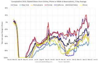 Thanks to OpenTable for providing this restaurant data:
This data is updated through April 24, 2021.
This data is "a sample of restaurants on the OpenTable network across all channels: online reservations, phone reservations, and walk-ins. For year-over-year comparisons by day, we compare to the same day of the week from the same week in the previous year."
Note that this data is for "only the restaurants that have chosen to reopen in a given market". Since some restaurants have not reopened, the actual year-over-year decline is worse than shown.
Dining picked up during the holidays, then slumped with the huge winter surge in cases. Dining was picking up again, but has moved up and down over the last couple of weeks.
----- Movie Tickets: Box Office Mojo -----
 This data shows domestic box office for each week and the median for the years 2016 through 2019 (dashed light blue).
 Thanks to OpenTable for providing this restaurant data:
This data is updated through April 24, 2021.
This data is "a sample of restaurants on the OpenTable network across all channels: online reservations, phone reservations, and walk-ins. For year-over-year comparisons by day, we compare to the same day of the week from the same week in the previous year."
Note that this data is for "only the restaurants that have chosen to reopen in a given market". Since some restaurants have not reopened, the actual year-over-year decline is worse than shown.
Dining picked up during the holidays, then slumped with the huge winter surge in cases. Dining was picking up again, but has moved up and down over the last couple of weeks.
 This data shows domestic box office for each week and the median for the years 2016 through 2019 (dashed light blue).
 Blue is 2020 and Red is 2021.
The data is from BoxOfficeMojo through Apr 22nd.
Note that the data is usually noisy week-to-week and depends on when blockbusters are released.
Movie ticket sales were at $24 million last week, down about 83% from the median for the week.
Note that the data is usually noisy week-to-week and depends on when blockbusters are released.
Movie ticket sales were at $24 million last week, down about 83% from the median for the week.
 This graph shows the seasonal pattern for the hotel occupancy rate using the four week average.
 The red line is for 2021, black is 2020, blue is the median, and dashed light blue is for 2009 (the worst year since the Great Depression for hotels - before 2020).
Occupancy is now above the horrible 2009 levels.
This data is through April 17th. Hotel occupancy is currently down 13% compared to same week in 2019). Note: Occupancy was up year-over-year, since occupancy declined sharply at the onset of the pandemic. However, occupancy is still down significantly from normal levels.
Notes: Y-axis doesn't start at zero to better show the seasonal change.
 This graph, based on weekly data from the U.S. Energy Information Administration (EIA), shows gasoline supplied compared to the same week of 2019.
Blue is for 2020. Red is for 2021.
As of April 16th, gasoline supplied was off about 3.2% (about 96.8% of the same week in 2019).
Gasoline supplied was up year-over-year, since at one point, gasoline supplied was off almost 50% YoY in 2020.
This graph is from Apple mobility. From Apple: "This data is generated by counting the number of requests made to Apple Maps for directions in select countries/regions, sub-regions, and cities." This is just a general guide - people that regularly commute probably don't ask for directions.
There is also some great data on mobility from the Dallas Fed Mobility and Engagement Index. However the index is set "relative to its weekday-specific average over January–February", and is not seasonally adjusted, so we can't tell if an increase in mobility is due to recovery or just the normal increase in the Spring and Summer.
 This data is through April 24th for the United States and several selected cities.
The graph is the running 7 day average to remove the impact of weekends.
IMPORTANT: All data is relative to January 13, 2020. This data is NOT Seasonally Adjusted. People walk and drive more when the weather is nice, so I'm just using the transit data.
According to the Apple data directions requests, public transit in the 7 day average for the US is at 68% of the January 2020 level. It is at 63% in Chicago, and 61% in Houston - and moving up recently.
Here is some interesting data on New York subway usage (HT BR).
 This graph is from Todd W Schneider. This is weekly data since 2015.
 Most weeks are between 30 and 35 million entries, and currently there more than 10 million subway turnstile entries per week - and increasing.
This data is through Friday, April 23rd.
Schneider has graphs for each borough, and links to all the data sources.
He notes: "Data updates weekly from the MTA’s public turnstile data, usually on Saturday mornings".
This data is through Friday, April 23rd.
Schneider has graphs for each borough, and links to all the data sources.
He notes: "Data updates weekly from the MTA’s public turnstile data, usually on Saturday mornings".
Sunday, April 25, 2021
Sunday Night Futures
by Calculated Risk on 4/25/2021 06:21:00 PM
Weekend:
• Schedule for Week of April 25, 2021
• FOMC Preview
Monday:
• At 8:30 AM ET, Durable Goods Orders for March from the Census Bureau. The consensus is for a 2.5% increase in durable goods orders.
• At 10:30 AM, Dallas Fed Survey of Manufacturing Activity for April.
From CNBC: Pre-Market Data and Bloomberg futures S&P 500 and DOW futures are down slightly (fair value).
Oil prices were down over the last week with WTI futures at $62.15 per barrel and Brent at $66.12 per barrel. A year ago, WTI was at $12, and Brent was at $15 - so WTI oil prices are UP sharply year-over-year (oil prices collapsed at the beginning of the pandemic).
Here is a graph from Gasbuddy.com for nationwide gasoline prices. Nationally prices are at $2.87 per gallon. A year ago prices were at $1.74 per gallon, so gasoline prices are up $1.13 per gallon year-over-year.
April 25th COVID-19 Vaccinations, New Cases, Hospitalizations; 7-Day Average Cases Lowest Since March 23rd
by Calculated Risk on 4/25/2021 03:54:00 PM
Note: I'm looking forward to not posting this daily! I've been posting this data daily for over a year, and I'll stop once all three of these criteria are met:
1) 70% of the population over 18 has had at least one dose of vaccine,
2) new cases are under 5,000 per day, and
3) hospitalizations are below 3,000.
According to the CDC, 228.7 million doses have been administered. 36.5% of the population over 18 is fully vaccinated, and 53.6% of the population over 18 has had at least one dose (138.3 million people over 18 have had at least one dose).
And check out COVID Act Now to see how each state is doing.
Over 16,500 US deaths were reported so far in April due to COVID.
 Click on graph for larger image.
This graph shows the daily (columns) 7 day average (line) of positive tests reported.
Note: The ups and downs during the Winter surge were related to reporting delays due to the Thanksgiving and Christmas holidays.
This data is from the CDC.
 Click on graph for larger image.
This graph shows the daily (columns) 7 day average (line) of positive tests reported.
Note: The ups and downs during the Winter surge were related to reporting delays due to the Thanksgiving and Christmas holidays.
This data is from the CDC.
The 7-day average is 57,123, down from 59,563 yesterday, and down from the recent peak of 69,878 on April 13, 2021. This is also below the summer surge peak of 67,337 on July 23, 2020.
The second graph shows the number of people hospitalized.
 This data is also from the CDC.
The CDC cautions that due to reporting delays, the area in grey will probably increase.
The second graph shows the number of people hospitalized.
 This data is also from the CDC.
The CDC cautions that due to reporting delays, the area in grey will probably increase.
The current 7-day average is 38,111, down from 38,553 reported yesterday, and well above the post-summer surge low of 23,000.


