by Calculated Risk on 12/30/2016 11:41:00 AM
Friday, December 30, 2016
A few Graphs for 2016
Here are a few graphs for 2016.
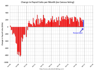
The first graph shows the monthly change in payroll jobs, ex-Census (meaning the impact of the decennial Census temporary hires and layoffs is removed - mostly in 2010 - to show the underlying payroll changes).
Total payrolls increased by 178 thousand in November (private payrolls increased 156 thousand).

Job growth has averaged 180,000 per month this year.
The peak year for job growth in this cycle was 2014 with just over 3 million jobs added. Job growth was at 2.74 million in 2015, and job growth was probably around 2.2 million in 2016.
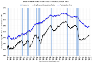
The second graph shows the employment population ratio and the participation rate.
A key story in 2016 was that the labor force participation rate (blue) increased slightly - from 62.6% in December 2015 to 62.7%.
Correction: Earlier I posted the participation rates for the 25 to 54 year old age group, not 16+.
Based on demographics, the participation rate will start declining again as more baby boomers retire - and continue declining for the next decade.
The increase in the participation rate this year suggests the labor market was strong enough to attract enough workers to overcome the demographic trend.

The unemployment rate decreased in November to 4.6%.
The unemployment rate was down from 5.0% in December 2015. The unemployment rate would have fallen further if not for the increase in the labor force participation rate.
Note the low for the unemployment rate in the previous cycles was 4.4% in 2006, and 3.8% in 2000. It wouldn't take much to be below the 2006 low.
And now to housing ...

Both existing home and home sales have been increasing, and the gap is closing.
I expect existing home sales to move more sideways, and I expect this gap to slowly close, mostly from an increase in new home sales.
This graph shows the year-over-year change in inventory and the months-of-supply. Inventory is not seasonally adjusted, so it really helps to look at the YoY change.
Inventory decreased 9.3% year-over-year in November compared to November 2015.
Months of supply was at 4.0 months in November.
The low level of existing home inventory continues to be a key story.
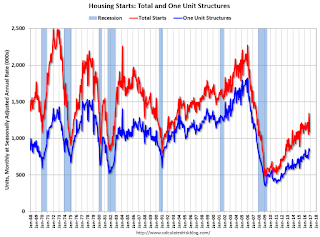
This graph shows the huge collapse in housing starts following the housing bubble, and that housing starts then mostly moved sideways for two years.
Housing is now recovering (but starts are still historically low) - so there is room to run.
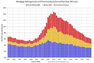
Another piece of good news is mortgage delinquencies are almost back to normal.

Note that the total percent delinquencies and foreclosures is below the 2002 level.
The percent of loans 30 and 60 days delinquent ticked down in Q3, and is below the normal historical level.
The 90 day bucket declined further in Q3, but remains a little elevated.
The percent of loans in the foreclosure process continues to decline, and is still above the historical average.
The 90 day bucket and foreclosure inventory are still elevated, but should be close to normal in 2017. Most other mortgage measures are already back to normal, but the lenders are still working through the backlog of bubble legacy loans.
Some more good news for housing is that REO (Real Estate Owned) inventories at Fannie and Freddie are almost back to normal.

REO inventory decreased in Q3 for both Fannie and Freddie, and combined inventory is down 31% year-over-year.
Delinquencies are falling, but there are still a number of properties in the foreclosure process with long time lines in judicial foreclosure states - but this is getting close to normal levels of REOs.
Remember this is just a portion of the total REO inventory. Private label securities (the worst of the worst lending) and banks and thrifts also hold a number of REOs.

Industrial production is 18.9% above the recession low, and is close to the pre-recession peak.

The recovery in consumer spending has been ongoing, and seem to have picked up in recent years.
Using the two-month method to estimate Q4 PCE growth, PCE was increasing at a 2.7% annual rate in Q4 2016. (using the mid-month method, PCE was increasing 3.2%). This suggests decent PCE growth in Q4.
So PCE had a solid year in 2016.

According to the AIA, there is an "approximate nine to twelve month lag time between architecture billings and construction spending" on non-residential construction. This index was positive in 9 of the last 12 months, suggesting a further increase in CRE investment through mid-2017.
Best to all


