 RSS Feed
 by Calculated Risk on 7/05/2022 10:30:00 AM
Tuesday, July 05, 2022
Heavy Truck Sales Solid in June
The BEA released their estimate of vehicle sales for June this morning.
This graph shows heavy truck sales since 1967 using data from the BEA. The dashed line is the June 2022 seasonally adjusted annual sales rate (SAAR).
Heavy truck sales really collapsed during the great recession, falling to a low of 180 thousand SAAR in May 2009. Then heavy truck sales increased to a new all-time high of 570 thousand SAAR in April 2019.
 Click on graph for larger image.
Note: "Heavy trucks - trucks more than 14,000 pounds gross vehicle weight."
Heavy truck sales really declined at the beginning of the pandemic, falling to a low of 308 thousand SAAR in May 2020.
Heavy truck sales were at 475 thousand SAAR in June, down from 491 thousand in May, and down slightly from 476 thousand SAAR in June 2021.
Usually, heavy truck sales decline sharply prior to a recession. Sales were solid in June.
CoreLogic: House Prices up 20.2% YoY in May
by Calculated Risk on 7/05/2022 08:00:00 AM
Notes: This CoreLogic House Price Index report is for May. The recent Case-Shiller index release was for April. The CoreLogic HPI is a three-month weighted average and is not seasonally adjusted (NSA).
From CoreLogic: CoreLogic Data: National Home Price Gains Continue to Exceed 20% in May
CoreLogic® ... today released the CoreLogic Home Price Index (HPI™) and HPI Forecast™ for May 2022.
Though U.S. home price growth relaxed slightly in May from April, it remained in double digits year over year for the 16th consecutive month. As in past months, all states and Washington, D.C. posted annual appreciation, with 13 states posting gains of more than 20%. While rising interest rates cooled overheated demand this spring and are expected to contribute to slowing price growth over the next year, motivated buyers may have less competition and more opportunities moving forward.
“Slowing home price growth reflects the dampening consequence of higher mortgage rates on housing demand, which was the intention,” said Selma Hepp, deputy chief economist at CoreLogic. “With monthly mortgage expenses up about 50% from only a few months ago, fewer buyers are now competing for continually limited inventory. And while annual home price growth still exceeds 20%, we expect to see a rapid deceleration in the rate of growth over the coming year. Nevertheless, the normalization of overheated buying conditions should bring about more of a balance between buyers and sellers and a healthier overall housing market.”
...
U.S. home prices (including distressed sales) increased 20.2% in May 2022, compared to May 2021. On a month-over-month basis, home prices increased by 1.8% compared to April 2022.
...
Annual U.S. home price gains are forecast to slow to 5% by May 2023 as rising mortgage rates and affordability challenges are expected to cool buyer demand.
emphasis added
Monday, July 04, 2022
Tuesday: CoreLogic House Prices
by Calculated Risk on 7/04/2022 11:25:00 PM
Weekend:
• Schedule for Week of July 3, 2022
• House Price Declines: How Long for Real Prices to Recover?
• Housing Inventory July 4th Update: Inventory Almost Double from March Low
• Recession Measures and NBER
Tuesday:
• At 8:00 AM ET, Corelogic House Price index for May.
From CNBC: Pre-Market Data and Bloomberg futures S&P 500 futures are up 24, and DOW futures are up 132 (fair value).
Oil prices were up over the last week with WTI futures at $110.66 per barrel and Brent at $113.50 per barrel. A year ago, WTI was at $73 and Brent was at $78 - so WTI oil prices are up 50% year-over-year.
Here is a graph from Gasbuddy.com for nationwide gasoline prices. Nationally prices are at $4.78 per gallon. A year ago, prices were at $3.11 per gallon, so gasoline prices are up $1.67 per gallon year-over-year.
House Price Declines: How Long for Real Prices to Recover?
by Calculated Risk on 7/04/2022 01:39:00 PM
Today, in the Calculated Risk Real Estate Newsletter: House Price Declines: How Long for Real Prices to Recover?
Excerpt:
Housing economist Tom Lawler sent me some old FHFA research from 2009: A Brief Examination of Previous House Price Declines. ... A conclusion from the research:First, house price downturns have tended to be long. The median time required to return to prior peak prices was 10½ to 20 years. Second, it tends to take longer for prices to rise from the trough to their former peak than it takes prices to decline from peak to trough. While the difference is small for Census Divisions and states, FHFA’s Metropolitan Statistical Area and Division (MSA) indexes suggest that the time from peak to trough tends to be about 3¾ years, whereas the median recovery period (from trough to prior peak) was 6⅔ years.
emphasis added... Here is a similar look at national prices using the real Case-Shiller index (adjusted for inflation).
The real return following the ‘79 peak was 6.5 years. It took 11 years for real prices to reach the previous peak following the peak in ‘89.
And it took 14.5 years to return to the real peak reached during the housing bubble.
This is a little premature, but following a downturn, it typically takes a long time for prices to return to the previous real price peak. Of course, homeowners think in nominal terms, and if prices just “stall”, they usually don’t notice the inflation adjusted price decline.

There is much more in the article. You can subscribe at https://calculatedrisk.substack.com/
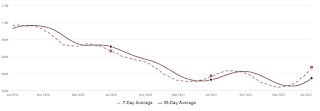
Housing Inventory July 4th Update: Inventory Almost Double from March Low
by Calculated Risk on 7/04/2022 09:40:00 AM
Inventory is increasing rapidly. Inventory bottomed seasonally at the beginning of March 2022 and is now up 97% since then. Almost double!
Altos reports inventory is up 27.4% year-over-year, and is now 8.7% above the peak in 2021.
 Click on graph for larger image.
This inventory graph is courtesy of Altos Research.
 Click on graph for larger image.
This inventory graph is courtesy of Altos Research.
As of July 1st, inventory was at 476 thousand (7-day average), compared to 444 thousand the prior week. Inventory was up 7.0% from the previous week. Inventory is increasing much faster than normal for this time of year (both in percentage terms and in total inventory added).
Inventory is still historically low. Compared to the same week in 2021, inventory is up 27.4% from 373 thousand, however compared to the same week in 2020 inventory is down 28.6% from 666 thousand. Compared to 3 years ago, inventory is down 50.3% from 958 thousand.
Here are the inventory milestones I’m watching for with the Altos data:
1. The seasonal bottom (happened on March 4th for Altos) ✅
2. Inventory up year-over-year (happened on May 13th for Altos) ✅
3. Inventory up compared to two years ago (currently down 27.4% according to Altos)
4. Inventory up compared to 2019 (currently down 50.5%).
1. The seasonal bottom (happened on March 4th for Altos) ✅
2. Inventory up year-over-year (happened on May 13th for Altos) ✅
3. Inventory up compared to two years ago (currently down 27.4% according to Altos)
4. Inventory up compared to 2019 (currently down 50.5%).

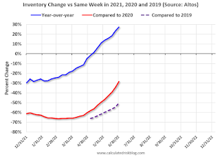
Here is a graph of the inventory change vs 2021, 2020 (milestone 3 above) and 2019 (milestone 4).
The blue line is the year-over-year data, the red line is compared to two years ago, and dashed purple is compared to 2019.
Two years ago (in 2020) inventory was declining all year, so the two-year comparison will get easier all year.
Based on the recent increases in inventory, my current estimate is inventory will be up compared to 2020 in Q3 of this year (in the next couple of months), and back to 2019 levels at the beginning of 2023.
Mike Simonsen discusses this data regularly on Youtube.
Five High Frequency Indicators for the Economy
by Calculated Risk on 7/04/2022 08:04:00 AM
These indicators are mostly for travel and entertainment. It is interesting to watch these sectors recover as the pandemic subsides. Notes: I've added back gasoline supplied to see if there is an impact from higher gasoline prices. Apple has discontinued "Apple mobility", and restaurant traffic is mostly back to normal.
The TSA is providing daily travel numbers.
This data is as of July 3rd.
 Click on graph for larger image.
This data shows the 7-day average of daily total traveler throughput from the TSA for 2019 (Light Blue), 2020 (Black), 2021 (Blue) and 2022 (Red).
The dashed line is the percent of 2019 for the seven-day average.
The 7-day average is down 5.1% from the same day in 2019 (94.9% of 2019). (Dashed line)
Air travel - as a percent of 2019 - has been moving sideways over the last several months, off about 10% from 2019.
 This data shows domestic box office for each week and the median for the years 2016 through 2019 (dashed light blue).
 Black is 2020, Blue is 2021 and Red is 2022.
The data is from BoxOfficeMojo through June 30th.
Note that the data is usually noisy week-to-week and depends on when blockbusters are released.
Movie ticket sales were at $206 million last week, down about 39% from the median for the week.
Note that the data is usually noisy week-to-week and depends on when blockbusters are released.
Movie ticket sales were at $206 million last week, down about 39% from the median for the week.
 This graph shows the seasonal pattern for the hotel occupancy rate using the four-week average.
 The red line is for 2022, black is 2020, blue is the median, and dashed light blue is for 2021. Dashed purple is 2019 (STR is comparing to a strong year for hotels).
This data is through June 25th. The occupancy rate was down 4.1% compared to the same week in 2019.
The 4-week average of the occupancy rate is at the median rate for the previous 20 years (Blue).
Notes: Y-axis doesn't start at zero to better show the seasonal change.
Notes: Y-axis doesn't start at zero to better show the seasonal change.

This graph, based on weekly data from the U.S. Energy Information Administration (EIA), shows gasoline supplied compared to the same week of 2019.
Blue is for 2020. Purple is for 2021, and Red is for 2022.
As of June 24th, gasoline supplied was down 5.7% compared to the same week in 2019.
Recently gasoline supplied has been running somewhat below 2019 levels.
Here is some interesting data on New York subway usage (HT BR).
 This graph is from Todd W Schneider.
 This graph shows how much MTA traffic has recovered in each borough (Graph starts at first week in January 2020 and 100 = 2019 average).
Manhattan is at about 36% of normal.
This data is through Friday, July 1st.
He notes: "Data updates weekly from the MTA’s public turnstile data, usually on Saturday mornings".
Sunday, July 03, 2022
Recession Measures and NBER
by Calculated Risk on 7/03/2022 03:18:00 PM
On Business Cycle Dating from NBER:
The NBER's definition emphasizes that a recession involves a significant decline in economic activity that is spread across the economy and lasts more than a few months. In our interpretation of this definition, we treat the three criteria—depth, diffusion, and duration—as somewhat interchangeable. That is, while each criterion needs to be met individually to some degree, extreme conditions revealed by one criterion may partially offset weaker indications from another. For example, in the case of the February 2020 peak in economic activity, the committee concluded that the subsequent drop in activity had been so great and so widely diffused throughout the economy that, even if it proved to be quite brief, the downturn should be classified as a recession.The following graphs show the two key measures that NBER uses as a percent of the previous peak. (Real personal income less transfers and nonfarm payroll employment).
Because a recession must influence the economy broadly and not be confined to one sector, the committee emphasizes economy-wide measures of economic activity. The determination of the months of peaks and troughs is based on a range of monthly measures of aggregate real economic activity published by the federal statistical agencies. These include real personal income less transfers, nonfarm payroll employment, employment as measured by the household survey, real personal consumption expenditures, wholesale-retail sales adjusted for price changes, and industrial production. There is no fixed rule about what measures contribute information to the process or how they are weighted in our decisions. In recent decades, the two measures we have put the most weight on are real personal income less transfers and nonfarm payroll employment.
emphasis added
 Click on graph for larger image.
This graph is for employment through May 2022.
Employment is currently off about 0.5% from the pre-recession peak (dashed line). This is a significant improvement from off 14.4% in April 2020.
Employment is still 822 thousand below pre-pandemic levels.
 And the second graph is for real personal income excluding transfer payments through May 2022.
Real personal income less transfer payments was at an all-time peak in May 2022.
These graphs are useful in trying to identify peaks and troughs in economic activity - and neither are suggesting a recession.
Note: See: Predicting the Next Recession. I'm not currently on recession watch.
Zillow Case-Shiller Forecast for May: Slowing House Price Growth
by Calculated Risk on 7/03/2022 08:11:00 AM
The Case-Shiller house price indexes for April were released this week. The "April" report is a 3-month average including February, March and April closings. So, this included price increases when mortgage rates were significantly lower than today. This report includes some homes with contracts signed last December (that closed in February)!
Zillow forecasts Case-Shiller a month early, and I like to check the Zillow forecasts since they have been pretty close.
From Zillow Research: April 2022 Case-Shiller Results & Forecast: Putting on the Brakes
With rates continuing their steep ascent and inventory picking up in months since, April is likely the first month of this deceleration as buyers balked at the cost of purchasing a home and pulled out of the market, leading to slower price growth. While inventory is improving, there is still plenty of room to go before it reaches its pre-pandemic trend. Still, coupled with relatively strong demand, that will continue to be a driver for sustained high prices even as sales volume is dropping in response to affordability constraints. As a result, more buyers will take a step to the sidelines in the coming months, which will help inventory to recover and price growth to slow from its peak, leading the market back to a more balanced stable state in the long run and providing more future opportunities for homeownership for those priced out today.
Annual home price growth as reported by Case-Shiller are expected to slow in all three indices. Monthly appreciation in May is expected to decelerate from April in both city indices, and hold in the national index. S&P Dow Jones Indices is expected to release data for the May S&P CoreLogic Case-Shiller Indices on Tuesday, July 26.
emphasis added
 The Zillow forecast is for the year-over-year change for the Case-Shiller National index to be 19.5% in May. This is slightly slower than in February, March and April, but still very strong YoY growth.
Saturday, July 02, 2022
Real Estate Newsletter Articles this Week
by Calculated Risk on 7/02/2022 02:11:00 PM
At the Calculated Risk Real Estate Newsletter this week:
• Housing: Inventory will Tell the Tale
• Case-Shiller National Index up 20.4% Year-over-year in April
• Worst Housing Affordability" since 1991 excluding Bubble
• Realtor.com Reports Weekly Inventory Up 25% Year-over-year
• Rent Increases Up Sharply Year-over-year, Pace is slowing
This is usually published 4 to 6 times a week and provides more in-depth analysis of the housing market.
You can subscribe at https://calculatedrisk.substack.com/
Most content is available for free (and no Ads), but please subscribe!
Vehicles Sales Increased to 13.00 million SAAR in June
by Calculated Risk on 7/02/2022 09:00:00 AM
Wards Auto released their estimate of light vehicle sales for June. Wards Auto estimates sales of 13.00 million SAAR in June 2022 (Seasonally Adjusted Annual Rate), up 2.5% from the May sales rate, and down 16.0% from June 2021.
 Click on graph for larger image.
This graph shows light vehicle sales since 2006 from the BEA (blue) and Wards Auto's estimate for June (red).
The impact of COVID-19 was significant, and April 2020 was the worst month. After April 2020, sales increased, and were close to sales in 2019 (the year before the pandemic).
However, sales decreased late last year due to supply issues. It appears the "supply chain bottom" was in September 2021.
 The second graph shows light vehicle sales since the BEA started keeping data in 1967.
 Sales in June were below the consensus forecast of 13.6 million SAAR.


