 RSS Feed
 by Calculated Risk on 4/04/2022 06:04:00 PM
Monday, April 04, 2022
Lawler: What is the Yield Curve Signaling?
From housing economist Tom Lawler: What is the Yield Curve Signaling?
Before addressing the above question, here is a little quiz:
The current Treasury yield is by historical standards:
(a) Unusually steep
(b) A bit flatter than normal
(c) Very unusually inverted
(d) All of the above
The current answer is, of course, (d), as the current Treasury yield curve is historically very steep from 3-months to 2-years, a bit flatter than normal from 2- to 3-years, and inverted from 3- to 10-years. (And spreads between the 3-year Treasury and the Fed funds rate is at its widest level since 1994).
Below is a chart comparing average yields curves during the previous three decades compared to today’s (mid-afternoon) yield curve.
 Such “humped” yield curves as the current curve are unusual, and the degree of “humpiest” in the current curve is virtually unprecedented.
Many analysts, economists, and financial news reporters have expressed significant “angst” recently because the spread between the 10-year Treasury yield and the 2-year Treasury yields has turned slightly negative, and such “inversions” have been leading indicators of recessions (though lag times vary considerably.)
However, there is nothing “magical” about the “10/2” spread: other yield curve measures have been comparable or some have argued even better indicators of recessions/growth slowdowns. For example, in a March “reprise” of their 2018 paper, Fed economists Engstrom and Sharpe (https://www.federalreserve.gov/econres/notes/feds-notes/dont-fear-the-yield-curve-reprise-20220325.htm) argue that a much shorter term yield curve measure (the implied forward 3-month Treasury rate 6 months out compared to the current 3-month Treasury rate) is a better forward indicator than the 10/2 spread.
While I’m not a fan of their particular “curve” indicator because (1) it requires quotes on 21 month and 18 month Treasuries, which are not readily available on screens or historically, and (2) the short part of the Treasury curve has at times been much steeper than private money market yield curves for reasons other than “expectations” (see Rowe, Lawler, and Cook https://citeseerx.ist.psu.edu/viewdoc/download?doi=10.1.1.1009.2682&rep=rep1&type=pdf , 1986), there are other yield curve measures that have had the same or better “indicator” value as the 10/2 spread but which today are sending much different signals than the 10/2 spread.
 E.g., [here] is a chart comparing the historical behavior of the spread between the 10-year and the 2-year Treasury with the spread between the 5-year and the 1-year Treasury. (Recessions are shown poorly in the chart.)
 As the chart shows, both of these yield curves meaasures have normally moved together, and both have typically inverted at about the same time – until recently. While the 10/2 spread went from an average of 79 bp in December of last year to negative 4 bp today, the 5/1 spread today is about 85 bp, down only slightly from the 93 bp average last December. And the spread between the 5-year Treasury and the Fed funds rate (not show here) has WIDENED to about 223 bp today from an 87 bp average last December.
 [Here] is another yield curve chart comparing spreads between 3-year Treasuries and Fed Funds as well as 3-year Treasuries and 6-month Treasuries from 1990 through today. This chart highlights have these yield curve measures have widened substantially this year. (The chart only goes back to 1990).
While the current “inversion” of the Treasury yield curve from 3-year to 10 years may reflect “the market’s” view that there may be a slowdown in the economy 3+year out in part because of substanial increases in the Fed’s target Fed funds rate over the next several years (though so far the Fed has only increased the funds rate by 25 bp current steepness of the the curve from the very short end to 3 years suggest that the yield curve is not giving any signals of a slowdown in economic growth over the next several years.
Update: Framing Lumber Prices: Down from Recent Peak, Up Triple from 2 Years Ago
by Calculated Risk on 4/04/2022 02:12:00 PM
Here is another monthly update on framing lumber prices.
This graph shows CME random length framing futures through April 4th.
Lumber was at $962 per 1000 board feet this morning.
This is down from the peak of $1,733, and down 5% from $1,013 a year ago - but up more than triple from $311 two years ago.
 Click on graph for larger image.
A combination of strong demand and various supply constraints have kept lumber prices high and volatile.
 Click on graph for larger image.
There is somewhat of a seasonal demand for lumber, and lumber prices usually peak in April or May (although it seems likely lumber prices peaked earlier this year).
A combination of strong demand and various supply constraints have kept lumber prices high and volatile.
Black Knight Mortgage Monitor for February: "Tightest affordability in 15 years"
by Calculated Risk on 4/04/2022 11:22:00 AM
Today, in the Calculated Risk Real Estate Newsletter: Black Knight Mortgage Monitor for February: "Tightest affordability in 15 years"
A brief excerpt:
And on the payment to income ratio (this is high):There is much more in the article. You can subscribe at https://calculatedrisk.substack.com/
• It now takes 29.1% of the median household income to make that P&I payment, up from 19.3% just 15 months agoAs Black Knight noted, there were “affordability products” with low teaser rates available during the housing bubble. Excluding the bubble years, this is the worst affordability since the early ‘90s.
• That is a full 4 percentage points more than the 1995-2003 long-term average, though still below the 2006 high of 34%
• In recent years, a payment-to-income ratio above 21% has worked to cool the housing market, but record-low inventory continues to fuel growth even in the face of the tightest affordability in 15 years
• At current home prices and interest rates, it would take a 16% rise in incomes to bring the P&I ratio back down to benchmark affordability levels

Housing Inventory April 4th Update: Inventory up 0.7% Week-over-week; Up 5.9% from Seasonal Bottom
by Calculated Risk on 4/04/2022 09:13:00 AM
Tracking existing home inventory is very important in 2022.
Inventory usually declines in the winter, and then increases in the spring. Inventory bottomed seasonally at the beginning of March 2022 and is now up 5.9% since then.
 Click on graph for larger image in graph gallery.
This inventory graph is courtesy of Altos Research.
As of April 1st, inventory was at 255 thousand (7-day average), compared to 253 thousand the prior week. Inventory was UP 0.7% from the previous week.
Last year inventory bottomed seasonally in April 2021 - very late in the year. This year, by this measure, inventory bottomed seasonally at the beginning of March.
Inventory is still very low. Compared to the same week in 2021, inventory is down 17.6% from 310 thousand, and compared to the same week in 2020, and inventory is down 66.0% from 751 thousand.
One of the keys will be to watch the year-over-year change each week to see if the declines are decreasing. Here is a table of the year-over-year change by week since the beginning of the year.
| Week Ending | YoY Change |
|---|---|
| 12/31/2021 | -30.0% |
| 1/7/2022 | -26.0% |
| 1/14/2022 | -28.6% |
| 1/21/2022 | -27.1% |
| 1/28/2022 | -25.9% |
| 2/4/2022 | -27.9% |
| 2/11/2022 | -27.5% |
| 2/18/2022 | -25.8% |
| 2/25/2022 | -24.9% |
| 3/4/2022 | -24.2% |
| 3/11/2022 | -21.7% |
| 3/18/2022 | -21.7% |
| 3/25/2022 | -19.0% |
| 4/4/2022 | -17.6% |

Here is a graph of the year-over-year change in the Altos data.
The blue trend line is from the beginning of the year, and the red trend line is over the last 8 weeks.
Currently it appears inventory will be up year-over-year sometime on the 3rd quarter of 2022.
Mike Simonsen discusses this data regularly on Youtube.
Six High Frequency Indicators for the Economy
by Calculated Risk on 4/04/2022 08:48:00 AM
These indicators are mostly for travel and entertainment. It is interesting to watch these sectors recover as the pandemic subsides.
The TSA is providing daily travel numbers.
This data is as of April 3rd.
 Click on graph for larger image.
This data shows the 7-day average of daily total traveler throughput from the TSA for 2019 (Light Blue), 2020 (Black), 2021 (Blue) and 2022 (Red).
The dashed line is the percent of 2019 for the seven-day average.
The 7-day average is down 9.8% from the same day in 2019 (09.2% of 2019). (Dashed line)
Air travel was picking up over the last month.
The second graph shows the 7-day average of the year-over-year change in diners as tabulated by OpenTable for the US and several selected cities.
IMPORTANT: OpenTable notes that all data is compared to 2019. Thanks!
 Thanks to OpenTable for providing this restaurant data:
This data is updated through April 2, 2022.
This data is "a sample of restaurants on the OpenTable network across all channels: online reservations, phone reservations, and walk-ins. For year-over-year comparisons by day, we compare to the same day of the week from the same week in the previous year."
Dining was mostly moving sideways but declined during the winter wave of COVID and is now increasing. The 7-day average for the US is down 1% compared to 2019.
 This data shows domestic box office for each week and the median for the years 2016 through 2019 (dashed light blue).
 Black is 2020, Blue is 2021 and Red is 2022.
The data is from BoxOfficeMojo through March 31st.
Note that the data is usually noisy week-to-week and depends on when blockbusters are released.
Movie ticket sales were at $109 million last week, down about 46% from the median for the week.
Note that the data is usually noisy week-to-week and depends on when blockbusters are released.
Movie ticket sales were at $109 million last week, down about 46% from the median for the week.
 This graph shows the seasonal pattern for the hotel occupancy rate using the four-week average.
 The red line is for 2022, black is 2020, blue is the median, and dashed light blue is for 2021.
This data is through March 26th. The occupancy rate was down 5.5% compared to the same week in 2019.
TThe 4-week average of the occupancy rate is just below the median rate for the previous 20 years (Blue).
Notes: Y-axis doesn't start at zero to better show the seasonal change.
Notes: Y-axis doesn't start at zero to better show the seasonal change.
The 4-week average of the occupancy rate will now mostly move sideways seasonally until the summer.
NOTE: Apple will stop providing this data on April 14th.
This graph is from Apple mobility. From Apple: "This data is generated by counting the number of requests made to Apple Maps for directions in select countries/regions, sub-regions, and cities." This is just a general guide - people that regularly commute probably don't ask for directions.
 This data is through April 2nd
 This data is through April 2nd
 for the United States and several selected cities.
The graph is the running 7-day average to remove the impact of weekends.
IMPORTANT: All data is relative to January 13, 2020. This data is NOT Seasonally Adjusted. People walk and drive more when the weather is nice, so I'm just using the transit data.
According to the Apple data directions requests, public transit in the 7-day average for the US is at 122% of the January 2020 level.
Here is some interesting data on New York subway usage (HT BR).
 This graph is from Todd W Schneider.
 This graph shows how much MTA traffic has recovered in each borough (Graph starts at first week in January 2020 and 100 = 2019 average).
Manhattan is at about 38% of normal.
This data is through Friday, April 1st.
He notes: "Data updates weekly from the MTA’s public turnstile data, usually on Saturday mornings".
Sunday, April 03, 2022
Sunday Night Futures
by Calculated Risk on 4/03/2022 07:29:00 PM
Weekend:
• Schedule for Week of April 3, 2022
Monday:
• No major economic releases scheduled.
From CNBC: Pre-Market Data and Bloomberg futures S&P 500 are down 4 and DOW futures are down 18 (fair value).
Oil prices were down over the last week with WTI futures at $99.27 per barrel and Brent at $104.39 per barrel. A year ago, WTI was at $61, and Brent was at $64 - so WTI oil prices are up 60% year-over-year.
Here is a graph from Gasbuddy.com for nationwide gasoline prices. Nationally prices are at $4.18 per gallon. A year ago prices were at $2.87 per gallon, so gasoline prices are up $1.31 per gallon year-over-year.
Zillow Case-Shiller House Price Forecast: February similar to January Year-over-year
by Calculated Risk on 4/03/2022 10:31:00 AM
The Case-Shiller house price indexes for January were released this week. Zillow forecasts Case-Shiller a month early, and I like to check the Zillow forecasts since they have been pretty close.
From Zillow Research: January 2022 Case-Shiller Results & Forecast: Competitive Conditions
Though home sales have remained at elevated levels, rising mortgage rates, rapidly increasing home values, and fierce competition for listings may have some potential buyers rethinking whether they’re going to take the plunge into the market. Looking to the months ahead, competition between buyers will be intense. Homes that went pending this winter typically did so in less than two weeks, an unseasonably fast pace. For those hoping there would be a big enough wave of sellers listing their homes this spring to ease some of the most competitive conditions we’ve ever seen, there’s no sign yet of that being the case. New listings are coming onto the market below levels we’ve seen in the weeks leading up to the shopping season of years past. In the short term, it all adds up to what is looking to be another few months of a history-making for-sale market.
Annual growth in February as reported by Case-Shiller is expected to accelerate slightly in the 10-city index and remain unchanged in the national and 20-city indices. Monthly growth in February is expected to decelerate from January in the national and 10-city indices, and hold steady in the 20-city index. S&P Dow Jones Indices is expected to release data for the February S&P CoreLogic Case-Shiller Indices on Tuesday, April 26.
emphasis added
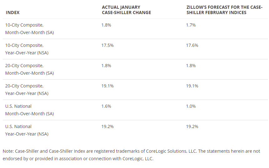 The Zillow forecast is for the year-over-year change for the Case-Shiller National index to be at 19.2% in February, unchanged from 19.2% in January.
Saturday, April 02, 2022
Real Estate Newsletter Articles this Week
by Calculated Risk on 4/02/2022 02:11:00 PM
At the Calculated Risk Real Estate Newsletter this week:
• It is the Change in Monthly Payment that Matters
• Housing: Don't Compare the Current Housing Boom to the Bubble and Bust
• Real House Prices, Price-to-Rent Ratio and Price-to-Median Income in January
• Case-Shiller National Index up 19.2% Year-over-year in January
• Housing Inventory Has Bottomed
This is usually published several times a week and provides more in-depth analysis of the housing market.
The blog will continue as always!
You can subscribe at https://calculatedrisk.substack.com/
Most content is available for free (and no Ads), but please subscribe!
Schedule for Week of April 3, 2022
by Calculated Risk on 4/02/2022 08:11:00 AM
This will be a light week for economic data.
The key report this week is the Trade Deficit.
No major economic releases scheduled.
8:00 AM: Corelogic House Price index for February.
 8:30 AM: Trade Balance report for February from the Census Bureau.
 This graph shows the U.S. trade deficit, with and without petroleum, through the most recent report. The blue line is the total deficit, and the black line is the petroleum deficit, and the red line is the trade deficit ex-petroleum products.
The consensus is the trade deficit to be $88.7 billion. The U.S. trade deficit was at $89.7 billion in January.
10:00 AM: the ISM Services Index for March.
7:00 AM ET: The Mortgage Bankers Association (MBA) will release the results for the mortgage purchase applications index.
2:00 PM: FOMC Minutes, Minutes Meeting of March 15-16, 2022
8:30 AM: The initial weekly unemployment claims report will be released. The consensus is for a decrease to 200 thousand from 202 thousand last week.
No major economic releases scheduled.
Friday, April 01, 2022
March Vehicles Sales decreased to 13.33 million SAAR
by Calculated Risk on 4/01/2022 07:04:00 PM
Wards Auto released their estimate of light vehicle sales for March. Wards Auto estimates sales of 13.33 million SAAR in March 2022 (Seasonally Adjusted Annual Rate), down 5.3% from the February sales rate, and down 24.4% from March 2021.
 Click on graph for larger image.
This graph shows light vehicle sales since 2006 from the BEA (blue) and Wards Auto's estimate for March (red).
The impact of COVID-19 was significant, and April 2020 was the worst month. After April 2020, sales increased, and were close to sales in 2019 (the year before the pandemic).
However, sales decreased late last year due to supply issues. It appears the "supply chain bottom" was in September 2021, however sales in February were below the consensus forecast of 14.1 million SAAR - and not far above the supply chain bottom last year.
Another weak month for vehicle sales.


