 RSS Feed
 by Calculated Risk on 7/26/2021 09:00:00 PM
Monday, July 26, 2021
Tuesday: Case-Shiller House Prices, Q2 Housing Vacancies and Homeownership
From Matthew Graham at Mortgage News Daily: MBS RECAP: Slow Monday, But Late Warning Shots
It was a slow trading day for the most part until the last 90 minutes. ... As the day wound down, yields bumped up to the highs--right in line with the 1.295% technical level--and MBS coughed up a quick eighth of a point. That was enough for several lenders to reprice for the worse even though the weakness doesn't speak to any bigger picture issues. ... [30 year fixed 2.86%]Tuesday:
emphasis added
• At 9:00 AM ET, S&P/Case-Shiller House Price Index for May. The consensus is for a 16.3% year-over-year increase in the Comp 20 index for May.
• Also at 9:00 AM, FHFA House Price Index for May. This was originally a GSE only repeat sales, however there is also an expanded index.
• At 10:00 AM: Richmond Fed Survey of Manufacturing Activity for July. This is the last of the regional surveys for July.
• Also at 10:00 AM, The Q2 Housing Vacancies and Homeownership report from the Census Bureau.
Freddie Mac: Mortgage Serious Delinquency Rate decreased in June
by Calculated Risk on 7/26/2021 04:38:00 PM
Freddie Mac reported that the Single-Family serious delinquency rate in June was 1.86%, down from 2.01% in May. Freddie's rate is down year-over-year from 2.48% in June 2020.
Freddie's serious delinquency rate peaked in February 2010 at 4.20% following the housing bubble, and peaked at 3.17% in August 2020 during the pandemic.
These are mortgage loans that are "three monthly payments or more past due or in foreclosure".
 Click on graph for larger image
Mortgages in forbearance are being counted as delinquent in this monthly report, but they will not be reported to the credit bureaus.
This is very different from the increase in delinquencies following the housing bubble. Lending standards have been fairly solid over the last decade, and most of these homeowners have equity in their homes - and they will be able to restructure their loans once (if) they are employed.
Also - for multifamily - delinquencies were at 0.15%, down from 0.19% in May, and down from the peak of 0.20% in April 2021.
July 26th COVID-19, New Cases, Hospitalizations, Vaccinations
by Calculated Risk on 7/26/2021 04:23:00 PM
Note: Data reported on Monday is always low, and is revised up as data is received.
This data is from the CDC.
According to the CDC, on Vaccinations.
Total doses administered: 342,212,051, as of a week ago 338,247,434. Average doses last week: 0.57 million per day.
| COVID Metrics | ||||
|---|---|---|---|---|
| Today | Yesterday | Week Ago | Goal | |
| Percent over 18, One Dose | 69.0% | 69.0% | 68.3% | ≥70.0%1,2 |
| Fully Vaccinated✅ (millions) | 163.2 | 163.0 | 161.5 | ≥1601 |
| New Cases per Day3🚩 | 42,226 | 45,332 | 34,465 | ≤5,0002 |
| Hospitalized3🚩 | 24,257 | 24,368 | 20,958 | ≤3,0002 |
| Deaths per Day3🚩 | 239 | 245 | 214 | ≤502 |
| 1 America's Short Term Goals, 2my goals to stop daily posts, 37 day average for Cases, Hospitalized, and Deaths 🚩 Increasing 7 day average week-over-week for Cases, Hospitalized, and Deaths ✅ Goal met (even if late). | ||||
KUDOS to the residents of the 20 states and D.C. that have achieved the 70% goal (percent over 18 with at least one dose): Vermont, Hawaii, Massachusetts and Connecticut are at 80%+, and Maine, New Mexico, New Jersey, Rhode Island, Pennsylvania, California, Maryland, Washington, New Hampshire, New York, Illinois, Virginia, Delaware, Minnesota, Oregon, Colorado and D.C. are all over 70%.
Next up are Florida at 67.6%, Utah at 67.1%, Wisconsin at 66.9%, Nebraska at 66.7%, South Dakota at 65.7%, Kansas at 65.9%, Iowa at 65.1%, Nevada at 64.8% and Arizona at 64.1%.
 Click on graph for larger image.
This graph shows the daily (columns) and 7 day average (line) of positive tests reported.
This data is from the CDC.
MBA Survey: "Share of Mortgage Loans in Forbearance Slightly Decreases to 3.48%"
by Calculated Risk on 7/26/2021 04:00:00 PM
Note: This is as of July 18th.
From the MBA: Share of Mortgage Loans in Forbearance Slightly Decreases to 3.48%
The Mortgage Bankers Association’s (MBA) latest Forbearance and Call Volume Survey revealed that the total number of loans now in forbearance decreased by 2 basis points from 3.50% of servicers’ portfolio volume in the prior week to 3.48% as of July 18, 2021. According to MBA’s estimate, 1.74 million homeowners are in forbearance plans.
The share of Fannie Mae and Freddie Mac loans in forbearance decreased 2 basis points to 1.81%. Ginnie Mae loans in forbearance decreased 1 basis point to 4.35%, while the forbearance share for portfolio loans and private-label securities (PLS) increased 5 basis points to 7.38%. The percentage of loans in forbearance for independent mortgage bank (IMB) servicers remained the same relative to the prior week at 3.68%, and the percentage of loans in forbearance for depository servicers decreased 1 basis point to 3.61%.
“As is typical for mid-month reporting, forbearance exits slowed, and there was a slight increase in new requests. The net result was a small drop in the share of loans in forbearance – the 21 st consecutive week of declines,” said Mike Fratantoni, MBA’s Senior Vice President and Chief Economist. “The forbearance share decreased for GSE and Ginnie Mae loans, but increased for portfolio and PLS loans, as new forbearance requests increased for this category.”
emphasis added
 Click on graph for larger image.
This graph shows the percent of portfolio in forbearance by investor type over time. Most of the increase was in late March and early April 2020, and has trended down since then.
The MBA notes: "Total weekly forbearance requests as a percent of servicing portfolio volume (#) increased relative to the prior week: from 0.03% to 0.04%"
Housing Inventory July 26th Update: Inventory Increased 3% Week-over-week, Up 31% from Low in early April
by Calculated Risk on 7/26/2021 12:23:00 PM
Tracking existing home inventory will be very important this year.
 Click on graph for larger image in graph gallery.
This inventory graph is courtesy of Altos Research.
As of July 23rd, inventory was at 403 thousand (7 day average), compared to 640 thousand the same week a year ago. That is a decline of 37.1%.
A week ago, inventory was at 391 thousand, and was down 39.6% YoY.
Seasonally, inventory has bottomed. Inventory was about 31.4% above the record low in early April.
Mike Simonsen discusses this data regularly on Youtube.
Altos Research has also seen a significant pickup in price decreases - almost back to the level of a year ago - although still well below a normal rate for July.
A few Comments on June New Home Sales
by Calculated Risk on 7/26/2021 10:34:00 AM
New home sales for June were reported at 676,000 on a seasonally adjusted annual rate basis (SAAR). Sales for the previous three months were revised down significantly.
This was well below consensus expectations for June, and probably the start of a number of months with year-over-year declines.
However, sales were in line with home builder comments about "limiting sales", closing communities and limited finished inventory.
Earlier: New Home Sales Decrease to 676,000 Annual Rate in June.
 Click on graph for larger image.
This graph shows new home sales for 2020 and 2021 by month (Seasonally Adjusted Annual Rate).
The year-over-year comparisons were easy in the first half of 2021 - especially in March and April.
However, sales will likely be down year-over-year in the 2nd half of 2021 - since the selling season was delayed in 2020.
And on inventory: note that completed inventory (3rd graph in previous post) is near record lows, but inventory under construction is closer to normal.
 This graph shows the months of supply by stage of construction.
The inventory of completed homes for sale was at 36 thousand in June, just above the record low of 33 thousand in March and April 2021. That is about 0.6 months of completed supply (just above the record low).
The inventory of new homes under construction, and not started, is at 5.6 months - slightly above the normal level. However, a record 105 thousand homes have not been started - about double the normal level.
New Home Sales Decrease to 676,000 Annual Rate in June
by Calculated Risk on 7/26/2021 10:15:00 AM
The Census Bureau reports New Home Sales in June were at a seasonally adjusted annual rate (SAAR) of 676 thousand.
The previous three months were revised down sharply.
Sales of new single‐family houses in June 2021 were at a seasonally adjusted annual rate of 676,000, according to estimates released jointly today by the U.S. Census Bureau and the Department of Housing and Urban Development. This is 6.6 percent below the revised May rate of 724,000 and is 19.4 percent below the June 2020 estimate of 839,000.
emphasis added
 Click on graph for larger image.
The first graph shows New Home Sales vs. recessions since 1963. The dashed line is the current sales rate.
This is the start of likely year-over-year declines since sales soared following the first few months of the pandemic.
The second graph shows New Home Months of Supply.
 The months of supply increased in June to 6.3 months from 5.5 months in May.
 The all time record high was 12.1 months of supply in January 2009. The all time record low was 3.5 months, most recently in October 2020.
This is above the normal range (about 4 to 6 months supply is normal).
"The seasonally‐adjusted estimate of new houses for sale at the end of June was 353,000. This represents a supply of 6.3 months at the current sales rate."
 On inventory, according to the Census Bureau:
 "A house is considered for sale when a permit to build has been issued in permit-issuing places or work has begun on the footings or foundation in nonpermit areas and a sales contract has not been signed nor a deposit accepted."Starting in 1973 the Census Bureau broke this down into three categories: Not Started, Under Construction, and Completed.
The third graph shows the three categories of inventory starting in 1973.
The inventory of completed homes for sale is just above the record low, but the combined total of completed and under construction is close to normal.
 The last graph shows sales NSA (monthly sales, not seasonally adjusted annual rate).
In June 2021 (red column), 60 thousand new homes were sold (NSA). Last year, 79 thousand homes were sold in June.
The all time high for June was 115 thousand in 2005, and the all time low for June was 28 thousand in 2010 and in 2011.
This was well below expectations of 800 thousand sales SAAR, and sales in the three previous months were revised down significantly. I'll have more later today.
Seven High Frequency Indicators for the Economy
by Calculated Risk on 7/26/2021 08:14:00 AM
These indicators are mostly for travel and entertainment. It will interesting to watch these sectors recover as the pandemic subsides.
The TSA is providing daily travel numbers.
This data is as of July 25th.
 Click on graph for larger image.
This data shows the 7-day average of daily total traveler throughput from the TSA for 2019 (Light Blue), 2020 (Blue) and 2021 (Red).
The dashed line is the percent of 2019 for the seven day average.
The 7-day average is down 21.3% from the same day in 2019 (78.7% of 2019). (Dashed line)
There was a slow increase from the bottom - and TSA data has picked up in 2021 - but moved over the last couple of weeks.
The second graph shows the 7-day average of the year-over-year change in diners as tabulated by OpenTable for the US and several selected cities.
IMPORTANT: OpenTable notes: "we’ve updated the data including downloadable dataset from January 1, 2021 onward to compare seated diners from 2021 to 2019, as opposed to year over year." Thanks!
 Thanks to OpenTable for providing this restaurant data:
This data is updated through July 24th, 2021.
This data is "a sample of restaurants on the OpenTable network across all channels: online reservations, phone reservations, and walk-ins. For year-over-year comparisons by day, we compare to the same day of the week from the same week in the previous year."
Note that this data is for "only the restaurants that have chosen to reopen in a given market". Since some restaurants have not reopened, the actual year-over-year decline is worse than shown.
Dining picked up during the holidays, then slumped with the huge winter surge in cases. Dining is generally picking up, but was down 6% in the US (7-day average compared to 2019). Florida and Texas are above 2019 levels.
----- Movie Tickets: Box Office Mojo -----
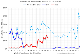 This data shows domestic box office for each week and the median for the years 2016 through 2019 (dashed light blue).
 Thanks to OpenTable for providing this restaurant data:
This data is updated through July 24th, 2021.
This data is "a sample of restaurants on the OpenTable network across all channels: online reservations, phone reservations, and walk-ins. For year-over-year comparisons by day, we compare to the same day of the week from the same week in the previous year."
Note that this data is for "only the restaurants that have chosen to reopen in a given market". Since some restaurants have not reopened, the actual year-over-year decline is worse than shown.
Dining picked up during the holidays, then slumped with the huge winter surge in cases. Dining is generally picking up, but was down 6% in the US (7-day average compared to 2019). Florida and Texas are above 2019 levels.
 This data shows domestic box office for each week and the median for the years 2016 through 2019 (dashed light blue).
 Blue is 2020 and Red is 2021.
The data is from BoxOfficeMojo through July 22nd.
Note that the data is usually noisy week-to-week and depends on when blockbusters are released.
Movie ticket sales were at $132 million last week, down about 52% from the median for the week.
Note that the data is usually noisy week-to-week and depends on when blockbusters are released.
Movie ticket sales were at $132 million last week, down about 52% from the median for the week.
 This graph shows the seasonal pattern for the hotel occupancy rate using the four week average.
 The red line is for 2021, black is 2020, blue is the median, dashed purple is 2019, and dashed light blue is for 2009 (the worst year on record for hotels prior to 2020).
Occupancy is well above the horrible 2009 levels and weekend occupancy (leisure) has been solid.
This data is through July 17th. The occupancy rate is down 8.7% compared to the same week in 2019. Note: Occupancy was up year-over-year, since occupancy declined sharply at the onset of the pandemic. However, the 4-week average occupancy is still down from normal levels.
Notes: Y-axis doesn't start at zero to better show the seasonal change.
 This graph, based on weekly data from the U.S. Energy Information Administration (EIA), shows gasoline supplied compared to the same week of 2019.
Blue is for 2020. Red is for 2021.
As of July 16th, gasoline supplied was down 3.9% compared to the same week in 2019.
There have been 3 weeks so far this year when gasoline supplied was up compared to the same week in 2019.
This graph is from Apple mobility. From Apple: "This data is generated by counting the number of requests made to Apple Maps for directions in select countries/regions, sub-regions, and cities." This is just a general guide - people that regularly commute probably don't ask for directions.
There is also some great data on mobility from the Dallas Fed Mobility and Engagement Index. However the index is set "relative to its weekday-specific average over January–February", and is not seasonally adjusted, so we can't tell if an increase in mobility is due to recovery or just the normal increase in the Spring and Summer.
 This data is through July 23rd for the United States and several selected cities.
The graph is the running 7-day average to remove the impact of weekends.
IMPORTANT: All data is relative to January 13, 2020. This data is NOT Seasonally Adjusted. People walk and drive more when the weather is nice, so I'm just using the transit data.
According to the Apple data directions requests, public transit in the 7 day average for the US is at 101% of the January 2020 level.
Strangely, New York City is doing well by this metric, but subway usage in NYC is down sharply (next graph). I'd put much more weight on subway usage!
----- New York City Subway Usage -----
Here is some interesting data on New York subway usage (HT BR).
 This graph is from Todd W Schneider. This is weekly data since 2015.
Here is some interesting data on New York subway usage (HT BR).
 This graph is from Todd W Schneider. This is weekly data since 2015.
 Most weeks are between 30 and 35 million entries, and currently there are over 12 million subway turnstile entries per week - and generally increasing.
This data is through Friday, July 23rd.
Schneider has graphs for each borough, and links to all the data sources.
He notes: "Data updates weekly from the MTA’s public turnstile data, usually on Saturday mornings".
This data is through Friday, July 23rd.
Schneider has graphs for each borough, and links to all the data sources.
He notes: "Data updates weekly from the MTA’s public turnstile data, usually on Saturday mornings".
Sunday, July 25, 2021
Monday: New Home Sales
by Calculated Risk on 7/25/2021 08:06:00 PM
Weekend:
• Schedule for Week of July 25, 2021
• FOMC Preview: Probably Too Soon for Hints on Tapering
Monday:
• At 10:00 AM ET, New Home Sales for June from the Census Bureau. The consensus is for 800 thousand SAAR, up from 769 thousand in May.
• At 10:30 AM, Dallas Fed Survey of Manufacturing Activity for July.
From CNBC: Pre-Market Data and Bloomberg futures S&P 500 and DOW futures are mostly unchanged (fair value).
Oil prices were up over the last week with WTI futures at $72.07 per barrel and Brent at $74.10 per barrel. A year ago, WTI was at $41, and Brent was at $43 - so WTI oil prices are UP about 75% year-over-year (oil prices collapsed at the beginning of the pandemic).
Here is a graph from Gasbuddy.com for nationwide gasoline prices. Nationally prices are at $3.14 per gallon. A year ago prices were at $2.15 per gallon, so gasoline prices are up $0.99 per gallon year-over-year.
July 25th COVID-19, New Cases, Hospitalizations, Vaccinations
by Calculated Risk on 7/25/2021 03:54:00 PM
Note: Cases and Deaths not updated on Sundays.
The 7-day average cases is the highest since May 3rd.
The 7-day average hospitalizations is the highest since May 21st.
This data is from the CDC.
According to the CDC, on Vaccinations.
Total doses administered: 341,818,968, as of a week ago 337,740,358. Average doses last week: 0.58 million per day.
KUDOS to the residents of the 20 states and D.C. that have achieved the 70% goal (percent over 18 with at least one dose): Vermont, Hawaii, Massachusetts and Connecticut are at 80%+, and Maine, New Mexico, New Jersey, Rhode Island, Pennsylvania, California, Maryland, Washington, New Hampshire, New York, Illinois, Virginia, Delaware, Minnesota, Oregon, Colorado and D.C. are all over 70%.
According to the CDC, on Vaccinations.
Total doses administered: 341,818,968, as of a week ago 337,740,358. Average doses last week: 0.58 million per day.
| COVID Metrics | ||||
|---|---|---|---|---|
| Today | Yesterday | Week Ago | Goal | |
| Percent over 18, One Dose | 69.0% | 68.8% | 68.2% | ≥70.0%1,2 |
| Fully Vaccinated✅ (millions) | 163.0 | 162.7 | 161.2 | ≥1601 |
| New Cases per Day3🚩 | 47,455 | 44,063 | 30,682 | ≤5,0002 |
| Hospitalized3🚩 | 24,252 | 23,654 | 17,724 | ≤3,0002 |
| Deaths per Day3🚩 | 253 | 249 | 216 | ≤502 |
| 1 America's Short Term Goals, 2my goals to stop daily posts, 37 day average for Cases, Hospitalized, and Deaths 🚩 Increasing 7 day average week-over-week for Cases, Hospitalized, and Deaths ✅ Goal met (even if late). | ||||
KUDOS to the residents of the 20 states and D.C. that have achieved the 70% goal (percent over 18 with at least one dose): Vermont, Hawaii, Massachusetts and Connecticut are at 80%+, and Maine, New Mexico, New Jersey, Rhode Island, Pennsylvania, California, Maryland, Washington, New Hampshire, New York, Illinois, Virginia, Delaware, Minnesota, Oregon, Colorado and D.C. are all over 70%.
Next up are Florida at 67.6%, Utah at 67.1%, Wisconsin at 66.8%, Nebraska at 66.7%, South Dakota at 65.7%, Kansas at 65.6%, Iowa at 65.1%, Nevada at 64.6% and Arizona at 63.9%.
 Click on graph for larger image.
This graph shows the daily (columns) and 7 day average (line) of hospitalizations reported.
This data is from the CDC.


