 RSS Feed
 by Calculated Risk on 5/11/2021 11:56:00 AM
Tuesday, May 11, 2021
Leading Index for Commercial Real Estate Increased in April
From Dodge Data Analytics: Dodge Momentum Index Increases In April
The Dodge Momentum Index posted an 8.6% gain in April, climbing to 162.4 (2000=100) from the revised reading of 149.5 in March. The Momentum Index, issued by Dodge Data & Analytics, is a monthly measure of the first (or initial) report for nonresidential building projects in planning, which have been shown to lead construction spending for nonresidential buildings by a full year. April’s gain marks the fifth consecutive monthly increase, and similar to February and March, was due to a large increase in institutional buildings entering the planning stage while commercial planning eased by less than one percent.
Since hitting its nine-year low in January, institutional planning has rebounded substantially, climbing 77% over the last three months. Healthcare and laboratory projects continue to dominate the sector, pushing institutional planning 50% higher on a year-over-year basis. Conversely, the commercial component has slipped in recent months as fewer warehouse projects have entered planning, though the sector is 21% higher than in April 2020. Overall, the Momentum Index is 31% higher than last April, which was the first full month of COVID-19 shutdowns.
emphasis added
 Click on graph for larger image.
This graph shows the Dodge Momentum Index since 2002. The index was at 162.4 in April, up from 149.5 in March.
According to Dodge, this index leads "construction spending for nonresidential buildings by a full year". This index suggests a decline in Commercial Real Estate construction through most of 2021, but maybe a pickup towards the end of the year.
BLS: Job Openings Increased to Record 8.1 Million in March
by Calculated Risk on 5/11/2021 10:08:00 AM
From the BLS: Job Openings and Labor Turnover Summary
The number of job openings reached a series high of 8.1 million on the last business day of March, the U.S. Bureau of Labor Statistics reported today. Hires were little changed at 6.0 million. Total separations were little changed at 5.3 million. Within separations, the quits rate was unchanged at 2.4 percent while the layoffs and discharges rate decreased to a series low of 1.0 percent.The following graph shows job openings (yellow line), hires (dark blue), Layoff, Discharges and other (red column), and Quits (light blue column) from the JOLTS.
emphasis added
This series started in December 2000.
Note: The difference between JOLTS hires and separations is similar to the CES (payroll survey) net jobs headline numbers. This report is for March, the most recent employment report was for April.
 Click on graph for larger image.
Note that hires (dark blue) and total separations (red and light blue columns stacked) are usually pretty close each month. This is a measure of labor market turnover. When the blue line is above the two stacked columns, the economy is adding net jobs - when it is below the columns, the economy is losing jobs.
The huge spikes in layoffs and discharges in March and April 2020 are labeled, but off the chart to better show the usual data.
Jobs openings increased in March to 8.123 million from 7.526 million in February. This is above the previous series maximum of 7.574 million.
The number of job openings (yellow) were up 40.8% year-over-year. This is a comparison to the beginning of the pandemic.
Quits were up 20.9% year-over-year. These are voluntary separations. (see light blue columns at bottom of graph for trend for "quits").
Small Business Optimism Increased in April
by Calculated Risk on 5/11/2021 08:34:00 AM
Most of this survey is noise, but sometimes there is some information.
From the National Federation of Independent Business (NFIB): April 2021 Report
The NFIB Small Business Optimism Index rose to 99.8 in April, an increase of 1.6 points from March. The Optimism Index has increased 4.8 points over the past three months since January but a record 44% of owners reported job openings they could not be filled.
...
Strong job growth continued for small businesses in April. Firms increased employment by 0.31 workers per firm on average over the past few months. The average has been above 0.30 since December 2020, historically an exceptional performance.
emphasis added
 Click on graph for larger image.
This graph shows the small business optimism index since 1986.
The index increased further in April.
Monday, May 10, 2021
Tuesday: Job Openings
by Calculated Risk on 5/10/2021 09:00:00 PM
From Matthew Graham at Mortgage News Daily: MBS RECAP: Heavy Issuance Weighs on Bonds
We knew bonds would be skittish about Treasury auctions this week, but the defensiveness began early owing to a big glut of corporate bond offerings ... The damage was minimal, all things considered, with MBS only losing an eighth of a point as of 4pm ET and 10yr yields up 2bps to 1.60%. [30 year fixed 3.03%]Tuesday:
emphasis added
• At 6:00 AM ET, NFIB Small Business Optimism Index for April.
• At 10:00 AM, Job Openings and Labor Turnover Survey for March from the BLS.
May 10th COVID-19 Vaccinations, New Cases, Hospitalizations; Lowest Cases Since September
by Calculated Risk on 5/10/2021 04:08:00 PM
Progress! Imagine if another 20% of the population was vaccinated. We have the capacity to administer 4 million shots per day (about double the current rate).
President Biden has set two vaccinations goals to achieve by July 4th:
1) 70% of the population over 18 has had at least one dose of vaccine, and
2) 160 million Americans fully vaccinated.
According to the CDC, on Vaccinations. Total administered: 261,599,381, as of yesterday: 259,716,989. Day: 1.88 million. (U.S. Capacity is around 4 million per day)
1) 58.2% of the population over 18 has had at least one dose.
2) 114.4 million Americans are fully vaccinated.
Note: I'll stop posting this daily once all three of these criteria are met:
1) 70% of the population over 18 has had at least one dose of vaccine, and
2) new cases are under 5,000 per day, and
3) hospitalizations are below 3,000.
And check out COVID Act Now to see how each state is doing.
Almost 5,500 US deaths were reported so far in May due to COVID.
 Click on graph for larger image.
This graph shows the daily (columns) 7 day average (line) of positive tests reported.
Note: The ups and downs during the Winter surge were related to reporting delays due to the Thanksgiving and Christmas holidays.
This data is from the CDC.
 Click on graph for larger image.
This graph shows the daily (columns) 7 day average (line) of positive tests reported.
Note: The ups and downs during the Winter surge were related to reporting delays due to the Thanksgiving and Christmas holidays.
This data is from the CDC.
The 7-day average is 38,678, down from 40,677 yesterday, and down sharply from the recent peak of 69,881 on April 13, 2021. This is the lowest since September 16, 2020, but still above the post-summer surge low of 34,668.
The second graph shows the number of people hospitalized.
 This data is also from the CDC.
The CDC cautions that due to reporting delays, the area in grey will probably increase.
The current 7-day average is 30,508, down from 31,992 reported yesterday, but still above the post-summer surge low of 23,000.
MBA Survey: "Share of Mortgage Loans in Forbearance Decreases to 4.36%"
by Calculated Risk on 5/10/2021 04:00:00 PM
Note: This is as of May 2nd.
From the MBA: Share of Mortgage Loans in Forbearance Decreases to 4.36%%
The Mortgage Bankers Association’s (MBA) latest Forbearance and Call Volume Survey revealed that the total number of loans now in forbearance decreased by 11 basis points from 4.47% of servicers’ portfolio volume in the prior week to 4.36% as of May 2, 2021. According to MBA’s estimate, 2.2 million homeowners are in forbearance plans.
The share of Fannie Mae and Freddie Mac loans in forbearance decreased 10 points to 2.32%. Ginnie Mae loans in forbearance decreased 20 basis points to 5.82%, while the forbearance share for portfolio loans and private-label securities (PLS) remained unchanged at 8.55%. The percentage of loans in forbearance for independent mortgage bank (IMB) servicers decreased 12 basis points to 4.58%, and the percentage of loans in forbearance for depository servicers declined 15 basis points to 4.47%.
“The pace in the declining share of loans in forbearance quickened in the last week of April. This 10th week of decreases reflected a faster rate of exits and a steady, low level of new requests,” said Mike Fratantoni, MBA’s Senior Vice President and Chief Economist. “Homeowners who have exited forbearance and been able to take up their original payment again are performing at almost the same rate as the overall mortgage servicing portfolio.”
Added Fratantoni, “More than 47 percent of borrowers in forbearance extensions are past the 12- month mark as of the end of April. Many homeowners continue to struggle and are falling farther behind on their obligations each month. We expect that a robust economic and job market recovery over the next several months will help these families regain their jobs and their incomes.”
emphasis added
 Click on graph for larger image.
This graph shows the percent of portfolio in forbearance by investor type over time. Most of the increase was in late March and early April, and has trended down since then.
The MBA notes: "Total weekly forbearance requests as a percent of servicing portfolio volume (#) remained unchanged relative to the prior week at 0.05%"
Atlanta Real Estate in April: Sales Up 32% YoY, Inventory Down 65% YoY
by Calculated Risk on 5/10/2021 01:38:00 PM
Note: Remember, sales were weak in April last year, so the year-over-year comparison is especially strong this month. I'm tracking data for many local markets around the U.S. I think it is especially important to watch inventory this year.
From the GAMLS for Atlanta:
Total Residential Units Sold in April 2021 were 8,925, up 31.9% from 6,766 in April 2020.
Active Residential Listings in April 2021 were 6,964, down 64.6% from 19,697 in April 2020. Inventory was down 6.1% from 7,418 last month.
Months of Supply was 0.82 Months in April 2021, compared to 2.54 Months in April 2020.
 Click on graph for larger image.
This graph from the Georgia MLS shows inventory in Atlanta over the last several years - and the sharp decline in inventory at the start of the pandemic.
Inventory in Atlanta was at a record low in April.
NMHC: Rent Payment Tracker Shows Households Paying Rent Decreased Slightly YoY in Early May
by Calculated Risk on 5/10/2021 12:09:00 PM
From the NMHC: NMHC Rent Payment Tracker Finds 80.0 Percent of Apartment Households Paid Rent as of May 6
The National Multifamily Housing Council (NMHC)’s Rent Payment Tracker found 80.0 percent of apartment households made a full or partial rent payment by May 6 in its survey of 11.7 million units of professionally managed apartment units across the country.
This is a 0.1 percentage point decrease from the share who paid rent through May 6, 2020 and compares to 81.7 percent that had been paid by May 6, 2019. This data encompasses a wide variety of market-rate rental properties across the United States, which can vary by size, type and average rental price.
“This month’s findings are part of what seems to be an increasingly clear pattern of economic recovery and strong demand for multifamily housing,” said Doug Bibby, NMHC President. “With more and more vaccines being administered, job creation on the rise and tens of billions in rental assistance being distributed to residents and housing providers in need, the outlook for the industry is a positive one.
emphasis added
 Click on graph for larger image.
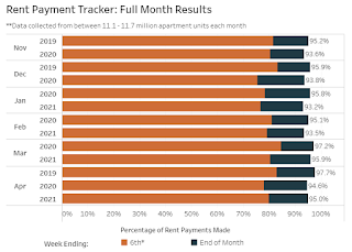
This graph from the NMHC Rent Payment Tracker shows the percent of household making full or partial rent payments by the 6th of the month compared to 2019 and to the first COVID year.
Although payments are down from 2019, rent payments are mostly unchanged from last year.
This is mostly for large, professionally managed properties.
The second graph shows full month payments through April compared to the same month the prior year.
This is mostly for large, professionally managed properties.
The second graph shows full month payments through April compared to the same month the prior year.

For April, rent payments were up compared to April 2020, and down compared to April 2021.
CR Note: There are some timing issues month to month.
Housing Inventory May 10th Update: Slight Increase Week-to-Week
by Calculated Risk on 5/10/2021 10:38:00 AM
One of the key questions for 2021 is: Will inventory increase as the pandemic subsides, or will inventory decrease further in 2021?
Tracking inventory will be very important this year.
 Click on graph for larger image in graph gallery.
This inventory graph is courtesy of Altos Research.
As of May 7th, inventory was at 310 thousand (7 day average), compared to 732 thousand the same week a year ago. That is a decline of 57.6%.
A week ago, inventory was at 307 thousand, and was down 58.4% YoY. Seasonally, inventory might be at a bottom - this has been at about the same level for the last four weeks.
Mike Simonsen discusses this data regularly on Youtube.
Mike Simonsen discusses this data regularly on Youtube.
Seven High Frequency Indicators for the Economy
by Calculated Risk on 5/10/2021 08:27:00 AM
These indicators are mostly for travel and entertainment. It will interesting to watch these sectors recover as the vaccine is distributed.
IMPORTANT: Be safe now - if all goes well, everyone could be vaccinated by June.
----- Airlines: Transportation Security Administration -----
The TSA is providing daily travel numbers.
 Click on graph for larger image.
This data shows the seven day average of daily total traveler throughput from the TSA for 2019 (Light Blue), 2020 (Blue) and 2021 (Red).
The dashed line is the percent of 2019 for the seven day average.
This data is as of May 9th.
The seven day average is down 36.9% from the same day in 2019 (63.1% of 2019). (Dashed line)
There was a slow increase from the bottom, with ups and downs due to the holidays - and TSA data has picked up in 2021.
----- Restaurants: OpenTable -----
The second graph shows the 7 day average of the year-over-year change in diners as tabulated by OpenTable for the US and several selected cities.
----- Hotel Occupancy: STR -----
 This graph shows the seasonal pattern for the hotel occupancy rate using the four week average.
The red line is for 2021, black is 2020, blue is the median, and dashed light blue is for 2009 (the worst year since the Great Depression for hotels - before 2020).
Occupancy is now above the horrible 2009 levels.
This data is through May 1st. Hotel occupancy is currently down 17% compared to same week in 2019). Note: Occupancy was up year-over-year, since occupancy declined sharply at the onset of the pandemic. However, occupancy is still down significantly from normal levels.
Notes: Y-axis doesn't start at zero to better show the seasonal change.
----- Gasoline Supplied: Energy Information Administration -----
 This graph, based on weekly data from the U.S. Energy Information Administration (EIA), shows gasoline supplied compared to the same week of 2019.
Blue is for 2020. Red is for 2021.
As of April 30th, gasoline supplied was off about 10.2% (about 89.8% of the same week in 2019).
Gasoline supplied was up year-over-year, since at one point, gasoline supplied was off almost 50% YoY in 2020.
----- Transit: Apple Mobility -----
This graph is from Apple mobility. From Apple: "This data is generated by counting the number of requests made to Apple Maps for directions in select countries/regions, sub-regions, and cities." This is just a general guide - people that regularly commute probably don't ask for directions.
There is also some great data on mobility from the Dallas Fed Mobility and Engagement Index. However the index is set "relative to its weekday-specific average over January–February", and is not seasonally adjusted, so we can't tell if an increase in mobility is due to recovery or just the normal increase in the Spring and Summer.
 This data is through May 8th for the United States and several selected cities.
The graph is the running 7 day average to remove the impact of weekends.
IMPORTANT: All data is relative to January 13, 2020. This data is NOT Seasonally Adjusted. People walk and drive more when the weather is nice, so I'm just using the transit data.
According to the Apple data directions requests, public transit in the 7 day average for the US is at 70% of the January 2020 level. It is at 70% in Chicago, and 65.0% in Houston - and moving up recently.
----- New York City Subway Usage -----
Here is some interesting data on New York subway usage (HT BR).
 This graph is from Todd W Schneider. This is weekly data since 2015.
The TSA is providing daily travel numbers.
 Click on graph for larger image.
This data shows the seven day average of daily total traveler throughput from the TSA for 2019 (Light Blue), 2020 (Blue) and 2021 (Red).
The dashed line is the percent of 2019 for the seven day average.
This data is as of May 9th.
The seven day average is down 36.9% from the same day in 2019 (63.1% of 2019). (Dashed line)
There was a slow increase from the bottom, with ups and downs due to the holidays - and TSA data has picked up in 2021.
The second graph shows the 7 day average of the year-over-year change in diners as tabulated by OpenTable for the US and several selected cities.
IMPORTANT: OpenTable notes: "we’ve updated the data including downloadable dataset from January 1, 2021 onward to compare seated diners from 2021 to 2019, as opposed to year over year." Thanks!
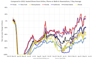 Thanks to OpenTable for providing this restaurant data:
This data is updated through May 8, 2021.
This data is "a sample of restaurants on the OpenTable network across all channels: online reservations, phone reservations, and walk-ins. For year-over-year comparisons by day, we compare to the same day of the week from the same week in the previous year."
Note that this data is for "only the restaurants that have chosen to reopen in a given market". Since some restaurants have not reopened, the actual year-over-year decline is worse than shown.
Dining picked up during the holidays, then slumped with the huge winter surge in cases. Dining was picking up again, but has moved up and down over the last couple of weeks. Florida and Texas are above 2019 levels.
----- Movie Tickets: Box Office Mojo -----
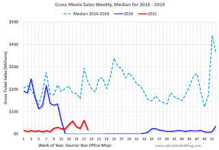 This data shows domestic box office for each week and the median for the years 2016 through 2019 (dashed light blue).
 Thanks to OpenTable for providing this restaurant data:
This data is updated through May 8, 2021.
This data is "a sample of restaurants on the OpenTable network across all channels: online reservations, phone reservations, and walk-ins. For year-over-year comparisons by day, we compare to the same day of the week from the same week in the previous year."
Note that this data is for "only the restaurants that have chosen to reopen in a given market". Since some restaurants have not reopened, the actual year-over-year decline is worse than shown.
Dining picked up during the holidays, then slumped with the huge winter surge in cases. Dining was picking up again, but has moved up and down over the last couple of weeks. Florida and Texas are above 2019 levels.
 This data shows domestic box office for each week and the median for the years 2016 through 2019 (dashed light blue).
 Blue is 2020 and Red is 2021.
The data is from BoxOfficeMojo through May 6th.
Note that the data is usually noisy week-to-week and depends on when blockbusters are released.
Movie ticket sales were at $19 million last week, down about 92% from the median for the week.
Note that the data is usually noisy week-to-week and depends on when blockbusters are released.
Movie ticket sales were at $19 million last week, down about 92% from the median for the week.
 This graph shows the seasonal pattern for the hotel occupancy rate using the four week average.
 The red line is for 2021, black is 2020, blue is the median, and dashed light blue is for 2009 (the worst year since the Great Depression for hotels - before 2020).
Occupancy is now above the horrible 2009 levels.
This data is through May 1st. Hotel occupancy is currently down 17% compared to same week in 2019). Note: Occupancy was up year-over-year, since occupancy declined sharply at the onset of the pandemic. However, occupancy is still down significantly from normal levels.
Notes: Y-axis doesn't start at zero to better show the seasonal change.
 This graph, based on weekly data from the U.S. Energy Information Administration (EIA), shows gasoline supplied compared to the same week of 2019.
Blue is for 2020. Red is for 2021.
As of April 30th, gasoline supplied was off about 10.2% (about 89.8% of the same week in 2019).
Gasoline supplied was up year-over-year, since at one point, gasoline supplied was off almost 50% YoY in 2020.
This graph is from Apple mobility. From Apple: "This data is generated by counting the number of requests made to Apple Maps for directions in select countries/regions, sub-regions, and cities." This is just a general guide - people that regularly commute probably don't ask for directions.
There is also some great data on mobility from the Dallas Fed Mobility and Engagement Index. However the index is set "relative to its weekday-specific average over January–February", and is not seasonally adjusted, so we can't tell if an increase in mobility is due to recovery or just the normal increase in the Spring and Summer.
 This data is through May 8th for the United States and several selected cities.
The graph is the running 7 day average to remove the impact of weekends.
IMPORTANT: All data is relative to January 13, 2020. This data is NOT Seasonally Adjusted. People walk and drive more when the weather is nice, so I'm just using the transit data.
According to the Apple data directions requests, public transit in the 7 day average for the US is at 70% of the January 2020 level. It is at 70% in Chicago, and 65.0% in Houston - and moving up recently.
Here is some interesting data on New York subway usage (HT BR).
 This graph is from Todd W Schneider. This is weekly data since 2015.
 Most weeks are between 30 and 35 million entries, and currently there more than 11 million subway turnstile entries per week - and increasing.
This data is through Friday, May 7th.
Schneider has graphs for each borough, and links to all the data sources.
He notes: "Data updates weekly from the MTA’s public turnstile data, usually on Saturday mornings".
This data is through Friday, May 7th.
Schneider has graphs for each borough, and links to all the data sources.
He notes: "Data updates weekly from the MTA’s public turnstile data, usually on Saturday mornings".


